Too often, the porch is viewed merely as a functional entryway—a utilitarian stopgap for wiping muddy boots before entering the house. This limited mindset leaves the exterior disconnected from the carefully curated design of the interior, creating a jarring barrier rather than an inviting extension of the home. However, a porch serves a vital role: it is the threshold where architecture meets nature. By treating this transitional zone as a seamless “outdoor room” through strategic color application, you can fundamentally change the way your home interacts with its surroundings.
Selecting nature-inspired hues, such as watery blues or earthy taupes, visually echoes the landscape and dissolves the hard lines of the built environment. Darker tones, including forest green or charcoal, ground the area and allow furniture to pop, while a soft “haint blue” ceiling draws the eye upward to mimic the sky. These choices bridge the gap between a constructed sanctuary and the wilder elements outside.
This comprehensive guide reveals specific paint strategies to blur the boundaries between inside and out effectively. We will explore how to choose colors that complement your interior, select durable satin finishes that withstand the elements, and apply design principles to create a sophisticated connection to nature. These actionable steps ensure your porch functions not just as a passage, but as a stylish, cohesive part of your living space.
Philosophy: Why exterior color is an architectural handshake
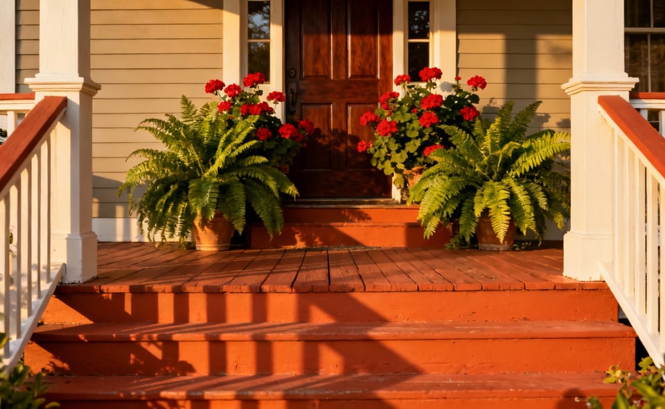
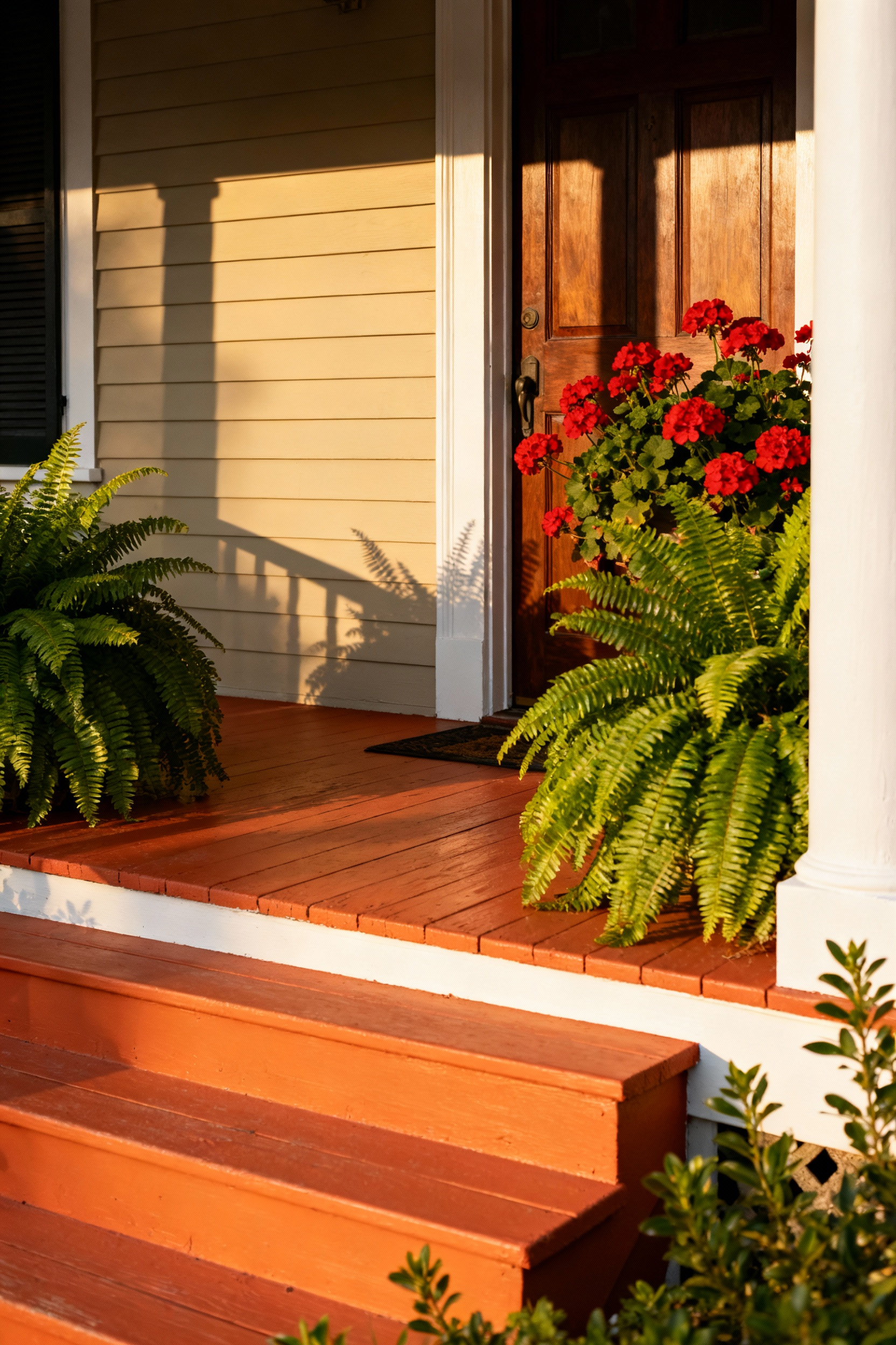
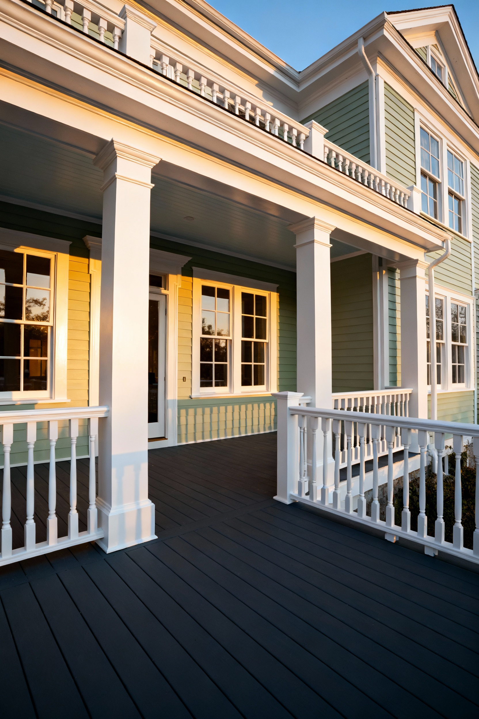
Think of your porch color as an architectural handshake. It offers a non-verbal introduction to guests and the wider community before anyone speaks a word. As the literal gateway to your home, this color choice delivers the first impression, so prioritize its psychological impact. Opt for warm hues, such as deep red, terracotta, or warm beige, to evoke a cozy and inviting feeling. These tones create an immediate sense of hospitality and effectively set the mood for the transition between outdoor and indoor living.
Remember that a handshake is a two-way interaction. Your exterior must greet guests while respectfully acknowledging its context. Color selection should express your unique style while maintaining visual cohesion with the neighborhood. Select a shade that complements or slightly enhances the existing dominant palette of your streetscape. This approach ensures your home stands out positively without disrupting the community’s aesthetic balance.
Finally, use paint to define and explain your porch’s design. Move beyond simple decoration by using color to accentuate architectural form. Apply a contrasting color to the porch floor, ceiling, or railings—such as a deep warm gray against white siding—to make defining elements pop. This technique visually frames the entryway, transforming the structure into the home’s primary focal point and reinforcing the porch’s function as a deliberate outdoor room.
I. Grounding the Space: Porch Floor Paint Ideas that Anchor Your Outdoor Room
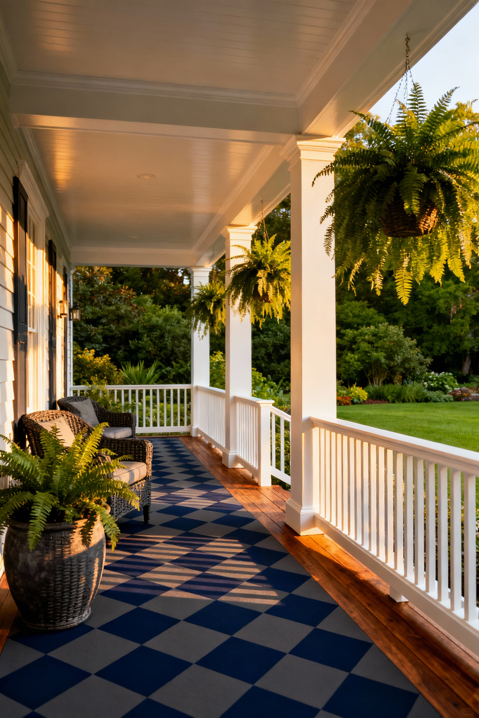
To create a true outdoor room, you must establish a stable visual foundation. Select deep, moody hues for your porch floor to effectively ground the space. Colors like charcoal gray, navy blue, or Charleston Green provide necessary visual weight, preventing the area from feeling unfinished. This approach anchors your furniture and creates a distinct boundary between the porch and the yard. For added architectural structure, consider painting a classic checkerboard or broad stripes. These patterns add depth and turn the floor into a deliberate focal point that contrasts sharply with lighter ceilings or trim.
Aesthetics mean nothing without durability. Standard exterior wall paint cannot withstand the abrasion of constant foot traffic. Always specify a dedicated Porch & Patio Floor Paint, typically an acrylic or epoxy-based formula designed for concrete or wood. These products resist scuffing and fading while handling weather fluctuations. Safety is equally important in these transition zones. Select a paint with a built-in anti-slip finish, or mix in an aggregate additive during application to ensure the surface remains safe and functional when wet.
The longevity of your finish depends entirely on surface preparation. Since porch floors endure significant environmental abuse, prep work is the most critical step of the project. Follow these essential steps for a lasting bond:
- Thoroughly clean the surface and scrape away any loose or flaking material.
- Sand the existing finish to create a mechanical bond for the new coat.
- Etch bare concrete to open the pores and apply a high-quality exterior primer to seal the substrate.
1. The Slate Standard: Deep charcoal floors to mimic natural stone
Adopting a deep charcoal hue for your porch floor establishes an immediate visual anchor. This color choice effectively mimics the sophisticated, earthy tones of natural stone without the expense of masonry work. Beyond aesthetics, a dark slate saturation serves a critical maintenance function. The deep color camouflages organic debris, such as tracked-in mud, dried leaves, and dust, keeping the transition between your garden and your home looking tidy between cleanings.
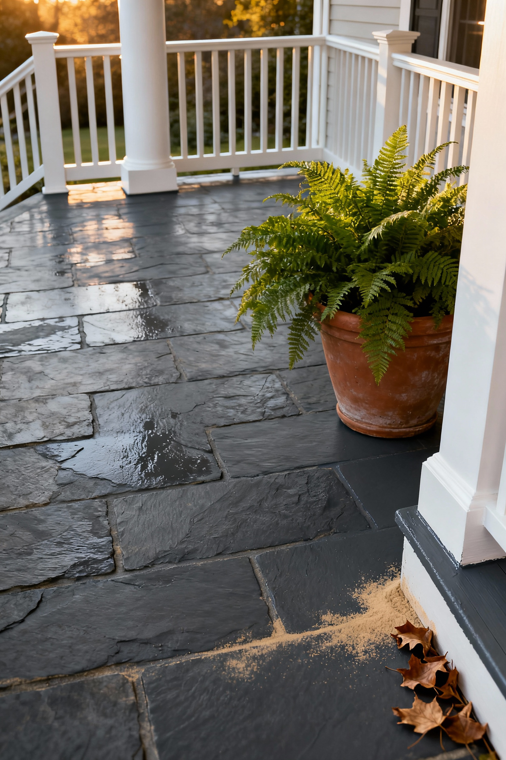
To ensure longevity, select a 100% acrylic latex floor paint or enamel specifically formulated for exterior porches. These products withstand the harsh realities of outdoor exposure, resisting mildew growth, scuffing, and UV fading. When selecting a sheen, opt for a low-lustre or satin finish. A high-gloss surface often reflects too much light, creating an artificial, plastic-like appearance. A satin sheen strikes the right balance, offering durability and cleanability while maintaining the matte, grounded look of authentic quarried stone.
Finally, consider the tactile experience and safety of the surface. Authentic slate possesses a natural grit that standard paint lacks. You can bridge this gap by applying a resurfacing product or paint with a built-in textured or anti-skid finish. This addition enhances the visual depth of the floor, making it appear more organic. More importantly, the added texture provides necessary slip resistance during wet conditions, ensuring your outdoor room remains safe and functional year-round.
2. Terracotta Warmth: Earth-toned masonry paint for seamless garden transitions
Select high-performance exterior masonry paint for any concrete, brick, or stucco surfaces on your porch. This formulation offers essential resilience against cracking, dirt, and mold, ensuring a professional finish that withstands the elements better than standard exterior latex. To seamlessly merge the built environment with nature, utilize a strategy of tonal gradation. Apply lighter, sandy beige tones to the deck or floor, graduating to deeper clay colors on foundational walls. This layering adds depth and harmonizes the transition from the hardscape to the garden without creating sharp visual boundaries.
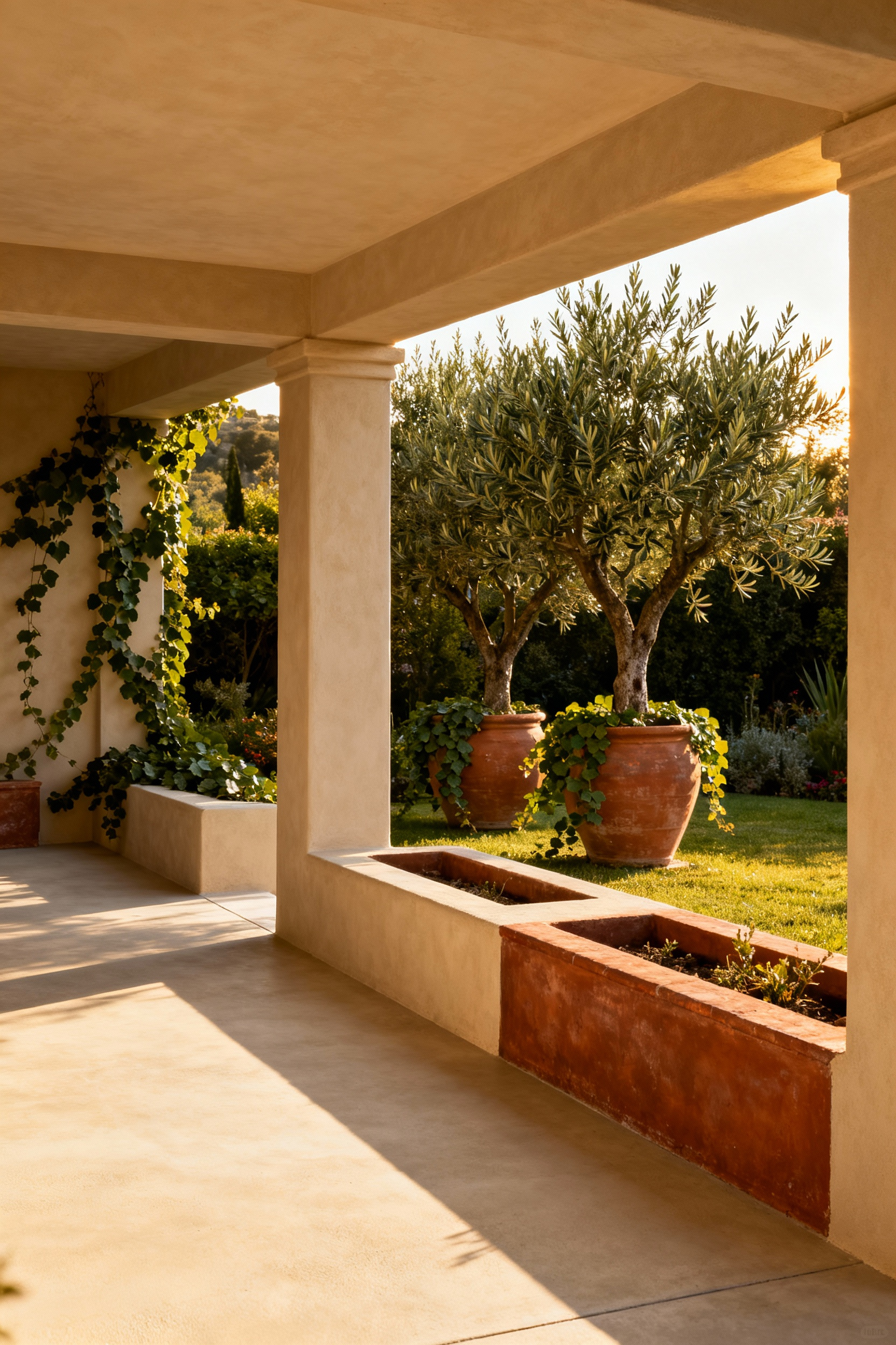
Extend this warm palette to your container garden to create a unified, architectural look. Painting clay pots with the same masonry paint used on the structure establishes a cohesive “European Garden” aesthetic, though you must use a quality primer and weatherproof sealer to address the porosity of raw terracotta. To prevent the earth tones from feeling flat, introduce complementary accent colors on trim, furniture, or railings:
- Deep Green: Grounds the space and amplifies the earthy quality of the masonry.
- Soft Gray or Taupe: Adds a modern, sophisticated edge to the warm palette.
- Crisp White or Cream: Brightens the area and allows the terracotta hues to appear more vibrant.
3. The Nautical Anchor: Classic Navy decking for durability
Select classic navy blue to ground your outdoor room with sophisticated maritime flair. This deep, saturated shade serves as a practical foundation for high-traffic areas, effectively hiding dirt, minor scuffs, and daily wear better than lighter alternatives. To achieve a timeless aesthetic, pair the dark floor with crisp white railings, columns, or trim. This high-contrast palette visually “anchors” the space and mimics the clean lines of classic naval architecture.
Durability and comfort are paramount when applying dark tones to horizontal surfaces. Choose a high-quality, 100% acrylic deck paint or solid color stain with a satin finish. This sheen offers the best balance of longevity and cleanability without the visual distraction of high reflectivity. Since dark colors naturally absorb heat, select modern solid color stains featuring heat-deflecting “Cool Field” technology. This innovation can reduce surface temperatures by up to $20^{\circ}$, ensuring your deck remains comfortable underfoot even during peak summer hours.
Complete the transition from deck to outdoor sanctuary with intentional material choices. Incorporate natural wood elements, such as teak or cedar furniture, to warm up the cool blue tones and replicate authentic ship materials. Metallic accents, particularly copper or brass lanterns, add a layer of refinement to the design. For a bolder statement on smaller porches, consider painting a blue-and-white stripe motif. These details transform a standard deck into a cohesive, stylish extension of your home’s living space.
4. Zoning with Geometry: Stenciled ‘area rugs’
Open patios often lack definition, leaving furniture floating in undefined space. A stenciled “area rug” solves this issue by using geometry to establish distinct visual boundaries. By centering a perimeter pattern beneath a dining table or lounge grouping, you create an anchor that mimics the structure of an indoor room without physical walls. Current trends favor high-impact, repeating geometric designs, such as Moroccan or Portuguese Azulejos styles. These patterns simulate the look of expensive cement or ceramic tiling, adding a sophisticated architectural layer to simple concrete surfaces.
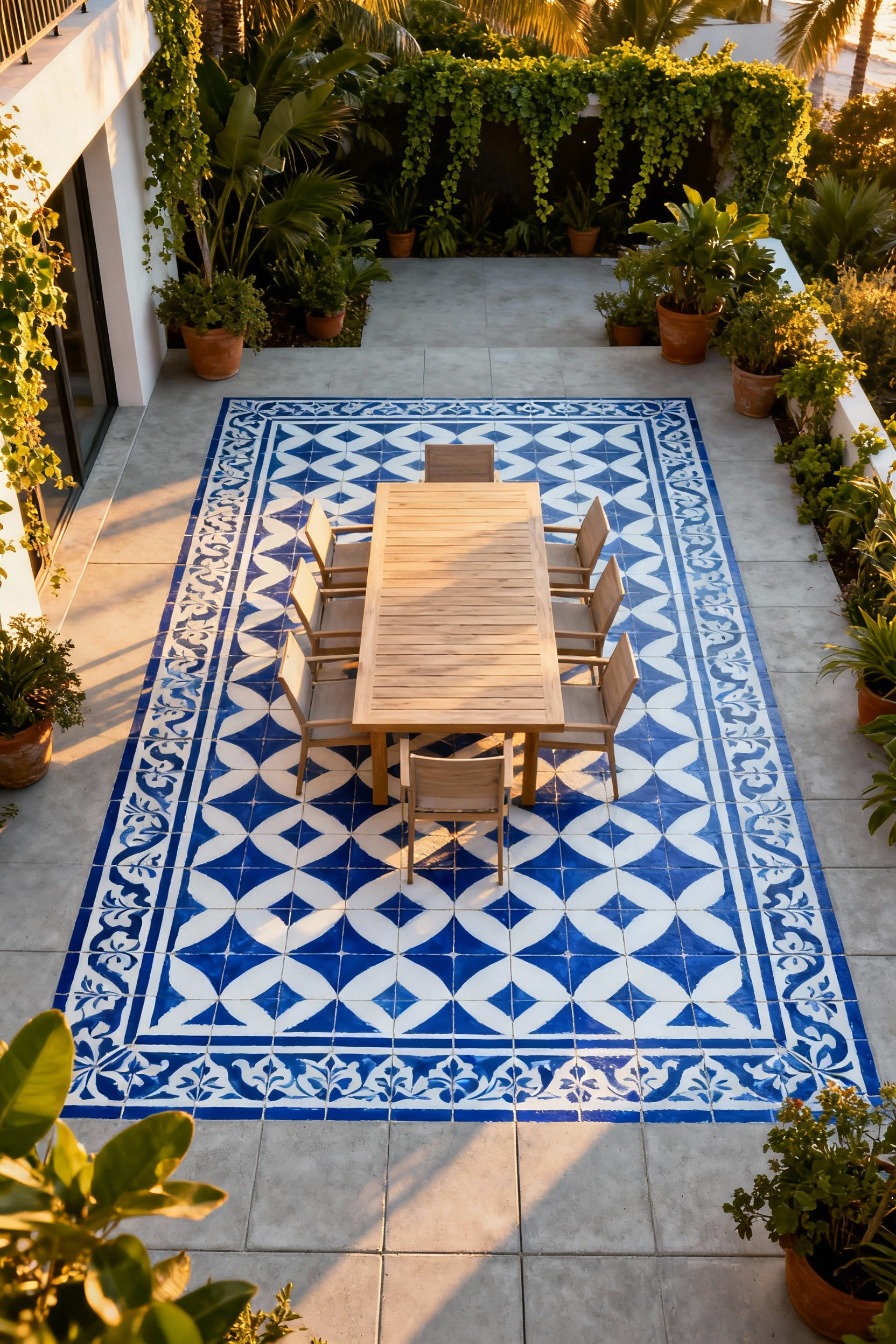
Achieving a professional, durable finish requires strict adherence to surface preparation and application techniques. Concrete is porous and holds debris, so you must thoroughly clean, degrease, or power-wash the area before applying any color. Always select high-quality, exterior-rated Porch and Patio paint to ensure the design withstands foot traffic and weather.
Precision is the key to a realistic tile effect. To prevent paint from bleeding underneath the stencil and ruining the crisp lines, use a specific stencil brush or a dense foam roller. The most critical technique is “offloading”: remove almost all excess paint onto a paper towel before touching the stencil. Apply the color with a light dabbing motion or gentle roll; this patience ensures the geometric pattern remains sharp and distinct.
5. Driftwood Greige: Weathered palettes that embrace dust
Maintaining a pristine outdoor living area often feels like a battle against the elements, specifically pollen and dust. Instead of constantly sweeping stark white or deep black floors, consider a “Driftwood Greige” palette. This approach utilizes a true blend of gray and beige to create a mid-toned, earthy foundation. By selecting a shade with subtle brown or green undertones, you mimic the natural colors of sandy soil and dried leaves. This visual camouflage allows your porch to maintain a clean appearance even when a fine layer of seasonal pollen settles on the surface.
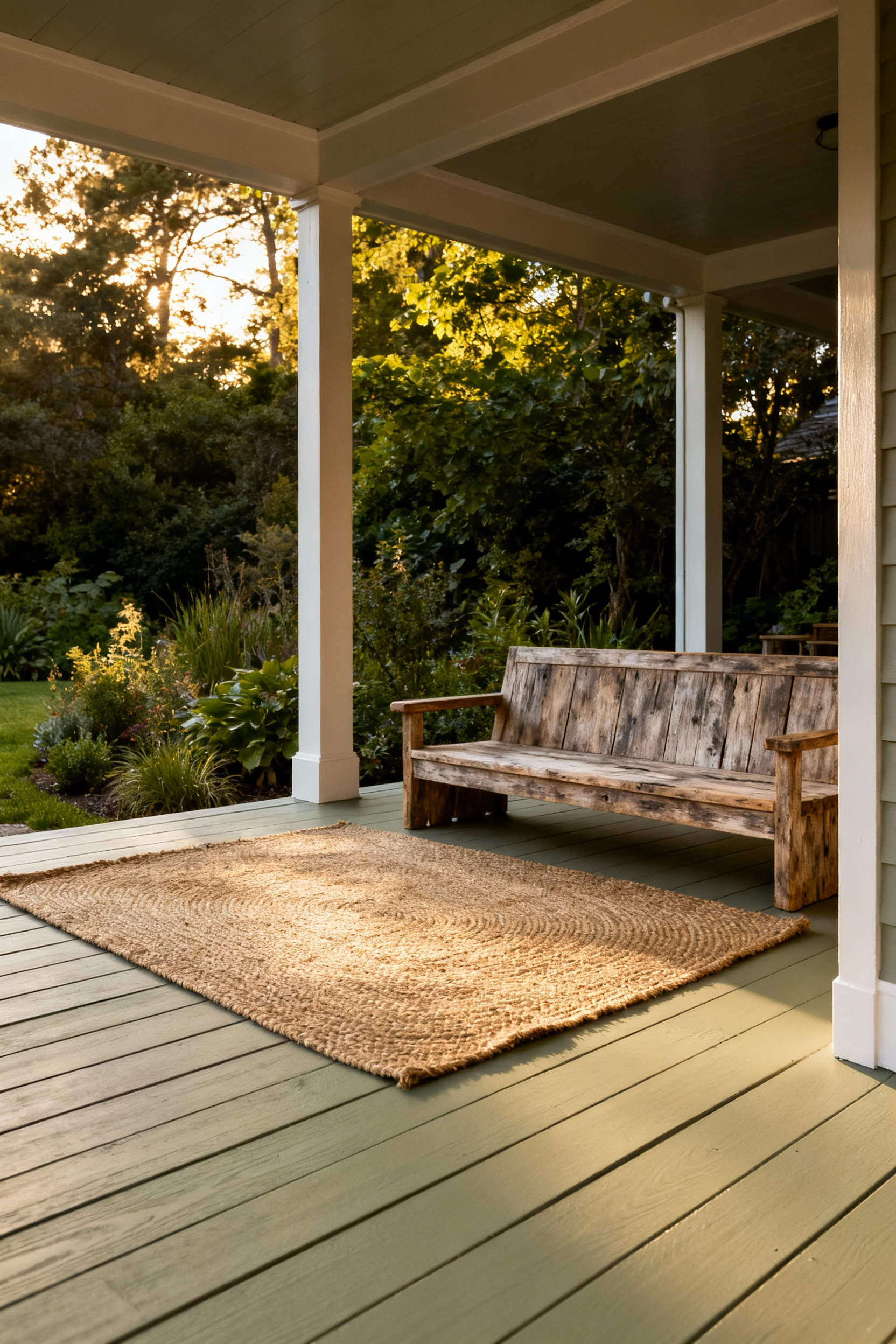
The finish you choose is just as important as the color for long-term wearability. Avoid high-gloss paints, as their reflective properties highlight imperfections and dust layers. Instead, opt for a satin or flat finish to achieve an integrated, weathered look that effectively hides unavoidable scuffs from high foot traffic. Before committing to a full application, test your specific greige on a small section of the porch. Natural light shifts dramatically throughout the day, and you must ensure the hue remains balanced—neither too icy gray in the shade nor too yellow in direct sunlight.
Treat this flooring choice as a sophisticated, neutral backdrop similar to natural stone. A weathered greige floor acts as a grounding element, allowing you to introduce crisp white accents or vibrant colors through planters, railings, and textiles. By shifting the visual focus to these accessories, the floor remains a functional, seamless connector between your indoor and outdoor spaces without drawing attention to every speck of dirt.
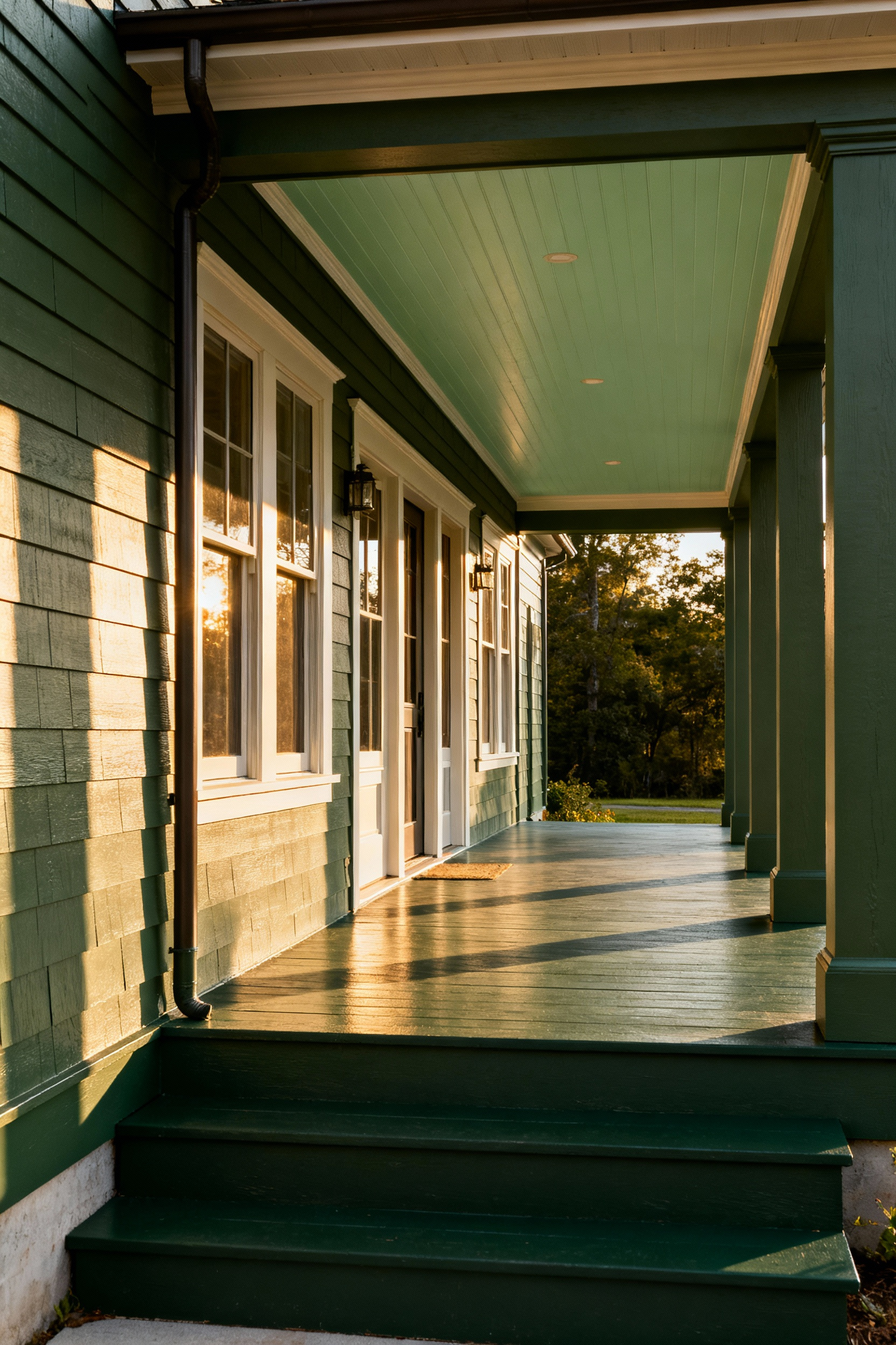
II. The Atmospheric Canopy: Ceiling Concepts
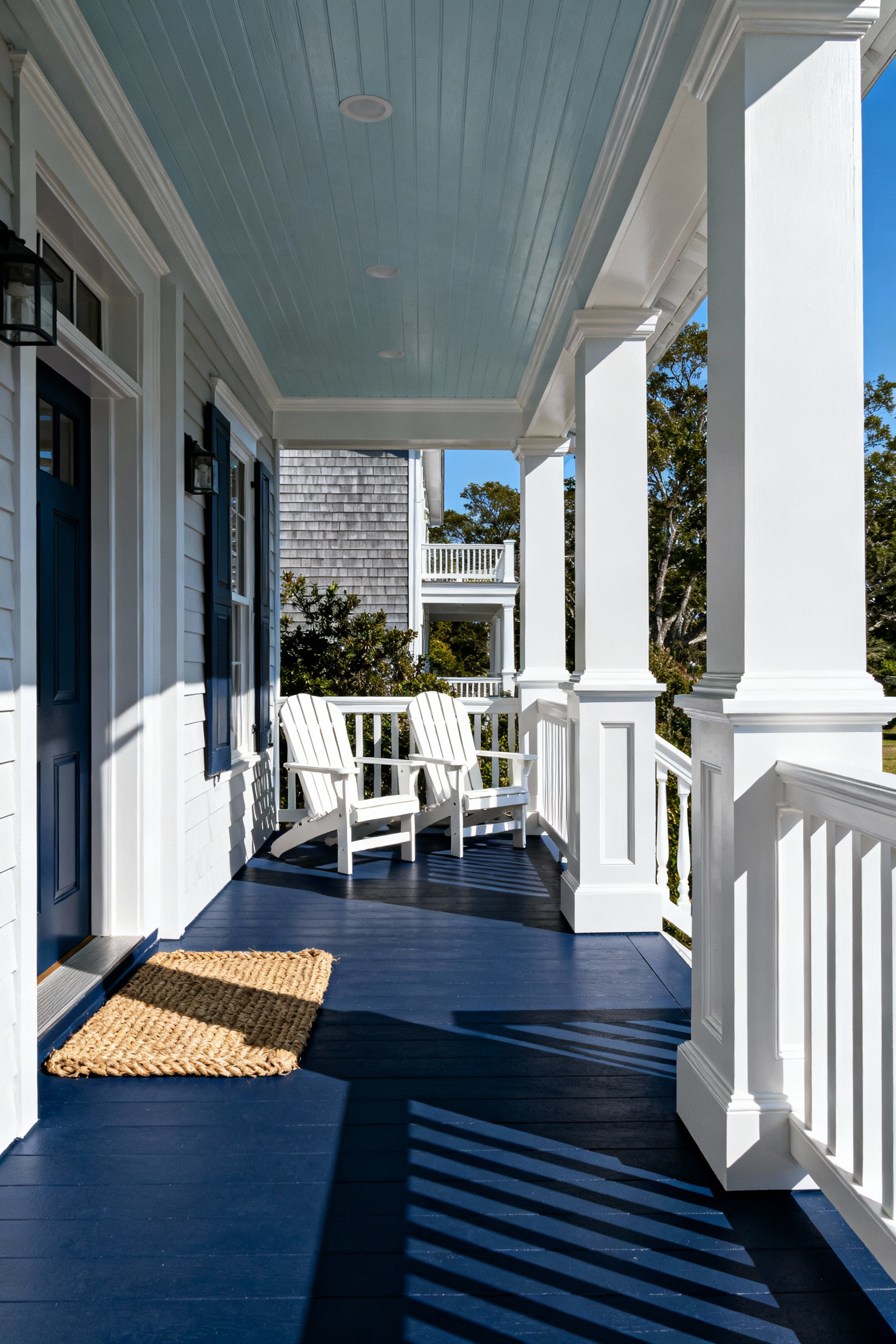
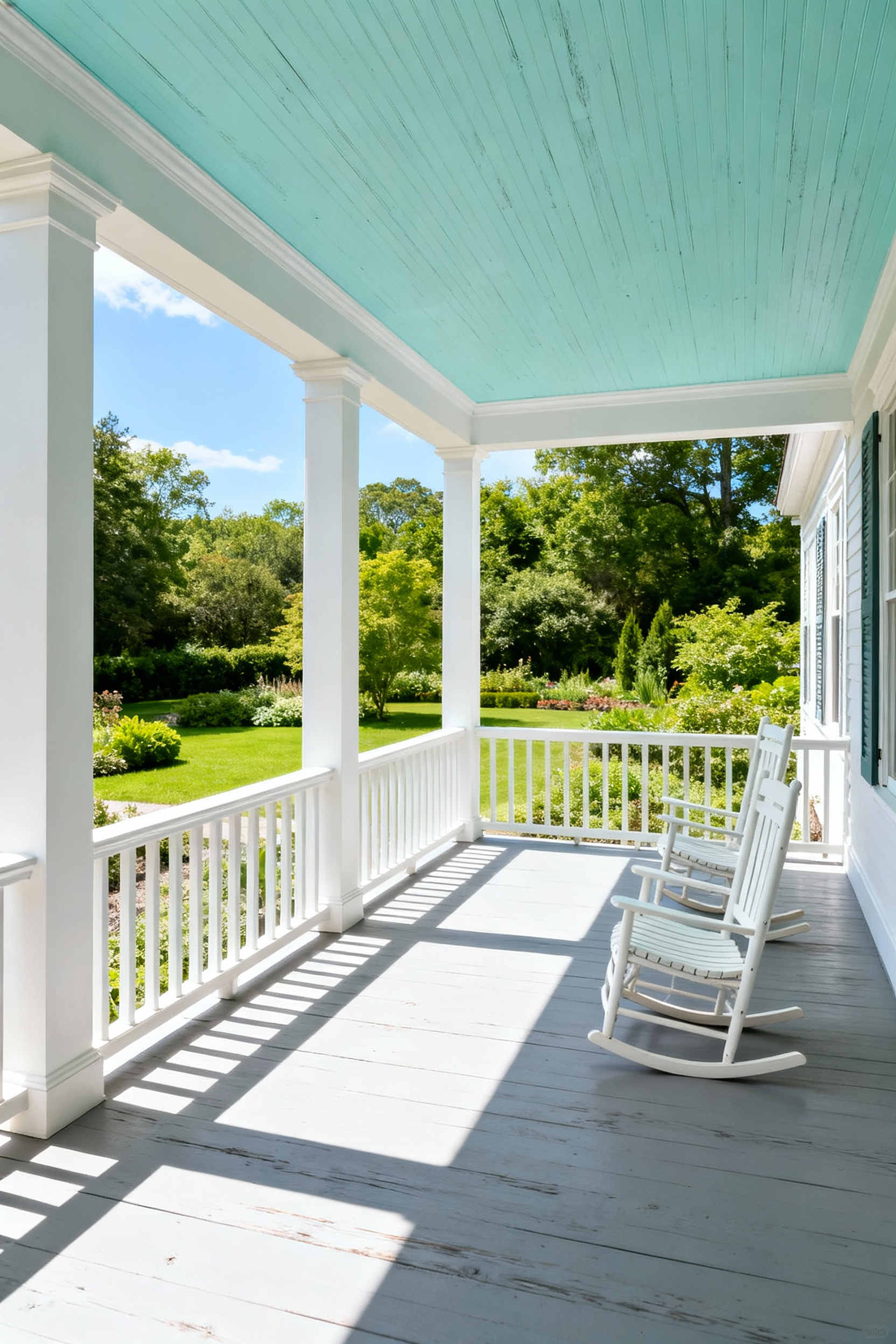
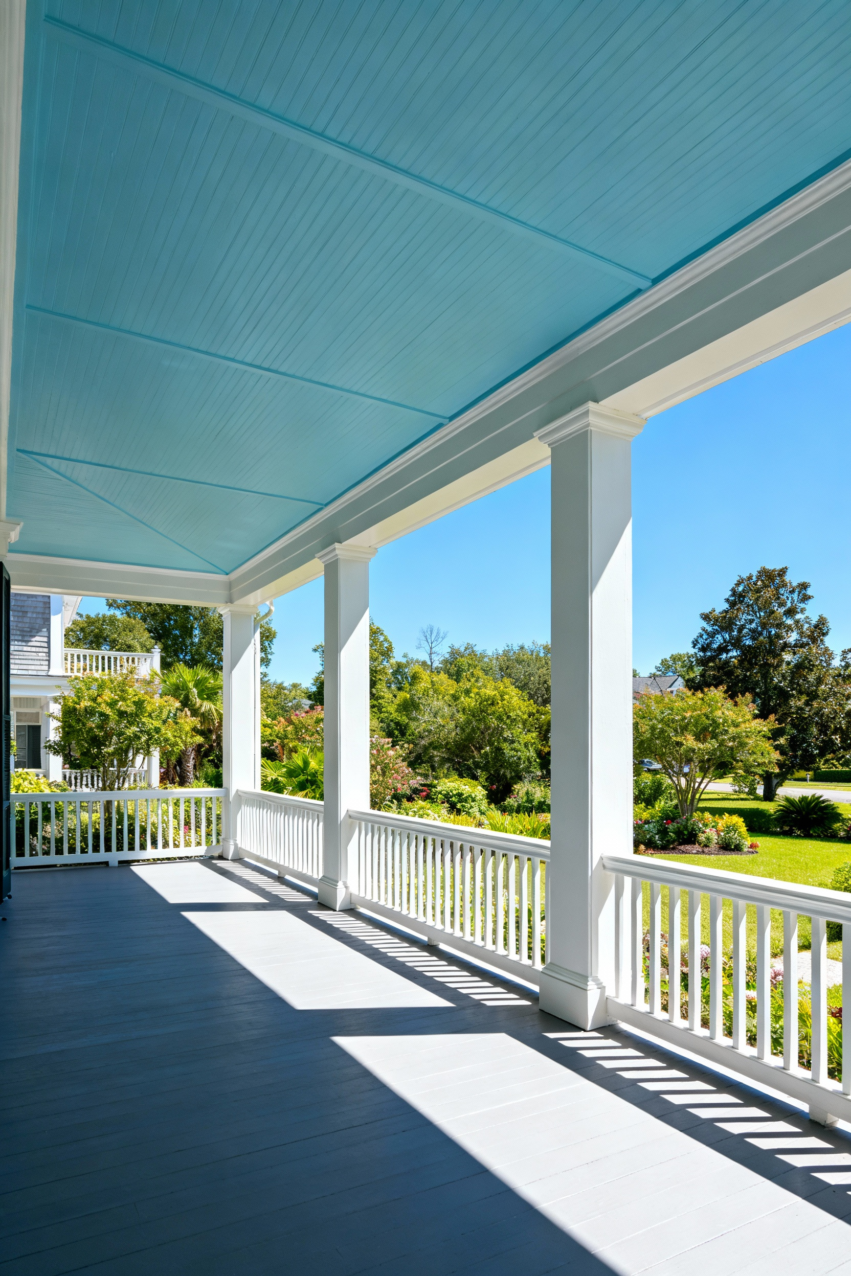
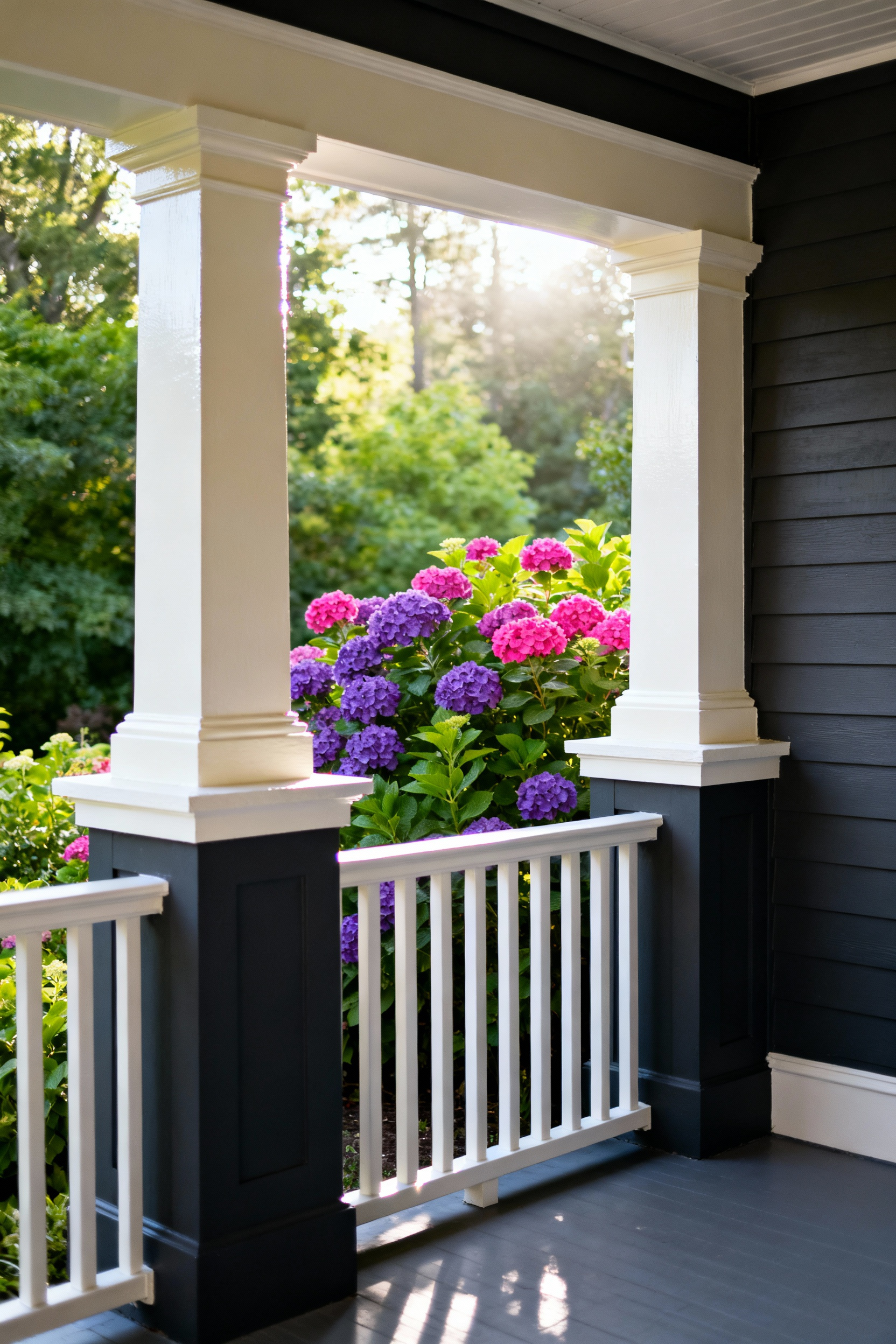
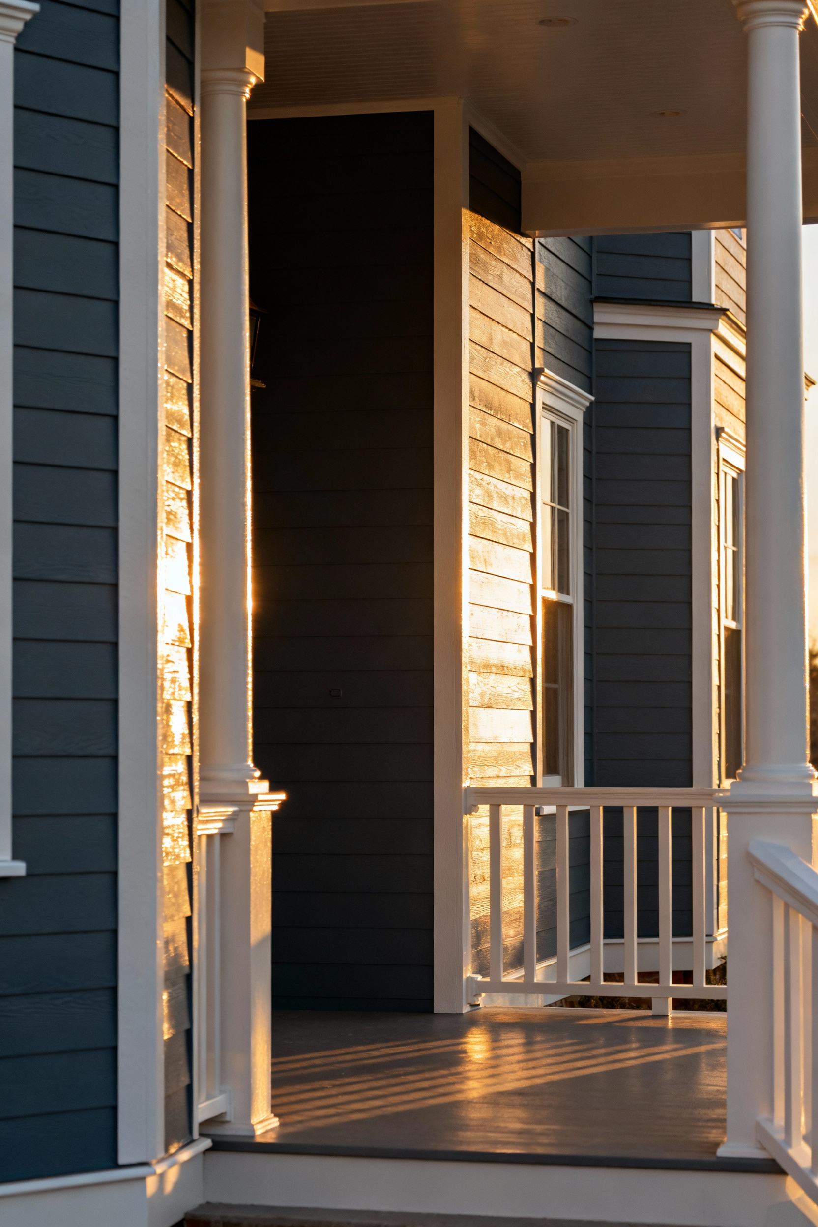
Treat your porch ceiling as a “fifth wall” rather than a neglected surface. This overhead space offers a prime opportunity to visually expand the volume of your outdoor room. To create a sense of height, opt for light hues like crisp whites, soft grays, or the traditional “Haint Blue.” This pale blue-green shade mimics the natural sky, creating a psychological effect of airiness that seamlessly connects the sheltered space with the open environment.
Coordinate your color choice with the surrounding architecture and furnishings to establish a cohesive flow. If your home features neutral siding, use the ceiling canopy to introduce a bold accent without overwhelming the design. A pale yellow infuses the area with perpetual warmth, while a rich terracotta provides a calming, earthy anchor. Always reference the undertones in your outdoor fabrics and flooring to ensure the ceiling color complements the total composition.
Prioritize durability when selecting your materials. While the ceiling remains relatively protected, it still endures moisture, temperature shifts, and wind-blown debris. Apply a high-quality exterior paint formula that offers robust UV protection. This prevents the finish from cracking or peeling over time, ensuring your outdoor living space remains both functional and stylish for years.
6. The Haint Blue Revival: Psychological expansion of the sky
Painting a porch ceiling pale blue creates a seamless visual transition between the covered shelter and the open air. This design technique, deeply rooted in the “Haint Blue” tradition of the American South, mimics the color of the sky to influence spatial perception. By tricking the eye, the color makes the structural ceiling appear to recede, visually lifting the overhead plane. This simple application transforms a confined outdoor room into an airy, expansive space that feels directly connected to the surrounding landscape.
Beyond the architectural illusion, this specific palette serves functional purposes. The light-reflective nature of pale blue-greens captures ambient light, brightening the porch during twilight hours and inviting guests to linger longer. Historically associated with the Gullah Geechee culture as a spiritual barrier, the color is also widely believed to deter pests. Many homeowners find that wasps and spiders perceive the blue surface as open sky, making them less likely to build nests in the corners of the structure.
Execution requires restraint to maintain sophistication. “Haint Blue” refers to a range of atmospheric tones rather than a single standardized swatch. Avoid vibrant, saturated blues, as they often appear neon when contrasted against white exterior trim. Instead, select muted shades with gray or green undertones, such as Sherwin-Williams’ “Atmospheric” or Benjamin Moore’s “Palladian Blue.” The goal is a whisper of color that looks almost white on the chip but reads as a soft extension of the horizon once applied.
7. High-Gloss Reflection: Using sheen to amplify natural light
Shaded porticos often struggle with low visibility, making them feel enclosed rather than inviting. To counter this, treat your paint finish as a functional lighting tool. Select a high-gloss or semi-gloss finish instead of standard satin or flat options. Higher sheen levels act as a soft mirror, capturing the limited natural light available and bouncing it back into the seating area. This simple adjustment maximizes brightness and transforms a dim entry into an open, accessible extension of your indoor living space.
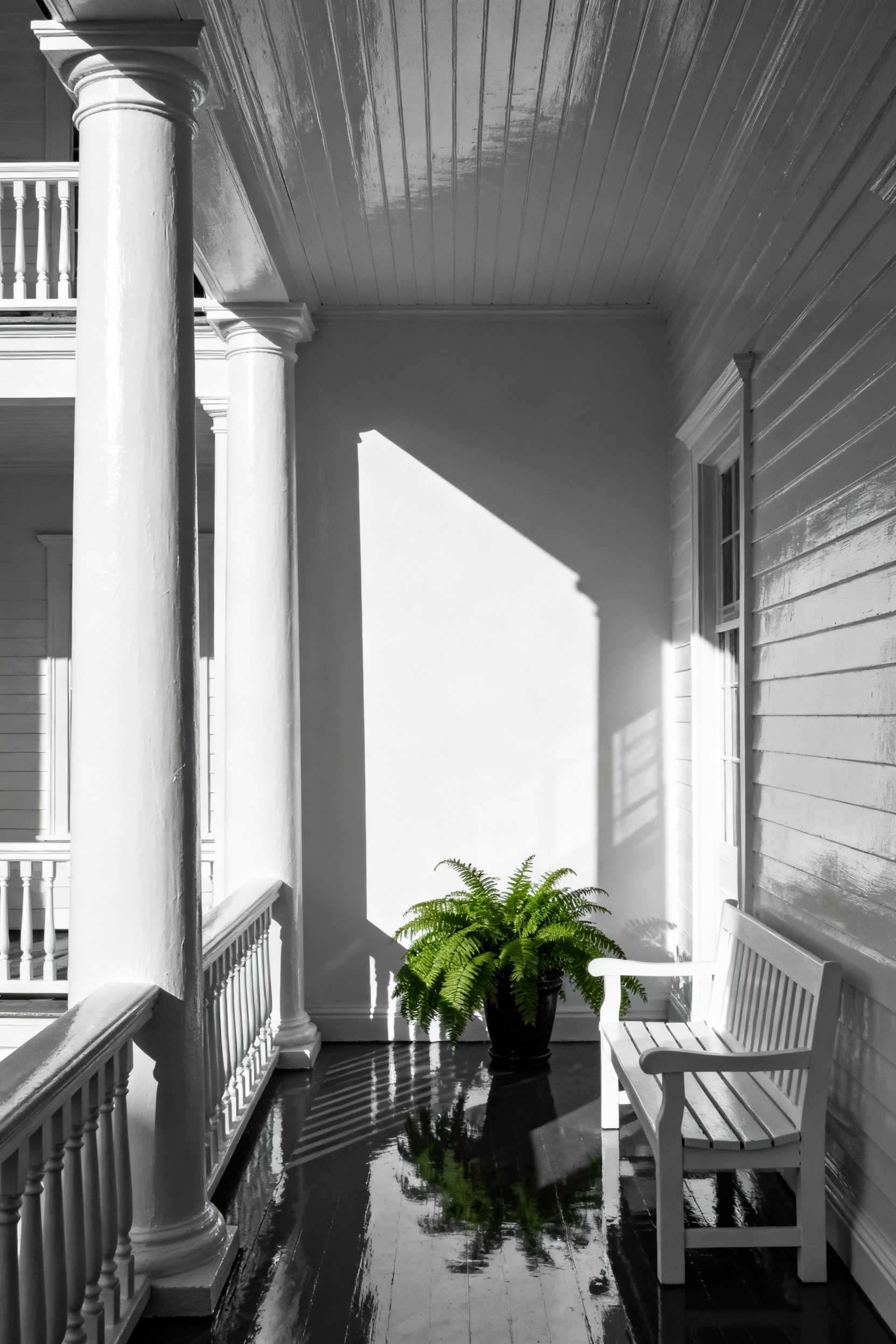
Your ceiling offers the most valuable real estate for this amplification technique. Apply the high-gloss finish to this overhead surface using a color with a high Light Reflectance Value (LRV), such as “Ultra Pure White,” soft cream, or a very pale gray. Pairing the glossy sheen with these lightest possible hues ensures the surface absorbs minimal light. This directs ambient light down onto the porch floor and walls, effectively making the portico feel taller and airier.
However, high-gloss finishes are unforgiving and will highlight every imperfection. Success relies entirely on preparation. Before application, ensure the wood or concrete surface is thoroughly cleaned, sanded, and smoothed. A flawless foundation allows light to reflect evenly across the surface. Conversely, a rough or textured substrate will scatter the light beams, diffusing the reflection and diminishing the brightening effect you want to achieve.
8. Warm Timber Tones: Faux-wood graining for cold climate warmth
In colder regions, visual warmth transforms a stark porch into an inviting retreat. To achieve this effect without the maintenance of natural timber, select deep wood tones rather than cool or light styles. A rich Mahogany with a reddish-brown base or a dark Walnut creates an immediate sense of luxury and coziness. These darker hues psychologically counter the chill of the surrounding landscape and anchor the space as a true outdoor room.
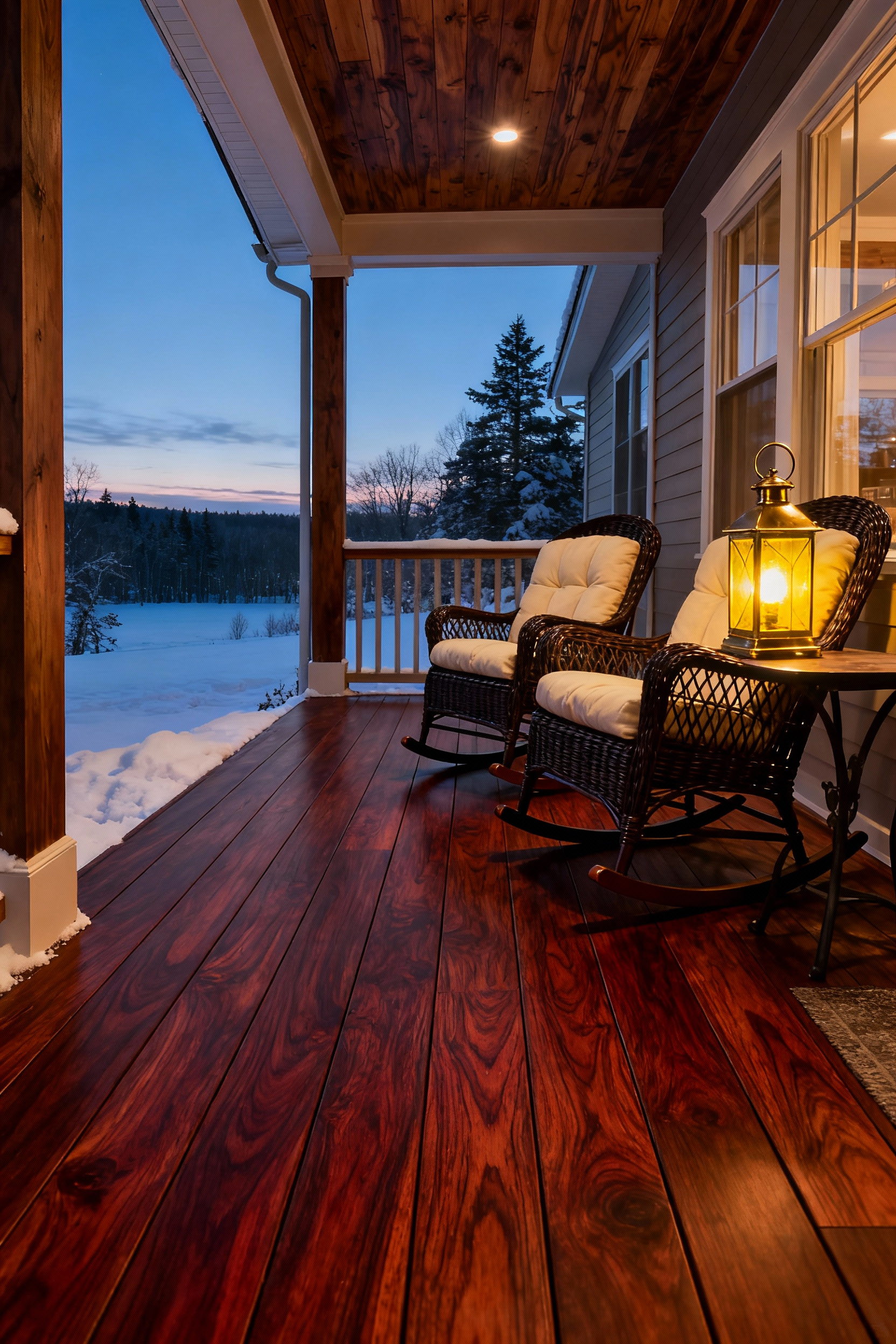
The execution relies on the glaze-and-tool layering method. Begin with a fully dried, lighter base coat, then apply a contrasting tinted glaze—a darker color mixed with a glaze medium—over the surface. While the glaze remains wet, drag a wood graining tool or rocker through it to expose the lighter base and form the grain pattern. For added realism, employ a scumbling technique by selectively wiping away portions of the darker glaze. This step mimics the natural variation and high points of real timber, adding essential depth to the finish.
Durability creates the bridge between style and function in harsh climates. Standard interior products will fail when exposed to moisture and temperature fluctuations. Ensure all paints and glaze mediums are explicitly exterior-grade. Once the faux finish cures, seal the surface with a high-quality, weather-resistant exterior top coat or varnish. This final layer prevents moisture intrusion and protects against freeze-thaw cycles, ensuring the floor withstands the elements while maintaining its warm, handcrafted aesthetic.
9. The Midnight Ceiling: Dark matte finishes for intimacy
Transform your covered porch by embracing darker tones. While white suggests openness, a deep charcoal or true black ceiling creates a sophisticated, cocoon-like atmosphere. This approach adds surprising depth and coziness without making the space feel closed in. To execute this correctly, select a flat or matte exterior paint. Glossy finishes reflect light and highlight architectural flaws, but a matte finish absorbs light to reinforce a sense of intimacy.
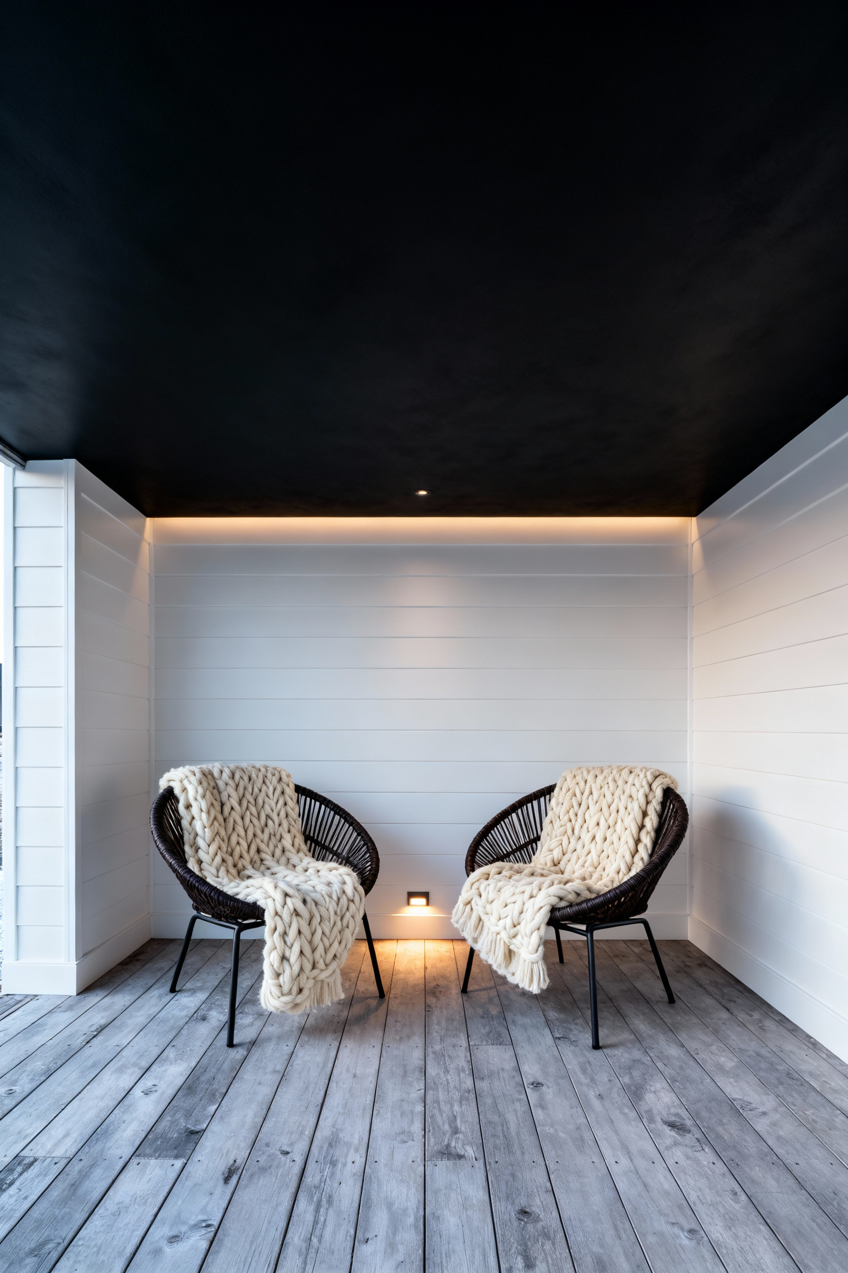
Technical precision matters when working with such dark hues. Opt for a factory black or a pre-mixed base rather than a custom-tinted deep shade. Custom tints often require high pigment loads that can create a temporary, unwanted sheen even in flat formulas. For a truly celestial touch, consider stenciling or hand-dotting the dry surface with luminous paint. This mimics constellations, providing a subtle visual focus that emerges only when the sun goes down and the porch lights remain off.
Lighting choices dictate the success of this aesthetic. Bright, overhead fixtures will wash out the paint and destroy the mood. Instead, curate a low-light environment to preserve the dark atmosphere:
- Avoid direct overhead brightness: Rely on floor lamps or table lamps rather than ceiling-mounted fixtures.
- Layer soft sources: Use dimmable string lights or candles to create a warm, ambient glow.
- Control the direction: Position discreet up-lights away from the ceiling to ensure the “midnight” canvas remains dark and dramatic.
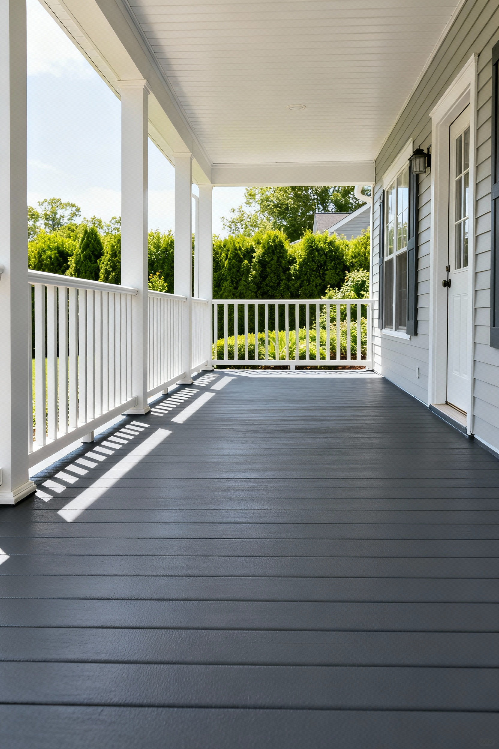
III. Architectural Definition: Rails, Columns, and Trims
Railings, columns, and trims act as the visual frame for your outdoor living space, defining the boundary between the home and the landscape. To achieve a unified, classic look, paint all architectural details—including spindles and window trim—the same bright color, typically white. This strategy separates the structure from the siding and simplifies future decor changes. For a more contemporary edge, apply a high-contrast color like black or dark gray to the railings and posts while keeping the main house trim white. This creates a sharp, dramatic border. You can further accentuate these lines by applying an accent color specifically to the top and bottom rails or by adding painted horizontal bands around the base and capital of your columns.
Durability relies on correct material selection and rigorous preparation. Because top rails and spindles face heavy weathering and frequent handling, use a high-quality Interior/Exterior Porch & Floor Paint or a premium exterior acrylic latex. Before applying color, scrape away all loose paint, sand the wood smooth, and fill every joint or hole with caulk and wood putty. Apply an exterior primer to any bare wood or filled areas before the final coat. This seals intricate parts against moisture intrusion and prevents mold or decay, ensuring your architectural elements remain both structural and stylish.
10. The Invisible Boundary: Forest Green railings
To maximize the connection between a porch and the surrounding landscape, the railing should recede rather than stand out. A deep, dark Forest Green—verging on black—mimics the natural shadows found in dense foliage and gardens. For the most effective camouflage, mix a custom blend of 50 percent dark green and 50 percent flat black paint. This dark value tricks the eye, allowing the railing to dissolve into the background and creating an uninterrupted view of the outdoors.
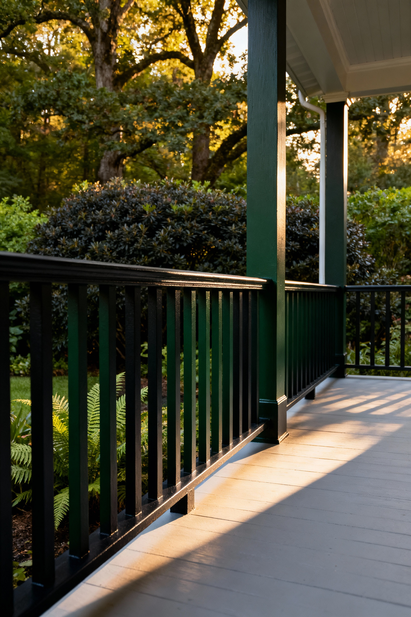
The finish of the paint is just as critical as the color. Always opt for an exterior paint with a flat or matte finish instead of a glossy one. Glossy surfaces reflect sunlight, drawing attention to the architecture of the railing and breaking the illusion. A matte finish absorbs light, which helps the structure fade from focus. This technique works best on thinner railing elements, such as vertical balusters or wrought iron, where there is less physical mass to interrupt the line of sight.
To ensure the home maintains a sophisticated appearance, balance the dark railing with the surrounding architecture. Pair the Forest Green elements with harmonious, natural neutrals on the porch floor, posts, or the main body of the house. Stone gray, deep brown, and soft beige provide a classic foundation that frames the “invisible” boundary. This approach preserves the structural definition of the outdoor room while removing visual barriers to nature.
11. Structural Black: High-contrast framing
Revitalize a traditional porch by using matte or satin black paint to define its structural elements. Applying this dark finish to key architectural bones—including columns, handrails, and perimeter trim—creates a crisp, graphic outline against lighter exterior tones like white or cream. This high-contrast approach instantly modernizes the home’s facade and lends a sophisticated edge to standard carpentry.
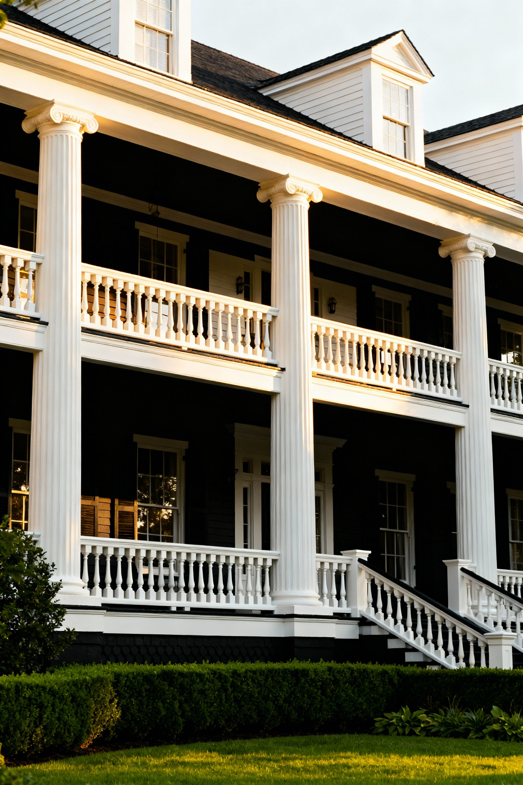
This technique also improves the visual connection to the surrounding landscape. When you paint screen or window frames black, they absorb light and visually recede, minimizing obstructions and enhancing the view of the outdoors. Anchor this open feeling with a matte black floor. A dark, non-reflective floor paint creates a solid foundation that looks elegant and practically hides dirt or imperfections on older wood or concrete.
Finally, ensure the high-contrast look remains inviting by introducing texture and warmth. To keep the space from feeling too stark, balance the black framework with natural wood accents, such as a stained ceiling or timber furniture. Alternatively, soften the contrast with a vibrantly painted front door or bright cushions. These elements maintain the modern aesthetic while ensuring the outdoor room feels comfortable and lived-in.
12. Crisp Linen Whites: Reflective borders
View your porch railing and columns as the matting around a piece of fine art. By applying a crisp linen white to these architectural details, you create a deliberate optical boundary that guides the eye outward. This high-contrast approach—setting bright trim against a darker building facade like deep charcoal, green, or natural wood—sharpens the view, turning your garden or landscape into a focal point distinct from the structure itself.
To keep this frame inviting rather than harsh, avoid sterile, blue-based whites. Instead, select a white with a Light Reflectance Value (LRV) generally under 85. A slightly lower LRV ensures the color remains bright without becoming blinding or stark in full sunlight. Look for hues with subtle greige or taupe undertones; these “linen” qualities bridge the gap between man-made structures and the organic warmth of the outdoors.
Finish the look by applying a semi-gloss or gloss sheen to these borders. The added reflectivity catches the light and crisply defines the edges of posts and rails. This slight shine solidifies the architectural line, ensuring your porch frames nature with the distinct precision of a photograph.
13. Tonal Layering: Using three shades of one hue
Monochromatic layering transforms a flat exterior into a structured, sophisticated outdoor room. This technique utilizes three closely related variations of a single base hue—light, medium, and dark—to build dimension without introducing clashing colors. To guarantee harmony, select a single paint strip and choose three consecutive shades. Because these colors share the exact same undertone, they layer seamlessly and provide instant visual cohesion.
To apply this scheme effectively, assign tones based on the architectural weight of each feature. This hierarchy guides the eye and defines the structure:
- Lightest Tone: Apply the lightest tint to the ceiling or main walls. This reflects light, maximizes the sense of height, and makes the porch feel open and airy.
- Medium Tone: Use the middle shade on railings, balusters, and column shafts. This adds substance to the perimeter and frames the view from the porch.
- Darkest Tone: Reserve the deepest shade for the floor, steps, or front door. This creates a grounding focal point that anchors the space visually.
You can further refine the look by using contrast to highlight craftsmanship. For instance, painting a column shaft in the medium tone while highlighting the base and cap trim in the darkest tone draws attention to the millwork. This strategic placement turns standard structural elements into elegant design features, ensuring your porch feels as curated as your interior living spaces.
IV. Materiality and Texture: Specialized Applications
Selecting the right coating requires specific attention to chemical composition and physical density. For superior exterior performance, utilize 100% acrylic or urethane-fortified acrylic formulas. These mixtures offer UV stability that prevents the yellowing often seen with standard epoxies. They also maintain flexibility during temperature shifts to prevent cracking. High-viscosity “high-build” paints further enhance the substrate by filling hairline cracks and surface chips. This creates a uniform canvas and reduces prep time on weathered surfaces.
Safety remains the primary driver for texture application. Wet porches and ramps demand a high Coefficient of Friction (COF) to prevent accidents. Manufacturers achieve this by suspending fine aggregates, such as silica sand or aluminum oxide, within the paint. For custom projects, you can introduce separate non-skid additives like rubber grit into a standard base. This method allows you to dictate the specific texture grade, balancing aggressive traction with ease of maintenance.
Current design trends favor coatings that mimic natural hardscapes. Specialized finishes now replicate the look of granite or aggregated stone. These applications elevate the visual weight of the porch, making it feel like a permanent extension of the home’s architecture. Because these finishes rely on physical texture to mimic stone, they inherently provide a non-skid surface, effectively solving both aesthetic and functional requirements in a single application.
14. Limewash Breathing: Permeable finishes for aging brick
Standard film-forming paints often fail on aging brick or stone porches because they create an impermeable seal that traps moisture. This trapped water inevitably leads to peeling flakes and accelerates the deterioration of the masonry itself. Limewash offers a superior alternative by providing a breathable, mineral-based finish. By allowing moisture vapor to escape naturally from pillars and foundations, this permeable coating preserves the structural integrity of your porch and significantly increases the longevity of the application.
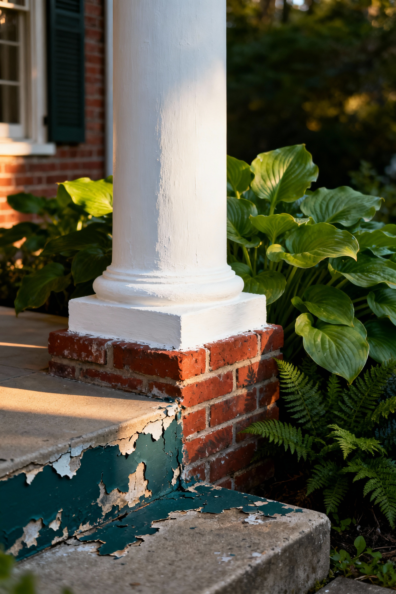
Unlike topical paints that sit on the surface, limewash chemically bonds to the porous material through calcification. Because of this reaction, you must apply the product to unpainted, absorbent masonry; previously sealed or painted surfaces will prevent the necessary adhesion. Once cured, the finish delivers a soft, chalky matte texture that evokes a classic European aesthetic. Instead of chipping away, the surface develops a natural patina over time, enhancing the character of the stone rather than degrading it.
You can easily customize this finish to match your desired level of coverage. Dilute the mixture with water for a translucent, subtle wash, or apply concentrated coats for full opacity. For a distressed, aged appearance, use a damp rag or brush to remove some of the wet product shortly after application. This technique reveals the underlying brick or stone texture, adding immediate depth and history to your outdoor room.
15. Texture vs. Sheen: Manipulating light
To create a sophisticated outdoor room, look beyond color and consider how light interacts with your surfaces. Pairing matte walls with gloss accents establishes a dynamic contrast that adds immediate depth. Apply a low-sheen or matte finish to the main body of the porch to diffuse sunlight and reduce glare. This provides a soft backdrop that allows architectural details to shine. Conversely, use a semi-gloss or high-gloss finish on trim, railings, and posts. The reflective quality defines these edges, making them stand out sharply against the muted walls.
Strategic sheen selection also solves common maintenance issues. Matte finishes absorb and scatter light, effectively camouflaging uneven patches or texture in older wood and stucco. This makes matte the ideal choice for large surface areas that may have minor imperfections. Save high-gloss paints for high-traffic zones like the front door and railings. The higher resin content in glossy paint creates a hard, durable shell that resists moisture and withstands frequent scrubbing better than flat finishes.
Finally, pay specific attention to the porch floor to ensure safety and longevity. Avoid high-gloss finishes underfoot, as high reflectivity magnifies every scuff mark and dirt particle. Instead, opt for a matte or satin porch floor paint. These finishes often include a textured or anti-skid component, providing necessary traction while effectively hiding the inevitable wear and tear of an active outdoor living space.
16. The Safety Contrast: Alternating riser and tread colors
Effective outdoor design prioritizes safety without sacrificing aesthetics. One of the most practical ways to prevent falls is by creating a sharp visual distinction between your stair parts. You must maximize luminance contrast to clearly define the edge of each step. Aim for a Light Reflectance Value (LRV) difference of at least 30 points between the tread and the riser. This high contrast ensures maximum visibility for guests in low light or those with visual impairments, guiding them safely from the garden to the deck.
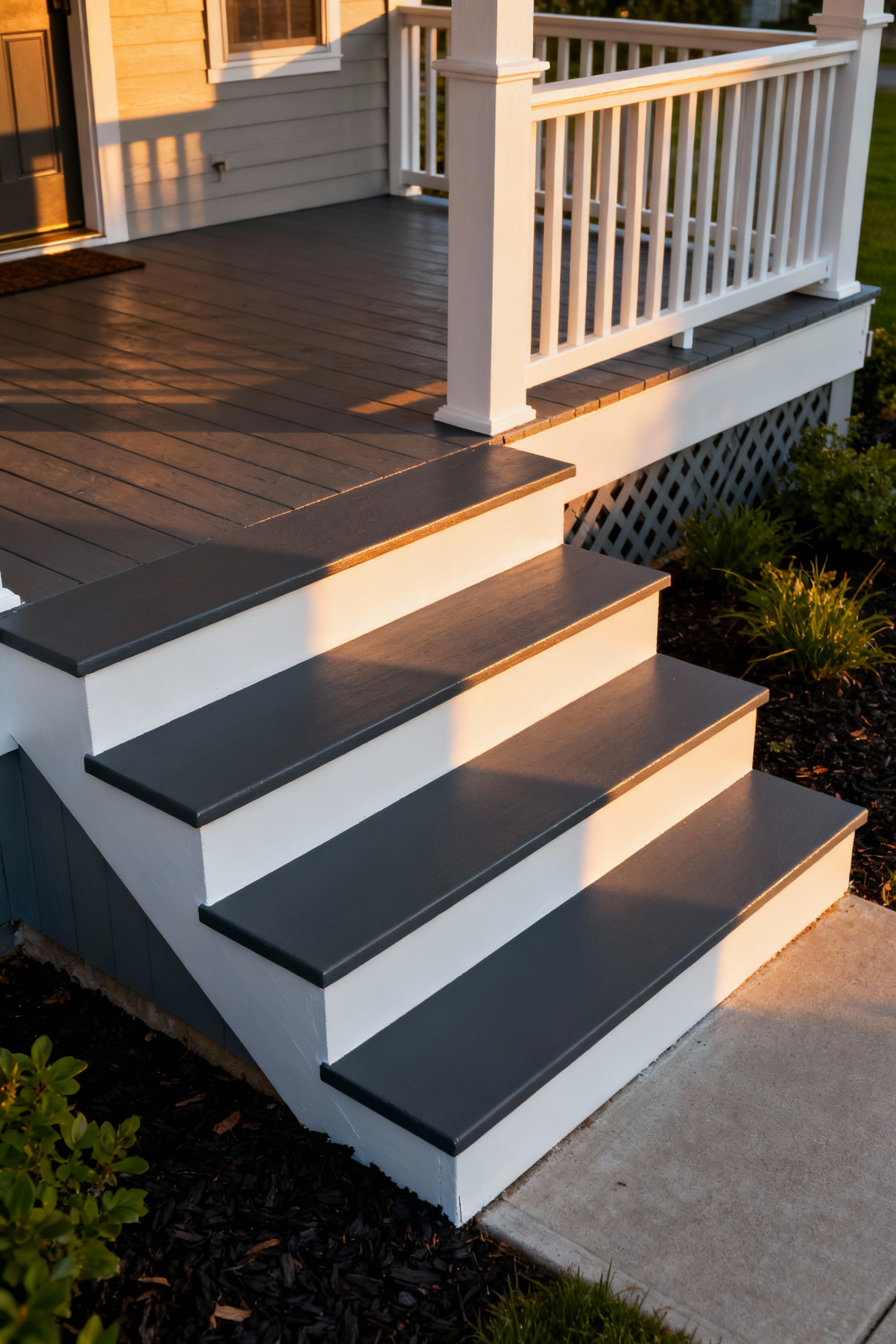
To balance durability with this safety requirement, treat the distinct parts of the stair differently. Paint your treads—the horizontal part you step on—a darker hue like charcoal, slate, or a deep stain. Darker colors effectively hide dirt and scuff marks from heavy foot traffic. Conversely, paint the vertical risers a lighter, contrasting color such as white or cream. This approach provides a clean visual break and creates a strong aesthetic pop that defines the staircase structure.
While treads require a consistent, slip-resistant finish for continuity, risers offer a prime opportunity for artistic expression. View this vertical space as a canvas for your outdoor room’s personality. You can apply nautical stripes, geometric stencils, or even a gradient fade to the risers to bridge your interior and exterior styles. These designs add unique character to the transition between spaces without compromising the critical visibility of the step edges.
Frequently Asked Questions About Porch Painting
What is the most durable type of paint for a porch floor?
The most durable paint for a high-traffic porch floor is typically an epoxy-based or 100% acrylic latex Porch & Patio Floor Paint. These formulations are designed specifically to withstand abrasion, UV damage, and temperature fluctuations, resisting the peeling and cracking that plague standard exterior wall paints. For maximum longevity, consider using a urethane-fortified acrylic with a built-in anti-slip additive.
How should I prepare my old wooden porch floor before painting?
Proper preparation is crucial for durability. You should: 1) Thoroughly clean the surface to remove dirt, mildew, and grease, using a deck cleaner if necessary. 2) Scrape and sand away all loose, bubbling, or flaking existing paint to create a smooth surface. 3) Apply an exterior wood primer to all bare wood areas, ensuring the substrate is sealed before applying the final two topcoats of the porch paint.
Why is “Haint Blue” traditionally used on porch ceilings?
The tradition of painting porch ceilings Haint Blue (a pale, airy blue-green) originated in the American South. There are two main reasons: Architecturally, the color visually mimics the sky, making the porch feel taller and more expansive. Culturally, it was historically believed to ward off “haints” (evil spirits) and, practically, the color is known to deter pests like wasps and spiders who perceive the pale blue surface as the open sky and avoid building nests there.
Can I use standard exterior house paint on my porch deck or railings?
While standard exterior house paint can be used on vertical surfaces like railings and columns, it is not recommended for horizontal surfaces like the deck floor or steps. House paint is formulated to withstand UV rays and rain, but lacks the necessary binders and resin content to resist the constant abrasion from foot traffic and furniture, leading to premature peeling and flaking. Always use a dedicated Porch & Patio Floor Paint product for the decking itself.
Conclusion: Curating a Space that Ages with the Seasons
Selecting the right porch color extends beyond simple curb appeal; it establishes a resilient stage for nature’s cycles. By grounding your outdoor room in timeless neutrals—like deep blues, silvery grays, or muted greens—you create a sophisticated foundation that outlasts fleeting trends. This approach transforms your permanent architecture into a versatile canvas, allowing the paint to remain steadfast while you introduce vibrancy through rotating textiles and seasonal botanicals. Investing in climate-appropriate finishes ensures this backdrop maintains its elegance, weathering the elements with the same grace as the landscape around it.
Ultimately, this strategy fosters a seamless connection between your interior living space and the shifting world outside. It allows your home to evolve rhythmically with the calendar without requiring constant renovation. Embrace the philosophy of longevity over temporary fashion to create an outdoor room that feels relevant year-round. Begin by auditing your property’s natural palette across all four seasons, then select a durable, high-quality paint color that anchors those fluctuating hues into a unified, enduring design. These porch paint ideas will ensure your transition zone is always welcoming and stylish.