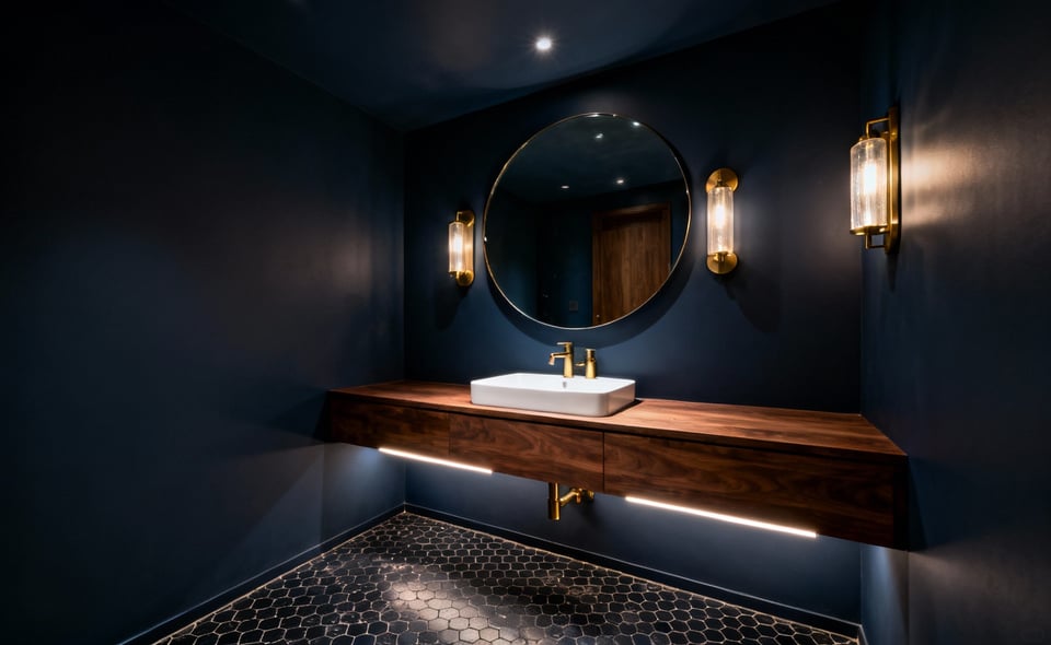
Many homeowners believe that small spaces require white surfaces. Indeed, the “White Box” strategy promises to maximize light. It ostensibly expands the room’s perceived size. However, relying solely on this neutral palette creates unintended consequences. This “safe bet” frequently results in rooms that feel flat or uninvitingly cold. This guide addresses that common error. We offer discerning homeowners advanced bathroom designs for small bathrooms that prioritize depth and texture. Instead of standard aesthetics, we focus on *architectural integrity*. Actually, limited square footage is the perfect canvas for sophisticated design.
Historically, this sanitary aesthetic comes from early 20th-century health concerns. Originally, white tiles served a utilitarian purpose. They made grime immediately visible. Yet, translating that clinical look into a modern home often feels sterile. Furthermore, pure white surfaces act as a harsh spotlight. They highlight every imperfection. Consequently, the space becomes a source of anxiety rather than relaxation. Without abundant natural light, these walls can even appear muddy.
Fortunately, preserving a home’s character while expanding visual space is possible. We will explore alternatives to the monochromatic “White Box” method. Specifically, this guide reveals how texture adds necessary depth. Instead of clinical coldness, we focus on warm neutrals. Additionally, we examine how “color drenching” shifts focus from size to impact. Ultimately, you can design a small room that feels spacious and inviting.
Debunking the myth that small bathrooms require timid design and all-white palettes
Conventional wisdom suggests painting small rooms white to increase their size. However, this reductive approach often results in a stark, clinical box. It rarely feels like a spacious retreat. Specifically, bright white reflects light. This causes walls to visually advance. It clearly defines the room’s tight boundaries. Conversely, dark, saturated hues absorb light. This absorption effectively blurs corners. It obscures ceiling lines. Therefore, the eye fails to register the room’s true dimensions. In architectural terms, this creates a “theater effect.” The darkness recedes to create an impression of boundless depth.
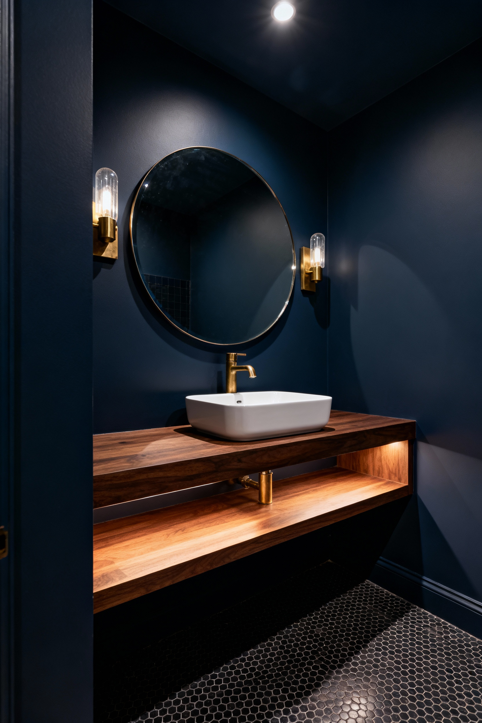
Beyond optical illusions, small bathrooms serve as ideal “confidence zones.” Because these spaces see transient usage, homeowners can experiment safely. You can add drama without overwhelming the home’s broader narrative. Consequently, designers often treat powder rooms as “jewel boxes.” Instead of playing it safe, they utilize moody palettes. They employ rich textures to create an enveloping experience. Thus, the design becomes the focal point. It effectively diverts attention away from limited square footage.
Successfully executing this bold aesthetic requires understanding scale. For instance, large-scale patterns work better than small, busy prints. Busy prints generate visual noise. Furthermore, a technique called “color drenching” creates a seamless envelope. You paint walls, trim, and ceilings the same hue. This lack of visual breaks allows the eye to sweep continuously. Finally, incorporating high-gloss finishes counters light absorption. This addition adds dynamic reflection. It prevents dark colors from feeling oppressive while maintaining a *sophisticated* atmosphere.
Establishing Authority: Lessons from 150+ historic row house renovations
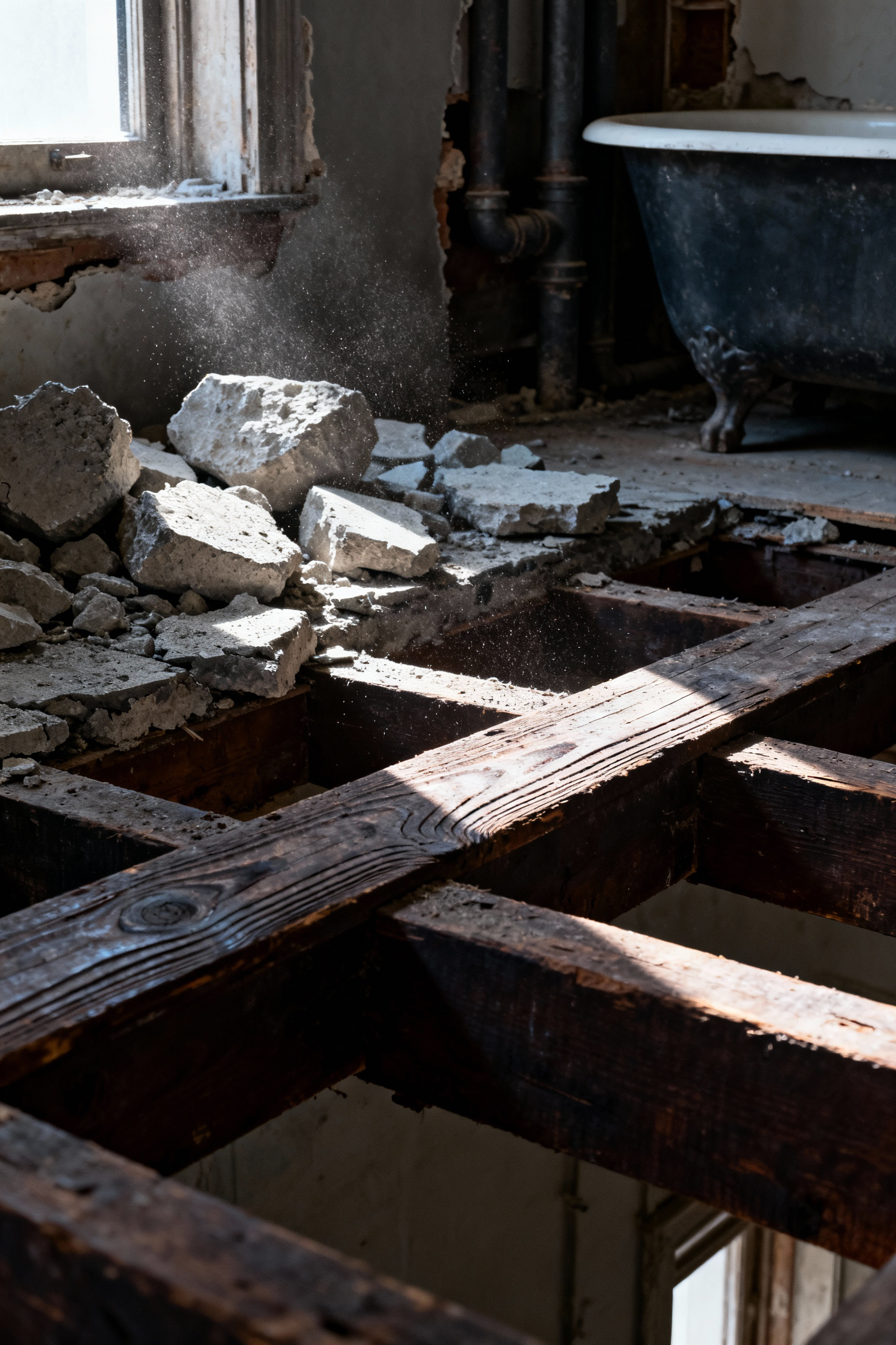
True design authority begins with understanding a home’s hidden structure. In historic row houses, the critical challenges lie beneath the surface. Specifically, many early bathrooms relied on heavy concrete slabs. These slabs supported cast iron bathtubs. Consequently, aging slabs place immense stress on wooden joists. Therefore, removing this burden allows the structure to “breathe” again. Furthermore, outdated galvanized piping often lurks behind walls. Thus, replacing these lines ensures modern water pressure.
Once the foundation is secure, focus shifts to spatial engineering. In narrow 14-foot footprints, every inch counts. For instance, swapping a generic tub for a walk-in shower reclaims square footage. Similarly, installing pocket doors eliminates dead space. Standard doors require room to swing. In fact, this simple switch recovers up to nine square feet. Additionally, shallow, wall-mounted vanities create visual space.
Finally, successful renovation requires blending eras. Historic materials like subway tiles honor the home’s past. However, pairing them with quartz countertops ensures longevity. Moreover, extending wainscoting draws the eye upward. This counteracts low ceilings common in older builds. Ultimately, these choices balance preservation with modern demands.
The Reveal: Why architectural manipulation outweighs decorative styling
In constrained spaces, cosmetic updates act as mere illusions. Specifically, decorative elements like light tiles promise depth. Yet, they often deliver only visual tricks. However, architectural manipulation offers a tangible cure. By altering the room’s volume, we reclaim actual square footage. For example, consider the pocket door system again. Suddenly, the space reserved for the door’s swing becomes functional territory.
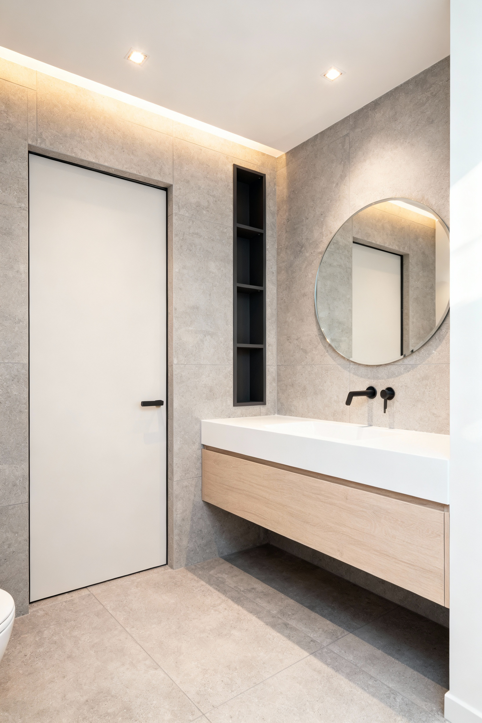
Furthermore, fixture placement is a structural decision. Consider the impact of a wall-mounted toilet. Because these elements expose the floor, light travels to the far wall. Consequently, the room feels aerated and open. More importantly, this provides critical legroom. Conversely, standard storage units protrude into circulation paths. Therefore, utilizing the wall cavity for recessed niches is essential. It turns a stud bay into a storage solution.
Ultimately, a fundamentally flawed layout creates persistent discomfort. No amount of wallpaper can resolve a toilet obstructing the entry. In fact, structural layout overrides aesthetics every time. Realigning plumbing lines is a significant undertaking. Yet, it creates a permanent foundation. Paint simply cannot achieve this. Without these structural corrections, design remains superficial.
Theme 1: Architectural Trompe-l’œil (Manipulating Visual Boundaries)
Architectural *Trompe-l’œil*, or “deceiving the eye,” creates optical illusions. It radically expands perceived space. Historically, this concept stems from Renaissance *quadratura*. Artists painted 3D structures on flat ceilings. Today, we adapt this to transform a small bathroom’s “dead” wall. Specifically, a painted mural prevents the eye from stopping abruptly. Consequently, this creates a psychological escape. It challenges the room’s physical limits.
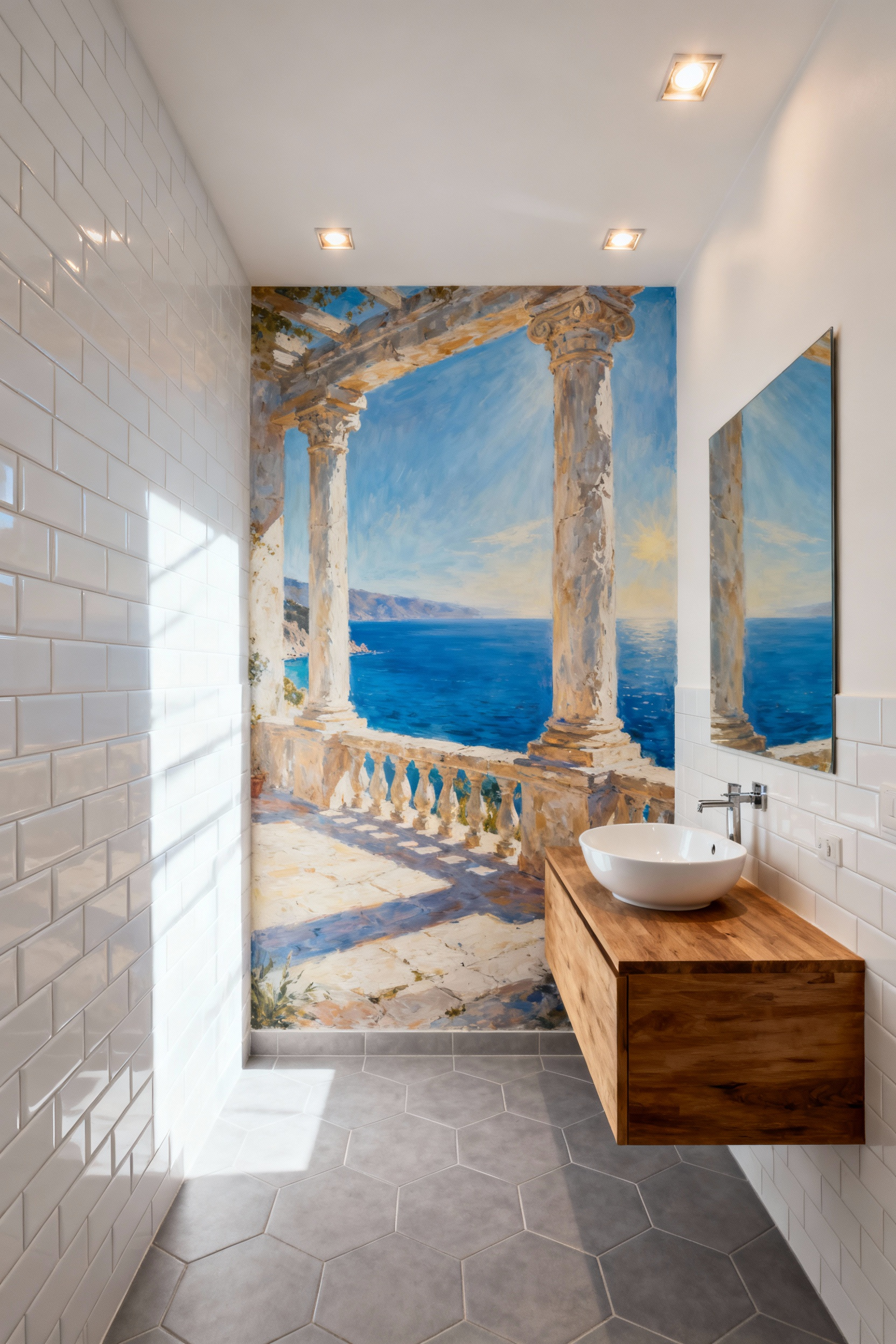
Furthermore, modern illusions extend to functional micro-architecture. For instance, faux recessed niches suggest storage depth. However, the most potent tool remains the mirror. In fact, a large mirror placed opposite a light source dissolves the wall. By reflecting the room, it effectively doubles the perceived volume. It also amplifies brightness.
Finally, you can manipulate perspective through material scale. Using large-format floor tiles minimizes grout lines. This allows the eye to sweep across the floor uninterrupted. Similarly, laying tiles diagonally forces the eye along the longest lines. Ultimately, these subtle adjustments trick the brain. A confined area registers as a spacious environment.
1. The Curbless ‘Wet Room’ Transition: Erasing the shower footprint
The zero-entry shower serves as a powerful psychological tool. By eliminating the raised threshold, you remove a physical barrier. This barrier typically compartmentalizes a small bathroom. Consequently, large-format tile runs uninterrupted from the main floor into the shower. This creates seamless continuity. The eye perceives the area as one cohesive volume. Thus, the room feels larger than its actual footage. It effectively erases the shower’s footprint. For more detailed solutions, explore advanced shower design ideas for small bathrooms.
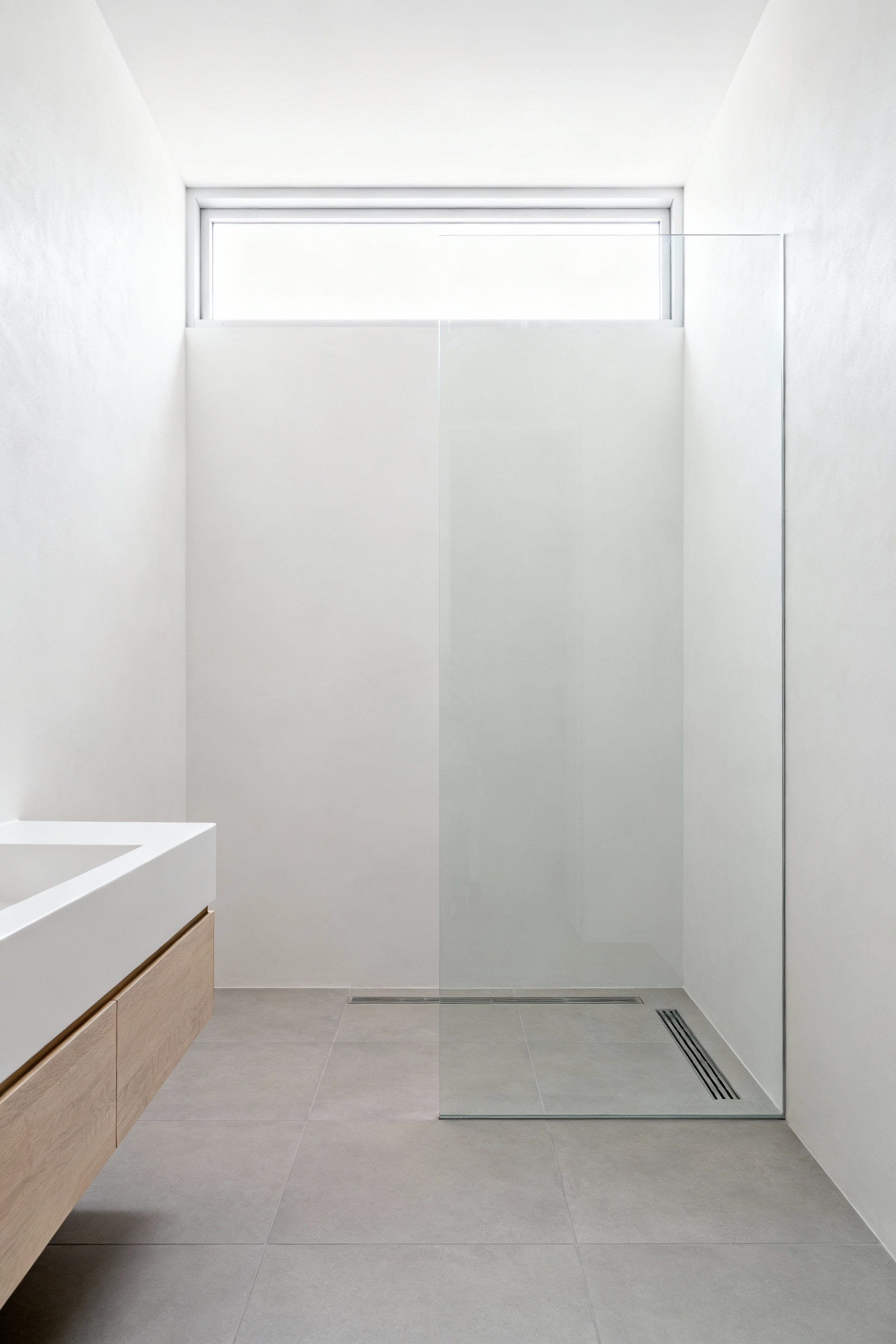
However, achieving this illusion requires engineering. Specifically, the subfloor must often be recessed. This allows for a drainage slope without a curb. It ensures water flows correctly while keeping the transition flush. Furthermore, incorporating linear drains simplifies the floor pitch. This avoids complex tile cuts. It maintains a clean aesthetic. Crucially, a robust waterproofing system must extend beyond the shower.
Historically, this efficient concept has global roots. For instance, Japanese “unit baths” utilize curbless designs. They maximize utility in dense housing. Today, we adapt this necessity into a feature of Universal Design. The seamless floor eliminates trip hazards. Therefore, the space is inherently safer for aging in place. This technique offers a blend of history and modern safety.
2. Floor-to-Ceiling Tile Continuity: Eliminating visual breaks
In small bathrooms, distinct visual boundaries confine the space. Consequently, extending tile from the floor to the ceiling acts as a design strategy. This approach eliminates the jarring transition between wall and paint. It creates a “*monolithic* wrapper.” As a result, the eye travels uninterrupted. This tricks the brain into perceiving a larger volume.
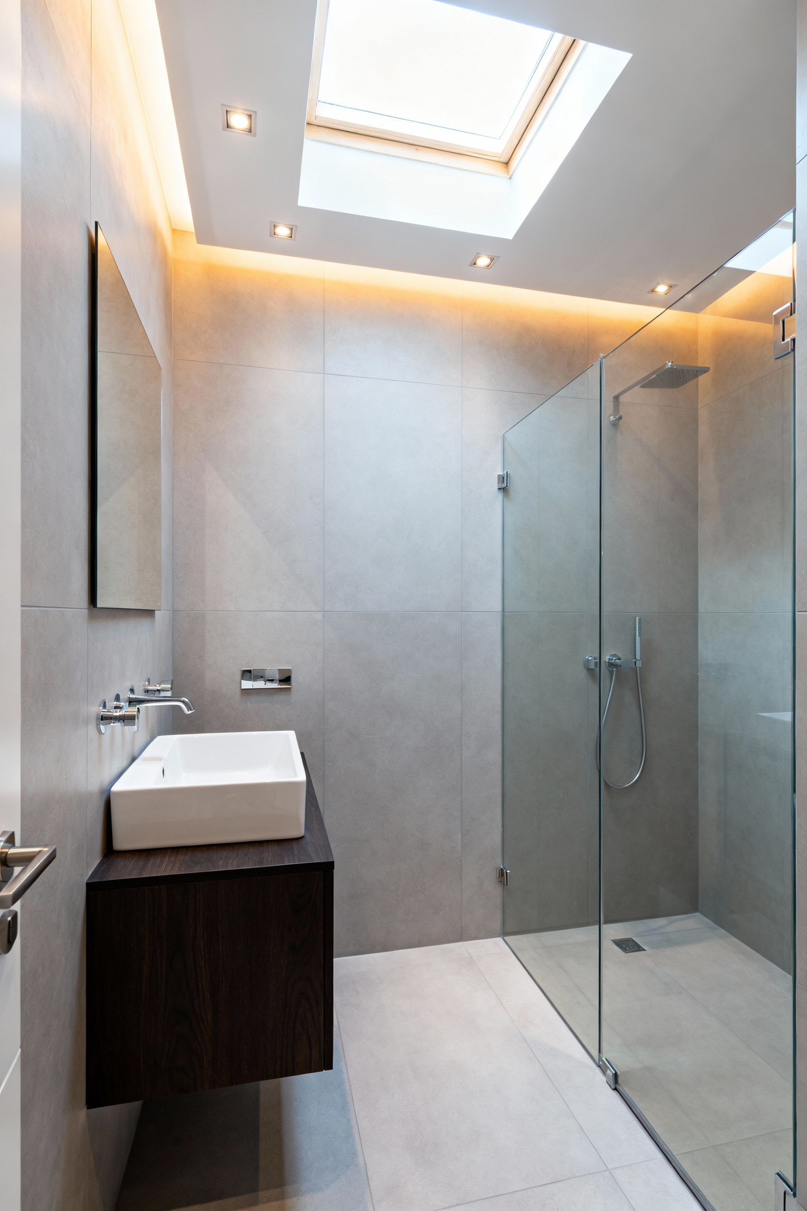
However, achieving this illusion requires minimizing the visual grid. Specifically, large-format tiles are essential. They drastically reduce the number of grout lines. Furthermore, utilizing tiles with rectified edges allows for tighter joints. Similarly, selecting a grout color that matches the tile is critical. In fact, this dissolves the grid. The surface reads as a singular material.
Beyond selection, installation orientation significantly impacts dimensionality. For example, installing tiles vertically forces the eye upward. Therefore, standard ceilings feel significantly loftier. Ultimately, this continuity creates a high-end aesthetic. By reducing visual “noise,” you foster a tranquil environment. It feels intentionally curated and surprisingly spacious.
3. Scale Disruption: Why oversized slabs work better than mosaic in micro-spaces
Scale Disruption creates a powerful optical illusion. Historically, homeowners assumed small rooms required small tiles. However, this approach shrinks the perceived space. Specifically, mosaics create a dense visual grid. Thousands of grout lines force the eye to register every individual unit. This repetition makes a confined area feel cluttered. Alternatively, oversized slabs offer a “monolithic” aesthetic. By minimizing seams, these large elements allow the eye to glide. Thus, boundaries seem to dissolve.
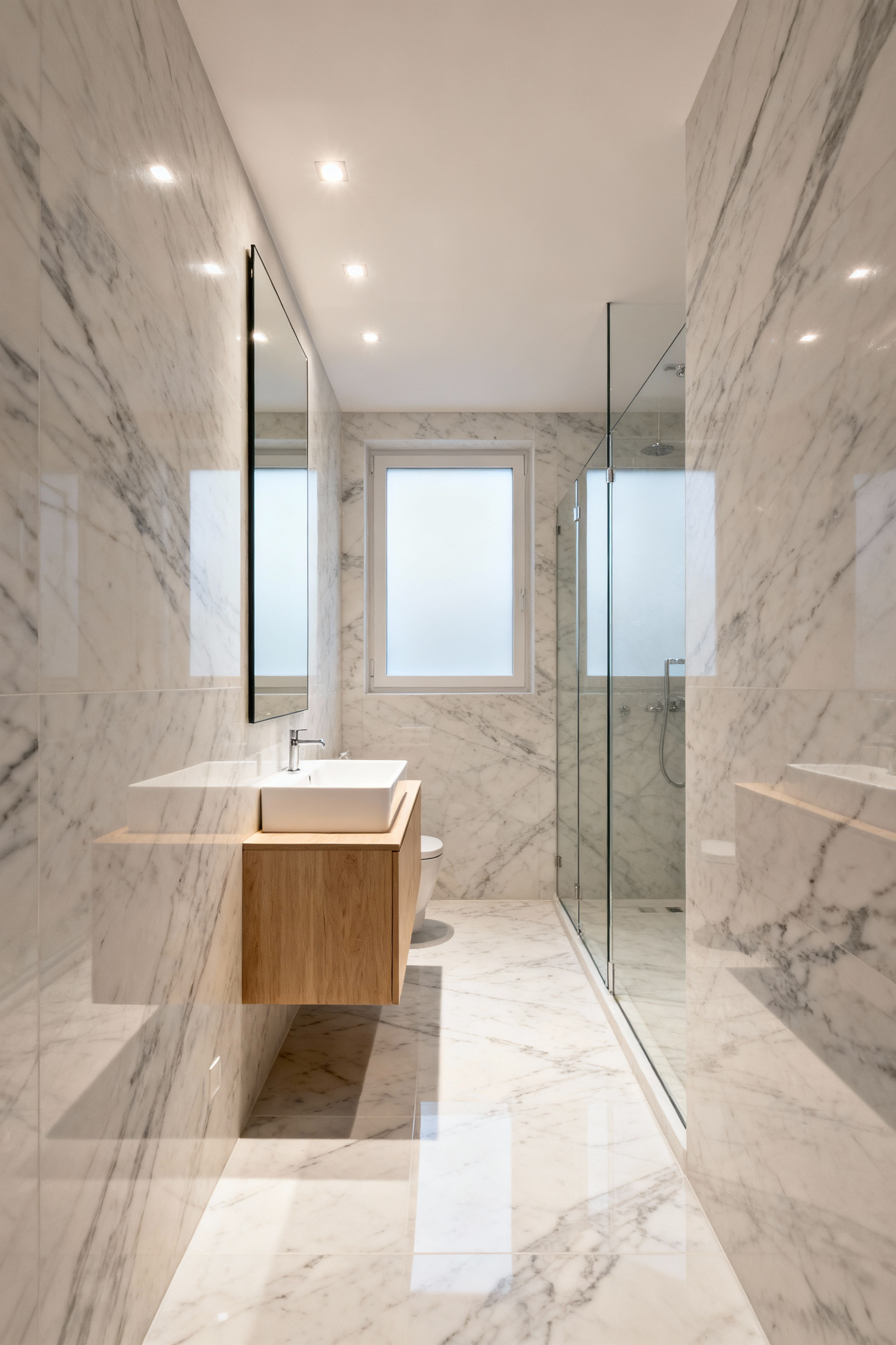
Furthermore, this technique elevates the material itself. For instance, marble-look porcelain relies on long veins for impact. Mosaics inevitably fragment these patterns. In contrast, a large slab captures the organic drift of the design. Therefore, the space feels like a cohesive work of art.
Finally, simplicity creates calm. In a small bathroom, you view surfaces up close. Consequently, reducing visual noise prevents the room from feeling overwhelming. Moreover, fewer grout joints mean fewer places for grime. Ultimately, this ensures the room remains pristine. It enhances the feeling of *luxury* over time.
4. Structural Recesses: Framing storage between studs rather than protruding out
In small bathroom renovations, maximizing square footage is paramount. Therefore, structural recesses offer a brilliant solution. This technique reclaims “negative space” inside your walls. Standard framing provides about four inches of internal depth. Consequently, this is ideal for storing toiletries or rolled towels. By burying these items, you eliminate protruding shelves. Thus, the room maintains an unbroken sightline.
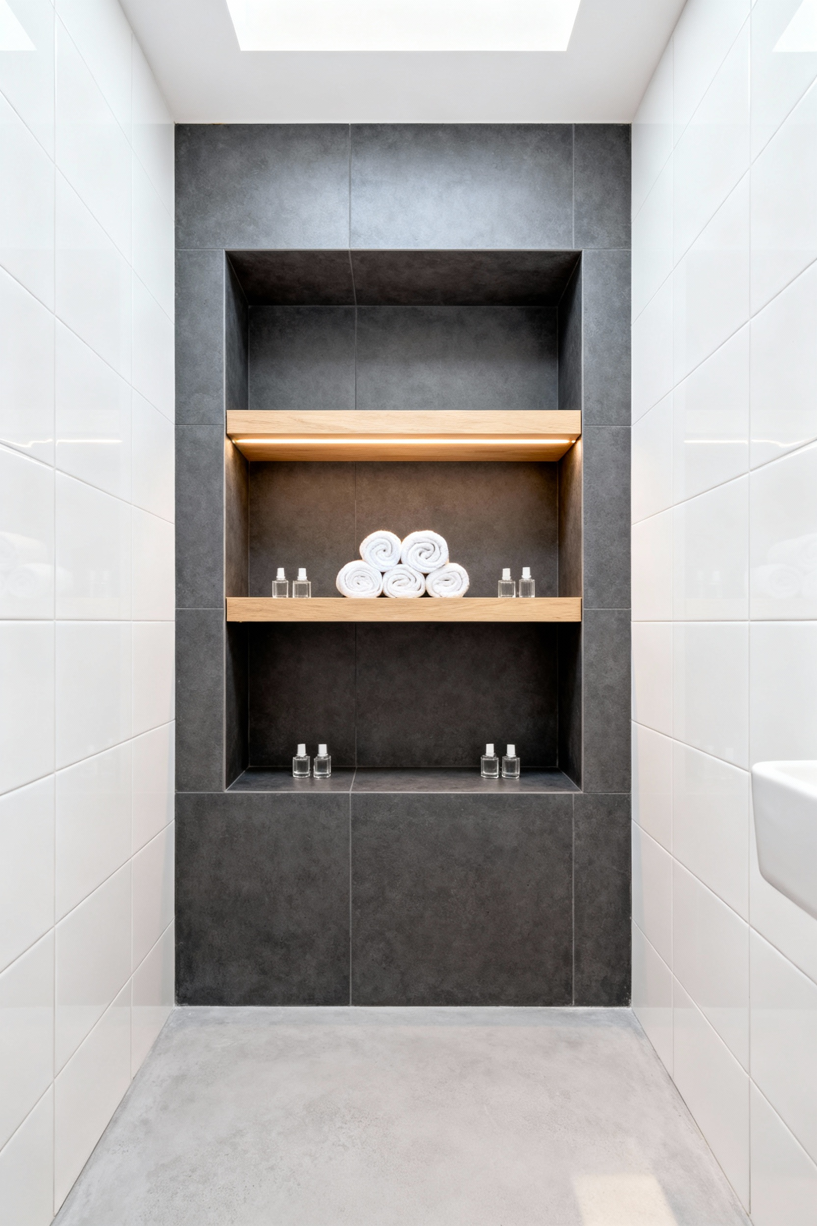
However, creating these niches requires precision. It is not simply cutting a hole in the drywall. Openings wider than fourteen inches demand headers. Furthermore, you must locate hidden electrical lines. In wet areas, waterproofing is critical. Specifically, a sealed membrane is mandatory. Additionally, a slight downward pitch ensures water drains properly.
Design-wise, the visual impact depends on planning. Ideally, adopt a “tile-first” strategy. This ensures the niche edges align with your grout lines. As a result, you avoid awkward tile cuts. Moreover, consider ergonomics. For instance, install shower niches at chest level. Ultimately, this approach merges structural integrity with elegance.
5. The High-Gloss Ceiling: Using reflection to artificially extend verticality
A high-gloss ceiling operates as a subtle secondary mirror. By reflecting the walls upward, the mind perceives a continuation of space. Consequently, this trick “dissolves” the actual ceiling surface. The result is an illusion of endless height. Furthermore, the reflective finish magnifies light. It bounces light deep into corners. Thus, the room feels significantly airier.
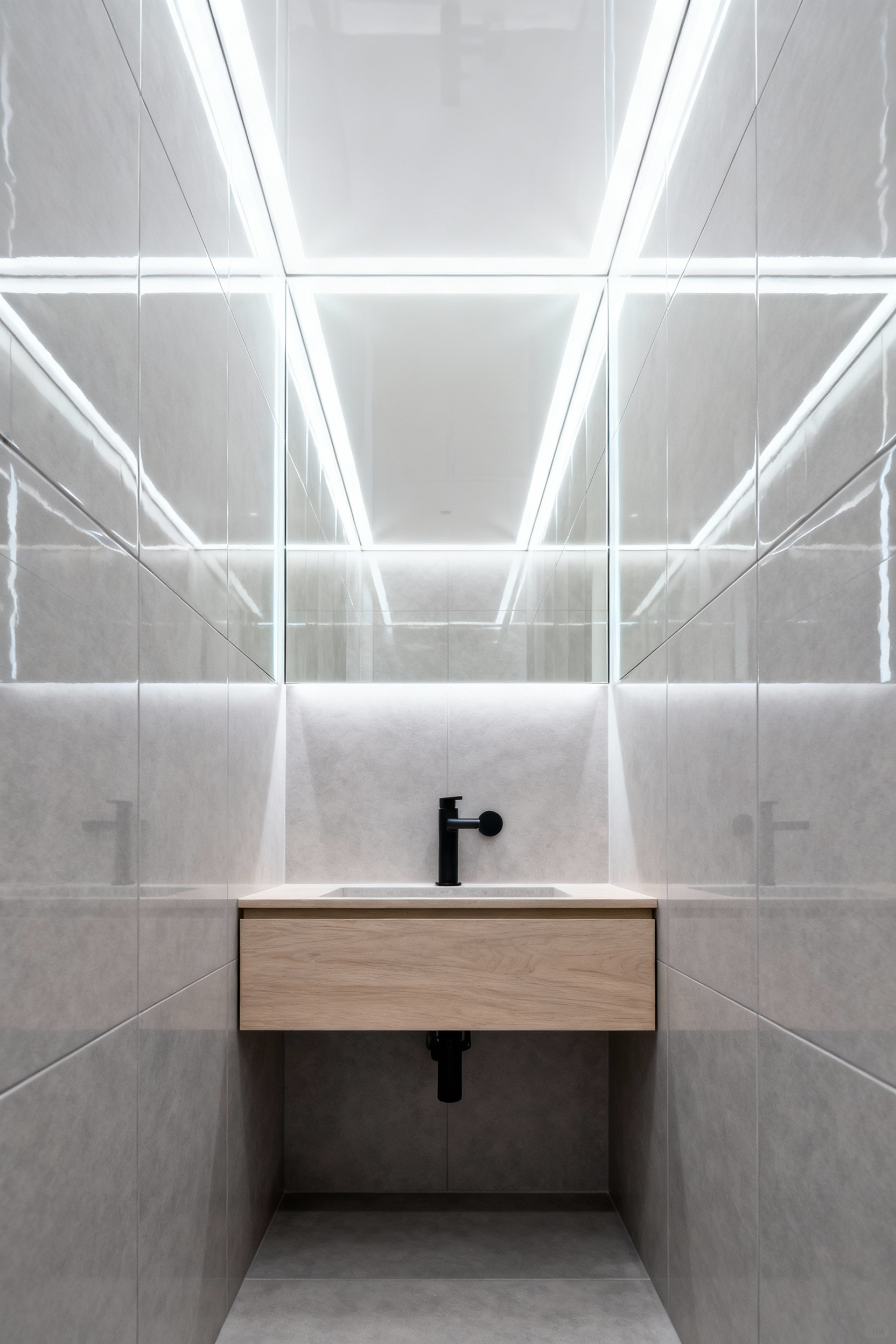
Traditionally, homeowners achieved this look using lacquer paint. However, this method highlights minor imperfections. Therefore, a modern “stretch ceiling” offers a superior solution. This moisture-resistant membrane ensures a flawless finish. Moreover, it withstands humidity better than drywall.
Regarding color, choices dictate atmosphere. For instance, pale tones maximize reflection. Conversely, dark tones create cinematic depth. While bold, a dark mirror effect can “erase” the ceiling boundary. Ultimately, this technique transforms a utility space into a *luxurious* retreat.
Theme 2: The Floating Plane (Maximizing Floor Real Estate)
The “Floating Plane” strategy fundamentally alters spatial perception. Specifically, this approach eliminates floor-mounted obstacles. Consequently, the eye travels uninterrupted from one wall to the next. This continuity tricks the brain into perceiving the room as larger. Furthermore, utilizing large-format tiles minimizes visual clutter.
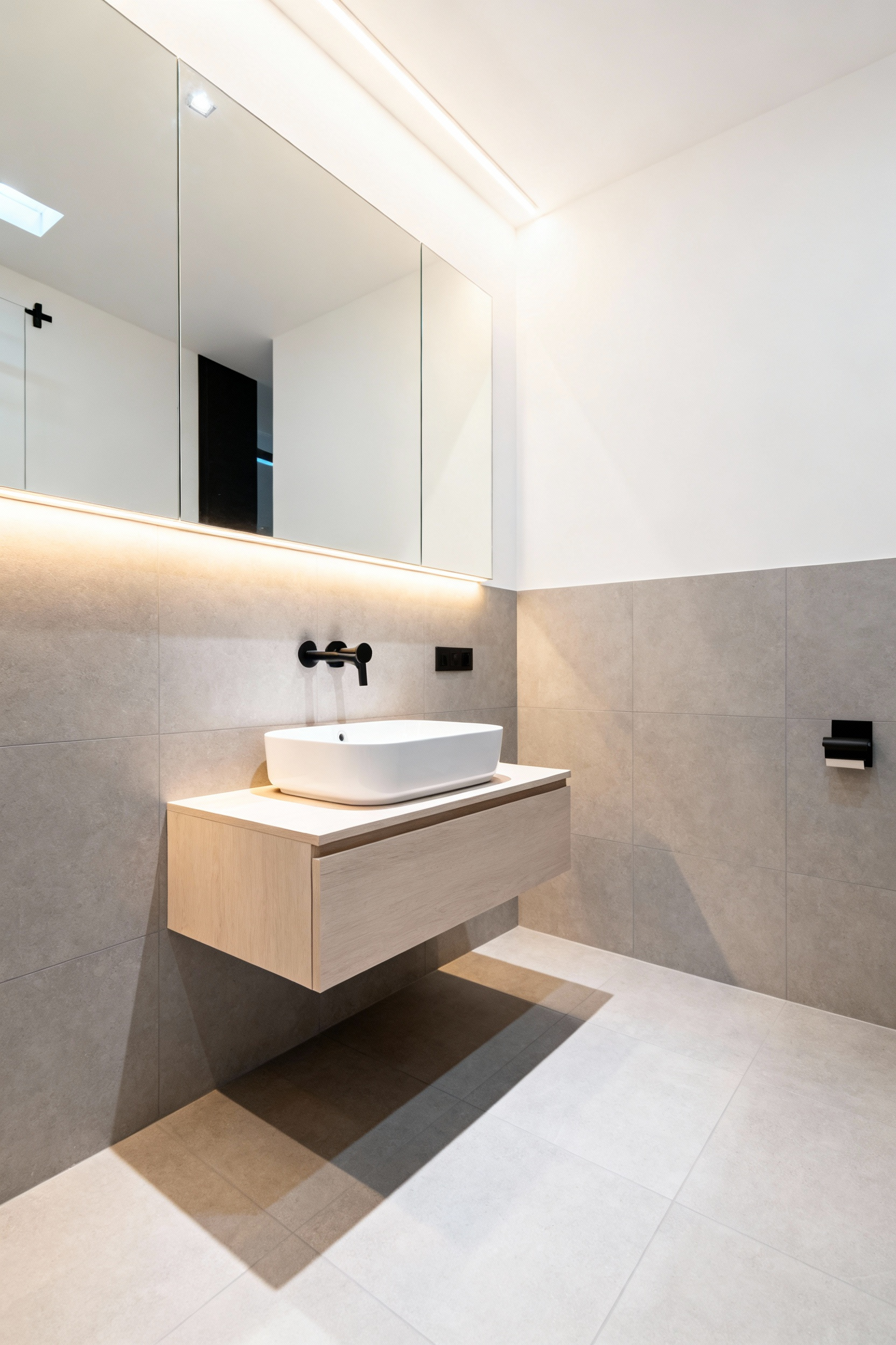
To enhance this effect, designers incorporate under-vanity LED lighting. As a result, a soft glow emphasizes the fixture’s levitation. This transforms a utilitarian space into a spa-like retreat.
Historically, exposed plumbing was a functional necessity. However, modern renovations prioritize a cleaner aesthetic. Today, steel carrier frames support wall-mounted toilets. Therefore, the focus shifts to architectural minimalism.
Nevertheless, this look requires structural commitment. In fact, walls often need reinforcement. Additionally, homeowners must consider maintenance. Access to internal mechanisms is limited. Thus, repairs could require opening the wall. Ultimately, balance visual space against practical access needs.
6. The Cantilevered Vanity: Exposing floor area to trick the eye
The *cantilevered* vanity serves as a sophisticated solution. Fundamentally, this design utilizes a visual trick. Traditional cabinetry creates a heavy visual stop. In contrast, a floating vanity removes this barrier. Consequently, the eye registers the flooring extending to the rear wall. This continuous plane tricks the brain. Therefore, even tight quarters feel airier. If you are seeking more inspiration, read our guide on vanity ideas for tiny bathrooms.
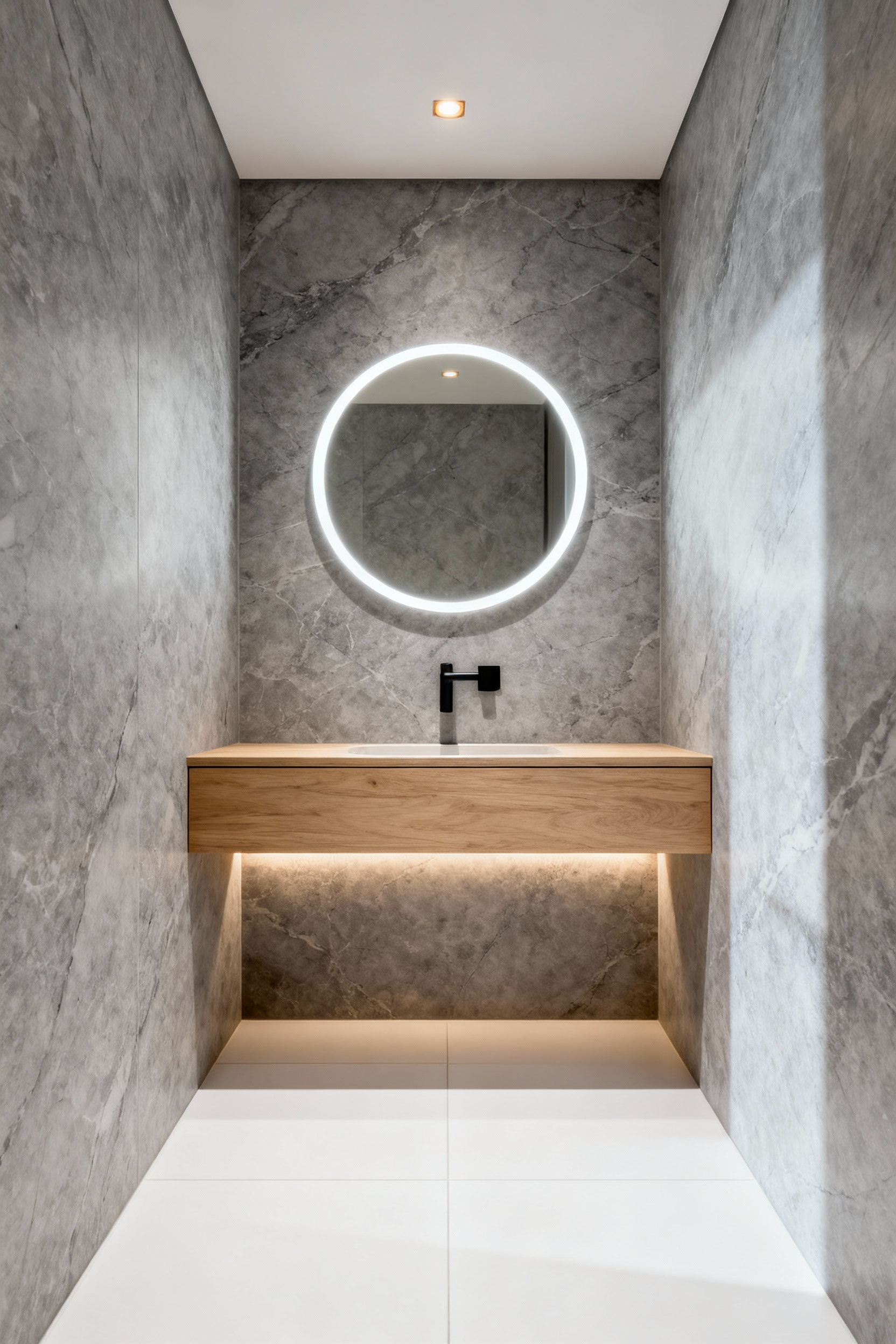
However, achieving this weightless aesthetic requires structural foresight. Specifically, the unit relies on wall anchors. Thus, renovation necessitates installing wood blocking between studs. Furthermore, plumbing lines must be concealed. This ensures the exposed area remains sleek.
Additionally, the open space invites enhancements. For instance, adding LED tape lighting creates a soft glow. This pushes the visual boundary further back. Moreover, the design offers a lifestyle advantage. Without legs, cleaning becomes effortless. Ultimately, this preserves a hygienic atmosphere.
7. Wall-Mounted Plumbing Architecture: Reclaiming vanity depth
Transitioning to recessed wall-mounted systems offers a distinct advantage. Specifically, this shift reclaims space in two directions: exterior depth and interior volume.
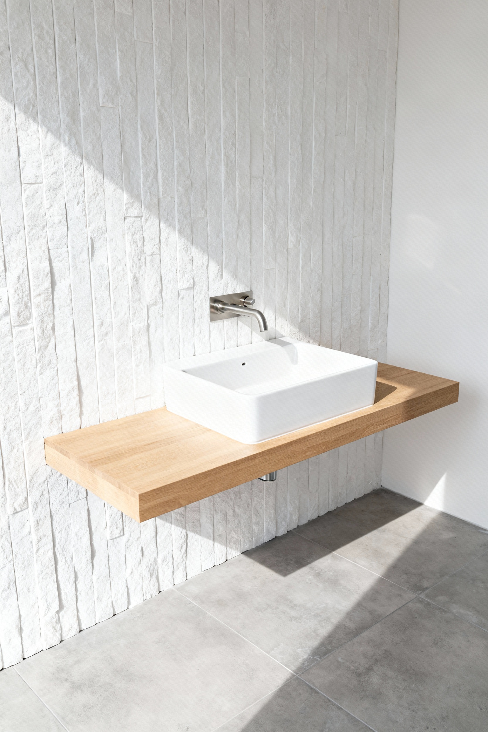
First, eliminating the faucet base saves inches of counter depth. Consequently, designers can utilize “slimline” vanities. This reduction immediately increases the room’s walkable area. Internally, the benefits are equally significant. By recessing lines into the wall, the cabinet volume is liberated. Therefore, full-depth drawers can replace inefficient open cabinets.
However, this commitment requires planning. To support these fixtures, plumbers anchor heavy-duty carrier systems. Furthermore, rough-in alignment must be precise. Post-installation adjustments are difficult.
Despite demands, the payoff is powerful. Visually, lifting the hardware creates a streamlined effect. Moreover, this setup simplifies maintenance. Counters remain free of water-collecting bases. Ultimately, this approach pushes the walls away.
8. Tankless and Wall-Hung Toilets: Modernizing the footprint
Modernizing a compact bathroom requires reclaiming every inch. Wall-hung toilets offer a brilliant solution. They conceal the bulky cistern within the wall. Consequently, this reduces the fixture’s projection by up to 12 inches. Beyond physical metrics, the “floating” bowl creates an optical illusion. In fact, seeing the floor makes the room feel larger.
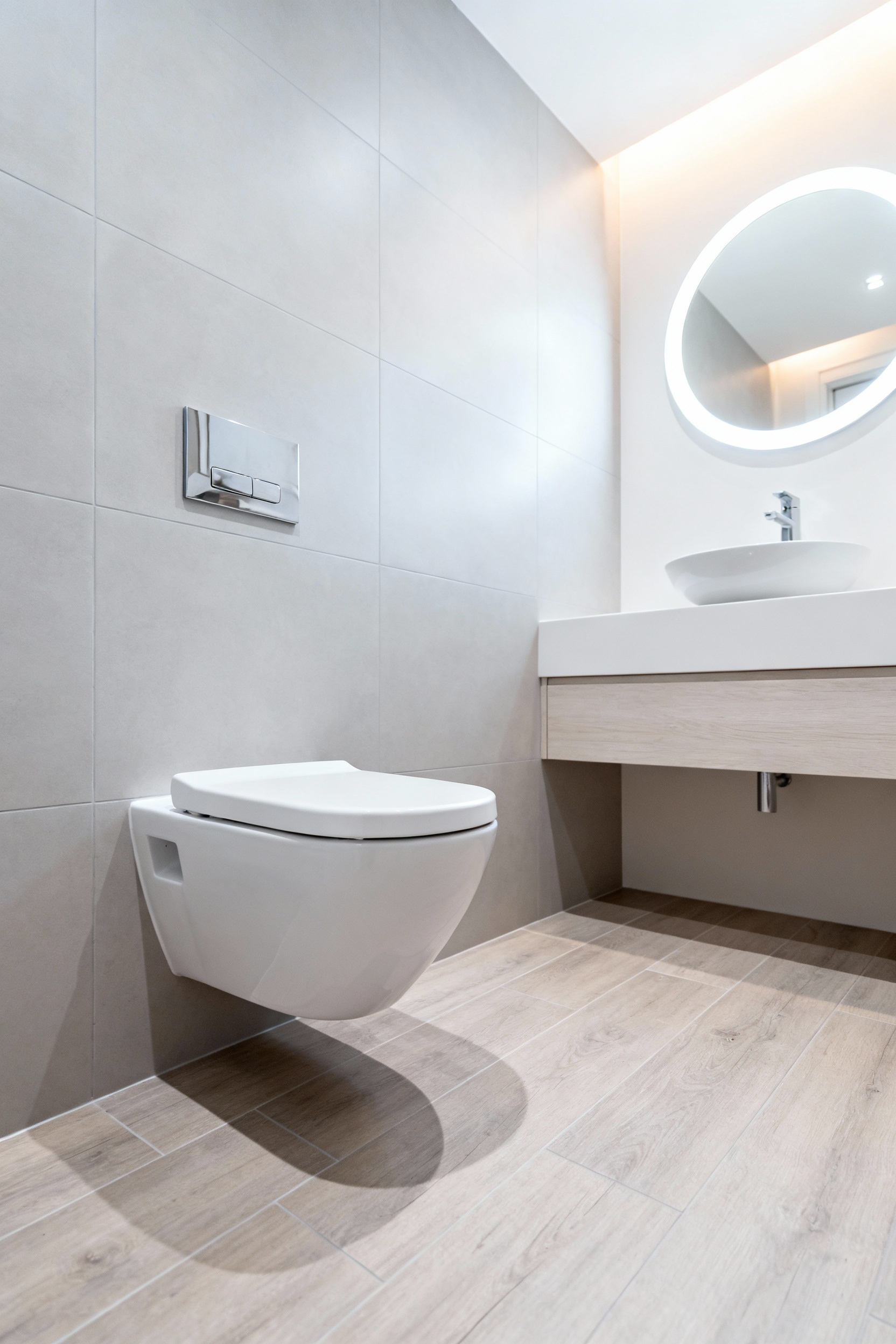
Interestingly, this efficiency has roots in the past. Tankless systems were essential in early NYC apartments. However, residential plumbing often lacks high pressure. Modern systems overcome this with pumps. Thus, you achieve commercial power with elegant styling.
Functionality extends to maintenance. Notably, eliminating the pedestal revolutionizes cleaning. A mop can pass underneath the bowl. Furthermore, many homeowners worry about access. On the contrary, the actuator plate acts as a service hatch. Ultimately, these fixtures preserve character while adapting for modern living.
9. Spatial Reclamation: The non-negotiable necessity of pocket doors
Pocket doors represent critical spatial reclamation. Specifically, a standard door consumes up to 18 square feet of clearance. This “swing arc” dictates where fixtures can go. By eliminating this barrier, you reclaim usable square footage. Therefore, this choice determines if a room can accommodate a full vanity.
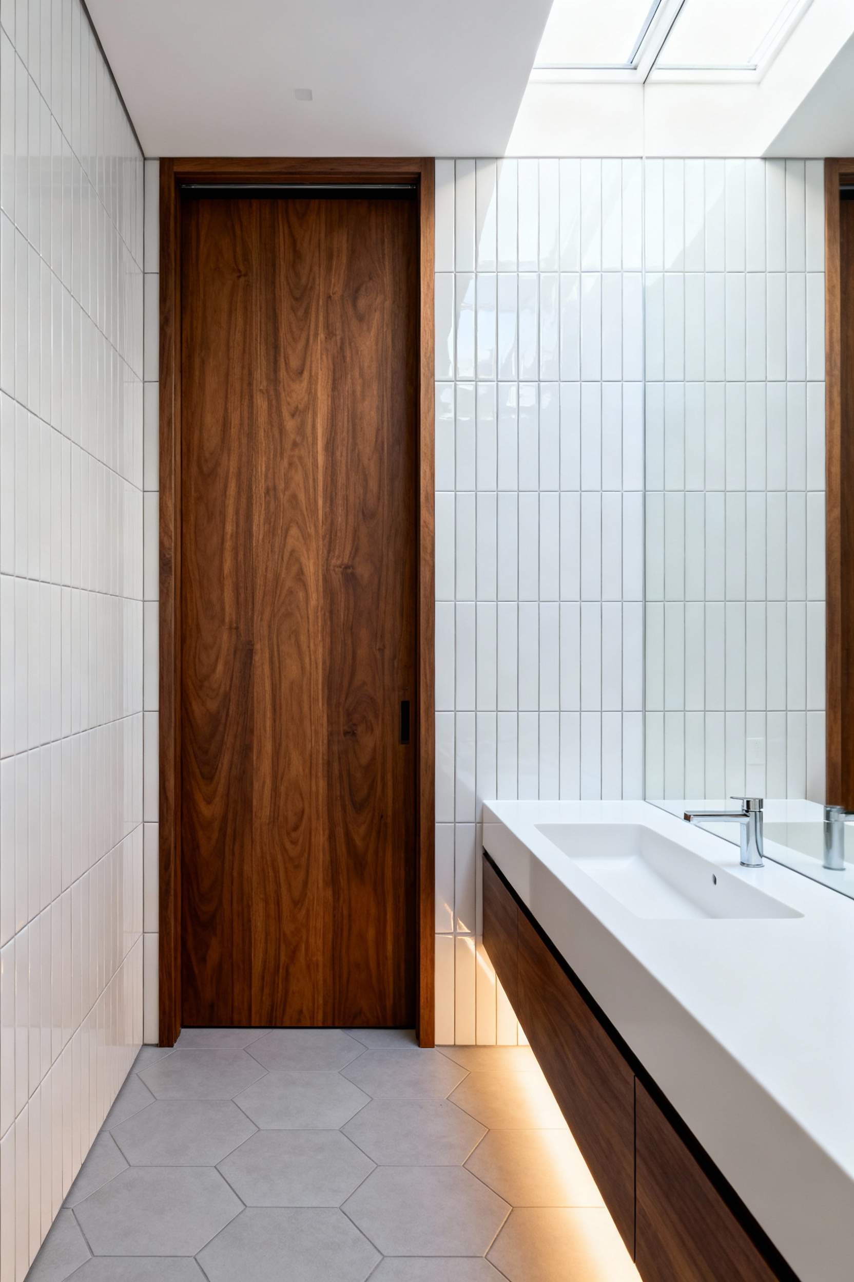
Historically, this element shifted from luxury to utility. Victorian parlors used them for flow. Post-war designs used them for efficiency. Today, updated hardware ensures smooth operation.
Furthermore, the sensory impact is undeniable. When open, the panel disappears. This removes visual clutter. Thus, the bathroom feels significantly larger. Additionally, using frosted glass allows borrowed light to permeate. Ultimately, this structural adjustment unlocks the home’s potential.
Theme 3: The ‘Jewel Box’ Philosophy (Materiality & Depth)
The “Jewel Box” philosophy reimagines the small bathroom as a vessel of *luxury*. Historically, jewelry caskets protected precious contents. Similarly, this strategy treats square footage as a catalyst. Instead of expanding physically, you deepen the experience emotionally.
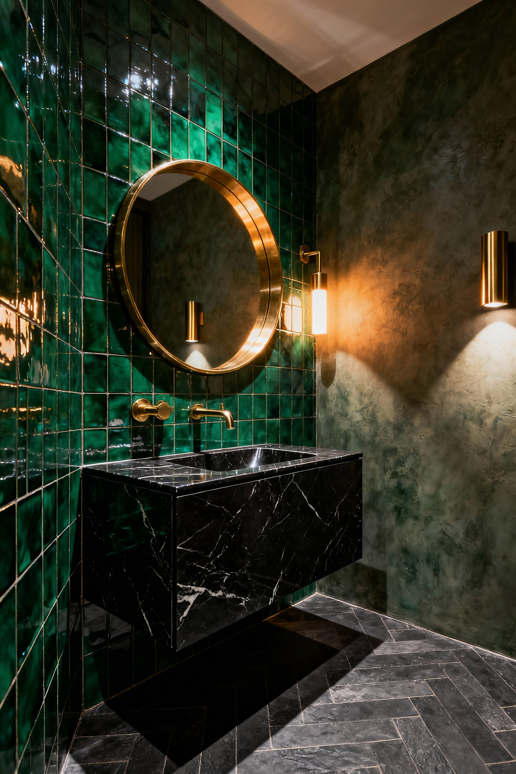
Consequently, designers often reject all-white palettes. In fact, dark colors can create infinite depth. This technique is effective in windowless rooms. It turns constraints into choices. To prevent oppression, reflective stones effectively bounce light.
Furthermore, this approach demands hyper-focused detailing. Every fixture functions like a gemstone setting. Specifically, tactile fittings in gold or chrome serve as focal points. Additionally, running tiles from floor to ceiling creates a seamless wrap. This blurs boundaries.
Finally, reflection amplifies materials. For example, wall-to-wall mirrors double the volume. Ultimately, the goal is atmosphere rather than size.
10. Embracing Saturation: How dark colors blur corners and expand perception
It is a misconception that white paint is the only way to expand space. In reality, deep saturation offers a sophisticated illusion. Specifically, dark shades absorb light. Consequently, distinct lines of corners are obscured. Shadows blend into the walls.
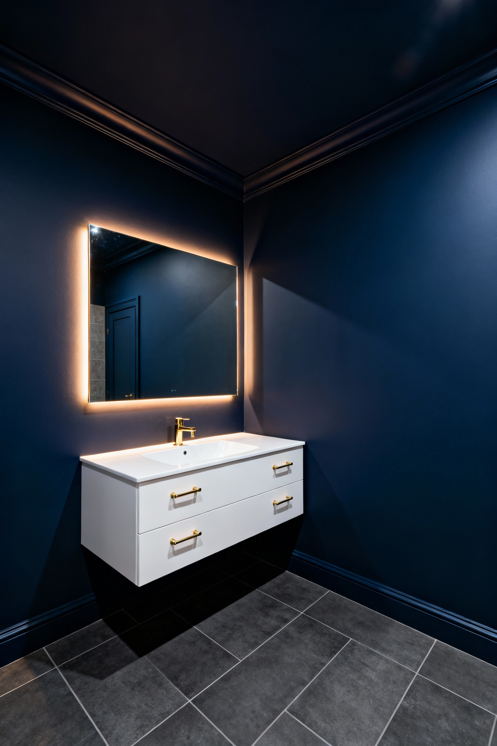
Architects call this the “theater trick.” By painting everything one hue, physical boundaries dissolve. As a result, walls appear to recede. Therefore, the space feels larger because boundaries are undefined.
Beyond dimensions, this shifts the atmosphere. A utilitarian room becomes a sanctuary. However, execution is critical. A matte finish is essential. Glossy paints reflect light, creating hard lines.
Furthermore, contrast prevents heaviness. A crisp white sink will pop against the dark backdrop. Additionally, large mirrors amplify light. Ultimately, embracing darkness creates a sense of luxury.
11. Integrated Lighting: Backlit mirrors and toe-kick lighting to create depth
In small bathrooms, lighting defines boundaries. Unfortunately, single overhead fixtures highlight limits. Therefore, successful design employs layering to create depth.
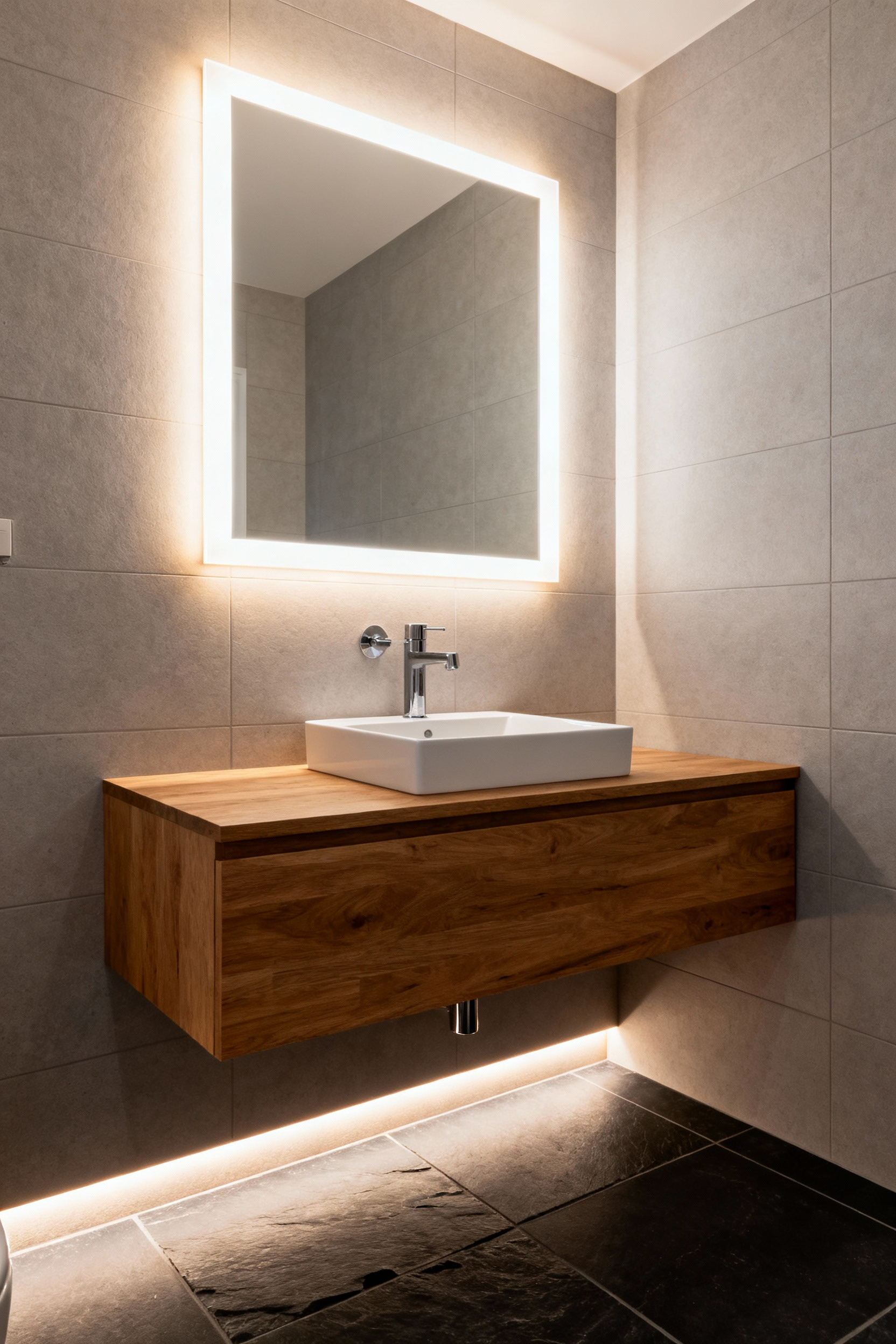
Specifically, backlit mirrors expand space at eye level. By casting a “halo,” the fixture separates from the wall. Consequently, the wall appears to recede. This adds a psychological layer of depth.
Simultaneously, we address the floor. Toe-kick lighting illuminates the flooring underneath. Ideally, this pairs with a floating vanity. Thus, the brain perceives the flooring as continuous. It effectively maximizes the room’s apparent footage.
Furthermore, these planes work together. The high light lifts the gaze. The low light pushes the perimeter outward. Technically, enhance this with color temperature. Use neutral light for the mirror. Use warmer light for the toe-kick. Ultimately, this transforms a tight box into a retreat.
12. The Seamless Glass Partition: Removing visual stops entirely
The seamless glass partition is a potent tool. Fundamentally, it preserves the critical sightline. Traditional curtains create “hard visual stops.” Consequently, these barriers slice the room into segments. By removing them, the eye travels uninterrupted. Thus, the brain perceives a continuous expanse.
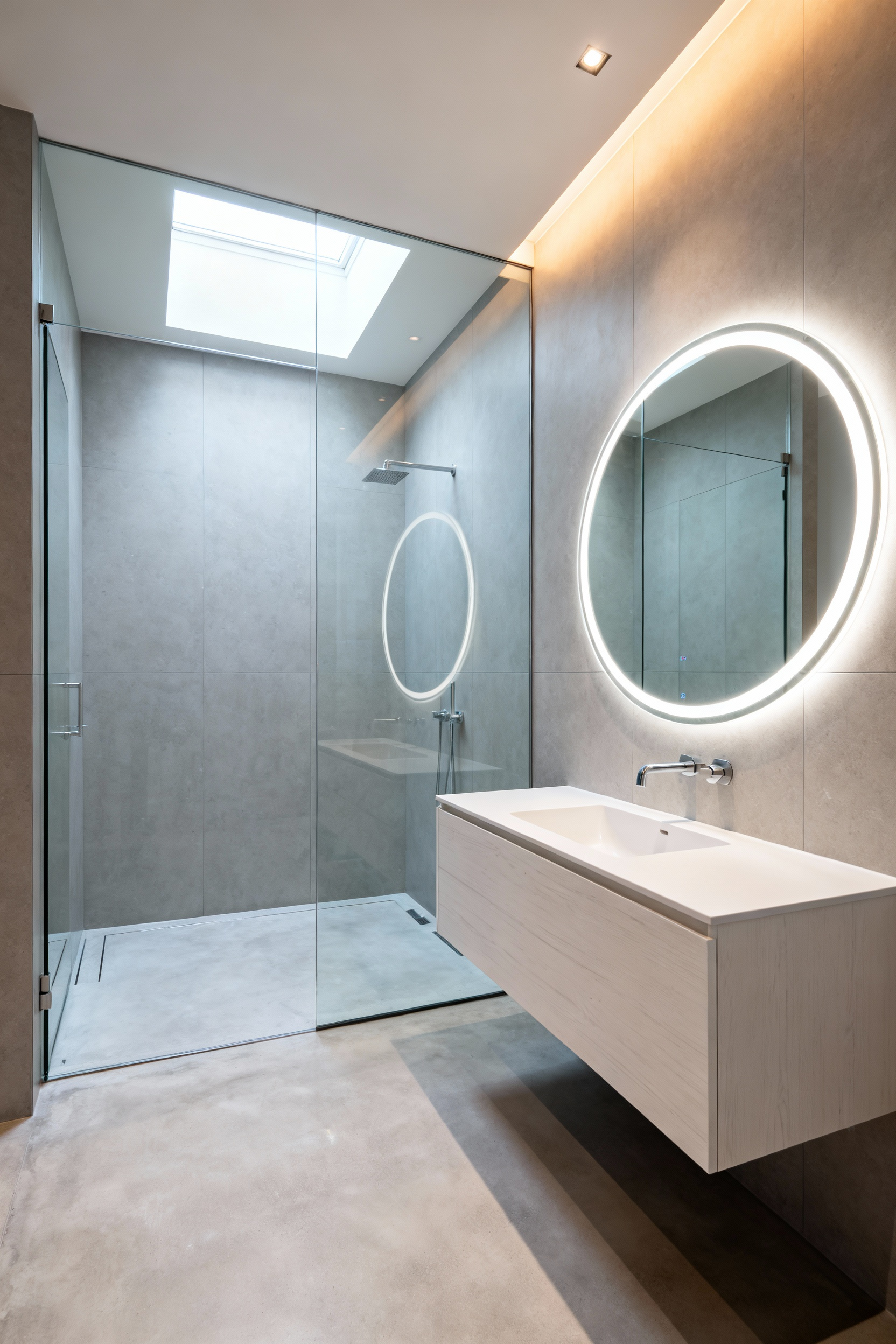
Beyond illusion, transparency eliminates dark corners. Frameless glass allows light to flood the footprint. To achieve an invisible effect, select low-iron glass. This reduces the standard green tint. Furthermore, sufficient thickness provides stability without hardware.
This approach integrates with curbless designs. Additionally, the absence of tracks improves hygiene. Without frames to trap grime, the environment remains cleaner. Ultimately, this creates a sleek aesthetic.
13. Mixed Metals and Texture: Creating distraction through complexity
Mixing metals creates a “jewel box” effect. This distracts the eye from a small footprint. Specifically, it offers multiple focal points. While monochromatic spaces can feel sterile, complexity mimics nature. Therefore, the brain processes these details easily. Instead of seeing a small box, the viewer perceives a *curated* collection.
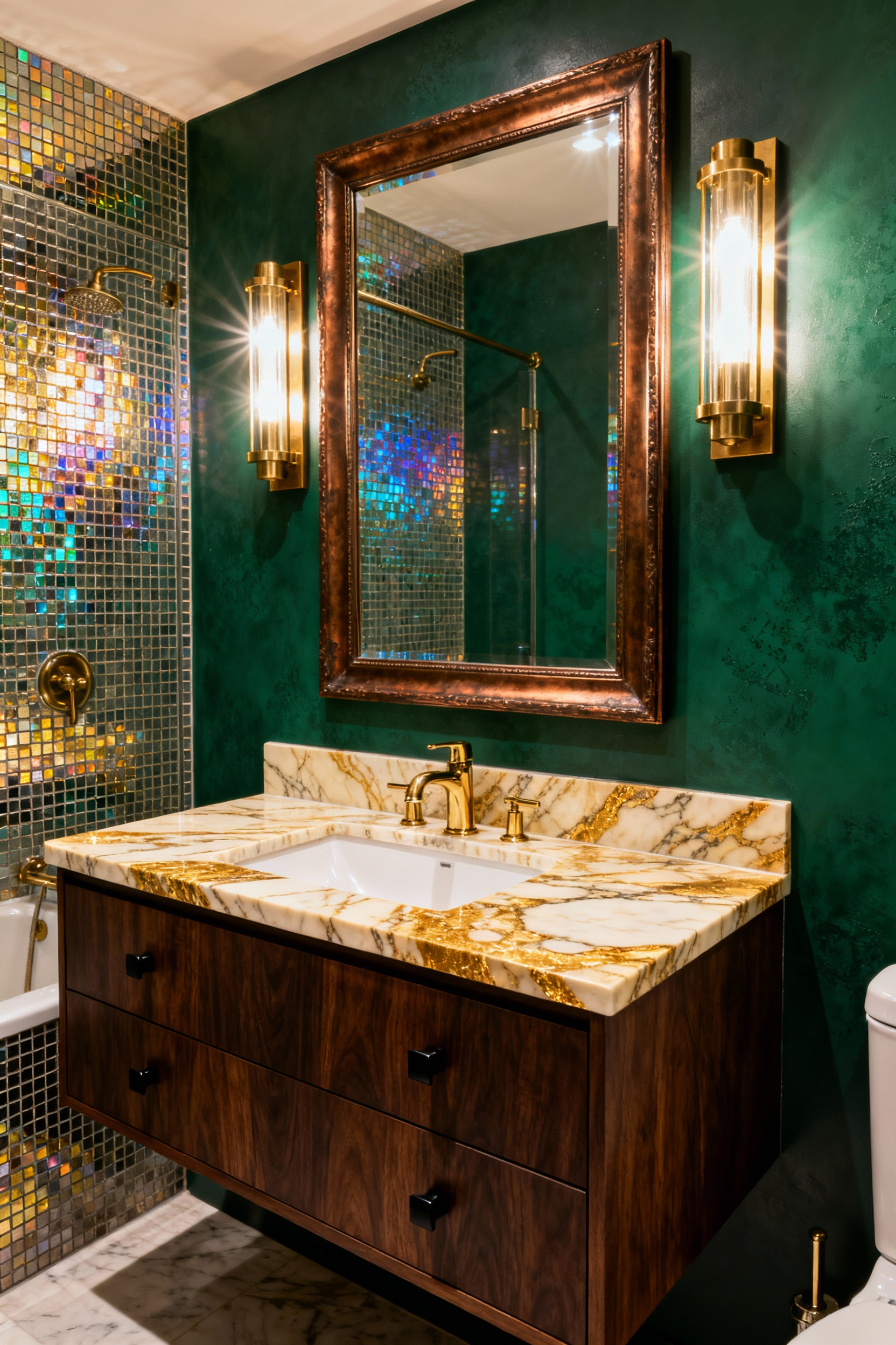
To achieve depth, combine cool tones with warm accents. Consequently, cool metals visually recede. Warm finishes feel closer. This illusion creates dimensional layering. Furthermore, polished surfaces reflect light. Conversely, matte finishes provide necessary anchors.
Beyond color, incorporate “living finishes” like unlacquered brass. These materials develop a patina. This suggests the home has a history. However, restraint is crucial. Ideally, maintain balance using a strict rule. Assign a dominant metal to 60% of fixtures. Use an accent metal for the remaining 30%. Ultimately, this repetition unifies the complexity.
Theme 4: Modern Integration in Historic Footprints
Preserving a small historic bathroom requires “invisible functionality.” Specifically, the goal is natural evolution, not a museum. Consequently, modern fixtures should maintain period designs. For instance, a faucet might feature 1920s styling but house efficient valves. Thus, the experience focuses on heritage materials.
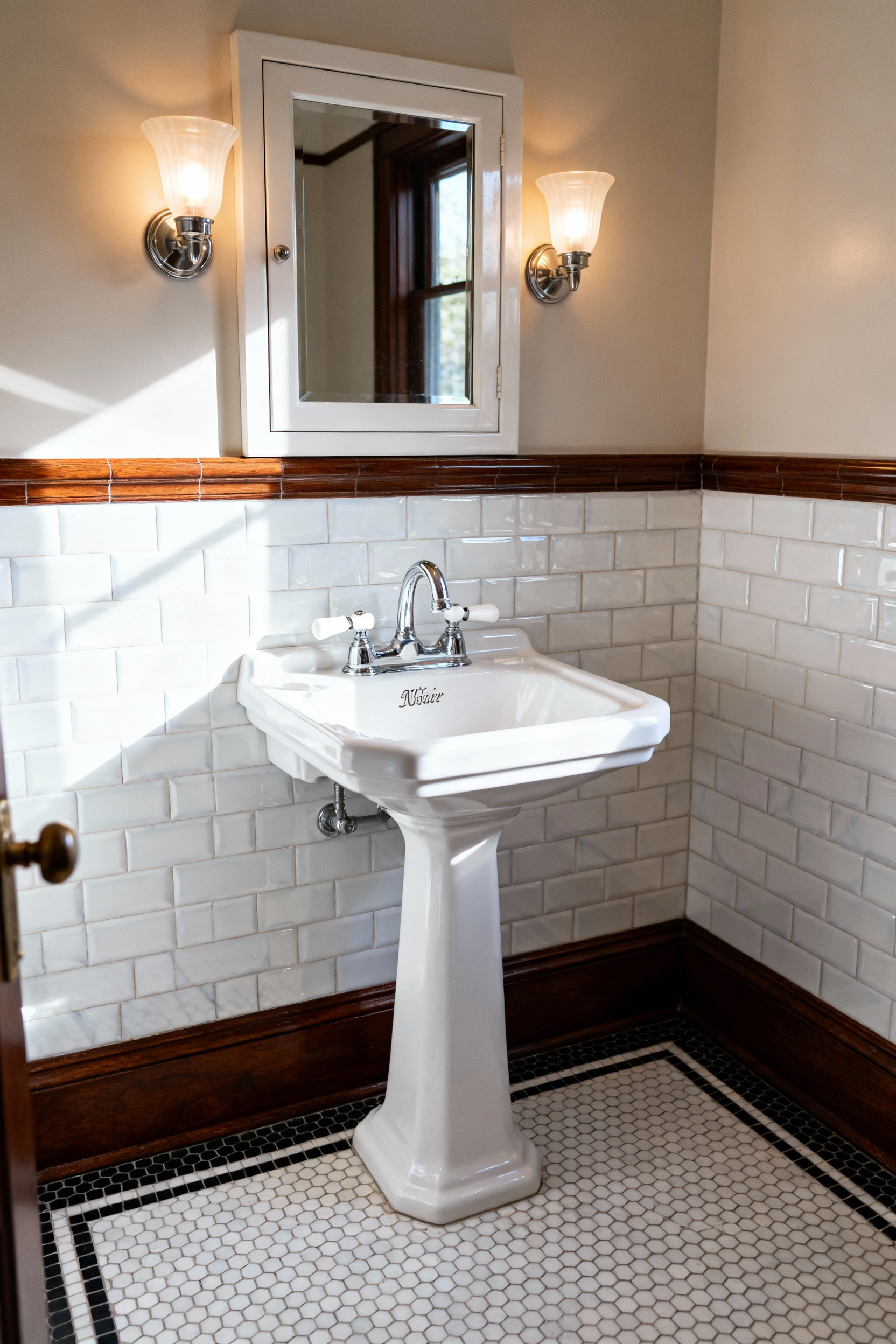
Structurally, maximizing the footprint demands altering infrastructure. In fact, installing in-wall carriers reduces fixture depth. This frees up precious floor space. It aligns with a cleaner aesthetic.
Visually, strategic tiling bridges eras. Designers often employ “period-echo” styles like penny tiles. Surprisingly, extending textures vertically expands boundaries. Furthermore, large-scale graphic prints can trick the eye.
Finally, maintaining layout necessitates vertical space. Pedestal sinks expose the floor to create openness. To compensate for lost storage, custom medicine cabinets blend in. Additionally, *bespoke* niches provide interest. Ultimately, these choices respect the home’s character.
14. Borrowing Light: Transoms and skylights in windowless powder rooms
Windowless powder rooms often feel claustrophobic. However, natural light strategies alter this perception. Specifically, Tubular Daylighting Devices (TDDs) are ideal. These systems channel sunlight from the roof. Consequently, they deliver soft illumination. This vertical light draws the eye upward. It makes the ceiling feel higher. In fact, this addition transforms a utility space.
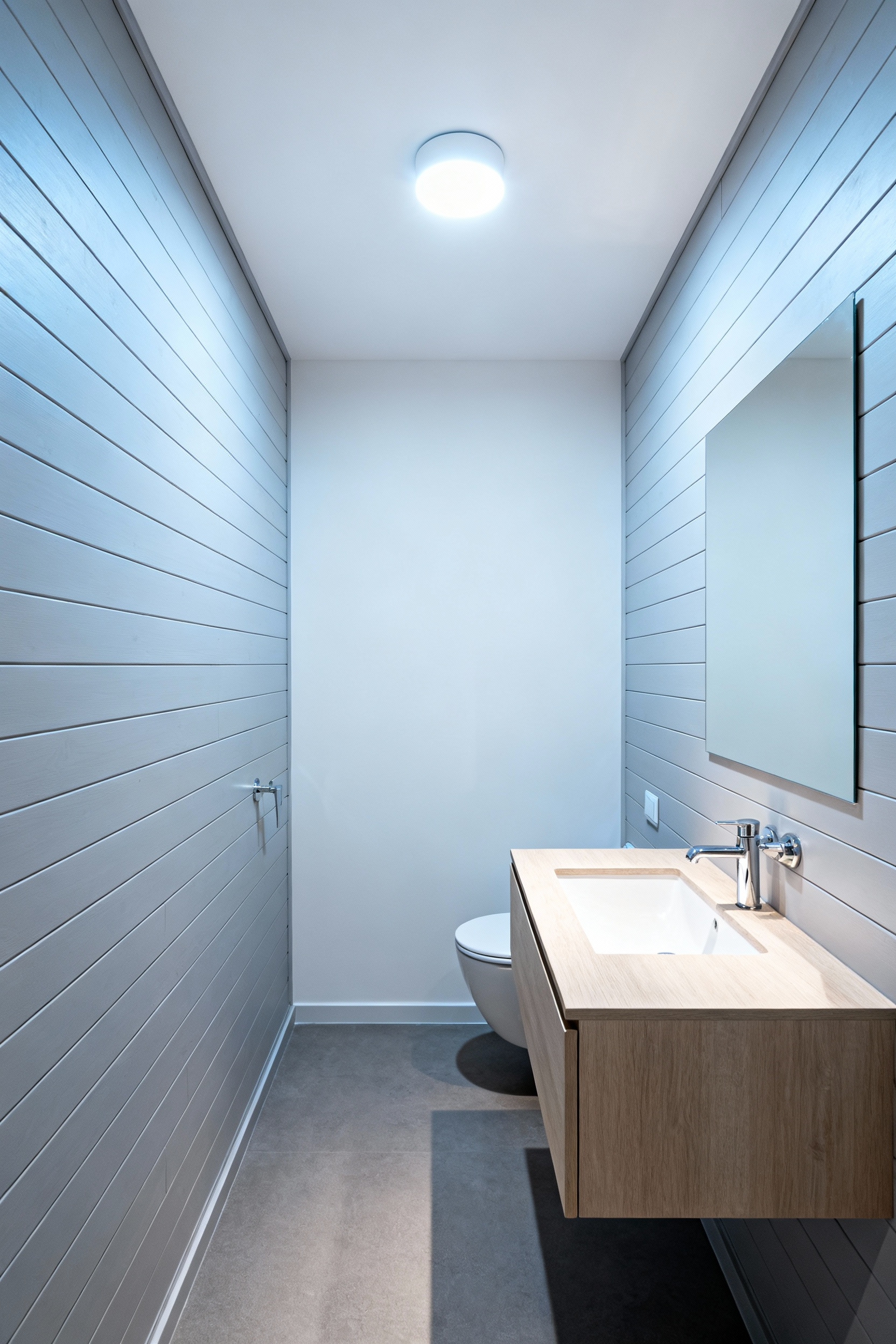
Alternatively, employ “borrowed light” through transoms. These windows sit above doors to capture hallway light. To ensure privacy, we use textured glass. Therefore, the transom obscures sightlines while allowing light to pass. Additionally, this scattered light softens harsh shadows.
Finally, addressing ventilation is critical. Vented skylights solve both problems. Modern units often include rain sensors. Thus, they allow for fresh air circulation. This helps manage humidity. Ultimately, these methods turn a dark room into a breathable environment.
15. Radiator Conversions: Heated floors as invisible luxury amenities
In compact vintage bathrooms, radiators consume real estate. Consequently, removing them eliminates “visual noise.” It immediately reclaims space. This conversion replaces a visible object with an invisible amenity. Specifically, the comfort shifts to uniform warmth underfoot. In fact, walking on warm tile feels far superior to standard drafts.
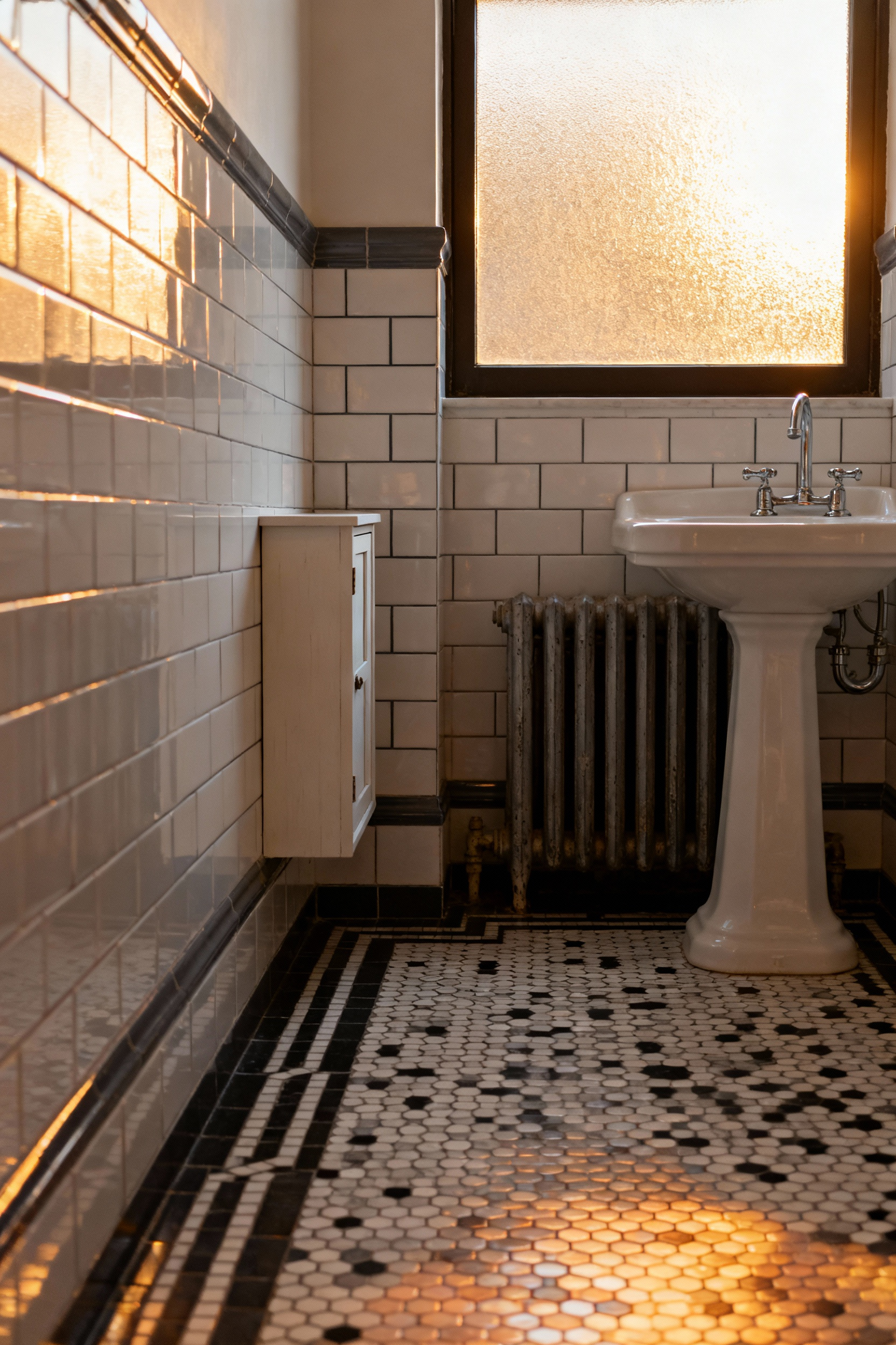
However, integrating floor heating requires planning. Traditional radiators operate at high heat. Radiant floors must run cooler. Therefore, retaining a system requires complex valves. For this reason, experts recommend electric mats for retrofits. These options are incredibly thin. They minimize floor height changes.
Ultimately, this upgrade offers more than minimalism. Radiant heat is silent and clean. It can reduce energy usage. Thus, you preserve character while modernizing functionality.
16. The Corner Sink Configuration: Utilizing dead architectural space
In small bathrooms, the 90-degree corner often sits unused. However, utilizing this dead zone transforms layout. A corner sink performs spatial alchemy. It effectively relocates a bulky fixture. Consequently, this shift clears a diagonal path. Therefore, the room feels significantly larger.
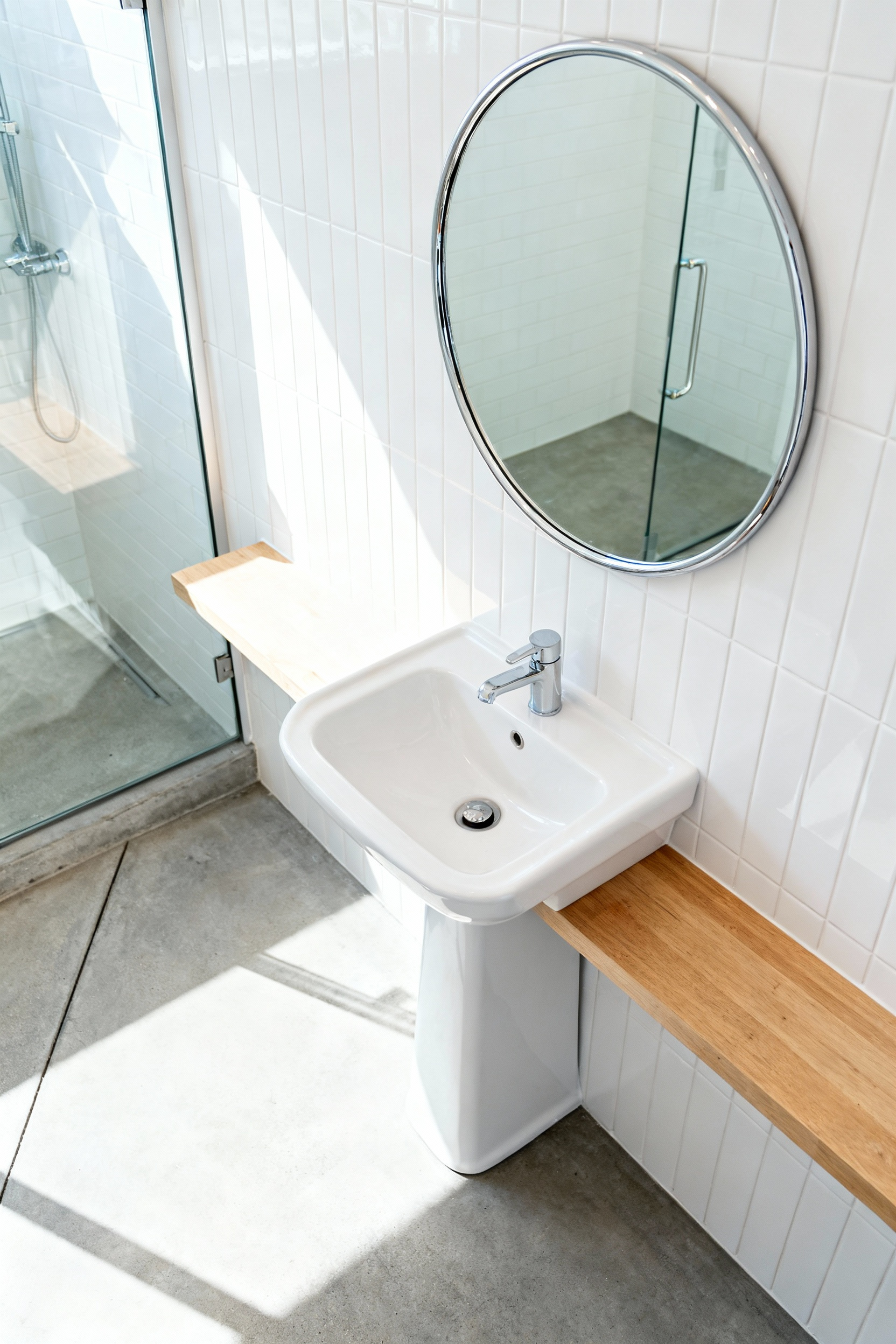
Naturally, this placement introduces ergonomic considerations. Standing in a corner restricts elbow room. Furthermore, faucet placement requires planning. Experts often suggest deck-mounted faucets. Yet, accessibility gains justify these adjustments. For instance, open floor space accommodates pivoting. Thus, a cramped room becomes functional.
Finally, the sink’s form dictates visual weight. A wall-mounted basin creates a “floating effect.” As a result, the space feels airier. Conversely, a pedestal sink offers a refined aesthetic. It conceals unsightly plumbing. Alternatively, a corner vanity maximizes utility. Ultimately, utilizing the corner turns dead space into an asset.
17. Custom Millwork: Why off-the-shelf storage fails in tight dimensions
Off-the-shelf cabinetry adheres to standard dimensions. Consequently, these units rarely respect a home’s layout. For instance, standard vanity widths jump in six-inch increments. Therefore, a 34-inch alcove forces you to select a 30-inch unit. You inevitably lose four inches to filler strips. In contrast, custom millwork is scribed to exact measurements. This precision converts lost inches into storage.
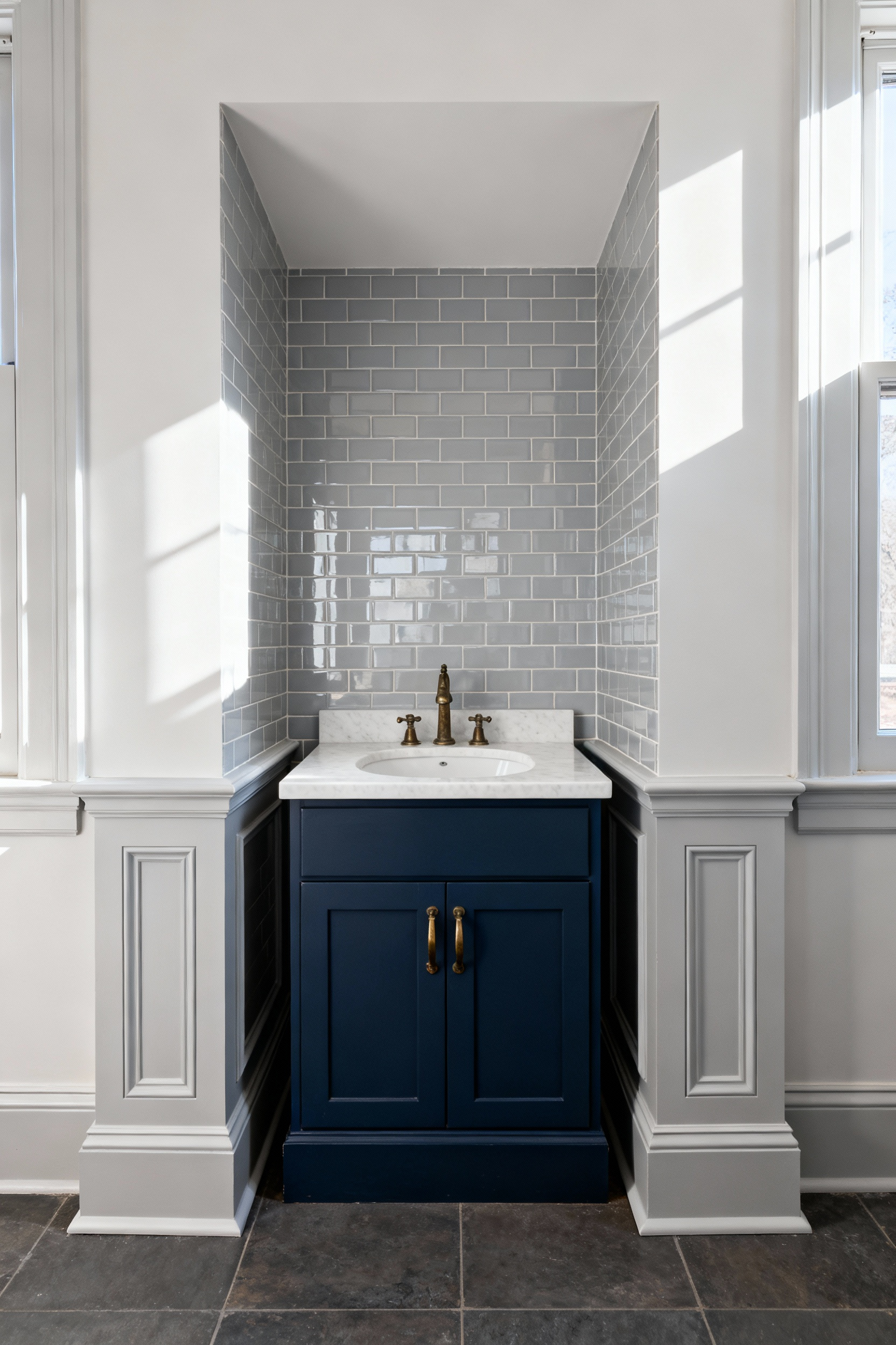
Furthermore, depth is a critical factor. Standard units can impede traffic flow. Conversely, custom designs allow for shallow profiles. This preserves floor space without sacrificing the counter. Additionally, internal engineering dictates functionality. Stock cabinets often become cluttered “black holes.” However, custom drawers utilize full-extension glides.
Moreover, plumbing integration creates another challenge. Stock units require clumsy cutting. Alternatively, custom joinery features U-shaped drawers. These wrap around P-traps. Ultimately, millwork transforms dead space into a seamless feature.
Conclusion: Transforming the ‘Cramped’ into the ‘Curated’
Transforming a small bathroom extends beyond renovation. Instead, it represents a shift from utility to sanctuary. Historically, we viewed these spaces as sanitation boxes. However, modern design reclaims them as emotional architecture. By prioritizing fluidity and removing clutter, you gain psychological space. Consequently, the room feels grounded and surprisingly expansive. Ultimately, true luxury is not about square footage. It is about intentional *curation*. We hope these sophisticated bathroom designs for small bathrooms empower you.
This mindful approach prepares your home for the future. In fact, balancing character with sensory details creates timeless appeal. Furthermore, a curated space supports daily rituals. Therefore, viewing design through this lens enhances life. Begin by auditing your daily items. Finally, remove visual noise to reveal potential. For quick changes, review our top compact bathroom decor ideas to maximize space.
Frequently Asked Questions
What colors should I use to make a small bathroom look luxurious?
For a luxurious feel, avoid stark white. Instead, embrace deep, saturated hues like matte navy, charcoal, or deep emerald green. These dark colors absorb light and blur the corners of the room. This creates an optical illusion of depth known as the “Jewel Box” effect. Pair these colors with high-contrast elements, such as polished brass, to introduce sophistication.
What is the most effective way to maximize floor space in a tiny bathroom?
The most effective ways involve architectural manipulation. Focus on installing cantilevered vanities or wall-mounted toilets to expose continuous flooring. Replace traditional hinged doors with pocket doors to reclaim the door swing arc. Finally, utilize structural recesses within wall cavities for storage, rather than protruding shelving.
Should I use small or large tiles in a small bathroom design?
You should use large-format tiles or slabs. While traditionally small rooms used small tiles, mosaics create a busy visual grid. This can make the space feel cluttered. Large slabs minimize grout lines. This allows the eye to sweep across the surface uninterrupted. It effectively dissolves the room’s boundaries, making the area feel larger.
