You know what people always ask me? It’s not about which color is “in” right now. It’s much simpler. They’ll be standing in their kitchen, a space they live in every single day, and they’ll say, “I want this to feel different. I want it to feel like us.” They want to love their kitchen, not just for the five minutes after it’s been professionally cleaned, but during the beautiful, chaotic mess of daily life—the holiday cookie baking, the post-school snack rush, the lazy Sunday morning coffees.
And here’s the secret the design magazines don’t shout from the rooftops: a transformative kitchen isn’t about the trendiest color. It’s about creating the perfect, adaptable stage for your life. As an event planner, I learned that the backdrop is everything. It sets the mood before a single guest arrives. Your cabinet color is that backdrop. It needs to look just as good with bright summer sunshine pouring in as it does with the cozy glow of Christmas lights. So, let’s cut through the noise and talk about how to choose a color that makes your heart sing, all year long.
Laying the Foundation: Smart Prep for Perfect Cabinet Colors
Okay, can we talk about why so many people get this first part wrong? They fall in love with a color on Pinterest, run to the store, and slap it on the cabinets. Disaster. This prep work is the un-sexy part, I know, but skipping it is like trying to build a house without a foundation. This is where you save yourself from the soul-crushing moment of realizing you just spent a fortune to make your kitchen look… worse. Trust me on this.
1. Assess Natural Light: Optimize Brightness & Warmth
I once had a client who was convinced she wanted this gorgeous, deep charcoal for her cabinets. She had a north-facing kitchen, which means it gets cool, indirect light all day. In the bright showroom? Stunning. In her kitchen? It looked like a black hole. It sucked all the life out of the room and made the space feel dreary and small. We had to pivot, fast. Your light is the boss. It tells every color what to do, and you have to listen to it.
Before you even think about a color, spend a full day just watching your kitchen. How does the light move? Is it bright and intense, or soft and gentle? A south-facing room can handle bold, cool colors, but that same color will feel icy and sad in a north-facing room that craves warmth. Your light is the number one design tool you have, and it’s completely free. Don’t ignore it.
Understanding your light is the single most important step. Now, let’s talk about the things in your kitchen that, like stubborn family members, are not going to change.
2. Harmonize with Existing Elements: Floors & Counters
Think of your countertops and floors as the guests of honor at the party. You don’t ask them to change; you dress to complement them. The biggest mistake I see is people ignoring the undertones of these fixed elements. That granite countertop might look beige, but does it have little flecks of pinky-red? Does your “gray” tile floor have a sneaky blue or green undertone? Ignoring this is how you end up with a kitchen that just feels… off, and you can’t put your finger on why.
Hold your potential color swatches right up against your counters and your floor. Don’t just look at them on the other side of the room. See how they speak to each other. That trendy “greige” might look perfect on the chip, but next to your warm, yellow-toned oak floors, it could suddenly look depressingly purple. You need to find colors that are in the same family, even if they aren’t the same color. It’s about creating harmony, not a competition.
Once you know what your light and your existing finishes are doing, you can use color to play some amazing tricks with the size of your space.
3. Evaluate Kitchen Size: Enhance Perceived Space or Coziness
This one is simple but powerful. Light colors bounce light around, making any space feel bigger, brighter, and more open. It’s an optical illusion, and it’s your best friend in a small or galley-style kitchen. Think of it as pushing the walls out without a single sledgehammer. It’s perfect for creating that bright, airy feeling for spring brunches or making a small space feel less cramped during a crowded holiday party.
But what if you have a huge, open-concept kitchen that feels a bit like a warehouse? That’s when you bring in the dark, moody colors. A deep navy, a forest green, or a rich charcoal on your cabinets will absorb light, creating a sense of intimacy and coziness. It makes a big space feel grounded and intentional, turning a cavernous room into a warm, inviting hub. This isn’t about “rules”; it’s about deciding if you want your kitchen to feel like an expansive, sun-drenched beach or a cozy, intimate library.
Okay, you’ve thought about light, floors, and size. Now for my favorite part, which comes straight from my event-planning playbook.
4. Define Your Desired Mood: Create a Specific Kitchen Vibe
Stop thinking about paint colors for a second. Instead, ask yourself: How do I want to feel in my kitchen? Seriously. Do you want to feel energized and creative? Calm and serene for your morning tea? Do you want a sophisticated space for hosting cocktail parties, or a durable, fun hub for your kids’ art projects? Write down those words. Energetic. Calm. Sophisticated. Playful. Cozy.
Once you have your mood words, then you can look for colors that bring that feeling to life. “Energetic” might lead you to a surprising pop of color on an island. “Calm” will point you toward soft sages, creamy whites, and muted blues. This one step will narrow down your choices faster than anything else. You’re not just picking a color; you’re creating an atmosphere. Your kitchen should support the life you want to live in it.
Now that you have a mood and a feeling, we can use a classic designer trick to make sure it all comes together without looking like a hot mess.
5. Utilize the 60-30-10 Rule: Master Balanced Color Distribution
This sounds technical and boring, but stick with me. It’s just a recipe for a balanced room. Think of it like a plate of food: 60% is your main course, 30% is your side dish, and 10% is that delicious, flavorful garnish. In your kitchen, the 60% is your dominant color—this is likely your main cabinet color. It’s the anchor.
The 30% is your secondary color. Maybe this is your island, or your lower cabinets in a two-tone scheme, or a really statement-making countertop. It’s there to provide contrast and interest. And the 10%? That’s the fun part. That’s your accent. It’s your cabinet hardware, your light fixtures, the decor on your open shelving. It’s the little pop of personality that brings the whole look together. This “rule” just keeps you from having too many things fighting for attention.
Getting the balance right is key, but the real secret to making those colors play nicely together lies in their hidden personality.
6. Understand Color Undertones: Achieve a Cohesive Kitchen Palette
I touched on this with floors and counters, but it’s so important it deserves its own moment. Undertones are the secret, whispered colors hiding inside another color. It’s what makes one white feel creamy and warm (yellow undertone) and another feel crisp and cool (blue undertone). It’s what makes one gray feel cozy (a warm “greige”) and another feel industrial (a cool, steely gray). This is the detail that separates a professionally designed space from an amateur one.
I learned this the hard way years ago. I chose a beautiful light gray for a client’s cabinets, but in her warm, west-facing afternoon light, the paint’s slight purple undertone came out to play in the worst way. It looked… dusty and sad. The shortcut? Put your paint chips on a piece of pure white paper. This helps you see the true color hiding underneath. Does it lean a little green? A little pink? A little yellow? Knowing this is like having a superpower. It ensures your cabinets, counters, and floors will all sing in harmony.
Now that we’ve got the essential prep work down, let’s get to the fun part: picking the actual colors!
Exploring Timeless & Trending Kitchen Cabinet Hues
Alright, this is where we get to dream! These colors are the classics and the rising stars for a reason—they work. But I’ll tell you why they work and how to make them feel uniquely yours, ready for every season and celebration.
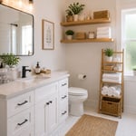
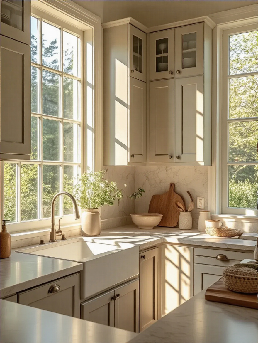
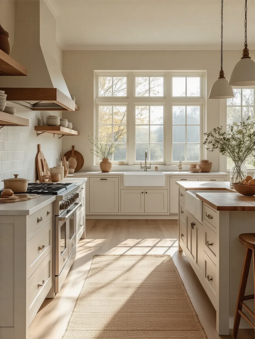
7. Embrace Classic White: Brighten Any Kitchen Space Instantly
Let’s be honest, white kitchens are the little black dress of the design world. They never go out of style. They make any space feel bigger and brighter, they’re a clean canvas for any style, and they create the most incredible backdrop for seasonal decor. Your Christmas greens will pop, your autumn gourds will feel extra cozy, and your spring florals will look incredibly fresh. A white kitchen is a chameleon.
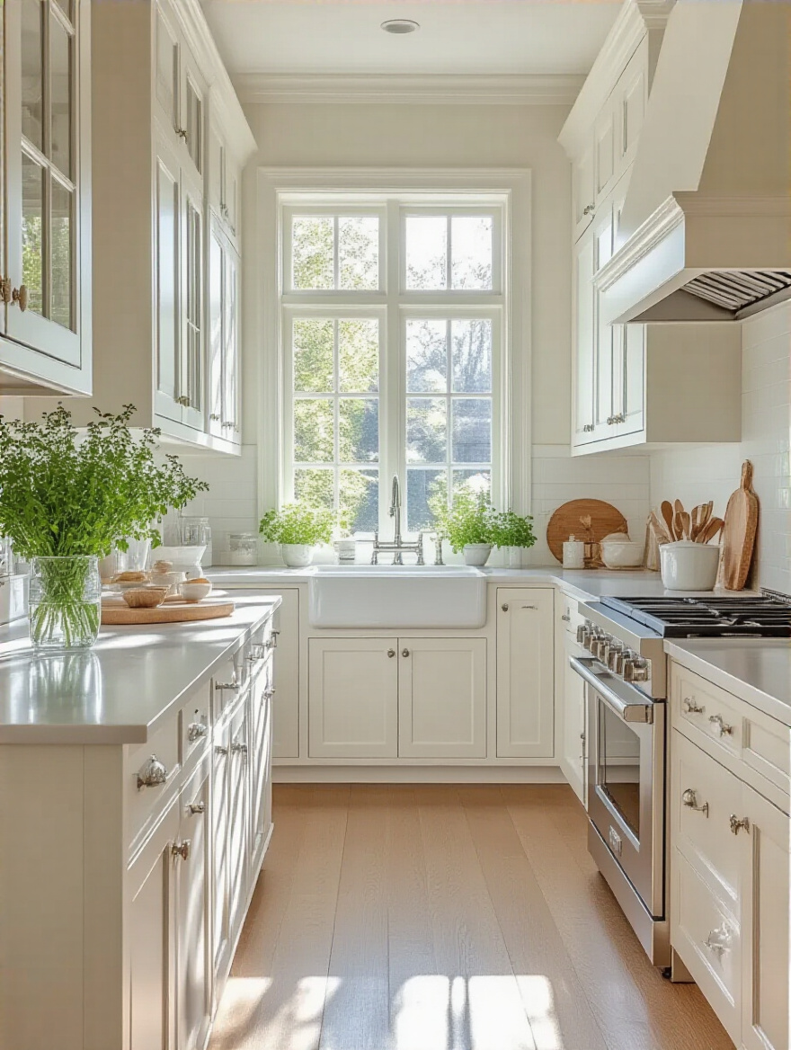
The trick is to keep it from feeling cold or sterile. My go-to move? Introduce warmth. Think about natural wood cutting boards, a vintage wooden bowl on the counter, or warm brass or bronze hardware. And please, layer in different shades of white! A pure white cabinet with a slightly creamier white wall can feel so much richer and more intentional than just one-note white.
From the ultimate classic, let’s move to its equally sophisticated, but slightly moodier, cousin.
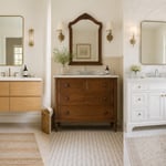
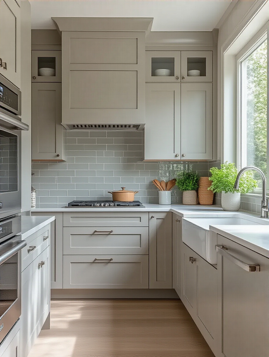
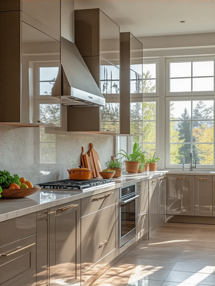
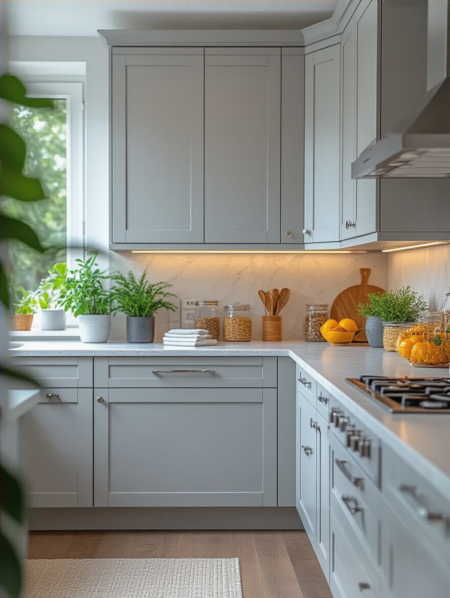
8. Opt for Versatile Greys: Sophisticate Your Kitchen’s Aura
Grey can be incredibly chic and sophisticated. It can feel modern, traditional, and everything in between. But I’m going to give you a warning: not all grays are created equal. A flat, cool gray in the wrong light can feel like a depressing, cloudy day. The magic is in the undertone. I’m a huge fan of warm grays, often called “greiges,” because they have a softness that feels inviting, not industrial.
The best way to make gray cabinets shine is to pair them with texture and life. Think about a beautiful marble-vein countertop, rustic open shelving in a warm wood, or a collection of vibrant green plants on the windowsill. These elements keep the gray from feeling flat and bring out its sophisticated side. And test, test, test! A gray that looks perfect in the store can easily turn blue, green, or even purple in your home’s unique light.
If you like the idea of a neutral that isn’t white or grey, the next one is my absolute favorite for bringing the outdoors in.
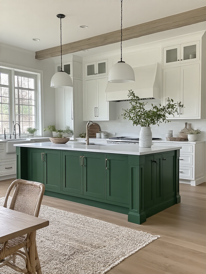
9. Discover Soothing Greens: Infuse Natural Calmness & Earthiness
I’m just going to say it: I’m obsessed with green kitchens. Whether it’s a soft, dusty sage or a deep, dramatic forest green, this color instantly makes a kitchen feel grounded, serene, and connected to nature. It’s like a deep, calming breath for the heart of your home. It’s a color that feels amazing year-round—fresh and vibrant in the spring and summer, and incredibly cozy and rich in the fall and winter.
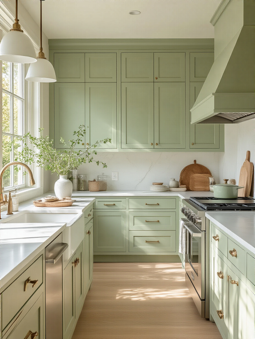
Green is surprisingly versatile. It pairs beautifully with wood tones, crisp whites, and warm metals like brass and copper. A light sage green is a fantastic way to add color without being overwhelming, and it can make a space feel soft and airy. A deep forest green on an island or on lower cabinets creates a stunning, luxurious focal point that feels both timeless and completely of the moment.
For a warmth that’s a little more traditional and subtle, let’s talk about the unsung hero of the neutral world.
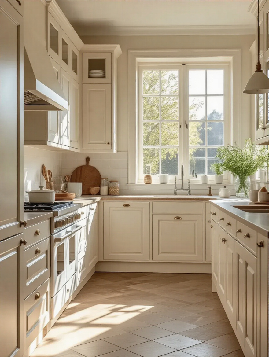
10. Choose Warm Creams & Off-Whites: Add Subtle Comfort
If pure white feels a little too stark for you, welcome to the world of creams and off-whites. Think of these as the cozy cashmere sweater of cabinet colors. They offer all the brightness and versatility of white but with a built-in layer of warmth and softness that makes a kitchen feel instantly more inviting. They are absolute perfection for creating a timeless, traditional, or modern farmhouse vibe.
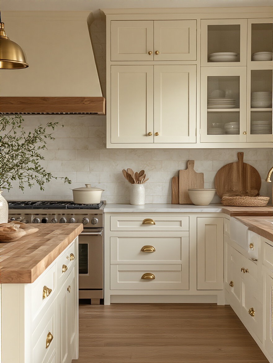
The key with creams is to pay close attention to the undertone. You don’t want a cream that’s so yellow it looks dated. Look for complex off-whites with creamy, beige, or even soft grey undertones. These colors are fantastic at hiding fingerprints better than stark white and provide a beautiful, soft-focus glow to a room, especially in the evening light.
But what if you’re craving something bolder, more dramatic, and undeniably chic? Let’s dive deep.
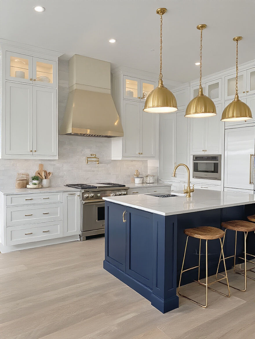
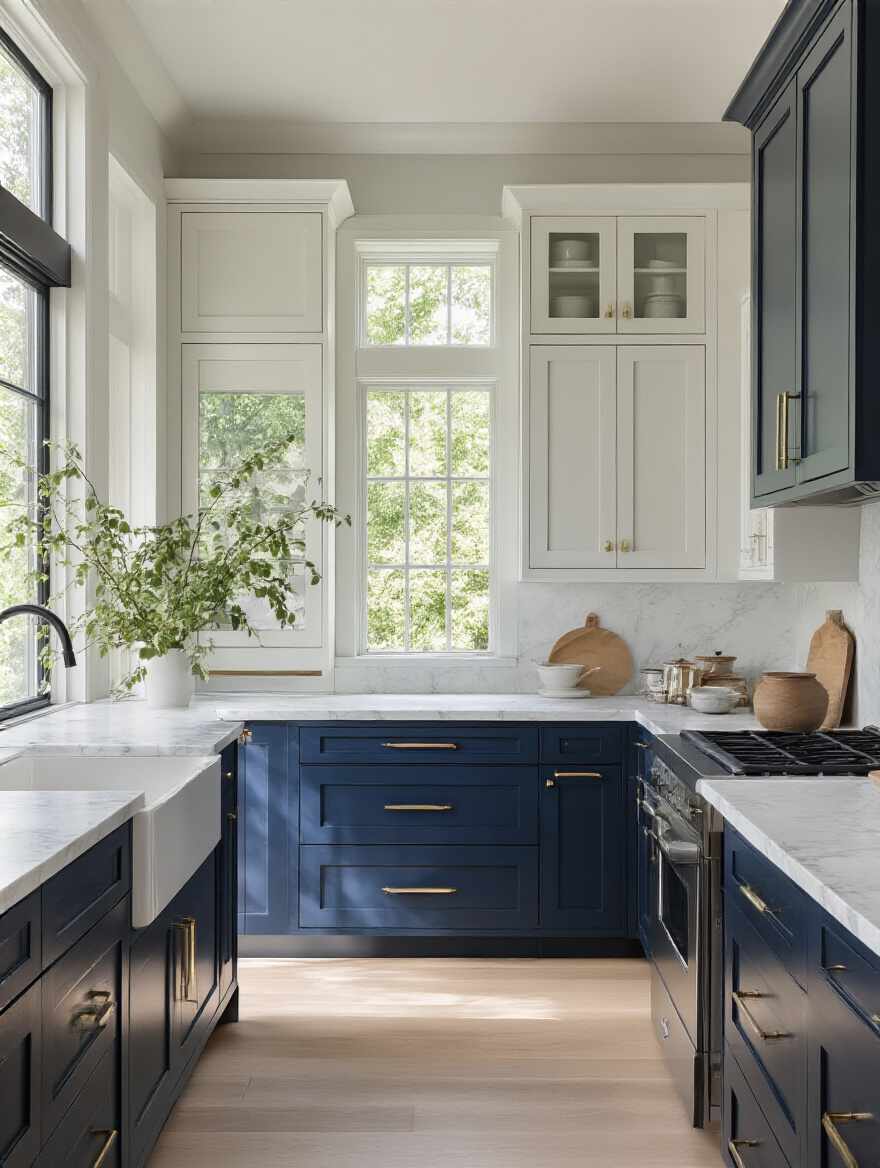
11. Select Deep Navy Blues: Achieve Luxurious Depth & Drama
A kitchen with deep navy blue cabinets is a kitchen that has its life together. It’s sophisticated, it’s confident, and it feels incredibly custom and high-end. Navy acts as a “new neutral,” meaning it has the classic staying power of black or charcoal but with a little more personality and life. It’s absolutely stunning in a kitchen that gets a good amount of natural light.
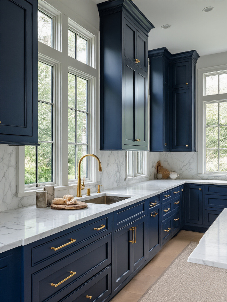
To keep navy from feeling too heavy or dark, you have to balance it. Pair it with a bright white or light-colored countertop and backsplash to create a crisp, beautiful contrast. Warm metallics are navy’s best friend—brass, copper, and gold hardware and light fixtures will absolutely sing against the deep blue. And don’t be afraid to use it just on the lower cabinets or an island for a powerful punch of drama without overwhelming the space.
From the depths of navy, we now head to the airy, sun-bleached shores of Scandinavian design.
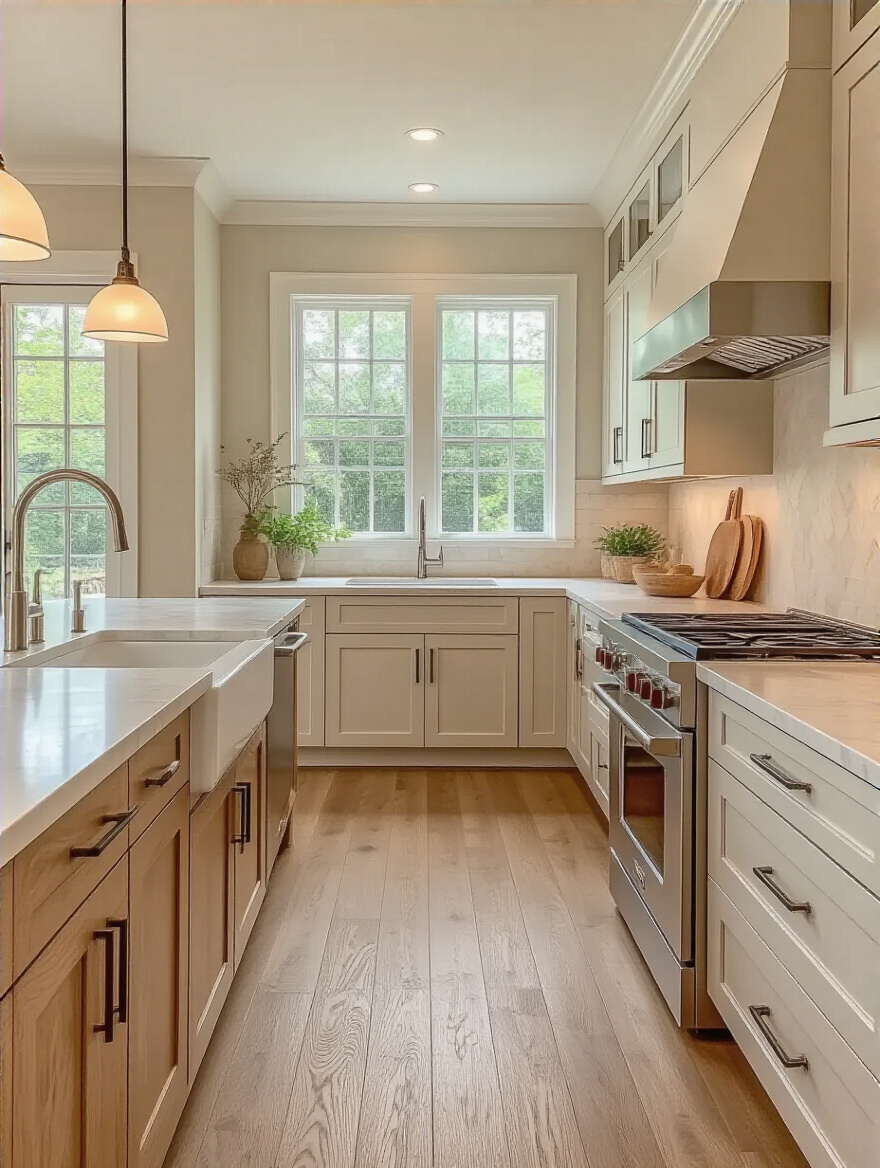
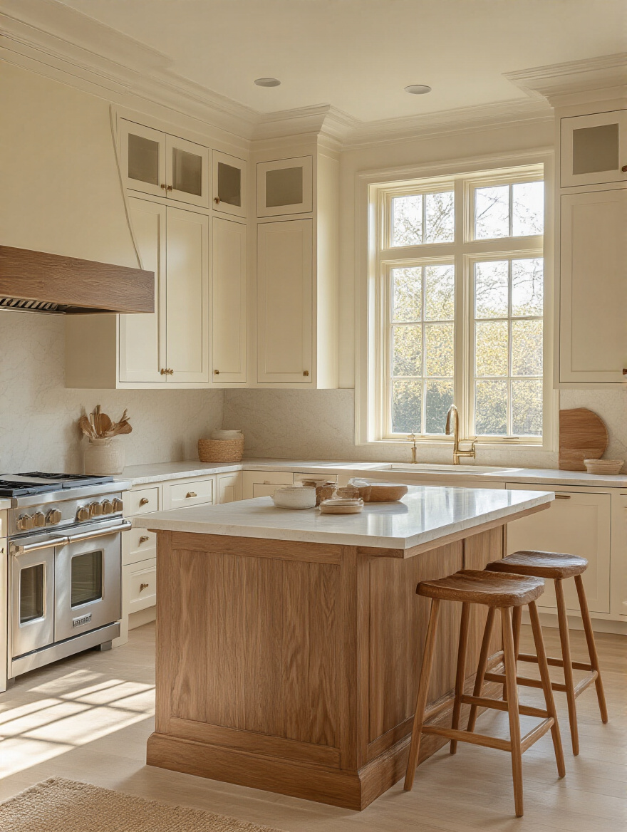
12. Consider Light Wood Tones: Foster Natural Scandinavian Charm
There is a serene, spa-like quality to a kitchen with light wood cabinets. Think light oak, ash, or maple. It’s a look that’s all about embracing natural materials, simplicity, and light. This style is less about a “color” and more about a “texture” and a feeling. It’s warm without being heavy, and modern without being cold. It’s the perfect canvas for a minimalist, uncluttered aesthetic.
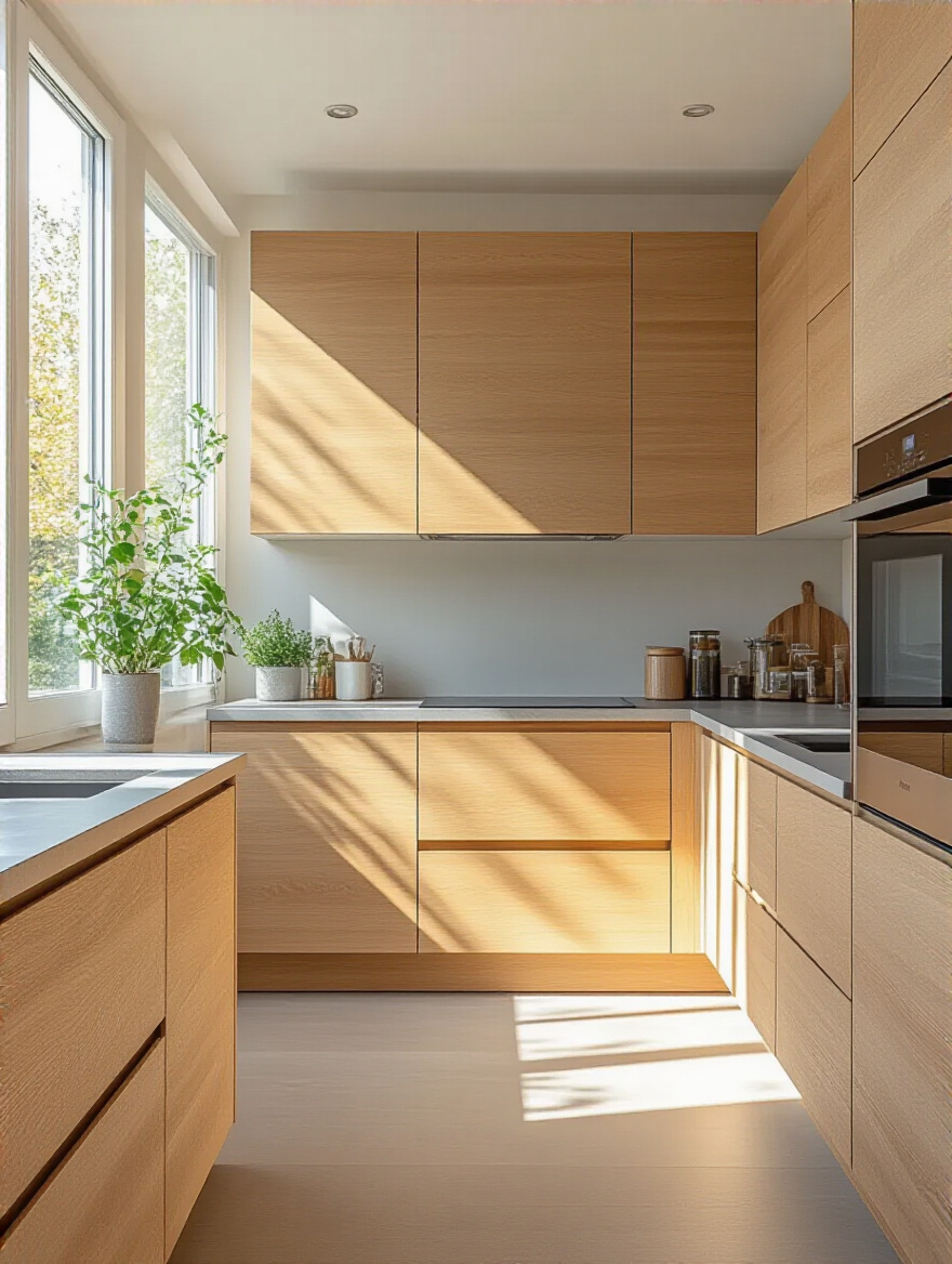
The beauty of light wood is in its grain. You want to choose a finish that enhances the natural pattern, not one that covers it up with a heavy, shiny stain. Pair these cabinets with simple, clean lines—flat-front doors, minimal hardware, and neutral countertops. This look is all about creating a calm, restorative space that feels like a quiet retreat from the busy world.
Now that you’ve got a handle on the key colors, let’s explore some more advanced ways to put them together for a truly custom look.
Advanced Color Strategies for Dynamic Cabinet Design
Okay, you’ve mastered the basics. Now let’s get creative. These aren’t just single-color solutions; these are design strategies for layering color and personality into your kitchen. This is how you take a nice kitchen and turn it into a space that truly wows.
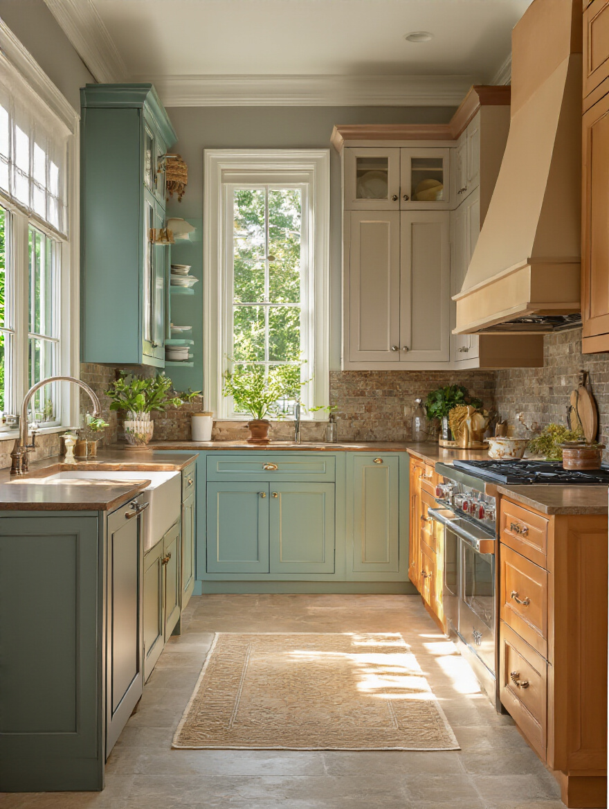
13. Implement Two-Tone Schemes: Boost Visual Interest Dramatically
This is one of my all-time favorite tricks for adding instant character. A two-tone scheme is exactly what it sounds like: using two different colors for your cabinets. The most classic approach is using a darker color on the lower cabinets and a lighter color on the uppers. This is brilliant for two reasons: it grounds the space with the darker color, and the lighter color on top draws the eye upward, making the ceiling feel higher and the room feel more open.
But you can have fun with this! It could be a bold color on an island with neutral cabinets around the perimeter. Or you could have one statement wall of cabinets in a different color. It’s a fantastic way to use a bolder color that you might be scared to commit to for the entire kitchen. It adds depth, dimension, and a custom-designed feel that’s hard to beat.
This idea of using different colors in different zones leads perfectly to our next strategy: giving the star of the kitchen its own moment in the spotlight.
14. Highlight Islands: Use a Distinct Accent Color Confidently
Your kitchen island is the natural hub of the room. It’s where everyone gathers, where homework gets done, and where party appetizers are served. So why not treat it like the star it is? Painting your island a different color from the rest of your cabinets is one of the easiest and most impactful ways to add personality to your kitchen.
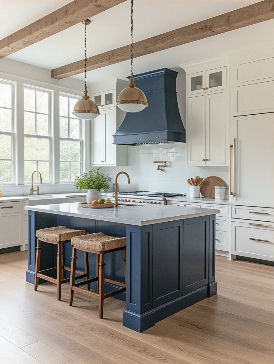
This is your chance to be bold! Have you been dreaming of a deep green or a vibrant blue but are too nervous to go all-in? The island is the perfect place for it. Because it’s a single, contained element, a strong color here feels intentional and exciting, not overwhelming. It instantly makes your kitchen feel more dynamic and designed, creating a focal point that anchors the entire room.
A contrasting island is one version of a two-tone scheme, but the most classic combination deserves its own special mention.
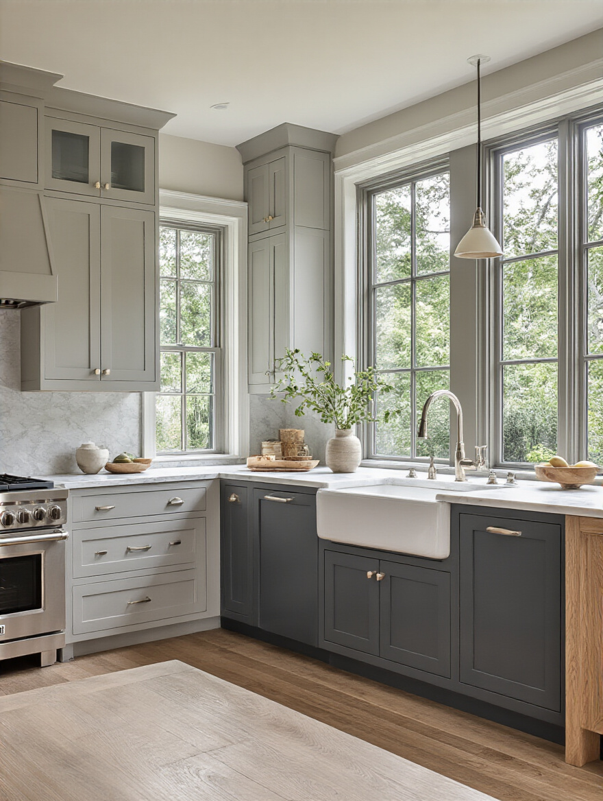
15. Create Contrast: Pair Dark Lowers with Lighter Uppers
We touched on this, but it’s such a winning combination that it’s worth a closer look. There’s a psychological reason this works so well: things in nature are typically darker on the bottom (the earth) and lighter on top (the sky). So, a kitchen with dark lower cabinets and light uppers feels naturally balanced and grounded to our eyes. It just feels… right.
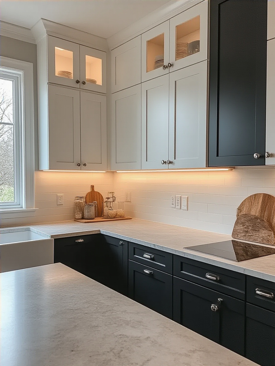
This strategy is also incredibly practical. Lower cabinets take the most abuse—kicks, scuffs, spills. A darker color is far more forgiving at hiding the wear and tear of daily life. Meanwhile, the light upper cabinets keep the room from feeling heavy and reflect light around the space, making your work surfaces brighter. It’s the perfect marriage of sophisticated style and real-world practicality.
But sometimes, the best way to add interest isn’t with more color, but with a deliberate absence of cabinets.
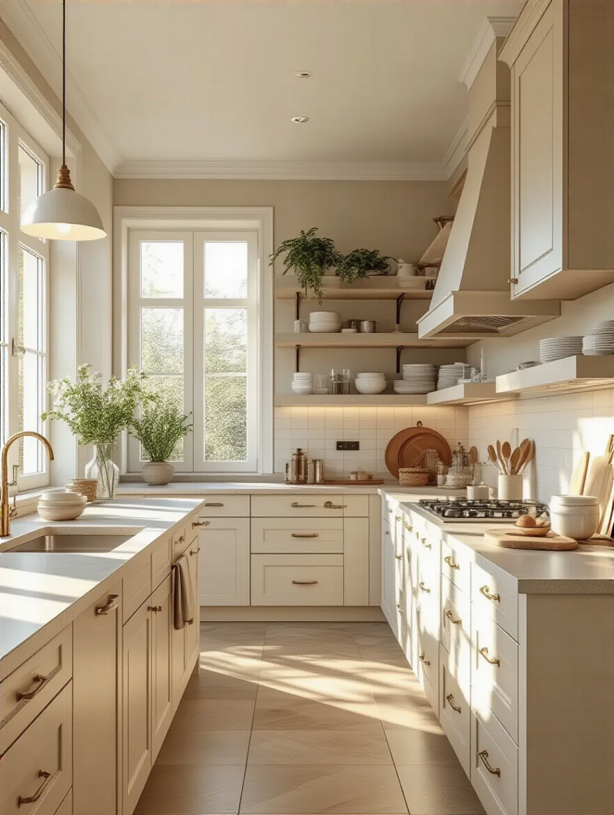
16. Integrate Open Shelving: Break Up Monotony with Style
A solid wall of upper cabinets, especially in a dark color, can feel heavy and overwhelming. Swapping out a section of those cabinets for open shelving is like opening a window—it instantly creates a sense of airiness and light. It breaks up the monotony and gives you a fantastic spot to inject your personality. This is your stage!
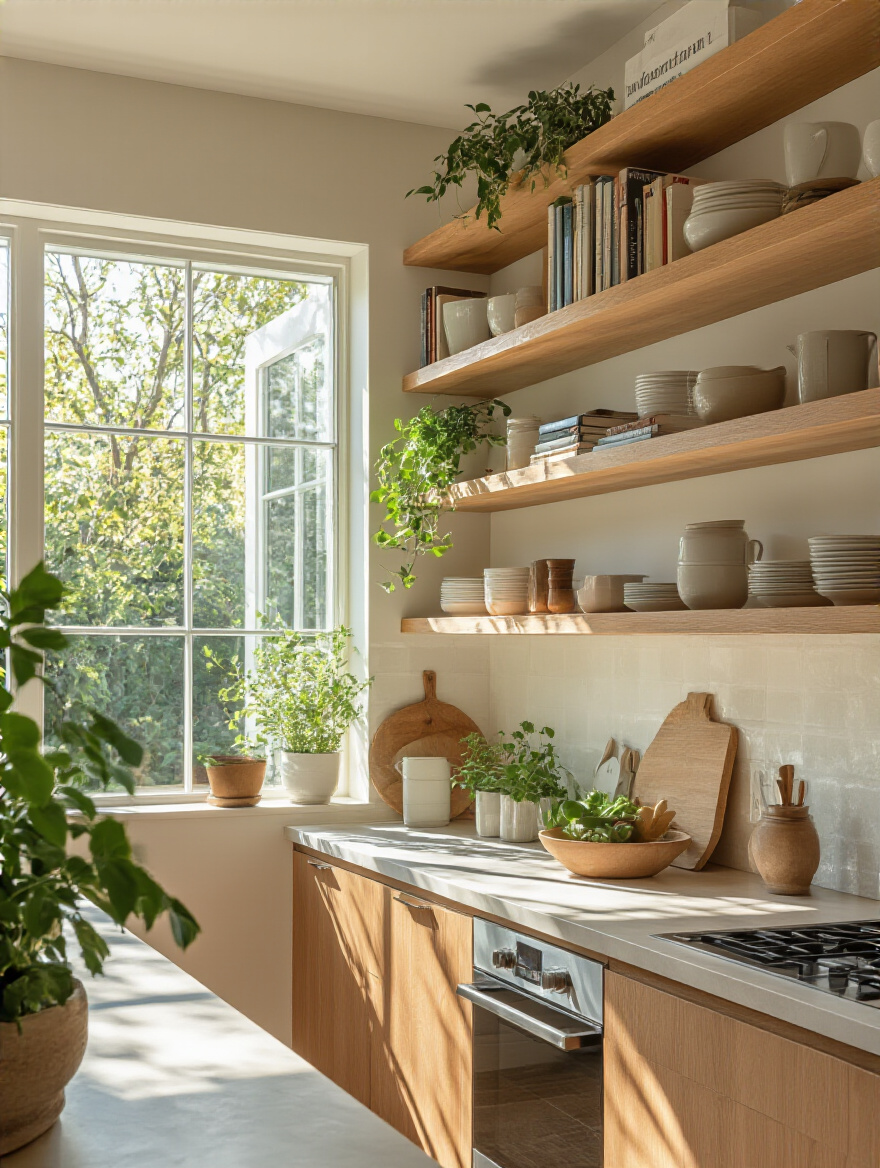
I absolutely love using open shelving to bring in seasonal touches. A few small pumpkins and some autumn-toned mugs in the fall; a string of twinkling lights and some festive plates in the winter; a collection of bright, colorful bowls in the summer. It’s a low-commitment way to keep your kitchen feeling fresh and current all year long. Just remember the golden rule of open shelving: curate, don’t clutter. Display your prettiest things, and keep the plastic stuff behind closed doors.
Of course, you can create a high-impact moment inside your cabinets, too.
17. Experiment with Unexpected Pops: Add Bold Personality Effectively
This is for the adventurous decorator who wants a little surprise and delight in their kitchen. An unexpected pop of color is a fantastic way to add a shot of personality without a huge commitment. My favorite way to do this is to paint the inside of a glass-front cabinet or a set of open shelves. Imagine an all-white kitchen, but when you open a cabinet, the back is painted a brilliant, sunny yellow. It’s like a secret smile.
You can also use this technique on a small, freestanding piece, like a small bank of drawers or a pantry door. It’s a low-risk, high-reward strategy. If you get tired of the color in a few years, repainting a small section is a simple weekend project, not a major overhaul. It’s a wink of color that says this kitchen doesn’t take itself too seriously.
Now, for a much more subtle but incredibly high-end look, let’s talk about the art of blending in.
18. Match Cabinet Hues: Harmonize Seamlessly with Backsplash Choice
If you want your kitchen to feel expansive, serene, and ultra-chic, consider matching your cabinet color to your backsplash. When there’s no harsh line between where the cabinets end and the backsplash begins, your eye flows smoothly across the surface. This tricks the brain into perceiving the space as larger and more continuous.
The key to preventing this look from feeling flat is to play with texture and sheen. You could pair matte-finish cabinets with a glossy tile in the exact same color. Or you could use a tile with a subtle handmade texture, like a Zellige tile, that creates beautiful variations in light and shadow, even with a single color. This creates a rich, layered, and incredibly sophisticated look that feels calm and cohesive.
With all these creative ideas swirling, we can’t forget about the practical side of things. How do you actually make it happen and make it last?
Practical Execution & Long-Term Maintenance Tips
You’ve got your vision! Amazing. Now let’s make sure it becomes a reality you’ll love for years to come. This is the part where we talk about process, finishes, and cleaning—the stuff that ensures your beautiful new kitchen stays beautiful.
19. Always Test Swatches: See Colors in Your Real Environment
If you remember one thing from our chat, let it be this: NEVER, EVER skip testing your paint colors in your actual kitchen. I don’t mean holding a tiny 1-inch paint chip up to the wall. I mean getting a large, movable sample. Companies like Samplize sell giant peel-and-stick samples made with real paint, and they are a game-changer.
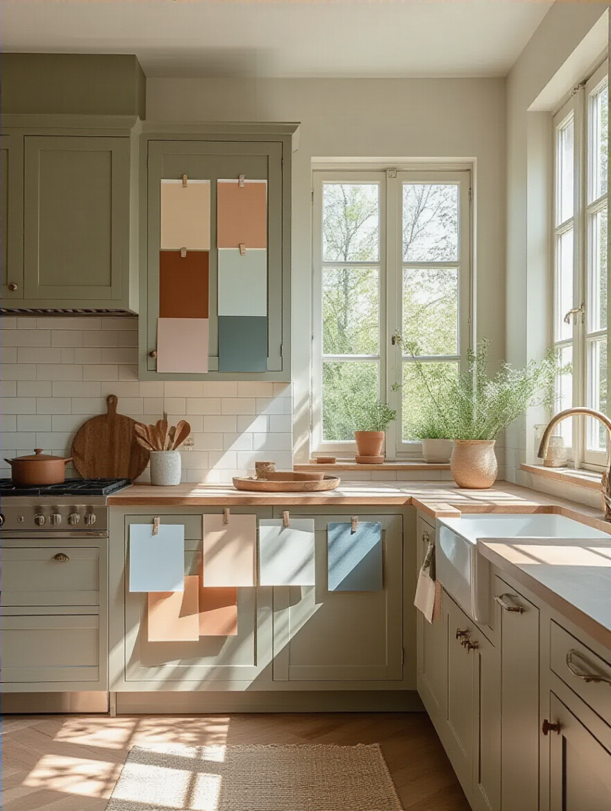
Stick those samples on your upper cabinets, your lower cabinets, next to the window, and in the darkest corner. Live with them for a few days. See how they look in the bright morning light, in the warm glow of the afternoon, and under your artificial lights at night. A color can and will change dramatically in different lighting. This single step is the best insurance policy against expensive, heartbreaking mistakes.
Your light is the most powerful factor, so let’s make sure you’re considering all of it.
20. Factor in Lighting Conditions: Avoid Color Surprises Effectively
It’s not just about natural light. The light bulbs in your kitchen have a huge impact on color. Have you ever noticed how some LED lights cast a cool, almost blue glow, while others are warm and yellow? This is measured in Kelvins (K). A “warm white” bulb (around 2700K-3000K) will make colors feel cozier and can bring out the yellow in creams. A “cool white” or “daylight” bulb (4000K-5000K) is much bluer and will make colors appear starker.
When you’re testing your swatches, make sure you look at them under the exact light bulbs you plan to use. There’s nothing worse than picking the perfect creamy white, only to have your new cool-toned LED lights turn it into a sickly, washed-out green. A consistent lighting plan is essential for your color to look its best, day and night.
Once the color and light are sorted, we have to talk about the ‘feel’ of the cabinets, which is all about the finish.
21. Select Ideal Finishes: Impact Cabinet Color Perception & Durability
The sheen of your paint—or the finish—is just as important as the color. A matte finish absorbs light, which gives colors a soft, velvety, and rich appearance. It’s beautiful and sophisticated, but it can be harder to clean. A high-gloss finish, on the other hand, reflects a ton of light, making colors look more saturated and intense. It’s a very modern, glam look, but it will show every single fingerprint and smudge.
For most kitchens, especially for busy families, I recommend a satin or semi-gloss finish. It’s the happy medium. It has a subtle sheen that reflects a bit of light, makes the color look great, and most importantly, it’s durable and easy to wipe clean. The finish affects not just how the kitchen looks, but how it lives.
And that brings us to the most important question for any real-world kitchen…
22. Prioritize Durability & Cleaning: Maintain Beauty Effortlessly
A beautiful kitchen that’s a nightmare to keep clean isn’t a beautiful kitchen for long. Your kitchen is a workhorse! It has to stand up to grease splatters, sticky fingers, and slammed doors. The durability comes from both the paint quality and the finish. A high-quality cabinet paint is formulated to be tougher and more scrubbable than regular wall paint. Don’t cut corners here.
When it comes to cabinet style, smoother is easier. Ornate, detailed cabinets have tons of little nooks and crannies for dust and grime to collect. A simpler style, like a Shaker or a flat-panel door, is much easier and faster to wipe down. Think about your real life. Do you have the time and patience for deep cleaning tiny grooves, or do you want a surface you can quickly wipe and be done with?
Finally, let’s talk about the future, because your choices today can have a big impact down the road.
23. Consider Future Resale Value: Make Wise Long-Term Choices
Even if you have no plans to move, it’s always smart to think about resale value. A kitchen remodel is a big investment, and you want it to pay off. The truth is, timeless, neutral cabinet colors have the broadest appeal to potential buyers. White, off-white, light gray, and even classic navy are generally safe bets that won’t turn people away.
This doesn’t mean your kitchen has to be boring! This is where those advanced strategies come in. Keep your main cabinets in a crowd-pleasing neutral, and then go wild with a fun, bold color on your island. Or add personality with a unique backsplash, statement lighting, and funky hardware. These are much easier and less expensive for a future owner to change than an entire kitchen of bright purple cabinets.
Conclusion
So, there you have it. Choosing the right color for your kitchen cabinets is so much more than picking a swatch. It’s an incredible opportunity to craft a space that not only looks beautiful but feels right. It’s about creating a backdrop that makes your daily rituals feel more special and your celebrations more joyful. It’s the stage for your life, ready for every season.
By understanding your light, listening to your home’s existing elements, and defining the mood you want to create, you can move beyond fleeting trends and choose a color with confidence. You’re not just painting wood; you’re infusing the heart of your home with personality, warmth, and style that will last for years. Now go grab some big samples, have fun with it, and get ready to fall in love with your kitchen all over again.