You know what drives me absolutely nuts? Can we talk about why everyone is obsessed with turning their bedroom into a generic, beige “sanctuary”? I see it all the time on social media. People take a home with 100 years of history—with quirks, character, and stories embedded in the plaster—and they sand it all down to create a bland, featureless box that looks like a hotel room. They’re so busy chasing a fleeting trend that they completely ignore the incredible character they’re living in.
The real magic, the kind that feels deeply personal and lasts for decades, doesn’t come from a catalog. It comes from listening to the house itself. It’s about working with the wavy plaster, the oddly-placed window, the rich history of the materials. The goal isn’t to create a perfect, sterile “sanctuary.” It’s to create your room, one that honors the home’s past while making it work for your life today. This is where the real work—and the real fun—begins.
So let’s cut through the noise. Here’s what actually matters when you’re deciding what to do with those four walls.
Laying the Groundwork: Planning & Vision
Look, I get it. This is the boring part. You want to get to the paint and the pictures. But I promise you, five hours of solid planning upfront will save you 50 hours of frustration and a thousand bucks in mistakes later. Every single time a client project goes sideways, it’s because we skipped a step here. In an older home, planning isn’t just a good idea; it’s your roadmap through a landscape of beautiful, and sometimes baffling, surprises.
1. Define Your Bedroom’s Desired Mood & Ambiance
Before you pick a single color, stop and ask yourself: what is the purpose of this room, beyond sleep? Is it a quiet reading nook? A place to disconnect from screens? A vibrant space to wake you up in the morning? Forget design terms for a second. Use real words. “Calm.” “Cozy.” “Dramatic.” “Intellectual.” The feeling you’re after should dictate every single choice you make. This is your compass.
A client of mine owned a beautiful 1890s Victorian. The previous owners had painted the bedroom a stark, gallery-white. It was cold, sterile, and fought the architecture at every turn. My client wanted “a cozy, enveloping retreat.” So, we looked at historical palettes and chose a deep, moody teal. It made the original dark wood trim sing. We didn’t just paint a room; we gave it back its soul and, in doing so, created the exact feeling she was after.
Forget fleeting trends you see online. A room’s true ambiance comes from a dialogue between your needs and the building’s own history.
2. Assess Wall Space for Perfectly Scaled Decor
Okay, this sounds simple, but here’s where people mess up. They measure the wall, but they don’t assess it. Is it plaster or drywall? An old plaster wall might be wavy and won’t give you a perfect plane. Do you have original picture molding? Use it! That’s what it’s for. Where are the studs? In a home built before 1950, they might not be every 16 inches. A good stud finder isn’t a suggestion; it’s a necessity.
The biggest mistake I see is what I call “postage stamp art.” A tiny picture floating on a giant wall. A good rule of thumb is that art over a piece of furniture (like a headboard or dresser) should be about 2/3 the width of that furniture. And please, hang it so the bottom of the frame is 6-10 inches above the furniture, not halfway to the ceiling. It needs to feel connected, not like it’s floating away. Tape out the sizes with painter’s tape on the wall before you even think about drilling a hole.
This isn’t just about making it look good; it’s about respecting the architectural scale of the room.
3. Establish a Realistic Budget for Decoration Materials
Let’s be honest. Whatever you think it’s going to cost, add 20%. That’s not pessimism; it’s experience. This is your contingency fund. In an old house, you might discover you need to skim-coat a whole wall before painting, or that the old wiring for a sconce needs a complete overhaul. That’s where your buffer comes in.
The common BS is that you can get a high-end look for cheap. You can get a trendy look for cheap. It won’t last. My advice? Prioritize your spending. Invest in the things you touch and see up close every day. Buy high-quality paint—it covers better and the finish is undeniably richer. Splurge on one stunning piece of art or a beautifully framed mirror instead of ten cheap prints from a big-box store. Quality over quantity, always. You’re the steward of this historic place; treat it with the respect it deserves.
A thoughtful budget means you’re making intentional choices, not panicked compromises halfway through the project.
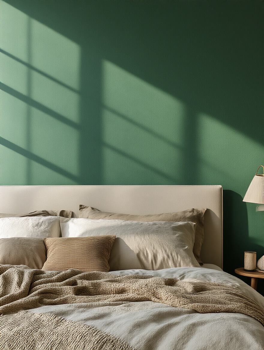
4. Curate a Cohesive Color Palette for Wall Accents
The light in an old house is different. The windows might be smaller, the glass wavy, the ceilings higher. The “perfect greige” you saw online might look like depressing cement in a north-facing room with a single window. The single most important shortcut here is to get tester pots and paint large swatches on every single wall. Live with them for a few days. See how they look in the morning light, at high noon, and in the evening with the lamps on.
The 60-30-10 rule (60% dominant color, 30% secondary, 10% accent) is a decent starting point, but don’t treat it as gospel. The real secret is to pull colors from something that already exists and that you love. An old Persian rug. A piece of art. The brick on the fireplace. This ensures your palette is grounded and personal, not just plucked from a trend report. For historic homes, consider looking up heritage color palettes from brands like Benjamin Moore or Farrow & Ball—they’ve done the historical research for you.
Your palette isn’t just about color; it’s about how that color interacts with the unique light and architecture of your specific room.
5. Pinpoint Your Personal Decor Style: Modern or Classic?
I’d rephrase this question. It’s not about “Modern vs. Classic.” It’s about how you want to interact with the home’s history. Do you want to restore and complement its original style, or do you want to create a compelling juxtaposition? Both are valid, but they require different approaches. Putting sleek, modern furniture in a highly ornate Victorian room can be breathtaking—if it’s done with intention. It highlights the beauty of both.
Here’s the shortcut: Don’t fight the house. If you have a Craftsman bungalow with gorgeous, dark wood trim everywhere, trying to force a light, airy, coastal vibe is going to be an uphill battle. Work with the bones of the house. Your personal style is how you furnish and accessorize within that framework. A home feels most authentic when there’s a clear, respectful conversation happening between the old and the new.
Once you know whether you’re complementing or contrasting, every other decision becomes simpler.
Transforming Walls with Unique Treatments
Now we’re getting to the good stuff. Paint is just the beginning. The walls themselves can become the primary feature. This is where you can add layers of texture, depth, and character that make a room feel like it has evolved over time—even if you did it all last weekend.
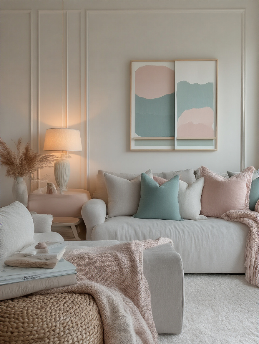
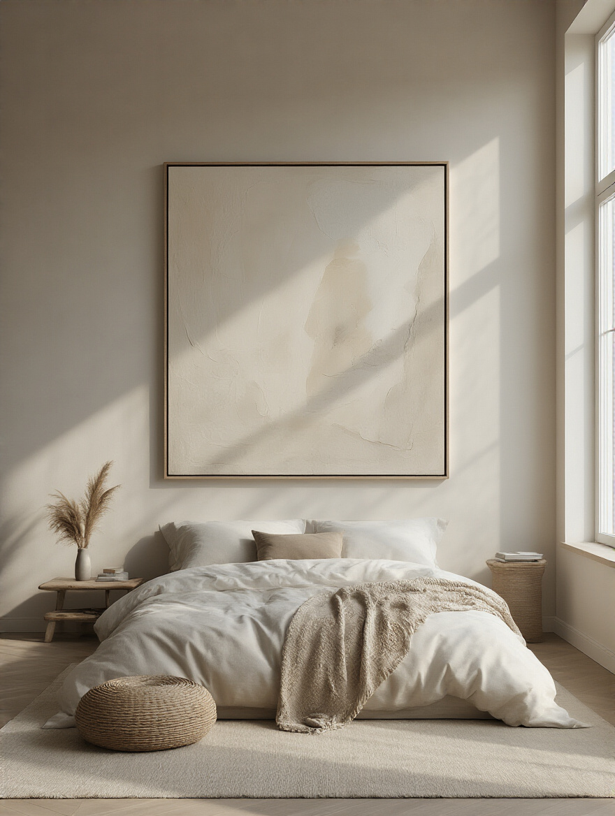
6. Apply Accent Paint to Create a Dynamic Focal Point
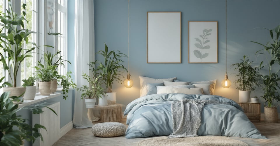
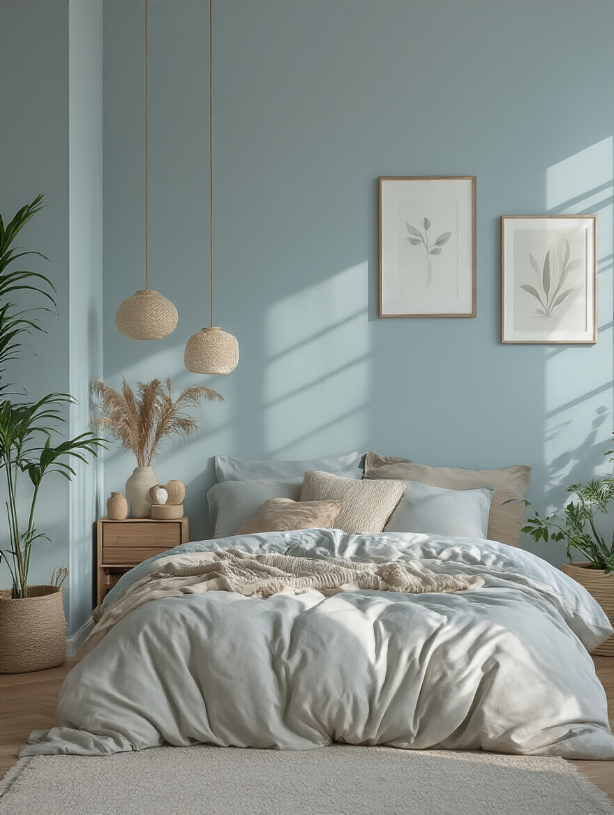
An accent wall is more than just a splash of color; it’s a tool for directing the eye and defining a space. In a bedroom, the most natural place for it is the wall behind your headboard. It grounds the bed, creates an immediate focal point, and gives the room a sense of purpose and depth. It says, “This is the most important spot in this room. This is the place of rest.”
But here’s a pro tip from the world of historic homes: don’t just pick a random wall. Look at the architecture. Do you have a natural alcove or a chimney breast? That’s your accent wall right there. The house is literally telling you where the focal point should be. Painting it a distinct color simply highlights the beautiful form that already exists. This approach feels intentional and respectful of the original design.
From a simple coat of paint, we can now move into adding a tangible, touchable quality to the walls.
7. Incorporate Textured Wallpaper for Immediate Depth
Before drywall, walls were plaster. They had texture, movement, life. Bringing texture back to a wall is a nod to that history and a powerful way to add warmth and depth. Textured wallpapers like grasscloth, linen, or even paintable anaglypta or Lincrusta—a beautiful, deeply embossed Victorian wall covering—can completely transform a room. They absorb sound, making the space quieter, and they play with light in a way that flat paint never can.
I was once working on a 1920s Tudor revival, and the client wanted to add character to a boxy bedroom. We found a deep green grasscloth wallpaper. It took the room from being a simple, painted box to feeling like a wood-paneled library in an English manor. It added instant age, warmth, and sophistication. The key is to commit. Often, this works best on a single feature wall behind the bed, so it envelops you without overwhelming the space.
Wallpaper isn’t just a pattern; it’s a way to add a layer of material history to your room.
8. Install Peel-and-Stick Decals for Flexible Styling
Alright, I’ll be honest. As someone who loves permanent, quality materials, I used to think peel-and-stick was flimsy nonsense. I’ve come around, with a major caveat. It’s brilliant for two things: renters who can’t make permanent changes, and for testing out a very bold idea before you commit to spending thousands on high-end wallpaper. It’s a design dress rehearsal.
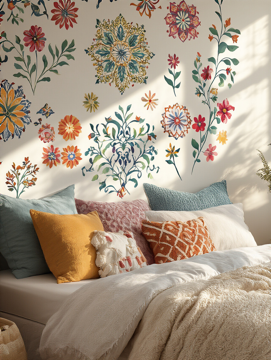
But here’s the real talk everyone else leaves out: it’s not always damage-free. On new drywall with modern paint, it usually comes off clean. But on an old plaster wall with layers of decades-old paint? You’re likely to peel off a lot more than just the decal. Always, always test it in a small, hidden spot first—like behind where the dresser will go. Think of it as a temporary solution, not a permanent fix.
Think of decals as a low-risk experiment, not a long-term investment.
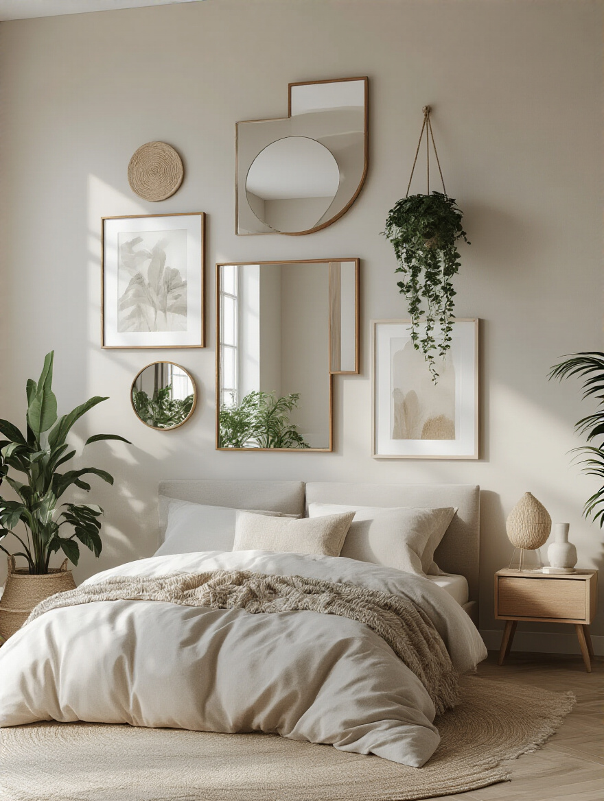
9. Strategically Place Mirrors to Visually Expand Space
Long before electricity, mirrors were a technology for manipulating light. In old homes with fewer and smaller windows, a large mirror was the equivalent of adding another light source. It would catch the sun or candlelight and bounce it around a dark room. When you place a mirror in a historic home today, you’re tapping into that original, functional purpose.
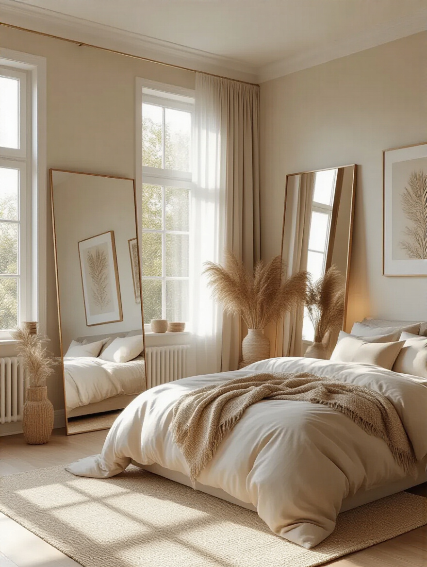
Place a large mirror directly opposite a window to double your natural light and bring the view from outside, in. In a long, narrow room, a mirror on one of the long walls will create an illusion of width. And don’t be afraid of a frame with character. A simple, modern mirror might look out of place in a Victorian home, whereas a gilt or carved wood frame would look spectacular. The frame is just as important as the reflection.
A mirror isn’t just decoration; it’s a tool for sculpting light and space.
10. Add Natural Warmth with Reclaimed Wood Paneling
This is one of my absolute favorite things to do. Bringing reclaimed wood into a room adds an unmatched layer of story and texture. Every knot, nail hole, and saw mark tells a tale. It could be wood from an old barn, a factory floor, or even joists from a dismantled 19th-century building. It has a patina and soul that new wood just can’t replicate.
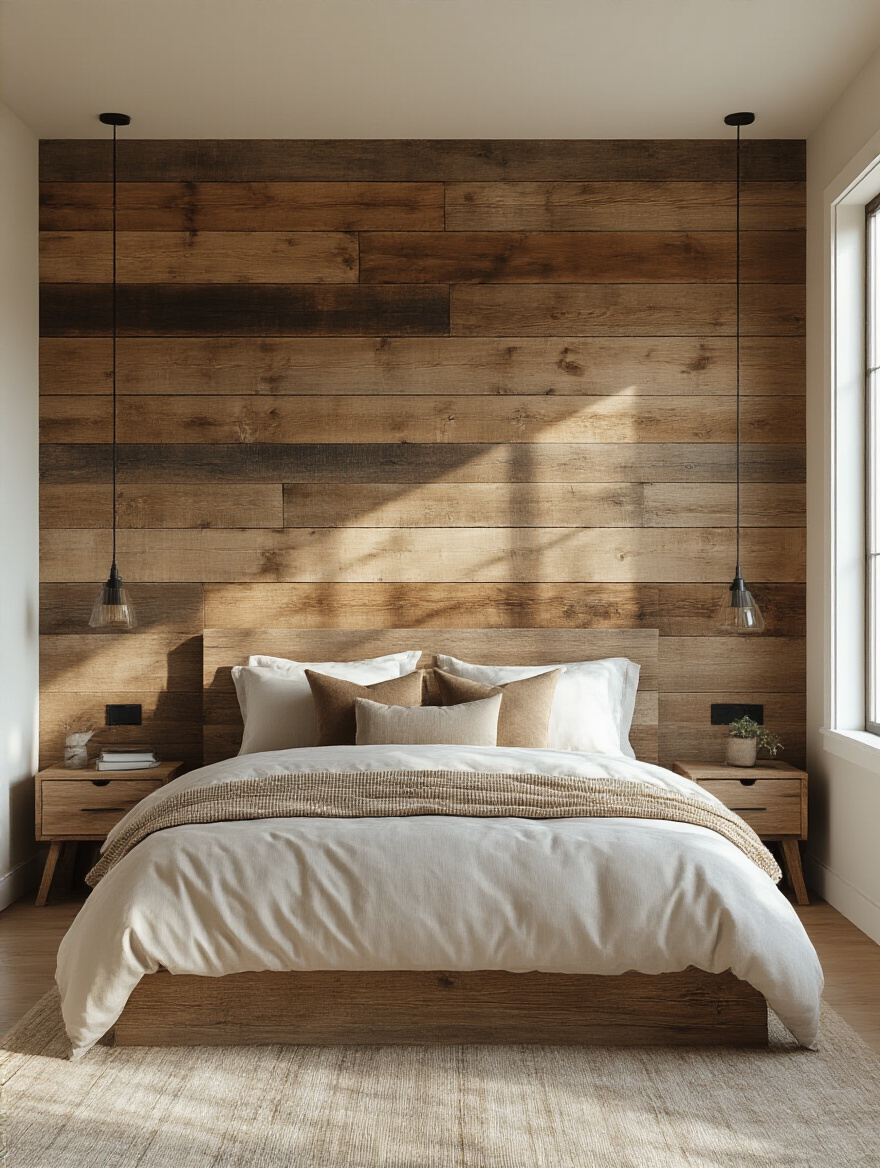
A word of warning: source it from a reputable dealer. The wood needs to be properly de-nailed, kiln-dried to kill any pests, and tested for things like lead paint. I watched a client lose thousands because they bought “cheap” barn wood from a guy on Craigslist, only to have it warp, crack, and infest their home with powderpost beetles. Don’t cut corners here. An accent wall of reclaimed wood behind the bed can be the single most powerful statement in the entire room, adding warmth, history, and incredible character.
Good reclaimed wood brings the story of another building into the heart of your home.
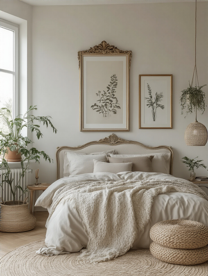
Personalizing with Curated Art & Decor
Your walls are set. They have color, maybe some texture. Now it’s time to hang the things that tell your story. This isn’t about filling space. It’s about curating a personal gallery that reflects who you are, what you love, and where you’ve been.
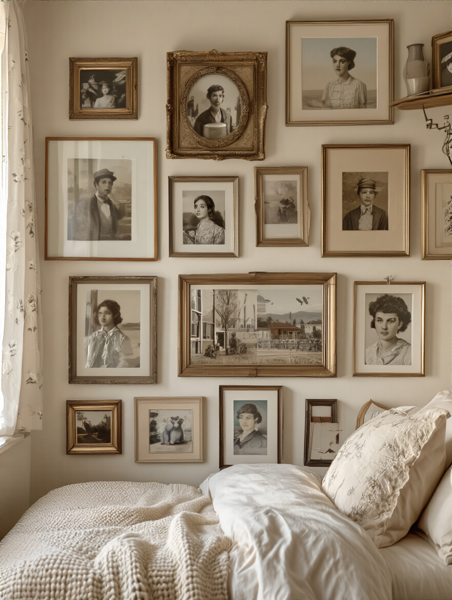
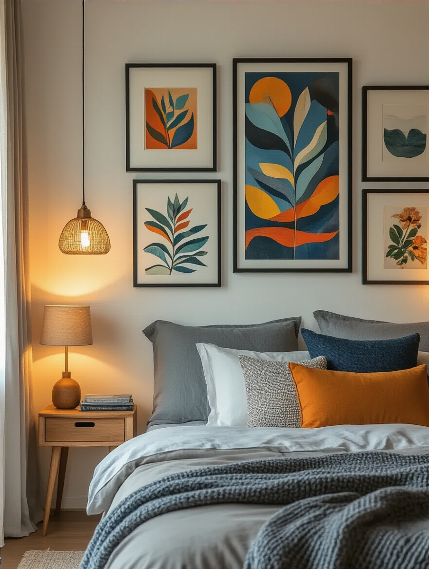
11. Design an Engaging Gallery Wall with Mixed Media
A gallery wall should look collected over time, not bought in a single afternoon. The most interesting ones mix different media: a framed print next to an oil painting, a modern photograph next to a vintage mirror, maybe even a small piece of textile art or a decorative plate. This creates layers of texture and interest that draw you in.
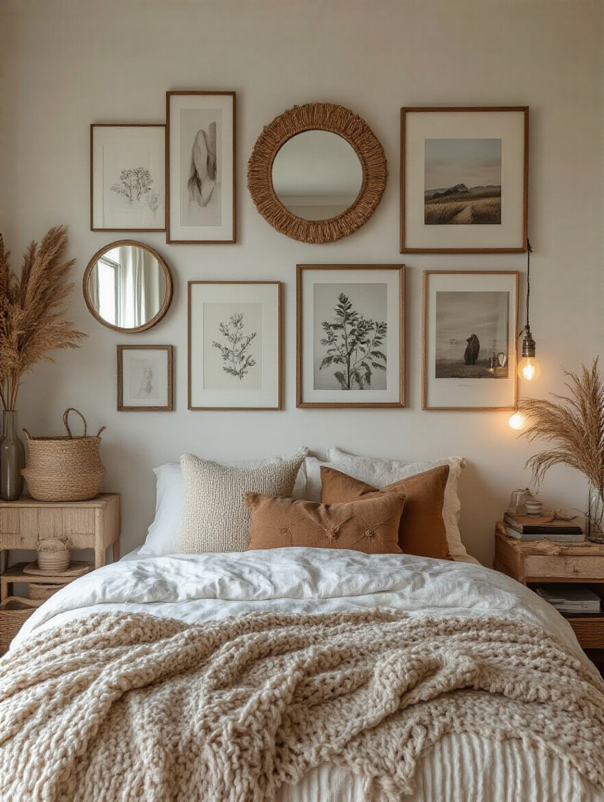
The biggest shortcut to making it work? Lay it all out on the floor first. Arrange and rearrange the pieces until the composition feels balanced. Then, trace each piece onto craft paper, cut it out, and tape the paper templates to the wall. This lets you get the spacing and flow exactly right before you hammer a single nail. Keep the spacing between the frames consistent, and anchor the whole collection with one or two larger pieces.
Your wall is a canvas for your life’s story, so let it be rich and varied.
12. Showcase Cherished Personal Photographs & Mementos
There is nothing more personal than your own photographs. But a random scattering of mismatched frames can quickly look cluttered. The secret to making personal photos look chic and intentional is to unify them. Choose one single color for all the frames—black, white, or a simple metallic—to create a cohesive look, even if the photo sizes vary.
Another great technique is the photo ledge. These are narrow floating shelves that allow you to lean your framed photos against the wall. This gives you incredible flexibility—you can swap photos in and out, layer different sizes, and add small mementos without ever having to drill another hole. It turns your memories into a living, evolving display.
By creating a consistent framework, you let the moments in the photos be the star of the show.
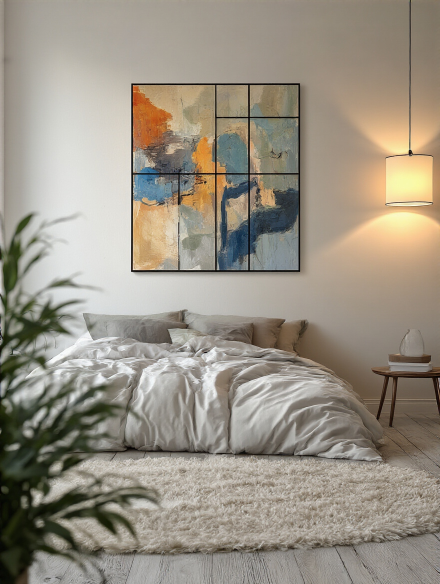
13. Integrate Oversized Artwork for Bold Visual Impact
Sometimes, one big statement is more powerful than twenty small ones. A single piece of oversized art can command a wall, acting as the undisputed focal point of the room. It’s confident, dramatic, and surprisingly, can make a small room feel larger by drawing the eye to one expansive gesture.
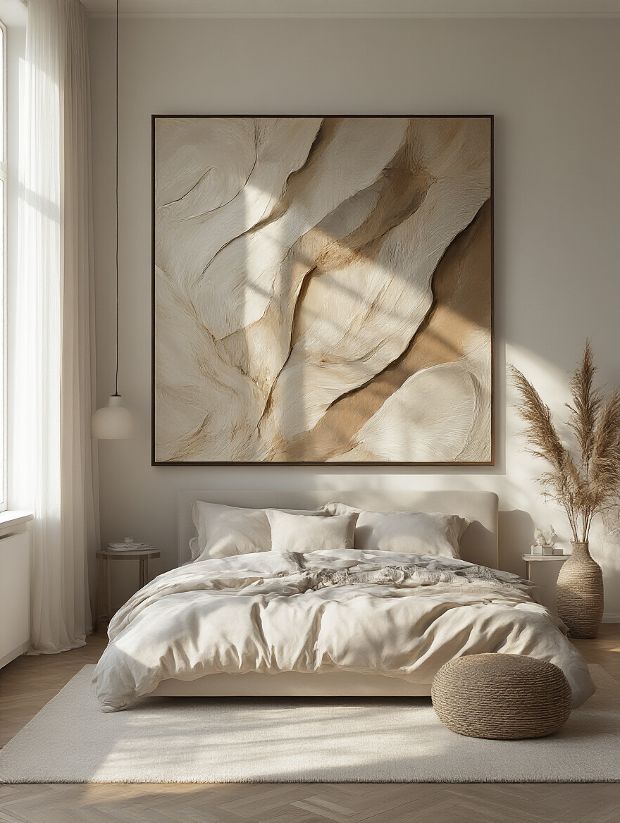
But a word of warning I learned the hard way: measure your hallways, stairwells, and doorways before you fall in love with a massive piece of art. I once had a client buy a stunning 6-foot canvas for their master bedroom, only to discover we couldn’t get it up their narrow 1910 townhouse staircase. We had to hire a crane to bring it in through the window. It was an expensive lesson in logistics.
Oversized art is a commitment, so make sure it’s a piece you truly love and that you can physically get it into the room.
14. Hang Unique Fabric Tapestries for Softness & Pattern
Tapestries are one of the oldest forms of wall decoration for a reason. In medieval castles and drafty manor homes, they were insulation. They warmed up cold stone walls and absorbed sound, making large, echoey chambers feel more intimate. They do the exact same thing today. Hanging a large tapestry behind your bed adds a layer of softness, color, and pattern, and it will noticeably quiet the room.
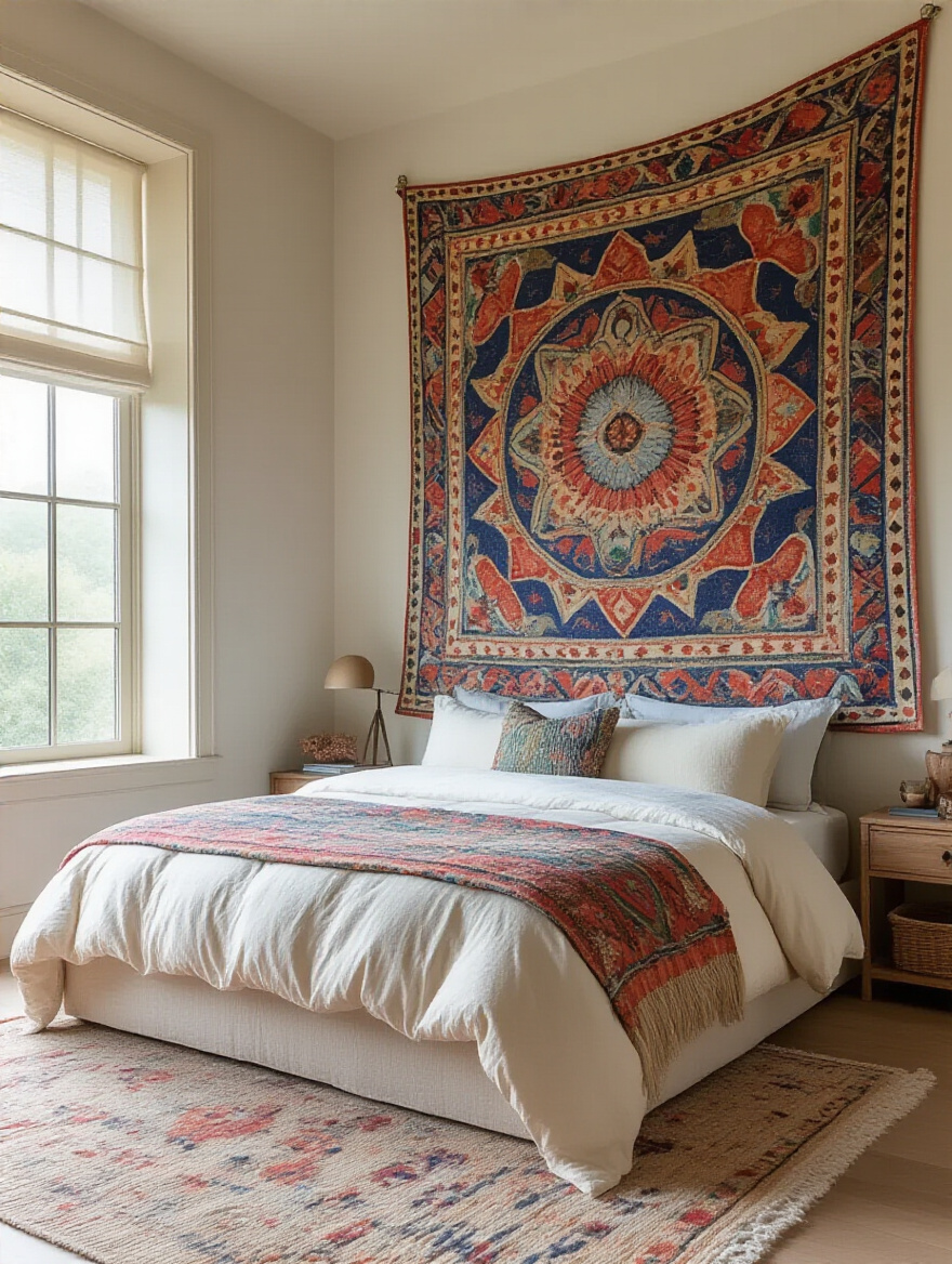
It’s also a fantastic solution for a large, blank wall where a traditional framed piece of art might be too expensive. A beautiful textile can provide the same scale and impact for a fraction of the cost. Plus, there’s no glass to create glare. Just find a simple curtain rod or a piece of wood to hang it from, and you’ve got an instant, impactful, and historically-proven wall treatment.
Tapestries connect you to a centuries-old tradition of making a space both beautiful and comfortable.
15. Utilize Floating Shelves to Display Decorative Objects
Floating shelves are a great modern invention, but they can be tricky on old plaster walls. You absolutely must anchor them into a stud. Plaster and lath can’t hold much weight on its own, and using the wrong anchor will just create a big, crumbly hole. So, again, your stud finder is your best friend here.
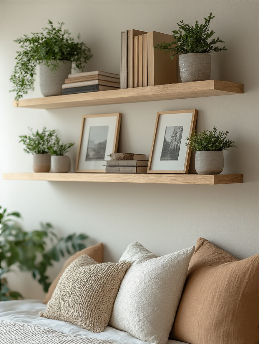
Once installed properly, shelves are a fantastic way to create a ‘moment’ on a wall. Style them with a mix of books, small framed prints, and objects of different heights and textures. A key designer trick is to style in threes or fives. A small stack of books, a plant, and a sculptural object create a balanced little vignette. Leave some breathing room—don’t cram them full. The empty space is just as important as the objects.
Shelves aren’t just for storage; they are platforms for creating curated, three-dimensional art.
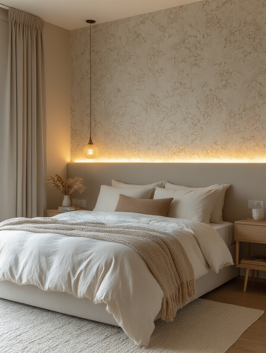
16. Mount Statement Wall Sconces for Ambient Lighting
In a historic home, hardwired sconces feel so much more authentic than a table lamp with a messy cord running down the wall. If you’re doing any renovation work, it’s the perfect time to have an electrician run the wiring. Flanking a bed or a piece of art with a pair of beautiful sconces adds a layer of architectural detail and provides soft, ambient light that makes a room glow.
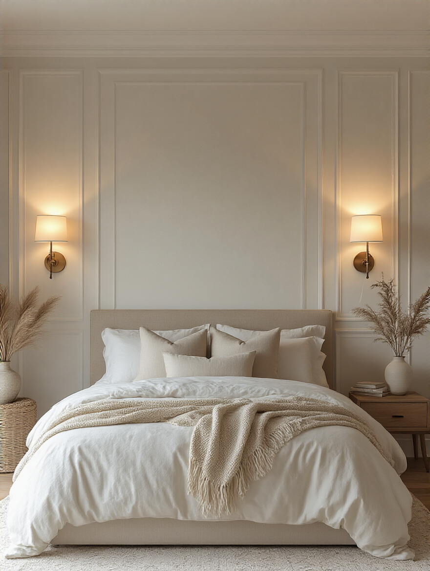
Make sure the style of the sconce complements the era of your home. A sleek, modern sconce might work in a juxtaposition, but a brass or black-iron fixture often feels more at home. And put them on a dimmer switch! This is non-negotiable in a bedroom. It allows you to control the mood, from bright light for reading to a soft glow for winding down.
Sconces are functional jewelry for your walls.
Mastering Strategic Placement & Layouts
You’ve got the art, you’ve got the objects. Now, where do they go? How you arrange things is the final step, and it can make the difference between a room that feels chaotic and one that feels calm and composed. The “rules” are just guidelines, but they’re based on how our brains perceive balance and harmony.
17. Master Eye-Level Hanging for Optimal Viewing Comfort
Museums have a rule: hang art so its center point is 57 inches from the floor. This is the average human eye level, and it works. It ensures the art is part of the room’s living space, not floating somewhere up near the crown molding. It’s the single easiest way to make your decor look professional and considered.
In a bedroom, you can and should adjust this. If you’re hanging something over a tall headboard, the “6-10 inches above” rule takes precedence. And consider your primary viewing angle. Are you mostly looking at this wall while sitting in a reading chair or lying in bed? Sit down, see where your eye naturally falls, and adjust accordingly. The goal is viewing comfort.
Art should be hung for the people living in the room, not for a hypothetical giant standing in the center.
18. Implement the “Rule of Thirds” for Visual Balance
This is a classic trick from art and photography. Instead of plonking your main piece of art right in the dead center of the wall, imagine the wall is divided into a 3×3 grid (like a tic-tac-toe board). Placing your focal point along one of the lines or at one of the four intersections creates a much more dynamic and pleasing composition.
It’s what gives a layout energy and movement. An asymmetrical arrangement balanced using the rule of thirds feels more sophisticated and less static than perfect, dead-center symmetry. It encourages your eye to travel around the wall, discovering different elements. It’s a subtle shift that makes a huge difference in how polished your decor feels.
Perfect balance is often found in imperfection.
19. Group Related Items to Form a Unified Composition
If you have a collection—vintage maps, botanical prints, a series of black-and-white photos—hang them together. A single grouping has far more impact than scattering them across the room. The collection becomes a single, powerful piece of art. The whole is truly greater than the sum of its parts.
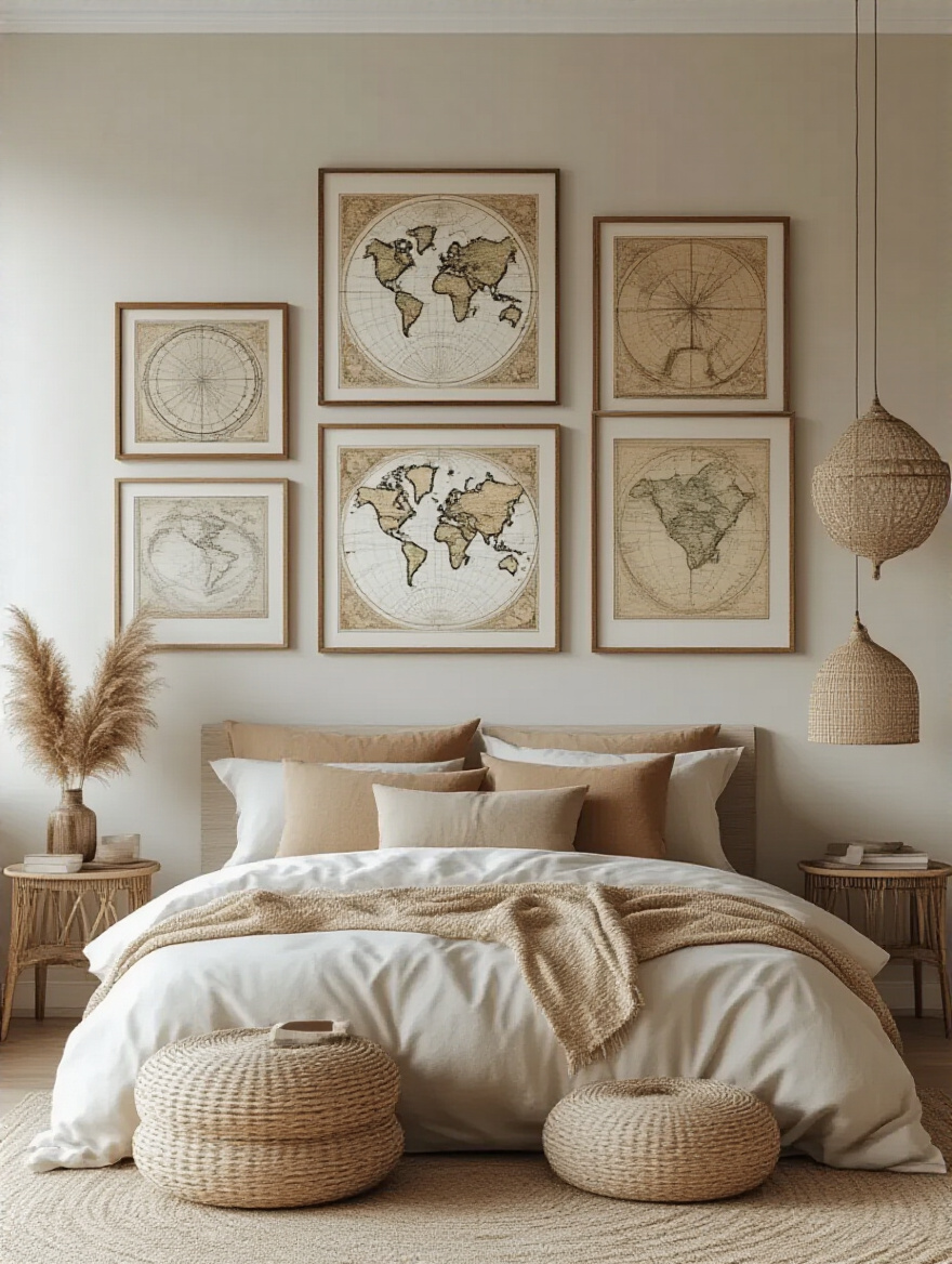
Again, unified framing is your friend here. Using the same style and color of frame will tie the entire collection together, even if the prints themselves are very different. Then, hang them in a tight grid or a more organic cluster, but keep the spacing between the frames consistent. This creates a rhythm and order that’s deeply satisfying to the eye.
Don’t let your collection get lonely; let its pieces talk to each other by grouping them together.
20. Incorporate Negative Space to Highlight Key Pieces
The most common design mistake is filling every inch of wall space. The wall itself—especially an old plaster wall with beautiful trim—is a design element. Negative space, or the empty space around your art, is what gives it power. It allows the eye to rest and tells your brain, “This piece right here is important. Pay attention to it.”
I had a client with an incredible, large-scale painting. They had it on a wall cluttered with small photos and a bookshelf. It was completely lost. We moved it to a large, empty wall and put nothing else on it. Suddenly, it was a museum-quality moment. The entire room felt more sophisticated. Don’t be afraid of empty walls. They are a sign of confidence in the pieces you have chosen to display.
Sometimes the most powerful statement is the space you leave empty.
21. Arrange Asymmetrically for Modern, Dynamic Visual Interest
Asymmetry is your go-to for a more relaxed, modern, and energetic feel. It’s a carefully orchestrated balancing act. A large piece on one side can be balanced by a tight grouping of three smaller pieces on the other. It’s not about equal sides; it’s about equal visual weight.
This works particularly well in homes that are a bit quirky themselves, like a Craftsman or a Mid-Century Modern. The architecture isn’t always rigidly symmetrical, so the decor doesn’t have to be either. An asymmetrical gallery wall that climbs up a staircase or a large mirror on one side of a bed balanced by a tall floor lamp on the other—these are the things that give a room personality and life.
Asymmetry feels collected, personal, and effortlessly cool.
22. Create Symmetrical Arrangements for a Calm, Balanced Look
If your goal is tranquility, order, and a timeless, formal elegance, symmetry is your answer. It is deeply calming to the human brain. We are wired to find harmony in balance. This is why it works so well in a bedroom, a space dedicated to rest and rejuvenation.
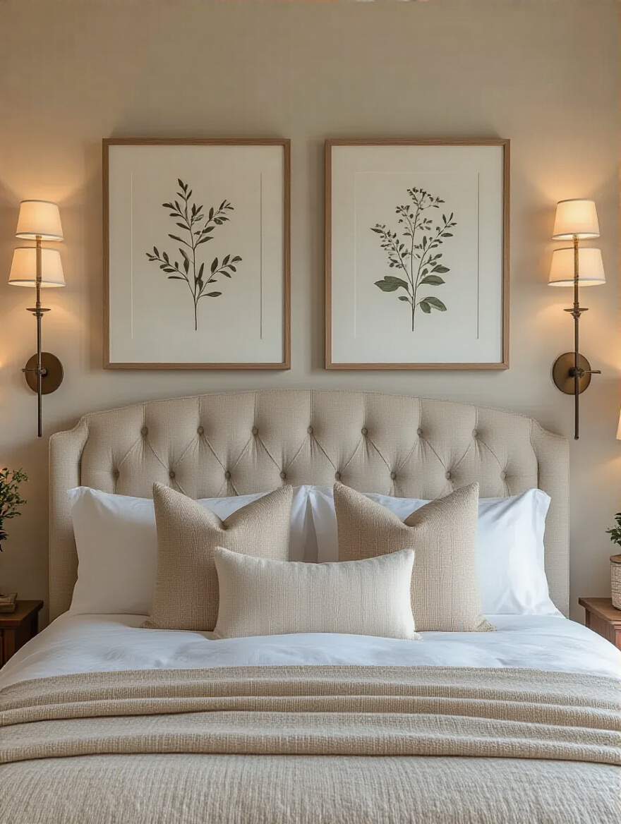
Flanking a bed with matching nightstands, identical lamps, and a pair of perfectly aligned prints above them is a classic for a reason. It creates an undeniable sense of stability and peace. It’s a hallmark of more traditional architectural styles like Georgian, Colonial, or Neoclassical, where the entire building is often based on a symmetrical plan. If you’re in one of those homes, embracing symmetry is working with the grain of the architecture.
Symmetry is the visual equivalent of a deep, calming breath.
Conclusion: Your Walls, Your Sanctuary
So, there you have it. Your bedroom walls are not just drywall and plaster. They are the backdrop to your life, and they have the potential to be a deep source of comfort and inspiration. The journey from a blank slate to a finished room is about making a series of deliberate, thoughtful choices—about honoring the history of your home while boldly telling your own story.
Don’t get paralyzed by the options. Just start. Pick one wall. Pick one idea from this list that speaks to you. Live with it. Let your home tell you what it wants. When you stop trying to force a trend onto it and start a real conversation with the space you inhabit, you’ll create something far more meaningful than a generic “sanctuary.” You’ll create a room that feels, unequivocally, like home.