Historically, the bedroom was not always a private retreat. For centuries, it served as a semi-public stage for dining, reception, and displaying status. Today, for the discerning homeowner, this space must function as a distinct sanctuary from the dense, chaotic world. This urgent need for deep restoration makes color selection a matter of neurobiology, not just style. In this comprehensive guide to blue bedroom ideas, we explore how specific shades actively lower heart rates. Indeed, the eye perceives these hues as environmental signals of safety and stability. This triggers a powerful bio-feedback loop that allows the nervous system to power down. Therefore, the bedroom becomes a performance space for cellular renewal and psychological decompression.
We can also look to ancient traditions for guidance on this protective atmosphere. Cultures from Egypt to the Mediterranean used blue to symbolically ward off misfortune. Similarly, we will explore how to harness this protective power using modern wellness architecture. This guide reveals how muted, complex blues transform a room into a haven for deep rest. Ultimately, we move beyond simple aesthetics to engineer a space for total wellbeing.
Design Philosophy: Why Blue is the Frequency of Rest
To understand blue’s role in the bedroom, we must first address a scientific paradox. High-energy blue light actually suppresses melatonin and signals wakefulness. However, the wellness architecture approach relies on the psychological impact of pigment, not light frequency. Consequently, our bodies react differently to the deep, low-luminance hues found on a painted wall. Physiologically, studies suggest that exposure to cool colors acts as an internal “slow-down” signal. For instance, looking at navy or slate shades can effectively lower blood pressure. Therefore, these hues accelerate physical recovery and relaxation after a stressful day.
Furthermore, this preference is deeply rooted in our evolutionary history. Universally, humans associate blue with clear skies and clean, deep water. Thus, the color serves as a cognitive signal for safety and abundance. Unlike red, which demands immediate attention, blue recedes visually. As a result, it removes visual noise and creates a sense of order essential for sleep. Finally, darker shades like indigo offer a layer of spiritual significance. Historically connected to wisdom, they transform a bedroom into a sanctuary. Ultimately, deep blue anchors the space, allowing the nervous system to fully surrender to rest.
Part I: The Spectrum of Sleep—Selecting Your Physiological Palette
Designing a blue bedroom requires navigating a distinct physiological paradox. Crucially, while blue light signals wakefulness, blue *pigment* induces rest. Scientifically, high-energy blue wavelengths from screens suppress melatonin, the hormone responsible for sleep. Conversely, blue walls offer a visual antidote to this digital stimulation. Therefore, we use pigment to create a sanctuary that effectively counters technology’s alertness signal.
Beyond aesthetics, blue acts as a biological brake for the body. Specifically, soft hues are linked to lowering blood pressure and slowing the heart rate. This deceleration signals the nervous system to shift into a safe “rest and digest” state. Consequently, this physiological downshift leads to tangible results. In fact, surveys indicate that people in blue rooms average nearly eight hours of sleep. Thus, the color transforms your environment into a functional bio-feedback tool.
Selecting the right shade allows you to calibrate this calming effect. For example, light tones like powder blue create an airy, anxiety-reducing atmosphere. These shades feel like a gentle, spacious embrace for the mind. Alternatively, deep navies or indigos function differently. They foster a sophisticated “cocoon effect,” wrapping the sleeper in stabilizing darkness. Ultimately, your choice depends on whether you seek expansive calm or enveloping security. For more holistic bedroom interior design ideas, balancing these approaches is key.
1. Midnight Navy: Creating a Cocoon for Deep REM Cycles
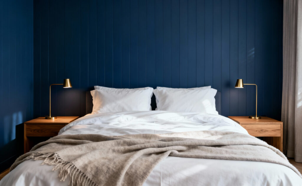
Midnight Navy is more than just a stylish choice among blue bedroom ideas. In fact, it is a scientifically backed tool for deeper rest. Research consistently identifies blue as the ultimate sleep catalyst. Specifically, exposure to these deep hues creates a physiological anchor. It actively helps lower blood pressure. Consequently, this slows both respiration and heart rate. Therefore, the color signals your central nervous system that it is time to unwind.
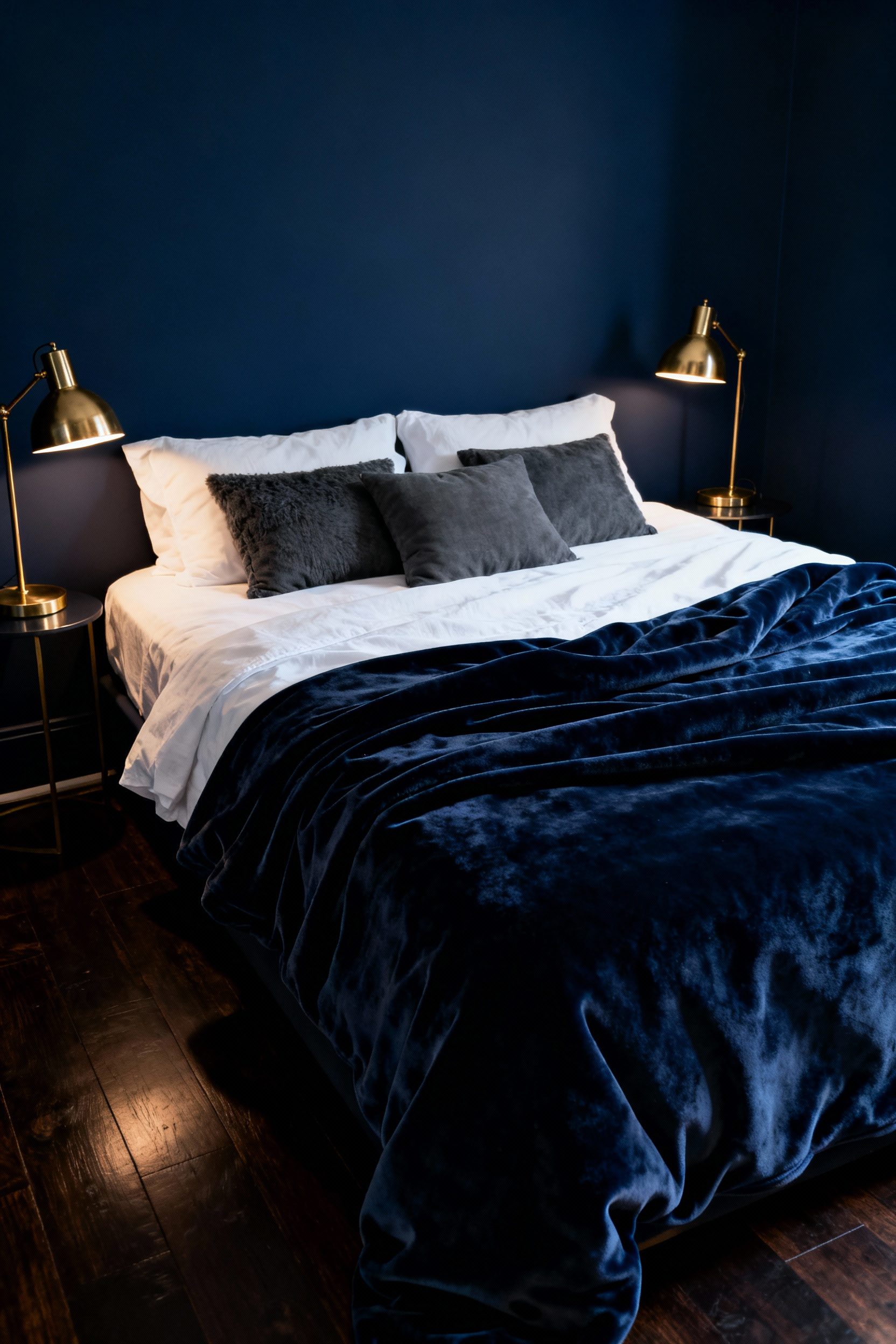
Beyond physiology, this saturation creates a unique psychological effect. Interior designers describe this as a “cocooning calm” akin to twilight skies. Thus, the room encourages a total surrender to stillness. Unlike lighter, coastal shades, Midnight Navy offers a dramatic, sophisticated depth. To enhance this, pair the color with plush, tactile fabrics like velvet. Additionally, use soft, ambient lighting to illuminate the rich tones without disrupting the atmosphere. As a result, the space feels enveloping rather than oppressive.
Finally, this shade serves a critical functional purpose. Dark, matte finishes naturally minimize surface shine. Hence, they absorb distracting ambient light from streetlamps or devices. This darkness is vital because it protects melatonin production. Ultimately, Midnight Navy creates the blackout conditions necessary for deep REM cycles.
2. Powder Blue & Morning Light: Optimizing for Circadian Awakening
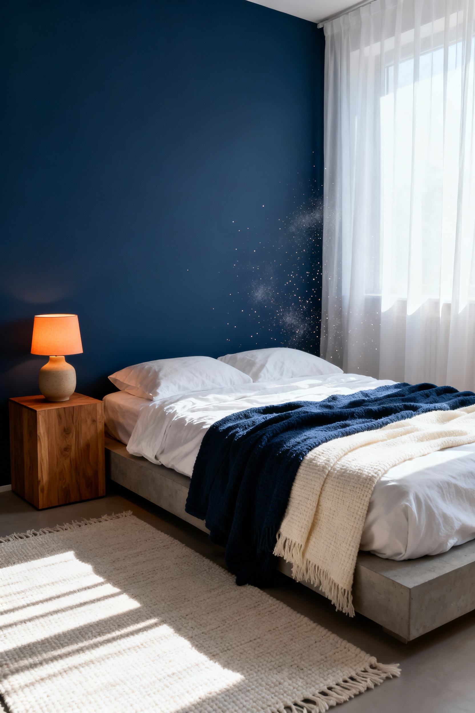
At its core, this combination functions as a passive amplifier for your body’s internal clock. Specifically, circadian rhythms are sensitive to the blue light spectrum, peaking around 480 nanometers. Consequently, exposure to these short wavelengths triggers the release of melanopsin, a pigment signaling alertness. Therefore, a Powder Blue wall acts as a functional reflector. In fact, as natural light floods the room, the pigment maximizes waking signals.
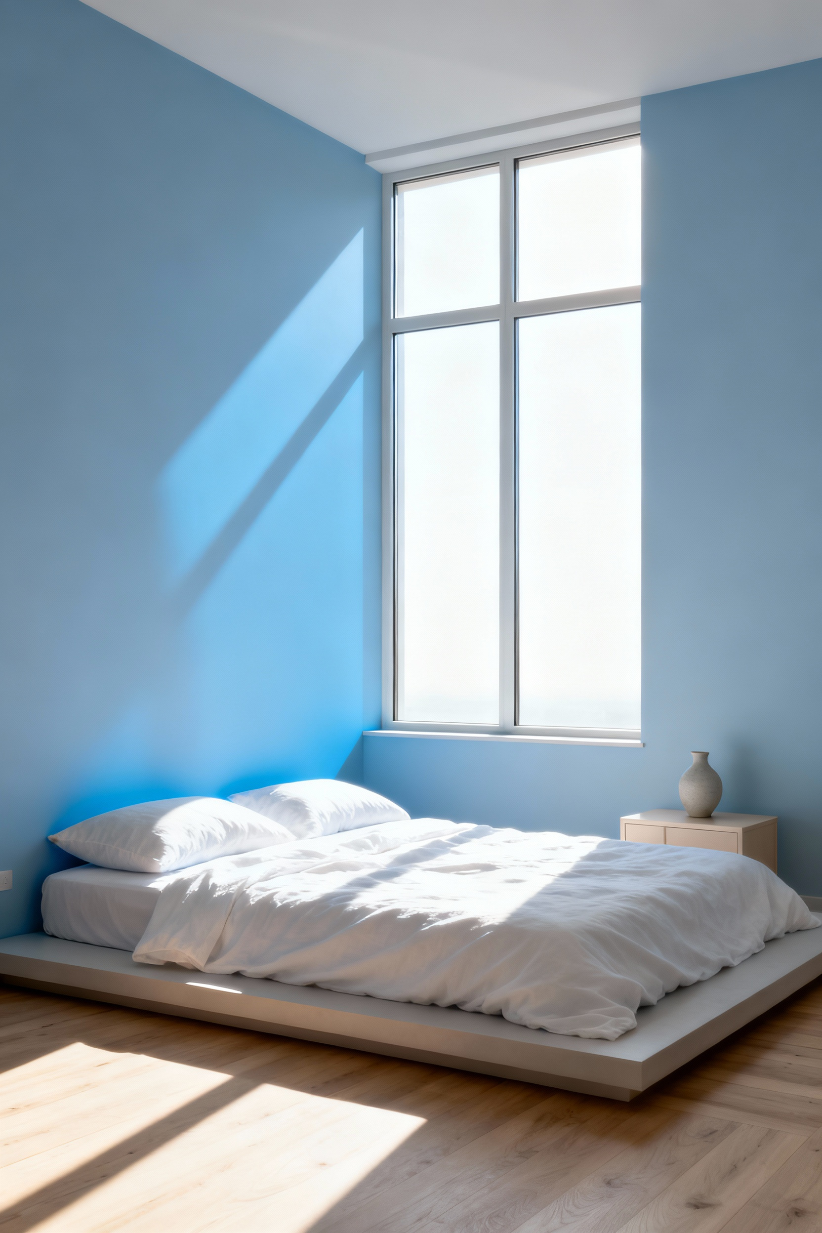
However, a valid question often arises regarding the duality of blue. Psychologically, studies consistently rank soft blue as a sedative color that lowers blood pressure. Fortunately, this contradiction is resolved through timing. At night, when lighting is low, the color provides the relief needed for sleep. Conversely, once illuminated by high-intensity sun, the walls actively support awakening.
Ultimately, this aesthetic choice taps into a deep, cross-cultural association with clarity and renewal. Historically, designers used pigments like cerulean to mimic the heavens, bringing the sky indoors. Today, pairing Powder Blue with natural light recreates that sensory experience of dawn. Thus, the room becomes a space of freshness, aligning your biology with the new day.
3. Slate and Grey-Blue: The Grounding Neutrals for Anxiety Reduction
Unlike airy pastels, slate and grey-blue tones function as “grounding neutrals.” Specifically, the inclusion of grey pigment adds essential visual weight. Therefore, these moody hues anchor the space effectively. Instead of stimulating the senses, they provide deep, rooted stability. In fact, designers often describe a room dipped in these tones as a “gentle hug.” Consequently, this atmosphere counters the unmoored feeling associated with anxiety.
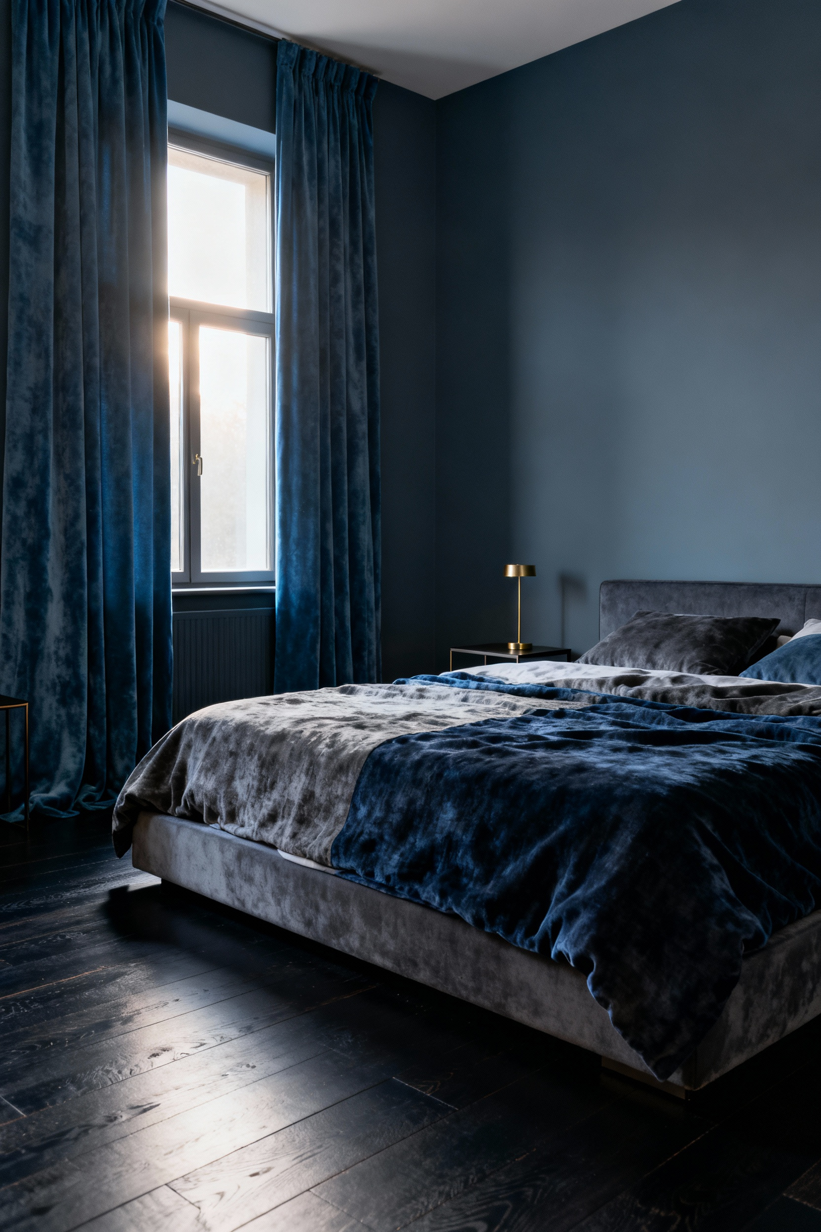
Physiologically, this palette does more than just look calm. For instance, studies indicate that blue environments can lower heart rates. Furthermore, these shades regulate circadian rhythms by signaling the body to unwind. This response stems from a subconscious connection to nature. Notably, slate evokes the tranquility of a rainy sky or mineral-rich rock. Thus, the mind associates the color with earth’s resilience.
Interestingly, this depth has historical significance. Originally, grinding lapis lazuli too finely resulted in this specific “dull grey.” As a result, the modern color retains a connection to geological origins. To enhance this earthy quality, pair these blues with warm textures. Specifically, natural wood and soft linens prevent the space from feeling cold. Ultimately, this combination creates a refined sanctuary that promotes emotional balance.
4. Oceanic Teal: Biophilic Connections for Lower Cortisol Levels
Oceanic Teal offers more than just aesthetic appeal. Specifically, this saturated blue-green hue directly impacts physical health. Its primary power lies in its cool-spectrum wavelengths. Scientifically, these shorter wavelengths require significantly less adjustment by the retina. Consequently, this reduces the brain’s visual processing load. Therefore, the nervous system can settle into a calmer state immediately. This reaction effectively taps into the “Blue Mind” theory. Because humans possess an affinity for water, teal invokes evolutionary safety.
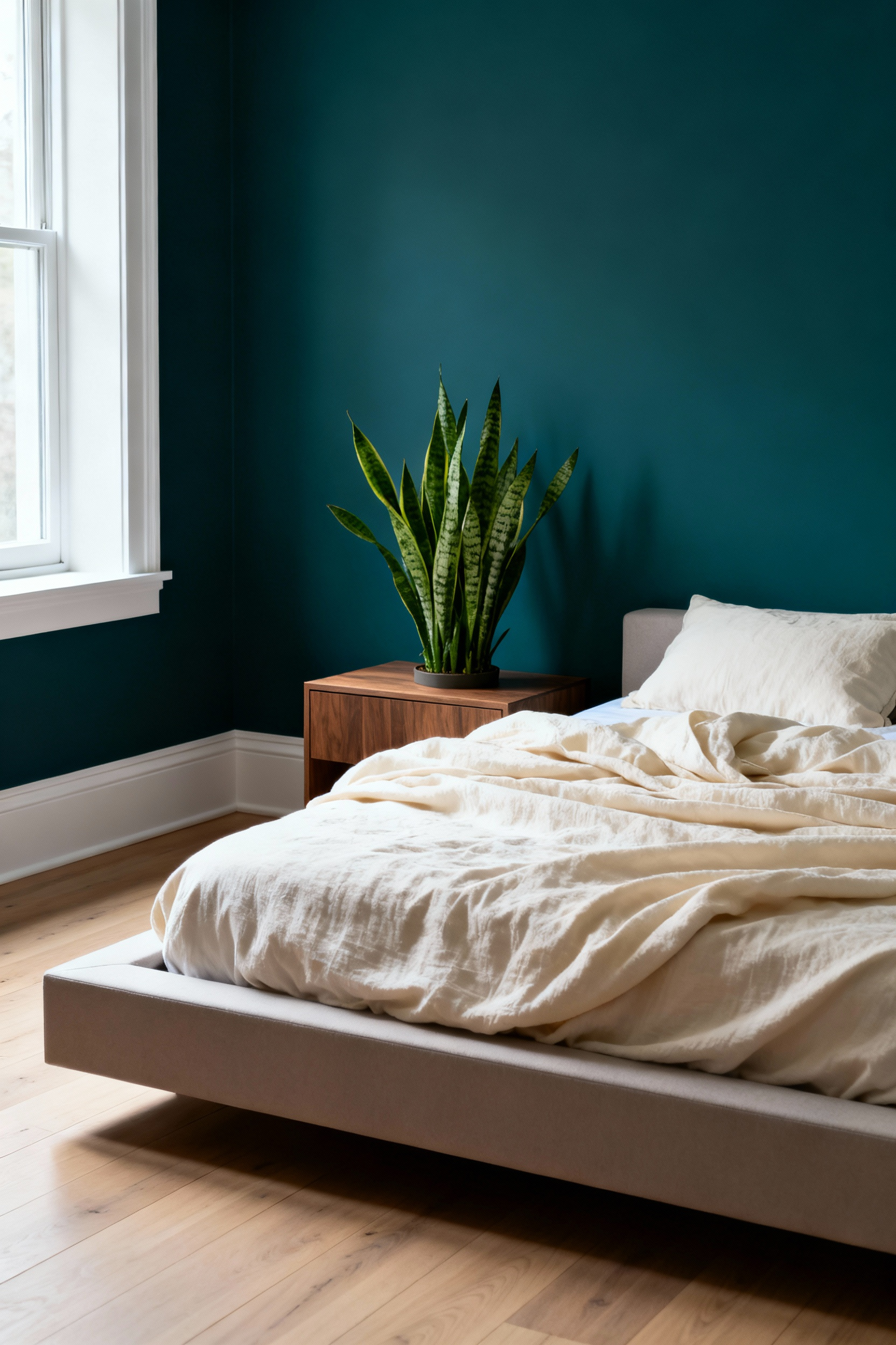
Ideally, a bedroom should function as a low-cortisol sanctuary. Research confirms that exposure to oceanic hues can diminish stress hormones. Furthermore, these calming shades help slow the heart rate. In fact, they can even measurably reduce blood pressure. Unlike the “Red Mind” state of high anxiety, teal fosters physiological tranquility.
To maximize this restorative effect, apply biophilic design principles. Treat the color as an “Indirect Experience of Nature.” Oceanic Teal possesses a Light Reflectance Value of around 50%. This creates a feeling of refuge without feeling claustrophobic. However, paint alone is not enough. You should pair this backdrop with tactile, organic textures. For example, introduce raw wood furniture or unbleached linen bedding. This mimics the organized complexity found in nature. Ultimately, this approach transforms a standard space into a therapeutic retreat.
Part II: Tactile Serenity—Materiality and Toxin-Free Comfort
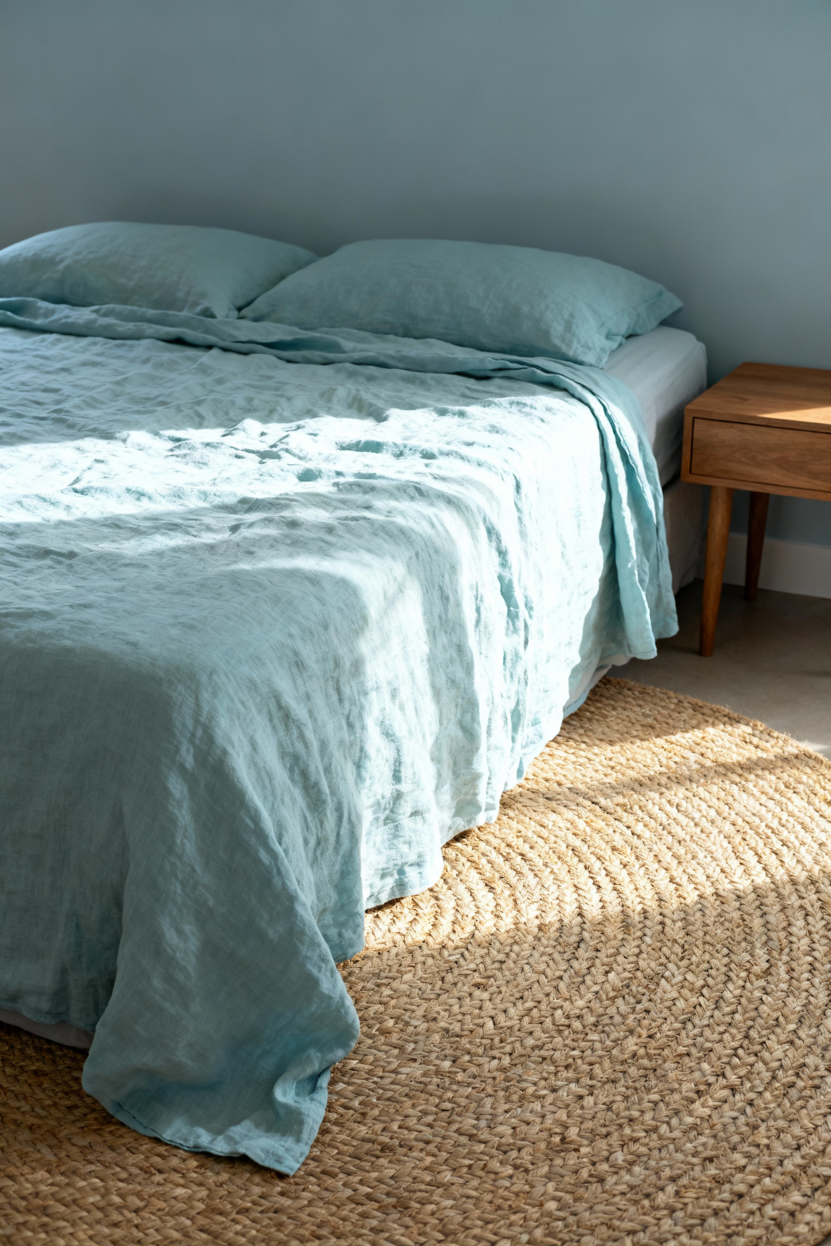
While a blue bedroom offers visual calm, it can inadvertently feel physically cold. Therefore, design must bridge the gap between optical cool and haptic warmth. Specifically, we apply a principle called haptic counterbalance. Ideally, you should pair cool, airy blues with rough, warm textures. For instance, layer organic flax linen against a coarse jute rug. This mimics nature, recalling the contrast of sea against sand. Furthermore, consider the walls themselves. A chalky limewash finish adds a grounding texture that flat paint lacks.
However, true comfort extends beyond touch to what we breathe. Unfortunately, that distinct “new room smell” often signals an off-gassing cocktail of chemicals. In fact, common paints and engineered woods release toxins like formaldehyde. Consequently, these invisible threats can disrupt health and sleep. Thus, a wellness-focused design demands zero-VOC paints and solid wood furniture. Additionally, prioritize organic mattresses free from pesticides and flame retardants.
Finally, we can look to history for safe, authentic pigmentation. Before synthetic chemistry, blue textiles relied on plant-based dyes like Indigo. Notably, natural indigo sits on the fiber’s surface rather than penetrating it. As a result, it creates a unique, living finish that fades beautifully. Ultimately, selecting plant-dyed textiles ensures your sanctuary remains aesthetically rich and chemically pure.
5. Organic Indigo Linens: Breathability Meets Non-Toxic Dye
True wellness design requires looking beyond just the color on the walls. Specifically, mass-produced blue textiles often rely on harsh chemicals like formaldehyde. In contrast, organic indigo dye is derived from the *Indigofera* plant. Consequently, this creates a “living dye” that eliminates toxic off-gassing. Furthermore, historical evidence suggests natural indigo possesses antibacterial properties. In fact, some brands even register their indigo linens as medical devices for sensitive skin.
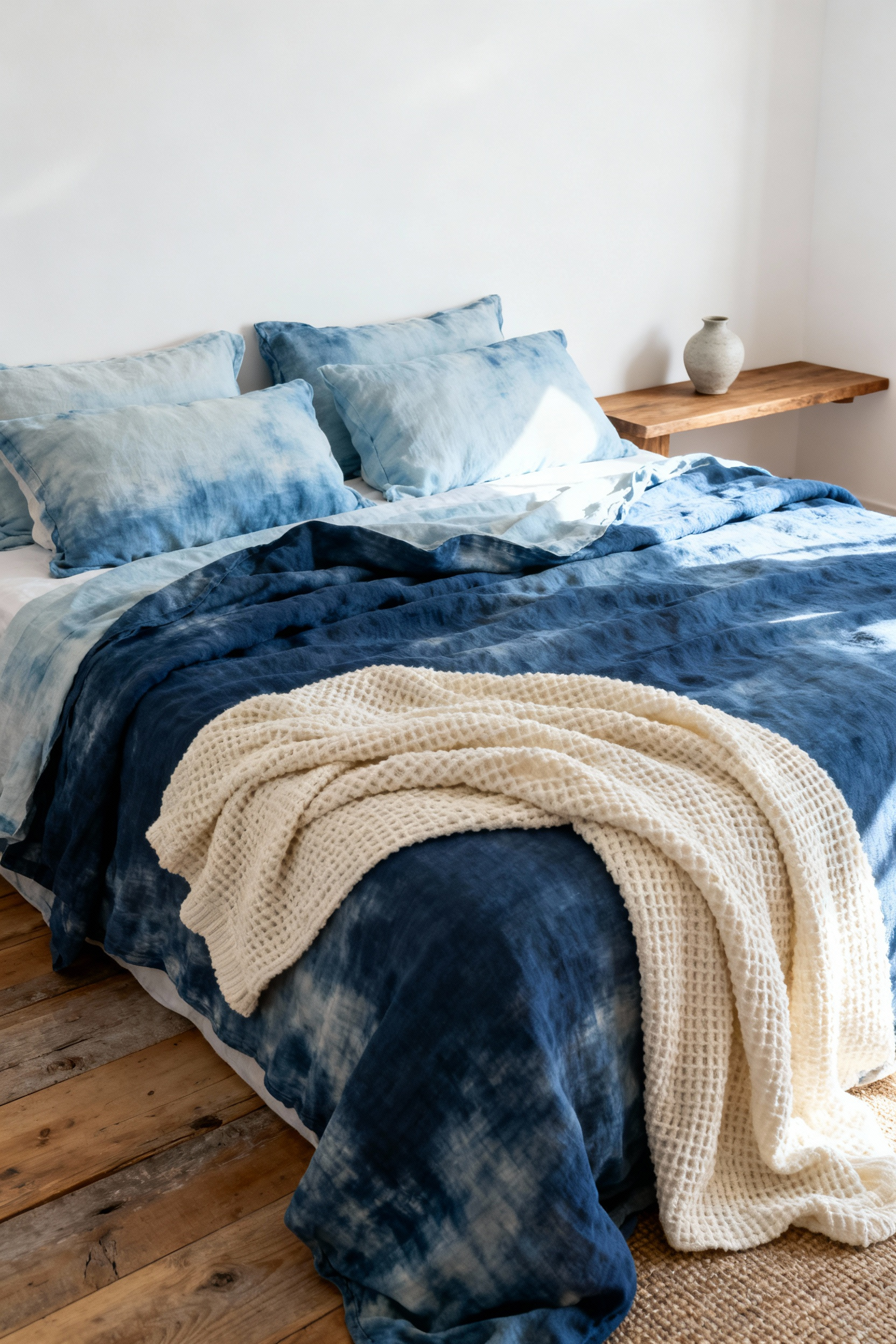
Beyond health benefits, the combination of linen and indigo offers superior sleep performance. For instance, organic linen is celebrated for its natural thermoregulation. Therefore, it keeps your body cool and dry throughout the night. Aesthetically, natural indigo offers a unique advantage over synthetic alternatives. Unlike uniform chemical dyes, natural indigo develops a beautiful patina over time. Thus, the fabric mellows into varied shades, embracing the philosophy of *wabi-sabi*. Ultimately, choosing organic indigo connects your bedroom to the legacy of “Blue Gold.”
6. Sound-Dampening Velvet Headboards in Royal Blue
A royal blue velvet headboard offers significantly more than just visual drama. Fundamentally, it serves as a sophisticated acoustic tool for your sanctuary. Specifically, the dense pile of velvet acts as a passive sound absorber. Consequently, the fabric traps sound waves that would otherwise bounce off walls. This reduction creates a quieter atmosphere essential for uninterrupted sleep. Furthermore, the thick upholstery provides a functional thermal barrier. Thus, you remain protected from cold walls, maintaining a consistent body temperature.
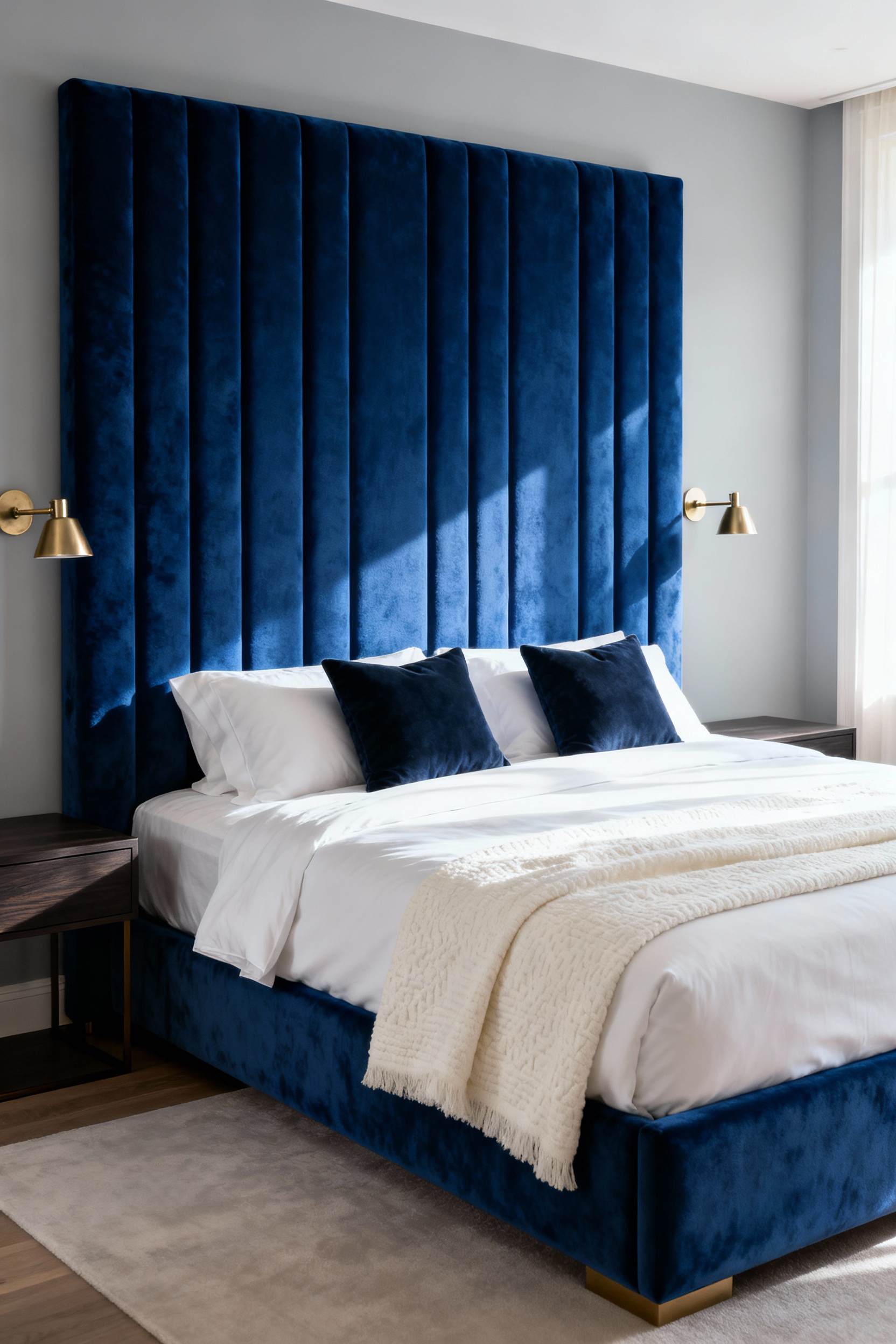
Beyond utility, the material introduces a unique sensory depth. Unlike flat paint, royal blue velvet shifts dynamically depending on light. For instance, the fabric appears inky navy in low light but glows sapphire when illuminated. Therefore, the headboard becomes a living, sculptural focal point.
Psychologically, this specific shade anchors the room with stability. Historically, royal blue is associated with nobility, wisdom, and timeless elegance. As a result, framing your bed with this color creates a feeling of security. Ultimately, this combination of acoustic silence, tactile softness, and rich color fosters a restorative environment.
7. Layered Wool Rugs: Anchoring the Space with Soft Texture
Blue suggests tranquility, yet a monochromatic palette can sometimes feel visually cold. Therefore, introducing layered wool rugs serves as a vital counterpoint. Specifically, wool provides thermal warmth that transforms a room into a psychological cocoon. Consequently, this interplay helps anchor the space, offering visual stability and tactile comfort.
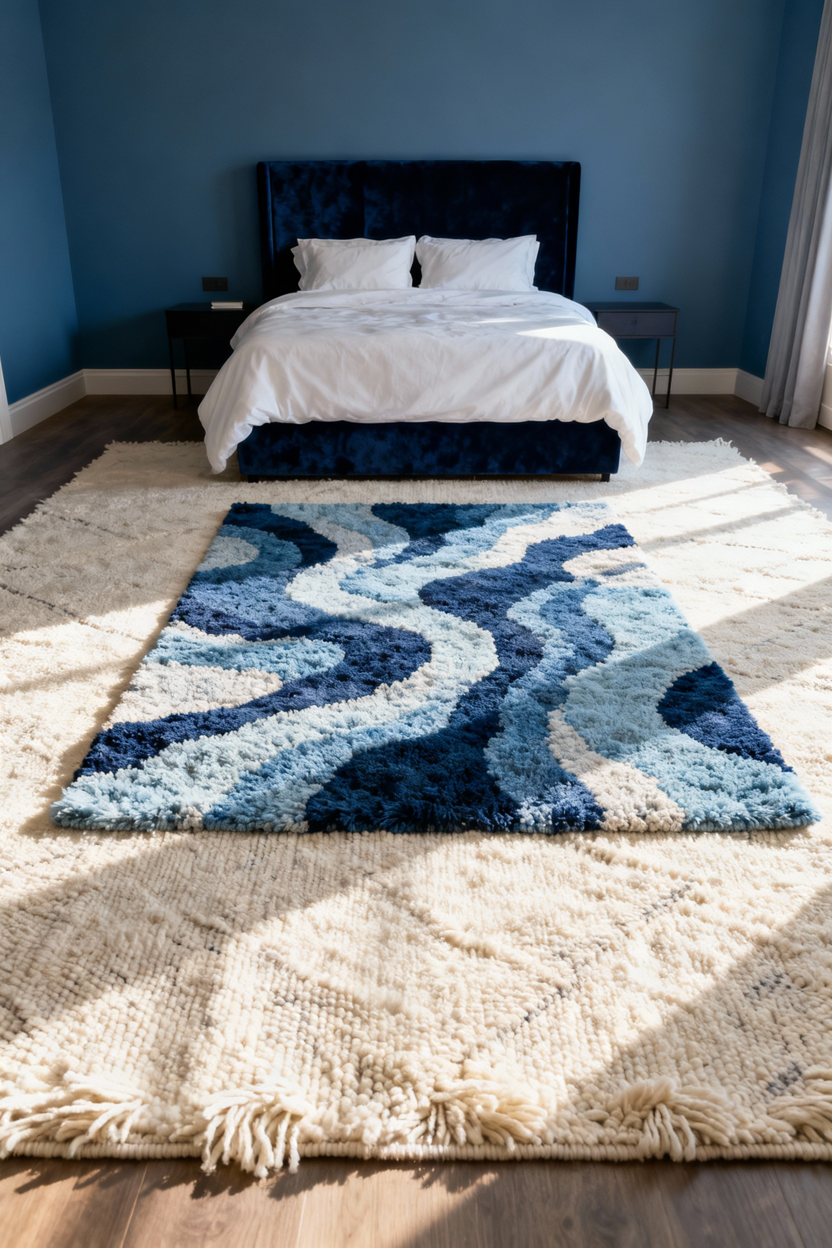
To create true architectural depth, you should utilize a dual-layer strategy. First, lay a foundational anchor using a durable, neutral fiber like jute. This layer offers necessary texture and breathability. Next, place a smaller, high-pile wool rug on top. Indeed, the contrast between the rough base and plush top creates a sophisticated effect.
Furthermore, prioritizing the weave is crucial for sensory wellness. High-pile wool ensures superior underfoot cushioning. Additionally, this density creates acoustic dampening, effectively quieting the room. Unlike synthetics, wool is naturally resilient and creates a healthier indoor environment. Ultimately, these layered textures turn the floor into a soft foundation for your blue sanctuary.
8. Raw Silk Drapery: Filtering Light Through Cooling Hues
Specifically, raw silk—often known as Dupioni—introduces a unique textural element. These fabrics feature irregular threads called “slubs” that create a rustic surface. Consequently, this texture dramatically changes how sunlight enters the room. Instead of a flat glare, the light catches on the fabric’s imperfections.
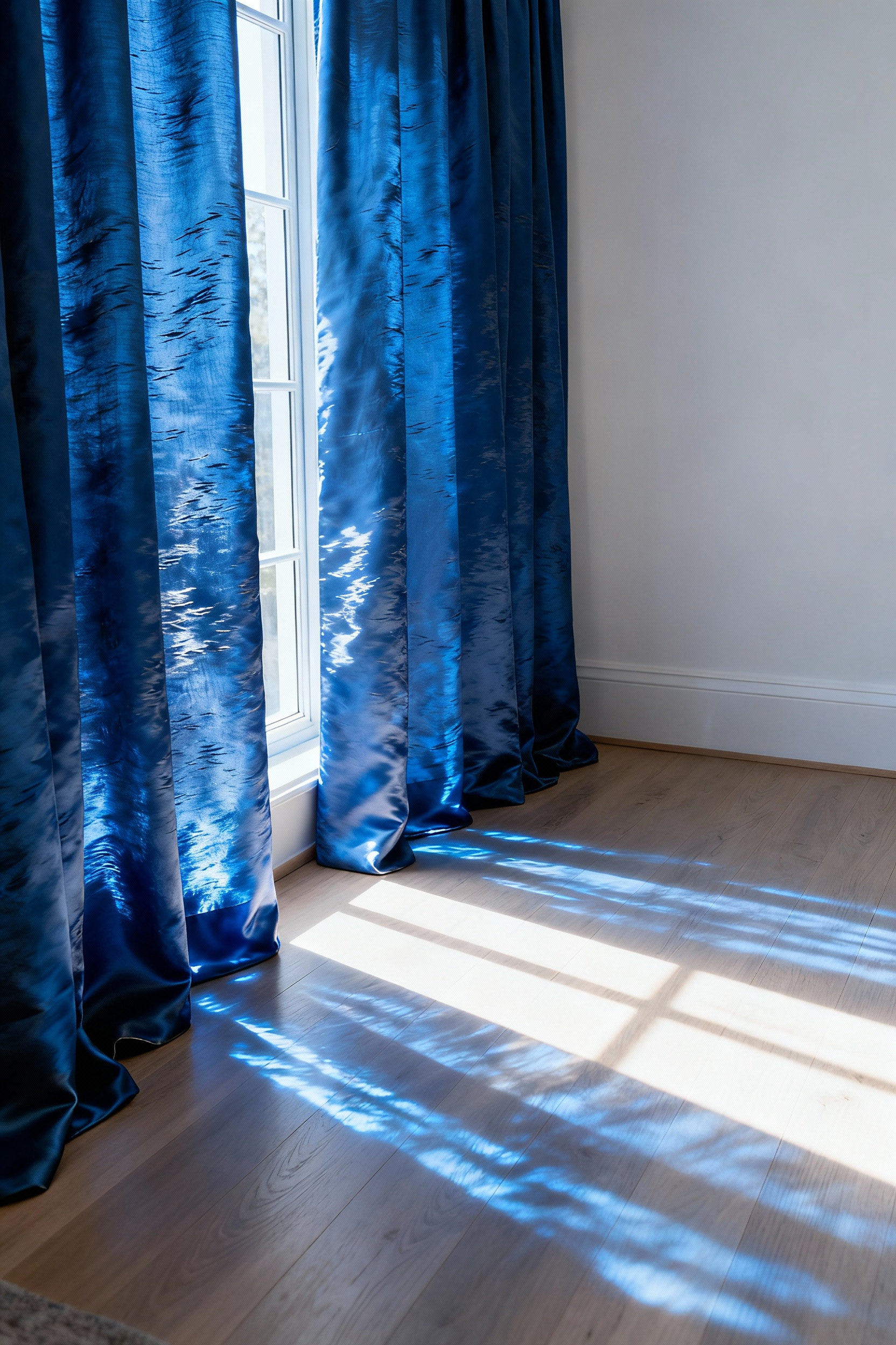
As a result, the window treatment creates a shimmering effect. When sunlight filters through a blue-dyed panel, it produces a soft, tinted glow. Ideally, this dynamic play of light mimics the movement of water. Furthermore, silk naturally regulates temperature. Therefore, it physically complements the psychological cooling effect of blue tones.
Structurally, raw silk offers a crisp, full-bodied drape. It holds elegant folds that look tailored rather than stiff. However, natural silk fibers are vulnerable to UV damage. Direct sun can quickly fade rich navy hues. Thus, incorporating a privacy or blackout lining is mandatory. This protective layer ensures the color remains true while allowing for that signature shimmer.
Part III: Spatial Harmony—Feng Shui and Flow
In Feng Shui, blue represents the Water element. Consequently, it carries Yin energy, which is soft, passive, and essential for healing. Therefore, blue naturally aligns with the biological need for deep sleep. However, the specific shade dictates the quality of energy flow. Specifically, pale blues evoke the peaceful expansion of a clear sky. In contrast, deep navy offers grounding but can feel heavy. Indeed, excess dark blue may lead to gloom rather than rest.
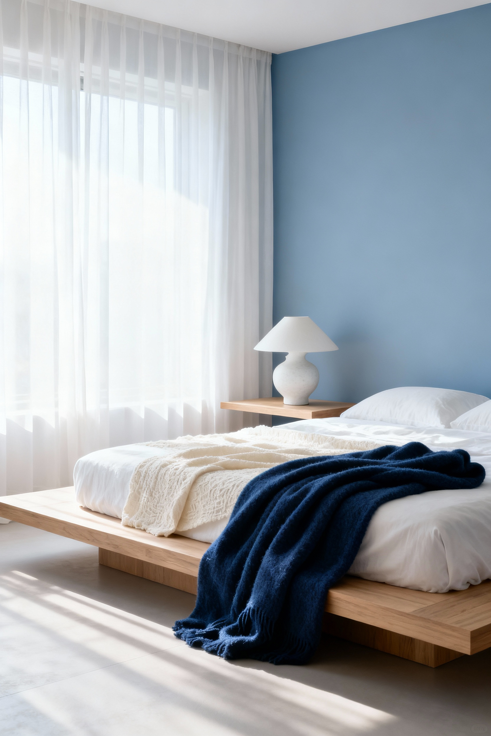
Beyond color, spatial harmony relies heavily on furniture placement. Most importantly, the bed must occupy the “commanding position.” This entails placing the headboard against a solid wall facing the entry. Simultaneously, ensure the sleeper is not directly in line with the door. This layout reduces subconscious anxiety and promotes safety. Furthermore, incorporate symmetry to support balanced relationships. For instance, matching nightstands allow energy to circulate freely. For further bedroom furniture inspirations that adhere to flow principles, prioritize natural materials.
Finally, balance blue’s Water energy with supportive materials. Wood elements, like oak frames, nurture Water and add vital warmth. Alternatively, white accents introduce the Metal element to polish the energy. Conversely, avoid actual water features like fountains, as they are too active. Ultimately, the goal is a gentle flow that supports total wellness.
9. The Commanding Position: Anchoring the Bed with a Blue Accent Wall
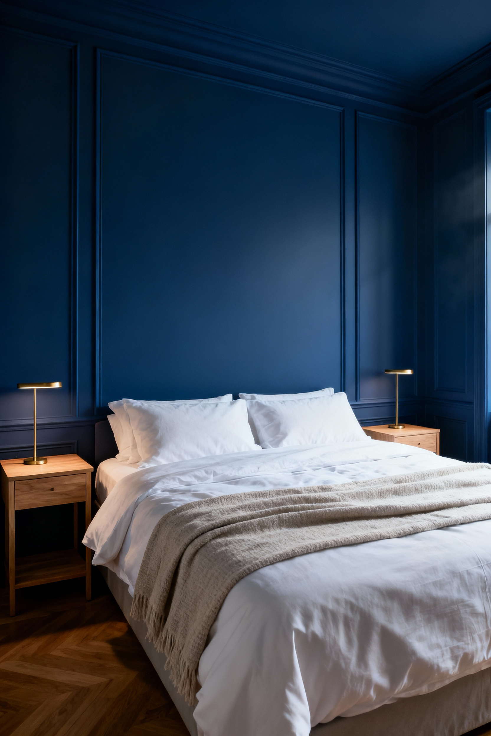
In wellness architecture, bed placement significantly impacts your nervous system. Specifically, the “Commanding Position” dictates anchoring the bed against a solid, windowless wall. This placement allows a view of the door without direct alignment. Consequently, your brain perceives the environment as safe, enabling deeper sleep. To enhance this, designers often utilize a blue accent wall behind the headboard.
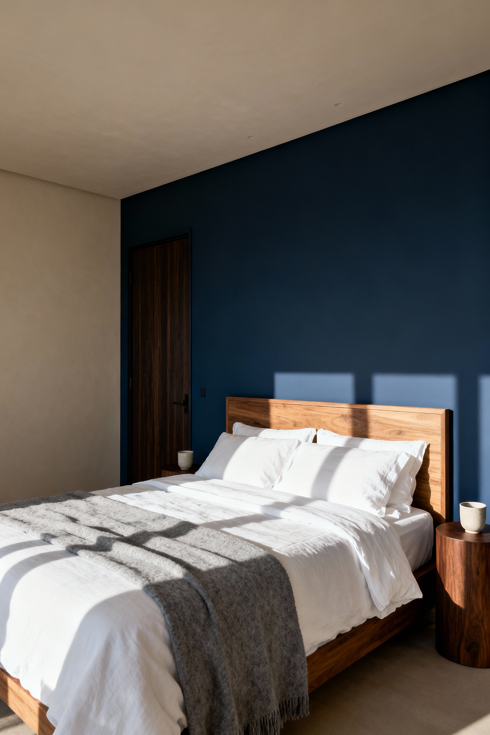
Physiologically, blue is the ultimate color for sleep because it helps lower blood pressure. Therefore, applying this hue creates a focal point that signals relaxation. Ideally, choose deep shades like navy or indigo to provide visual weight. These darker tones evoke stability, authority, and confidence. Thus, the accent wall effectively “holds” the room, preventing the space from feeling unmoored.
Furthermore, this strategy creates a sophisticated frame for your sanctuary. For instance, pair a dark blue wall with light bedding to create dynamic contrast. This balance prevents the blue from feeling oppressive. Additionally, consider utilizing textured wallpapers on this surface. Such materials add depth while subtly improving room acoustics. Ultimately, combining a solid position with a blue anchor creates a commanding retreat.
10. Visual Silence: Monochromatic Styling to Reduce Cognitive Load
Your brain constantly processes every piece of visual input. Consequently, high-contrast designs can unknowingly contribute to sensory fatigue. Distinct color boundaries act like “mini stop signs” for your eyes. Therefore, your brain must work harder to interpret the scene. In contrast, “Visual Silence” employs a monochromatic strategy to minimize distinct borders. By using tonal layering, the eye glides smoothly across the room. As a result, this continuity reduces cognitive load and fosters clarity.
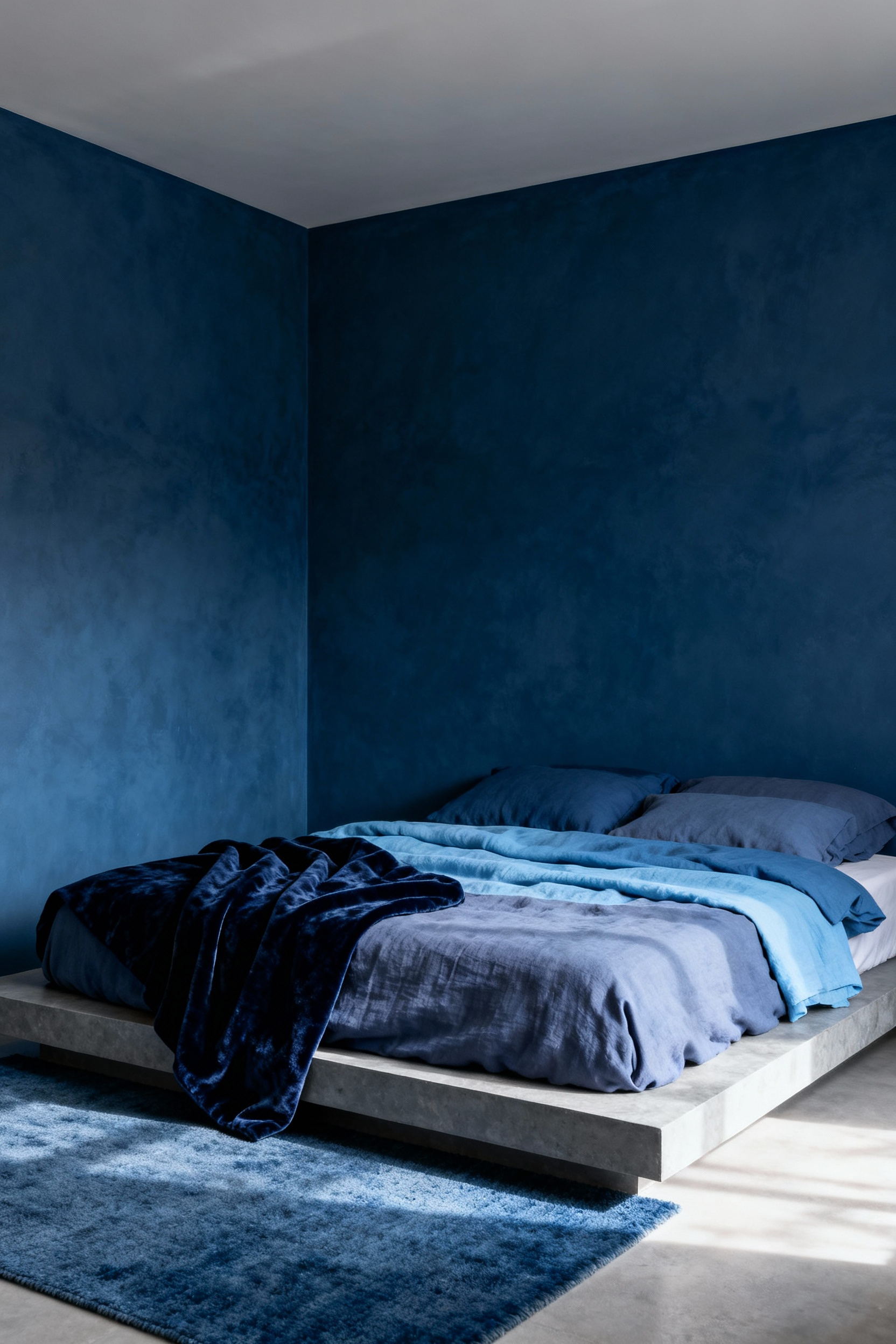
Blue is uniquely suited for this low-contrast approach. Scientifically, exposure to blue can effectively reduce heart rate. Furthermore, studies show it often decreases blood pressure. Thus, it aligns perfectly with the goal of deep rest. Specifically, soft blues foster openness, while indigos convey security. For additional modern bedroom decor ideas, explore minimalist palettes. Regardless of shade, the physiological result is a calmer nervous system.
However, a single-color palette risks feeling flat if executed poorly. Therefore, texture must become the primary source of interest. Instead of color contrast, rely on tactile variation. For instance, pair a matte wool rug with a glossy vase. Similarly, layer plush velvet against smooth linen. Crucially, opt for matte paint finishes. These absorb light rather than reflecting it. Ultimately, this approach creates an enveloping sanctuary that allows the mind to unwind.
11. The Element of Water: Integrating Fluid Shapes and Patterns
Designing with the Water element requires nuance. Fundamentally, the palette already establishes this elemental connection. However, traditional Feng Shui often cautions against literal water features here. Real water might be “too cooling” or dampen energy. Instead, wellness architecture suggests focusing on fluid shapes.
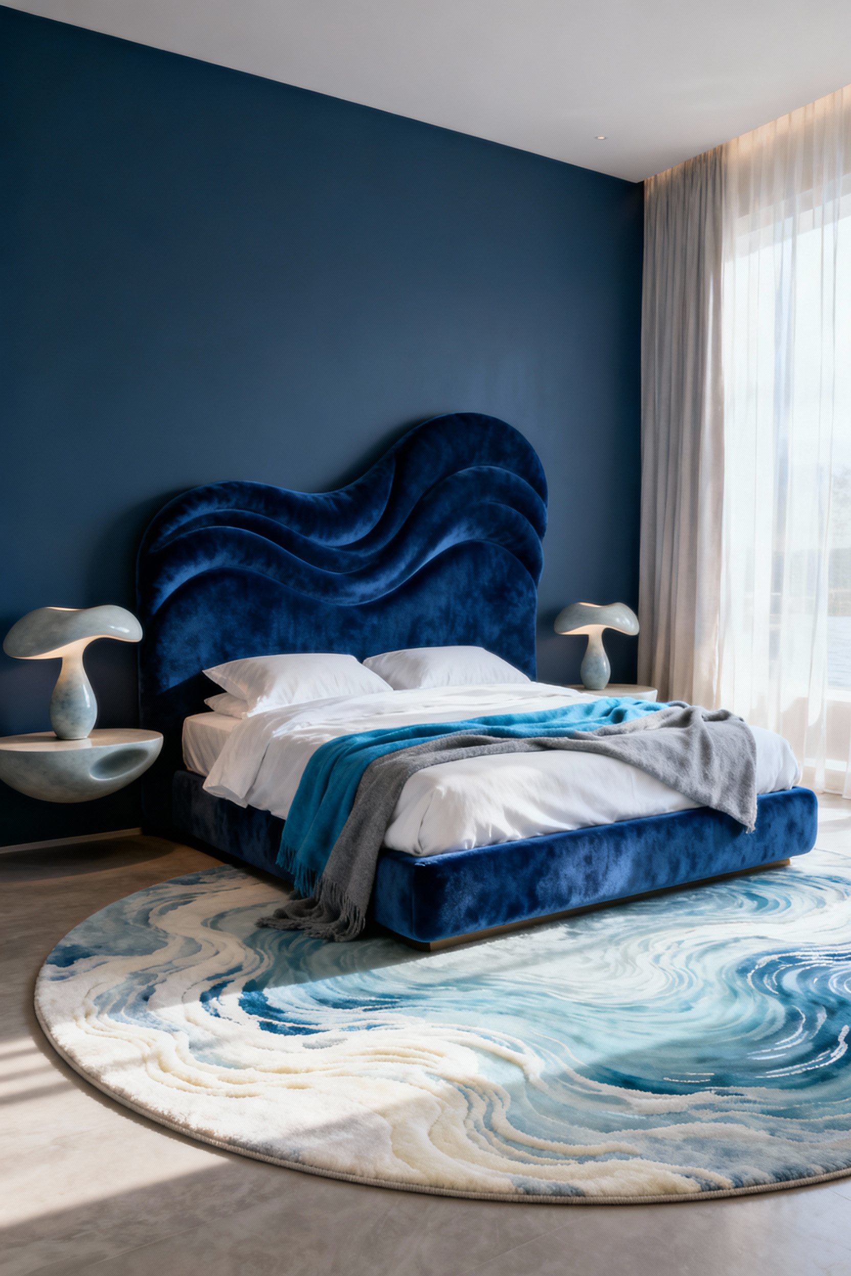
Psychologically, the brain prefers these softer lines. In fact, studies show that rounded forms reduce physiological stress compared to sharp angles. Therefore, incorporating soft curves creates a safer atmosphere. You can introduce this fluidity through textile patterns. For example, Shibori naturally mimics organic movement. Similarly, marbling patterns on wallpaper offer a sense of “liquid luxury.” These designs capture motion without relying on literal ocean imagery. For more advice on integrating bedroom art aesthetic ideas, focus on fluid lines.
Beyond patterns, the furniture itself should guide the eye. Specifically, choose curved headboards to break up rigid lines. Furthermore, you can achieve a water-like aesthetic through tonal layering. Mixing materials like linen with velvet creates shifting visual movement. Ultimately, this interplay simulates the soothing depth of water.
12. Concealed Storage in Dark Hues: Minimizing Clutter Stress
Research confirms that visual disorganization acts as a stressor. Specifically, clutter forces the brain to process irrelevant stimuli. To combat this, deep blue hues function as visual camouflage. Because they have a low Light Reflectance Value, they absorb visual noise. Consequently, a wardrobe in navy becomes a wall of calm.
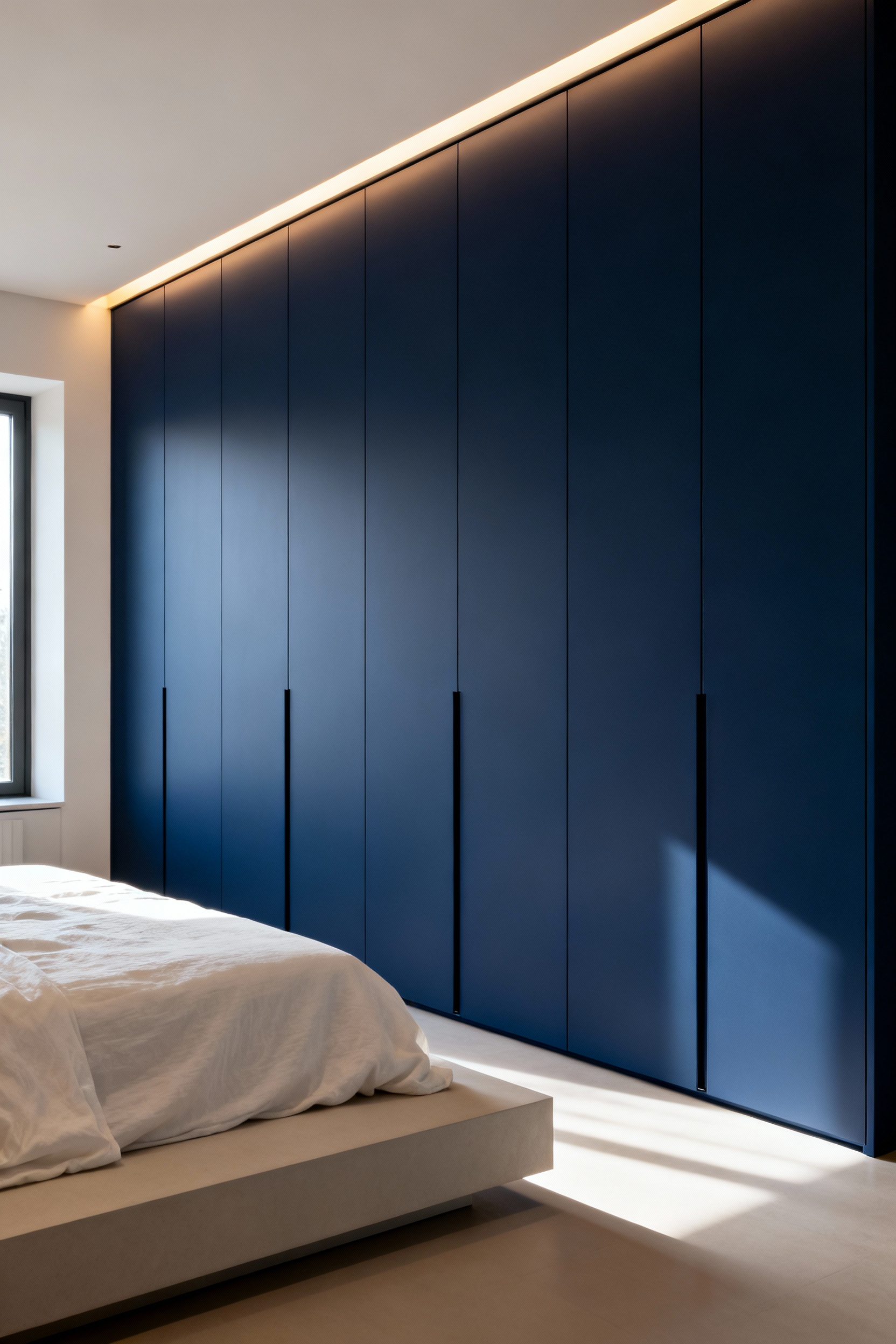
However, true concealment requires specific technical choices. Crucially, you must select a matte finish. Glossy surfaces act as mirrors, reflecting distracting light. In contrast, matte finishes allow storage to blend seamlessly. Furthermore, distinct handle-less designs eliminate visual anchors. Using push-to-open latches allows doors to sit flush.
Historically, this mirrors the Victorian shift toward fitted wardrobes. Today, concealing everyday items creates a sense of mastery over your environment. Ultimately, this strategy offers a necessary sensory contrast: visual austerity for mental clarity, hiding organized luxury within.
Part IV: Sensory Integration—Lighting and Atmosphere
Designing a blue bedroom requires navigating a distinct sensory paradox. While blue pigment promotes calm, blue *light* disrupts biology. Therefore, successful integration relies on managing color temperature. Specifically, blue wavelengths suppress melatonin. Consequently, avoid “daylight” bulbs. Instead, experts recommend bulbs between 2700K and 3000K. These “soft white” options mimic sunset. Thus, they signal your brain to rest.
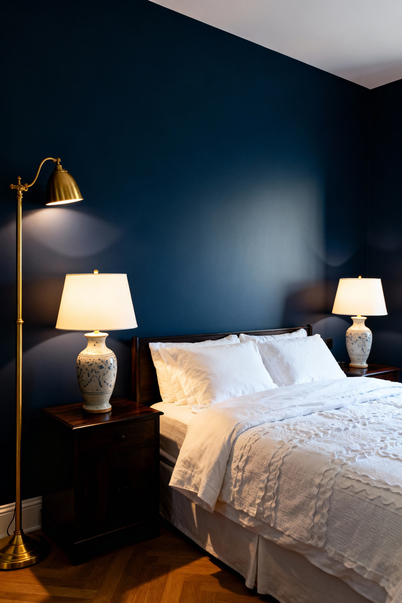
Furthermore, this warm illumination interacts uniquely with blue paint. The light’s amber cast naturally “mutes” the wall’s cool hues. As a result, the room feels cozy rather than cold. Interestingly, research indicates warm light on blue walls reduces anxiety. However, dark blues can feel flat without layering. To prevent this, introduce reflective material contrasts. For instance, gold accents catch low-level light effectively. Additionally, these elements add luxurious warmth.
Finally, consider the role of surface texture. Rich fabrics like velvet absorb light to create moodiness. Conversely, high-gloss finishes bounce light to add depth. Ultimately, balancing these elements creates a restorative sanctuary.
13. Warm Kelvin Lighting: Balancing Cool Walls for Evening Wind-Down
While blue walls promote tranquility, lighting choices dictate your biological response. Specifically, lighting serves a dual purpose: aesthetic balance and hormonal regulation. Consequently, avoiding cool light is imperative for healthy sleep hygiene.
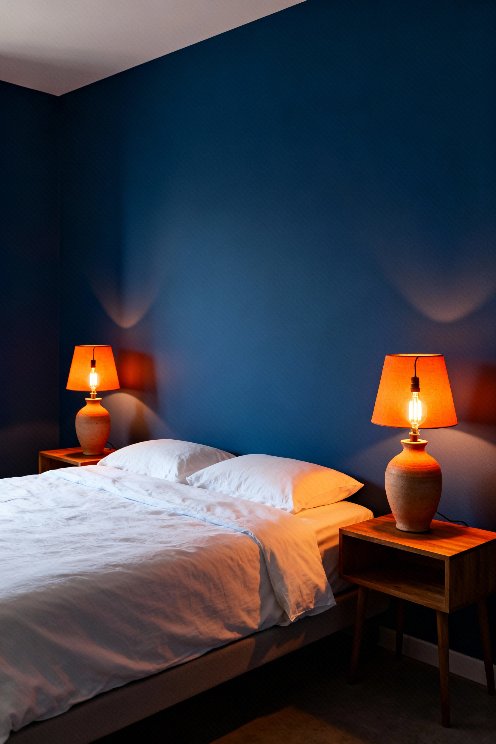
From a design perspective, warm light acts as the perfect counterpoint to cool walls. In fact, orange-spectrum light is the direct complement to blue. This combination visually softens the room. Conversely, high-Kelvin light signals to your brain that it is daytime. As a result, this suppresses melatonin production.
To optimize your environment, prioritize a layered lighting approach. For general use, “warm white” bulbs around 2700K provide brightness. However, the secret lies in bedside fixtures. Ideally, select bulbs reaching the deep amber range of 2200K. This spectrum mimics candlelight, directly signaling your body to rest. Finally, ensure these sources are dimmable.
14. Midnight Blackout Curtains: Prioritizing Melatonin Production
True restoration requires total darkness to trigger melatonin. This “hormone of darkness” is incredibly sensitive to light. In fact, research indicates that merely 8 lux can suppress it. Consequently, your body remains alert rather than winding down. Specifically, short-wavelength blue light is the most disruptive. Therefore, achieving “zero lux” is a biological necessity.
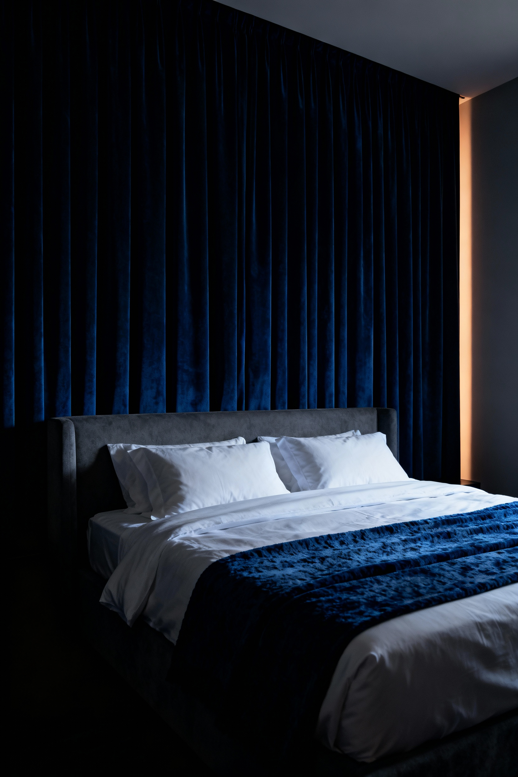
This creates a paradox within blue designs. Psychologically, deep hues evoke tranquility. However, physiological alertness is triggered if external light leaks inside. Thus, midnight blackout curtains act as a safeguard. They allow you to enjoy blue decor safely. Essentially, they filter out harmful wavelengths.
Furthermore, effectiveness relies heavily on installation. High-quality fabric alone is often insufficient due to “light gaps.” For example, standard rods allow light to leak. Alternatively, ceiling-mounted tracks effectively seal the window treatment. Additionally, wrap-around rods secure edges to the wall. Ultimately, this hermetic seal ensures deep sleep.
15. Meditative Corners: A Dedicated Chair for Mindfulness Practice
Transforming a quiet bedroom corner into a meditative space creates a mental retreat. Specifically, blue functions as a neurological anchor for tranquility. Research indicates that blue hues actively help lower blood pressure. Consequently, this biological response facilitates a transition from stress to clarity.
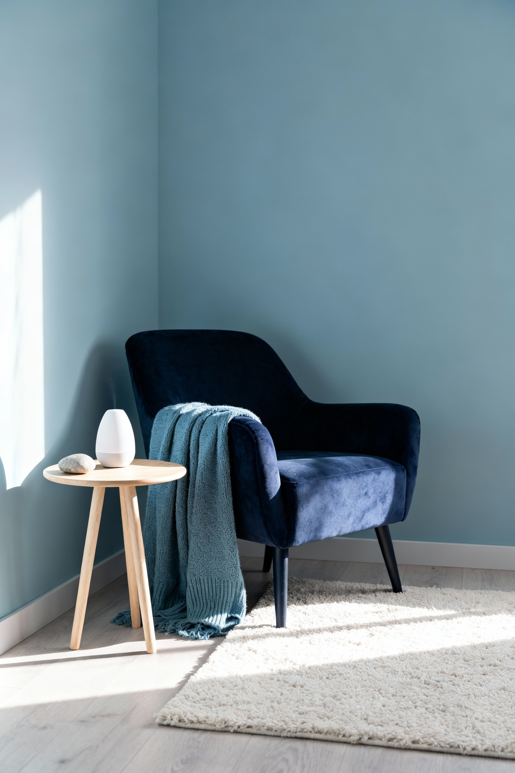
However, the furniture selected must support this internal work. A dedicated mindfulness chair goes beyond aesthetics. Unlike standard accent chairs, specialized designs promote spinal alignment. For instance, elevated seats position hips higher than knees. This alignment improves circulation and prevents distraction.
Furthermore, placing this chair in a corner establishes a psychological boundary. Facing a clutter-free corner limits the visual field. Therefore, the mere presence of the chair creates a “ritual prompt.” Seeing this space signals the mind to prepare for introspection. Ultimately, combining ergonomic function with blue’s properties creates a holistic wellness tool.
16. Scent and Sight: Pairing Blue Decor with Calming Aromatherapy Zones
Combining blue decor with aromatherapy creates a powerful wellness tool. Specifically, this pairing targets two physiological pathways. Visually, blue hues lower heart rate. Consequently, they signal your body to unwind. Simultaneously, calming scents trigger the brain’s limbic system. Therefore, this approach “cools down” your nervous system better than color alone.
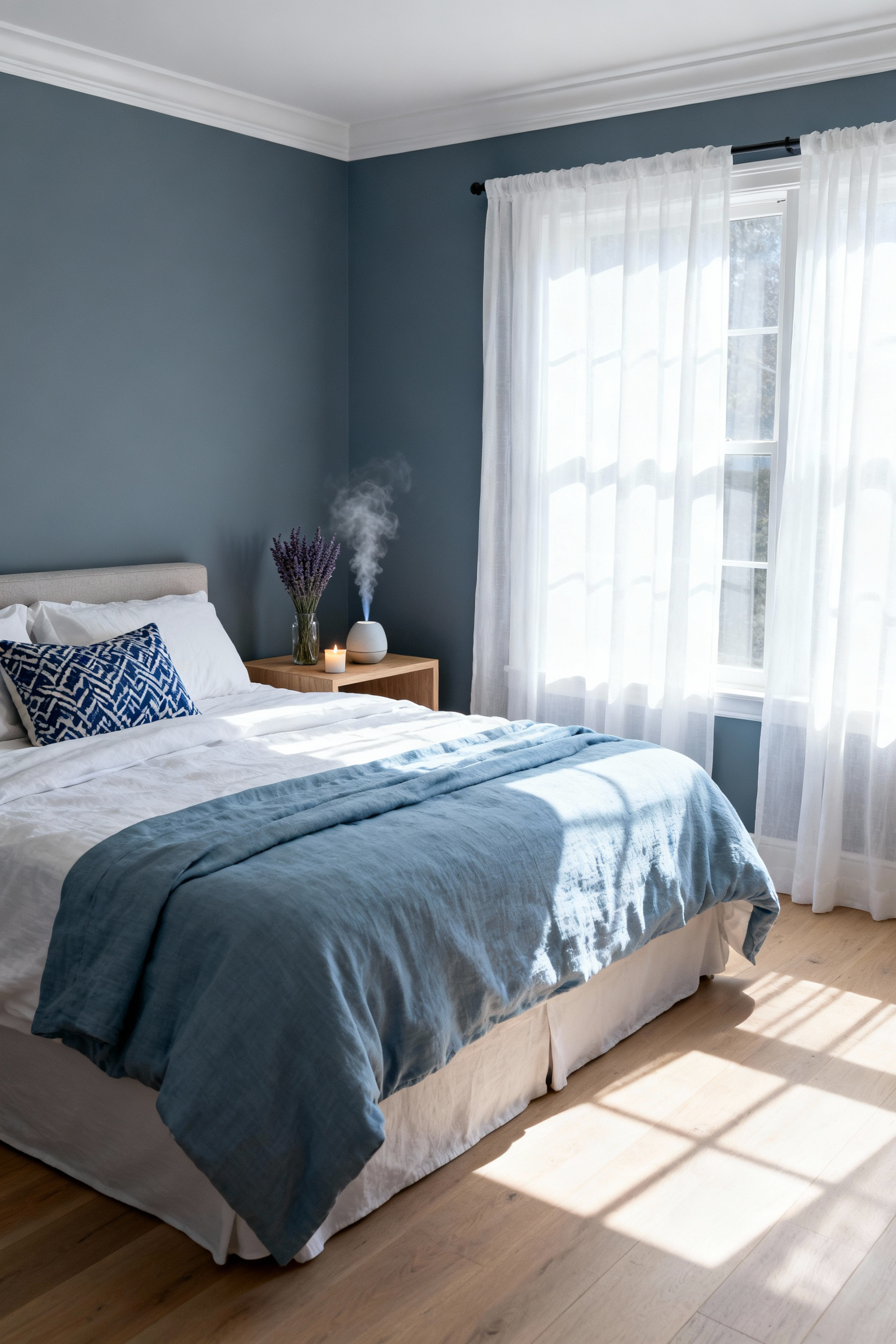
You can further enhance this effect through “synesthetic design.” For instance, blue naturally evokes clear skies or calm waters. To reinforce this, choose aquatic fragrances. Specifically, look for notes of sea salt or marine botanicals. Thus, the room feels as expansive as it looks.
Finally, strategic placement transforms a diffuser into a zone marker. Rather than placing scents centrally, position them near your bedside. As a result, the fragrance becomes a cue for sleep. Eventually, this builds a powerful “scent memory.” Your body learns to link the blue environment with deep relaxation.
Conclusion: Integrating the Blue Mind Theory into Daily Rituals
Ultimately, designing a blue bedroom transcends simple aesthetics. Instead, it functions as a deliberate neurological bridge. By incorporating watery hues, you actively counter the anxious “Red Mind.” Consequently, your space becomes a modern sanctuary for restorative neurochemistry. Reviewing these sophisticated blue bedroom ideas ensures your sleeping environment acts as a physical proxy for the coast. In effect, you are crafting a daily ritual of “downshifting” into tranquility.
Moving forward, consider the sensory details that support this calm. Specifically, layer rhythmic sounds and fluid textures. These elements guide your brain waves toward deep sleep. Thus, wellness architecture transforms your home into a vessel for mental health. Finally, commit to this practice of sacred self-care. Begin by auditing your current bedside textures for softness and flow.
Frequently Asked Questions (FAQ)
Which shade of blue is scientifically proven to be the best for sleep?
Deep, low-luminance shades like Midnight Navy and Indigo are often cited as the most effective for promoting deep sleep. Scientifically, these colors function as a visual anchor that lowers heart rate and blood pressure, cueing the central nervous system to enter a “rest and digest” state. They also maximize darkness by absorbing ambient light, which is crucial for optimal melatonin production.
How do I make a predominantly blue bedroom feel warm and luxurious, avoiding a cold atmosphere?
To introduce warmth, utilize “haptic counterbalance” and warm color temperatures. Pair the cool blue walls with rich, tactile materials like layered wool rugs, velvet upholstery (e.g., a headboard), and natural wood furniture (oak or walnut). For lighting, exclusively use warm-Kelvin bulbs (2700K to 3000K) for ambient and bedside fixtures. This amber light contrasts beautifully with the blue, making the space feel cozy and inviting rather than clinical.
Does blue light from electronics contradict the calming effect of blue paint?
Yes, they have opposite physiological effects. High-energy blue light (480 nm wavelength) emitted by electronics actively suppresses melatonin and signals alertness to the brain. In contrast, the psychological impact of blue *pigment* (paint) induces calm and lowers stress. A successful blue bedroom design must strictly limit exposure to high-Kelvin light sources (screens, daylight bulbs) in the evening while enjoying the restorative effect of the wall color.
