Have you ever walked into a living room and felt like it was just…missing something? Maybe it was a little too neutral, a little too safe. Well, my friends, it’s time to say goodbye to boring beige and embrace the world of modern living room color schemes!
As an interior designer, I’ve seen firsthand how color choices can completely transform a space. Gone are the days of playing it safe with neutral palettes. Today’s living rooms are all about bold, dynamic hues that pack a visual punch. And trust me, the results are nothing short of stunning.
This article will explore the exciting world of modern living room color schemes, from vibrant accent colors to serene monochromatic palettes and everything in between. We’ll dive into the psychology of color and how it can be used to create the perfect ambiance for your living room. And we’ll share real-life examples to inspire your color journey.
So, if you’re ready to ditch the beige and add some life to your living space, keep reading. It’s time to get colorful!
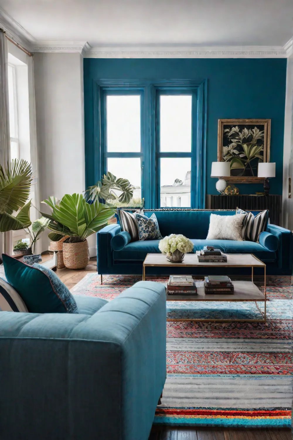
Bold Accent Colors
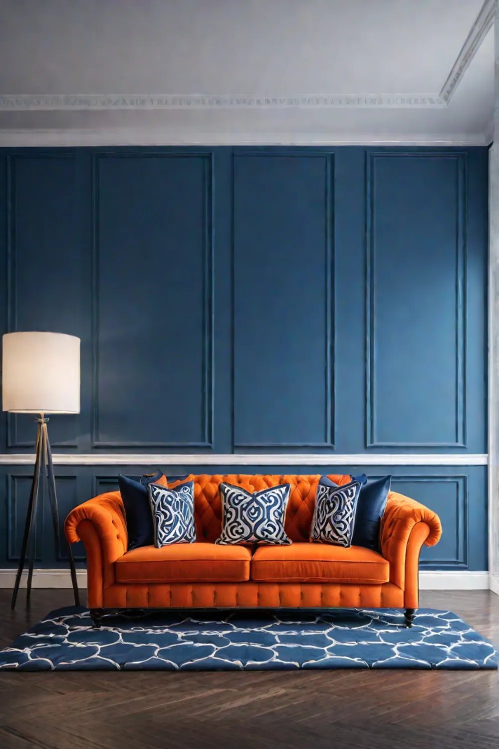
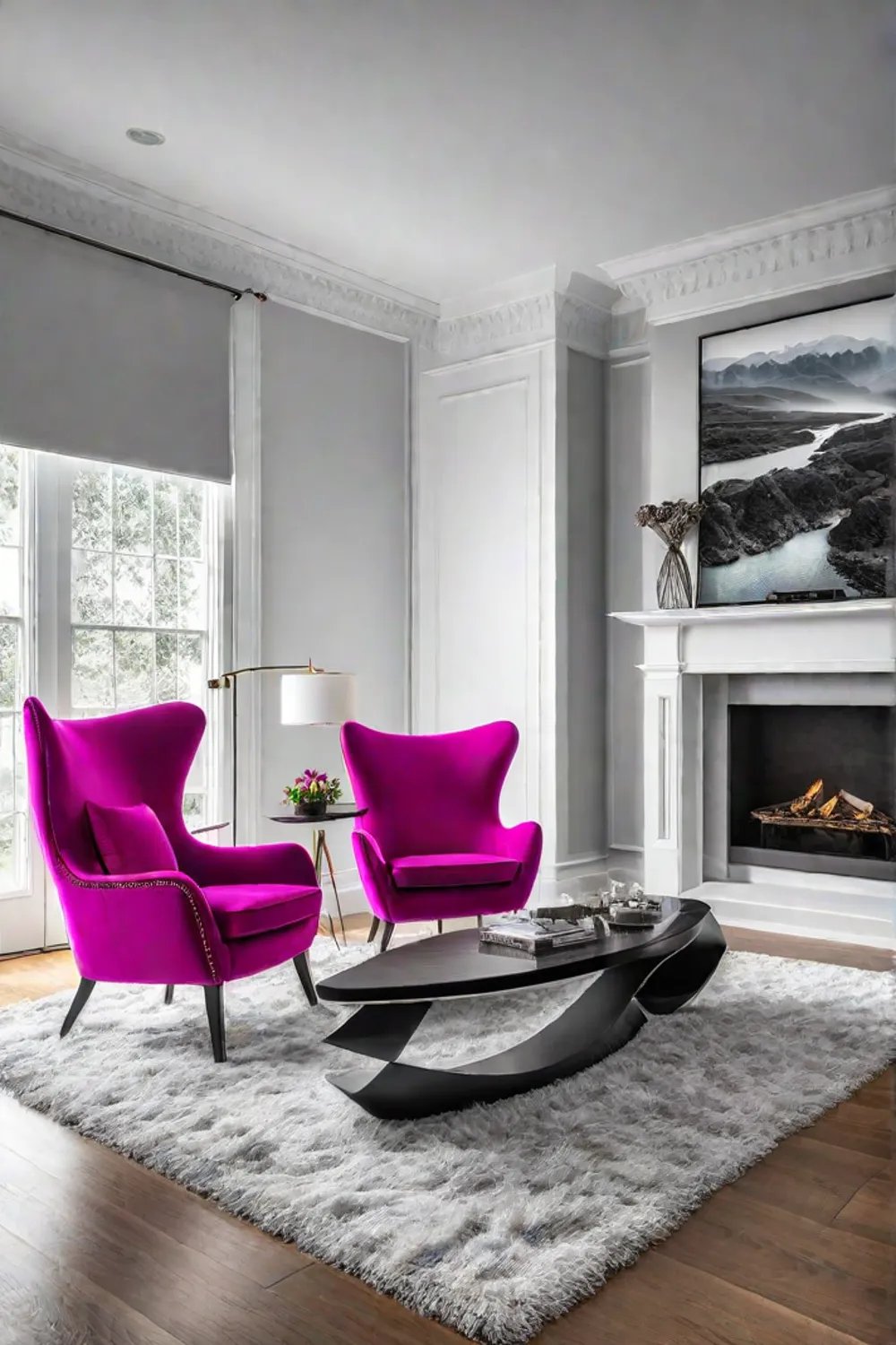
Imagine walking into a living room and instantly captivated by a rich, jewel-toned sofa or a statement-making piece of artwork. That’s the power of bold accent colors. These vibrant hues can transform a space, adding drama, energy, and visual interest that can’t be achieved with a neutral palette.
The key to incorporating bold accent colors is to strike the right balance. You don’t want the room to feel overwhelming or chaotic. Instead, think of the bold color as the show’s star, with the rest of the space playing a supporting role.
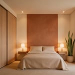
One way to do this is by using the bold accent color in larger pieces, like a statement armchair or a vibrant area rug. This creates an immediate focal point that draws the eye. Then, you can use neutral tones, like white or gray, as the foundation, allowing the bold color to shine.
Another approach is using bold accent color in smaller, more easily changeable pieces, like throw pillows, vases, or artwork. This allows you to experiment and switch things up without committing to a major renovation.
The psychology of bold colors is also fascinating. Reds and oranges, for example, are associated with energy and passion, while blues and greens can create a sense of calm and tranquility. By carefully selecting your bold accent colors, you can curate the perfect atmosphere for your living room.
So, whether you’re drawn to the drama of a deep teal or the warmth of a sunny yellow, don’t be afraid to let your bold color flag fly. You can transform your living room into a vibrant, visually captivating space with the right balance and a little color psychology.
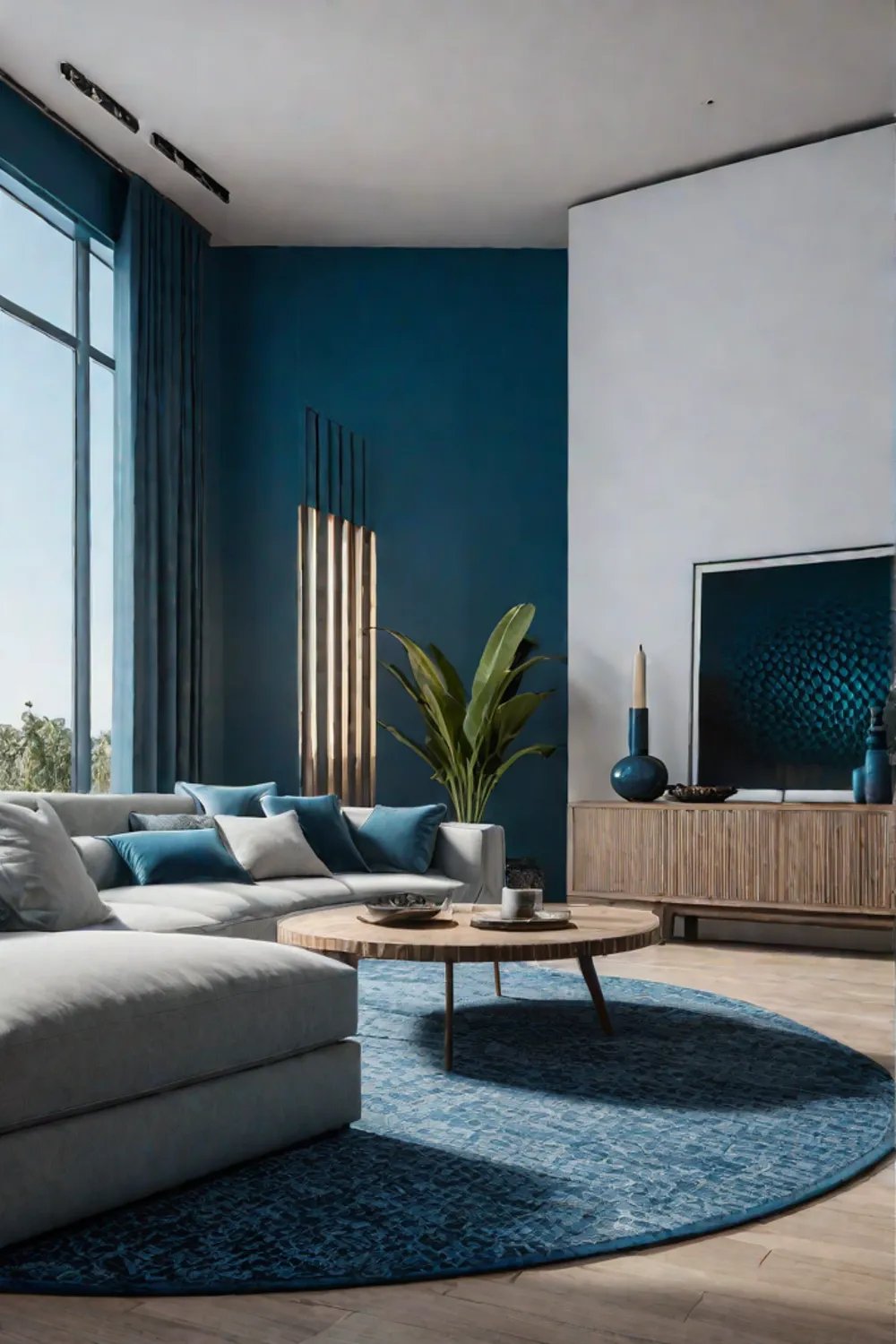
Monochromatic Palettes
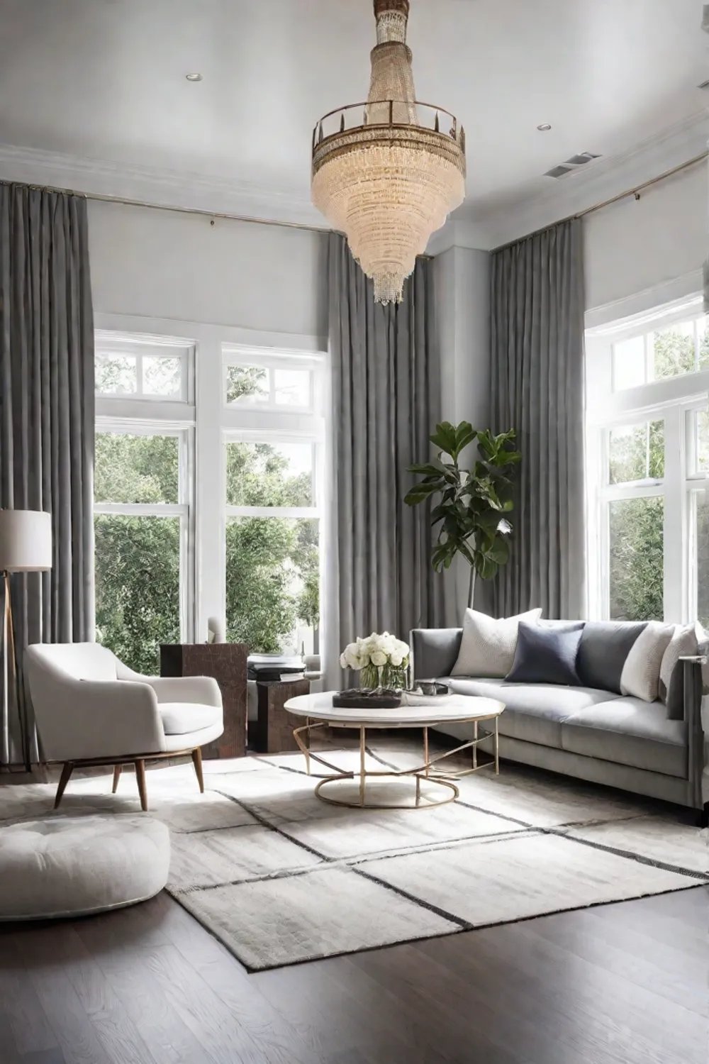
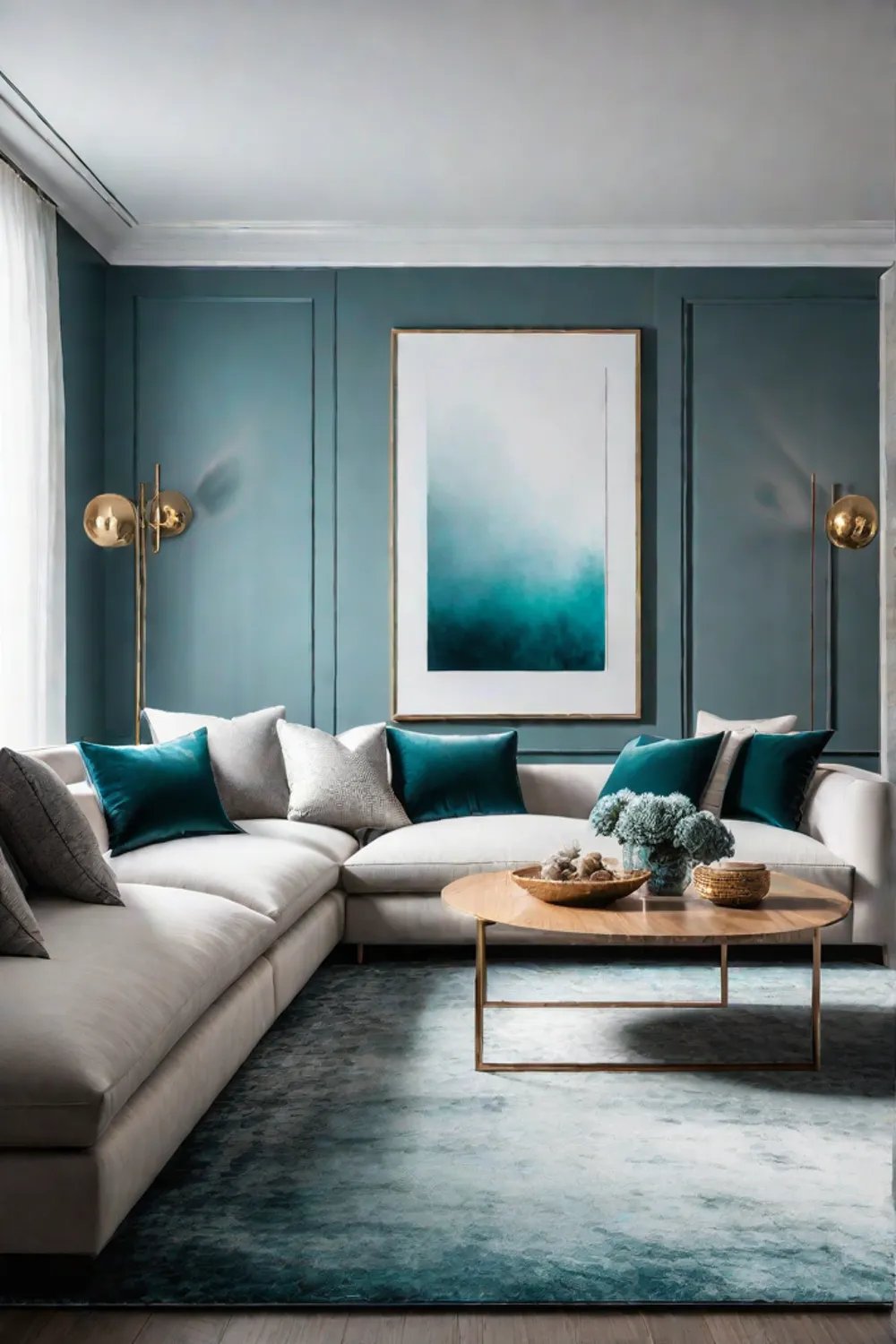
If bold accent colors aren’t your thing, don’t worry – another modern living room color scheme is equally stunning: the monochromatic palette. This approach involves using a single color and its various shades, tints, and tones to create a cohesive and harmonious look.
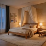
The beauty of a monochromatic scheme is that it can instantly make a room feel serene and calming. Imagine a living room wrapped in soothing shades of blue, from the soft, pale walls to the deeper navy accents. Or picture a space bathed in a warm, cozy palette of earthy browns and taupes. The result is a visually stunning yet remarkably tranquil environment.
But don’t be fooled—monochromatic design is anything but boring. It’s all about creating depth and texture within that single-color canvas. By incorporating different shades, tints, and tones, you can add visual interest and prevent the space from feeling flat or one-dimensional.
For example, you could pair a deep charcoal sofa with lighter gray throw pillows and a medium-toned area rug—or layer shades of green, from mossy hues to vibrant emeralds, with natural wood accents. The key is to play with the nuances of the color, using texture and lighting to create a sense of depth and dimension.
When selecting the right monochromatic color palette for your living room, consider the mood you want to evoke. Cooler tones like blues and greens can create a calming, serene atmosphere, while warmer hues like reds and oranges can add a cozy, inviting feel. And don’t forget to factor in the lighting in your space—the way the color interacts with natural and artificial light can have a big impact on the overall look and feel.
So, if you’re craving a living room that feels like a tranquil oasis, a monochromatic color scheme might be just the thing, by embracing the power of a single color and all its subtle variations, you can craft a visually stunning and emotionally soothing space.
Complementary Colors
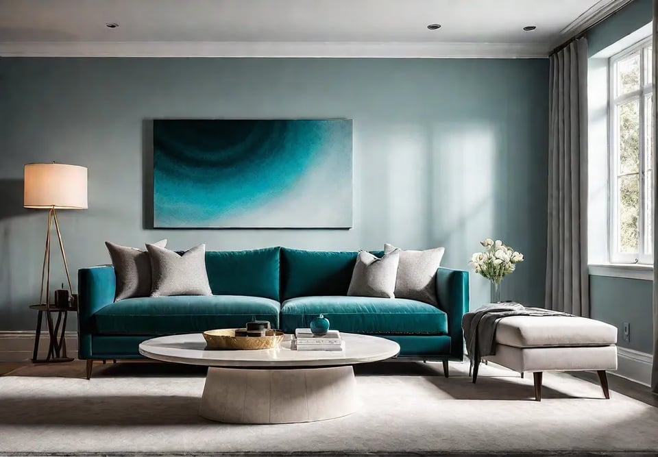
Let’s talk about complementary colors – those bold, dynamic hues that sit opposite each other on the color wheel. When used in a living room, these color pairs can create a striking, visually captivating space that will turn heads.
The key to making complementary colors work is all about balance. You don’t want the room to feel like a chaotic clash of colors. Instead, you want to find that sweet spot where the two hues complement each other perfectly, creating a harmonious and visually appealing design.
One way to achieve this balance is to use one color as the dominant hue and the other as an accent. For example, you could have a living room with blue walls and orange accents or a space with a green sofa and red throw pillows. This allows the complementary colors to play off each other without feeling overwhelming.
Another approach is to use complementary colors in equal measure, creating a sense of balance and visual interest. Imagine a living room with a purple armchair, a yellow area rug, or walls painted deep red and curtains vibrant turquoise. The result is an intentional, bold, and stylish living room.
The history of complementary colors in interior design is fascinating. In the 18th century, French artist Jacques-Gabriel Bourguignon d’Angeville developed a color wheel highlighting these dynamic color pairings. The Impressionist painters later embraced this concept, using complementary colors to create their signature vibrant and dynamic paintings.
But the appeal of complementary colors goes beyond just aesthetics. These bold color combinations can also have a significant psychological impact on the occupants of a living room. For instance, blue and orange can create a sense of energy and excitement, while purple and yellow can evoke a feeling of calmness and balance.
So, if you’re ready to bring some drama and visual interest to your living room, don’t be afraid to experiment with complementary colors. Whether you opt for a dominant-accent approach or a more balanced design, these dynamic hues can transform your space into a true showstopper.
Texture and Pattern
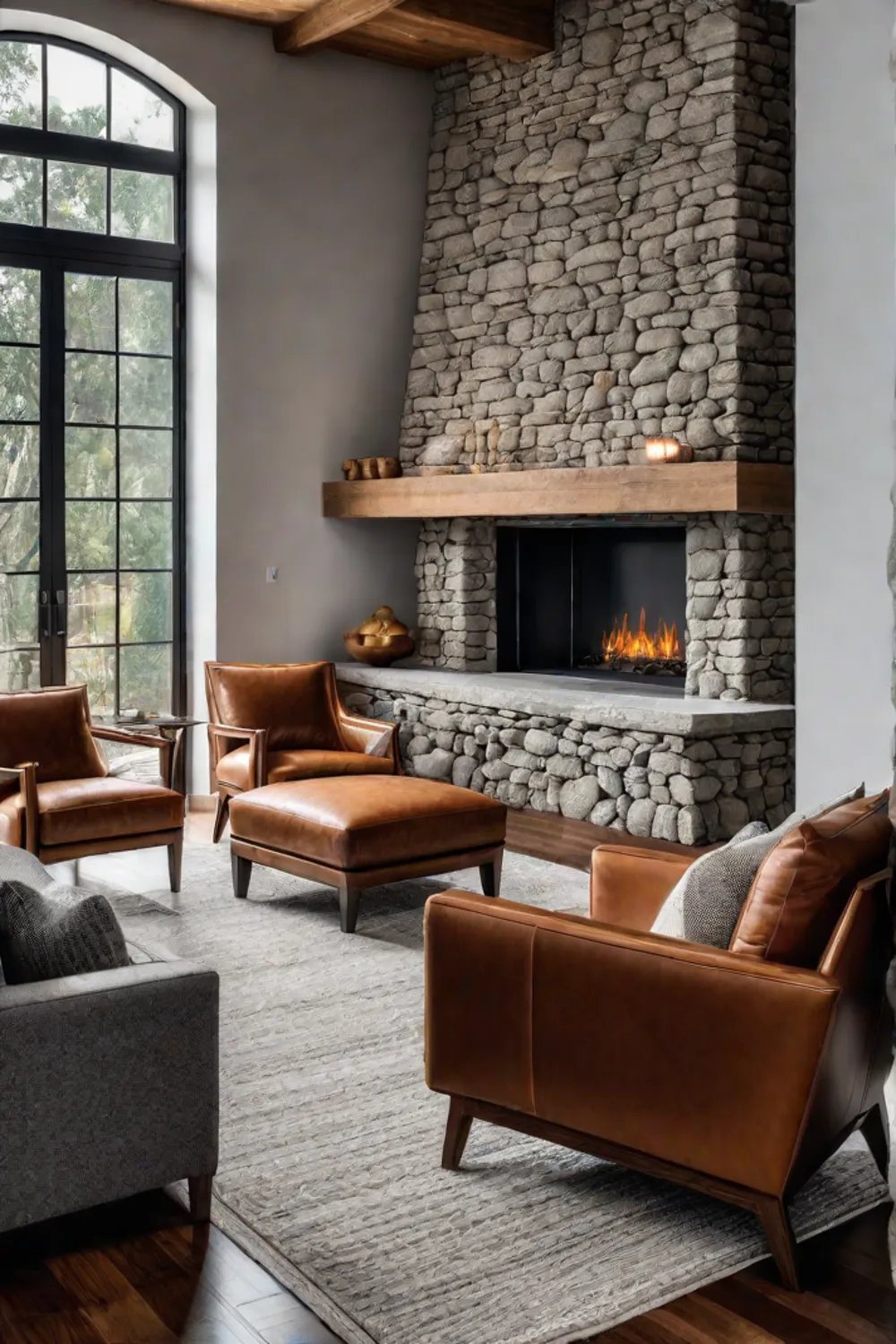
Regarding modern living room design, color is just one puzzle piece. Texture and pattern are equally important elements that can elevate a space and add depth, visual interest, and a sense of tactility.
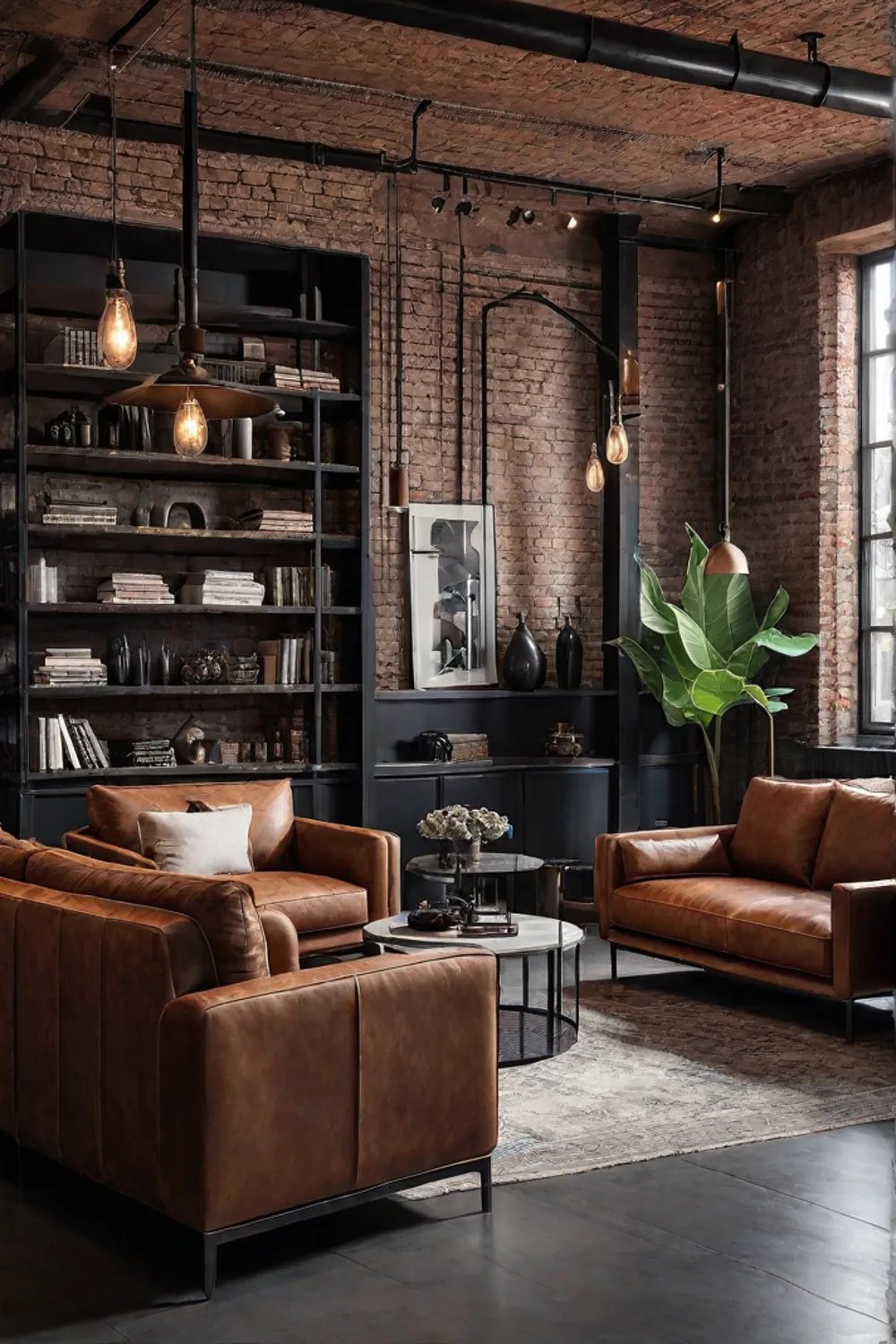
Think about it – a living room with a neutral color palette can feel a bit flat and one-dimensional. But when you introduce different textures, like the soft, plush feel of a velvet sofa or the rustic charm of a woven area rug, suddenly, the room comes alive. And when you layer in patterns, whether a bold geometric print or a delicate floral, the space instantly becomes more visually stimulating.
The history of texture and pattern in interior design is rich, with styles and trends evolving over time. From the ornate patterns of the Victorian era to the clean, minimalist designs of the mid-century modern movement, these design elements have always played a crucial role in shaping the look and feel of a space.
But it’s not just about aesthetics – texture, and pattern can also have a significant psychological impact on the occupants of a living room. Warm, tactile materials like velvet or wool can create a sense of coziness and comfort, while cool, geometric patterns can evoke a feeling of calm and order.
When incorporating texture and pattern into your living room, the key is to strike the right balance. You don’t want the space to feel cluttered or overwhelming, but you don’t want it to feel flat and one-dimensional. That’s where the art of layering comes in.
Try pairing a plush, textured throw blanket with a patterned accent pillow or complementing a solid-colored sofa with a geometric area rug. The goal is to create visual depth and interest while maintaining a cohesive and harmonious design.
And don’t be afraid to experiment with different combinations of texture and pattern. For instance, a living room with a monochromatic color scheme can be elevated by adding varied textures, like the juxtaposition of a smooth, glossy coffee table and a rough, natural-fiber rug.
Ultimately, the power of texture and pattern lies in their ability to transform a living room from a mere collection of furniture and decor into a truly immersive and engaging space. So, embrace the tactile and the visually compelling, and watch your living room come alive with depth and character.
Color Psychology
As an interior designer, I’m fascinated by the power of color and how it can shape our emotions, behaviors, and perceptions of space. Understanding the psychology of color is key to creating an environment that looks great and feels just right, especially in living room designs.
Think about it—different colors can evoke vastly different responses. Blue, for example, is often associated with calmness and tranquility, while red is linked to energy and passion. These psychological associations can have a profound impact on how we experience a living room.
So, when selecting a color palette for your living room, it’s important to consider the mood and atmosphere you want to create. Are you looking to cultivate a sense of relaxation and serenity? Then cool, soothing hues like blues and greens might be the way to go. Or perhaps you want to inject some vibrancy and excitement into the space? In that case, warm, bold colors like reds and oranges could be the perfect fit.
But it’s not just about the overall palette – the placement and balance of colors in a living room can also play a crucial role in how the space is perceived and used. For instance, a living room used primarily for socializing and entertaining might benefit from a warmer, more energetic color scheme. In contrast, a living room that doubles as a home office could benefit from a cooler, more focused palette.
The history of color psychology in interior design is fascinating. Different cultural and personal associations shape how we view and use color in our homes. In the 1950s, for example, bold and bright colors were all the rage, reflecting the optimism of the post-war era. In the 1970s, earthy tones like brown and orange were popular, mirroring the natural and organic aesthetic of the time.
Today, as we continue to navigate the ever-evolving landscape of modern living room design, the psychology of color remains a powerful tool in our arsenal. By understanding how different hues can impact our emotions and behaviors, we can create living rooms that look stunning and foster a sense of well-being and comfort.
So, whether you’re drawn to the calming influence of blue or the energizing power of red, don’t be afraid to let color be your guide. With some color psychology know-how, you can transform your living room into a space that nourishes your senses and soul.
Conclusion
Well, there you have it – a deep dive into the world of modern living room color schemes. From bold accent colors to serene monochromatic palettes, dynamic complementary hues, and the role of texture and pattern, we’ve covered a lot of ground.
But the most important takeaway? Color is a powerful tool in interior design. By understanding the psychology and impact of different hues, you can create living rooms that are not only visually stunning but also emotionally resonant.
So, as you embark on your living room color journey, remember to experiment, have fun, and trust your instincts. Whether you’re drawn to the drama of a deep teal or the calming influence of a soft blue, the key is to choose colors that speak to your style and the mood you want to cultivate in your space.
And who knows – you might find that stepping outside your comfort zone and embracing a bold, modern color scheme is the key to transforming your living room into the vibrant, personality-packed space of your dreams. So, what are you waiting for? It’s time to get colorful!