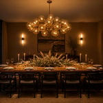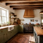
The dining room is where memories are made, one meal at a time. It’s the backdrop for everything from everyday family dinners to special celebrations. While furniture and lighting play their part, nothing transforms a dining space quite like the right paint color.
As someone who’s spent over a decade designing outdoor-indoor transitions, I’ve seen firsthand how the right dining room paint can completely change not just how a room looks, but how it feels. Whether you’re aiming for intimate and cozy or bright and energizing, these 19 tips will help you navigate the world of paint to create your ideal dining space.
1. Set the Mood: Choosing Your Dining Room Color Palette
Paint color wields remarkable power in influencing how people feel and interact within your dining room. Warm colors like reds and oranges stimulate conversation and appetite, creating an energetic atmosphere. Cool colors promote calmness and relaxation, ideal for leisurely meals. The color palette you select fundamentally sets the tone for every gathering around your table.
When selecting dining room paint, consider factors beyond personal preference. Natural light dramatically alters how colors appear throughout the day. Room size matters too – lighter colors expand, darker colors enclose. Your existing furniture and adjacent rooms should inform your choice to create a cohesive flow, especially in open floor plans.
The inspiration for this collection struck when I noticed how dramatically the same dining room can shift from energizing to intimate simply by changing the wall color. Let’s explore the specific color families that excel at creating that coveted warm, inviting atmosphere.
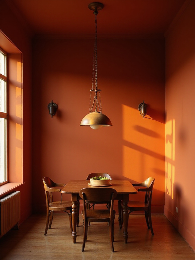
2. Warm & Inviting: The Best Hues for Cozy Meals
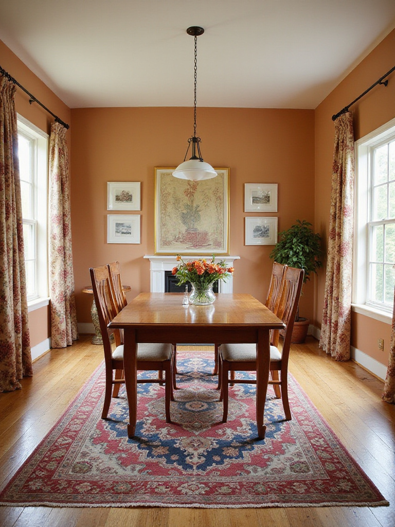
Warm colors reign supreme for creating that cozy, inviting dining room atmosphere we all crave. Reds, oranges, yellows, and earthy tones stimulate the senses, including appetite and conversation. They psychologically connect with comfort, warmth, and hospitality in a way cool colors simply can’t match. These hues visually bring walls inward, creating the intimate, snug feeling that makes shared meals more memorable.
For a dining room that encourages lingering and connection, consider these warm color families:
- Stimulating reds: Burgundy, crimson, terracotta
- Friendly oranges: Peach, rust, burnt orange
- Cheerful yellows: Goldenrod, mustard, buttery yellow
- Sophisticated browns: Taupe, beige, chocolate
- Earthy tones: Deep olive, warm terracotta
Look closely and you’ll notice the subtle texture of how warm colors change throughout the day. A terracotta that feels energizing at breakfast becomes remarkably intimate by candlelight. But what if your vision for dining leans more toward tranquility than stimulation? Let’s explore the serene side of the color spectrum.
3. Cool & Calm: Serene Paint Colors for Relaxed Dining
For a dining experience centered on tranquility, cool and calm paint colors offer the perfect solution. Blues, greens, certain purples, and cool-toned neutrals create an inherently soothing backdrop. These shades promote relaxation and reduce stress, encouraging unhurried meals and peaceful conversations that stretch long into the evening.
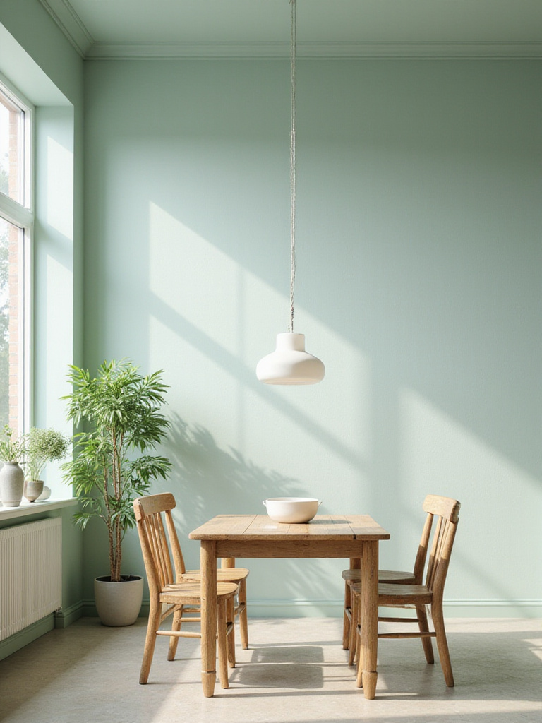
Unlike stimulating warm tones, cool colors calm rather than energize. They make spaces feel airy and expansive, creating breathing room that allows diners to unwind. This effect is particularly beneficial if you envision your dining room as a tranquil retreat from busy days. Light blues and sage greens work beautifully in naturally bright spaces, while deeper teals and slate grays can create sophisticated serenity in rooms with controlled lighting.
Even in smaller spaces, here’s how this works: cool colors visually recede, making walls appear farther away and creating a sense of spaciousness that can make even compact dining rooms feel more comfortable. But perhaps you’re looking for something with more dramatic impact? Let’s explore how bold colors can transform your dining space.
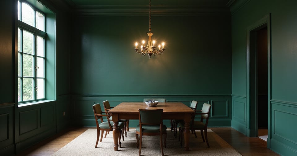
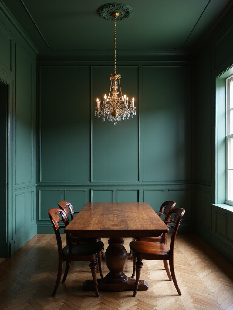
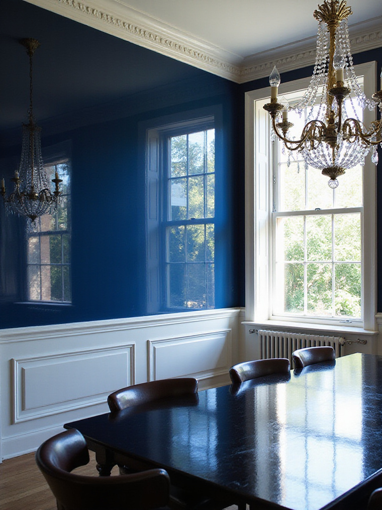
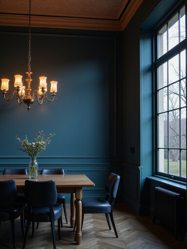
4. Go Bold: Making a Statement with Dramatic Dining Room Paint
The dining room offers a perfect canvas for experimenting with bold, dramatic paint colors. Unlike living rooms or bedrooms where you spend extended periods, dining rooms are typically used for focused gatherings, making them ideal for creating a specific, impactful mood without the color feeling overwhelming over time.
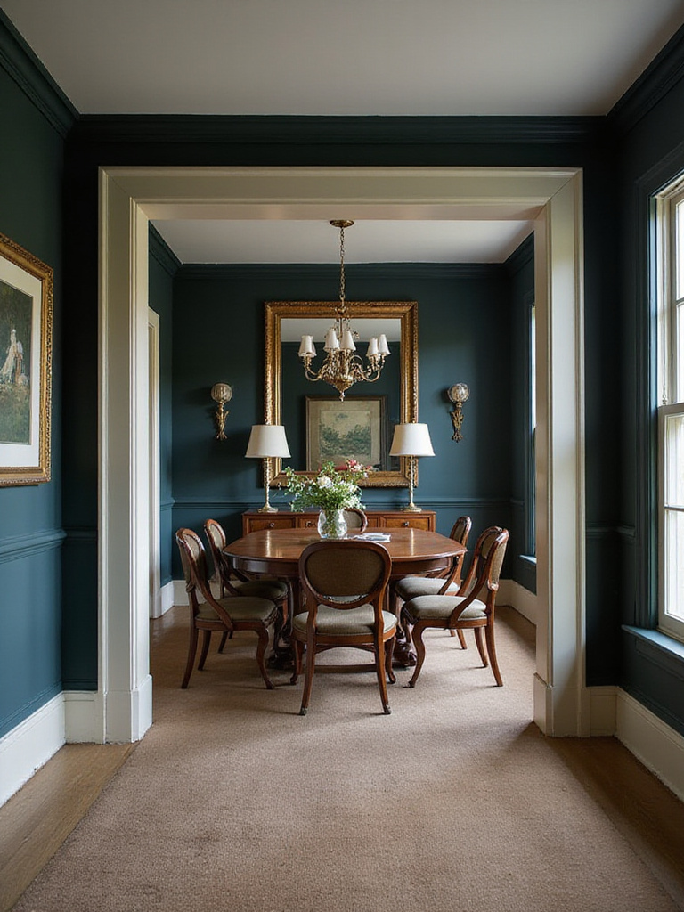
Dramatic dining room paint options include deep, saturated hues like:
- Navy blue or midnight blue
- Forest green or emerald
- Charcoal or true black
- Rich burgundy or wine
- Deep plum or aubergine
- Vibrant teal or peacock
What makes this design special is the way bold colors transform ordinary meals into memorable experiences. A dining room in deep navy or rich emerald creates an instant sense of occasion that elevates even weeknight dinners. For balance, incorporate adequate lighting, reflective surfaces, and lighter accents to prevent the space from feeling too dark or heavy.
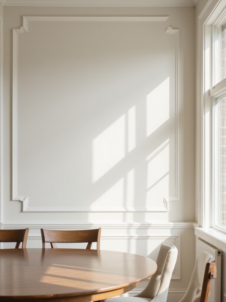
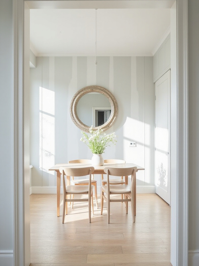
5. Neutral Ground: Timeless & Elegant Dining Room Paint Ideas
Neutral dining room paint colors – whites, blacks, grays, beiges, taupes, and greiges – offer unmatched sophistication and versatility. These understated hues act as quiet backdrops, allowing furniture, art, and textiles to take center stage. Their inherent restraint creates a timeless elegance that remains stylish for years without being tied to passing trends.
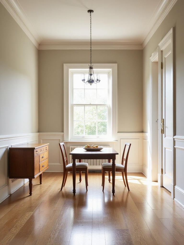
The beauty of neutrals lies precisely in their subtlety. They provide a clean, classic canvas that complements virtually any furniture style, from traditional mahogany to sleek modern pieces. To prevent a neutral dining room from feeling cold, incorporate warm undertones (creamy whites, warm beiges), add texture through natural materials, and layer different shades of your chosen neutral family.
The unexpected pairing that always works is combining neutral walls with bold, colorful accessories or artwork. This approach gives you the flexibility to change accents seasonally while maintaining the sophisticated foundation that neutrals provide. But what if you want to experiment with color without committing to all four walls? Let’s explore the power of the accent wall.
6. The Accent Wall Advantage: Adding Focus with Paint
An accent wall can dramatically enhance your dining room by creating a clear focal point and injecting personality without overwhelming the space. This strategic design technique breaks up monotony, highlights architectural features, and draws attention to significant pieces like a buffet or artwork. In dining rooms, an accent wall introduces drama, intimacy, or energy while offering a low-commitment way to experiment with bolder colors.
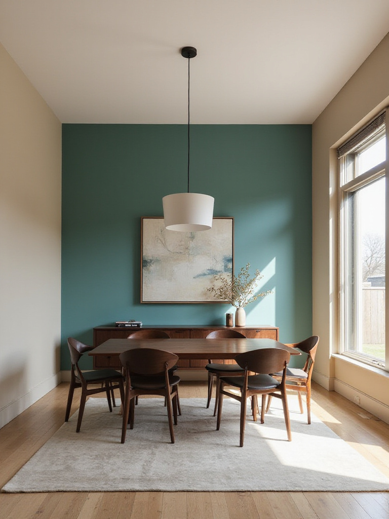
When selecting your accent wall, choose the one that naturally draws the eye first – typically the wall behind a buffet, the head of the dining table, or a wall with a fireplace. For maximum impact, select a color that complements your existing palette but adds depth or contrast. Deep, saturated hues like navy, emerald, or burgundy add sophistication, while brighter colors like coral or teal create energy.
The designer’s secret here is to use the accent wall to frame the dining experience, creating a backdrop that makes gatherings feel more intentional and special. Now that we’ve explored color placement, let’s examine how the finish of your dining room paint affects both appearance and practicality.
7. Matte Magic: Why a Flat Finish Works in the Dining Room
A flat or matte dining room paint finish offers unique advantages that make it particularly well-suited for creating an elegant eating space. Unlike shinier finishes, matte absorbs light rather than reflecting it, which significantly minimizes glare from chandeliers, sconces, and natural light sources. This creates a soft, sophisticated backdrop that keeps focus on the dining experience, the food, and the company.
The light-absorbing quality of matte finishes allows the true color to shine without interference. Without reflective glare, the pigment appears richer, deeper, and more saturated, providing a uniform appearance that enhances color intensity. This makes matte finishes excellent for showcasing complex or dark hues, contributing to the warmth and intimacy often desired in dining rooms. An additional practical benefit is how effectively matte hides minor wall imperfections – small dents or uneven textures disappear rather than being highlighted.
After months of sourcing and curation, I’ve found that matte dining room paint in deep, dramatic colors creates the most enveloping atmosphere for intimate dinners. But what if you’re concerned about durability and cleanability in a room where spills happen? Let’s compare two popular alternatives.
8. Satin vs. Eggshell: Picking the Perfect Sheen
When selecting dining room paint, the choice between eggshell and satin finishes often comes down to balancing aesthetics with practicality. Eggshell has a very low sheen, offering just a subtle glow that’s slightly more reflective than flat paint. It resembles, as the name suggests, the delicate surface of an actual eggshell. Satin, meanwhile, provides a more noticeable velvety sheen with moderate reflectivity, giving walls a slightly glossier, more polished appearance.
In terms of durability – crucial for dining rooms where spills and splatters happen – satin generally outperforms eggshell. The higher resin content in satin creates a harder, less porous surface that makes wiping away marks and stains easier. However, eggshell excels at hiding minor wall imperfections, while satin’s higher reflectivity will highlight these flaws more prominently. Both are appropriate for dining spaces, but satin often wins for its balance of subtle elegance and practical cleanability.
The craftsmanship reveals itself in details like how these different sheens interact with your lighting and wall texture. For truly maximum durability and a striking visual effect, let’s explore the highest end of the sheen spectrum.
9. Glossy Glamour: Using High-Shine Paint in the Dining Room
High-shine dining room paint finishes like semi-gloss or full gloss bring unmatched durability and glamour to eating spaces. Their primary practical advantage is exceptional washability – the hard, smooth surface makes cleaning up inevitable dining messes remarkably easy. Beyond functionality, their high reflectivity bounces light throughout the room, creating a brighter, more expansive feel with a distinctly luxurious quality.
Working with high-gloss paints demands meticulous preparation. Their reflective nature mercilessly highlights every wall imperfection – dents, bumps, and even subtle sanding marks become glaringly obvious. Application requires skill to avoid visible brush strokes and roller marks. Rather than covering all walls, consider strategic placement:
- Trim and molding for definition
- A single accent wall for drama
- The ceiling for unexpected depth
- Built-in cabinetry for durability
- The lower section of two-tone walls
The unexpected environmental benefit comes from high-gloss dining room paint’s light-reflecting properties, which can reduce the need for artificial lighting. Now that we’ve covered finishes, let’s revisit how specific colors can create that coveted intimate atmosphere for memorable meals.
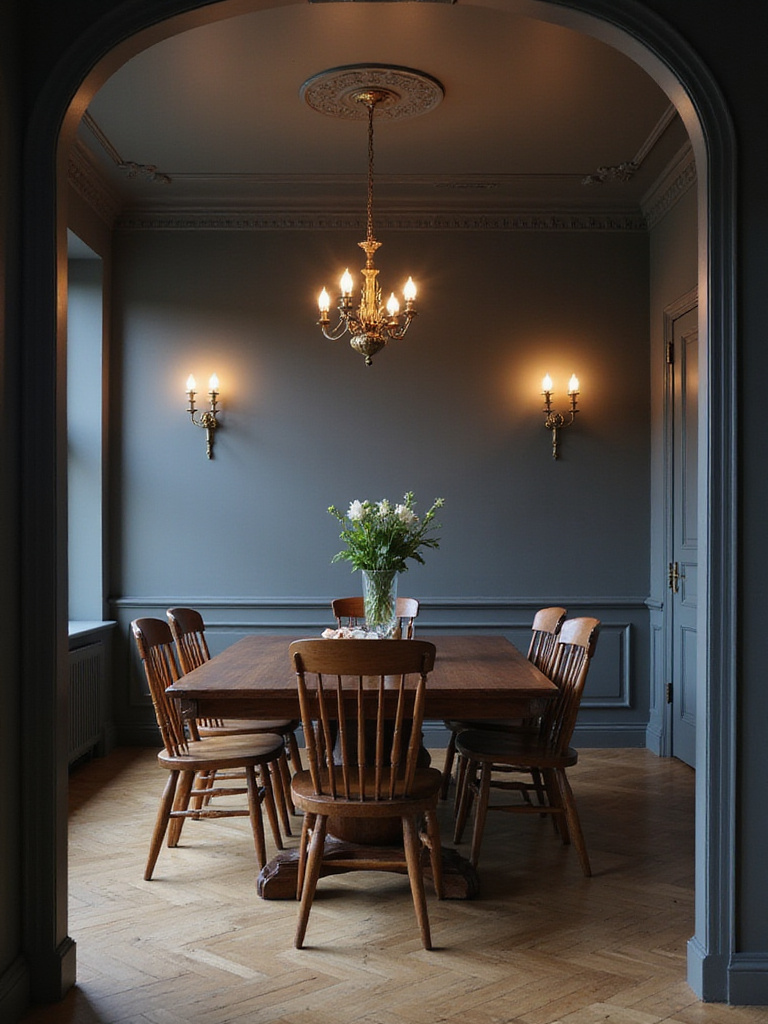
10. Intimate Eats: Colors That Create a Cozy Vibe
To create a truly intimate dining atmosphere, focus on warm, deep, and saturated dining room paint colors. These hues absorb rather than reflect light, making the space feel smaller, more enclosed, and wonderfully cozy. Rich, earthy tones and jewel colors like burgundy, terracotta, chocolate brown, forest green, navy blue, or warm charcoal work beautifully to envelop guests in an atmosphere that encourages connection.
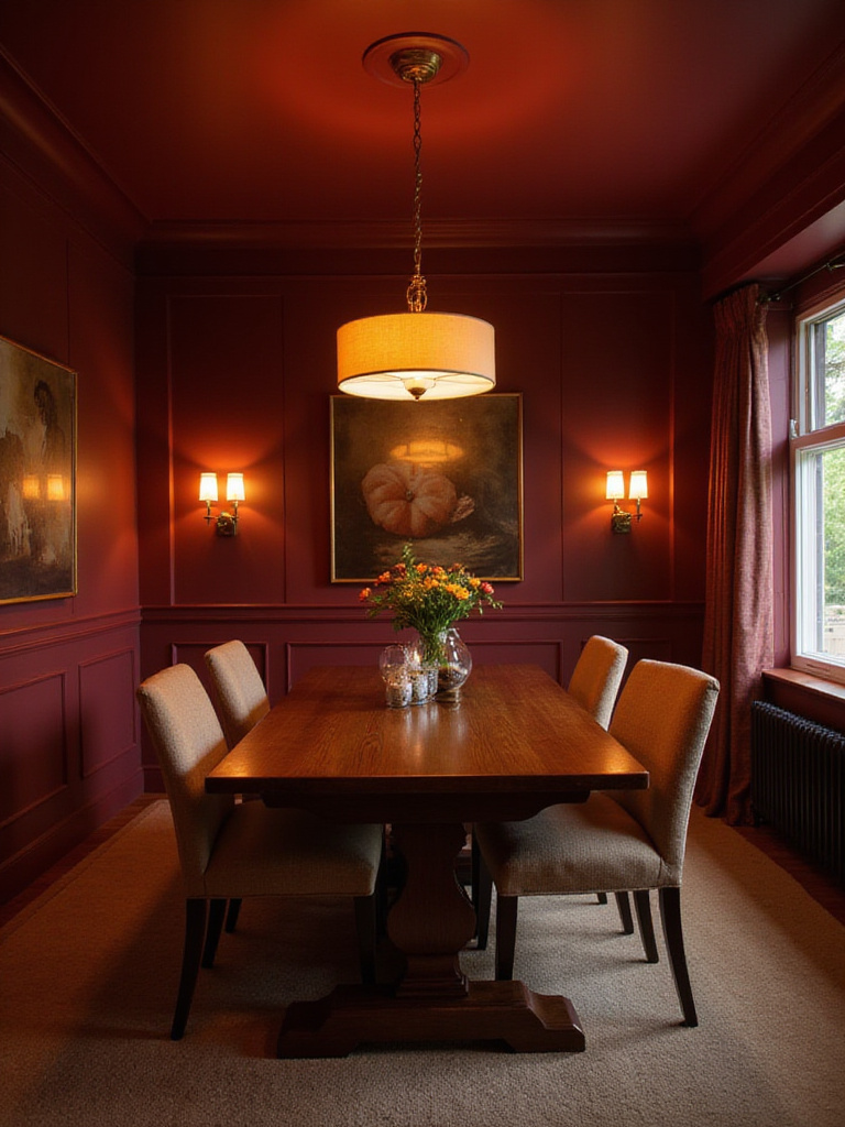
The psychology behind these colors is fascinating – they literally make the room’s boundaries feel closer, creating a sense of containment that feels like a warm embrace. These colors are intrinsically linked to comfort, reminiscent of firelight or a cozy blanket. They ground the space emotionally, promoting calm and focus that enhances mealtime conversation and encourages savoring each bite rather than rushing.
Imagine coming home to the gentle glow of a dining room painted in deep, rich color, where the outside world fades away and the only focus is the meal and company before you. But what if your dining room is small and you’re worried about making it feel cramped? Let’s explore how paint can actually expand your space.
11. Expand Your Space: Paint Tricks for Smaller Dining Rooms
If your dining room runs on the smaller side, strategic paint choices can create a remarkable sense of spaciousness. Light, cool colors and neutrals work wonders because they reflect light rather than absorbing it. Soft whites, pale blues, light greens, lavenders, and light grays make walls visually recede, brightening the room and creating an airier feel. Using variations of the same light shade on walls, trim, and ceiling further blurs boundaries, enhancing the expansive effect.
Paint finish plays an equally important role in visually expanding a small dining room. Higher sheen finishes like eggshell, satin, or semi-gloss reflect more light than matte, bouncing illumination around the room and creating brightness that suggests more space. Consider these additional tricks:
- Use a monochromatic color scheme for seamless flow
- Paint trim the same color as walls to eliminate visual breaks
- Add subtle vertical stripes to increase perceived height
- Use lighter colors on the ceiling to draw the eye upward
The challenge of awkward spaces becomes easier when you understand how paint color and light interact to create optical illusions. Speaking of light, what if your dining room is naturally dark? Let’s look at how paint can brighten even the dimmest eating area.
12. Lighten Up: Brightening a Dark Dining Area with Paint
For dining rooms lacking abundant natural light, the right paint becomes your most powerful tool for creating a brighter, more welcoming atmosphere. Select light, reflective shades with high Light Reflectance Values (LRV of 70+) to maximize brightness. Whites, off-whites, soft grays, pale blues, light greens, and warm pastels like blush or pale yellow excel at bouncing available light back into the room.
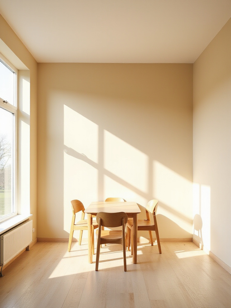
The paint finish is equally crucial for brightening a dark dining room. Higher gloss finishes reflect significantly more light than matte options. While full gloss might be too intense for all walls, eggshell or satin finishes offer an excellent balance of reflectivity without highlighting every imperfection. Beyond wall color, strategic paint choices for other surfaces make a dramatic difference:
- Paint the ceiling in luminous white or a pale shade with satin finish
- Use bright white on trim to frame light sources
- Consider lighter colors on the upper portion of walls if using two-tone techniques
The artisans’ commitment to environmental practices means choosing light-reflective dining room paint can actually reduce energy usage by decreasing reliance on artificial lighting. Adding visual interest doesn’t always require multiple colors on separate walls; sometimes, the magic happens using two tones on a single surface.
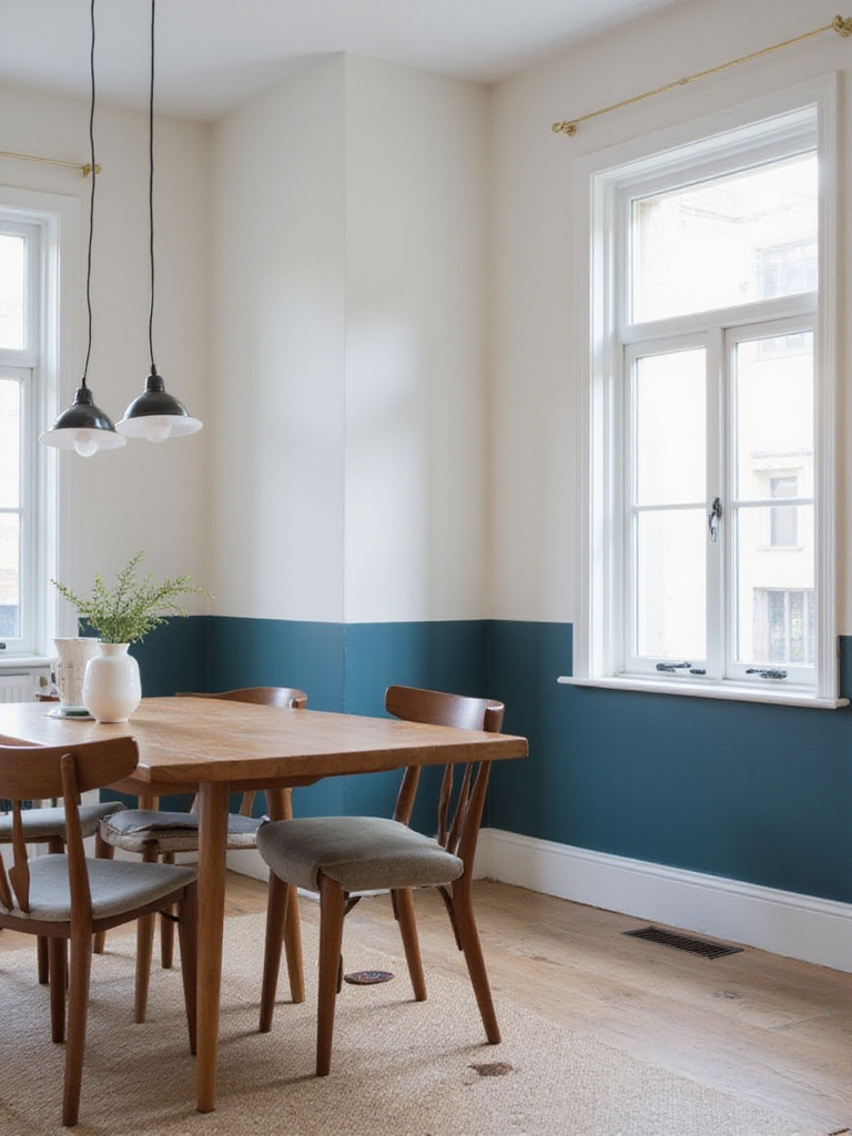
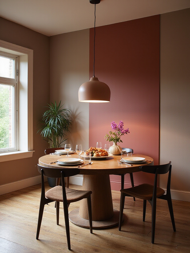
13. Two-Tone Walls: Adding Depth and Style
Two-tone walls in the dining room add remarkable visual interest, depth, and architectural detail without major construction. This technique divides walls horizontally with two different colors, breaking up large surfaces and creating a focal point that makes the space feel more dynamic and intentionally designed. It can alter perceived room proportions, making a dining room feel taller or cozier depending on placement.
When selecting colors for two-tone dining room paint, consider:
- Two shades of the same color for subtle sophistication
- Complementary colors for balanced contrast
- A darker color below with lighter above (traditional approach)
- A lighter color below with darker above (more contemporary feel)
The dividing line’s placement is crucial – typically aligned with existing architectural features like chair rails (30-36 inches from floor) or window sills. Without such features, place the line anywhere from one-third to two-thirds up the wall; lower lines make ceilings feel taller, while higher lines emphasize the lower color for a cozier effect.
The magic of this piece lies in its ability to add architectural interest to even the plainest dining room. No matter which colors or techniques you choose, how they appear is fundamentally dictated by your lighting. Let’s explore this critical relationship.
14. Let There Be Light: How Lighting Impacts Your Paint Choice
The interaction between light and dining room paint is perhaps the single most influential factor in how your color actually appears. Natural light provides the truest representation of color, but varies dramatically based on room orientation. South-facing rooms receive warm, bright light that enhances warm tones, while north-facing rooms get cool, diffused light that makes colors appear cooler or grayer. East and west-facing rooms experience significant shifts from morning to evening, meaning your paint color can look remarkably different throughout the day.
Artificial lighting, often dominant during evening meals, also transforms paint colors. Different bulb types cast distinctive glows:
- Incandescent: Warm, yellowish light enhances warm colors, mutes cool ones
- Halogen: Closer to daylight, shows colors more accurately
- LED: Available in various color temperatures, with high CRI options for true color representation
The position of fixtures creates shadows and highlights that further alter appearance, while paint finish determines how much light reflects or absorbs. Higher gloss bounces more light but highlights imperfections; lower gloss absorbs light for a softer, more muted look.
Running your hand across this material reveals how the same dining room paint color can feel entirely different depending on the light source illuminating it. Given these dramatic variations, testing colors before committing becomes non-negotiable.
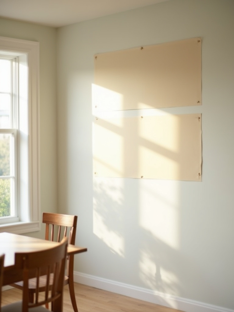
15. Swatch Savvy: Always Test Your Dining Room Paint Colors
Never select dining room paint from a tiny chip or digital image alone – it’s like choosing a wine based on the label. Testing actual paint swatches directly on your walls is absolutely essential. The unique lighting in your space – both natural light that shifts throughout the day and your specific artificial lighting – will dramatically alter how colors appear compared to the controlled environment of a paint store. Your existing furniture, flooring, and decor will also interact with the wall color in ways impossible to predict from a small sample.
For effective testing:
- Apply large swatches (at least 12×12 inches, preferably larger)
- Test on multiple walls that receive different light
- Place swatches near elements you won’t be changing (trim, flooring, furniture)
- Observe at different times of day and evening
- View under both natural and artificial light
- Consider painting swatches on movable boards to compare positions
When clients ask us about balancing style with comfort, we always emphasize the testing process as the bridge between vision and reality. While walls are your primary canvas, don’t overlook the surface above – the ceiling offers unique opportunities for adding color and dimension.
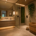
16. Look Up: Painting the Ceiling for a Unique Touch
Thinking beyond white ceilings opens exciting possibilities for your dining room design. Treating the ceiling as a “fifth wall” by applying color adds depth and sophistication that draws the eye upward and makes the space feel more intentional. A colored ceiling creates a sense of intimacy and coziness, particularly in rooms with high ceilings, making the dining experience feel more enveloping. It’s a unique way to introduce color without overwhelming the walls.
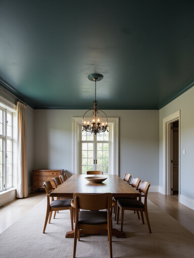
Ceiling color choices depend on your desired effect:
- Light colors (soft blue, pale gray): Create airiness, mimic sky, make room feel taller
- Dark colors (navy, charcoal, black): Add drama and intimacy, lower perceived height
- Bold colors or metallics: Add playfulness or glamour
- Same color as walls but lighter/darker: Create cohesive envelope
For finishes, flat or matte remains popular as it hides imperfections and reduces glare from overhead lighting. However, a slight sheen like eggshell can add subtle glow, especially with deeper colors or metallics, though this requires a very smooth ceiling surface.
The interplay between the colors creates a dining room with distinctive character that feels complete from floor to ceiling. As we’ve seen, color profoundly impacts mood and perception. Let’s explore the psychology behind dining room paint choices.
17. The Psychology of Color in Your Dining Space
Understanding color psychology empowers you to choose dining room paint that enhances the entire eating experience. Warm colors like red, orange, and yellow stimulate energy and appetite. Red particularly encourages lively conversation and makes a dining room feel vibrant. Orange creates a friendly, welcoming atmosphere, while yellow promotes happiness and optimism. However, intense versions of these colors can become overwhelming if overused.
Cool colors like blue and green have calming, soothing effects. While blue is sometimes said to suppress appetite (perhaps because it’s uncommon in natural foods), lighter blues create a serene atmosphere perfect for relaxed meals. Green connects to nature and freshness, promoting tranquility that encourages lingering conversations. Neutral colors provide sophisticated backdrops letting other elements shine, while deeper tones (burgundy, navy, forest green) create intimacy and elegance perfect for special occasions.
Beyond aesthetics, the ecological impact matters because the atmosphere created by your dining room paint influences not just how the space looks, but how people eat, interact, and feel during meals. Your dining room doesn’t exist in isolation – the paint must harmonize with your existing furniture and decor.
18. Coordinate Your Canvas: Matching Paint to Your Decor
Selecting dining room paint isn’t just about choosing a color you love – it must harmonize with your existing furniture, rugs, artwork, and accessories. These elements already establish a palette, style, and mood. As the largest surface and primary backdrop, walls that clash with these pieces will make the room feel disjointed or chaotic. Well-coordinated paint enhances your current pieces, reinforces your intended style, and contributes to a cohesive, inviting atmosphere.
To find the right coordinating color:
- Identify dominant and accent colors in key pieces (rug, artwork, upholstery)
- Bring physical samples or clear photos to compare with paint chips
- Consider the overall mood suggested by your decor colors
- Use a color wheel to understand complementary and analogous relationships
- Get sample pots to test how colors interact with your actual decor in your lighting
The styling mistake most people make is selecting dining room paint in isolation without considering how it will interact with existing elements. The perfect color on a chip might clash with wood tones or fabric undertones once on your walls. No matter how perfect your color choice, success ultimately depends on proper preparation.
19. Prep Like a Pro: Essential Steps Before You Paint
Thorough preparation is the foundation of a successful dining room paint job. Skipping or rushing prep leads to poor adhesion, visible imperfections, uneven finishes, and less durability. A properly prepared surface ensures the paint bonds correctly, provides a uniform look, hides underlying issues, and creates a professional result that lasts for years.
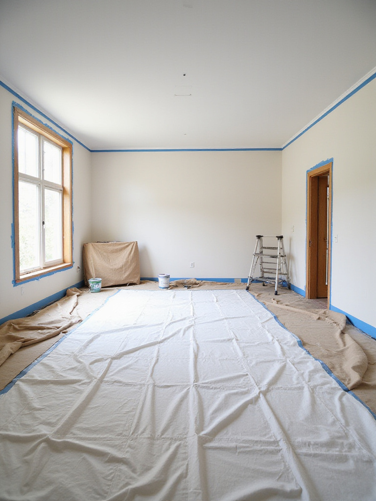
Essential preparation steps include:
- Clear the room completely or cover furniture thoroughly
- Protect floors with canvas drop cloths (better than plastic)
- Clean walls thoroughly with mild cleaner to remove dust, grease, and grime
- Repair imperfections with spackle or patching compound
- Sand repairs smooth and wipe away dust
- Apply appropriate primer to seal surfaces and ensure uniform color absorption
- Use high-quality painter’s tape on trim, baseboards, and ceiling lines
The environmental story behind this piece began with understanding that proper preparation actually reduces waste by extending the life of your paint job and reducing the need for premature repainting. Taking time with prep creates a dining room paint finish you’ll enjoy for years to come.
Conclusion
The dining room serves as the backdrop for countless moments in our lives – from everyday family meals to special celebrations. The paint color you choose fundamentally shapes these experiences, influencing everything from appetite and conversation to mood and comfort.
Whether you’re drawn to the warmth of terra cotta, the serenity of sage green, or the drama of deep navy, your dining room paint choice should reflect both your personal style and the atmosphere you want to create. By considering factors like lighting, room size, existing decor, and the psychological effects of color, you can transform your dining space into exactly what you envision – an inviting haven where memories are made, one meal at a time.