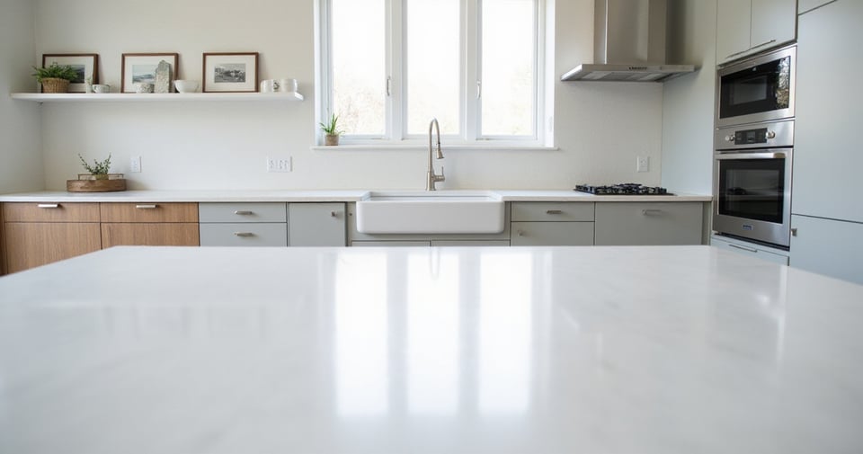
When it comes to kitchen design, few decisions impact the overall feel as much as your countertop color. It’s not just a surface for chopping vegetables – it’s the visual anchor that ties together cabinets, backsplash, and flooring while setting the mood for countless family gatherings and holiday festivities.
I’ve seen countless homeowners struggle with this choice during my years as a seasonal design specialist. Should you chase trends or stick with classics? Go bold or play it safe? The perfect kitchen countertop color balances your personal style with practical considerations while creating a space that feels right throughout the changing seasons. Let’s explore 18 essential tips to help you make this crucial decision with confidence!
1. Embrace the Timeless Appeal of Classic White Countertops
White countertops have maintained their coveted status in kitchen design for good reason. Their enduring popularity stems from unparalleled versatility and a clean, bright aesthetic that simply refuses to go out of style. White surfaces reflect light beautifully, instantly making kitchens feel more spacious and welcoming – a particular blessing in smaller spaces or kitchens with limited natural light. As a neutral canvas, white effortlessly complements virtually any cabinet color, backsplash material, or decorative style.
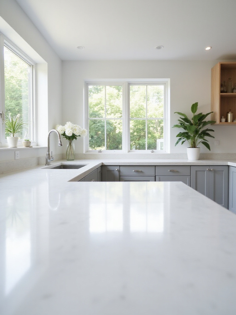
When exploring white options, you’ll find this versatile color across various materials, each with distinct characteristics:
- Quartz: Highly durable, non-porous, stain-resistant, requires no sealing
- Marble: Luxurious beauty with unique veining, more porous, requires regular sealing
- Granite: Available in predominantly white slabs with darker patterns, heat-resistant
- Solid Surface: Seamless integration, non-porous finish, less resistant to heat
- Laminate: Budget-friendly with many white pattern options, less durable than stone
The magic of this piece lies in how you experience white countertops differently throughout the day. Morning light highlights their crisp brightness, while evening brings a softer, warmer glow that creates an inviting atmosphere for gathering around the kitchen island.
2. Go Bold and Chic with Sleek Black Countertop Surfaces
Stepping into a kitchen with black countertops makes an immediate statement of sophistication and modernity. These dark surfaces anchor a kitchen design with sleek elegance while pairing effectively with nearly any cabinet color – from crisp whites and various grays to warm woods and even vibrant hues. Black countertops can be remarkably forgiving, often concealing minor spills and crumbs that might stand out starkly on lighter surfaces.
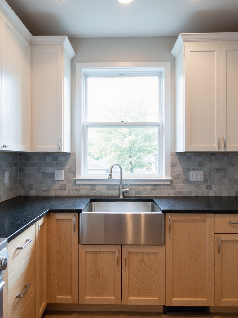
However, embracing the drama of black comes with considerations. Depending on the specific material and finish, especially highly polished surfaces, black countertops may show fingerprints, smudges, and water spots more readily than lighter or patterned alternatives. For those worried about maintenance, consider these options:
- Choose a matte or honed finish rather than high-gloss to minimize visible fingerprints
- Select black granite or quartz with subtle flecks or pattern variations
- Pair with light-colored cabinetry to balance the visual weight
- Ensure adequate lighting, both natural and artificial, to prevent the space from feeling dark
The unexpected environmental benefit comes from how black countertops can absorb and retain heat in winter months, creating a subtle warming effect in the kitchen – particularly noticeable when paired with natural materials like wood cabinetry for a striking contemporary contrast.
3. Find Balance with Versatile Shades of Gray Countertops
Gray countertops offer a beautiful middle ground between the starkness of white and the intensity of black, providing exceptional versatility that makes them a perennial favorite. Gray exists on a broad spectrum, from the palest, almost white shades to deep, dramatic charcoals approaching black. This extensive range allows gray countertops to harmonize with virtually any cabinet color, backsplash, flooring, and kitchen style.
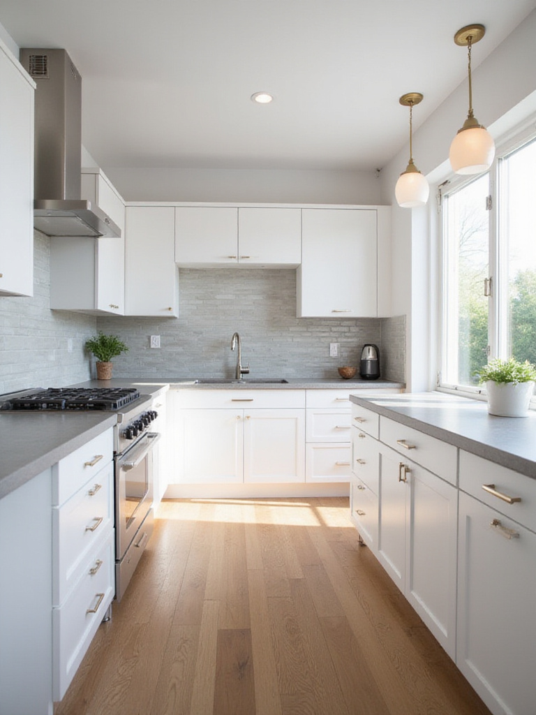
One of the key advantages gray offers over pure white or solid black is its ability to be incredibly forgiving of minor messes. Many gray countertops, especially those with subtle patterns or variations found in granite or quartz, excel at camouflaging crumbs, dust, and small spills. The specific shade you choose significantly impacts your kitchen’s overall mood:
- Light grays: Evoke an airy, bright feel, making smaller kitchens seem more spacious
- Medium grays: Offer a classic, balanced look that pairs well with most colors
- Dark grays: Add drama, depth, and luxury, often used in modern or industrial designs
The challenge of awkward spaces becomes easier when you introduce gray countertops. Their neutral nature allows them to visually recede or advance depending on the surrounding elements, helping to balance oddly shaped kitchens or unusual layouts while maintaining a sophisticated aesthetic.
4. Inject Warmth with Earthy Brown and Beige Countertop Tones
Brown and beige countertops bring an immediate sense of warmth, comfort, and stability into the kitchen, grounding the space with their earthy tones. These colors are deeply associated with nature, wood, and the earth itself, elements that evoke feelings of coziness and security. Unlike cooler neutrals, their inherent undertones, often leaning towards red, yellow, or orange, contribute to a visually warmer palette, making the kitchen feel more inviting and lived-in.
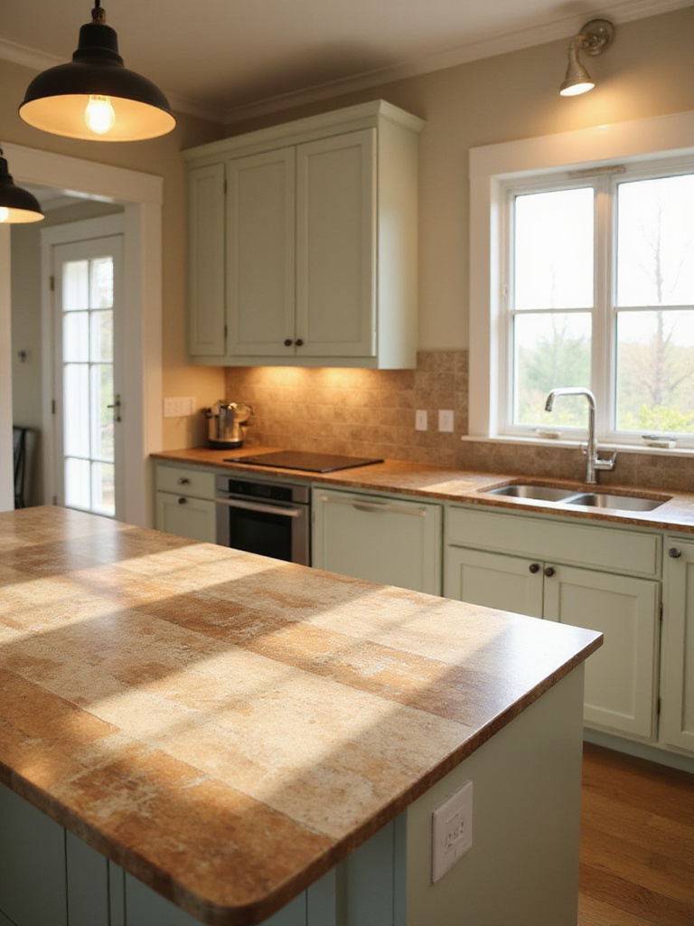
These earthy tones complement a wide array of kitchen design styles. They’re perfectly suited for traditional, rustic, farmhouse, and craftsman designs, enhancing the connection to natural materials. However, brown and beige also work beautifully in transitional and even certain modern designs, adding warmth that can soften sleek lines. Popular materials featuring these tones include:
- Natural stones like granite and marble with stunning variations
- Engineered quartz in numerous earth tones
- Butcher block for natural wood warmth
- Laminate and solid surface materials in realistic stone patterns
Beyond aesthetics, the ecological impact matters because many earth-toned countertops reflect sustainable choices. Natural materials like responsibly harvested wood or locally quarried stone reduce transportation emissions, while some engineered products incorporate recycled content. These countertops connect your kitchen to the environment both visually and practically.
5. Add a Pop of Color with Blues, Greens, or Other Vibrant Hues
For those who want their kitchen to make a statement and reflect a bold personality, choosing a vibrant kitchen countertop color like blue, green, or even something unexpected like red or yellow can be transformative. These colors inject immediate personality and visual interest, turning an ordinary space into a memorable one. Beyond aesthetics, colors influence mood – blues often feel calming and serene, while greens evoke nature and freshness.
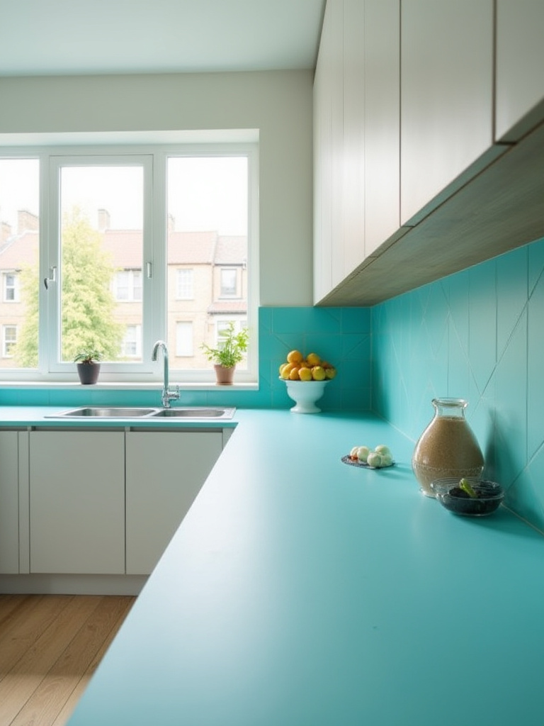
Vibrant countertop colors are most commonly found in engineered materials:
- Quartz: Offers the widest range of consistent, saturated hues
- Laminate: Provides extensive color options at a lower cost
- Solid surface (acrylic): Comes in many colors with seamless integration
- Epoxy resin: Achieves striking, custom colors for unique applications
The seasonal adaptation reveals itself when you pair these bold countertops with different accessories throughout the year. A deep blue countertop that feels cool and refreshing in summer can become cozy and rich when accented with copper and warm woods in autumn. Similarly, an emerald green surface transitions beautifully from spring’s bright whites to winter’s festive golds and reds.
6. Consider Your Kitchen Cabinet Color as the Starting Point
When embarking on the journey of selecting a kitchen countertop color, your cabinets provide the logical and practical starting point. Cabinets typically occupy the largest visual space in the room and represent a significant investment. Their color establishes the foundational tone for the entire kitchen design, making it essential to choose a countertop that harmonizes with this dominant element.
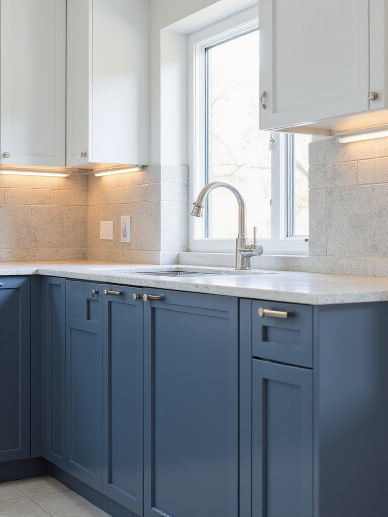
There are three basic approaches to pairing cabinet and countertop colors:
- Contrast: Selecting a countertop significantly lighter or darker than cabinets (white cabinets with black countertops)
- Complement: Choosing a countertop similar in tone with subtle variation (light grey cabinets with slightly darker grey countertops)
- Coordinate: Matching undertones and overall style for harmony (warm wood cabinets with warm-toned granite)
The inspiration for this collection struck when I noticed how different cabinet colors naturally suggest certain countertop pairings. White cabinets offer the most versatility, working with virtually any countertop color. Grey cabinets pair beautifully with white, lighter grey, black, or marble-look surfaces. Dark wood or black cabinets create drama when paired with light countertops. Medium wood cabinets harmonize with creamy whites, beiges, greens, or earthy granites that pick up undertones in the wood.
7. Use Countertop Color to Influence the Room’s Overall Mood
Beyond simply looking good, your kitchen countertop color is a powerful psychological tool that significantly influences the mood and atmosphere of the entire space. Color psychology reveals that light colors (whites, light grays, pale beiges) evoke feelings of spaciousness, cleanliness, and calm by reflecting light. Darker colors (black, charcoal, deep brown) add sophistication, drama, or cozy intimacy by absorbing light. Warm colors stimulate energy and appetite, while cool colors bring tranquility.
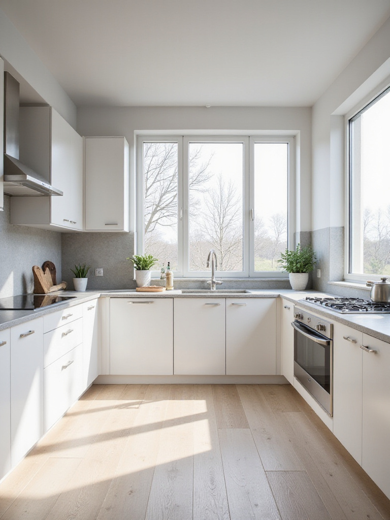
The finish of your countertop further impacts the mood:
- Highly polished: Adds brightness and formality, making colors appear richer
- Honed or matte: Creates a softer, more understated look for a calmer feel
- Leathered or textured: Adds tactile interest and a natural, organic quality
After months of sourcing and curation, I’ve found that defining the primary mood you want for your kitchen is the essential first step in color selection. For a spa-like retreat feeling, consider soft blue or green quartz paired with natural wood cabinets and diffused lighting. For an energetic, social kitchen hub, high-contrast combinations like white cabinets with bold-colored or black countertops create visual excitement that stimulates conversation.
8. Think About Light vs. Dark: Impact on Perceived Space
The choice between light and dark kitchen countertop colors profoundly affects how spacious your kitchen appears. Light-colored countertops – whites, creams, light grays, and pastels – excel at reflecting light, making spaces feel more open and airy. They visually recede, creating an illusion of depth that expands the perceived boundaries of the room. This makes light countertops particularly valuable in smaller kitchens or spaces with limited natural light.
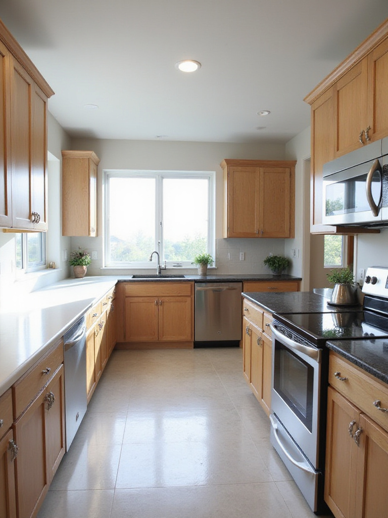
Conversely, dark-colored countertops – black, charcoal, deep blues, and dark browns – absorb light and define boundaries more strongly. While they add sophistication and drama, they generally make spaces feel more intimate. Consider these factors when deciding between light and dark:
- Kitchen size: Small kitchens usually benefit from light countertops
- Natural light: Limited light suggests lighter countertops
- Ceiling height: Lower ceilings pair well with lighter surfaces
- Cabinet color: Dark countertops need balance with lighter elements elsewhere
While designing clients’ homes, I’ve noticed how the interplay between light and shadow throughout the day dramatically affects how we perceive kitchen countertop colors. Morning light streams through windows differently than afternoon sun, creating shifting patterns across surfaces that can make the same color feel dramatically different at various times. This natural rhythm of light should inform your color choice based on when you most frequently use your kitchen.
9. Coordinate or Contrast with Your Backsplash Design
The relationship between your kitchen countertop and backsplash is critical to the overall visual harmony of the space. You have two primary approaches: coordinating or contrasting. Coordinating means selecting colors, patterns, or materials for both surfaces that are similar in tone or style, creating a seamless, unified look. This approach often results in a calmer, more elegant kitchen and is favored in minimalist, traditional, or transitional designs aiming for understated sophistication.
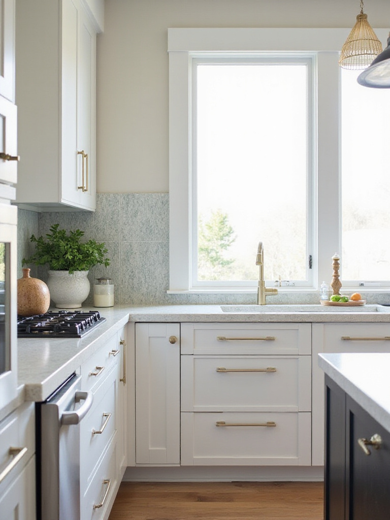
Contrasting involves deliberately choosing elements that differ significantly in color, shade, texture, or pattern. This creates visual separation and makes one or both elements stand out as potential focal points. To decide which approach works best for your kitchen:
- Consider the overall style and mood you want – serenity suggests coordination, personality suggests contrast
- Look at your cabinets, flooring, and walls – if they’re busy, coordinating counter and backsplash might provide balance
- Decide which element you want as the “star” – the contrasting element usually takes this role
- Think about visual flow – coordination creates calm continuity, contrast creates energy and interest
Running your hand across this material reveals how the texture of your countertop can create a compelling tactile contrast with your backsplash, even when colors are similar. For instance, a honed marble-look quartz countertop paired with a glossy ceramic tile backsplash in the same color family creates subtle contrast through texture rather than color – an approach that adds sophistication without overwhelming the eye.
10. Account for Natural and Artificial Kitchen Lighting
Lighting is arguably the most critical factor influencing how your chosen kitchen countertop color will appear in your space. Natural light is highly dynamic, changing in intensity, direction, and color temperature throughout the day and across seasons. Morning light might have a cool bluish cast, while late afternoon light brings warmer golden tones that dramatically transform how colors appear.
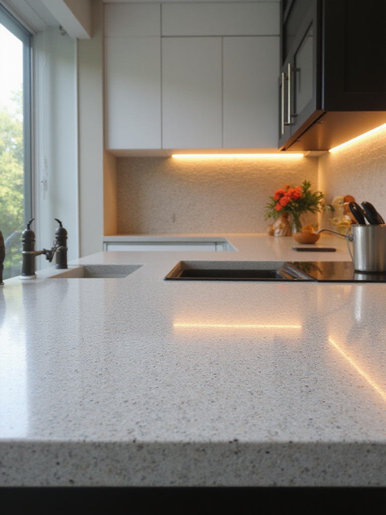
Artificial lighting is equally impactful, with different bulb types creating distinct effects:
- Warm white (2700K-3000K): Makes colors appear warmer, cozier
- Cool white (4000K-5000K): Makes colors appear cooler, cleaner
- Daylight (5000K-6500K): Aims for balanced color representation
- Color Rendering Index (CRI): Higher numbers (90+) show colors more accurately
The ambiance evolves throughout the day as natural light shifts, which is why testing samples under all your kitchen’s lighting conditions is essential. Place large samples of potential countertop materials in different locations and observe them at various times – morning, midday, evening – with both natural light and artificial lights. Pay attention to how shadows fall, how reflective the surface is, and how the color interacts with cabinet and wall colors under different lighting scenarios.
11. Factor in Maintenance and Stain Visibility by Color
While material type primarily determines a countertop’s inherent stain resistance, the kitchen countertop color and pattern you choose dramatically affect the visibility of everyday wear and tear. Very dark and very light solid colors tend to show imperfections most clearly. Dark solid surfaces highlight fingerprints, smudges, and water spots, while pure white surfaces immediately reveal colorful stains from wine, coffee, or turmeric.
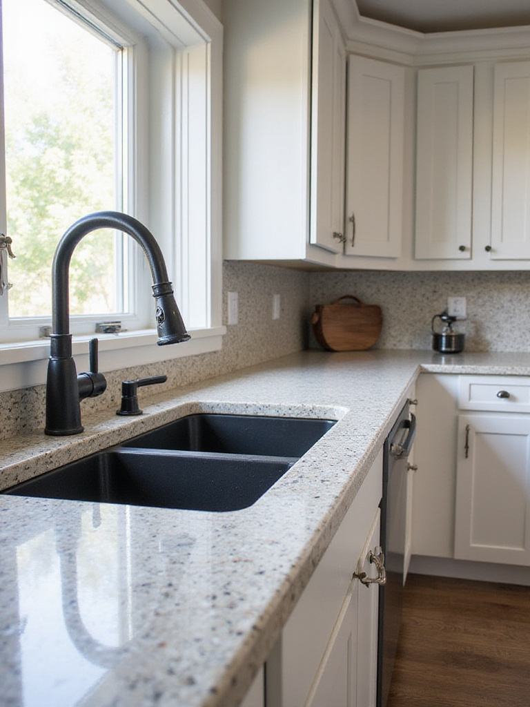
For those hesitant about bold patterns, consider these practical insights about how different colors show common kitchen messes:
- Very dark solids (black, dark blue): Show water spots, dust, fingerprints
- Very light solids (pure white): Show colorful stains, scratches
- Medium tones (grays, beiges): Generally more forgiving of everyday messes
- Patterns and variations: The best at hiding crumbs, minor stains, and light scratches
The craftsmanship reveals itself in how well a countertop’s color and pattern work with your lifestyle. When hosting holiday gatherings, I’ve noticed how differently kitchen countertop colors perform under pressure. A friend’s speckled granite island remained looking pristine throughout a chaotic Thanksgiving prep, while another’s solid white quartz showed every splash of cranberry sauce and pumpkin filling. Match your color choice to your cooking style and how much maintenance you’re willing to perform.
12. Understand How Color Affects Material Durability and Appearance
The color and pattern of a countertop material significantly impact how it performs visually over time and how visible everyday wear becomes. Pattern and color depth excel at hiding crumbs, dust, fingerprints, and minor scratches. A busy, multi-tonal granite or quartz with prominent veining makes imperfections much harder to spot compared to uniform surfaces, effectively making the countertop appear more durable.
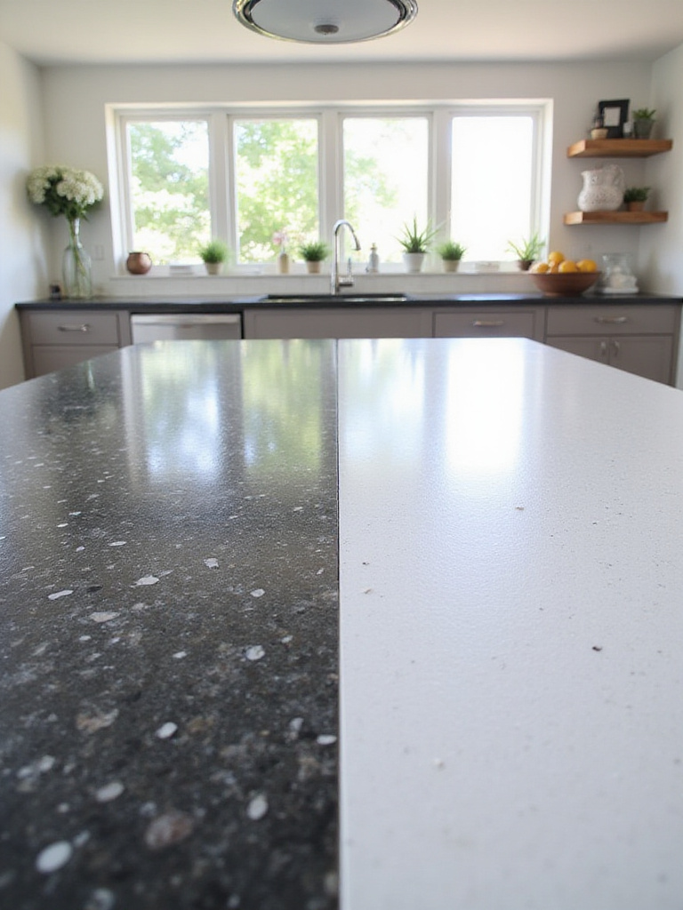
While actual physical durability depends on the material itself, color influences how the material visually ages:
- Sunlight exposure: Some pigments in engineered materials may fade over time, with darker colors potentially showing this more obviously
- Etching visibility: On materials like marble, etching (dull spots from acids) is often more noticeable on dark, polished surfaces than lighter or honed finishes
- Scratch visibility: Scratches typically appear lighter than the base material, making them more noticeable on darker surfaces
- Chip visibility: Chips reveal the interior of the material, which may contrast more with some colors than others
The designer’s attention to detail shows in how thoughtfully color and material are paired. During a recent kitchen renovation project, I recommended a client choose a medium-toned quartz with subtle veining for their busy family kitchen. Three years later, it still looks nearly new despite heavy use, while their neighbor’s solid black granite shows every water spot and requires constant wiping to maintain its appearance.
13. Explore Veining and Pattern Variations within Colors
Beyond base color, the presence and style of veining and patterns define many popular countertop materials, adding depth, movement, and unique personality. Veining refers to distinct linear or swirling formations, often in contrasting colors, that create marbled or streaked effects. Patterns encompass veining as well as speckling, mottling, or granular textures inherent in natural stones or designed into engineered materials.
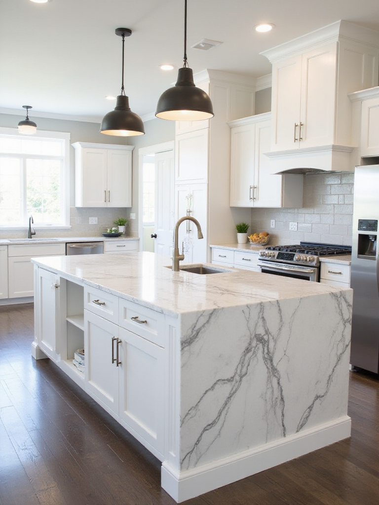
Veining and patterns significantly impact a kitchen’s feel compared to solid colors:
- Bold, high-contrast veining: Makes a powerful statement, adds drama and luxury
- Subtle, tone-on-tone patterns: Add warmth and organic texture without overwhelming
- Large, open patterns: Create a more dramatic, artistic impression
- Tight, speckled patterns: Offer more visual consistency and often hide messes better
What makes this design special is the way different pattern scales create distinct impressions in the kitchen. When clients ask me about balancing style with practicality, I often recommend medium-patterned materials that hide everyday messes while providing visual interest. It’s absolutely crucial to see the actual slab or a very large sample before purchasing, especially for natural stone or quartz with significant veining, as small samples cannot adequately represent how patterns flow across an entire countertop.
14. Consider the Size of Your Kitchen Space
The physical dimensions of your kitchen should directly influence your kitchen countertop color selection. In smaller kitchens, your goal is typically to maximize the feeling of spaciousness and brightness. Lighter countertop colors – whites, creams, light grays, or pastels – reflect light effectively, making rooms feel larger and more open. Dark colors or busy patterns can sometimes feel visually heavy in compact spaces.
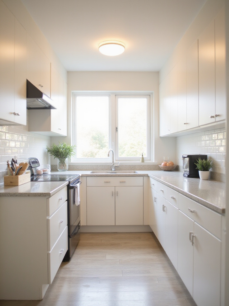
Larger kitchens offer much greater flexibility:
- You can confidently use darker, bolder colors without making the space feel small
- The kitchen can handle more dramatic patterns or veining
- You might consider using different countertop colors in distinct zones (island vs. perimeter)
- Contrasting elements create visual interest in expansive spaces
If you’ve struggled with similar rooms before, know that creative approaches can overcome spatial challenges. Even in smaller kitchens, dark countertops can work beautifully when balanced with light cabinets, walls, and ample lighting. I recently helped transform a tiny galley kitchen using a dramatic black granite with subtle gold flecks, paired with bright white cabinets and strategic lighting – the result felt both spacious and sophisticated despite the limited square footage.
15. Align the Color Choice with Your Personal Style and Decor
Your kitchen is a reflection of you, and the countertop color is a major player in establishing its personality. Identifying your kitchen’s existing or desired style (modern, traditional, farmhouse, industrial, transitional) is fundamental since different design styles naturally favor specific color palettes and aesthetics.
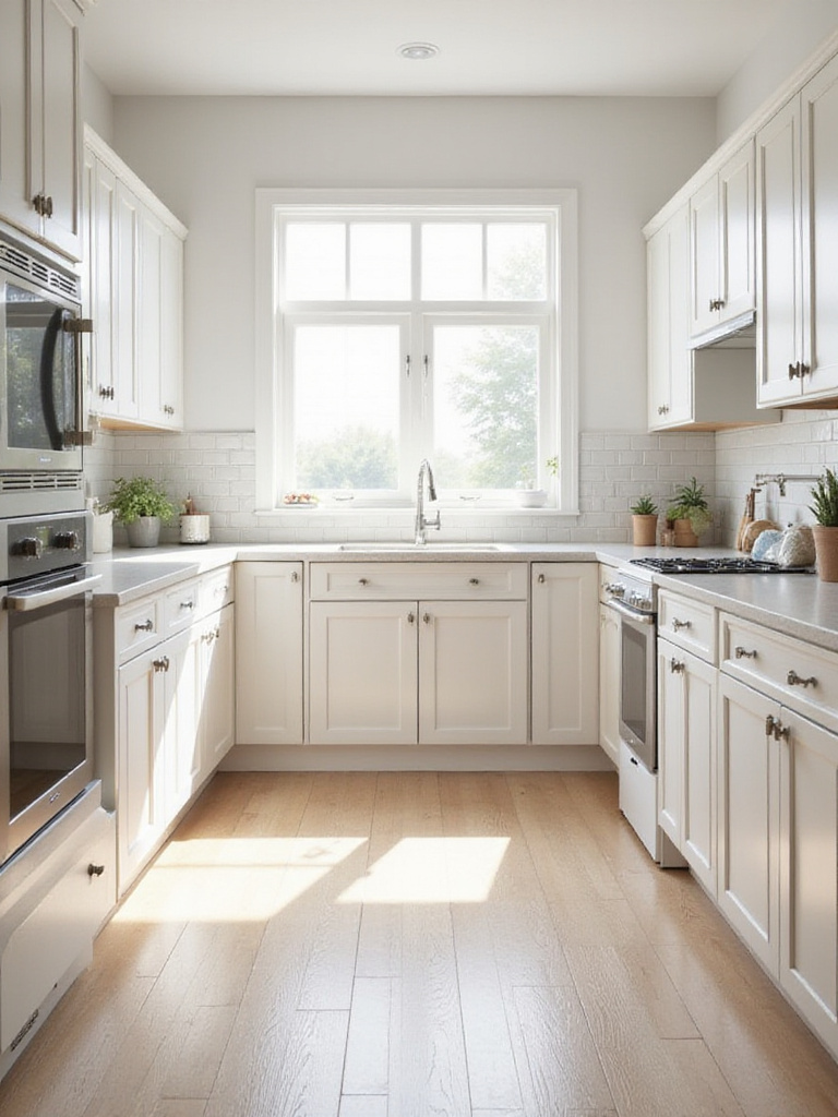
Understanding your style helps filter countertop options:
- Modern/Contemporary: Clean whites, grays, or bold solid colors
- Traditional: Richer, darker colors or intricate granite patterns
- Farmhouse: Warm neutrals, butcher block, or lighter stone tones
- Industrial: Raw materials like concrete or dark, matte surfaces
- Transitional: Wide range from classic neutrals to sophisticated deeper tones
The artisan collective that creates these pieces often draws inspiration from various design traditions, which is why certain countertop colors naturally align with specific styles. During seasonal home refreshes, I’ve noticed how the same kitchen countertop color can feel dramatically different when surrounded by different decor elements. A cream-colored quartz that feels traditional with cherry cabinets and ornate hardware transforms into a coastal-casual look when paired with light blue cabinetry and rope-inspired accessories.
16. Look at Current Kitchen Countertop Color Trends (But Don’t Be Ruled By Them)
Keeping an eye on current kitchen countertop color trends can provide valuable inspiration. Today’s trends highlight a preference for natural looks, clean lines, and versatile neutrals. Various shades of white and off-white, particularly those mimicking marble veining, remain highly popular. The spectrum of gray continues strong, offering sophistication and modernity. Warmer neutrals like greige, taupe, and earthy browns are gaining momentum, while black or very dark gray countertops, especially in matte finishes, add drama.
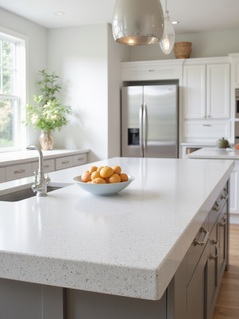
However, it’s crucial not to let trends completely dictate your choice:
“Trends come and go, but you’ll be living with your countertops for years. Choose what speaks to you, not just what’s currently popular in magazines.” – Interior design wisdom I share with all my clients
While trendy, certain elements have staying power because they connect to fundamental design principles rather than fleeting fashions. For example, the current preference for natural materials and organic patterns reflects a deeper cultural shift toward environmental consciousness and authenticity. When helping clients navigate seasonal trends, I encourage them to distinguish between genuine evolution in design (like the move toward more sustainable materials) and more superficial color fads that might quickly date their kitchen.
17. Gather Samples and View Them in Your Own Kitchen Lighting
This is perhaps the single most important step in choosing your perfect kitchen countertop color. It is absolutely crucial to view physical samples of materials and colors you’re considering in your own kitchen under your specific lighting conditions. Showroom lighting rarely replicates the unique mix of natural and artificial light in your home, and the color can look dramatically different once installed.
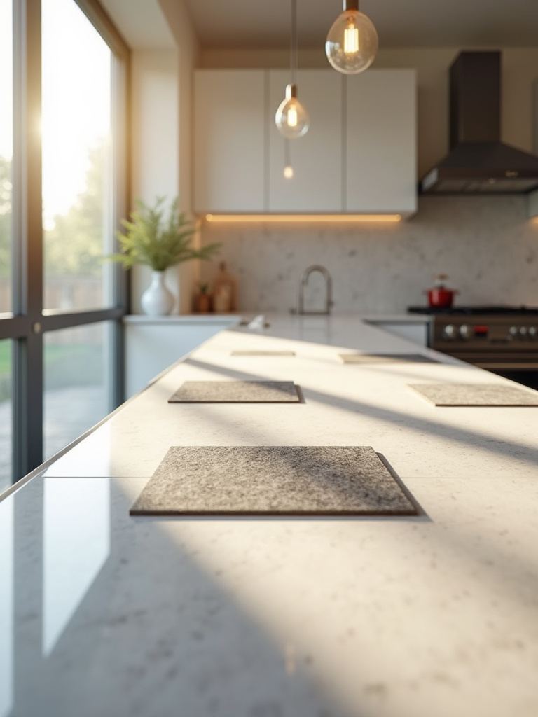
Different types of kitchen lighting affect countertop colors in distinct ways:
- Natural daylight: Provides the most accurate color representation but changes throughout the day
- Incandescent bulbs: Cast a warm, yellowish glow
- Halogen lights: Brighter and whiter
- LED lights: Vary widely based on color temperature and CRI
- Under-cabinet lights: Create specific highlights and shadows
The unexpected pairing that always works is bringing together multiple large samples with swatches of your cabinet color, flooring, and backsplash materials. I’ve been working behind the scenes with countertop suppliers to help homeowners create “sample stations” where they can arrange these elements together and view them at different times of day. This practice has prevented countless expensive mistakes and disappointments when the installed countertop doesn’t match expectations.
18. Don’t Forget the Resale Value – Choose Widely Appealing Colors
While your kitchen should absolutely reflect your personal style, if you anticipate selling within the next decade, consider how your kitchen countertop color choice might impact resale value. The kitchen is a major selling point, and countertops are prominent, expensive, and difficult to change. Choosing a color with broad appeal can make your home more attractive on the market, potentially leading to a faster sale and higher price.

The most widely appealing countertop colors for resale include:
- Various shades of white (pure white, off-white, speckled white)
- Light to medium grays
- Beige and greige tones
- Neutral granites and marbles with subtle patterns
- Quartz in these neutral palettes
The sustainable journey of this material involves thinking long-term about both environmental impact and design longevity. When many homeowners wonder how to balance personal preference with future marketability, I suggest focusing on timeless materials in neutral colors for the main countertops, while expressing personality through easily changeable elements like backsplashes, hardware, or decorative accessories. This approach satisfies both your current desires and future selling potential.
Conclusion
Selecting the perfect kitchen countertop color requires balancing aesthetics, practicality, personal style, and sometimes resale considerations. By thoughtfully evaluating how color interacts with your cabinets, influences mood, performs under your specific lighting, and holds up to daily life, you can navigate the vast array of options confidently.
Remember that your countertops are a significant investment and central feature of your kitchen for years to come. Whether you choose timeless white, dramatic black, versatile gray, warm earth tones, or a bold statement color, the right choice creates a kitchen that feels both beautiful and functional – a space where memories are made through every season, from summer brunches to holiday gatherings and quiet winter evenings at home.
