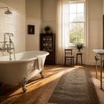
There’s a moment most of us have had: standing in the bathroom early in the morning, reaching for a towel, and realising that every wall is bare. The space is functional — clean, well-organised, perfectly lit — but it feels like no one lives there. Not quite a bathroom. More like a bathroom you’re borrowing.
We spend more time in our bathrooms than we tend to account for. A few minutes in the morning, a shower in the evening, a long bath at the weekend. Multiplied across a year, it adds up to hundreds of hours in a space that most of us have never actually designed — just filled. And bathroom art ideas are where most people start when they finally decide to change that.
As a wellness design consultant, I’ve seen how a considered approach to art in the bathroom can change the whole experience of a room. Not through grand gestures, but through the daily act of looking at something that calms you, inspires you, or simply makes the space feel inhabited. The 16 bathroom art ideas below range from botanical prints and handmade ceramics to oversized photography and gallery walls — with guidance on what works where, and why.
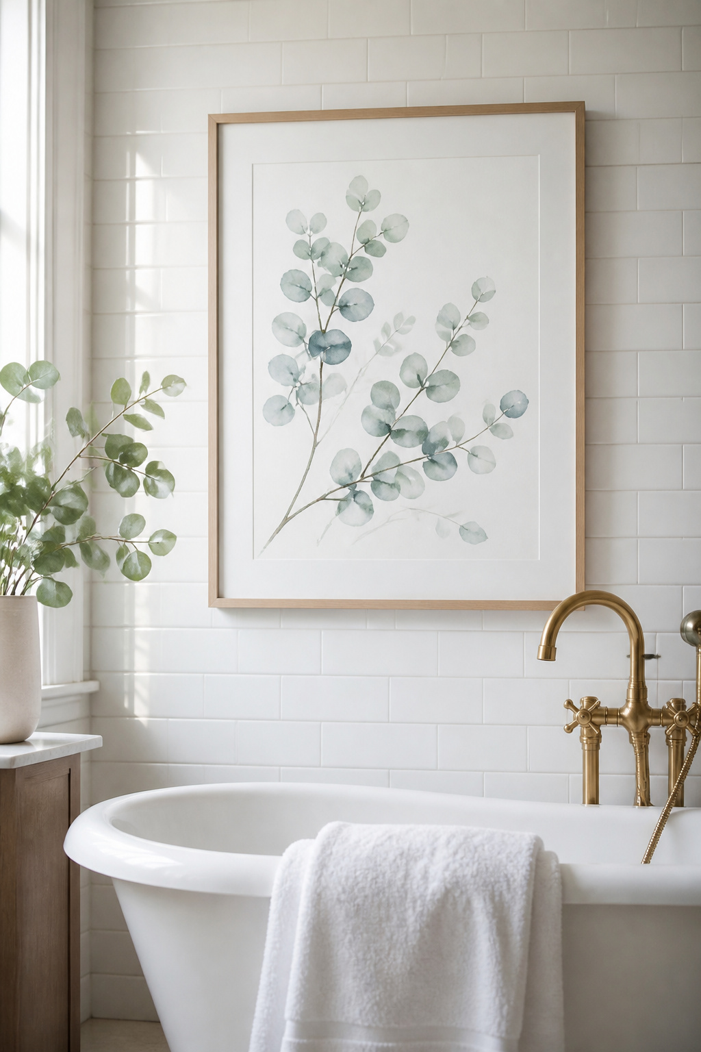
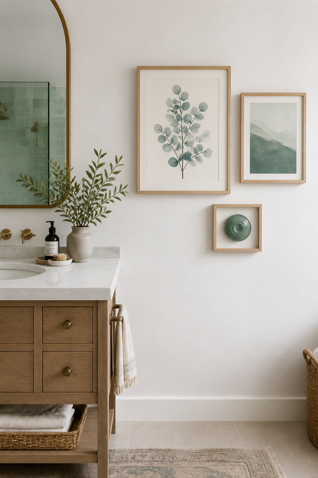
1. Botanical Prints as Bathroom Art Ideas That Calm and Centre
There’s real research behind the instinct most people already have — that looking at plants, even pictures of plants, feels good. Biophilic design studies show that nature imagery measurably lowers cortisol and reduces physiological stress markers, producing effects similar to spending time outdoors. In environments as removed from nature as most modern bathrooms, botanical prints become a daily micro-dose of that benefit. Bathrooms visited five or six times a day are, in that sense, ideal placements for this kind of artwork.
The type of botanical illustration matters. Scientific botanical engravings — the kind produced by 18th and 19th century naturalists, where every root, stem, and seed is rendered with precision — engage a different quality of attention than a loose painted flower. They reward looking. Your eye keeps finding detail. That quality of slow, curious observation is, in itself, a form of calm.
For framing: thin black or natural wood frames let the content lead. Use UV-resistant acrylic glazing rather than standard glass — it resists bathroom humidity better, won’t shatter from temperature cycling, and filters the UV that fades prints over time. For placement above a toilet, match the art width to roughly two-thirds of the toilet’s width — typically 16-20 inches across. Anything narrower looks like it wandered there by accident.
For high-quality prints that aren’t generic, look at museum shop archives (the Natural History Museum and Kew Gardens both sell excellent reproduction prints), Charting Nature’s coordinated print sets, or Etsy sellers like WatercolorBotanicals for original watercolour work. If you want to go deeper into the wellness case for biophilic bathroom design principles, the research is both fascinating and immediately practical.
2. Framed Pressed Botanicals Under Glass for a Tactile Living Wall
A pressed botanical under glass is not the same thing as a print of a botanical. That distinction is worth making clearly, because it changes everything about how the piece reads.
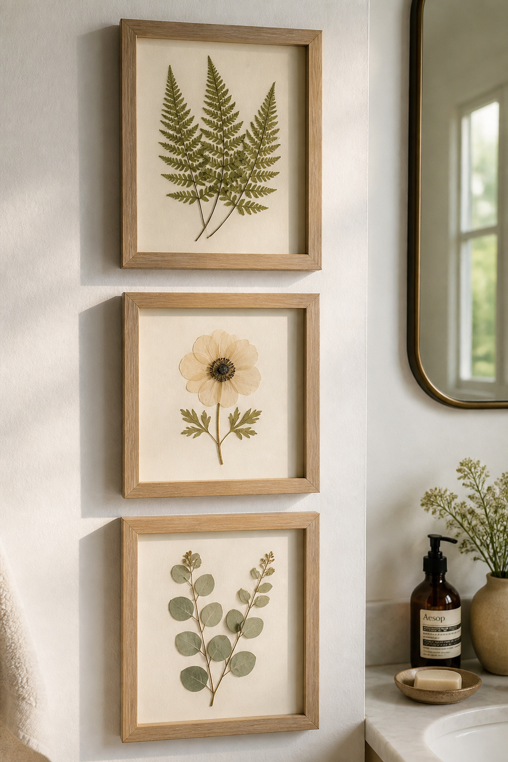
Real pressed plant material — ferns, anemones, seed heads, grasses dried flat and mounted on archival board — retains its original organic structure. The variation between individual specimens means no two framed pieces look exactly alike. The vein patterns in a ginkgo leaf, the translucency of a dried poppy petal, the subtle colour shift from edge to centre in a eucalyptus sprig — these details are not reproducible. They have the quality of something that was once alive, and that registers below conscious awareness.
For bathroom use, framing needs thought. Use a frame with airtight sealing and UV-resistant acrylic glazing. Mount specimens on acid-free mat board with archival adhesive — standard PVA glues yellow over time and transfer to the specimen. A deep rebate keeps the specimen from touching the glazing, preventing condensation contact on humid mornings. Groups of three or four pressed botanicals in matching frames work better than a single piece — consistency in frame finish (all matte black, all natural oak) unifies varied specimen types into a collection. Mix scales: one larger statement piece alongside two smaller ones creates hierarchy without uniformity.
3. Abstract Bathroom Wall Art in Muted, Earth-Toned Palettes
Bathrooms are visually complex environments. Tile grout lines, reflective surfaces, chrome fixtures — all of it competing for attention before 8am. Muted abstract bathroom wall art functions as a resting point in this complexity, a place for the eye to settle rather than read and process.
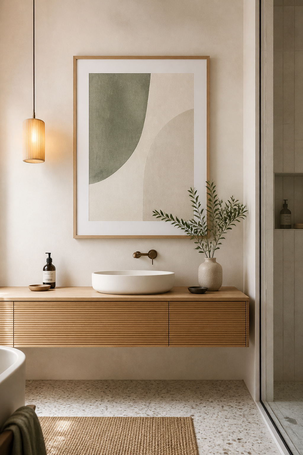
The research on this is specific. Sage green has been linked in residential studies to reduced cortisol and improved mood — its calming effect mimics the visual impact of forest foliage. Warm terracotta and clay tones read as grounding rather than stimulating — ideal in a space associated with starting and ending the day. Cool blue-greens suit bathrooms with white or chrome fixtures, softening the clinical quality without clashing with existing warmth.
In 2025 and into 2026, the dominant trend for art for bathroom walls has moved firmly toward Japandi-influenced abstract work: Zen brushwork, abstract landscapes in muted fields of colour, quiet floral compositions on visible textured paper. Society6, Desenio, and Art.com all carry affordable muted abstract prints — aim for a minimum resolution of 300 DPI for clean edges at larger sizes, and go for at least 40x50cm for any wall above waist height. Anything smaller disappears.
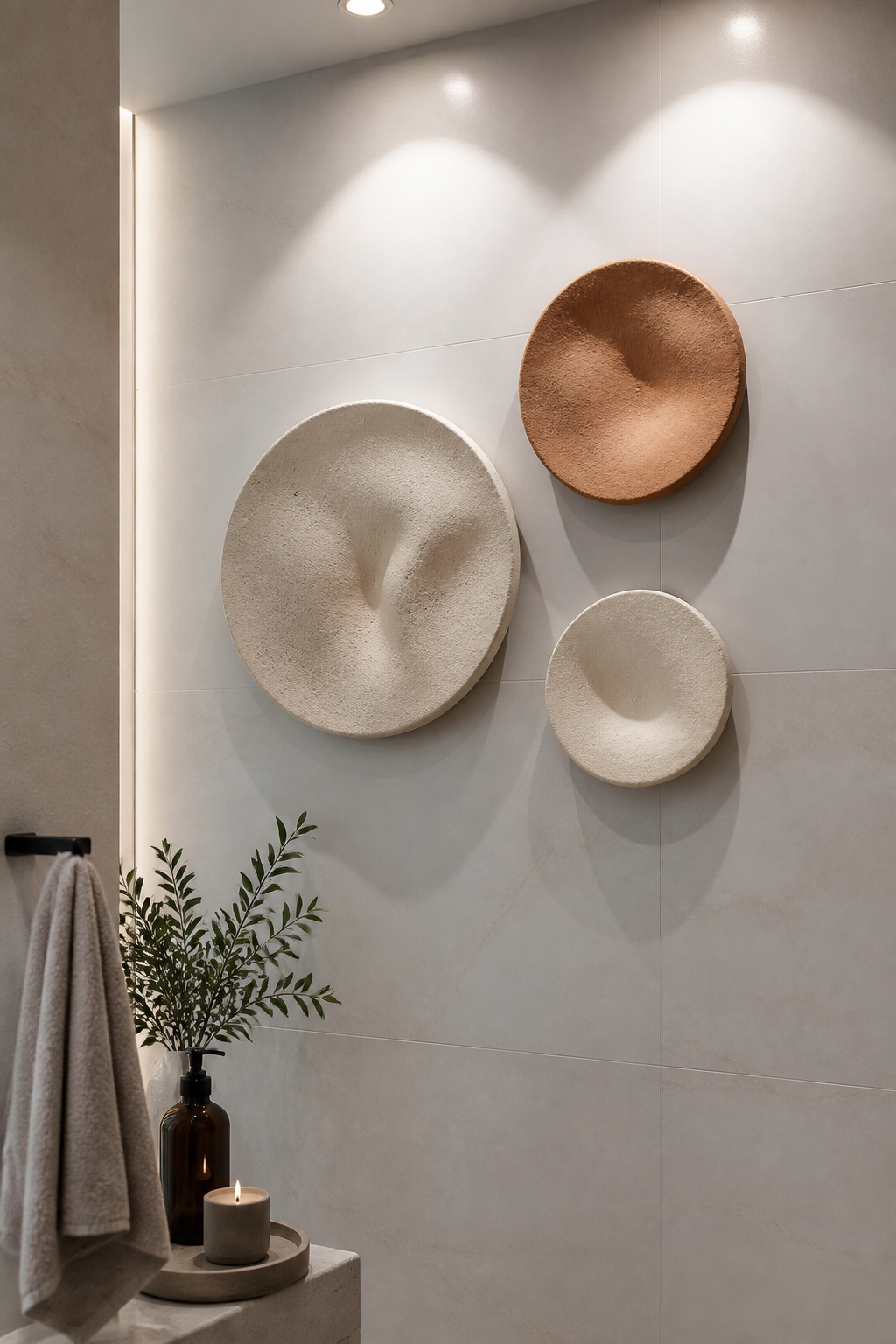
4. Handmade Ceramic Wall Hangings With Organic Texture
Ceramic wall art does something no flat print can: it casts shadows. Real ones, that change as your bathroom light shifts through the morning — directional overhead light at 7am reading the surface completely differently to the softer tungsten of the evening. That dynamic quality is what makes ceramic pieces feel alive rather than static on a wall.
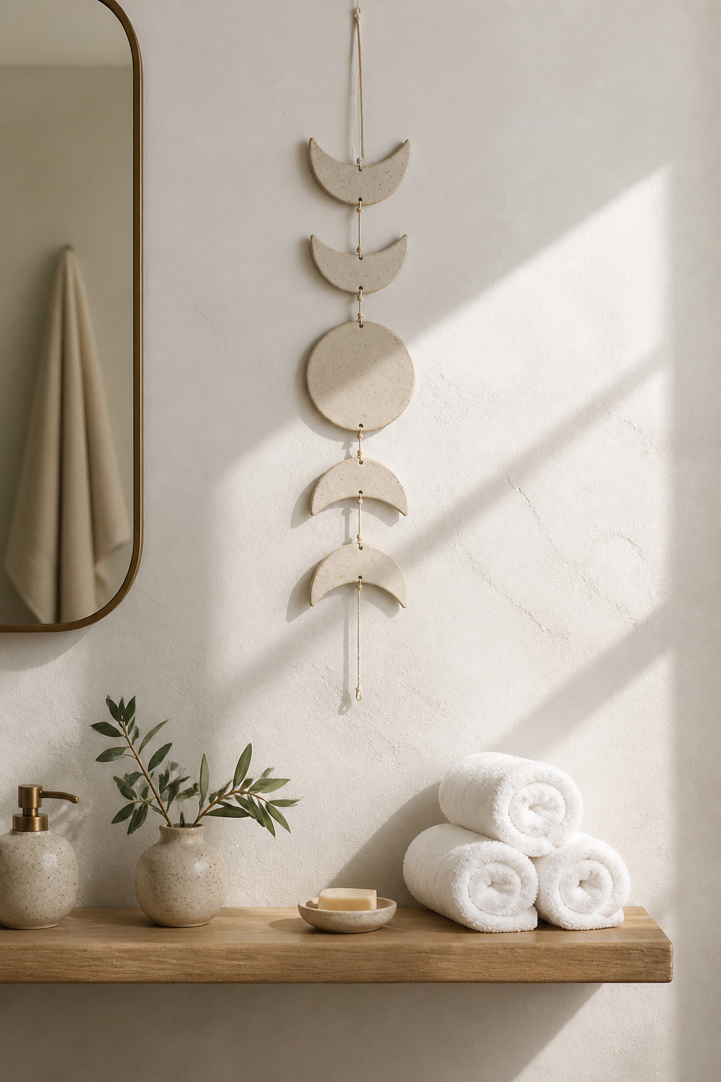
From a wellness design perspective, this matters. Tactile variation in the visual environment — what designers call sensory richness — supports psychological engagement and counters the sterile, uniform quality of heavily tiled bathrooms. Hand-thrown or slab-built ceramic has inherent organic irregularity: a glaze pool, a slight warp, a thumbprint in the clay. These are not flaws. They are evidence of a human hand, which the brain processes very differently from the machine precision of a printed image.
Ceramic is also genuinely bathroom-appropriate as a material. Properly fired and glazed stoneware is moisture-resistant by nature — no protective treatments needed, no humidity anxiety. Moon phase sets (a ring of crescent-to-full ceramic discs arranged horizontally) work in minimalist and maximalist spaces alike. Pressed-leaf forms bridge botanical art and ceramic sculpture. Abstract sculptural pieces in organic shapes suit modern and spa-style bathrooms particularly well. Wescover and Modest Hut both offer handmade options; Etsy’s ceramics section (search ‘stoneware wall hanging’) is worth browsing for independent makers.
For hanging: many ceramic pieces have built-in D-rings or wire loops. For anything over 500g — use Z-clips or mirror brackets mounted into wall studs rather than hollow-wall anchors. Avoid the wall directly above a shower or bath where steam concentration is highest.
5. Black-and-White Nature Photography Mounted in Simple Frames
The case for monochrome nature photography in bathrooms is partly about what it removes: colour. Bathrooms tend to already have a colour story — tile, wall paint, towels, accessories — and a strongly coloured art print always risks competing with elements you can’t easily change. Black-and-white sidesteps this entirely.
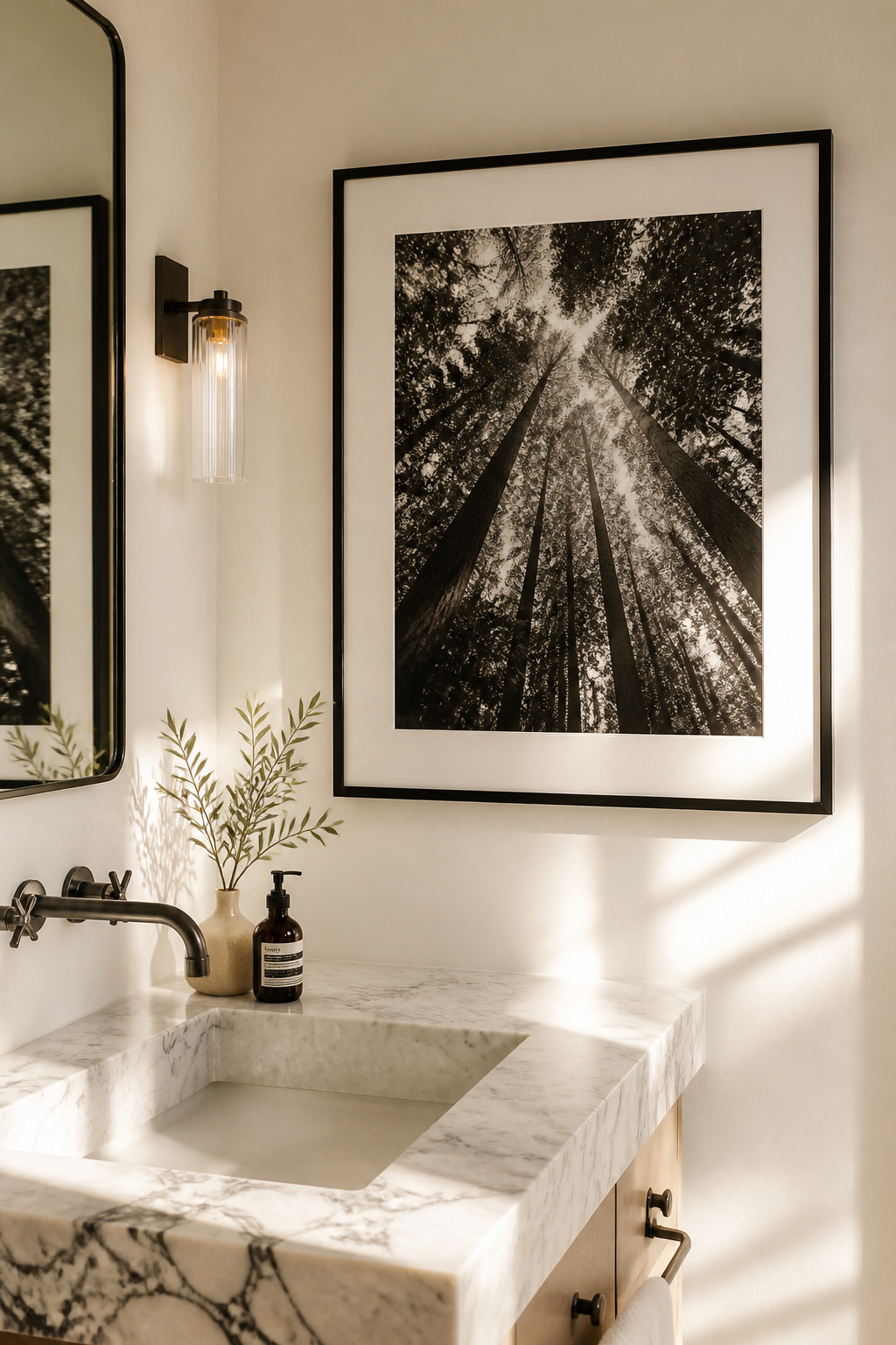
But it does more than sidestep conflict. Removing colour from a nature photograph forces the eye to read form, texture, and depth rather than hue contrast. The result is a slower, more contemplative visual experience — appropriate for a morning bathroom routine. The key is to avoid high-contrast harsh black-and-white: wide-tonal monochrome, with a rich range of greys between pure black and paper white, reads as thoughtful rather than dramatic.
Subject matter makes the difference between clinical and calm. Macro botanical photography — extreme close-ups of leaf veins, flower stamens, seed pods — provides the biophilic nature connection even at small print sizes. Forest canopy shots create an impression of overhead space in cramped bathrooms. Long-exposure water (a blurred waterfall, a smooth ocean horizon) combines the calming visual rhythm of water with the contemplative quality of monochrome. For framing: a thin black frame with a wide white mat is the timeless approach — it gives the photograph breathing room. Natural ash or oak with a white mat is a warmer alternative, effective in bathrooms with wooden vanities or linen accessories.
6. Watercolour Pieces: Soft Bathroom Art Ideas for a Spa-Like Feel
Watercolour has a quality that no other print medium replicates: luminosity. The white of the paper shows through tinted washes, creating the impression that the image is lit from within. It’s a quality that photographs of watercolour never quite capture — you need to see the real print to understand why it reads as warm and light in a way a digital reproduction doesn’t.
That luminosity, combined with the organic softness of the medium’s edges and the visible texture of watercolour paper, makes these works inherently spa-like. They are, in the most direct sense, the opposite of clinical. And bathrooms can easily tip toward clinical if the art choices are too sharp, too graphic, or too perfectly produced.
The subjects that work best for bathroom watercolours are loose botanicals (peonies, anemones, wild grasses rendered in soft washes rather than scientific precision), abstract coastal scenes in blue-green and sand, and single-plant studies in vertical format beside a mirror. Minimalist watercolours with a large expanse of white space around a small central subject — a Japandi influence — suit small bathrooms where visual simplicity is essential. For sizing: 40x50cm is the sweet spot for a single piece above the toilet. Vertical formats (20x60cm, 30x90cm) suit the narrow walls beside bathroom mirrors. Always frame watercolour prints with a mat — it prevents the print touching the glazing, which can cause condensation damage in humid rooms. For bathroom wall decor upgrades that actually transform a space, watercolour is frequently the change with the most immediate impact.
7. Macramé Wall Hangings That Add Warmth Without Visual Clutter
Most bathrooms are dominated by hard, reflective surfaces: tile, porcelain, glass, chrome. A textile piece — macramé, woven cotton, knotted fibre — does something none of the other bathroom art ideas on this list can do. It introduces the only genuinely soft texture on the walls, creating a contrast that the body and eye register before the conscious mind catches up.
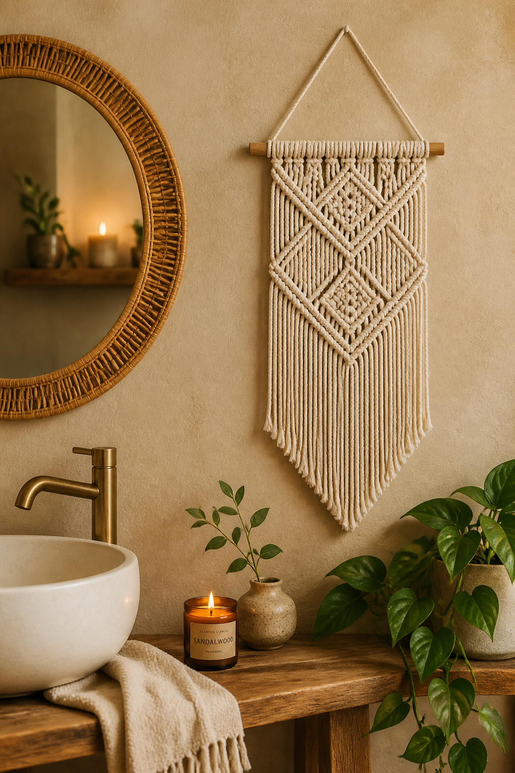
A small macramé piece (30x45cm) functions as an accent alongside framed art. A larger piece (60x90cm or more) functions as a statement — it can carry an entire bathroom wall on its own. Natural fibre pieces also absorb sound slightly, useful in hard-surfaced bathrooms where voices and water bounce.
The material question is important. Natural cotton macramé absorbs humidity and can develop mildew in poorly ventilated bathrooms, particularly if hung adjacent to a shower. For steamy bathrooms: polypropylene synthetic cord is moisture and mildew-resistant, often visually identical to cotton from a distance. Sealed jute handles moderate humidity reasonably well. If you prefer natural cotton — which hangs more beautifully — restrict its use to a well-ventilated powder room or guest bathroom away from the primary shower. Keep it to one piece per bathroom. Two macramé hangings in a small space stops being subtle texture and becomes a theme.
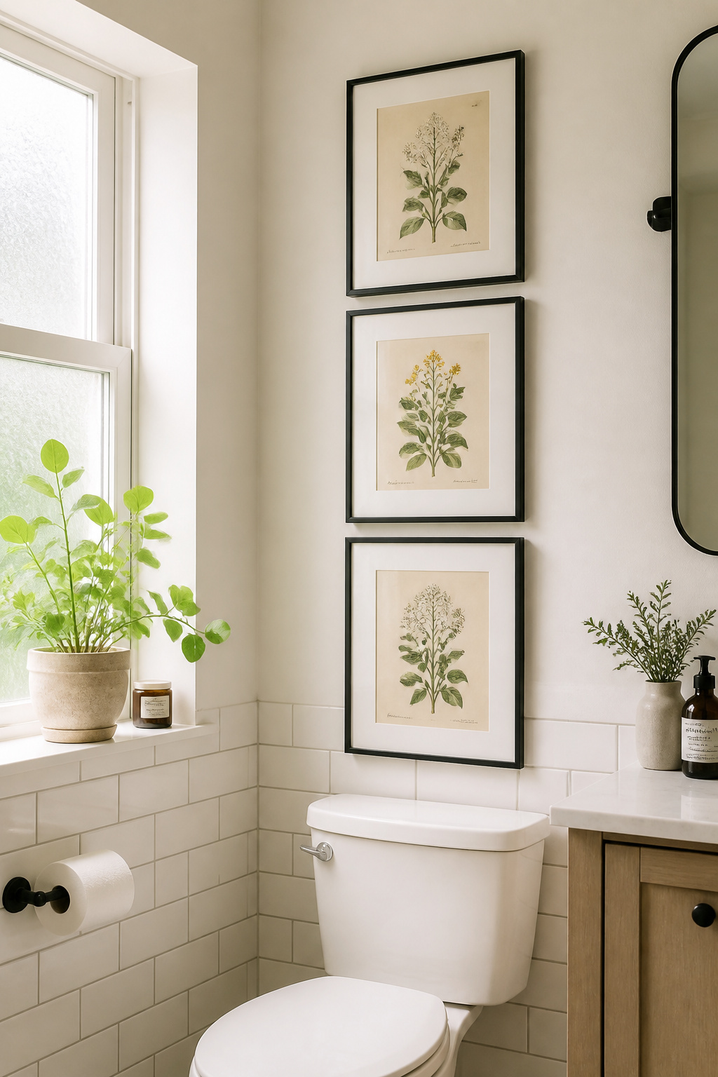
8. Vintage Anatomical Botanical Illustrations in Matching Frames
The 18th and 19th century naturalist illustration tradition produced some of the most extraordinary art ever made in the name of science. Georg Dionysius Ehret’s botanical engravings for Philip Miller’s Gardeners Dictionary. Pierre-Joseph Redouté’s watercolour illustrations of roses. The plates from Curtis’s Botanical Magazine, which ran continuously from 1787 to the present. In each case, the brief was scientific precision — and the result was also, inescapably, beautiful.
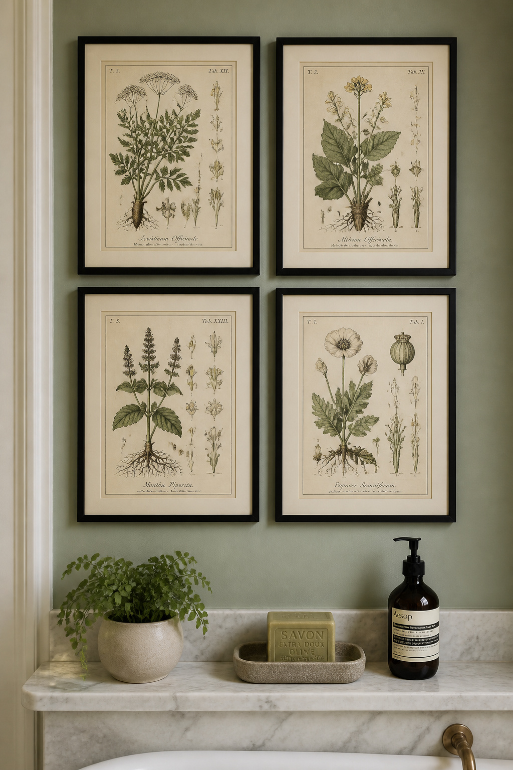
These illustrations work in bathrooms for reasons beyond aesthetics. The apothecary and herbarium aesthetic — botanical knowledge, medicinal tradition, the careful recording of the natural world — connects naturally with wellness design. The visual vocabulary is one of attention, patience, and reverence for natural material. It’s a coherent story for a space associated with self-care.
Sourcing: Capricorn Press restores and sells original 18th-19th century engravings. Museum gift shops (the Natural History Museum, Kew Gardens) sell high-quality archival reproductions. Facebook Marketplace and antique fairs regularly surface original Victorian-era framed botanicals at accessible prices — $15-80 for a good find is realistic. For framing matched sets: if you want the ‘collected over time’ look, mix frame finishes slightly (gilt and dark mahogany, or cream and natural oak) while keeping mat colours consistent — always cream or white, never coloured mats with vintage prints. For a cleaner modern take: identical thin black frames, white mats, three or four prints in a grid. The consistency of framing lets the illustrations lead.
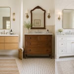
9. A Floating Gallery Wall: Mix Sizes, Frames, and Bathroom Wall Art
The fear with a gallery wall in a bathroom is that it will look chaotic in a space that’s already fighting visual complexity. That fear is valid — a badly planned gallery wall in a small bathroom makes the room feel cluttered and unresolved. But a well-planned one creates something no single piece of bathroom wall art can: a personal, evolving focal point that reveals itself slowly the longer you look.
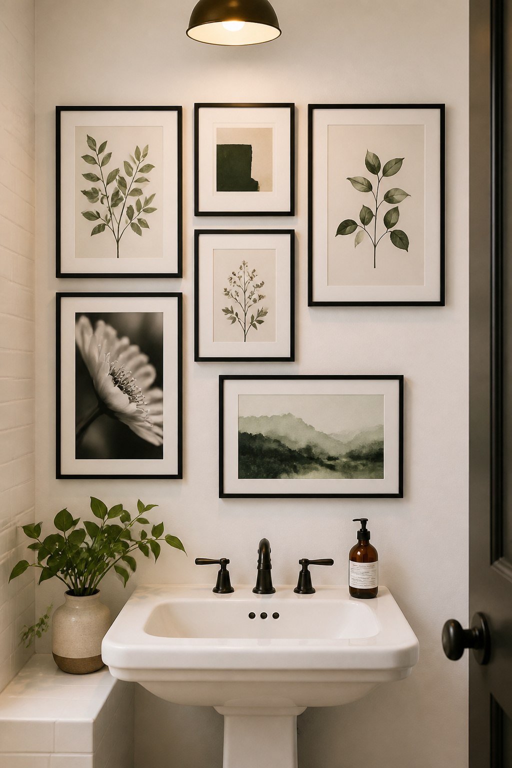
The planning method makes the difference. Before committing a single hole to plaster, trace every frame onto kraft paper, cut them out, label each with its hanging point, and tape the paper templates to the wall with low-tack painter’s tape. Leave them there for 48 hours — long enough to see how the arrangement reads in morning light and artificial evening light. Adjust until the overall shape feels balanced. The centre of the entire arrangement (not one individual frame) should sit at 57-60 inches from the floor. Maintain 3 inches of spacing between frames throughout.
For mixing frames: vary one variable, not two. Either the same frame finish in different sizes, or the same size in different finishes — not both simultaneously. Cohesion across the collection comes primarily from shared colour palette across the art, even if the subjects and media vary. Bathroom gallery walls work well with art that rewards close inspection — detailed illustration, macro photography, original prints. For inspiration across a different room before adapting the approach here, gallery wall ideas that actually work offer useful starting frameworks.
10. Three-Dimensional Sculptural Pieces Mounted Flush to the Wall
There’s a version of this that every wellness spa, hotel bathroom, and high-end powder room uses: a single sculptural piece mounted to the wall that changes the entire register of the space. Not a print. Not a mirror. Something with physical depth that creates real shadows and a sense that the wall itself is alive.
The effect is disproportionate to the investment. A well-chosen 3D piece — a carved wooden form, a set of stoneware discs, a geometric metal cut-out — fundamentally changes the sensory experience of a bathroom. Shadows shift as lighting changes through the day. The texture engages an instinct to touch that no photograph triggers. From a wellness design perspective, this is sensory richness: tactile variation in the visual environment that counters the sterile uniformity of a heavily tiled room.
Material choice matters for bathroom durability. Properly fired, sealed ceramic is fully moisture-resistant and the most authentic option. Powder-coated or brass-plated metal is equally resistant. Teak and bamboo handle bathroom humidity well when sealed; pine and MDF need protective treatment and should stay off steam-heavy walls. Resin and composite pieces are lightweight and completely moisture-proof, available in organic forms that suit spa aesthetics. Avoid paper-based sculptural pieces in bathrooms with poor ventilation. For heavy pieces: anything over 500g needs wall studs or a French cleat, not hollow-wall anchors.
11. Mindfulness Typography and Calm-Focused Quote Prints
Typography-based art works in bathrooms when it offers something worth returning to. A thought that is useful or quietly clarifying, rendered in a typeface that feels designed rather than decorated. It fails — and fails visibly — when the quote is too familiar to register or rendered in a font that looks like it wandered out of a greeting card.
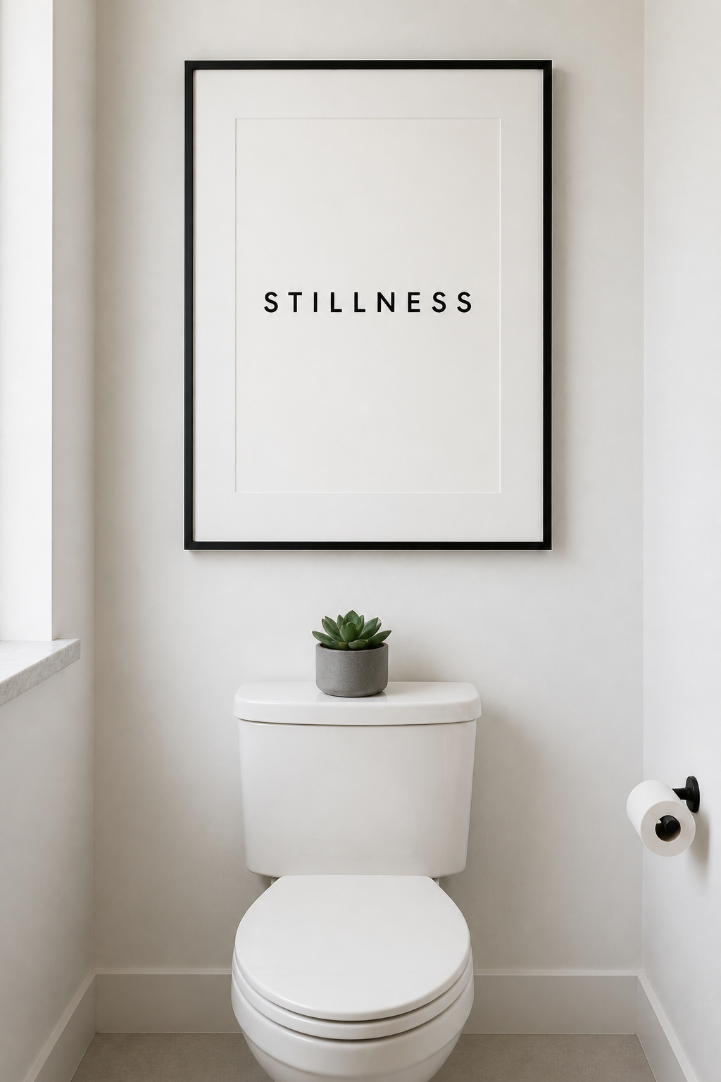
The distinction between considered typography and novelty decoration is real and worth thinking about. A single word — ‘stillness’, ‘rest’, ‘ground’ — in a clean sans-serif typeface at large point size on a white background has genuine design quality. It reads immediately from across the bathroom and holds its meaning across months of daily exposure. Helvetica Neue, Futura, and Gill Sans all have enough visual weight that a single-word print registers as an actual design choice rather than a purchase.
Contrast this with a longer quote in swash calligraphy at a point size that requires leaning forward to read, surrounded by decorative flourishes in three different weights. The first type of piece enriches a bathroom. The second is invisible within two weeks. The typographic principles are not complicated: one typeface, one weight, one message. Black on white, or off-white on cream, reads better in bathrooms than colour typography, which tends to compete with whatever palette the room already has. For single words: go larger than feels necessary — at least 30cm of printed height for any word you want to function as a visual anchor.
12. Coordinate Prints That Mark Meaningful Places on a Map
Personal art does something that no commercially produced print, however beautiful, can do: it makes a room feel inhabited by a specific person. GPS coordinate prints — clean typographic pieces showing the latitude and longitude of a place that matters — are among the most genuinely wellness-supportive bathroom art ideas precisely because they anchor the space in lived experience. For anyone thinking about how to add personality to your bathroom with wall art, this is the most direct route available.
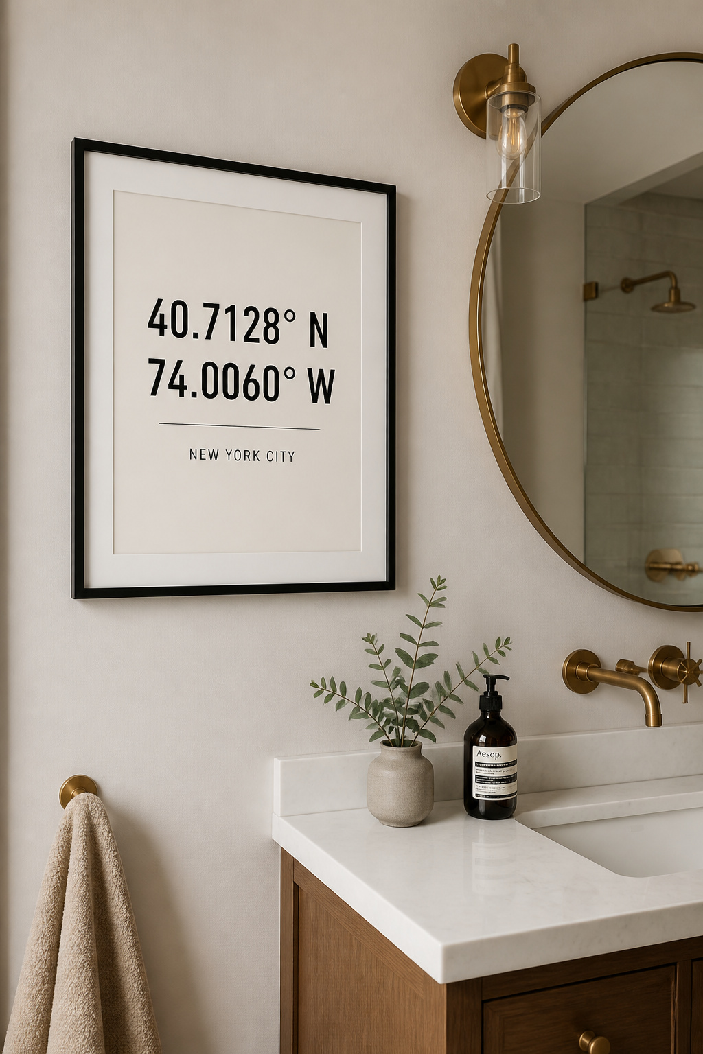
The options are more varied than they might initially appear. Classic coordinate typography (large numbers, clean sans-serif typeface, the name of the place below) is the most minimal option. Custom illustrated maps — hand-drawn renderings of a neighbourhood, city, or region — are more expensive ($60-150 from services like Mapiful and Positive Prints) but create something genuinely unique. Star map prints show the precise position of the stars on a significant date — a birth, a wedding, an anniversary — and are both visually striking and personally specific in a way that suits daily reflection.
For framing: personalised prints need to breathe. A thin black or thin natural wood frame with a white mat lets the typographic precision read cleanly. Ornate framing competes with the geometric exactness of the content. Minimum size: 30x40cm for GPS coordinate prints — below this, the numbers are too small to read from normal bathroom distance without leaning in, which defeats the ambient quality the piece should have.
13. Natural Art for Your Bathroom: Rattan, Woven, and Fibre Pieces
There’s a category of biophilic design that goes beyond imagery — beyond looking at pictures of nature — and into direct contact with natural materials. Rattan, seagrass, jute, raffia: when these materials appear on a bathroom wall, they provide a tactile and visual connection to the organic world that no print replicates. This is what biophilic design calls material connection with nature — research ranks it alongside nature imagery as a primary stress-reducing environmental intervention.
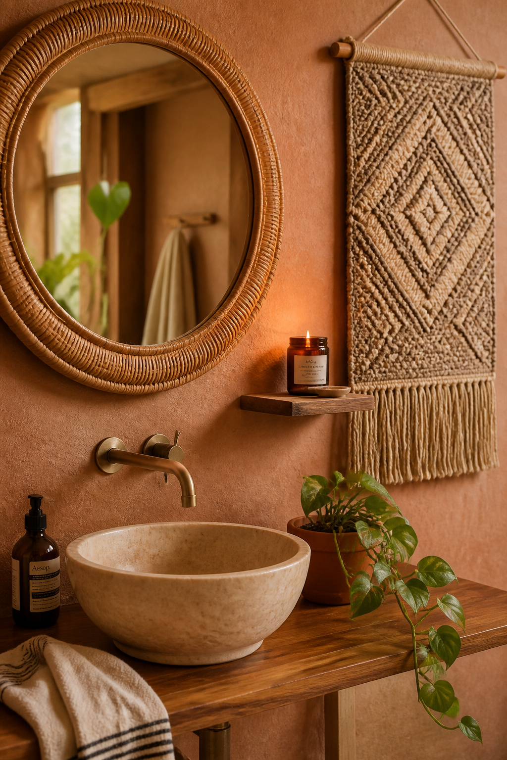
The range of natural material art for bathroom walls is wider than it might suggest. Rattan mirrors — round or organically shaped mirrors framed in natural rattan — blur the line between functional object and wall art in a way that works particularly well in bathrooms. Woven seagrass panels function as flat wall art and tolerate bathroom humidity better than cotton macramé in moderate steam conditions. Raffia and dried palm leaf weavings bring a more graphic, geometric quality — they suit Japandi and contemporary bathrooms alongside clean-line fixtures.
The styling principle: one natural material piece per bathroom, paired with other natural materials in the room. A rattan wall piece beside a wooden vanity reads as a coherent design language. The same rattan piece beside white laminate reads as an anomaly. In its undyed form — natural straw, honey, cream — natural fibre art works with virtually any bathroom colour palette, which is one of its most practically useful qualities.
14. Monochromatic Art Groupings for a Cohesive, Restful Look
Of all the bathroom art ideas in this list, monochromatic groupings are the most reliably effective — not because they’re the most dramatic, but because they eliminate the primary source of visual tension in a bathroom: colour conflict.
A monochromatic grouping means two to four pieces that share one primary hue, varying within that family in saturation and value rather than across different colour families. Three pieces in different values of blue-green — a pale mint, a mid-sage, and a deep eucalyptus — form a monochromatic grouping. The eye doesn’t have to work to reconcile them. They sit together with a restfulness that a mix of blue, terracotta, and cream never achieves, however individually beautiful each piece might be.
The colour families that work best in bathroom contexts: blue-green (teal, sage, turquoise) for bathrooms with white, grey, and chrome; warm neutrals (blush, terracotta, pale sand) for bathrooms with brass and warm timber; charcoal and mid-grey for modern and Scandi bathrooms. The most sophisticated approach within any of these families is to mix media rather than just prints — a framed watercolour, a ceramic piece, and a small textile piece all in the same green family creates far more depth than three prints of the same type. For this to work, keep frame finishes consistent even when the media and subjects vary.
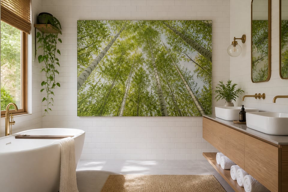
15. Oversized Nature Photography as a Bathroom Focal Point
Hotel bathrooms and spa design have applied this principle for decades, and it works because it works: one large, well-chosen photograph changes the scale experience of a room more than any other single intervention. Small bathrooms respond dramatically to a single oversized piece — the instinct to fight the size of the room with many small elements usually makes it worse rather than better.
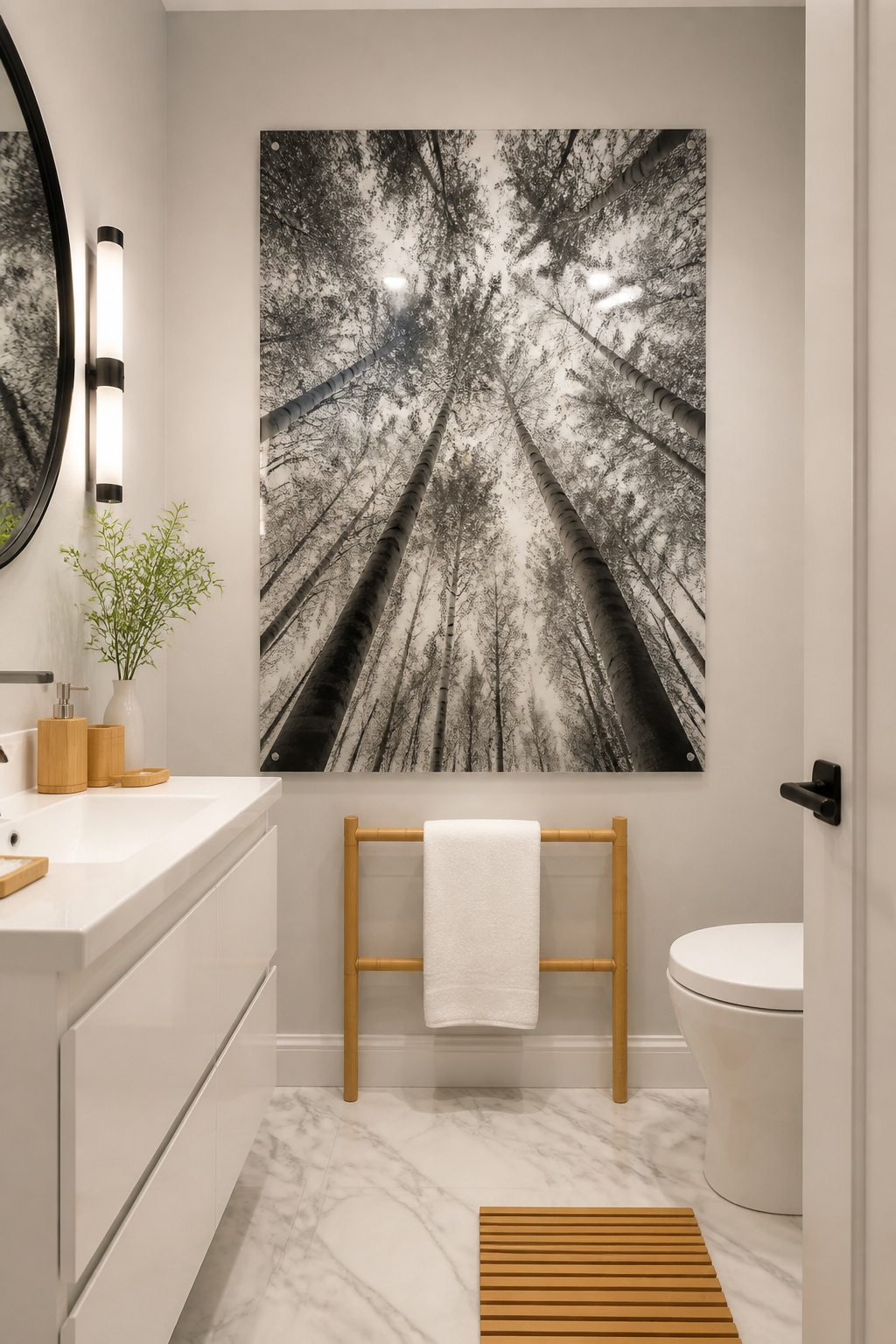
The psychological effect is measurable. A large nature photograph — a forest canopy, an ocean horizon, a macro botanical at 60x80cm — creates a perception of space that extends beyond the room’s physical dimensions. Looking up into tree cover expands the visual field vertically. A smooth long-exposure ocean horizon pulls the eye toward implied distance. These aren’t decorative effects. They are biophilic design working as intended.
For material in a bathroom context: acrylic face mount is the best choice for a statement piece — colours are deeper and more saturated than any other format, the surface is fully moisture-resistant, and cleaning requires only a soft damp cloth. The price premium over canvas is 50-80%, and the weight requires a French cleat or solid wall mount. Canvas gallery wrap is a more affordable option but needs a moisture-protective spray in any bathroom without excellent ventilation — without it, canvas edges will delaminate in humid environments over 12-18 months. Size threshold: below 50x60cm, the oversized effect doesn’t materialise. The piece needs to genuinely dominate the wall to produce the spatial shift.
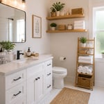
16. Bathroom Art Ideas for Small Spaces: Scale, Placement, and Impact
The most common small bathroom art mistake is going too small. It seems logical — a small room needs small art — but the effect of too-small art in a bathroom is not discretion. It’s clutter. Three 5×7 prints scattered across the walls of a 4-square-metre bathroom look like a notice board. One 40x50cm print on the primary wall looks like a decision.
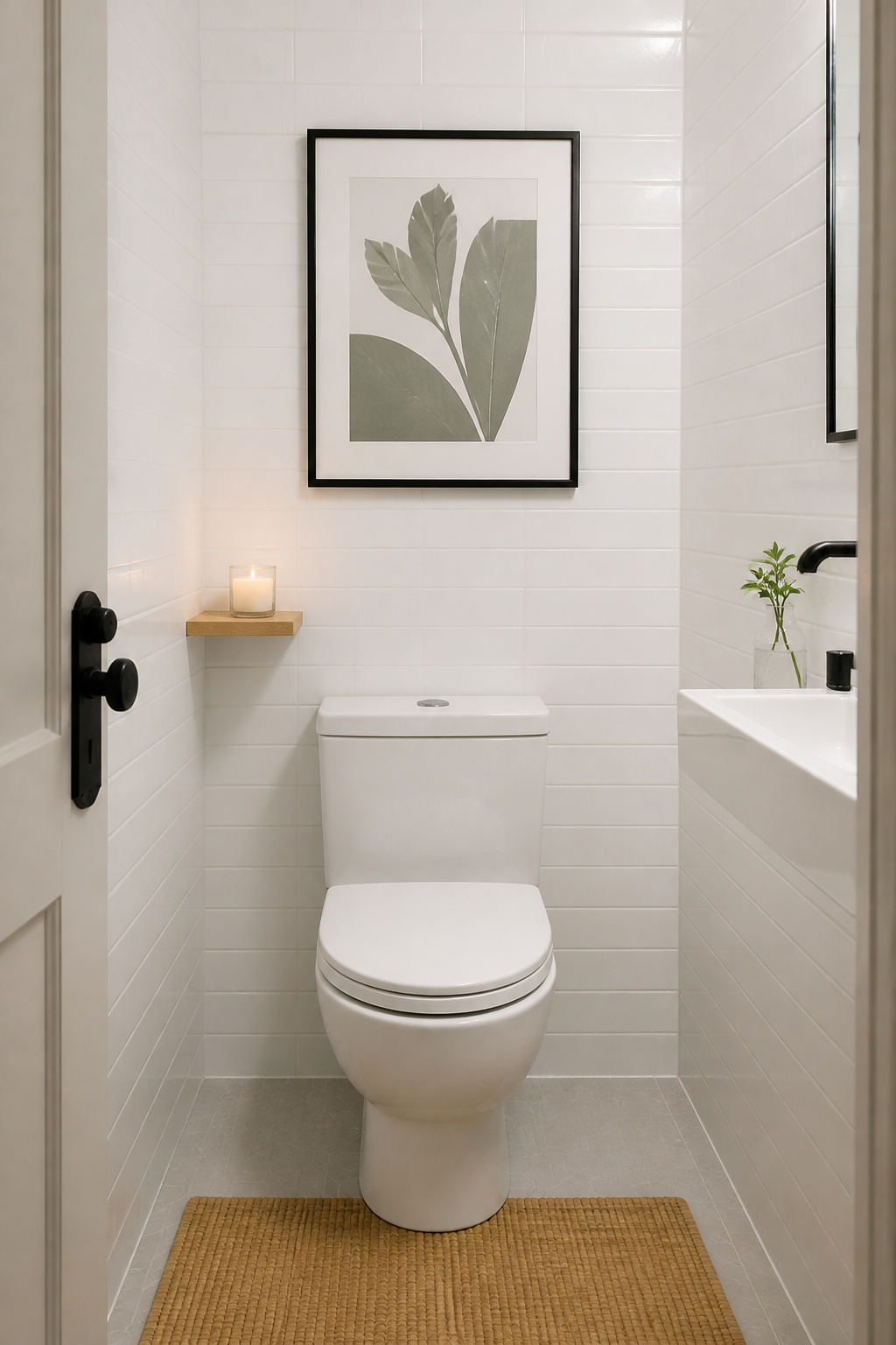
The principle is less and larger: in a bathroom under 5 square metres, one piece of 40x50cm (16x20in) serves the space better than three pieces of 20x25cm each. Fewer, larger, better. The visual weight of a single considered piece communicates intentional design in a way that multiple small, modest pieces never do.
For placement: above the toilet, hang 8-12 inches above the tank, with the centre of the piece at approximately 57-60 inches from the floor. Match art width to two-thirds of the toilet width — typically 16-20 inches. Beside the mirror is a tricky zone; the mirror already anchors that wall, so go quieter here — a 30x40cm vertical print at roughly mirror height on the adjacent wall surface. The back of the door is one of the most underused bathroom surfaces. A single print at eye height on a door hook with a clip frame turns wasted space into a daily moment — particularly effective in a small bathroom where every wall is visible from the toilet. For small bathroom makeover ideas that make real differences, art placement is one of the highest-impact, lowest-cost interventions available.
One more useful principle: the wall directly opposite a shower is the most steam-exposed surface in the bathroom. Save that wall for moisture-resistant functional items. Bathroom art ideas live best on side walls, the wall above the toilet, and the wall behind the door — surfaces that get incidental humidity rather than direct steam.
Choosing the Right Bathroom Art for Your Space, Style, and Wellbeing
The pattern across all sixteen of these bathroom art ideas is the same: specificity beats quantity, and placement beats number. One piece that is right for the wall it’s on does more than five pieces selected without regard to scale, material, and the room’s existing story.
A few practical decision points. For small bathrooms (under 5 square metres): start with one piece, minimum 40x50cm, placed above the toilet or on the wall opposite the door. For large bathrooms: a gallery wall or single oversized piece becomes genuinely viable — large bathrooms can absorb the visual complexity of a gallery arrangement without it competing with fixtures. For matching art to existing finishes: cool chrome and white bathrooms call for blue-green or monochromatic abstract work. Warm timber and brass bathrooms are served beautifully by watercolour botanicals, vintage illustrations, or warm-neutral abstracts.
So, start with one piece and live with it for four to six weeks before adding anything. The bathroom is a daily space, and you’ll know quickly whether something is working. If starting from scratch with no existing palette, let the art come first — it’s far easier to match towels, accessories, and paint to a fixed piece of art than to find art that fits a locked-in bathroom scheme. One genuinely good print in the right spot is worth more than a bathroom full of agreeable ones. These bathroom art ideas are, ultimately, a series of small daily investments in how you feel in your own home.