Walk into a beautifully put-together living room and your eye lands on the coffee table first. It’s the room’s centrepiece — not the sofa, not the rug — and it has the power to make a space feel designed or dumped-in-a-hurry within about three seconds. I’ve spent years helping people transform their rooms through seasonal styling, and the coffee table is almost always the first place I start. It’s low-risk, high-reward, and endlessly changeable.
The best part? You don’t need to buy much. Most of these coffee table styling ideas work with things you already own, rearranged with a bit of intention. Whether you’re starting from a completely bare surface or trying to fix an arrangement that looks fine but feels off, there’s something here for every table, every room, and every budget. I’ve pulled together 16 distinct approaches — from one-object minimalism to layered seasonal displays — so you can mix what resonates and rotate through them across the year.
1. The Tray Anchor: Grounding Your Coffee Table Display With a Single Hero Piece
The single most effective thing you can do for a coffee table is put a tray on it. Not because trays are magical — they’re not — but because they do something scattered individual objects cannot: create a visual boundary that says *this is intentional*. Without a tray, even a lovely collection of objects reads as clutter. Drop them into a tray and the same objects read as a vignette.
Tray Size and Material
Sizing is where most people go wrong. The tray should cover one-third to one-half of the table’s total surface area — anything smaller looks like a serving dish rather than a styling piece. Go for 18 inches minimum in diameter or width; many people discover they need something closer to 22-24 inches once they see a proper-sized tray in place. For a great cozy living room sanctuary, the tray is often the piece that ties a whole arrangement together.
Material contrast matters as much as size. If your table is glass or marble, use a woven rattan or wooden tray — the warmth offsets the table’s coolness. Dark walnut table? Choose something lighter: a lacquered white tray, a bleached wood, or a cream-painted piece. In 2025-2026, sustainable and reclaimed woods are by far the most popular tray material, followed by rattan and natural stone. Avoid matching the tray material to the table material — it makes the tray disappear.
What Goes Inside vs Outside the Tray
The tray holds your active group — the items you want read as a composed unit. Outside the tray, place only one or two counterpoints: a splayed book, a lone plant pot, a small dish. The moment you start placing clusters of objects both inside and outside the tray, the composition collapses. One tray, one group. Keep it simple.
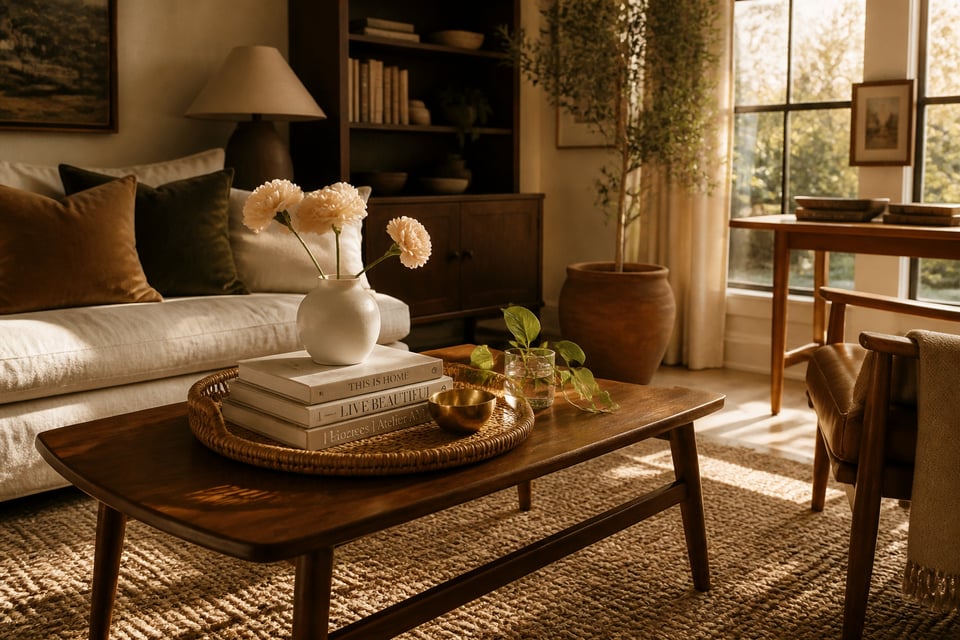
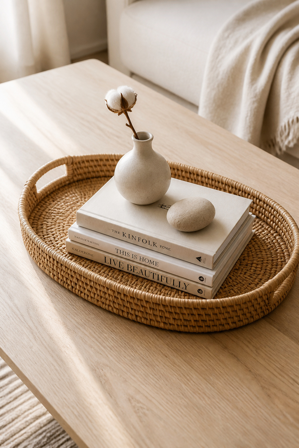
2. Stacked Books as Architecture: Building Height Into Your Coffee Table
Books are the structural backbone of any coffee table worth looking at. They’re not just decoration — they’re platforms. A stack of two or three large-format books raises a vase or sculpture by four inches, and that four inches makes a dramatic difference to how the entire arrangement reads from across the room.
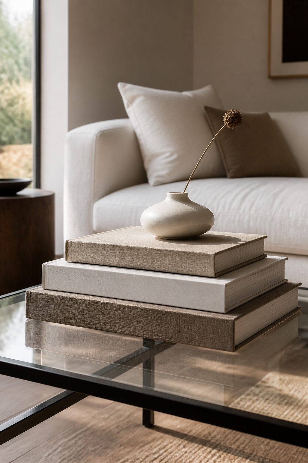
The stacking technique is simple but specific. Start with the largest book on the bottom, then work up to the smallest, centring each one on the one below. Use 2-4 books of roughly similar width but varying thickness; stacks that stay within a consistent footprint look intentional, while stacks that jut out in all directions look like someone just cleared a shelf.
Here’s a trick that professional stylists use: flip a book so the spine faces inward. The neutral page-edge texture that’s exposed is softer and more versatile than most spine designs, giving the stack a quiet, curated quality. For colour coordination, stick to one colour family — all neutrals, all warm earth tones, all muted blues — rather than mixing bright, competing spine colours.
As for what goes on top of the stack, keep it to one object. A tall candlestick, a small vase with a single stem, or a sculptural piece with strong lines. Two objects on top of a book stack starts to look like a shelf. One object, placed slightly off-centre, looks like a decision.
3. The Rule of Three for Effortlessly Balanced Coffee Table Decor
Interior design has a rule about odd numbers that sounds like a trick but genuinely works: group objects in threes, fives, or sevens and they’ll almost always look more interesting than pairs or quads. Odd-number groupings prevent the eye from splitting the arrangement down the middle — instead, it travels across the composition, taking in each piece in turn. The arrangement feels dynamic rather than static.
On a coffee table, three objects in a single grouping is the sweet spot. The classic combination: one low-and-wide object (a tray or flat bowl), one medium-height object (a book stack or wide ceramic), and one taller object (a candle, a slender vase, or a narrow sculptural piece). This naturally creates a visual triangle — the eye moves from the lowest point upward to the tallest, then down and around again. There are plenty of living room styling tricks that actually work at this level of composition, and the rule of three is among the most reliable.
The most common mistake is using three objects of identical height. They cancel each other out and read as a row, not a composition. The second most common mistake is spacing them too far apart — objects in a vignette need to feel related, which means keeping them close enough to read as a group, ideally within 2-3 inches of each other. A third pitfall: three objects made of the same material. Three ceramic pieces in different sizes look like a shop display. One ceramic, one wood, one organic element look like someone’s home.
4. Seasonal Blooms That Refresh Your Coffee Table Arrangement Every Few Weeks
A living element changes everything. You can style a coffee table with a hundred beautifully chosen objects and it will still look static — add a single stem in a bud vase and the whole surface comes alive. Flowers and botanicals bring the one quality that no manufactured object can replicate: actual life.
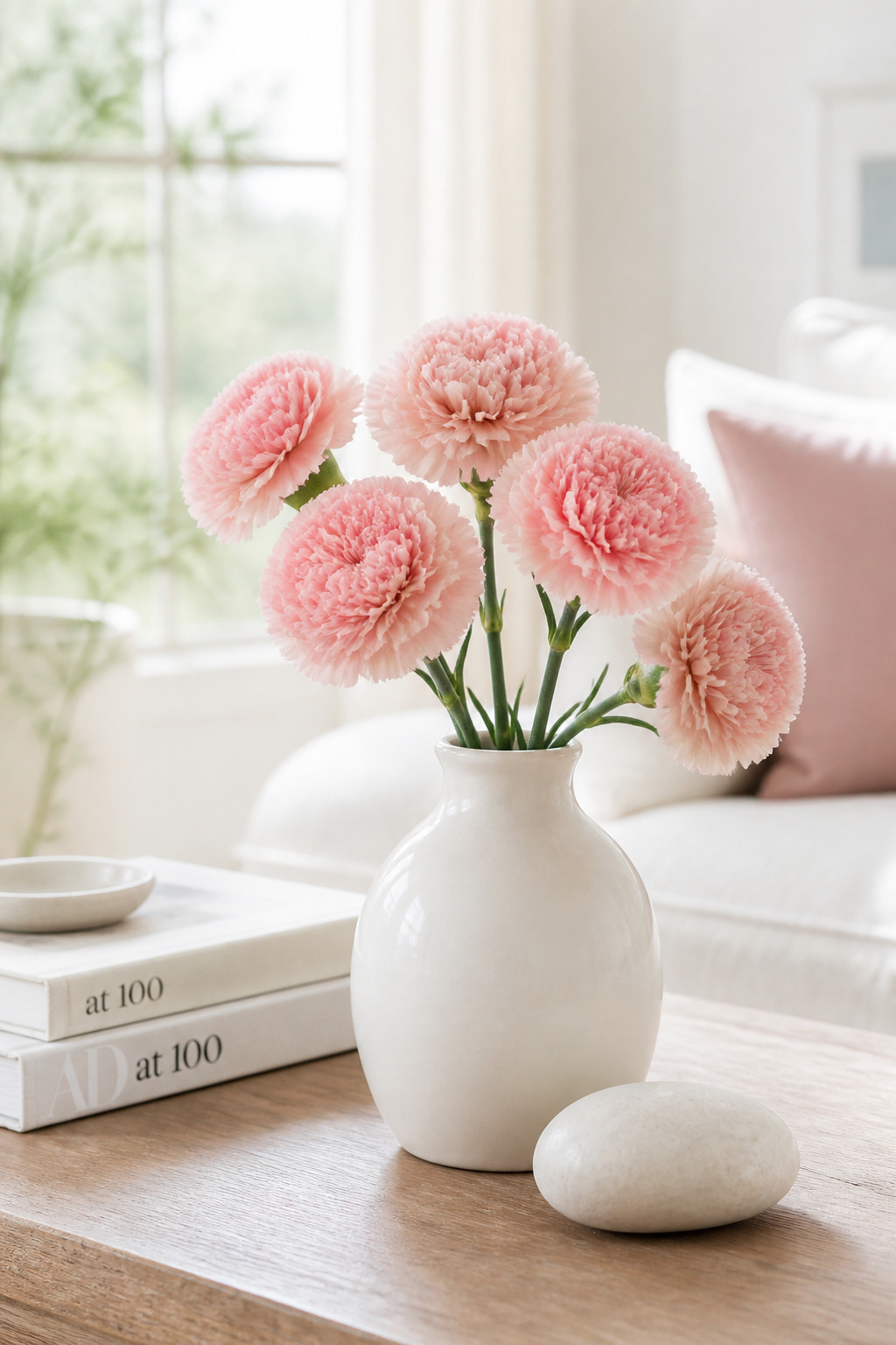
If you want the most from your grocery-store budget, choose for longevity. Chrysanthemums last 20-25 days in a vase with minimal care — they’re the undisputed longevity champion for cut flowers and desperately underrated by stylists who write them off as too ordinary. Carnations hold for 14-21 days and come in every imaginable colour. Alstroemeria lasts 10-14 days and produces multiple blooms per stem, making a single bunch look abundant. Anthuriums are the architectural choice: glossy, lasting 14-20 days, and they don’t shed or drop leaves — a significant advantage on a table where debris is immediately obvious.
The seasonal swap is where it gets genuinely fun. In spring, ranunculus and tulips in pale pinks and cream. Summer calls for a single large tropical leaf or eucalyptus stem in a clear glass vessel — cool and graphic, not fussy. Autumn is where I personally go overboard: terracotta chrysanthemums, dried pampas grass, a small dried cotton-stem bundle. Winter brings white amaryllis, clippings of pine or fir in a low wide vessel, or simply bare branches with tiny fairy lights wound through them.
If fresh flowers feel like too much maintenance, dried botanicals last months. Pampas grass, dried cotton stems, and eucalyptus bundles require no water at all — they just sit there and look beautiful until you’re ready to change them.
5. Natural Textures: Woven, Wood, and Stone in Coffee Table Styling
A room with all smooth, shiny surfaces — marble table, lacquered furniture, glass-fronted cabinets — needs natural texture urgently, and the coffee table is the easiest place to introduce it. Rattan, wood, linen, slate, and woven materials add warmth through both visual and tactile quality in a way that polished surfaces simply can’t. Touch a rattan tray and a lacquered tray: they feel completely different, and that difference registers in how the room feels even when you’re not touching anything.
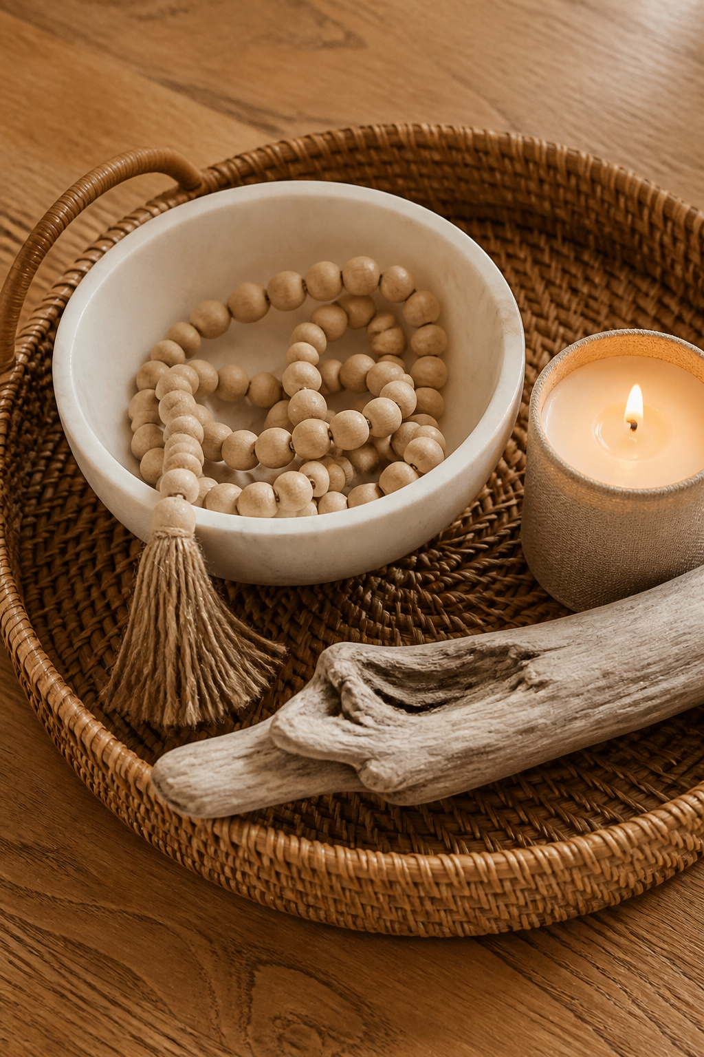
The best natural texture combinations layer contrasting materials at different scales. A rattan tray holding a smooth marble bowl and a linen-wrapped candle gives you woven, smooth stone, and soft fabric — three distinct textures that complement rather than compete. A piece of bleached driftwood alongside a slate coaster set and a small terracotta pot is another strong combination, particularly for coastal-inspired or farmhouse rooms.
The practical rule for mixing natural textures in coffee table styling is: one rough, one smooth, one soft or woven. Three elements of similar texture — three wooden objects, three woven pieces — read as monotonous rather than harmonious. And limit the total object count even when mixing textures; more objects don’t mean more texture interest, they mean more visual noise. A large woven tray containing two objects beats six small textured pieces scattered across the surface every time.
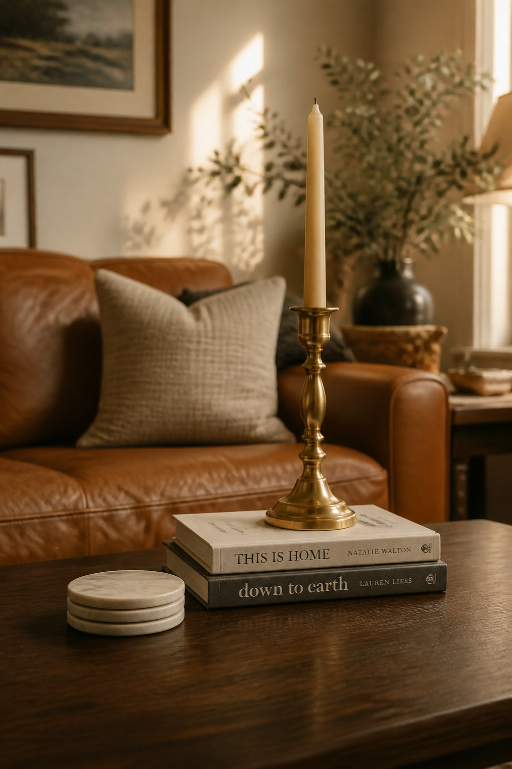
6. Candle Groupings as the Centrepiece of Your Coffee Table Decor
Candles are the most versatile tool in the coffee table styling toolkit. They add height, warmth, fragrance, and dramatic light — and they do all of that both lit and unlit. A beautiful pillar candle in a concrete or ceramic vessel is a sculptural object even in daylight. At night, grouped candles transform a coffee table from a display into an atmosphere.
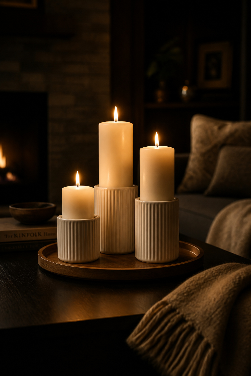
Height Variation and Vessel Choice
The rule of height variation applies here more strictly than almost anywhere else. Three pillar candles of identical height look like a corporate lobby. Three pillar candles at 4 inches, 7 inches, and 10 inches look like a considered arrangement. For groupings viewed from all sides — as a coffee table centrepiece is — the tallest candle goes in the back-centre with smaller candles clustered around it. Glass, concrete, and ceramic vessels in the same colour family create cohesion without rigidity.
Scent pairing matters more than people expect. Two candles with competing fragrance families in a small room are worse than no candles at all — woodsy-and-citrus or floral-and-musk becomes a headache rather than an atmosphere. Keep candles within one scent family: all woodsy and warm (cedar, sandalwood, vanilla), all fresh and green (eucalyptus, linen, green tea), or all floral. These groupings add up to a genuine room atmosphere, which is exactly what great cozy living room decorations that nurture warmth are all about.
Safety and Flameless Options
For family homes with young children, flameless LED candles from brands like Luminara have reached a quality level where they fool most guests on first glance. If using real candles, a tray underneath elevates them and creates a visual barrier. Keep real flames at least 3 inches apart to prevent overheating — which also happens to be the right spacing for the look.
7. The Curated Edit: Styling a Coffee Table With Exactly Five Objects
Every interior designer I’ve spoken to about coffee table styling says the same thing: the problem is almost never that you have too few objects on a table, it’s that you have too many. The five-object formula is a system that prevents overloading — and because each of the five objects belongs to a specific category, rotating them seasonally becomes almost effortless.
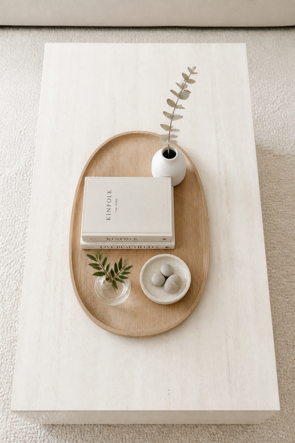
Here’s the formula: one tray (the containing structure), one book stack (for height and platform), one vessel (vase, bowl, or sculptural piece — the visual anchor), one organic element (something living or natural), and one personal item (a coaster set, a small decorative box, a dish with actual everyday objects in it). The tray and the stack are your permanent bones. The vessel, organic element, and personal item rotate with the season or your mood.
The reasoning behind five specifically is that fewer objects force each one to earn its place. A single beautiful ceramic bowl commands more attention on an empty table than it would fighting for notice among eight other objects. Restraint signals confidence — a curated table tells anyone who sits in front of it that every object was chosen, not accumulated. To refresh seasonally without buying anything new: keep the tray and books fixed, swap the vessel colour (clear glass in summer, dark ceramic in winter, terracotta in autumn), change the organic element with the season, and replace the personal item with something seasonally appropriate. The table looks completely different with three swaps and costs nothing.
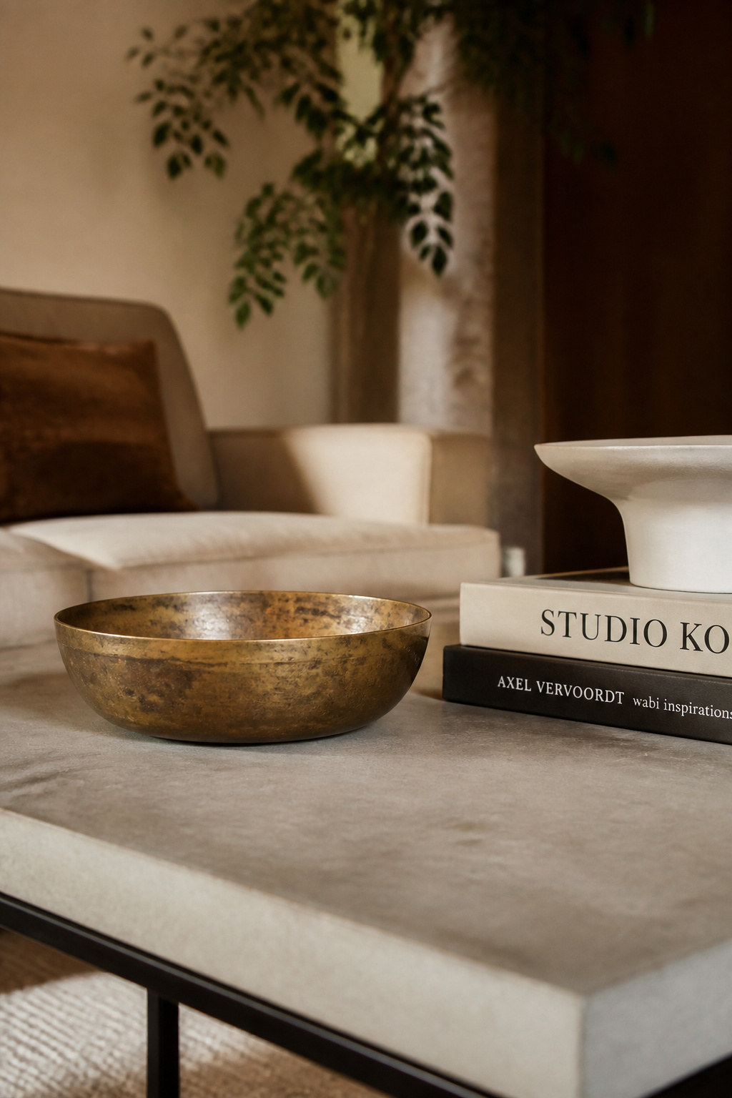
8. Metallic Accents for a Coffee Table Arrangement That Catches the Eye
A single metallic object in an otherwise matte, natural arrangement does something specific: it catches light. Even in a dimly lit room, a brass bowl or a gold-edged tray glows and draws the eye in a way that ceramic, wood, and stone cannot. This is why interior designers almost always include at least one metallic element on any surface they style — it creates a visual anchor that everything else refers back to.
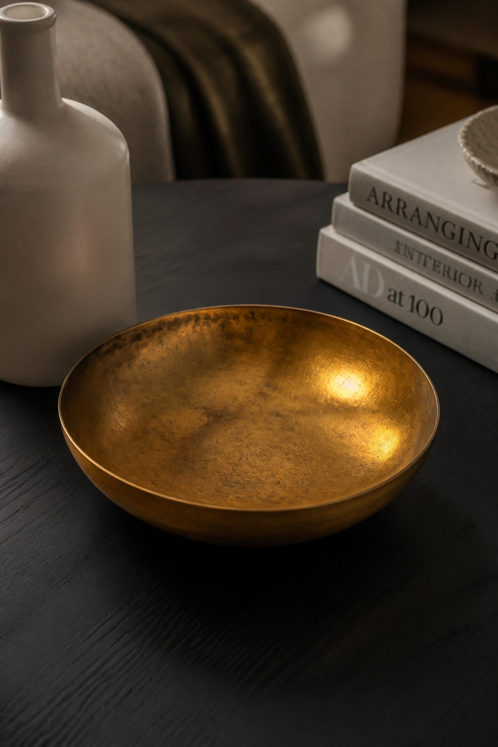
The metal-to-room-style match is worth getting right. Brass is the most versatile — warm, slightly antique in feeling, equally at home in traditional rooms, transitional spaces, and maximalist interiors. Copper is richer and more reddish, particularly strong in rustic, industrial, and eclectic rooms. Gold is warmer and more opulent than brass; pair it with deep colours rather than all-neutral palettes to prevent it looking garish. Silver and chrome are cooler-toned — they work well in Scandinavian and modern rooms but can feel harsh alongside too many natural materials.
The number of metallics is where restraint pays off dramatically. One metallic object in a five-piece arrangement is perfect. Two metallic objects of similar size fight each other and the arrangement loses its focal point. Three or more and the table starts to look like a gift shop. If you love mixing metals, let one dominate and use the other as a small secondary accent: a large brass tray with a single small silver candleholder works; two brass pieces and two silver pieces does not.
9. Coffee Table Styling for Small Spaces: Scaling Down Without Losing Impact
Small living rooms and apartments present a specific challenge: the standard rules of coffee table styling assume a reasonably sized rectangular table with plenty of surface area. In a 400-square-foot apartment or a living room that doubles as a dining room, the standard rules fail immediately. The solution isn’t to abandon styling — it’s to reconsider the format before worrying about the objects.
Standard coffee table sizing places the table at roughly two-thirds the sofa length, with 18-24 inches of clearance on all sides. In many small apartments, that maths leaves almost no floor space, which is exactly why apartment living room decor ideas almost always include alternatives to the traditional coffee table.
Styling Your Non-Traditional Table
Storage ottomans as coffee tables: place a rigid tray on top to create a flat styling surface. Style the tray with three objects maximum — a candle, a small plant, and one book. The ottoman lid needs to stay accessible, so anything styled on it should lift off in one piece when you need to open it. Nesting tables give you even less surface area per table, so reduce to 2-3 objects on the visible top surface. Glass-topped tables visually recede — they tolerate slightly more objects without feeling heavy because the floor shows through.
The adjustment required in small spaces is simply proportional. Everything smaller, fewer objects, with more negative space between them. The five-object formula becomes a three-object formula. The tray gets smaller. The books get fewer. The impact doesn’t disappear — it just scales.
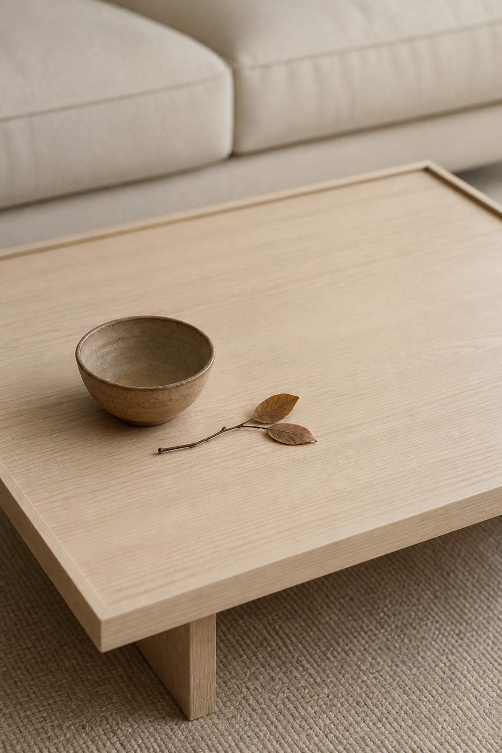
10. Organic Forms and Sculptural Objects in Coffee Table Decor
The objects that get the most compliments on coffee tables are almost never the perfectly shaped, factory-made ones. They’re the irregular ones — the piece of bleached driftwood, the handmade ceramic with visible finger marks from the potter, the geode that looks like a piece of the earth’s interior has ended up on the living room table. Organic and sculptural forms reward close looking in a way that perfect, symmetrical objects don’t, and that quality is genuinely irreplaceable.
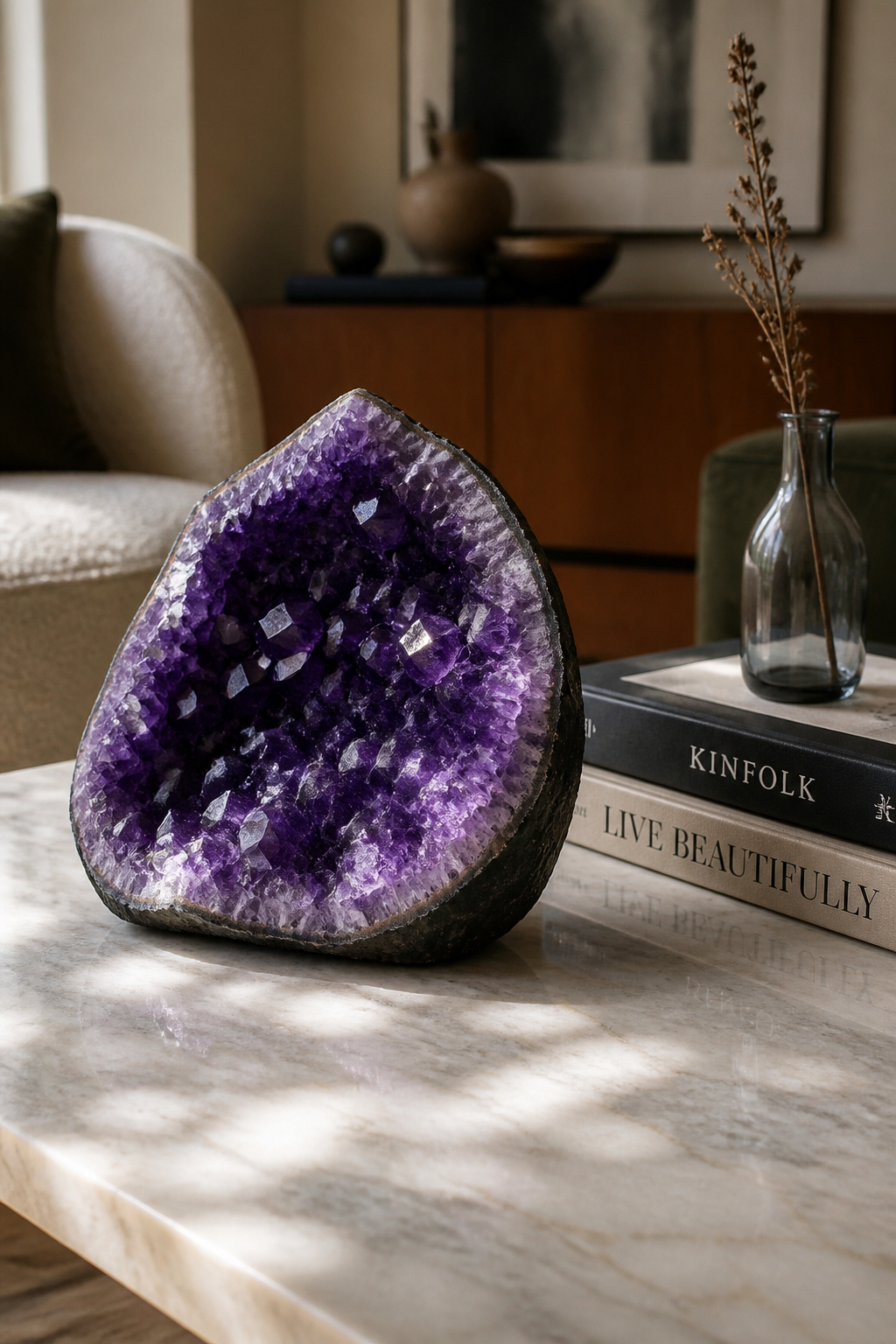
Driftwood is perhaps the most underestimated option. It’s lightweight, coastal, and naturally irregular — every piece is different, and its weathered surface contrasts beautifully with smooth objects like marble bowls or glass vessels. You can find it free on beaches or purchase it from Etsy sellers for $10-40. A striking amethyst geode cluster (5-7 inches) at $30-80 adds geological drama alongside quiet plant pots and neutral books — the deep purple tones catch light similarly to a metallic object but with a completely different character. Handmade ceramic vessels — even a simple pinch pot from a local market — read as more interesting than factory-made bowls precisely because of their slight imperfection.
The styling rule: the sculptural object should be the most visually complex item in the arrangement, and everything else should be quieter. Books make the ideal partner for a sculptural piece — they add height without competing. One sculptural object per arrangement is almost always the right answer. Two ‘statement pieces’ placed side by side cancel each other out and the arrangement looks confused rather than curated.
11. Art Books as Coffee Table Styling Foundations Worth Showing Off
The distinction between a coffee table book and a regular book is real but not always obvious. Large-format books (typically 10×12 inches or larger) with high-quality photography, premium paper, and covers designed to be read face-up are made to be displayed as much as read. Publishers like Assouline, Phaidon, and Taschen have built significant followings on exactly this kind of book, and their titles are worth the investment precisely because they function as objects as much as publications.
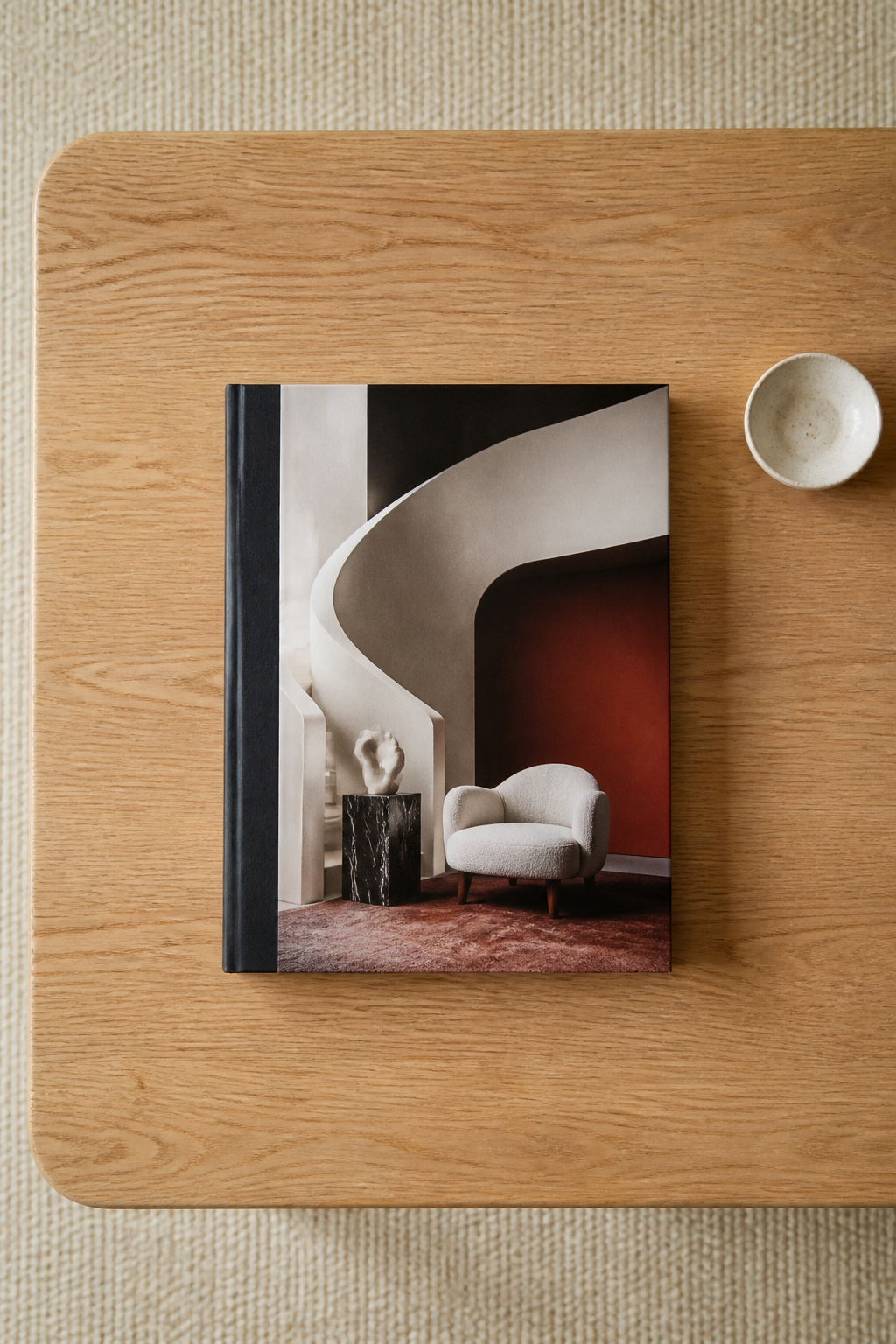
For art and architecture-forward rooms, 2025’s standouts include Phaidon’s *Making Space: Interior Design by Women*, which doubles as a beautiful cover object and a genuinely compelling read with profiles of 250 designers from the 20th century to now. For fashion-forward interiors, *André Leon Talley: Style Is Forever* and *Rick Owens: Temple of Love* both have strong graphic covers that hold up as display objects. Photography books — particularly landscape and portrait work — suit coastal, organic, and warm-toned rooms.
The styling question of one book versus three comes down to what you want the table to say. One large-format book displayed flat, cover-up, is a confident editorial choice. A curated stack of three with coordinated spine colours creates height and a platform for other objects; the visual effect is richer. A third option — a single book displayed open to a particularly beautiful spread — turns the book into a gallery piece, most effective on low, wide tables where the open pages can be seen from a seated position.
12. Seasonal Coffee Table Styling: Four Fresh Looks From One Base Setup
Here’s the coffee table styling approach I come back to every time someone says they love their current arrangement but want it to feel fresh: build a permanent base, then rotate only three elements per season. The table looks completely different four times a year. You spend almost no money. And the transition takes about 15 minutes.
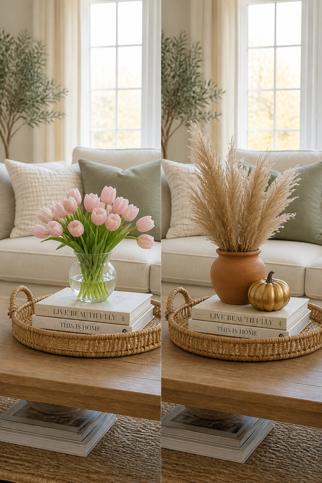
The permanent base is a neutral tray in a material that works year-round (rattan, natural wood, or a cream-painted piece), a 2-3 book stack with neutral or earth-toned spines, and a simple vessel in a neutral colour — white, natural clay, or clear glass. Everything about this base is chosen to be invisible, so the seasonal elements can be the story.
The Seasonal Swap Schedule
Spring: add ranunculus or tulip stems in a pale bud vase, introduce a pale green or blush ceramic object, and swap any dark book spines for lighter alternatives. Summer: switch to a clear glass vessel with a single large tropical leaf, remove candles entirely or replace with unscented white pillars, add a small bowl of sea glass. Autumn is my personal favourite seasonal swap — terracotta vase, dried pampas or cotton stems, and a small pumpkin or gourd as the organic element (they last 3-6 weeks on a dry surface with no water). Winter: clustered white pillar candles, pine or fir clippings in a low wide vessel, and one warm brass or gold accent piece. For a complete framework on how seasonal coffee table styling works across the whole room, living room decor ideas for a home that changes with the seasons goes into much more depth.
The 15-minute refresh routine: clear everything off the table, wipe the surface, place the tray first, then the books, then the seasonal elements. Step back to the sofa and assess from sitting height before adding anything else.
13. The Layered Look: How to Build Depth in a Coffee Table Arrangement
Layering is the word designers use for something specific and learnable: creating the visual impression of depth and dimension on a flat surface. A layered coffee table has objects at three distinct height levels, slightly overlapping footprints, and a composition that draws the eye upward through the arrangement rather than across it in a flat row.
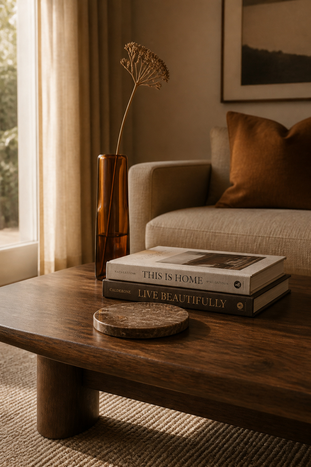
The Three-Layer Formula
Think in three planes. The foundation layer sits at or just above table surface level: the tray, a flat marble coaster set, a low wooden board. The middle layer is your book stack or wide ceramic bowl — something 3-5 inches tall that creates an intermediate plane. The top layer is the tallest element: a slender vase, a candlestick, a branch, or a tall dried stem. This is the point the eye travels up to, and it should be the most elegant object in the arrangement.
Overlap matters too. An arrangement where every object is placed side by side with clear space between them reads as a row — flat, static, and somewhat clinical. Slide a small vase so it sits slightly behind the book stack, partially overlapping. Move a candle so it’s slightly in front of the tray. These overlaps create the impression that the arrangement has depth, that there’s a front and a back.
The test that changes everything: sit on the sofa and look at the table from there. This is the only perspective that matters. Coffee tables look completely different from 18-22 inches above floor level than they do when you’re standing over them. Objects that seemed well-spaced from above often look crowded or sparse from a seated position. Do all your final adjustments from the sofa, not standing in the room.
14. Greenery and Plants That Make Your Coffee Table Feel Alive
Everything else on this list will make your coffee table look beautiful. Only a plant makes it feel genuinely inhabited. That sounds like a dramatic distinction, but it’s the practical reality: a living element changes day to day in small, almost imperceptible ways — a new leaf unfurling, a stem leaning slightly toward the light, the colour deepening or brightening — and that ongoing change keeps the table from becoming invisible. When everything is static, the arrangement eventually stops being seen.
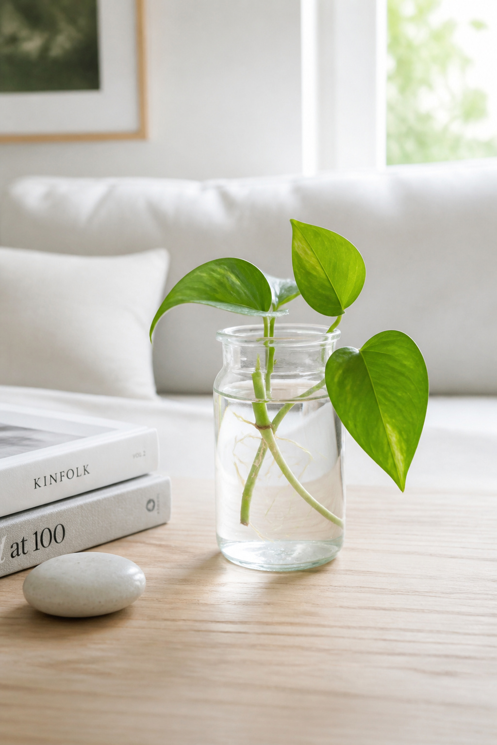
The challenge is that coffee tables are not natural plant habitats — they’re low to the ground, typically away from windows, and subject to knocks. So plant choices need to be genuinely tolerant of these conditions. Pothos cuttings in a glass bud vase are virtually indestructible — they root visibly in water over several weeks, which is decorative in itself, and they thrive in low to medium indirect light. Haworthia and echeveria succulents stay small indefinitely, need watering only every 2-3 weeks, and tolerate the low light of most living rooms better than most succulent varieties. Air plants (tillandsia) sit in any decorative vessel without soil and need only a weekly mist — they’re architecturally interesting and the most minimal-maintenance option available.
If you prefer something more dramatic, a single large monstera or banana leaf in a wide-mouthed vase of water is a bold, graphic approach particularly suited to large, minimal coffee tables. One leaf. One vessel. Done. The key mistake to avoid: choosing a plant that needs direct sunlight — most coffee tables are positioned far from windows, and sun-loving plants deteriorate quickly in those conditions.
15. Minimalist Coffee Table Styling: When Less Really Is More
Minimalist coffee table styling — particularly the Japandi version that blends Japanese wabi-sabi with Scandinavian simplicity — is the hardest style on this list to execute well and the easiest to execute poorly. The difference between a minimalist arrangement that looks intentional and one that looks like someone forgot to decorate is almost entirely about object quality and considered placement.
The Philosophy of Restraint
The foundation here is this: negative space is not emptiness, it’s an active design element. In Japandi interiors, the bare surface of the coffee table is part of the composition — it gives each object room to breathe, to be fully seen, to be appreciated as an individual piece. The skill is not in filling the table; it’s in choosing one or two objects significant enough to carry the whole surface. That requires more confidence than arranging five objects, because there’s nowhere to hide. The same commitment to intentional space is what makes adding depth to your minimalist bedroom so transformative — restraint in one room often encourages you to apply it throughout the house.
Choosing One Object That Carries the Table
For Japandi-style coffee table styling: a single hand-thrown ceramic bowl, off-centre, with one twig or small branch beside it. Or an Ikebana-style floral arrangement — one or two stems in an angular vessel, with the negative space around them as considered as the stems themselves. The material quality of that one object matters enormously — minimalism exposes cheap materials immediately. Invest in one excellent piece rather than five mediocre ones.
The placement rule: slightly off-centre almost always looks more considered than perfectly centred. Centred placement looks like someone put it there by accident; off-centre placement looks like a decision.
16. Vintage Finds That Give Your Coffee Table Decor Character and Story
The objects that get complimented most consistently on coffee tables are almost never the new ones. They’re the vintage brass bowl from an estate sale, the art book with a cracked spine and a previous owner’s name inside, the piece of coral found at a market in a town you once visited. Vintage and one-of-a-kind pieces give coffee table decor something no retailer can produce: history, patina, and the implied existence of a person who found them.
Patina — the colour change, surface wear, and character that develops on an object over decades — cannot be manufactured. It’s why a beaten-up brass bowl from the 1960s reads as more interesting than a perfectly finished new one from the same material. Interior designers consistently report that vintage or thrifted pieces generate more guest conversation than anything bought new. The story behind an object adds value that doesn’t show up on the price tag.
Where to Find the Right Vintage Pieces
For sourcing, Etsy is the most accessible starting point for small vintage objects — bowls, trays, sculptures, and books. Search by material and era (“1970s ceramic bowl” or “brass tray vintage”) rather than generic “vintage decor” for better, more specific results. Budget $15-100 for coffee table-sized pieces. eBay has an enormous selection of vintage books at used-bookstore prices, but condition photos are critical — always ask sellers for images of the spine and interior. Estate sales and thrift stores offer the best prices and most unexpected finds: vintage tool chests, old ceramic jars, and unusual sculptural objects show up regularly at charity shops for $2-15.
The mixing rule when combining vintage with modern: the 80/20 approach. Let 80% of the arrangement be cohesive — same palette, same material family — and introduce one vintage piece as the 20% that creates character. A vintage brass bowl beside clean modern ceramics reads as curated contrast. The same bowl alongside four other vintage oddities reads as accumulated rather than chosen.
Choosing the Coffee Table Styling Approach That Fits Your Home and Life
There’s no universally correct approach to coffee table styling, and any arrangement that works for one household may be completely wrong for another. A five-object display with candles and a glass vase is wonderful until you have a toddler who views coffee tables as a personal redistribution centre.
If you have young children: contain everything in a tray, skip anything with a flame, choose heavier objects over lightweight ones, and save the glass vase for when they’re older. Pet owners face similar considerations — heavier ceramics and stone objects are more pet-proof than tall vases, and anything on the table edge is eventually going to meet a wagging tail. For entertainers who use the coffee table for actual drinks and snacks, a more minimal day-to-day arrangement leaves surface space for guests without requiring a complete clear-off before every visit.
If you’re starting from scratch, the sequence that consistently works best: buy the tray first — it’s the structural decision everything else flows from. Next, look at what books you already own before buying anything specifically for display. A well-chosen personal book is always more interesting than a purchased ‘decor book.’ Then add one organic element — a plant cutting, a bud vase — and see whether you actually want more before you add it. Leave the arrangement for a day, come back, and remove one object. You’ll almost always find the table looks better after the edit. That last step — the removal — is the one that separates coffee table styling that looks good from coffee table styling that looks great.