Every piece of furniture you bring into your living room is a quiet decision about how you want to live. Not a style statement — a life statement. Minimalist living room furniture isn’t about owning less for its own sake; it’s about owning with enough intention that each piece earns its place and nothing competes with the people and conversations in the room. In over eight years working as a wellness design consultant, I’ve seen the same pattern repeat itself: the rooms that feel genuinely calm are not always the sparest, but they are always the most deliberate.
What follows are sixteen minimalist living room furniture ideas built on that principle — pieces that reduce visual load, support physical comfort, and match how a living room is actually used, day after day. Some are investments. Some are small decisions that cost almost nothing to make. All of them have a specific, defensible reason for being in the room.
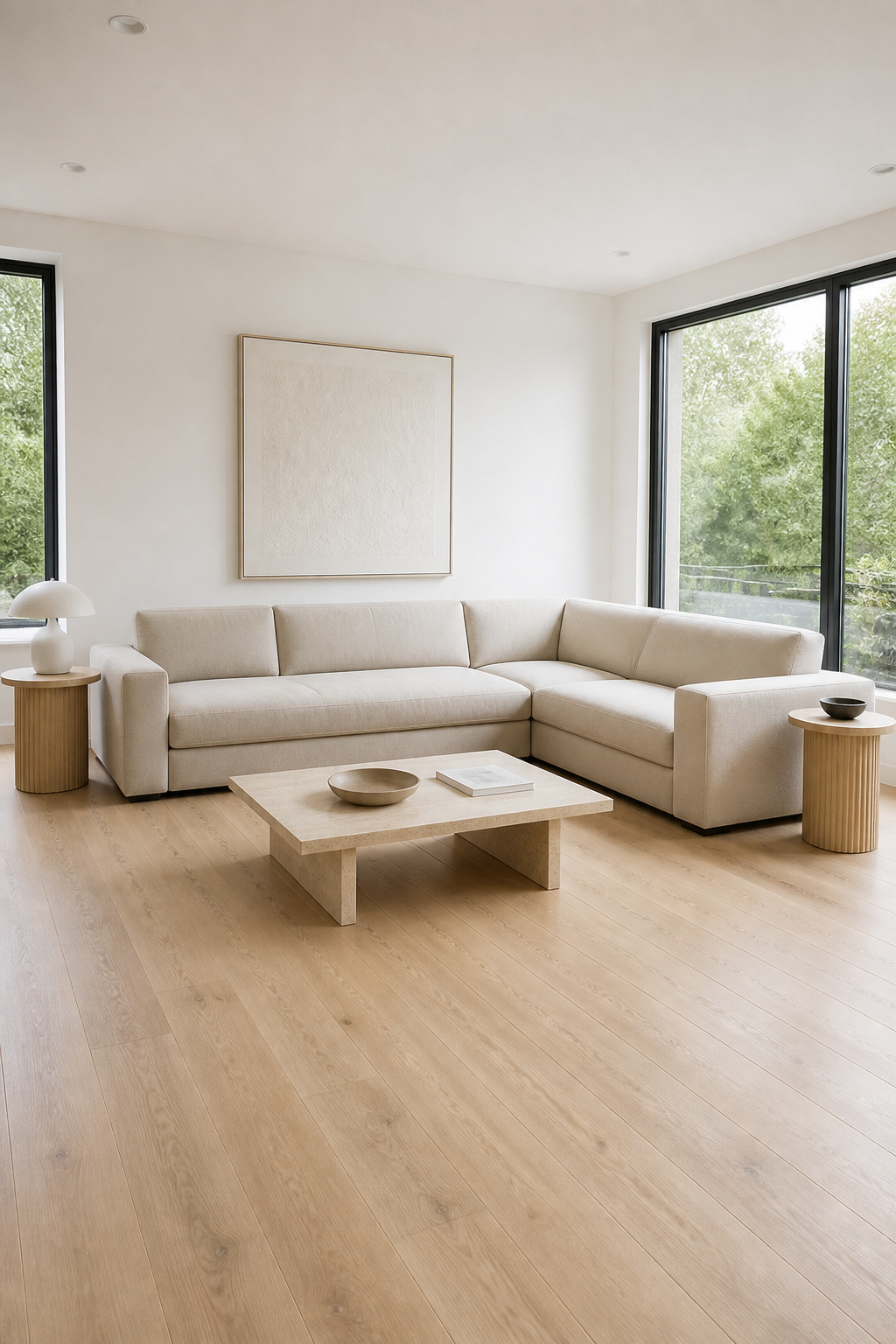
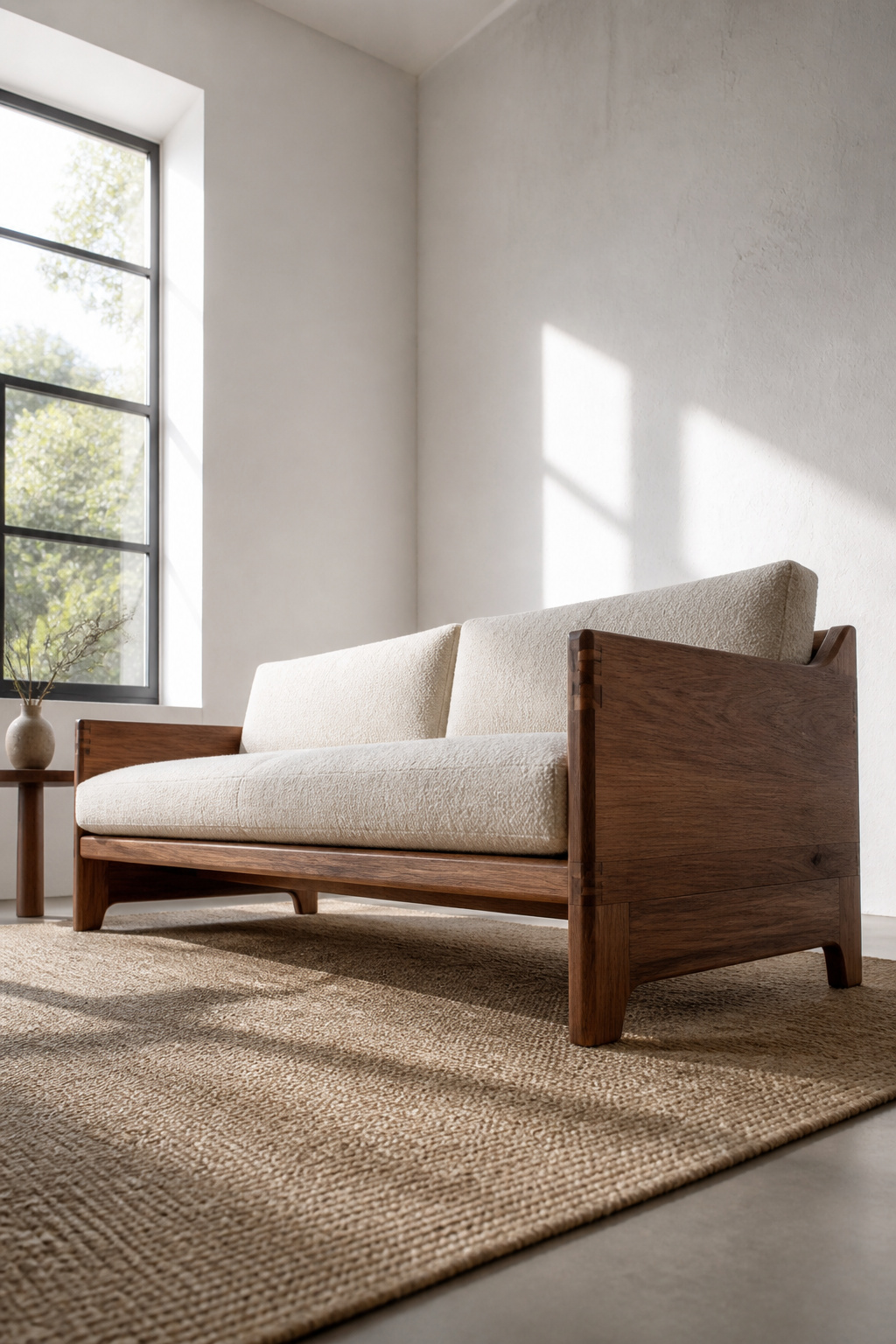
1. Low-Profile Sofa in a Single, Neutral Upholstery
A sofa with a seat height between 10 and 14 inches does something that taller, boxier sofas cannot: it allows the eye to sweep across the room rather than stopping at upholstered arms. At 12 inches — what designers now call the ergonomic sweet spot — the sofa provides intimate, grounded seating while keeping the room’s visual horizon low and open. It is one of the most effective tools in minimalist living room furniture, and it costs nothing extra to specify if you’re buying new.
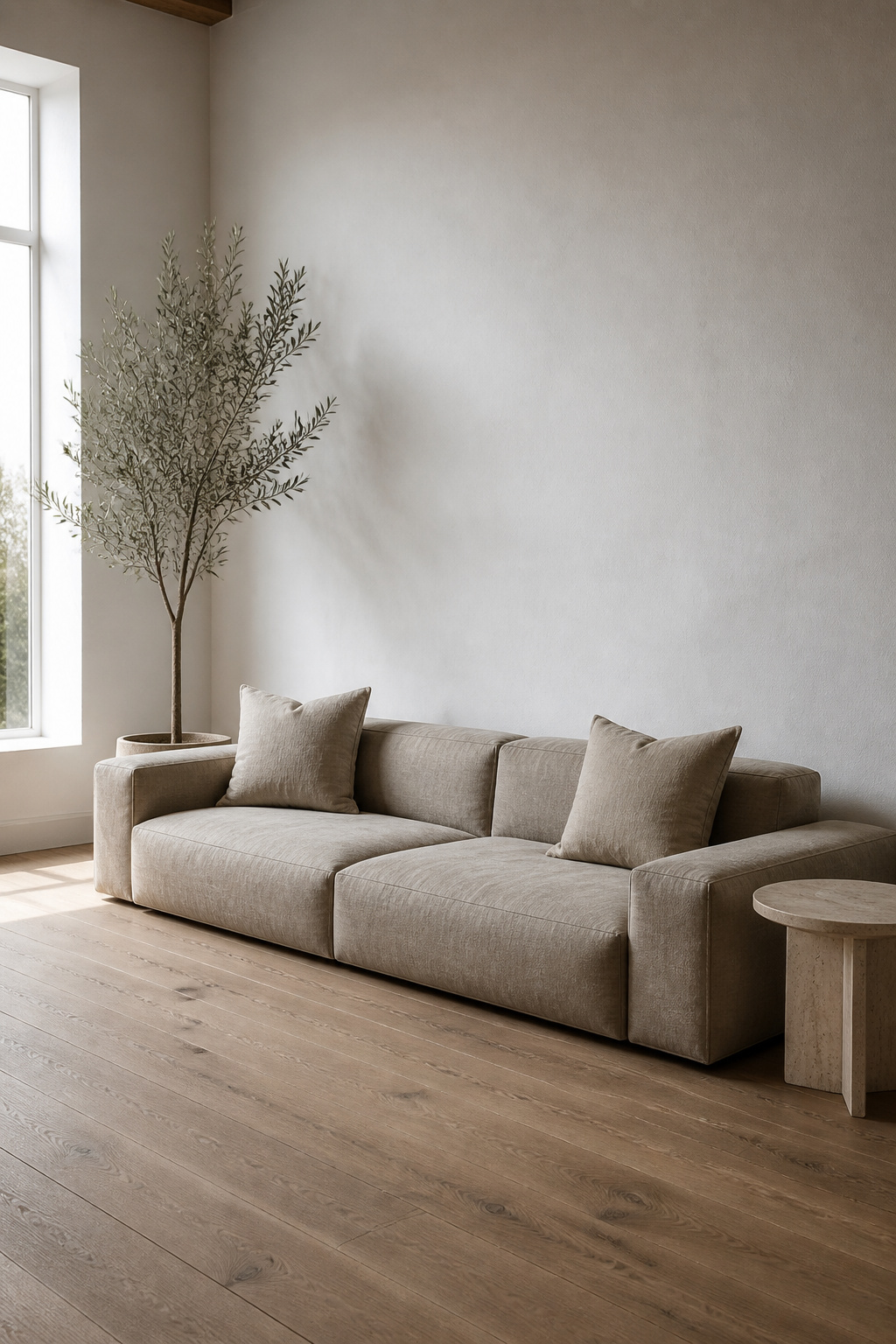
For colour, warm neutrals outperform cool ones in practice. Greige, warm white, camel, and the clay and mauve tones gaining momentum in 2026 all read differently under natural light than they do in showrooms. Cool grays, by contrast, pull blue under overcast skies and read as clinical rather than calm. Test swatches in situ before committing — this is advice I give every client and the one most often ignored.
The fabric choice matters for anyone thinking about indoor air quality or allergen load. Performance linen blends breathe like natural linen but resist staining — the sensible choice for families. Bouclé adds tactile warmth (the kind of texture that supports wellbeing through touch) but requires more maintenance. If indoor air quality is a priority, consider that synthetic fabrics off-gas volatile organic compounds particularly when new. A natural fibre upholstery — linen, organic cotton, wool — contributes nothing to that load.
2. One Statement Chair as the Room’s Anchor Point
The most common mistake in furnishing a minimalist living room is buying two matching armchairs “for symmetry.” Symmetry is not a requirement of good minimalist rooms. One carefully chosen chair, placed at 30 to 45 degrees to the sofa axis rather than parallel to it, creates the visual interest the room needs without doubling the seat count and tripling the visual mass.
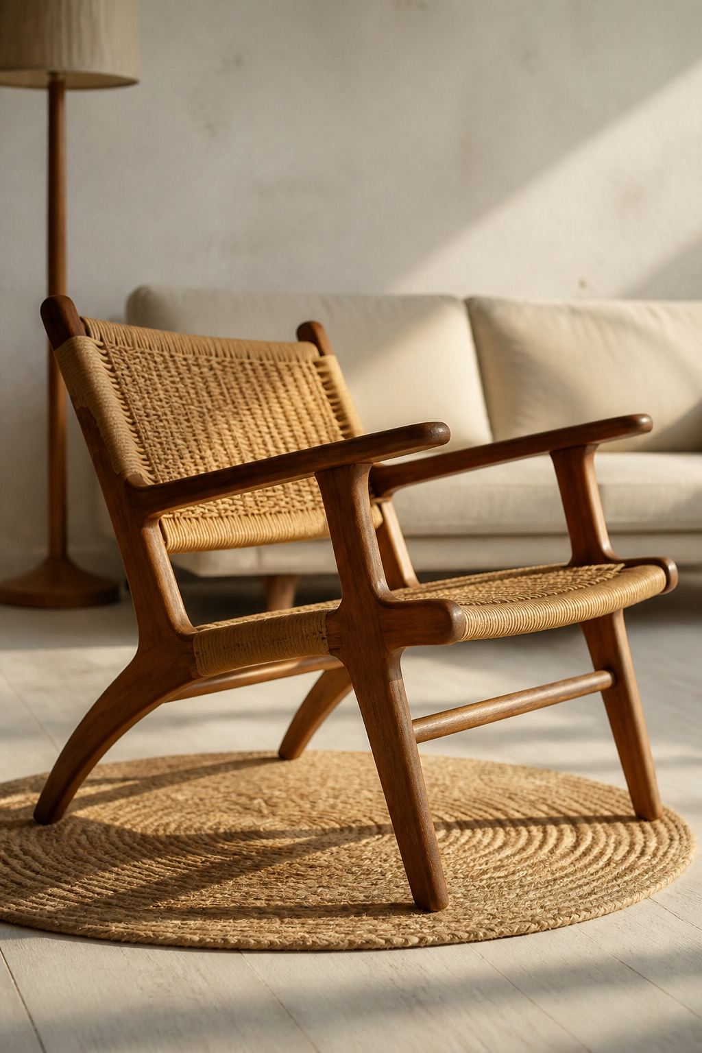
The chairs that have earned their place in this conversation are the ones still in production after 70 years. The Wishbone chair (Hans Wegner, 1949), the Barcelona chair (Mies van der Rohe, 1929), the Egg chair (Arne Jacobsen, 1958) — not because of their heritage, but because their proportions are resolved. They stopped searching. A chair that’s been solving the same problem well for seven decades is a chair whose design has been stress-tested by reality, not just photography.
In a room that prioritises natural materials — which any wellness-informed design should — natural leather and woven rattan both age well. Leather darkens at the arms and seat over years of use, accumulating character rather than showing wear. Rattan introduces a biophilic material (research consistently links natural materials with reduced cortisol) without introducing colour. You can also explore living room furniture ideas for holistic wellbeing if you’re approaching this through a wellness lens. Either way, the chair shouldn’t need styling around it to work — it should work on its own.
3. Floating Media Unit — The Minimalist Living Room Furniture Staple
Floor-standing media units interrupt the floor plane. That might sound like a small thing, but in a minimalist living room, the continuous floor is one of the most important visual elements — the clear, unbroken surface that tells the eye the room is under control. A wall-mounted unit eliminates this interruption entirely, which is why the floating media console has become a cornerstone of minimalist living room furniture.
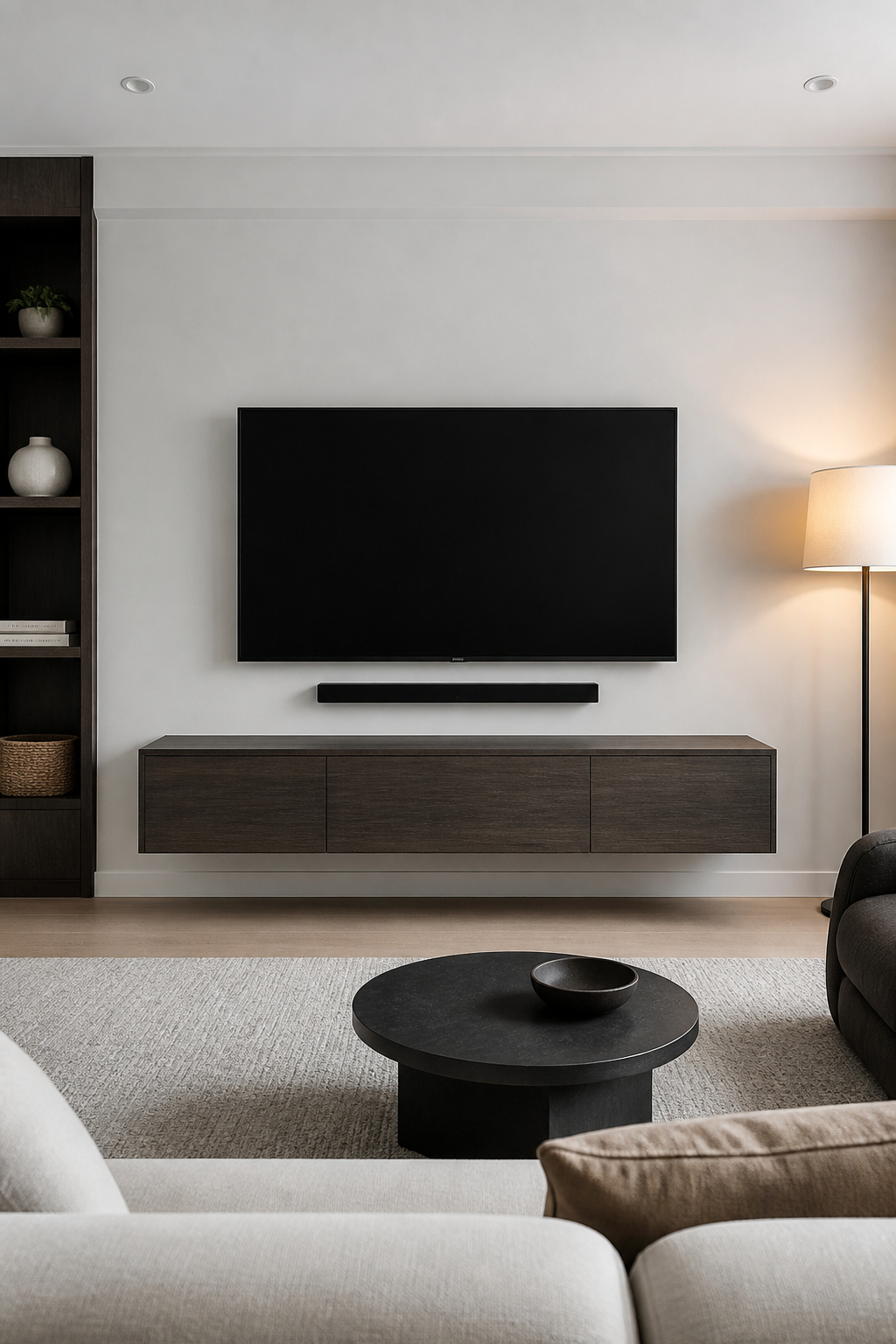
The mounting height needs to be functional, not stylistic. Position the console top at 20 to 24 inches from the floor, leaving 8 to 12 inches of clearance between the console and the TV bottom, with the TV center sitting at approximately 40 to 42 inches — the height that aligns with seated eye level for a standard sofa. Mounting too high is the most common error; it looks contemporary in a showroom photograph but causes neck strain over years of actual use.
For installation, locate and anchor into wall studs (typically 16 inches apart in timber-frame homes). The unit and its contents — TV, soundbar, any media equipment — should be supported at no more than 70 percent of the bracket’s rated capacity. Cable management is where most floating units fall short. Look for built-in grommet holes or internal cable channels, or run a single wall-mounted cable raceway from TV to console. The cleaner approach still: wireless HDMI adapters at around $80 to 150 eliminate the visible cable run entirely.
4. A Coffee Table With Concealed Storage and a Clean Profile
The coffee table is the room’s most-used horizontal surface and its most likely site of visual accumulation. Remotes, books, charging cables, yesterday’s coffee cup — open shelves beneath a table make all of this visible. A table with drawers, a lifting top, or a hidden interior solves the problem at the source rather than asking for constant discipline.
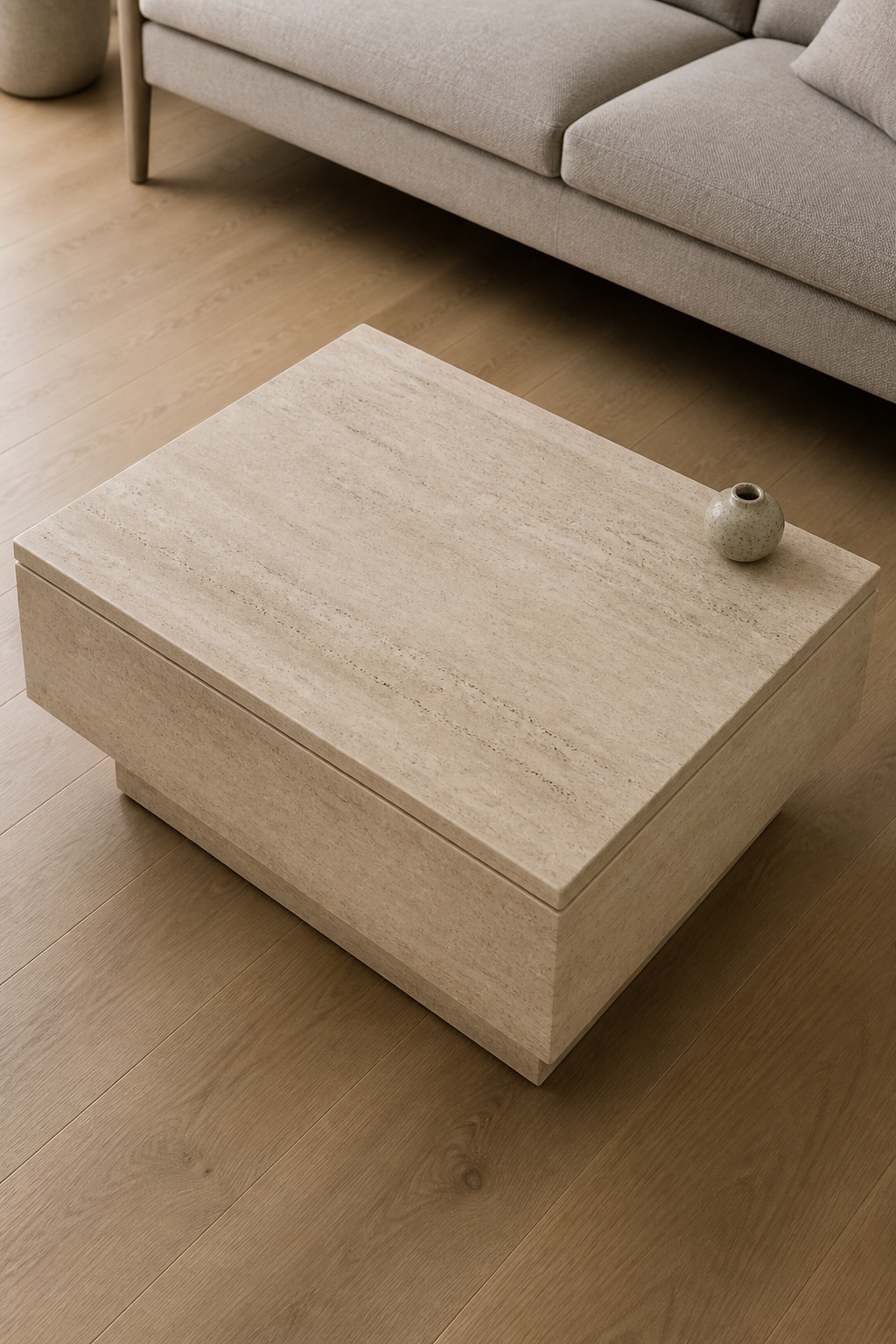
For materials, travertine with a honed finish is the strongest current choice in minimalist living rooms — not because it’s fashionable but because it does real visual work without requiring effort from you. The stone’s natural variation provides texture; the honed surface prevents the reflectivity of polished marble that pulls attention. For warm, pale rooms, ivory or cream travertine reads as soft and organic. Smoked glass is the alternative for near-invisibility, but it shows fingerprints immediately — acceptable in a very low-use room, practically impossible to maintain in any other.
For sizing, the two-thirds rule is reliable: table length should be approximately two-thirds your sofa’s length. For a 228cm (90-inch) sofa, target a 152cm (60-inch) table. Height should sit 2 to 3cm below the sofa seat height for ergonomic reach. And 35 to 45cm clearance between the sofa edge and the table edge is the minimum that allows someone to get up without performing a manoeuvre. That same principle applies throughout Scandinavian interior tradition, where the relationship between furniture scale and room volume is always primary.
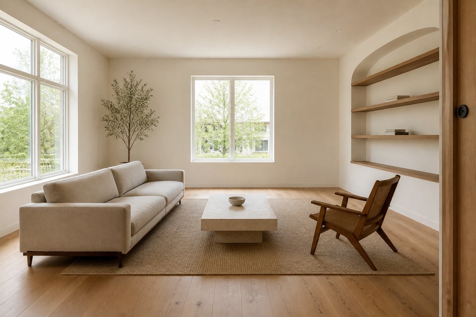
5. Simple Living Room Furniture: Open Shelving as Purposeful Display
There is a difference between display and accumulation, and open shelving makes this difference visible every day. A shelf that was styled once and not reviewed since is an accumulation shelf, regardless of how carefully it was arranged. A purposeful display shelf is one where every object on it was consciously placed and would be consciously chosen again today.
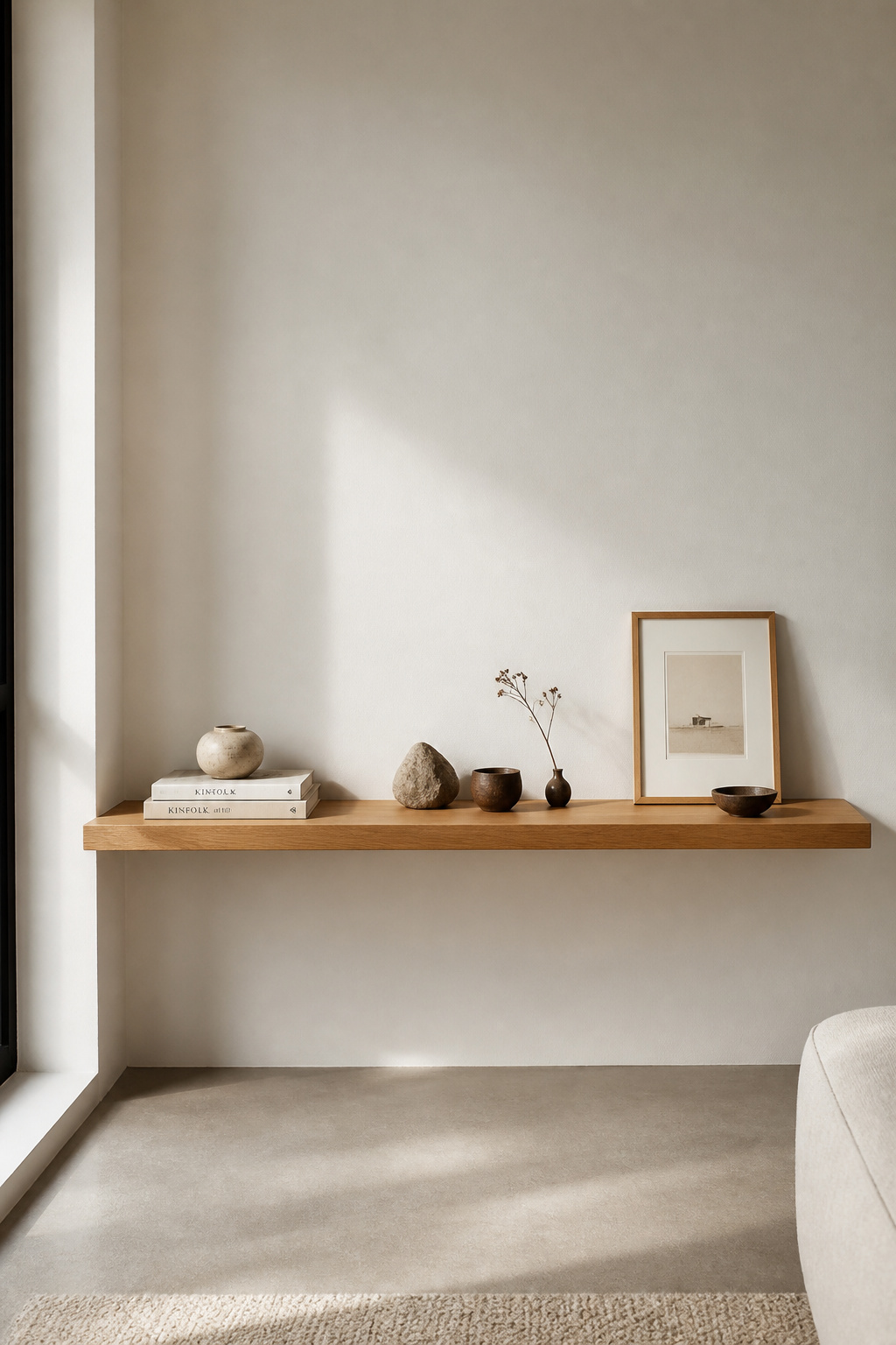
The rule of three is the most useful structural tool here: group objects in sets of three, vary their heights (tall, medium, low), and vary their textures (smooth, rough, organic). The eye settles on odd-number groupings more comfortably than even ones — this is a consistent finding in visual perception research, not designer intuition. Within each grouping, leave deliberate negative space. Not every shelf needs to be full. The empty stretches are what allow the displayed objects to be seen individually.
For the shelving material itself, solid oak in 25 to 30mm thickness, oiled or finished with matte lacquer, ages without drama. Powder-coated steel brackets in matte black or white read as structural rather than decorative — they support without competing. Avoid untreated MDF shelves in any room with humidity variation; the edges swell visibly within months and never recover. The shelf material is not where to compromise on quality in a minimalist room, since the shelving defines the wall.
6. Platform Daybed for Dual-Purpose Living and Lounging
A platform daybed solves a specific problem: the living room that also needs to function as a guest room without looking like one. A standard daybed accommodates a twin mattress at 97 by 190cm, which fits an adult guest comfortably. By day, with a firm medium mattress covered in linen and one large square pillow, it reads as a considered piece of living room furniture. By night, it becomes a functional bed — and as minimalist living room furniture goes, it’s one of the more intelligent single purchases you can make. That dual function replaces two pieces with one, saving 40 to 60 square feet of floor plan in a modest room.
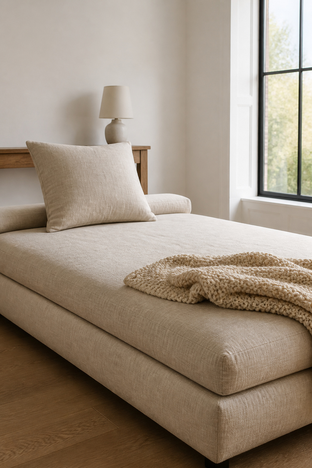
The mattress firmness is critical and often underestimated. A medium-firm rating (5 to 6 on a 10-point scale) is the practical range: firm enough to sit on through hours of daily use without bottoming out, soft enough that overnight guests don’t wake stiff. Natural latex mattresses (solid rubber, not foam) are the wellness-design choice here: no off-gassing, naturally antimicrobial, and structurally durable. They cost more upfront but don’t need replacing in the 5 to 7 year window that synthetic foam typically requires.
For styling, the discipline is severe: one pillow, one throw, nothing else. One 70cm square pillow in the same fabric as the mattress cover — not contrasting, not patterned. One loosely folded throw at the foot end in a complementary texture (chunky cotton knit, woven linen). Any more than this and the daybed reads as a bedroom, which is the one impression you’re trying to avoid in a living space.
7. A Precisely Scaled Modular Sectional
A modular sectional works in a minimalist living room only when it’s configured for the specific room rather than selected from a showroom in its default shape. The first step is not choosing a style — it’s measuring the perimeter. Subtract at least 90cm from each end of the longest wall for clearance, and that gives you your maximum sectional footprint before ordering a single module.
The clearance numbers are not suggestions. Every primary traffic path around minimalist living room furniture should maintain at least 76cm (30 inches) of clear passage — below this, the room functions as a corridor around furniture rather than a space you inhabit. The 40 to 45cm clearance between sofa front edge and coffee table is a separate measurement that must be confirmed independently. Both need to work simultaneously, which is why configuring by room dimensions rather than catalogue defaults is the only approach that works consistently. Scandinavian design tradition applies exactly this kind of precision planning — configuring furniture to the room’s actual proportions rather than starting with a standard size and working backward.
On seat depth: the standard 50 to 60cm range suits most people for upright and moderately reclined sitting. Modules deeper than 76cm are designed for lying down — they feel luxurious in a showroom and impractical the moment you try to sit up with good posture for a conversation or a meal. In a wellness context, furniture that encourages poor posture over extended daily use is not neutral. The ergonomics of where you sit most of your waking hours matter more than they’re usually credited for.
8. One Side Table Per Seat — No More, No Less
This is perhaps the most underspecified rule in minimalist living room furniture: one side table per seating position, not per sofa. A sofa with three seats and one side table at one end leaves two people without a surface. They’ll improvise — floor, armrest, coffee table — and the room will accumulate the visual evidence of those improvisations. One table per position solves the problem structurally, not decoratively.
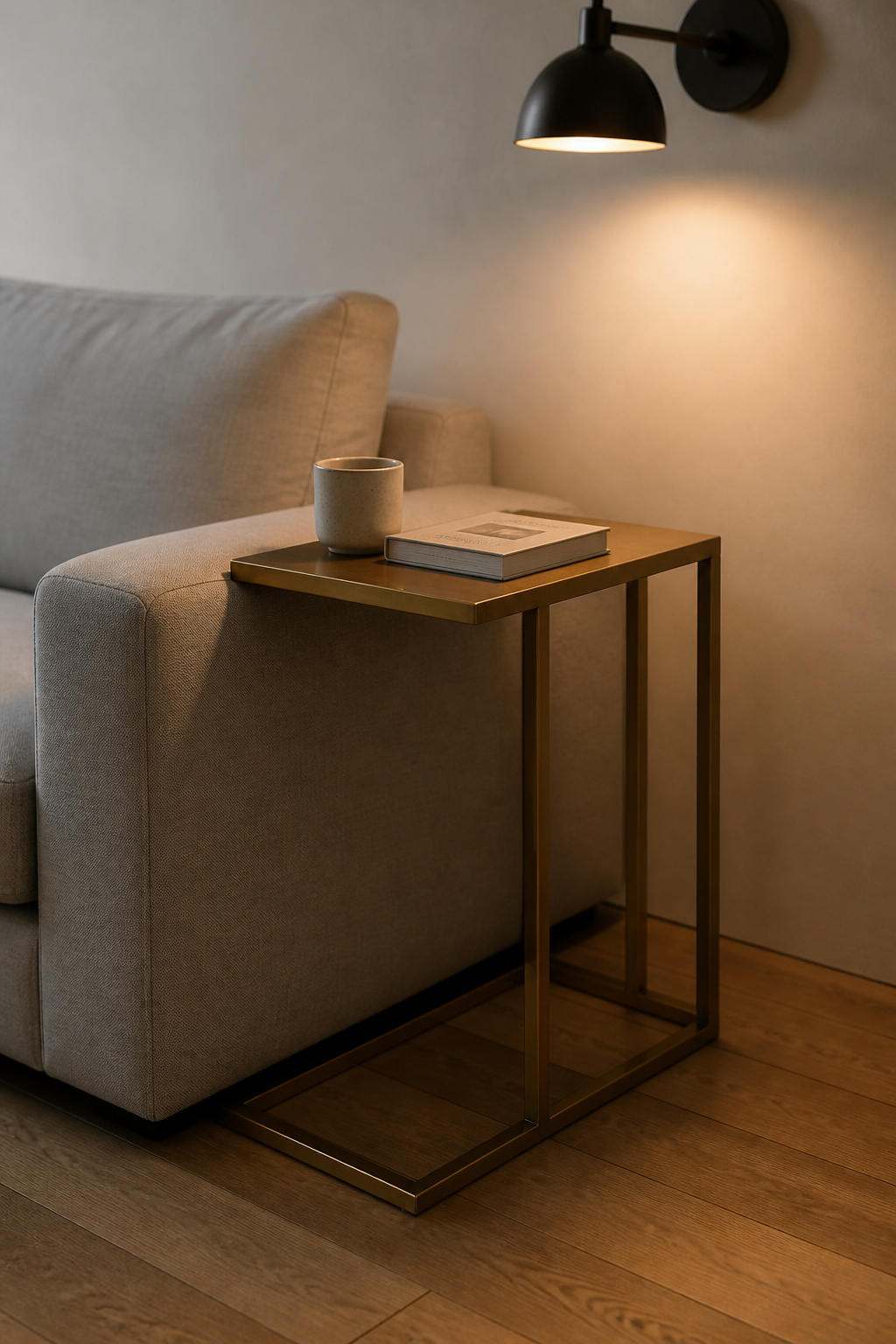
The height relationship is specific: the side table surface should sit within 2 to 3cm of the sofa arm height. For standard 43 to 45cm arm heights, that means a table at 22 to 26 inches (55 to 66cm). For a low-profile sofa with a 35cm arm, look for tables at the lower end of this range. The reason this matters is purely ergonomic — reaching up to set down a glass or pick up a book from a table that’s taller than your arm height creates micro-tension that accumulates across years of use. For more on choosing the right sofa to anchor these decisions, see mindful considerations for the perfect living room couch.
For shapes, round tables (no corners to catch legs or bags) and C-frame tables (which slide partially under the sofa arm, requiring zero additional floor space) are the cleanest options for minimalist rooms. Drum tables in travertine or concrete sit more confidently — appropriate when the side table is meant to be seen as a design object rather than just a surface.
9. Minimalist Living Room Furniture in Natural Oak and Walnut
Natural wood is not in conflict with minimalism. It is essential to it. The minimalist tradition that shaped this aesthetic globally — Scandinavian design from the 1950s through the 1980s — always included warm wood as the primary counterweight to neutral upholstery and white walls. A minimalist room without wood reads as sparse. A minimalist room with warm oak or walnut reads as calm.
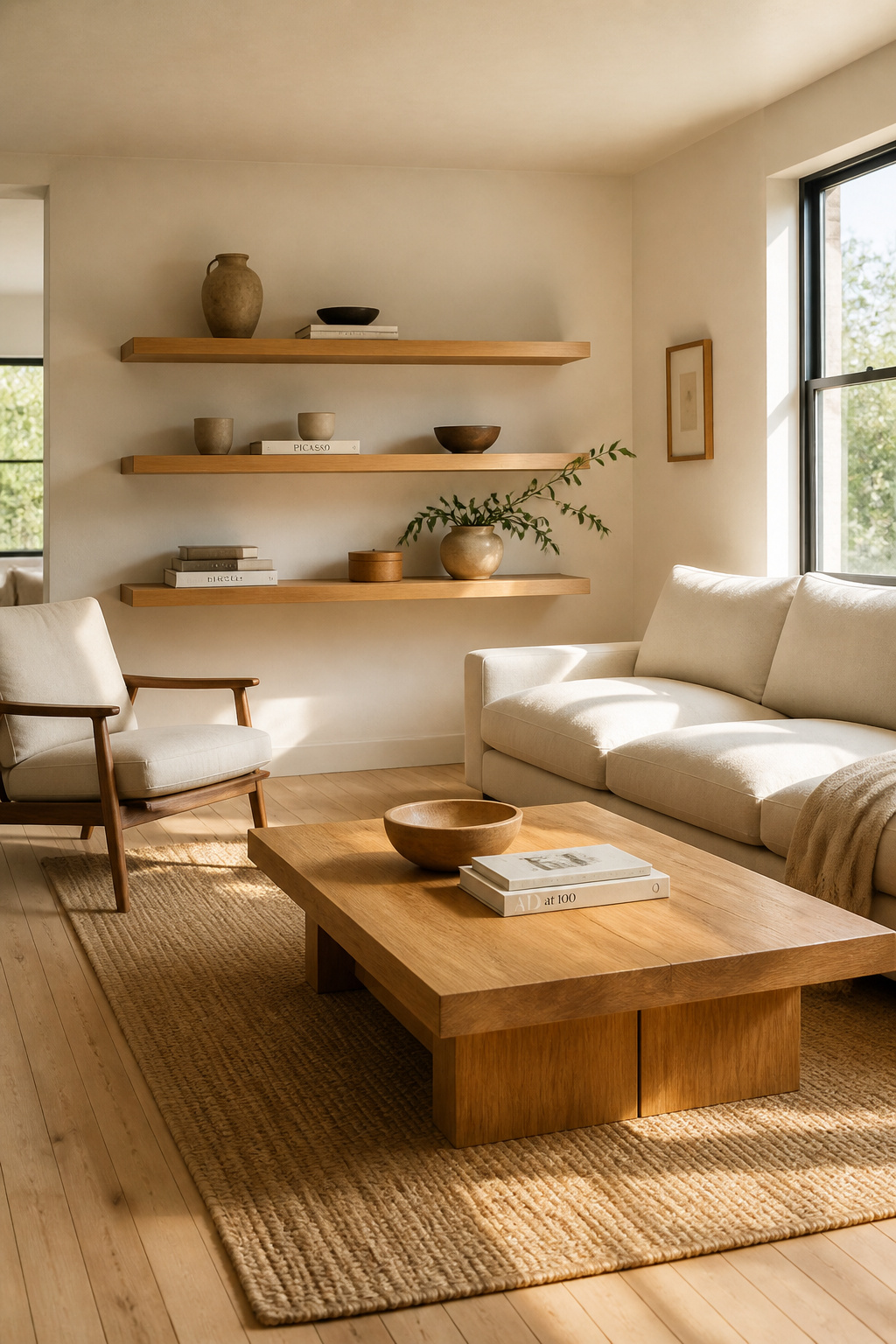
The choice between the two depends primarily on the room’s contrast level. Oak’s honey-to-amber grain adds warmth without imposing strong colour — it works in rooms from very pale to mid-tone. Walnut’s brown-to-near-black depth brings richer contrast, and suits rooms that can absorb it: higher ceilings, darker floors, or rooms with strong natural light. For reference, oak has a Janka hardness rating of 1290 (extremely durable for furniture surfaces) and walnut scores 1010 — both well within the range required for daily use furniture. If you want to push this direction further, modern living rooms with natural elements extends the conversation into biophilic design principles.
One note on finishing: oiled surfaces feel like wood because they are wood — the oil penetrates the grain rather than coating it. They require reapplication every one to two years but reward that maintenance with genuine tactile warmth. Matte lacquer is the practical choice if you can’t commit to maintenance cycles — it protects without significantly altering the natural appearance, and the difference in feel is the trade-off. Avoid glossy lacquer on anything in a minimalist room; it reflects light and draws attention to itself rather than receding.
10. Leggy Pieces That Leave the Floor Visible
Mid-century furniture designers understood something that later decades forgot: the floor is part of the composition. When furniture sits on exposed legs rather than sitting flat on the ground, the visible floor plane unifies the room. The space reads as continuous rather than divided by furniture bases at every horizontal level. This was a core insight of Scandinavian and American mid-century design, and it remains one of the most reliable techniques in minimalist living room furniture selection.
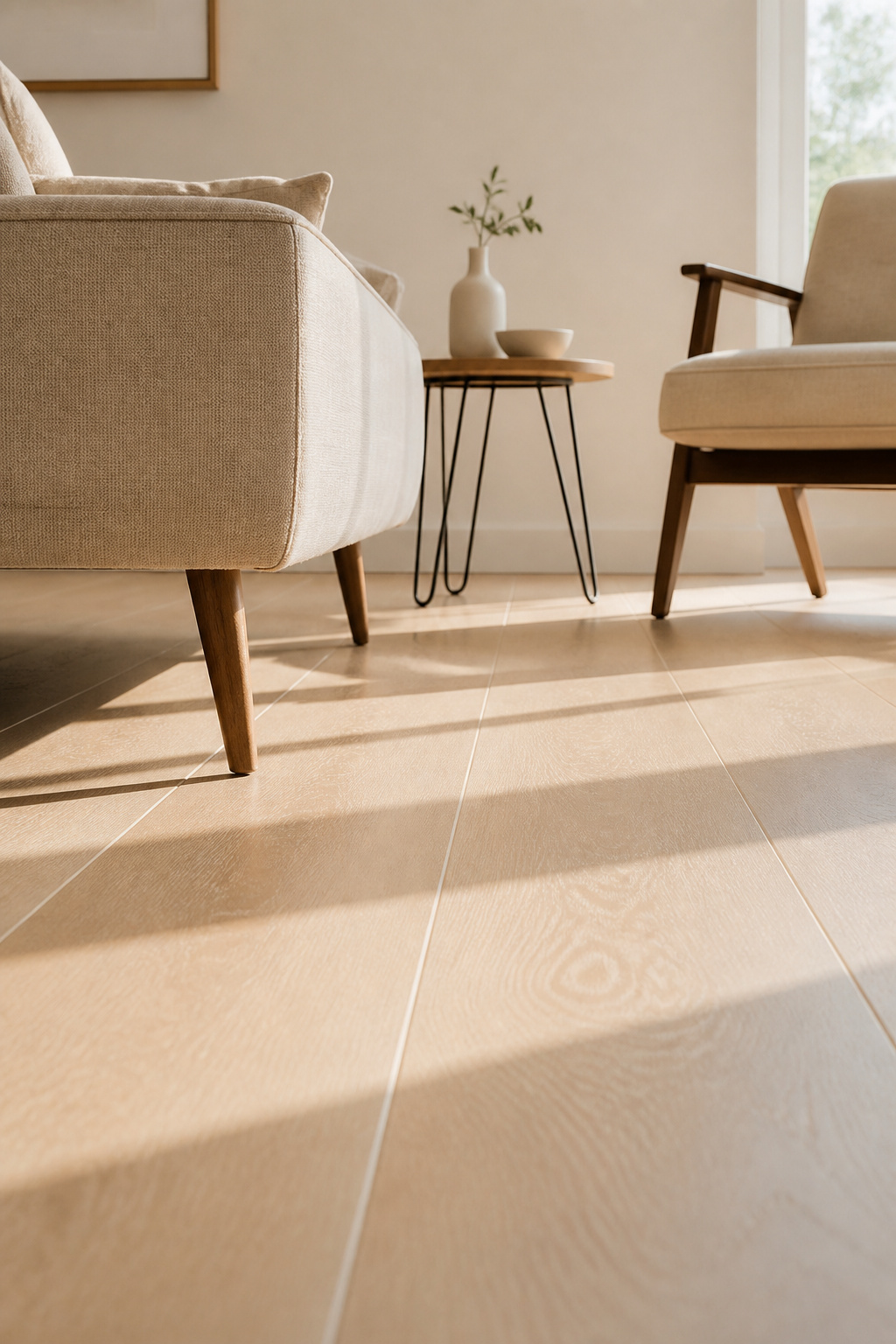
Tapered wooden legs (becoming progressively narrower toward the foot, often angled slightly outward) originated with designers like Hans Wegner and Finn Juhl in the 1940s and 50s. They read as warm and resolved — never temporary. Hairpin legs, introduced by designer Henry P. Glass in the 1940s as a V-shaped bent metal rod, are thinner and more industrial in character. Both are valid; but mixing them across different pieces in the same room requires deliberateness. If the coffee table has hairpin legs, the side tables should too, or there should be other metal elements (a lamp base, shelf brackets) that make the metal feel like a considered material rather than an accident of sourcing.
The alternative — skirted furniture that runs to the floor — has its place in traditional rooms. In a minimalist room, it closes off the floor plane and introduces a visual barrier at ground level that the eye reads as heaviness. Even a 10 to 15cm leg reveal under a sofa shifts the room’s visual register measurably. I’ve tested this in client rooms repeatedly, and the difference surprises people consistently.
11. A Neutral Area Rug as the Room’s Only Texture Layer
The most common single living room mistake: a rug that is too small. A rug that doesn’t anchor the furniture arrangement makes everything in the room look like it arrived separately and hasn’t yet been introduced. In a minimalist room, where there are fewer pieces and more visual weight riding on each one, an underscaled rug is immediately obvious.
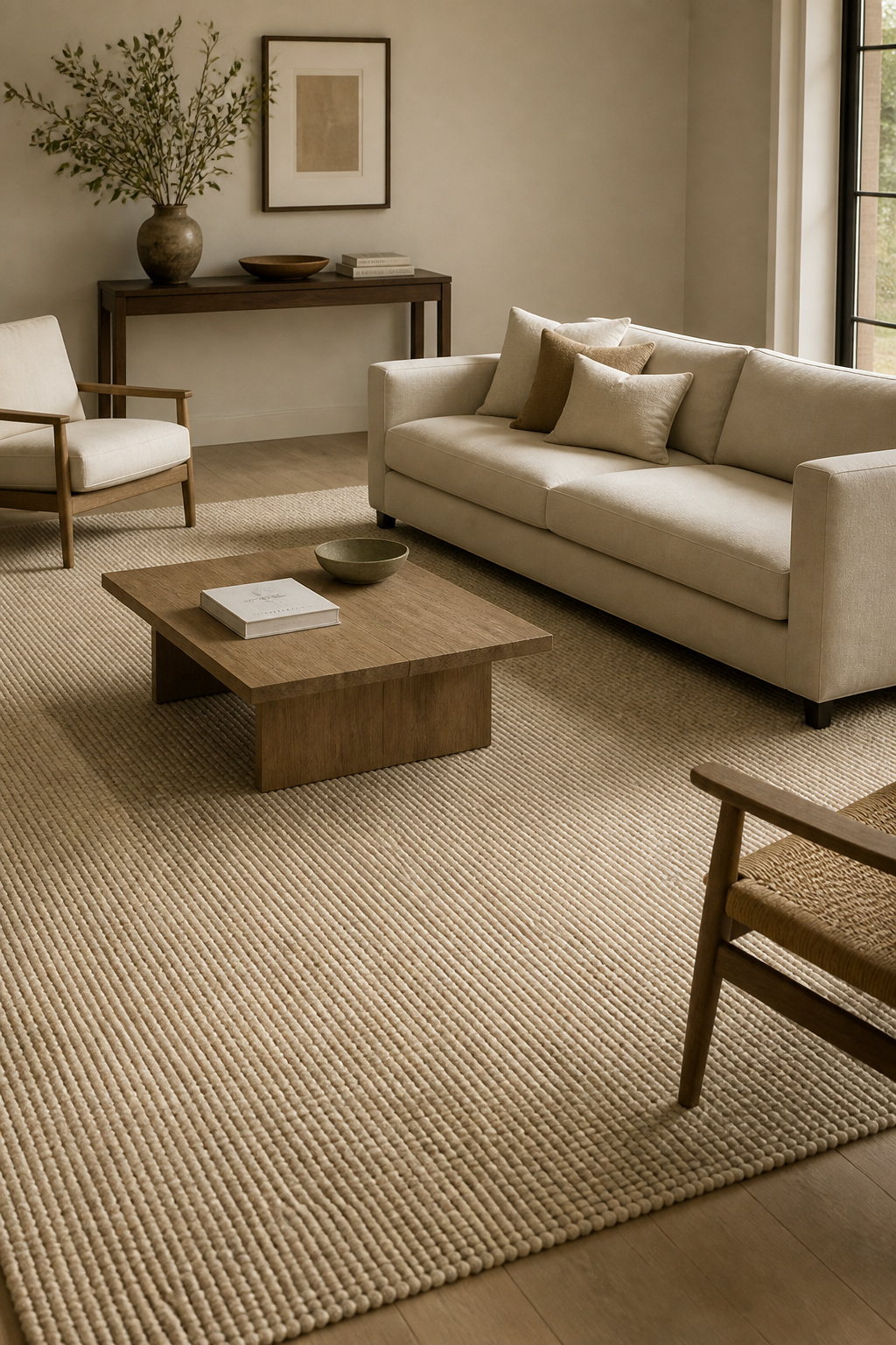
The placement rule with the fewest exceptions: all four sofa legs on the rug, or front two legs only — never no sofa legs at all. The “all legs on” approach typically requires a 9 by 12 foot or 10 by 14 foot rug in a standard living room and is the most resolved option. The “front legs on” approach works with an 8 by 10 foot rug and is more common in practice. What doesn’t work — ever — is a rug sized for a dining room chair arrangement in a living room context. The rug is the element most likely to undermine otherwise well-chosen minimalist living room furniture, and getting the size right is non-negotiable. Sophisticated living room rug ideas covers sizing and placement in further detail.
For materials, wool is the strongest choice if you’re approaching this from a wellness standpoint: naturally hypoallergenic (lanolin inhibits dust mite growth), structurally durable, and available in flat-weave options with pile under 6mm that read as minimal rather than plush. Jute and sisal are the plant-based alternatives — also low-pile, easy to clean, and free of chemical treatment. Both match the non-toxic material priorities that wellness design asks for. Avoid synthetic rugs in a health-conscious household: polyester and nylon off-gas VOCs when new and aren’t meaningfully better in performance for the trade-off.
12. Nesting Tables Sized for a Minimalist Living Room
Nesting tables solve one of minimalism’s practical challenges: the occasional need for more surface without the permanent presence of more furniture. A standard two-table set nests as a single visual unit — the smaller table (typically 37 by 37cm, 32.5cm high) tucked below the larger (46 by 46cm, 37.5cm high). When nested, it reads as one considered object. When separated, the room simply has more surface where it’s needed.
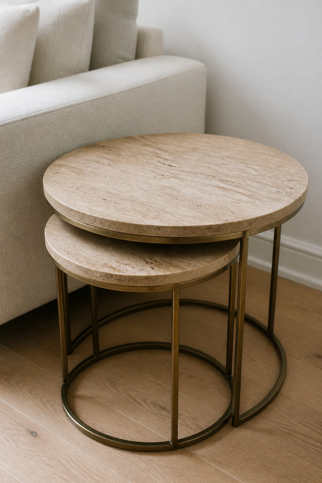
Round nesting tables are the most resolved form for minimalist rooms: no corners to catch on passing legs, the lightest visual footprint at a given surface area, and a form that relates naturally to other round elements (the rug, perhaps, or a drum side table). In travertine with a brass frame, the combination is particularly effective — the organic stone texture against warm metal creates a material partnership that reads as premium without requiring any styling around it. It’s the furniture equivalent of a well-matched material palette.
In terms of placement logic: keep them nested during the room’s regular daily use when surface demand is low. Pull them apart during gatherings, when reading requires a surface beside a chair that’s been pulled out of its usual position, or when one table is needed at a seating position that doesn’t have a dedicated side table. The moment they come apart, the room feels slightly more inhabited without feeling busier — that’s the design achievement.
13. Wall-Mounted Storage That Clears the Floor Completely
The case for wall-mounted storage as minimalist living room furniture is the same as the case for a floating media unit: the floor is a design element, and anything that interrupts it works against the room’s sense of openness. A freestanding bookcase or storage unit introduces a floor footprint that competes with the seating arrangement for territory. A wall-mounted system removes this competition entirely.
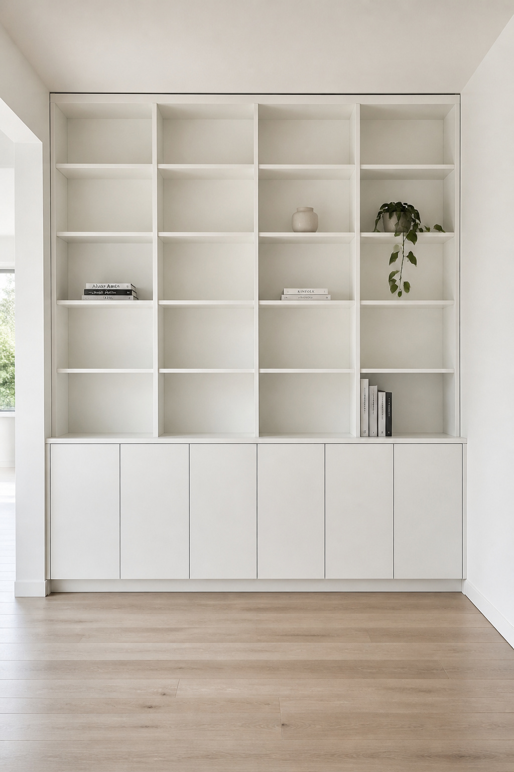
The most resolved wall storage option is full built-in shelving — no gaps between unit and ceiling, no visible side panels, flush with the wall surface. This reads as architectural rather than furniture, which in a minimalist room is the ideal outcome: storage that looks like wall. However, built-in installation requires professional work and is not reversible. For most rooms, a quality modular wall-mounted system (manufacturers like String Furniture and Reform offer pieces that read as close to built-in as anything freestanding can) achieves 70 to 80 percent of the visual result for a fraction of the cost.
The decision between open and closed storage is where most people underestimate the maintenance implication. Open shelving requires ongoing active management — it is never neutral, it always makes a statement, and the statement changes as objects accumulate. A unit with closed doors at the bottom and open display at eye level splits the difference practically: intentional display where you see it, practical storage where you don’t. If regular styling effort is not realistic — which it isn’t for most busy households — a higher proportion of closed storage is not a design compromise; it is a design decision.
14. Simple Living Room Furniture: The Considered Console Table
A console table earns its place in three specific configurations: behind a sofa floating in the centre of a room (filling the visual void above the sofa back), against a bare wall as the room’s first point of visual contact, or under a window at sill height to make use of an otherwise empty horizontal zone. In all three cases, it provides architectural presence without significant floor footprint.
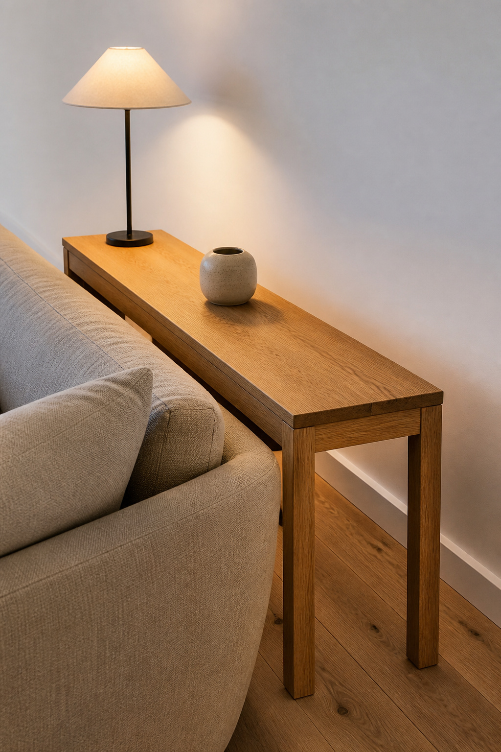
The depth dimension is critical. A console table at 30 to 35cm deep (12 to 14 inches) sits flat against a wall or directly behind a sofa without projecting into the room. Tables shallower than 25cm are too narrow to hold a lamp base plus one object without the surface looking pinched; tables deeper than 35cm behind a sofa start to feel like a barrier. Height at 80 to 90cm is standard: above sofa back height (typically 70 to 75cm) for visual separation, and at a natural standing-use height for the lamp and objects on the surface.
For styling, the discipline here is strict: one lamp, one object. The lamp provides functional light at the sofa user’s back — so the console is doing double duty as a light source, not just a display surface. The single object beside it (a stone, a small ceramic, a single stem in a vase) is enough. A tray holding three more objects reads as managed clutter — a different category from the intentional sparseness that makes a console table in a minimalist room work.
15. A Slim Bookshelf That Functions as Architectural Rhythm
A floor-to-ceiling bookshelf in a minimalist living room is not primarily about storage. It’s a vertical element in a room dominated by horizontal furniture, and in that role it does something the sofa, the coffee table, and the console cannot: it draws the eye upward and makes the room feel taller. At 25 to 30cm deep (10 to 12 inches), a narrow bookshelf reads as minimal — deep enough for most books and objects, shallow enough to sit against a wall without imposing. Going deeper than this, and the unit starts to read as a cabinet.
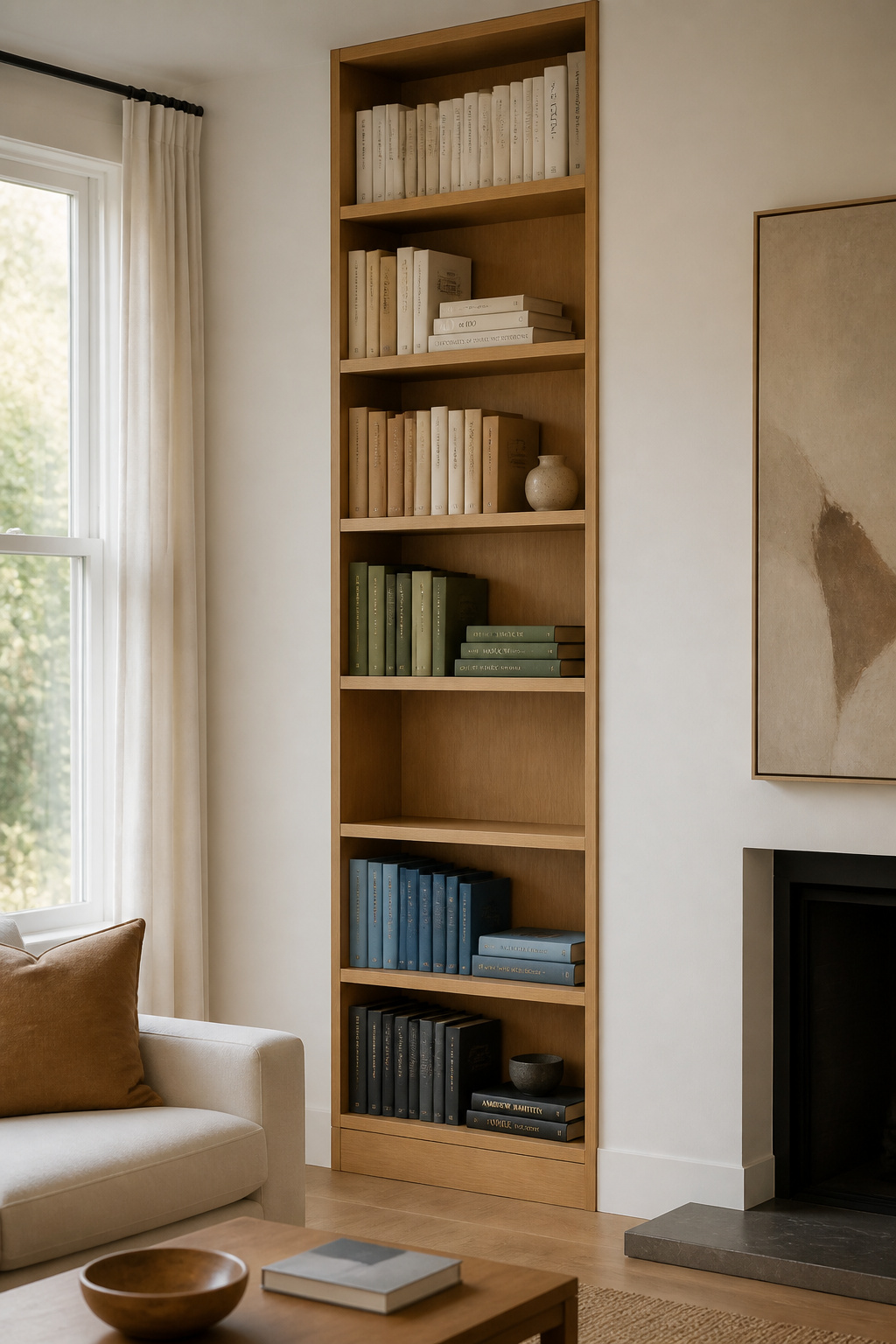
For the books themselves, the minimalist approach requires editing. Spine-out books at uniform density fill a shelf efficiently but read as heavy — the equivalent of a packed shelf. Occasionally stacking a row horizontally breaks this rhythm and creates a platform for one object above the stack. Colour-blocking (grouping books by spine colour) imposes order on a large collection without requiring individual curation; it’s a practical technique for people who own many books but want their shelves to read as calm. The same curation principle extends naturally into other rooms — a consistent approach that builds a whole home rather than a series of individual spaces.
The 70/30 ratio is the guide: 70 percent books (or structurally placed objects), 30 percent decorative objects with deliberate breathing space. One empty shelf in the unit signals intention. The objects that work on a minimalist bookshelf are few: small ceramics with clean forms, one leaned (not hung) framed print, one plant with architectural structure. Photo frames, candles without holders, and collections of small similar objects all read as clutter at the scale of an entire shelving unit.
16. Minimalist Living Room Furniture Built Around One Hero Piece
Every well-designed minimalist room has a piece that anchors it — not necessarily the largest piece, not the most expensive in isolation, but the one whose form is most fully resolved. Everything else in the room is chosen in relation to this piece, not independently. This is the hero piece principle, and it is what separates minimalist rooms that feel considered from those that feel merely empty.
The quality markers for a piece worth anchoring a room around are specific and verifiable. Dovetail joints in the drawer construction — interlocking wedge-cut wood that creates mechanical strength without relying on glue or hardware — indicate a maker who invested skilled labour in the piece. Solid wood in structural elements (tap the underside: solid wood sounds dense; hollow construction sounds hollow). And continuous production over 20 or more years: bad design gets discontinued. If a chair or table has been in production for two decades, the market has had two decades to dismiss it and chosen not to. That’s a meaningful signal.
The budget logic follows from this principle: allocate 60 percent of the total living room furniture budget to the hero piece, 25 percent to the secondary functional pieces (coffee table, side tables, storage), and 15 percent to incidentals. Concentrating spend this way produces one genuinely exceptional piece and everything else held to a functional, unobtrusive standard. A room of equally mediocre pieces has no focal point and no character. You can compare this approach with how luxury living room furniture pieces approach investment differently — sometimes quality and cost align, sometimes they don’t. One excellent piece, bought deliberately and for keeps, is always more powerful than ten acceptable ones bought to fill a room quickly.
Choosing Minimalist Living Room Furniture That Grows With You
The mistake most people make when furnishing a minimalist living room is trying to do it all at once. The resulting room is either sparse (if they held back) or immediately crowded (if they didn’t). The better approach is phased: a hero piece, a rug, and one side table is a complete room. It will feel incomplete to some visitors and perfectly resolved to others. The visitors who find it incomplete are not the ones to furnish for.
Phase two adds wall storage and a second piece of minimalist living room furniture — but only once you’ve lived with the phase one arrangement long enough to understand its specific limitations. Where do you actually need another surface? Where does the circulation actually get tight? Which wall feels bare in a way that needs addressing, and which one looks fine because the room doesn’t need anything there? These questions are only answerable by living in the room, not by looking at a floor plan.
The principle that maintains a minimalist room over time is simpler than any of the above: one in, one out. Every new piece that enters the room should displace one that leaves. And the discipline harder than any furniture decision — harder even than passing on the well-priced impulse buy — is this: when a piece is removed, sit with the gap for a week before deciding whether it needs to be filled. Most of the time, it doesn’t. The room that knows what it needs is the room that has learned to be comfortable with what it has.