The kitchen has never been a neutral room. Walk through any home built before 1950 and you’ll notice the kitchen was designed with intention: the position of the range relative to the window, the height of the countertops, the material of the sink. The best kitchen design ideas have never been invented whole. They’ve been discovered, refined, and rediscovered across generations of people who cooked, gathered, and figured out what actually works.
Over fourteen years of modernizing historic kitchens — from Georgian townhouses to Craftsman bungalows with original fir floors — I’ve come to recognize which design moves are genuinely timeless and which are simply in fashion. The difference matters enormously when you’re about to spend $40,000 on a room you intend to use for the next twenty years.
What follows are seventeen kitchen design principles proven across architectural eras, budget ranges, and homeowner preferences. Some are foundational layout decisions. Others are material and finish choices that carry centuries of domestic tradition. All of them will still look right in a decade.
1. The Work Triangle: A Timeless Kitchen Design Foundation
Few kitchen design principles have the empirical backing of the work triangle. The concept emerged from efficiency research conducted at Cornell University in the 1940s by Lillian Gilbreth — the same Gilbreth of *Cheaper by the Dozen* — who applied industrial motion-efficiency principles to domestic kitchens. The National Kitchen and Bath Association codified her findings into guidelines still used today. The triangle formed by the refrigerator, cooktop, and sink should have a total perimeter of no more than 26 feet. Each individual leg should measure between 4 and 9 feet, center-front to center-front.
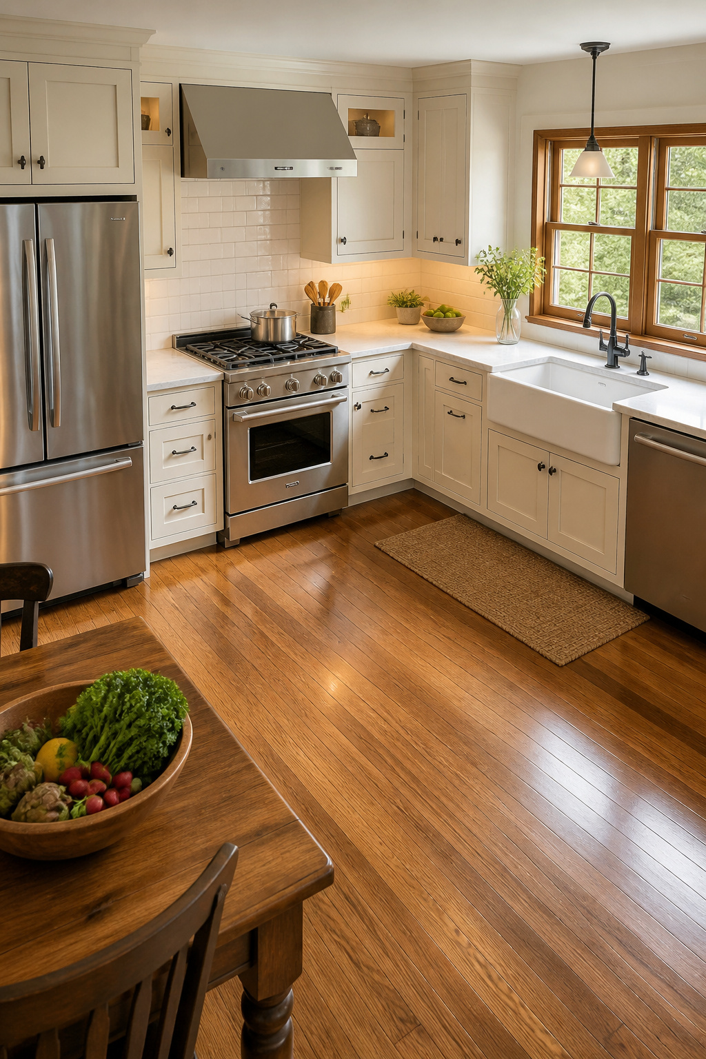
The rule violated most often isn’t the perimeter measurement — it’s the traffic clause. No major traffic path should bisect the triangle. In practice, this becomes a serious problem when remodelers add an island to an existing galley kitchen without reconfiguring the work path between the refrigerator and the range. The island becomes an obstacle rather than an asset.
In L-shape kitchens, the most efficient arrangement puts the sink at the inside corner. This minimizes the walking distance between the refrigerator and the cooktop. U-shape kitchens naturally form compact triangles. However, the hazard is parallel runs that are too close together. NKBA guidelines specify 42 inches minimum clearance for a single cook, 48 inches for two. In open-plan kitchens, limit any island intrusion into the triangle to no more than 12 inches. Beyond that, you’re not adding a prep surface. You’re adding an obstacle.
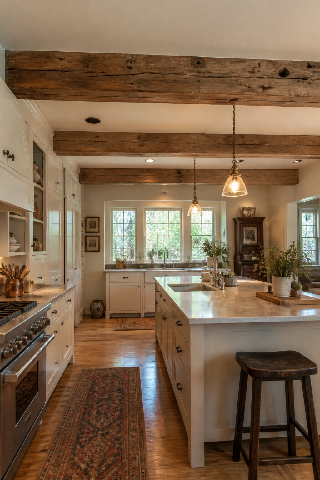
2. Statement Islands That Double as Social Hubs
The kitchen island has become the most socially ambitious piece of furniture in the American home. In historic renovation, the island often represents the most significant single intervention. It changes the room’s functional logic and social axis simultaneously. Getting it right requires thinking about both roles with equal discipline.
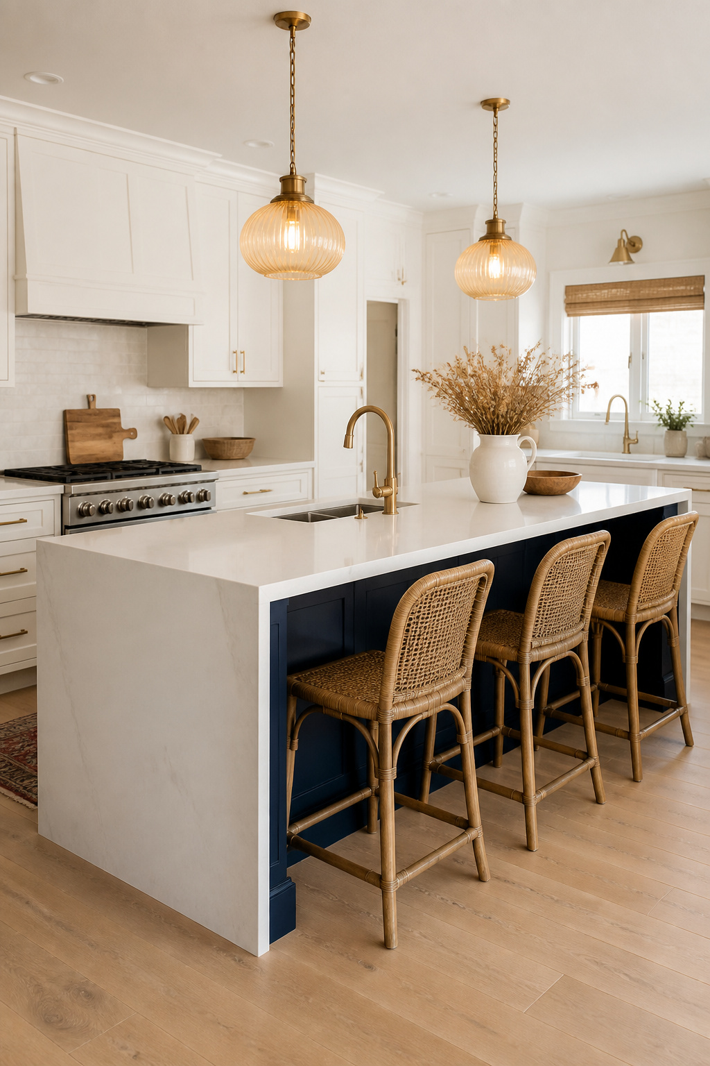
The clearance requirement is the starting point: 42 inches minimum on all sides for a single cook, 48 inches for two people working simultaneously. These are NKBA guidelines, and they exist for a reason. The 36-inch figure that appears in older renovation guides is technically passable but practically uncomfortable. If the existing floor plan doesn’t support 42-inch clearance on all sides, an island will make the kitchen harder to use. There are kitchen island ideas that work for cooking and entertaining at every scale, but size constraints must be respected before any aesthetic decision.
The Seating Side and Overhang Details
The seating side should face into the living or dining area. The social axis matters as much as the cooking function. A standard counter-height island (36 inches) requires a seating overhang of 12-15 inches for stools. Any stone or quartz overhang beyond 10-12 inches needs corbel or L-bracket support underneath. The waterfall countertop edge — where the stone continues vertically down the island end panel — is a premium detail worth considering if the material is exceptional. Budget $400-900 per side depending on the stone.
For storage, drawer stacks outperform base cabinet doors in an island context. Pull-out trash and recycling near the prep sink is consistently the most-praised built-in feature in renovation satisfaction surveys. If the island has the depth, a Sharp or Dacor microwave drawer at approximately 30 inches height eliminates the awkward overhead microwave that plagues kitchens with lower ceilings.
3. Thoughtfully Mixed Metals for Fixtures and Hardware
Mixed metals became mainstream as a kitchen design idea around 2015. Unlike most trends of that era, it has not faded. That’s because it reflects the way well-curated older kitchens actually look — not uniform, but considered. Victorian and Craftsman kitchens feel rich partly because the metals accumulated over time and were chosen for quality rather than matching sets.
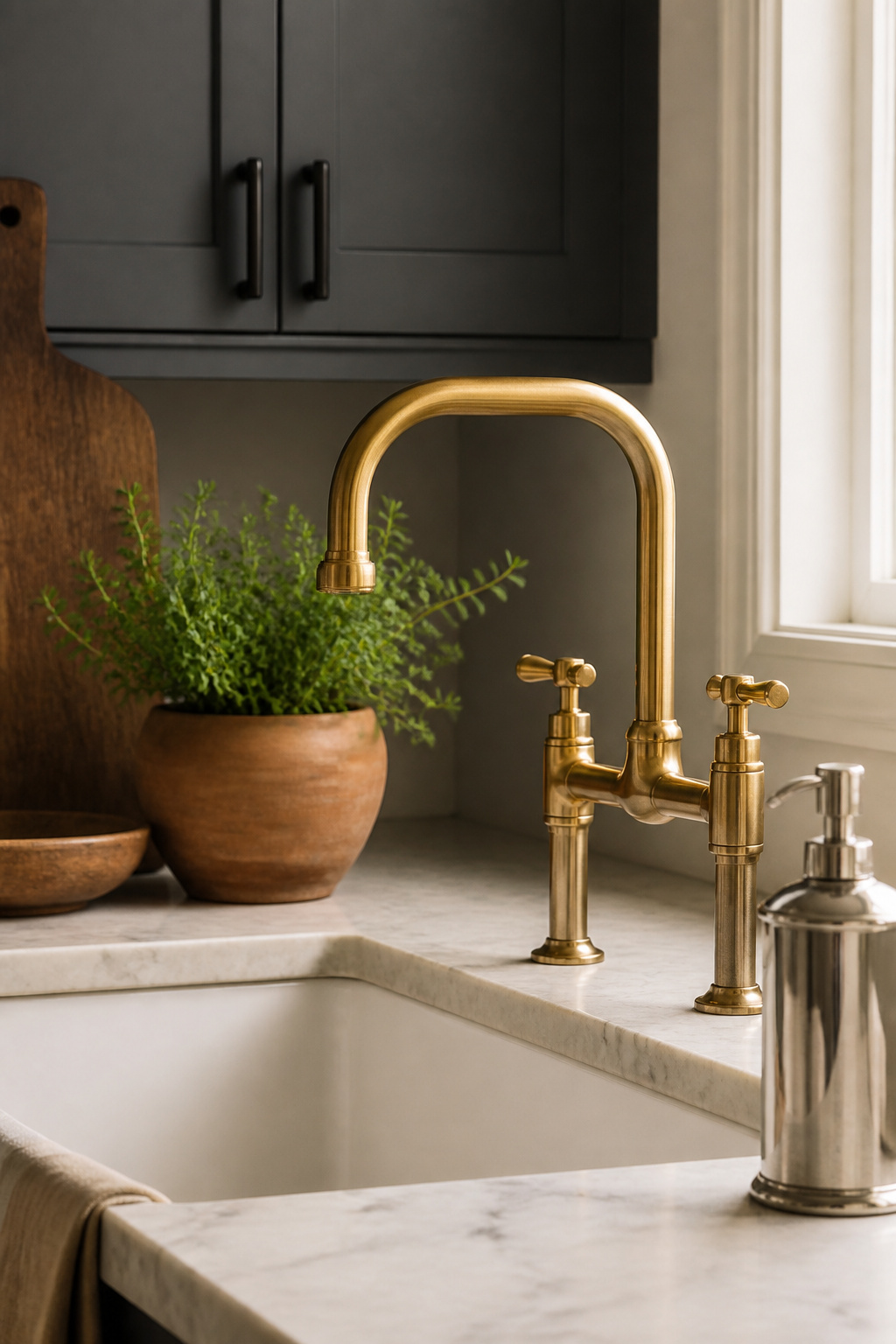
The professional approach is the 70/30 rule: one dominant metal covers approximately 70% of all metal surfaces — most of the cabinet hardware, the main faucet, the pot rack if there is one. The remaining 30% is the accent metal, typically appearing in the light fixtures, a secondary faucet, or decorative pulls on the island only. That ratio creates contrast without chaos.
The critical discipline is avoiding metals that share the same tone but differ only in finish. Brushed nickel next to polished chrome reads as an error. The contrast has to be categorical: a warm metal and a cool metal, or a bright finish and a matte finish in genuinely different metals.
The pairings that hold up: unlacquered brass and matte black is the dominant combination of the past five years. Its longevity suggests staying power — brass anchors the warmth, black provides graphic definition. Polished nickel and oil-rubbed bronze is the period-appropriate choice for Victorian, Arts and Crafts, and Colonial Revival kitchens. For a kitchen with fixed stainless appliances and a warm palette, brushed or satin gold pulls are the bridge. They read as intentional rather than accidental next to cold stainless.
4. Shaker Cabinets With Period-Authentic Hardware
Shaker cabinetry has been in continuous production for over two hundred years. The reason isn’t nostalgia. It’s that the design principle holds. The Shaker communities of 19th-century America built their furniture around the belief that ornament was a kind of dishonesty. Beauty should come from proportion, joinery, and honest material. The five-piece door construction that results — flat center panel, two stiles, two rails — is also the most dimensionally stable cabinet door configuration for solid wood.
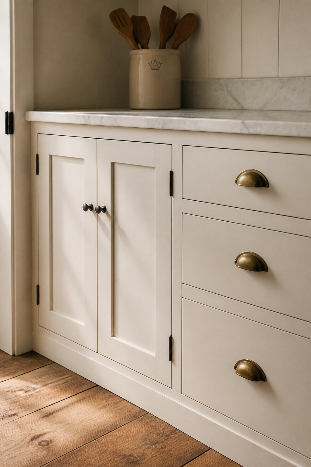
The hardware choice is where most Shaker kitchens either honor or betray the style. Cup pulls and bin pulls — the semi-circular ring-style drops — are the most historically authentic option for drawer fronts. The cup pull exists because it allows a full-hand grip, which mattered when drawers ran on wood slides without the precision of modern ball-bearing tracks. Ceramic and porcelain knobs in white or cream are another period-correct choice for painted Shaker cabinets. They appear throughout early-20th-century Craftsman kitchens and look right in ways that contemporary bar pulls do not.
Inset Shaker doors, where the door sits flush within the cabinet face frame, represent the true quality benchmark. They require more precise construction than overlay doors. The reveal between the door edge and the frame must be consistent to within 1/16 inch, and that precision shows craftsmanship in a way that full-overlay construction conceals. If the budget allows for inset construction, it’s the single most significant upgrade available within the Shaker vocabulary. Worth every dollar.
5. Open Shelving With Purposeful, Curated Displays
Open shelving divides homeowners more decisively than almost any other kitchen design question, and the division usually comes down to discipline. The shelves that look beautiful in design photography share one quality: every object on them was placed with intention. Shelves that end up boxed in after two years were used for storage rather than curation.
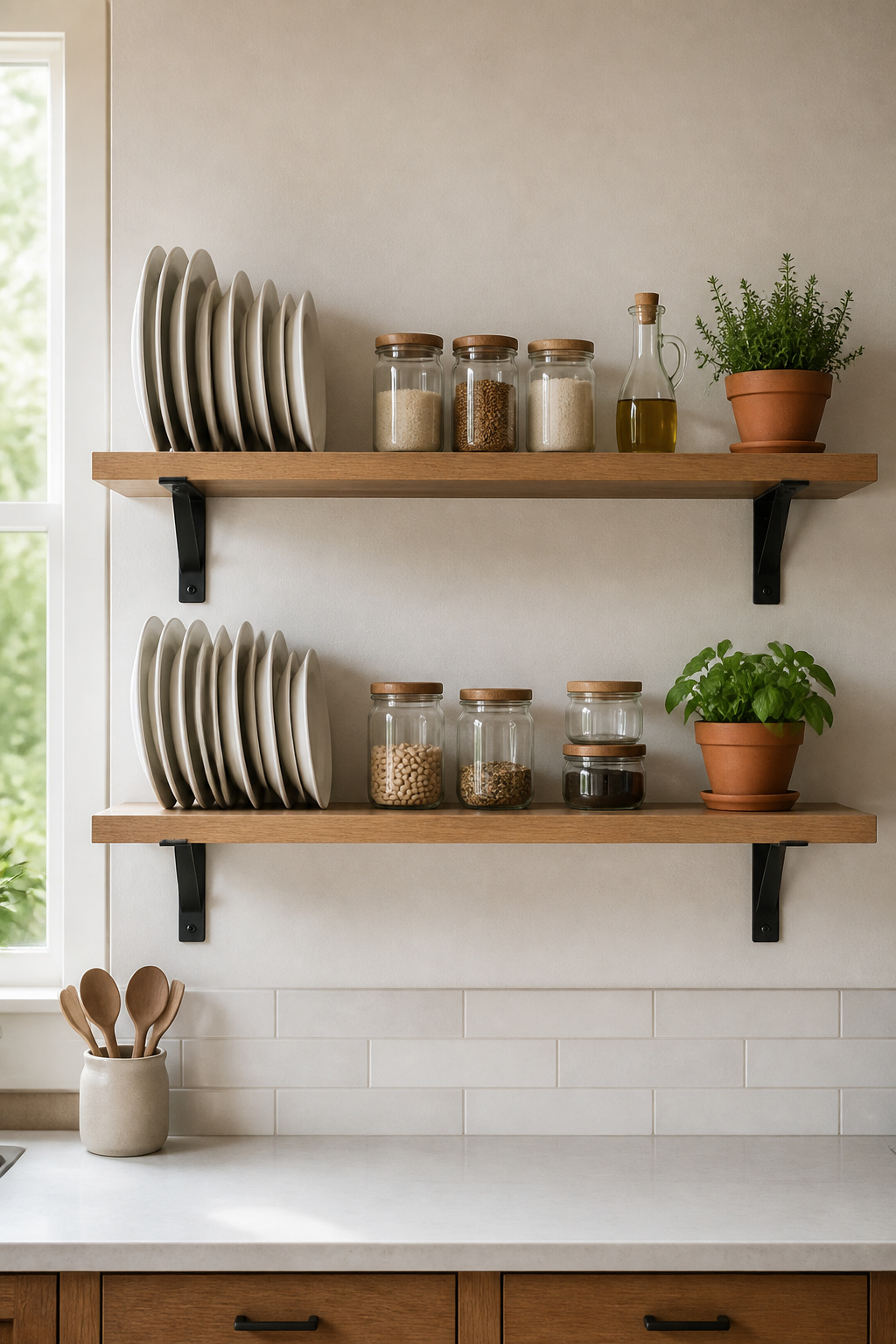
The structural details matter before the styling does. Shelf thickness: a minimum of 1.5 inches in solid hardwood for any span over 36 inches. Below that thickness, the shelf will visibly sag within a year under the weight of dishes. White oak and hard maple are the species that hold up best near cooking steam. Both accept stain, oil, or clear finish without difficulty. Bracket choice changes the shelf’s entire character — exposed steel angle brackets read industrial, corbels read traditional, floating hardware reads contemporary minimalist. Match the bracket to the kitchen’s dominant register.
For styling, the professional approach is to compose each shelf in thirds. An anchor piece near one bracket, medium-weight items in the middle as a visual bridge, a light accent object at the far end — and approximately 20% of the shelf deliberately empty. Color repetition is the shortcut: stacked white plates, white bowls, and a white pitcher read as designed where a random assortment reads as storage. The element most often absent from mediocre open shelf styling is a plant. A small potted herb provides the organic note that keeps the shelf from looking like a product display.
6. Statement Backsplash Tile as a Kitchen Design Anchor
The backsplash is the most accessible large-surface renovation in the kitchen. It can be changed independently without disturbing cabinetry or plumbing, and its visual impact is disproportionate to its cost. Understanding the history of the tiles you’re considering helps predict which ones will feel right in ten years and which will feel dated.
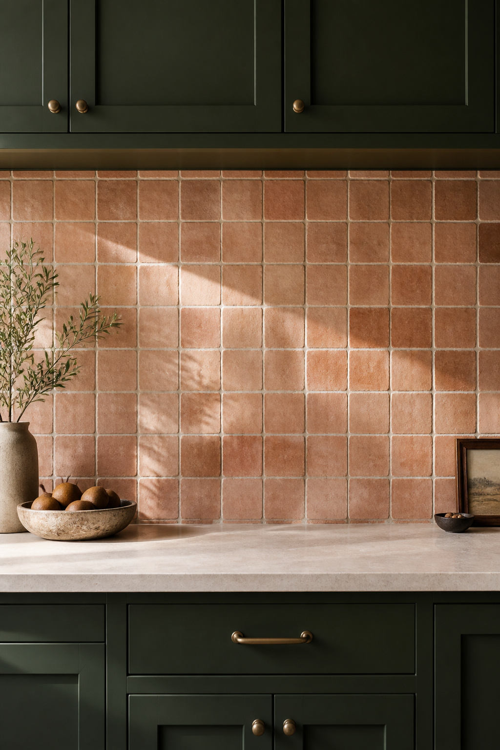
Subway tile has been with us since 1904, when the white 3×6 glazed ceramic was specified for the New York City IRT subway stations because it reflected light in underground spaces and cleaned easily. Its association with hygiene and civic investment made it desirable in domestic kitchens almost immediately. The tile hasn’t changed significantly in 120 years. Neither has its appeal.
Zellige tile from Morocco predates subway tile by roughly 800 years. Handmade from clay fired with traditional pigments, each tile varies in thickness and glaze — the inconsistency is the point. The textured, light-refracting surface has a quality that machine-made tiles cannot produce, which is why it remains in serious design use despite costing significantly more. For those exploring modern kitchen backsplash ideas that complement stone countertops, zellige and full-height stone slab backsplashes represent two ends of the handmade-to-minimal spectrum.
The grout decision shapes the outcome more than most people expect. A grout that matches the tile color produces a seamless, continuous surface that reads as a material plane. A contrasting grout emphasizes the individual tiles and the grid. For zellige and handmade tiles, slightly off-white or bone grout typically works better than true white. It allows the tile’s natural variation to read without the starkness of a white grid imposed on a handmade surface.
7. Under-Cabinet Lighting for Task-Focused Work
Under-cabinet lighting is, dollar for dollar, one of the highest-value improvements available in kitchen renovation. It costs a fraction of what countertop replacement costs. And it solves a problem that no countertop upgrade can address: shadows created when the cook’s body blocks the overhead light. Every standard recessed ceiling fixture creates a shadow the moment someone stands in front of a countertop. Under-cabinet fixtures eliminate that shadow by positioning the light source directly above the work surface.
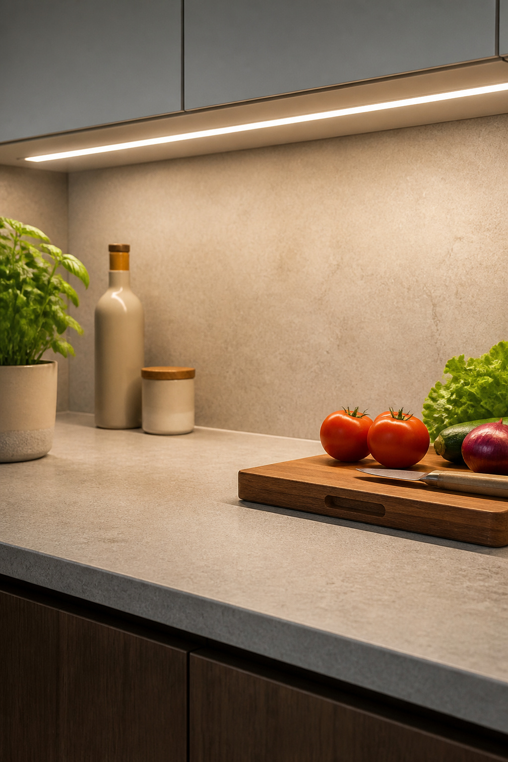
For genuine task work — chopping, reading labels, evaluating the color of a sear — 300-500 lumens per linear foot is the appropriate specification. Color Rendering Index matters here: a CRI below 90 can make fresh produce look grey or off-color, which affects cooking decisions. Specify CRI 90 or above for any kitchen lighting that illuminates food preparation.
Hardwired linear LED fixtures from manufacturers like Kichler or Task Lighting Corporation are the professional standard. They disappear behind the cabinet face, last 50,000 or more hours, and accept standard dimmer switches without flicker when properly paired. LED strip lights are the more economical alternative at $15-40 per linear foot installed. However, they require a diffuser or channel to prevent the visible hot-spot pattern of individual diodes.
Color temperature: 2700K for kitchens with wood, stone, and warm materials; 3000K as a versatile middle ground; 4000K for contemporary all-white or stainless kitchens where task accuracy matters more than atmosphere. Position the fixture at the front of the cabinet, not the back. Placing it at the rear means the light casts a shadow at the counter edge — the exact problem you were trying to solve.
8. Built-In Banquette Seating for Informal Dining
The built-in banquette solves a spatial problem that no freestanding furniture can address as efficiently: the awkward corner. In kitchens with alcoves, under-stair spaces, or ninety-degree junctions that no standard dining table can fill gracefully, a banquette transforms wasted geometry into the most used seat in the house. An L-shape banquette against two walls seats 6-8 people in a 10×10 foot corner. A comparable round table with chairs requires 13×13 feet of clear space.
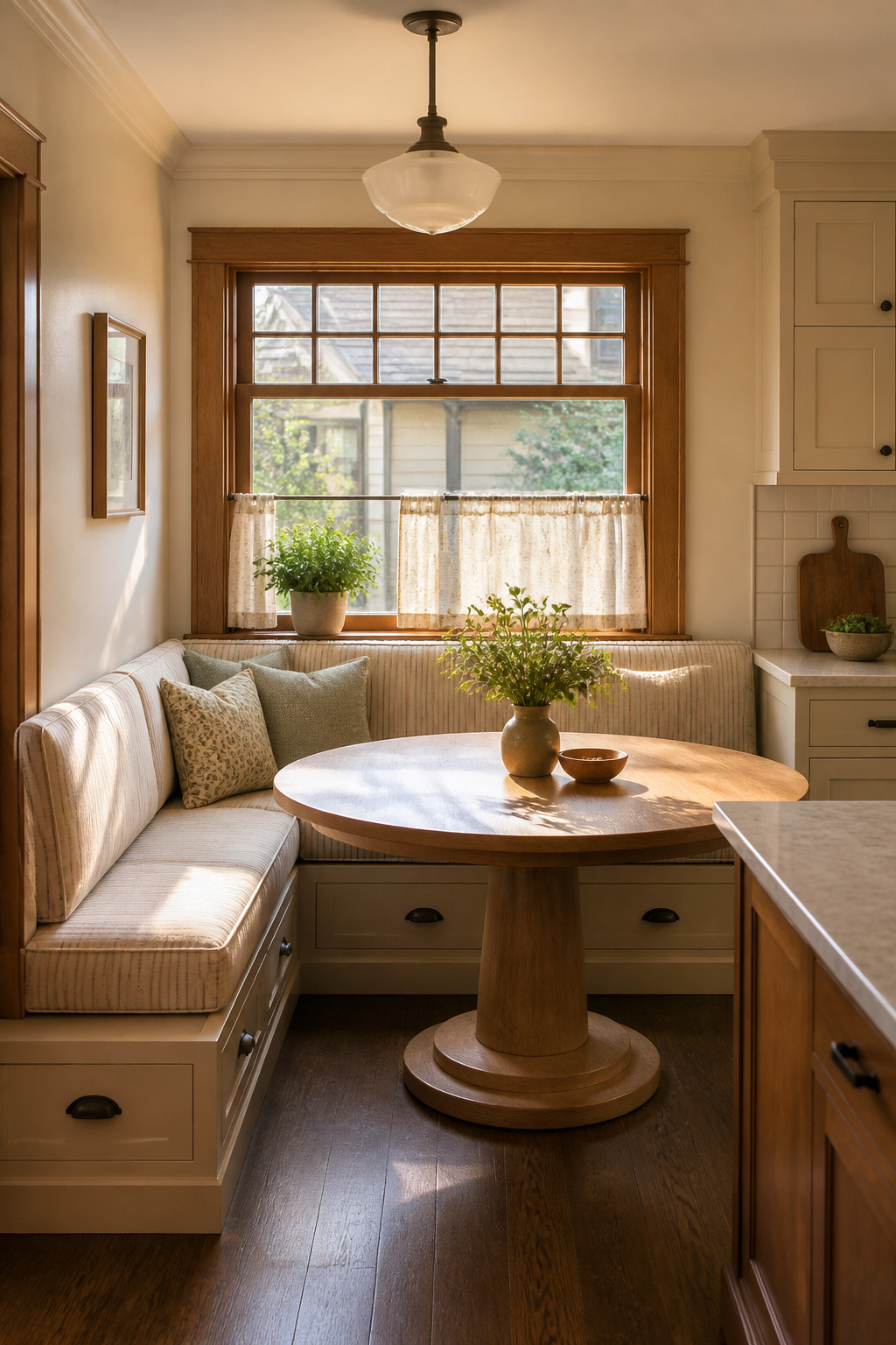
The banquette has appeared in American domestic kitchens since the 1920s, most naturally in Craftsman bungalows where the breakfast nook was a distinct architectural feature. The built-in quality — the fact that it is clearly a considered element rather than furniture pushed against a wall — raises the perceived design quality of the kitchen more than almost any other intervention at equivalent cost. If you’re working through kitchen design ideas for an older home, this is one worth prioritizing.
Dimensions that work: seat height 18 inches from the floor, seat depth 18-20 inches, back height 36-42 inches for adult comfort. If integrating storage drawers underneath — which is worth doing — build the platform 2-3 inches higher. The additional height brings the seat to 20-21 inches, still comfortable once a cushion is added. For the cushions themselves, specify foam of at least 2.0 pounds per cubic foot density at 3-inch thickness for the seat surface. Cheaper foam compresses permanently within two years of regular use. It’s a minor specification that determines whether the banquette remains an asset or becomes an embarrassment.
9. Natural Stone Countertops With Honest Variation
Natural stone has been a kitchen surface since Roman times, and its continued use reflects something that material technology has not yet replicated: the quality of improving with age. Marble develops a patina. Soapstone darkens and smooths. Granite holds its polish for decades without losing character. Engineered surfaces — however technically impressive — do not gain this quality of accumulated history.
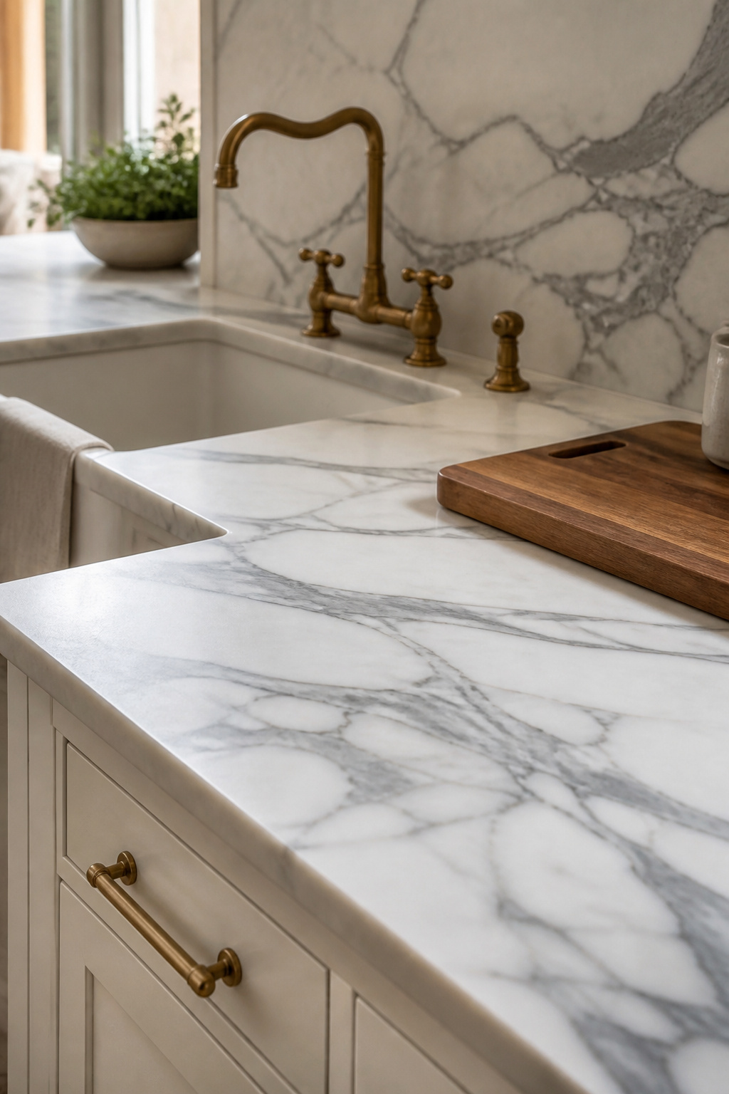
The material comparison comes down to what the household is willing to manage. Granite at Mohs hardness 6-7 is the workhorse: scratch-resistant, heat-resistant, and requiring sealing every one to three years. Quartzite at Mohs 7 is frequently confused with marble for its appearance but performs dramatically better. It’s more acid-resistant and requires only annual sealing. The critical caveat: quartzite is commonly mislabeled at stone yards. Always conduct an acid test before purchasing any stone sold as quartzite.
Comparing the Four Main Stone Types
Marble at Mohs 3-4 is the most beautiful and the most demanding. Acidic foods etch the surface within seconds. The honest professional position is that marble is appropriate for baking areas and for homeowners who accept patina as the material’s character rather than as damage. Soapstone, at Mohs 1-2, is non-porous and requires no sealing — the only maintenance is monthly mineral oil application in the first year. It was traditionally used in New England farmhouse and Colonial kitchens. For a thorough review of all options, kitchen countertop ideas across every material and budget cover the full spectrum with practical guidance.
The sealing check is simple: pour a small amount of water on the surface. If it beads after five minutes, the seal is good. If it absorbs before five minutes, reseal immediately.
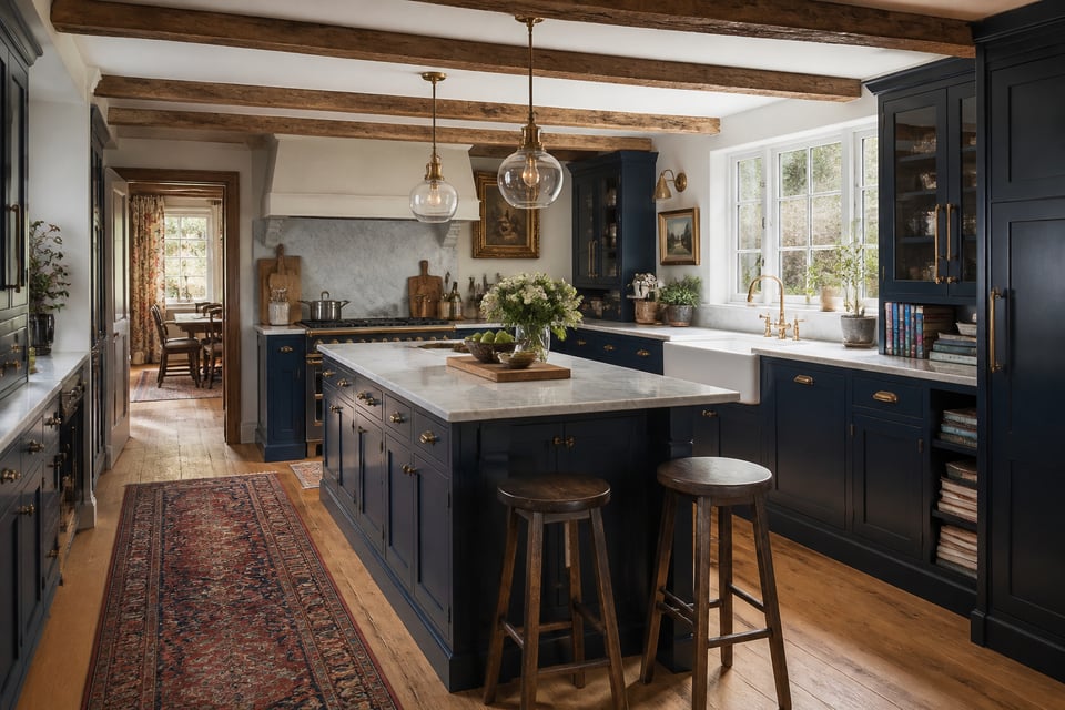
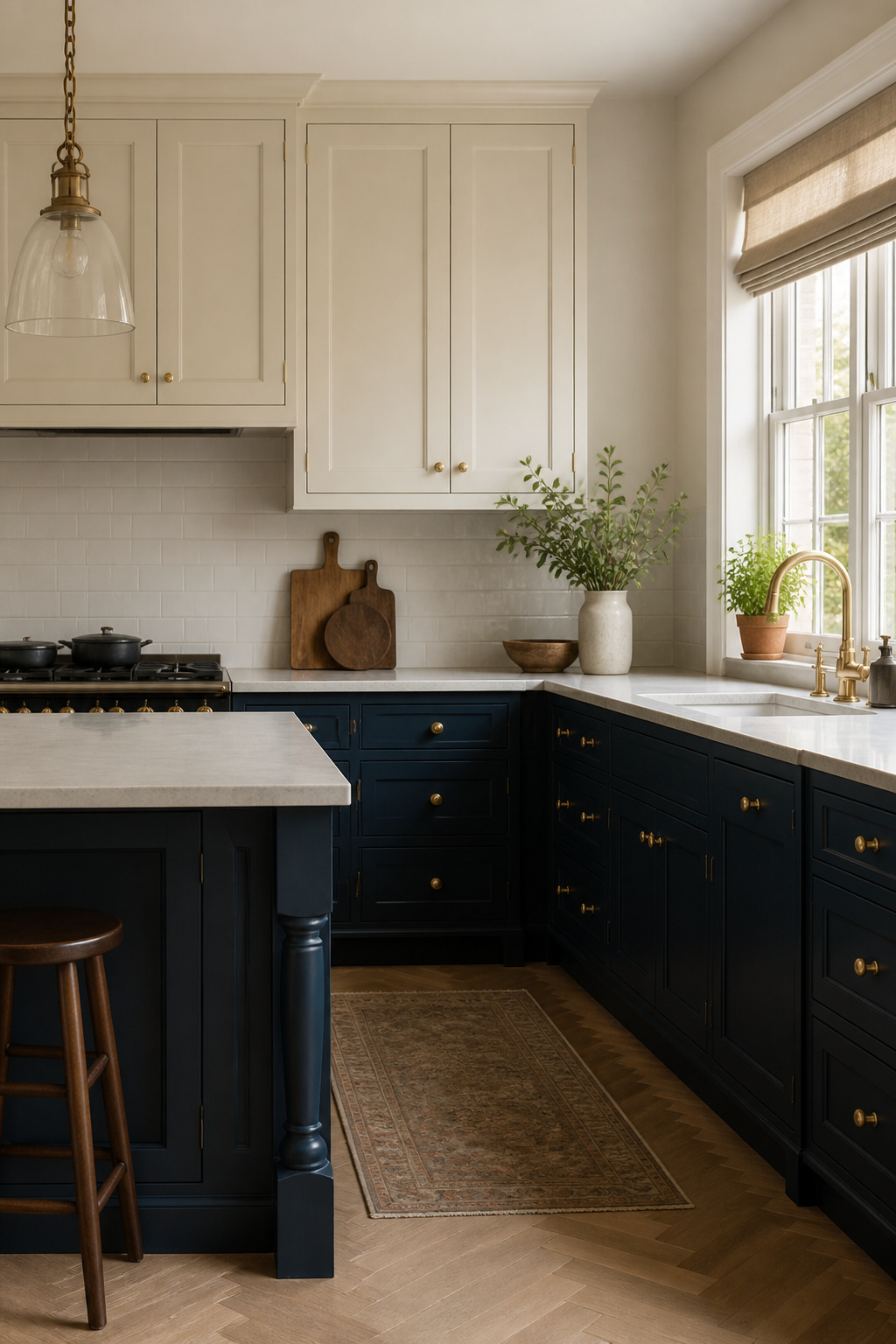
10. Two-Tone Cabinets for Visual Depth and Character
Two-tone cabinetry is one of the most effective kitchen design ideas for adding depth without adding complexity. The visual logic parallels wainscoting in traditional rooms: darker material below the horizontal break grounds the space; lighter material above maximizes light reflection. Applied to kitchens, this means lighter uppers to keep the room open and darker lowers to anchor the base. That hierarchy reads as designed and performs better practically, since darker lower cabinets hide scuffs and toe-kick wear more forgivingly.
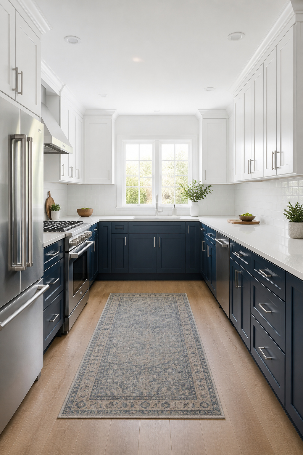
The pairings that hold up: white uppers with navy blue lowers have been in continuous use since the 1980s without signs of fatigue. Benjamin Moore’s Hale Navy and Sherwin-Williams Naval are the most specified navy shades in this context. Cream or off-white uppers with sage or forest green lowers dominated from 2022 through 2025. Farrow and Ball Mizzle, Sherwin-Williams Shade-Grown, and Benjamin Moore Evergreen Fog appear across the most considered examples. Both combinations share an undertone logic. The upper and lower colors are drawn from the same warm or cool family, which prevents the subtle dissonance that occurs when a warm white upper meets a cool grey lower.
The least committed entry point is painting only the island in a contrasting color while keeping all perimeter cabinets uniform. This works at every kitchen scale and is the most reversible approach — islands are frequently updated in secondary renovations, so a distinctive island color doesn’t lock in a long-term decision. The color break at the countertop line is the most architecturally decisive option. The island-only approach is the most flexible.
11. Integrated Appliances for Clean Kitchen Designs
Panel-ready and fully integrated appliances represent the highest finish level in kitchen design. They eliminate the visual interruption of standard appliance faces and allow cabinetry to read as a continuous composition. The cost premium is real. So is the transformation.
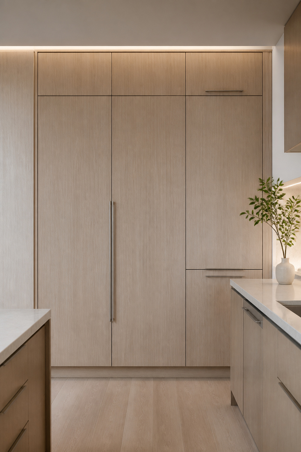
The clearest illustration of the effect is the refrigerator. A fully integrated 36-inch French door refrigerator behind cabinet panels looks indistinguishable from a tall pantry cabinet until it’s opened. Panel-ready differs from counter-depth: counter-depth refrigerators sit flush with the cabinet face but retain a visible stainless or glass front. Integrated units accept a full custom door panel that matches the surrounding cabinetry precisely.
The brands with the broadest panel-ready product range are Fisher and Paykel, Miele, Bosch, and Sub-Zero. Fisher and Paykel’s dish drawer is a particularly intelligent product for smaller kitchens. It’s a single or double drawer dishwasher that integrates behind a panel and accommodates a half-load without running a full cycle. The cost premium is real: a Fisher and Paykel Series 7 integrated French door refrigerator starts at approximately $6,200, versus a comparable counter-depth standard unit at $2,800-3,500. The integrated dishwasher is the accessible entry point — Bosch and Fisher and Paykel panel-ready units start at $1,299-1,499, a premium of roughly $400-500 over their standard-front equivalents.
One critical coordination note: confirm the cabinet manufacturer’s panel specifications before ordering the appliance. Hinge type, panel thickness, and reveal dimensions vary by brand and must be coordinated before fabrication begins. This is the mistake that causes expensive delays.
12. Deep Pantry Cabinetry With Pull-Out Organization
The deep pantry cabinet solves one of kitchen design’s most persistent failures: the base cabinet with items stacked at the back that are effectively lost until a reorganization crisis forces their rediscovery. A dedicated tall pantry cabinet — 84-96 inches tall, 24 inches deep, 18-24 inches wide — offers more accessible food storage per square foot of floor space than any standard base-plus-upper cabinet configuration. The reason is straightforward: the entire height is visible and reachable when the correct interior systems are installed.
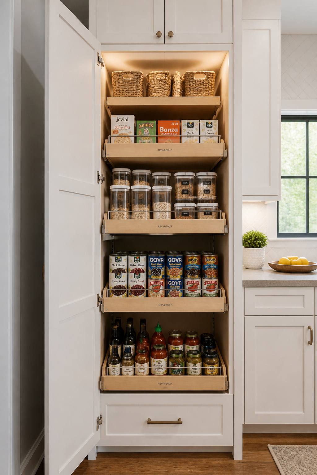
The distinction between a pantry cabinet and a walk-in pantry is proximity. A tall pantry placed within the work triangle keeps dry ingredients at arm’s reach during cooking. A walk-in pantry at the kitchen perimeter requires leaving the cooking zone to retrieve them. In smaller kitchens particularly, proximity wins. For kitchen storage pantry ideas that maximize every square foot, the pantry cabinet with internal pull-outs is the most consistently functional approach across different kitchen sizes.
The pull-out system makes the difference between a pantry cabinet that works and one that doesn’t. Rev-A-Shelf’s 448 series units support 250-265 pounds per unit and are available in widths from 6.5 to 14 inches. The 8-inch and 11-inch widths are most versatile for standard pantry cabinet openings. Soft-close slides are non-negotiable — without them, the weight of loaded shelves causes slamming that loosens fasteners and damages door frames within a few years. Two 18-inch pantry cabinets with pull-outs in each outperform one 36-inch pantry with fixed shelves. The narrower opening with full pull-out access beats the wide opening where the rear shelf is practically unreachable.
13. Pendant Lighting That Reframes Your Kitchen Design Ideas
Pendant selection over a kitchen island is the most visible lighting decision in the room. Scale errors here are immediately apparent — pendants that are too large crowd the island surface; pendants that are too small disappear and fail to establish the social character of the space.
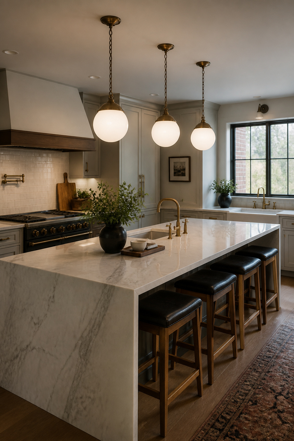
The most reliable sizing guideline: pendant diameter in inches should not exceed the island length divided by three. For a 72-inch island, that means pendants no more than 24 inches in diameter. Standard hanging height is 30-36 inches above the counter surface. Go toward 36 inches in kitchens with 9-foot or taller ceilings. Go closer to 30 inches where the ceiling is 8 feet — otherwise the pendants feel disconnected from the work surface below.
For three pendants over an island longer than 72 inches — usually the better choice over two — center each pendant roughly 15-18 inches from the island ends and 24-30 inches apart center to center. For comprehensive guidance, kitchen lighting over island ideas for pendant scale and placement provide the full framework for getting positioning right before the electrical rough-in.
Period-appropriate pendant style by kitchen type: schoolhouse globe pendants in milk glass or clear are correct for Craftsman, Colonial Revival, and mid-century kitchens. They sit quietly and never compete with the room. Blown glass pendants in amber, smoke, or clear work across the widest range of kitchen styles because the handmade quality echoes natural materials like stone and wood without being prescriptive about period. Confirm junction box positions before countertops are set. Boxes placed for general lighting during rough-in rarely fall in the ideal pendant position without deliberate planning.
14. Painted Cabinets in Historically Sourced Color Palettes
Heritage paint ranges are formulated from historically documented pigments, and the difference from contemporary color libraries isn’t just aesthetic — it’s physical. Mineral-based pigments from the pre-synthetic era have a saturation and depth that modern dyes don’t replicate. Applied to cabinetry, the colors feel permanent in a way that trend colors do not. They were designed for a world lit by candles and north light, which means they read beautifully under any light condition rather than being optimized for the flat conditions of color chip photography.
Farrow and Ball Estate Eggshell is the specified finish for cabinetry — low enough sheen to hide surface imperfections, washable and durable for kitchen use. Within the range, Railings (a near-black with blue-black depth, drawn from the iron railing colors of Georgian London) and Hague Blue (a rich, dark navy derived from 18th-century delftware pigments, LRV below 5) are the most dramatic choices for lower cabinets or islands. Mole’s Breath and Shaded White anchor the quieter end of the cabinet palette.
For North American applications, Benjamin Moore’s Advance waterborne alkyd formula in the Historical Collection is the most practical choice. It applies in satin or semi-gloss, self-levels well for brush-and-roller applications, and dries hard enough to rehang doors in 24 hours. Newburyport Blue, Salamander, and Gloucester Sage from the Historical Collection carry the same documentable depth as their British counterparts. Factory spray application with conversion varnish or catalyzed lacquer as the topcoat will outlast brush-and-roller in high-use kitchens. But the color quality translates regardless of application method. For general kitchen budget guidance, the post on 20 Living Ideas for a Thriving Kitchen Design on a Budget covers where to invest and where to save.
15. Butler’s Pantry as a Working Kitchen Design Addition
The butler’s pantry staged one of domestic architecture’s more remarkable comebacks. In the 19th century, it was the butler’s private domain — the staging room between the kitchen and the dining room. Silver, crystal, and fine china were stored here under lock and key. Formal meals were plated before presentation, keeping the kitchen’s mess out of the guests’ sight. By the 1950s it had nearly vanished, abandoned as domestic service disappeared and post-war tract housing eliminated the between-room it occupied.
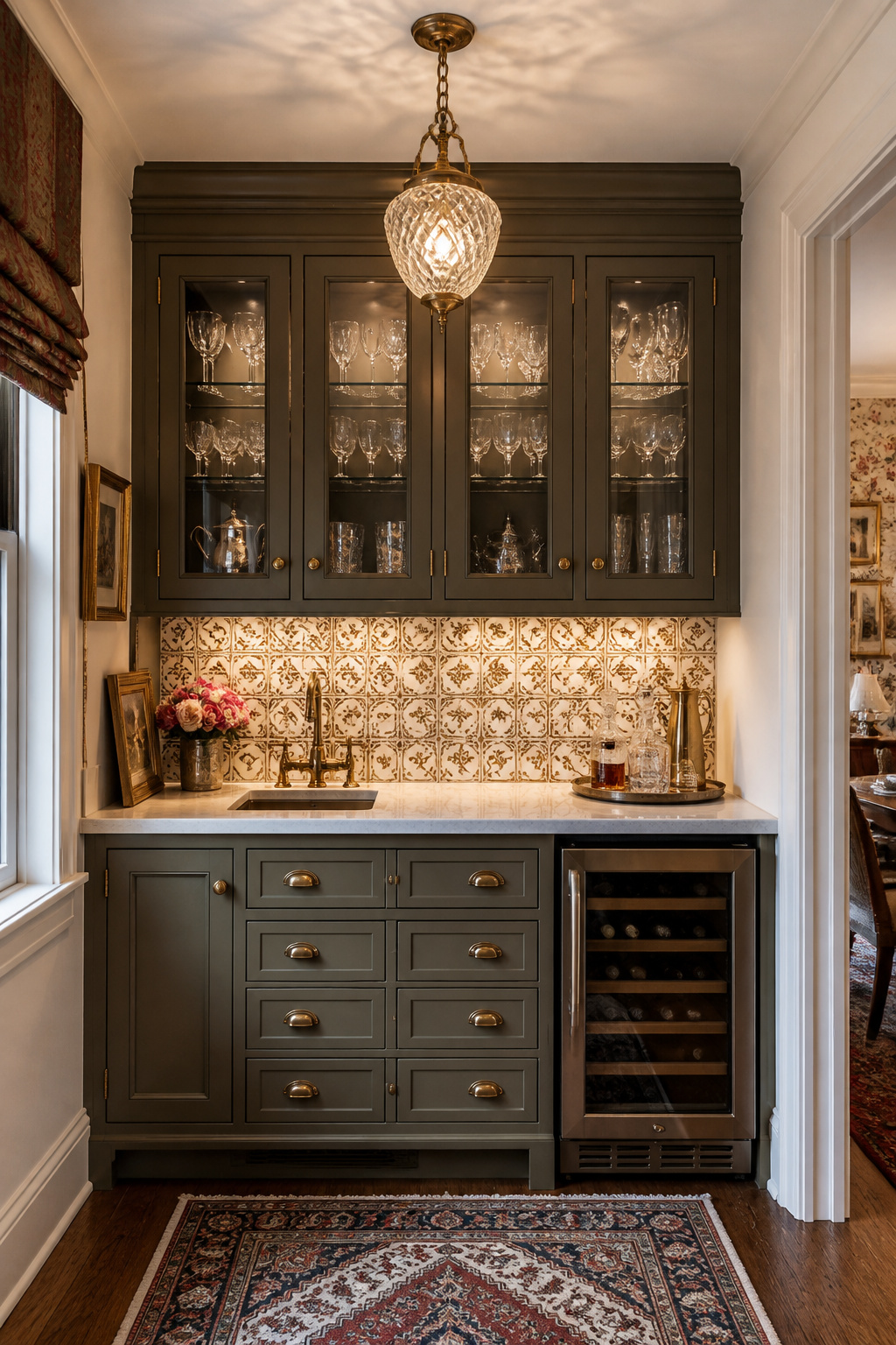
Its revival tracks the return of premium kitchen design and serious home entertaining. The modern butler’s pantry solves one of the open-plan kitchen’s persistent problems: where to put everything that clutters the main space. Appliance storage takes care of the coffee machine, stand mixer, and toaster. Overflow food and bar preparation have a dedicated zone. And the kitchen itself presents as composed because the actual mess of preparation happens behind a closed door.
The minimum useful run is 6 linear feet with a bar sink, upper and lower cabinets, and 24 inches of clear counter space. Below that, you have a wide hallway rather than a working room. The sink is not optional. A room with storage but no water point is a closet. A second dishwasher in the butler’s pantry — Miele, or a Fisher and Paykel dish drawer — is among the highest-rated features in post-renovation satisfaction surveys for households that entertain regularly. For finish, treat the butler’s pantry as a room with its own character: a patterned tile backsplash, a pendant or sconces, and glass-front upper cabinets for display.
16. Farmhouse Sink as a Kitchen Design Focal Point
The apron-front sink arrived in American kitchens from British and Scandinavian working farmhouses of the 18th and 19th centuries. The deep, wide basin was a working tool, necessary for washing produce, heavy cookware, and laundry before running water made specialized rooms a possibility. Its revival in American kitchen renovation beginning in the late 1990s reflected a broader cultural preference for materials and forms that carry genuine functional heritage over decorative surfaces that merely reference the past.
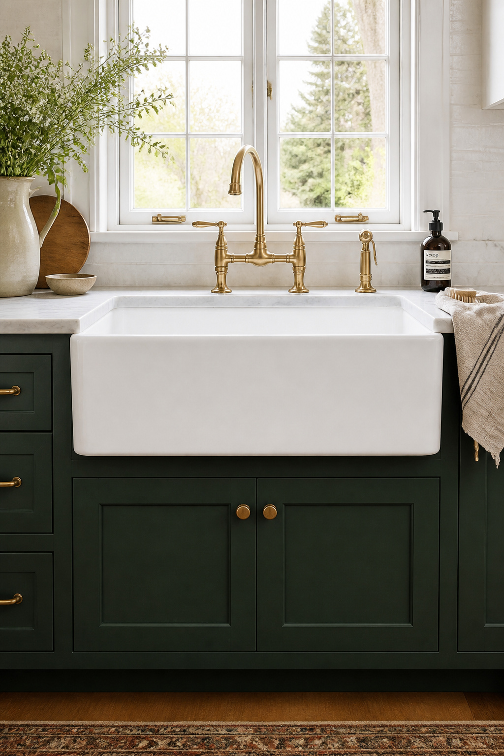
The staying power comes partly from the fact that the form is genuinely practical. A large, deep single basin handles large pot-washing and food prep more naturally than a divided standard undermount. The exposed front apron — the defining element that breaks the continuous cabinet face — gives the sink its architectural character while also revealing the craftsmanship of the material. For anyone exploring farmhouse kitchen ideas that make the most of traditional character, the sink is often the anchoring element around which the rest of the kitchen’s character organizes.
Material Comparison and Installation Notes
Fireclay (Kohler Whitehaven, Rohl) is the premium durability choice. Fired above 1,800°F, it produces a non-porous surface resistant to acids, stains, and most impacts. It will chip if struck by cast iron cookware, and it weighs 100-140 lbs installed. Cast iron has the longest American farmhouse history. The enameled surface is quiet and heat-retaining, but the enamel requires careful use at sharp impact points. Copper develops a living patina over time. Its antimicrobial properties are scientifically documented. Keep it away from harsh chemicals and oil it occasionally to maintain a consistent patina.
Base cabinet modification is unavoidable: the face frame must be recessed to accommodate the apron front, and the cabinet floor reinforced for a sink that may weigh 200 lbs when filled. Always confirm the plumbing rough-in position before ordering. Farmhouse sinks have drain placement requirements that differ from standard undermounts, and a misplaced rough-in means additional plumber visits.
17. Exposed Wood Ceiling Beams for Warmth and Character
Ceiling beams do two contradictory things simultaneously in a kitchen. They lower the perceived ceiling height by drawing the eye downward, and yet they make the room feel warmer and more enclosed. The psychological effect is increased intimacy. This is precisely what many large, open-plan kitchens lack. In historic renovation, the most satisfying beam projects are often the ones where original structural timbers — hidden for decades behind drywall or plaster — are revealed and refinished. The beams were always there. They were just waiting.
In new construction or addition contexts, the decision between genuine structural timber, new decorative timber, and faux beams comes down to installation conditions and desired character. Reclaimed wood from suppliers like Elmwood Reclaimed Timber or Olde Wood Ltd carries the marks of its first life: nail holes, saw marks, weathering, and checking. These are not defects. They’re character. Cost runs $15-45 per linear foot for material alone, with installation requiring structural reinforcement to support the weight.
Faux vs. New Timber, and Sizing Rules
New timber — Douglas fir, white oak, rough-sawn pine — can be wire-brushed, lightly charred, or stained to approximate reclaimed character. It also offers a cleaner profile for contemporary kitchens where precision reads better than rough-hewn surface. Faux beams from Barron Designs or Volterra Architectural Products are cast from genuine reclaimed wood, weigh a fraction of timber, and install without structural reinforcement. They read convincingly at conversational distance, which is the only distance that matters in daily use.
The sizing rule: beam depth should be approximately 1/12 of the span it crosses. For a 12-foot kitchen span, a 12-inch deep beam is the rough visual maximum. For decorative-only installations in typical kitchen proportions, 6-8 inches deep and 4-6 inches wide is the most common specification. Two or three beams feel architectural. Six or eight feel like a log cabin ceiling and reduce the available light considerably.
How to Choose Kitchen Design Ideas That Fit Your Home
The most durable approach to any kitchen renovation is to make decisions in the right order. Layout and work triangle come first — before countertops, before tiles, certainly before paint color. The bones of the kitchen: ceiling height, window placement, whether the room is open to the living area or enclosed. These structural conditions should determine which of these seventeen kitchen design ideas belong in your home, not the other way around.
Period of construction is the honest guide for historic homeowners. Pre-1940 kitchens support beams, Shaker cabinets, fireclay sinks, and heritage paint colors naturally. These elements have the character of the house behind them. Kitchens from the 1960s through the 1980s, on the other hand, often read best with two-tone cabinets and integrated appliances, where the resolution is clean and contemporary rather than period-revival.
The decision sequence that prevents renovation regret: layout and work triangle first, then appliance placement, then cabinetry configuration, then countertop material, then backsplash tile, then hardware and fixtures, then lighting, then paint color. Reversing this order — choosing a paint color before the layout is resolved — is the source of most of the renovation disappointment I see in historic kitchens.
The highest-impact, lowest-cost combination from this list: under-cabinet lighting, hardware replacement, and a painted cabinet color from a heritage range. These three changes can transform a kitchen’s character for under $3,000 including labor. Start there, and the more significant decisions become considerably clearer.