For about a decade, brown got crowded out. White kitchens came first, then the long grey stretch, then greige — and throughout all of it, the warm, earthy depth of a brown kitchen sat waiting. That wait is ending. In historic homes, craftsman bungalows, and increasingly in contemporary builds, brown kitchen ideas are back as a deliberate choice rather than a dated default.
The shift makes sense. White looks clean in photographs but cold in practice. Grey was always a compromise. Brown, done well, gives you something neither of those can — a kitchen that reads as lived-in, warm, and genuinely welcoming from the moment you walk in. After fourteen years renovating historic properties, I can tell you that every brown kitchen I’ve restored has felt more like a room and less like an appliance.
These 18 approaches span walnut slab cabinetry to painted mocha Shakers, exposed timber beams to terracotta tile floors. Some are full renovations; others are a weekend’s work. All of them deliver the same result: a kitchen with actual character.
1. Walnut Slab Cabinet Fronts With Visible Wood Grain
Walnut has become the signature material of serious kitchen renovations, and it’s not hard to see why. The wood’s Janka hardness rating sits at 1010 — comparable to oak and maple, significantly harder than softwoods — and its natural oils provide inherent moisture resistance that means less chemical treatment than birch or maple require. Most importantly, the grain does the design work for you.
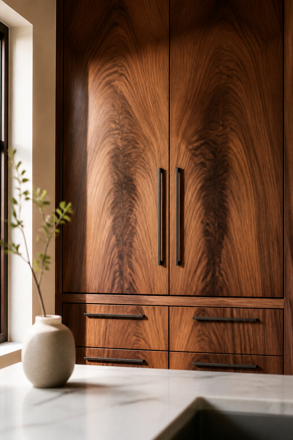
Book-matched walnut takes consecutive veneer sheets and opens them like a book, creating a mirror-image grain pattern across adjacent cabinet fronts. The effect is closer to furniture than construction. Cabinet-grade walnut uses this veneer on an MDF substrate, which is actually more dimensionally stable than solid wood in the humidity swings a kitchen generates.
The finish question is simpler than most people expect. Rather than stain — which obscures the very thing you’re paying for — most walnut cabinets get a clear coat, either an oil (Danish oil, tung oil) for a matte, natural feel or a lacquer for a more durable, wipeable surface. Walnut starts warm and deepens with UV exposure over years, meaning the cabinet gets more beautiful with time, not less.
For hardware, matte black is the current standard against walnut because it recedes visually. Unlacquered brass is the alternative worth considering — it ages alongside the wood, developing a patina that mirrors the cabinet’s own character.
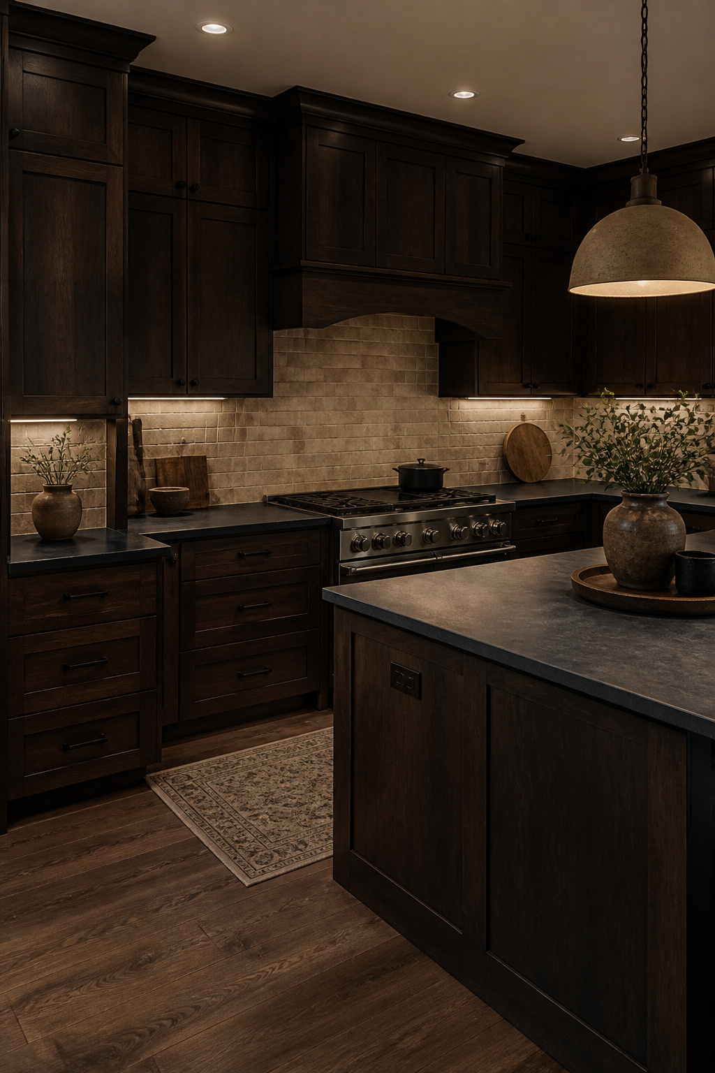
2. Chocolate Brown Lower Cabinets With Crisp White Uppers
Two-tone kitchens work on a visual weight principle as old as architecture itself: dark at the bottom, light at the top. The earth is brown; the sky is not. Brown lower cabinets anchor the room in a way that feels natural rather than designed, while white uppers reflect light and visually dissolve into the wall above — keeping the room open without sacrificing the warmth the lower cabinets deliver.
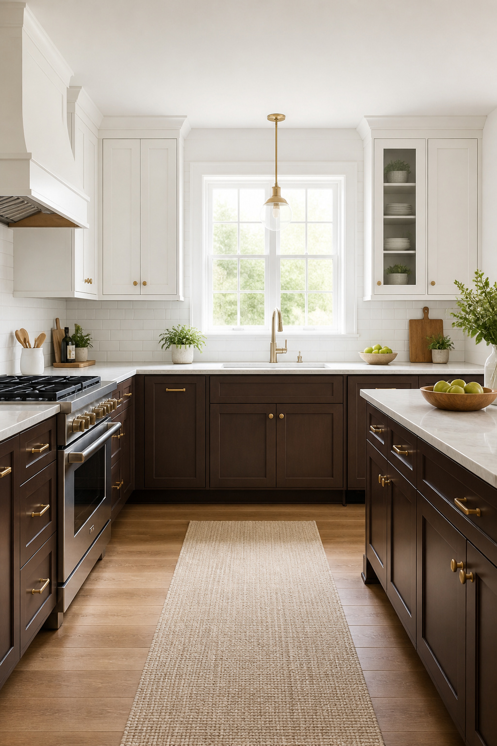
The 60-30-10 breakdown is a useful guide: white handles roughly 60 percent of the visual weight (uppers and walls), brown takes 30 percent (lowers), and hardware and accent details handle the remaining 10 percent. This ratio prevents either colour from dominating so completely that the room loses balance.
Colour selection matters more than most people expect. Benjamin Moore Whipped Mocha (CC-110) is worth testing first — a warm, neutral brown with no pink or orange pull, which makes it the most flexible choice across different countertop materials and light conditions. Farrow & Ball Jitney (299) reads more sophisticated, slightly more muted. For the uppers, resist pure bright white — it often clashes with the warmth of the lower cabinets under artificial light. Benjamin Moore White Dove or Swiss Coffee bridge the gap more successfully.
Where the line falls between upper and lower matters too. The natural split point is at countertop height — 36 inches — where the transition becomes part of the horizontal plane rather than an arbitrary mid-cabinet interruption. Matching hardware throughout (same finish on both upper and lower cabinets) is the single most effective way to unify two quite different colours.
3. Earthy Kitchen Ideas: Brown and Sage Cabinet Combinations
Brown and sage green is the kitchen colour pairing of this moment, and the reason is rooted in something older than trend: biophilic instinct. Green and brown are the dominant colours of natural foliage and soil. Put them together in a room and the space reads as calm and grounded without any deliberate effort — the visual cortex does the work.
Sage has matured since its 2022 peak. In 2026 it sits in deeper, more olive territory, with pronounced brown and grey undertones that make it dramatically more compatible with warm wood cabinetry than the blue-grey sage that dominated a few years earlier. Farrow & Ball Mizzle and Benjamin Moore Saybrook Sage both have enough brown in their undertone to sit alongside walnut or chocolate brown without colour temperature conflict.
The floor is where this pairing either comes together or falls apart. Terracotta tile is the obvious bridge — warm orange-red that echoes the brown while speaking to the green’s earth connection. For kitchens where terracotta feels too rustic, cream or warm limestone flooring keeps the palette earthy without reading farmhouse. The key is grout: buff or sand-coloured grout keeps stone floors warm; white grout imposes a graphic grid that fights the organic quality of the material.
Aged brass or antique nickel hardware and stone-inspired worktops finish the look. Both brown and sage are naturally compatible, and the design instinct here should be to get out of their way.
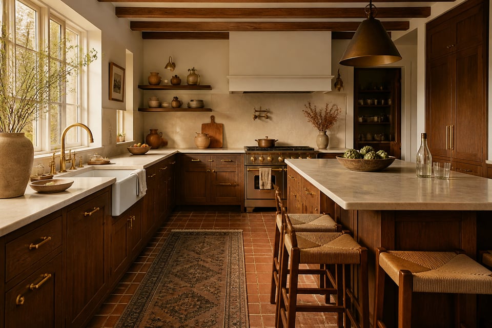
4. Exposed Timber Ceiling Beams Over Brown Cabinetry
There are two routes to ceiling beams in a kitchen — expose structural ones or add decorative ones — and the right choice depends on what’s already in your ceiling rather than what you prefer aesthetically. Structural beams are part of the building’s load path, require permits and engineering sign-off, and are typically uncovered during gut renovation rather than added. Decorative beams made from hollow timber or high-density polyurethane can be installed by confident DIYers over a weekend.
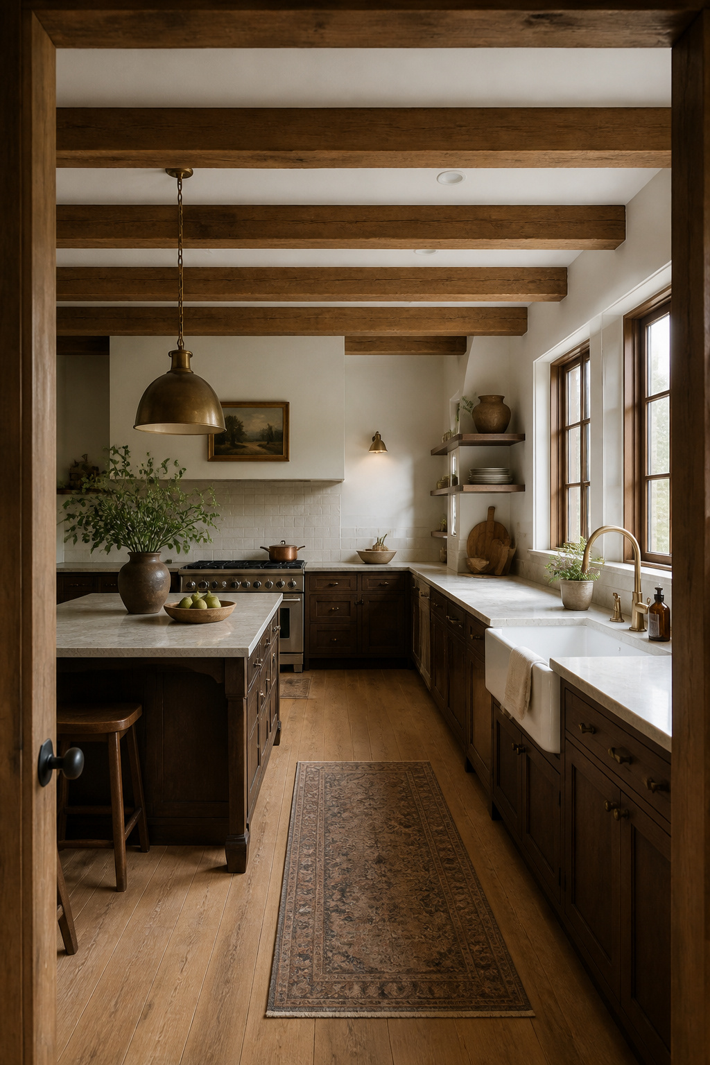
Sizing and spacing follow a simple rule: beam spacing should roughly match beam width. Eight-inch beams with eight-inch gaps creates a rhythm that reads as balanced rather than arbitrary. Three or four beams across a standard 12-to-14-foot kitchen width is the sweet spot — fewer looks sparse, more looks fussy.
Stain depth has an outsized effect on the room’s warmth. A medium walnut stain on beams over chocolate-brown cabinets creates a unified warmth without making the ceiling feel heavy. Dark espresso staining matches the cabinets more exactly but can lower the ceiling visually — compensate with pale countertops and a light backsplash. White or painted beams against brown cabinetry create a Dutch Colonial contrast effect that reads as deliberate and appealing in its own right. The beams and cabinetry don’t need to match exactly — within the same tone family is close enough.
5. Brown Kitchen With Stone Backsplash and Apron Sink
Stone backsplashes and apron sinks are old ingredients in kitchen design, and there’s a reason: both age rather than wear. A travertine backsplash that looked beautiful when installed looks more beautiful ten years later. That quality matters in a kitchen used every day.
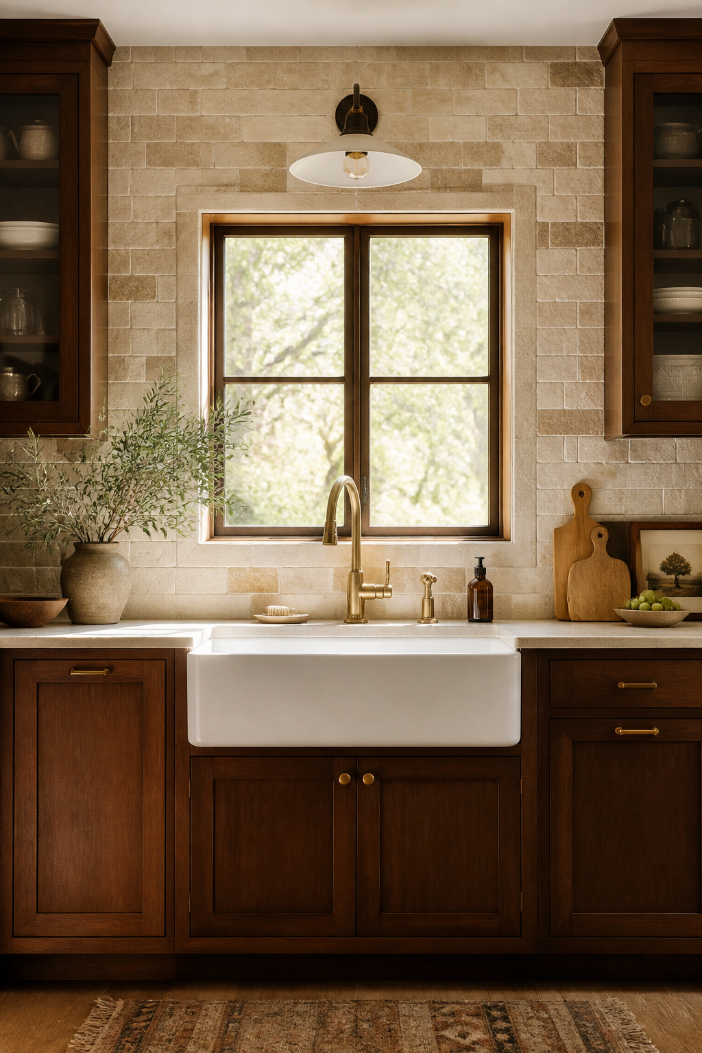
For brown cabinetry, travertine in beige, cream, and tan tones is the most harmonious choice — the warm undertones directly echo the palette rather than contrasting against it. Quartzite with active white-and-gold veining introduces movement that prevents the overall scheme from reading as monotone. Cool-toned stones — white Carrara marble, blue-grey slate — fight the warmth of brown wood and are better reserved for kitchens built around cooler palettes. There’s useful detail on kitchen backsplash and countertop combinations if you’re working through the stone selection with both surfaces in mind.
For the sink, fireclay is the most practical apron choice alongside brown cabinetry — durable, chip-resistant, and available in bisque or off-white finishes that complement warm wood better than stark white does. Cast iron with porcelain enamel is heavier (100-200 pounds means cabinet reinforcement is required) but develops age character that aligns with the brown kitchen’s overall aesthetic direction.
Grout colour is the step that most people get wrong. Warm sand or buff grout in natural stone tile keeps the surface looking organic and integrated. White grout cuts the stone into a grid that reads too hard against the softness of warm brown wood.
6. Matte Mocha Paint on Flat-Front Shaker Cabinets
Pantone named Mocha Mousse its 2025 Colour of the Year. More relevantly, interior designers were already arriving at this conclusion independently — earthy, warm browns in matte finishes have been building momentum in kitchen cabinetry for two years. Flat-front Shaker cabinets are the format that best shows off the effect.
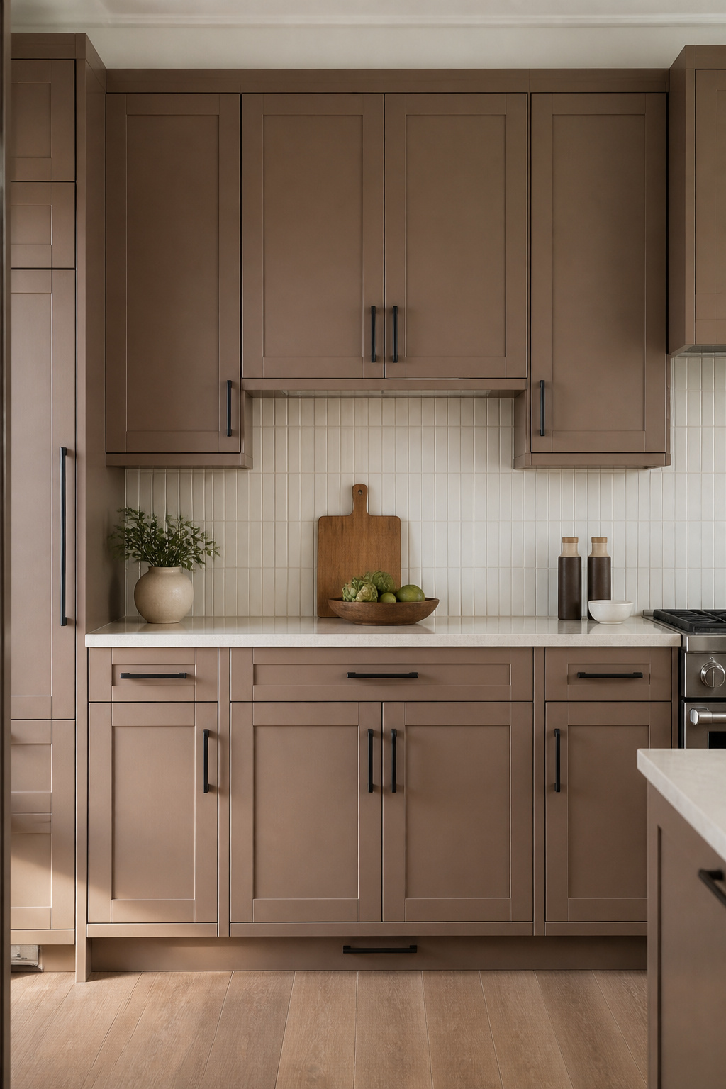
The reason comes down to physics. Matte finish absorbs light rather than reflecting it. On a raised-panel door, this creates uneven shading where light catches the panel edges at different intensities. On a flat-front Shaker, there’s no raised geometry to interrupt — the matte reads uniformly across the door face, creating a solid, calm colour presence that’s sophisticated without being severe.
Benjamin Moore Whipped Mocha is the most flexible mocha shade — no orange or pink pull means it plays well with most countertop materials and doesn’t shift unpleasantly under warm artificial light. Farrow & Ball Jitney (299) is quieter and more muted, reading as mocha in most conditions. Sherwin-Williams Umber (SW 6105) goes darker and richer for kitchens that want more drama than warmth.
Countertop pairing is where the decision gets consequential. Honed stone — honed marble, honed quartzite — works best alongside matte cabinets because both surfaces share the same non-reflective quality. Polished stone can work as deliberate contrast, but choose one with active veining rather than flat polished granite, which reads as budget against matte cabinetry.
7. Brown Kitchen Cabinets in a Craftsman Bungalow Setting
Gustav Stickley didn’t call it a movement. He called it “honest furniture” — design that showed its construction, used the actual colour of the wood it was made from, and declined to pretend it was something more refined than oak and honest joinery. The American Craftsman movement he helped establish in the late 1800s gave us the brown kitchen not as a style choice but as a logical consequence of working with real materials.
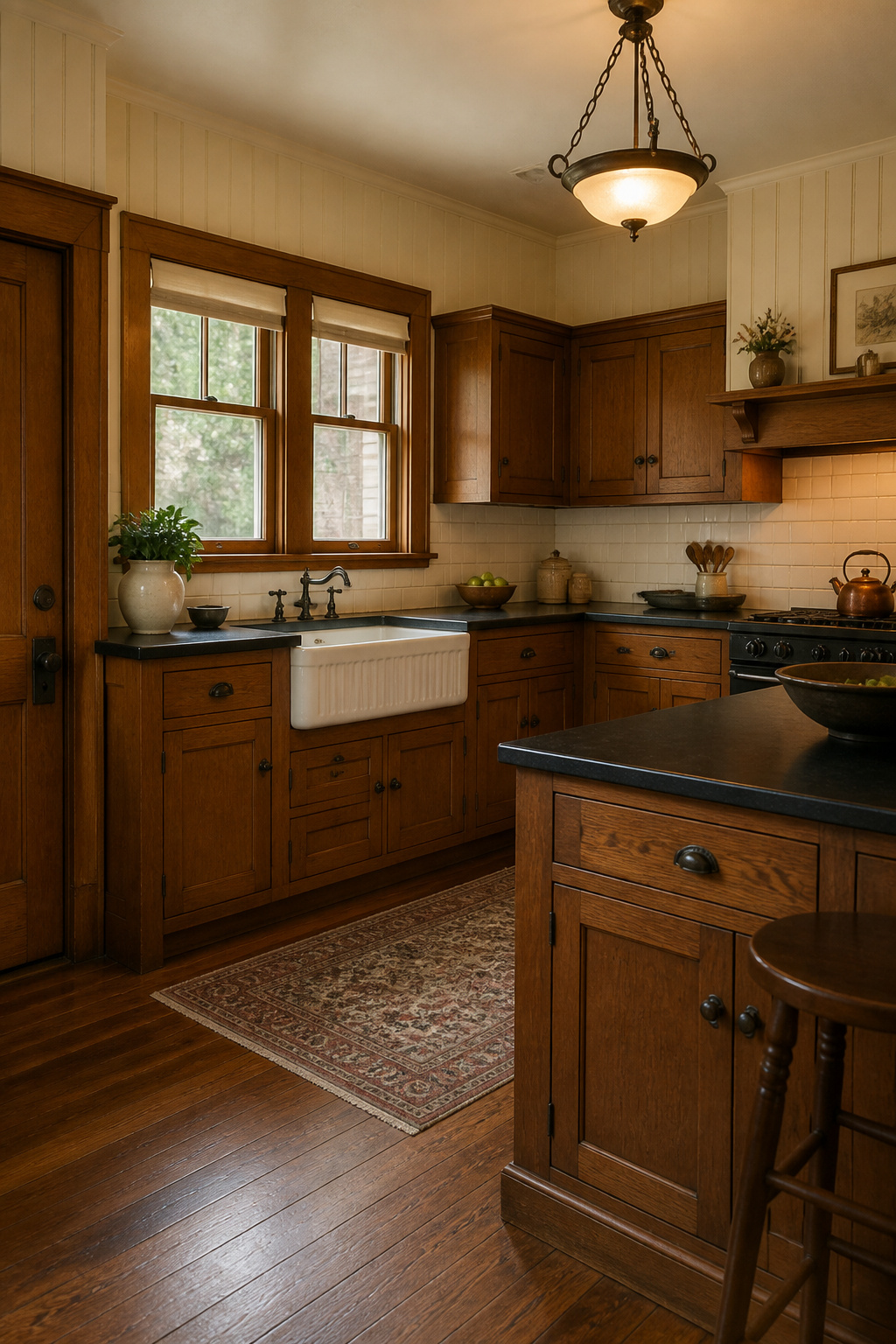
Craftsman bungalow kitchens typically feature inset cabinet doors rather than overlay — closer to furniture than millwork — with quarter-sawn white oak as the historic material of choice. The quarter-sawing technique produces a distinctive ray-fleck grain pattern that’s one of the most recognisable marks of period authenticity. There’s considerable depth on this in the historic kitchen remodeling ideas archive, particularly for Craftsman-era properties where getting the cabinet door profile and wood species right does more design work than any other single decision.
Hardware in a period-sensitive Craftsman kitchen should be oil-rubbed bronze — slightly aged, matte, warm brown undertones. Mission-style D-ring or bar pulls are period-accurate and still commercially available. Avoid polished nickel or chrome; both are too modern for a space that should feel like 1910.
Integrating modern appliances without breaking character is simpler than it sounds. Panel-ready dishwashers and refrigerators maintain the furniture-like quality. Range-style stoves in matte black or dark enamel are period-adjacent. A farmhouse fireclay sink is both historically appropriate and practical — exactly the kind of honest, durable material choice Stickley would have approved of.
8. Dark Espresso Island Anchoring a Lighter Kitchen
A dark espresso island in a white or cream-cabinet kitchen operates on the principle of the focal point: give the eye somewhere specific to land and the room immediately feels more composed. The contrast does the work that crown moulding, range hoods, and lighting fixtures often try and fail to do — it organises the visual field without announcing itself.
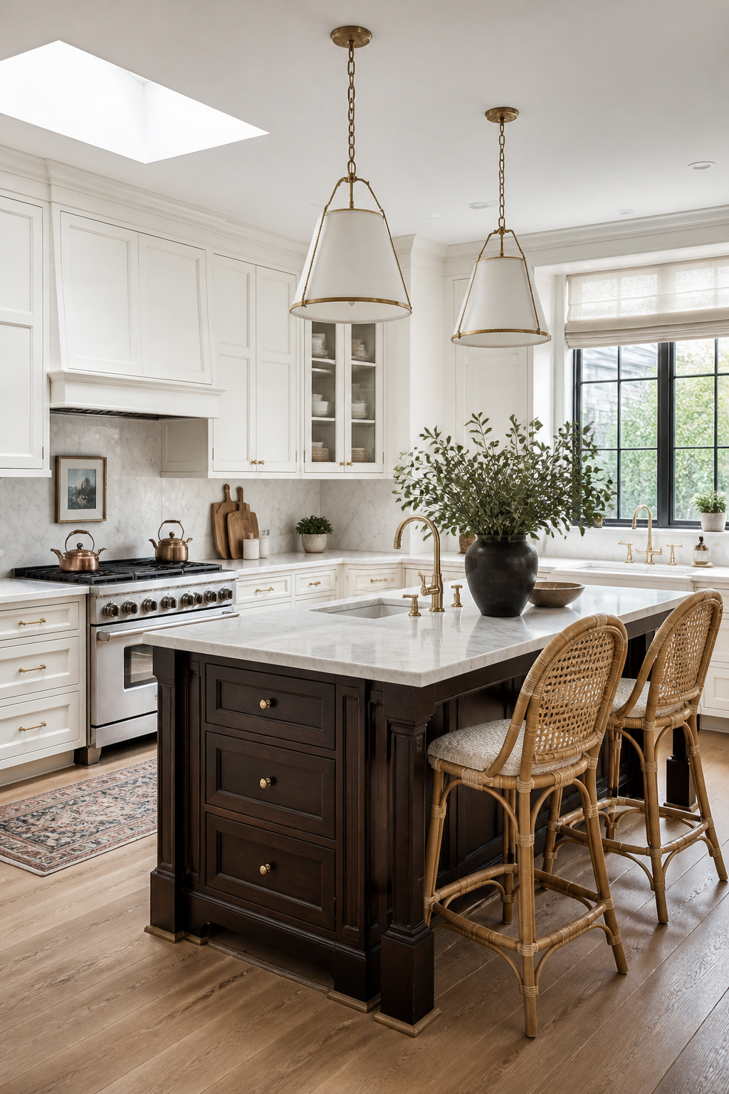
The island needs to read as furniture rather than construction to carry this effect. That means legs or a furniture-style toe kick rather than a solid base panel, and a countertop material that creates contrast against the dark base rather than blending into it.
White Carrara marble or white quartz on an espresso island is the most classically elegant combination — clean, high-contrast, and difficult to date. Honed butcher block in light maple or ash warms the combination toward farmhouse territory. Dark soapstone with silver veining on a dark island is the richer, more design-forward choice — it works only if the stone has enough movement to prevent the combination going flat.
Counter stool selection is where most people make the decisive mistake. Standard kitchen islands sit at 36 inches; counter stools should have a seat height of 24-26 inches. More importantly, choose a lighter colour than the island — cream upholstery, natural rattan, blonde wood. Dark stools against a dark espresso island simply disappear, which defeats the focal-point purpose entirely.
9. Raw Leather Bar Stools and Brown Wood Cabinetry Pairing
Leather and wood have appeared together in furniture since the Middle Ages. There’s a reason that combination has never gone out of style: both are natural materials with organic grain patterns, both age by becoming richer rather than more worn, and both share the same warm undertone family that makes them easy to mix without matching.
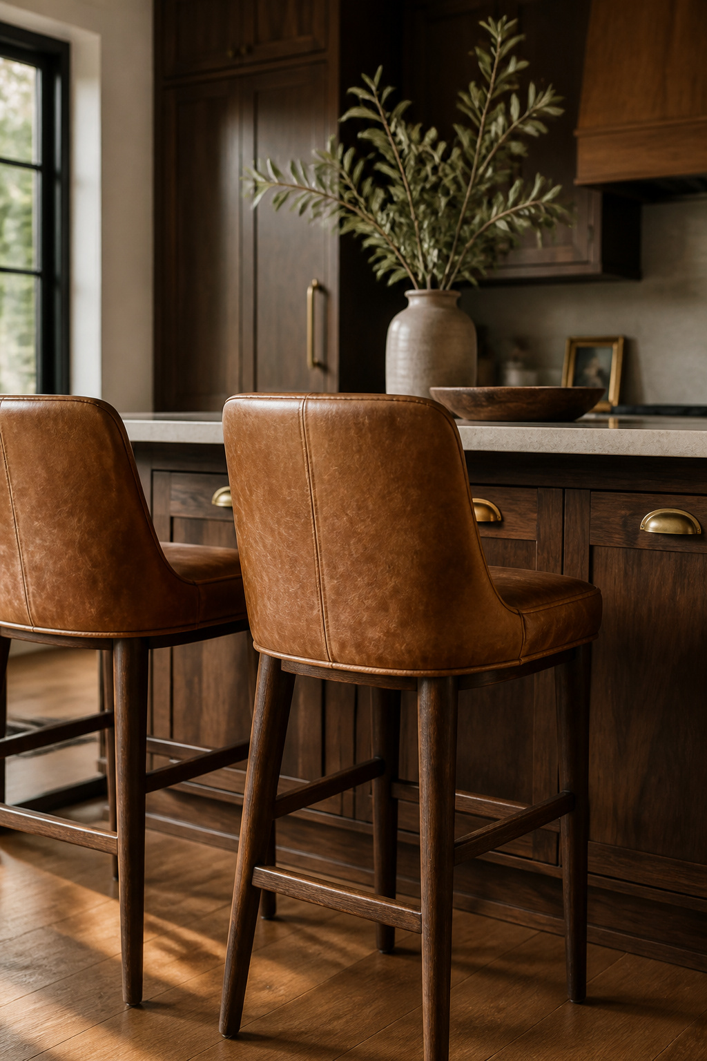
In a brown kitchen, leather bar stools introduce a second warm material in a different texture — the smooth, soft give of a seat against the hard, structural quality of the cabinetry. The combination reads as layered rather than monotone.
For kitchen environments, leather grade matters considerably. Full-grain leather — the outermost hide layer with natural grain intact — is the most durable option and develops the richest patina over time. Top-grain is sanded and treated, more uniform but slightly less characterful as it ages. Bonded or faux leather should be avoided entirely for stools that see daily kitchen use; they crack and peel within two or three years of regular contact.
Colour temperature is the nuance that separates a successful pairing from an accidental one. Warm-toned leather — caramel, cognac, saddle tan — pairs with warm-toned wood (walnut, cherry, medium oak). Cool-toned leather — dark espresso, charcoal brown — competes with warm wood rather than working with it. The leather doesn’t need to match the cabinetry; a caramel stool against dark walnut cabinets creates natural contrast within the same warm family that’s more interesting than a direct match.
10. Brown Kitchen Ideas for Small Kitchens Without Feeling Cave-Like
The concern with brown in a small kitchen is legitimate. Four walls of dark cabinetry in a tight space will feel oppressive. But the solution isn’t to abandon brown — it’s to understand which surfaces go dark and which ones don’t.
There’s good detail on small kitchen decor strategies for any colour palette, and the core principle applies equally here: reserve dark for the lower half of the room and keep the upper register light. In a brown kitchen, that means base cabinets in your chosen dark tone, upper cabinets in white or warm cream, and a light countertop that creates a horizontal band separating the two. In a genuinely tight space — under 150 square feet — consider brown on one wall or the island only, keeping all perimeter cabinetry lighter.
Lighting is the non-negotiable variable. Under-cabinet LED strips at 3000K (soft warm white) eliminate the shadow that dark cabinets cast on countertops during cooking. 3000K is the right temperature: warm enough to bring out brown tones without pushing everything orange, bright enough for actual task work. Avoid 2700K, which makes stone countertops read too golden, and anything above 3500K, which conflicts with the warmth of the cabinetry.
A glossy or glass-tile backsplash bounces light from under-cabinet LEDs back into the room rather than absorbing it. Glass-door upper cabinets with interior lighting add depth. A mirrored or glass panel on a pantry door or end wall creates the perception of additional width in a narrow galley — a small addition that has a noticeable effect in person.
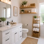
11. Terracotta Tile Floor With Brown Cabinet Combination
Terracotta and brown cabinetry is not a trend. It’s a vernacular that appears in Mediterranean, Spanish Colonial, and Southwest American kitchens across centuries because both materials come from the same source: fired clay and worked wood, shaped from the earth and installed in kitchens where food is cooked from scratch. The visual harmony is pre-rational — you don’t need to analyse why it works.
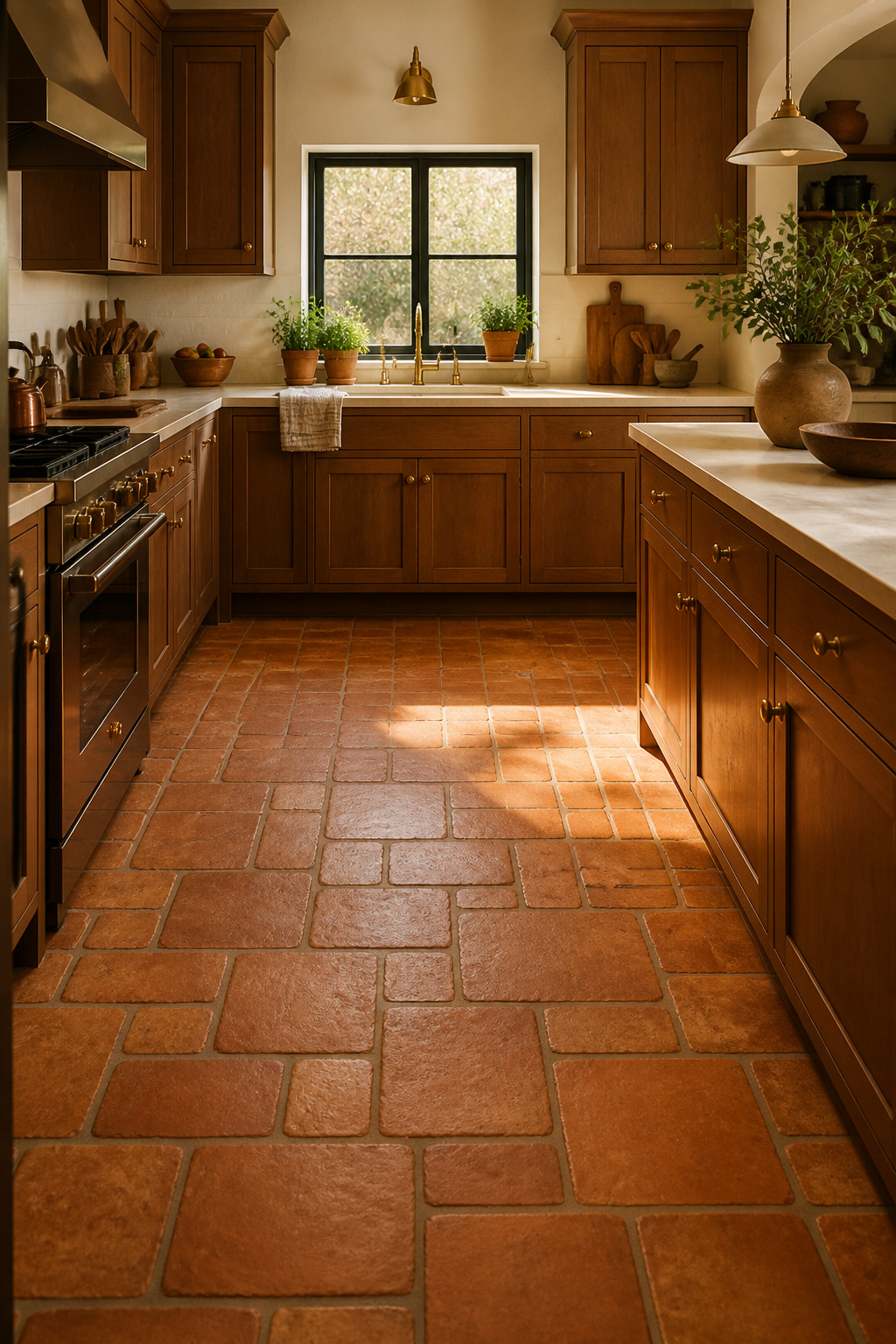
Saltillo tile from Mexico is the most commonly available terracotta in North America. The manganese Saltillo range runs from light clay to deep brown with terracotta undertones, making it naturally compatible with brown cabinetry across most shades. Italian terracotta is denser, more uniform, and more dimensionally consistent — it requires less allowance for size variation during installation. Both types require sealing before grouting; terracotta is porous enough that grout will permanently stain the tile face if you sequence those steps incorrectly.
A penetrating sealer (not a surface sealer) is the correct choice — it protects without altering the matte quality that makes terracotta beautiful. High-quality penetrating sealers last 10-15 years; typical maintenance is resealing every 2-4 years depending on foot traffic, and daily mopping with a pH-neutral cleaner.
For laying pattern: 12×12 in offset (brick) pattern accommodates the slight size variation inherent in handmade tile without making it obvious. Herringbone adds visual direction and draws the eye along the floor’s length — particularly effective in a narrow kitchen. Buff or sand-coloured grout keeps the floor warm; white grout imposes a graphic grid that fights the organic quality of the material.
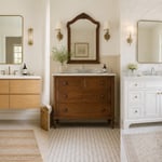
12. Open Walnut Shelving as a Warm Accent in a White Kitchen
If you’re not ready for a full brown kitchen but want the warmth, open walnut shelves in an otherwise white kitchen is the most efficient route. Two floating walnut boards — flanking the range, above the sink, or on a blank wall — introduce the material in a way that reads as a deliberate design decision rather than a starting point.
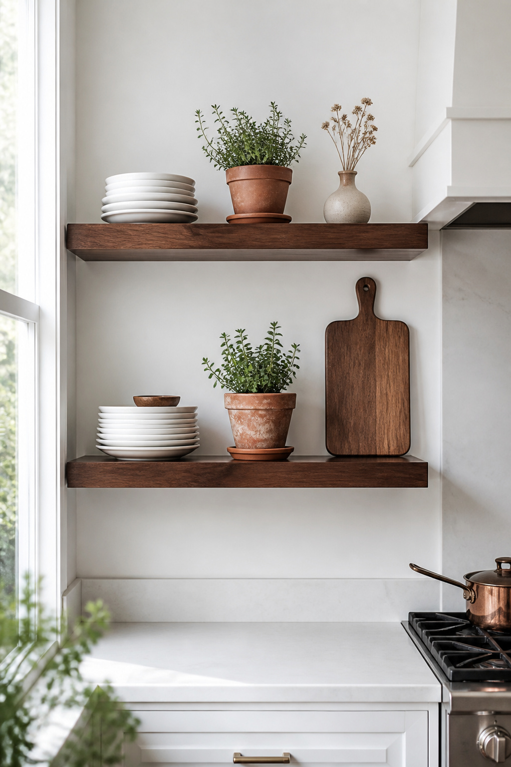
Positioning matters. The most impactful placement is flanking the range or hood, where two symmetrical shelves frame the cooking zone and create a visual anchor without enclosing the room. Above the sink is the classic practical choice — useful for frequently used items and visible from across the kitchen. Avoid positions directly above the stove where steam regularly contacts the wood; moisture over time warps solid timber shelves regardless of species.
Walnut is the preferred species for visible open shelving because it looks richer without stain than almost any other hardwood — it simply needs a clear oil or hardwax finish (Rubio Monocoat and Osmo oil are both excellent) to bring out its natural depth. White oak is a close second in both durability (Janka 1290) and visual appeal. Teak is the most moisture-resistant option but considerably more expensive for the length of shelf a kitchen needs.
For styling: group objects in odd numbers — three things, or five — rather than straight rows. Line the back of the shelf with stacked white plates, which pop against walnut and read as intentional. Add a terracotta herb pot for a touch of green that bridges the walnut tone and the white surrounding it.
13. Warm Kitchen Design: Brass Hardware Against Brown Cabinetry
Chrome had a long run. From roughly 2005 to 2020 it was the default finish for kitchen hardware across most price points, and it made sense in cool, clinical kitchens built around white and grey. In warm brown kitchens, chrome’s cool grey undertone fights the cabinetry rather than working with it. Brass — with its warm yellow-gold undertones — does the opposite.
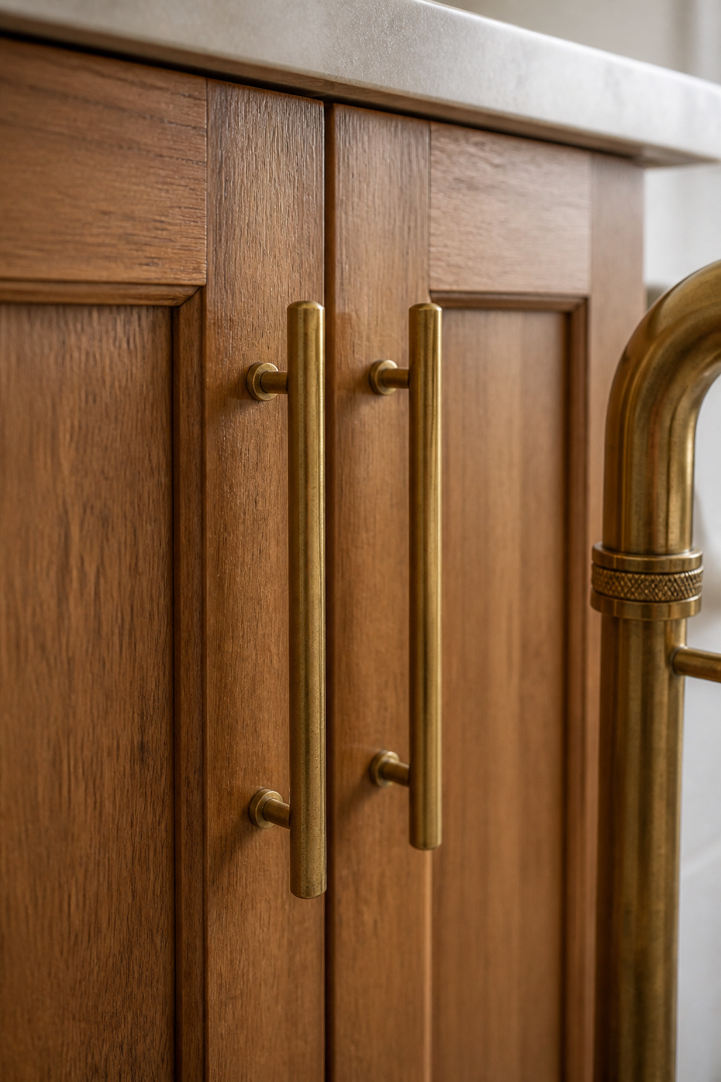
Unlacquered brass is the specific choice worth understanding. Unlike lacquered brass, which has a protective coating that keeps it frozen at its original finish, unlacquered brass has no coating. It reacts with oxygen and the oils in your hands to develop a natural patina over one to two years. The patina is uneven — pulls that are touched more often darken faster — which is the point. The hardware starts looking better with use, mirroring the character the brown cabinetry develops over the same period.
Rocky Mountain Hardware, Top Knobs, and RH all offer unlacquered brass collections for traditional and Craftsman kitchens. Pull sizing on shaker cabinets: 3-5 inch bar pulls are proportionate for standard cabinet widths; larger flat-panel doors take 5-8 inch pulls more comfortably.
Mixing metals in the same kitchen is fine within one rule: keep both finishes in the same temperature family. Brass hardware with black iron light fixtures is a classic warm-metal pairing. Brass hardware with brushed nickel faucets can work if the nickel leans warm. Brass with chrome, in the same sightline, is the combination to avoid — the temperature clash is immediately apparent and difficult to unsee.
14. Limewash Walls to Complement a Brown Kitchen Palette
Flat paint makes walls static. Limewash makes them alive. The difference is in the chemistry: limewash is slaked lime applied in thin, translucent layers — light passes through the surface and reflects back, creating a subtle glow that flat latex cannot replicate. In a kitchen built around the organic richness of brown wood, that quality of light reads as deeply compatible.
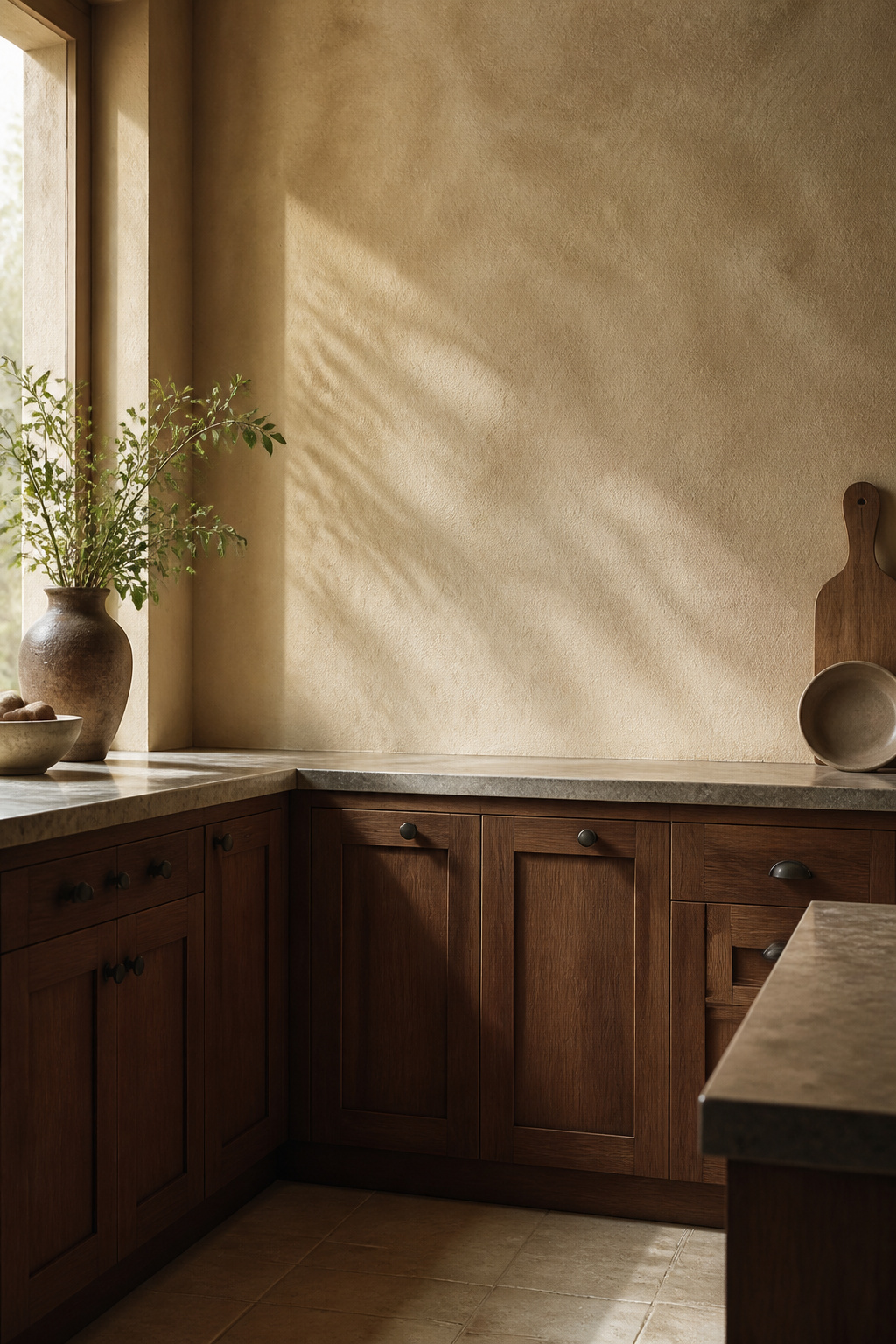
The application technique is a crosshatch brush stroke, working section by section with a large stain brush while keeping a wet edge. The overlapping marks create texture and dimensional movement. Portola Paints’ Lime Wash Series is the most widely available professional product in the US; Bauwerk Colour is a premium alternative where stockists carry it. Roman Clay (Portola makes this too) is applied with a trowel for a smoother, more suede-like finish that suits contemporary kitchens leaning toward the minimal.
For colour: warm white limewash (cream, bisque, antique white) is the most versatile alongside brown cabinetry — it reads differently at different times of day, always warm. Ochre-tinted limewash creates a honey-gold wall that directly echoes warm wood in kitchens with strong natural light. Cool grey limewash is the one to avoid alongside brown; the undertone conflict reads as confusion rather than contrast.
For DIY application: test behind the refrigerator first. The technique is genuinely forgiving — the imperfect quality is structural to the finish — but understanding how the product moves before tackling a feature wall prevents the kind of mistake that requires repainting.
15. Brown Kitchen With Dark Countertops for a Layered Tonal Look
Dark countertops on dark brown cabinets is the most committed version of the brown kitchen — and the most rewarding when it’s done right. The key is active management of stone selection, lighting, and the backsplash, which does more work in this configuration than in any other kitchen palette.
Soapstone is the best dark countertop choice for brown kitchens specifically because its undertones are blue-grey-green rather than brown — it provides subtle contrast against warm cabinetry rather than blending into it. Dark quartzite with white or silver veining (Black Fantasy, Nero Marquina) creates movement that prevents the dark-on-dark combination from going flat. For a deeper look at material selection and maintenance across the full range of stone options, this collection of stunning kitchen countertop ideas covers the field well. Black granite needs the most careful consideration — it shares similar depth with brown cabinetry and can create a combination with no tonal variety at all.
Lighting is non-negotiable. Under-cabinet LEDs illuminate the countertop directly and eliminate the shadow that dark cabinetry casts on dark stone during food preparation. The ceiling should be soft warm off-white — not stark white, which creates a jarring contrast, but warm enough to function as a light plane above the darker kitchen palette.
The backsplash becomes the tonal bridge in this configuration. A medium-value backsplash — cream travertine, off-white subway with buff grout, warm-veined marble — provides visual separation between cabinet and countertop, preventing the two dark surfaces from merging into an undifferentiated mass.
16. Integrated Timber Pantry Doors in a Contemporary Kitchen
A pair of floor-to-ceiling timber pantry doors in an otherwise sleek contemporary kitchen does something no paint colour can: it brings a vertical plane of natural material into the room at scale. The doors read as furniture — panels with grain and warmth — set against what’s otherwise a controlled, minimal environment.
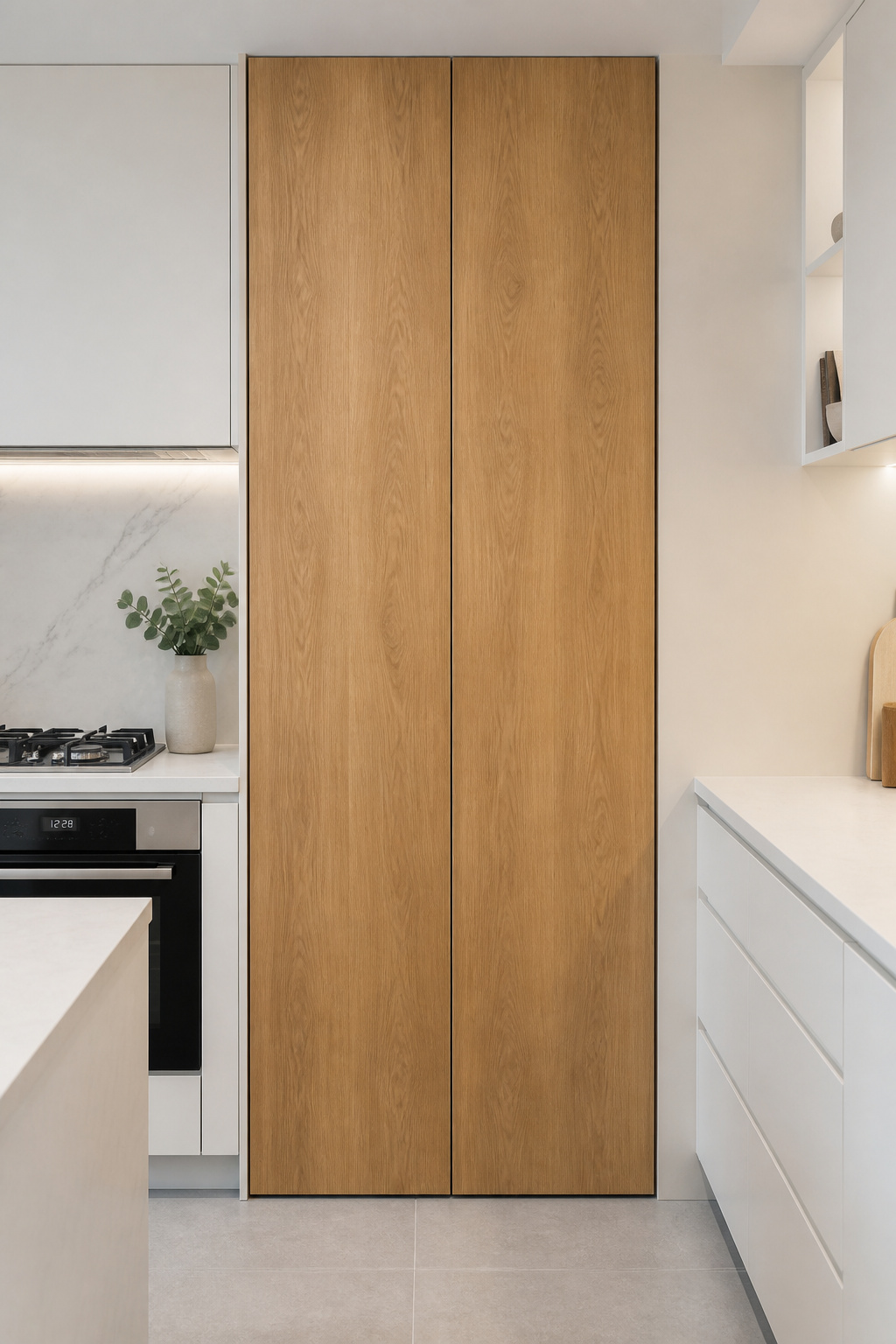
Profile choice positions the doors within the kitchen’s overall aesthetic. Flat-panel timber doors with no moulding or routing are the most contemporary interpretation — the grain carries all the visual information and the surface is otherwise uninterrupted. V-groove (shiplap-style) panels introduce a farmhouse or Scandinavian character that works in kitchens where warmth is the primary goal rather than minimalism.
White oak is the most popular species for contemporary timber pantry doors — its open grain takes hardwax oil beautifully, and its slightly warm-blonde tone sits between the coolness of ash and the richness of walnut. For large doors that run floor to ceiling, engineered timber (plywood core) is a more practical choice than solid — it handles humidity swings better. Any door positioned adjacent to a dishwasher or steam source should be engineered; solid timber in direct steam will warp.
Push-to-open mechanisms leave the timber surface completely uninterrupted and read as seamlessly contemporary. Full-height bar handles in brass or matte black make a strong design statement — the scale of the handle matches the scale of the door. Soft-close damper mechanisms are worth adding; large timber doors have significant momentum and will bang without damping.
17. Brown Kitchen Decor Ideas: Styling Countertops Without Clutter
Dark surfaces show everything. A cluttered brown countertop creates visual noise against an already rich background, which is why the edit principle matters more in a brown kitchen than in almost any other palette. The rule is simple: if you use something less than twice a week, it goes in a cabinet.
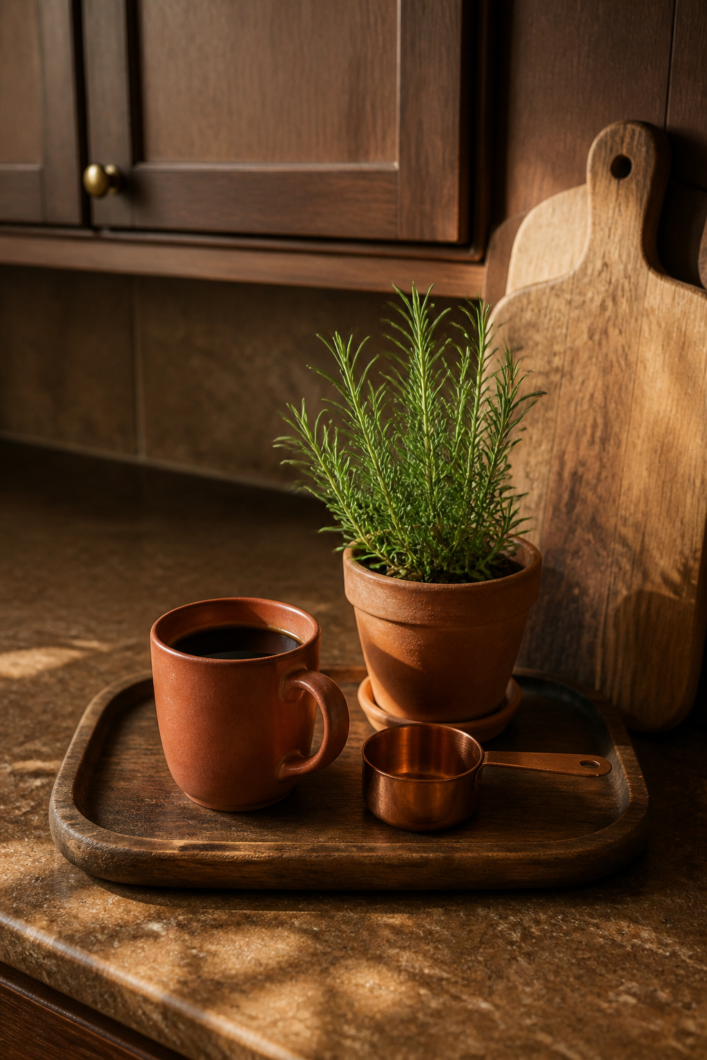
That edit doesn’t mean bare counters — it means deliberate counters. Grouping objects on a tray is the most effective corralling tool: three or four items on a wooden or ceramic tray read as a composed vignette rather than accumulated clutter. The tray contains the visual weight and limits how much the eye has to resolve.
Material choices for counter accessories in a warm brown kitchen should stay in the same temperature family: copper accessories, terracotta ceramics, and natural wood objects all work. Chrome and cold stainless steel read as out of place against warm brown surfaces; white plastic reads as an afterthought.
For farmhouse kitchen ideas with warm details, organic accessories are fundamental to the aesthetic — living plants especially. A small rosemary or thyme plant in a terracotta pot brings green into the brown palette naturally. Green and brown are complementary in the most literal sense — the combination reads as resolved before you’ve made a single deliberate decision.
18. Painting Existing Cabinets Brown — What Renovation Gets Right
Painting kitchen cabinets is one of the highest-return renovation decisions available, and the difference between a result that lasts five years and one that looks professionally done for twenty is almost entirely in the preparation — not the paint. Most DIYers underinvest in prep and then blame the paint.
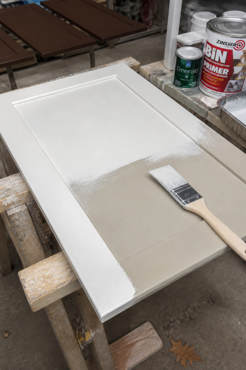
Start by removing all cabinet doors and hardware before painting anything. Painting in place produces drips, missed edges, and hardware masked in paint. Degrease the cabinet surfaces thoroughly with TSP substitute or a dedicated cabinet degreaser — kitchen surfaces accumulate cooking oils that prevent adhesion regardless of how good the primer is. Sand with 150-grit to scuff the existing surface, then 220-grit to smooth. Vacuum, then wipe with a tack cloth. This sequence is not optional.
For primer, Zinsser BIN (shellac-based) or Zinsser Stix (water-based acrylic bonding primer) are the professional standards. Benjamin Moore Advance is the finish paint most professionals reach for — a waterborne alkyd that self-levels, meaning brush and roller marks largely disappear as it cures. Sherwin-Williams Emerald Urethane Trim Enamel allows a 4-hour recoat window compared to Advance’s 16 hours, which matters significantly if you’re doing the job over a weekend.
Both products take 30 days to fully cure. During that window, treat the cabinets carefully — light cleaning only, no heavy scrubbing. Satin or semi-gloss are the right sheen levels for kitchen cabinets: wipeable and reasonably forgiving of surface imperfection, without the mark-showing quality of high gloss.
Finding Your Brown Kitchen Starting Point
The most practical piece of advice for a brown kitchen is the one that gets least attention: test against your specific light before committing. Brown changes more dramatically than almost any other colour across the light conditions of a day. A shade that reads as sophisticated warm mocha in morning sun can shift toward orange under warm artificial light in the evening. Test paint samples at multiple times of day, on a large board positioned on the actual cabinet surface — not a sample card held to the light.
North-facing kitchens with less direct natural light should work with medium-warm brown. Very dark espresso or near-black browns in a north-facing room will go heavy quickly. South-facing kitchens with abundant light can take the deepest tones — the natural light handles the weight. If you’re uncertain, go one shade lighter than your instinct. It’s easier to add warmth through accessories, hardware, and countertop choice than to repaint.
On where to invest: cabinet door fronts and hardware are touched every day, and poor quality shows fastest in both. A professional spray finish on dark cabinet doors costs more than a DIY roller job but produces a finish that reads clearly as intentional rather than attempted. Countertops in a brown kitchen should be hard stone — dark surfaces show scratches easily, and harder materials (quartzite over marble) earn that investment. Where you can save: limewash walls are genuinely DIY-friendly; open shelving on simple brackets looks as good as bespoke floating shelves at a fraction of the cost; bar stools are easily reupholstered when fashions shift.
The brown kitchen, done well, doesn’t feel like a decision you’ll need to revisit. That’s the point of it.