There’s a moment that happens to most of us at some point — you lie in bed, mind still running, and find yourself staring at your bedroom wall. Really staring. And whatever is on it either helps you land softly in the room or keeps you somewhere in between wakefulness and rest.
The bedroom is the most psychologically loaded room in the home. It’s where the nervous system is supposed to downshift, where real, restorative sleep is meant to happen. The bedroom art print you hang in that space is not a trivial decision. Research confirms that nature imagery can lower systolic blood pressure and increase alpha wave brain activity. Visual clutter elevates cortisol by up to 30%. The walls are working, whether you’ve thought about them or not.
As a wellness design consultant, I’ve spent years thinking about how the physical environment shapes the way people feel in their homes. Every bedroom art print idea in this list has been chosen with that context in mind — not just what looks beautiful, but what supports the state this room is supposed to create. Sixteen ideas, from biophilic botanicals to monochromatic print suites, for a bedroom that helps you genuinely rest.
1. Botanical and Pressed Flower Prints That Bring Biophilic Calm to Your Bedroom
There’s a reason the most consistently recommended bedroom art print type for sleep environments features plants, trees, leaves, and flowers. Biophilic design — the principle that humans have an innate need for connection to the natural world — has moved well beyond trend territory into research-backed territory. Studies show that nature-themed artwork measurably reduces systolic blood pressure and increases alpha wave activity compared to blank walls or architectural subjects.
Botanical prints work because they carry high fractal content — the branching, recursive patterns found in leaves, stems, and flowers that our nervous systems are calibrated to find soothing. It’s not a cultural preference; it’s biology.
The practical question is which type to choose. Herbarium-style illustrations (precise, scientific, taxonomic) are more visually demanding. Loose watercolour botanicals are softer and more restful — the diffuse edges require less processing. For a sleep-focused bedroom, lean toward the watercolour end.
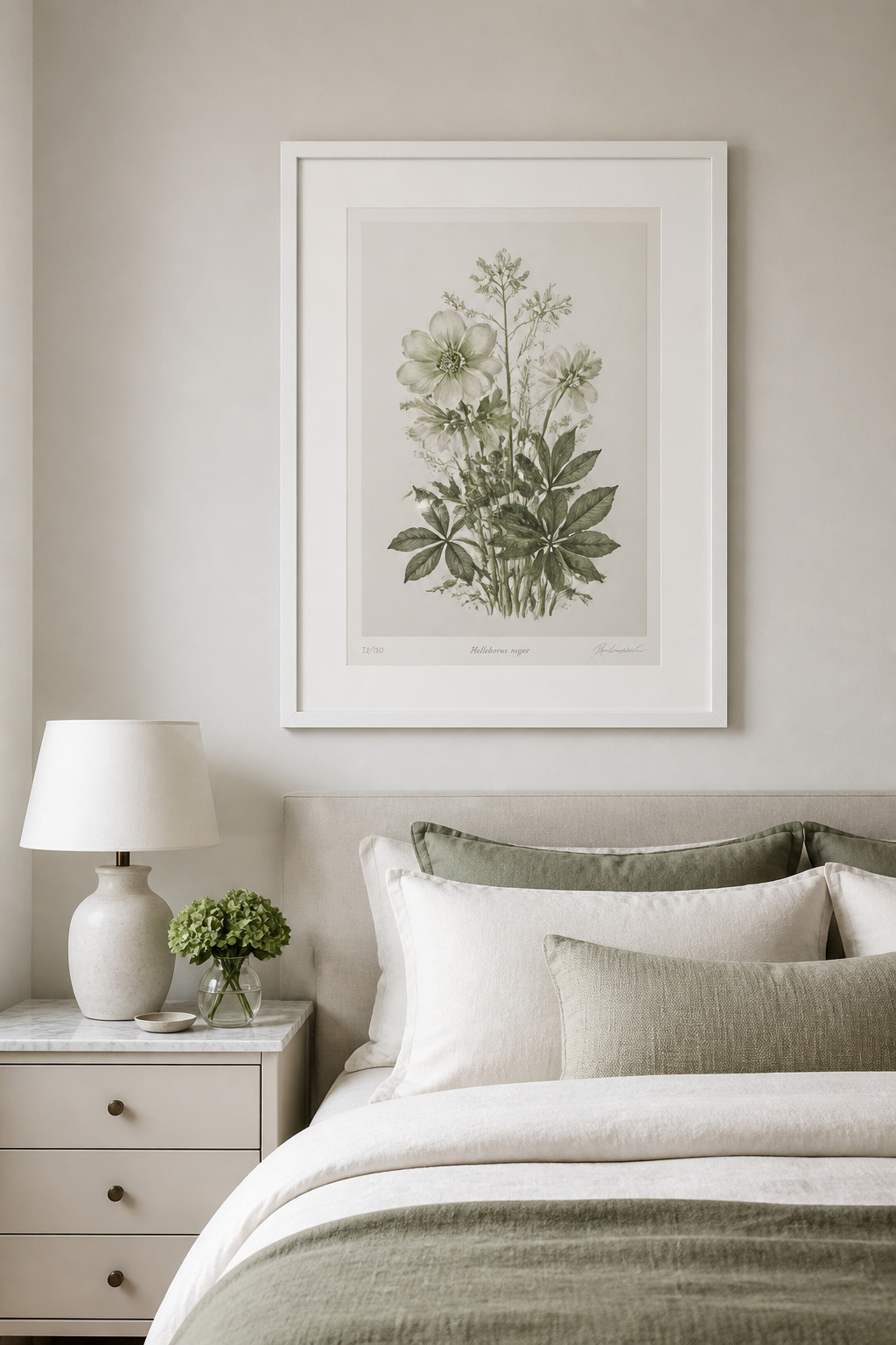
Sizing matters more than people expect. A single botanical bedroom art print at 24×30 or larger above a queen bed reads as intentional and anchoring. Multiple small prints grouped together create visual fragmentation rather than the calm that biophilic art should deliver. The botanical illustrations of Pierre-Joseph Redouté and Georg Ehret are public domain and available in high resolution through rawpixel.com and Pictureboxblue — download and print through a local fine art shop on 200gsm+ uncoated paper for museum-quality art at the cost of printing. There’s also a genuine connection between choosing botanical art and bringing the outdoors into your bedroom through natural materials — both approaches work together.
2. Minimalist Line Art as Bedroom Wall Art That Doesn’t Overwhelm
Not every bedroom needs representational art. For rooms that already carry a lot of texture — a rattan headboard, layered linen, woven cushions — a minimalist line drawing delivers personality without adding visual noise.
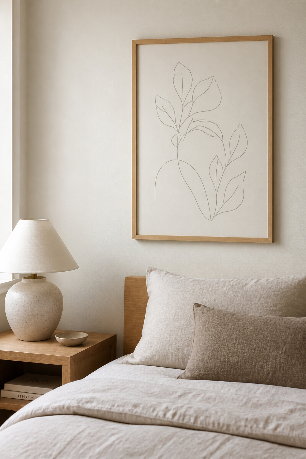
The research connection is clear: every visible object in a bedroom requires low-level cognitive processing, and that background load keeps the brain from fully shifting into the relaxed state that precedes sleep. Visual clutter — including complex or high-contrast art — competes with the brain’s wind-down process. Minimalist bedroom wall art gives you aesthetic interest and a restful environment at the same time.
The variables worth thinking through are line weight, subject, and colour. Fine, single-weight lines read as quieter than thick gestural strokes. For a sleep-focused space, delicate lines on cream or warm-white grounds are the calmest option. Abstract human figures work well; botanical outlines are excellent; simple landscape horizons are effective. Avoid urban subjects, jagged geometric patterns at high contrast, anything visually complex at small scale.
Colour matters more than most people realise when choosing bedroom wall art. Warm ink tones — terracotta, sage, dusty blush — on cream grounds connect naturally to earthy bedroom palettes. Cool grey or charcoal on white suits Scandinavian or Japandi interiors. The practical failure to avoid: choosing line art that’s too small. A 5×7 drawing on a generous bedroom wall is barely visible. Size up to at least 16×20 for a solo piece. If you’re building a minimal bedroom scheme, pairing your chosen print with the right minimalist bedroom furniture for a serene sanctuary makes both elements work harder aesthetically.
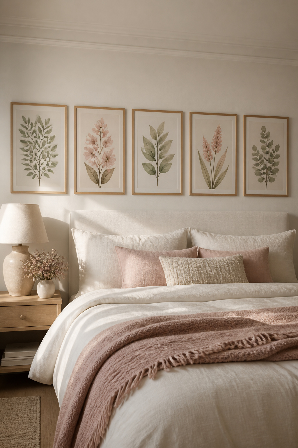
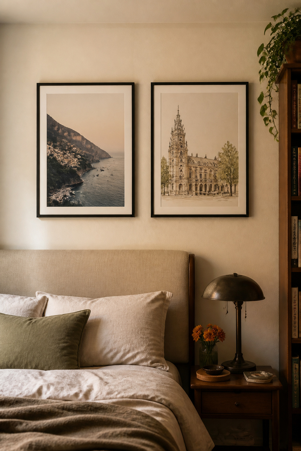
3. Gallery Walls With Bedroom Art Prints That Feel Curated, Not Cluttered
The gallery wall is both an opportunity and a trap in the bedroom. Done well, it creates warmth and layered intention. Done badly — too many prints, too many frames, too much variety — it becomes visual noise at the exact moment the room needs to be quiet.
Planning the Arrangement
Two to five prints above the bed is the functional range for a bedroom gallery. A diptych — two related prints, same size, same frame — is the simplest version and also the calmest; symmetry reads as settled. For layout, lay everything on the floor before making a single hole in the wall. Step back and squint — the arrangement should blur into a unified shape. If individual frames compete rather than group, the layout needs adjusting. Standard gap between frames: 4–5 inches. Bottom edge of the arrangement: 6–8 inches above the headboard. Total width: 60–75% of the headboard.
Frame Consistency and Colour Cohesion
The fastest way to make a bedroom art print gallery look intentional: one frame style, one finish. If you mix frame finishes, commit to two at most — natural oak and black, or white and brass. Three or more frame finishes tells the eye the collection happened by accident. Colour cohesion in the prints themselves matters equally — choose a 3–4 colour palette and make sure every bedroom art print shares at least one of those colours. For more ideas on what works at the wall level, bedroom wall decor ideas for better sleep covers approaches that go well beyond just art prints, including how art sits within the wider wall composition.
4. Watercolour Landscape Prints That Soften the Mood for Sleep
Watercolour landscapes are among the most consistently recommended bedroom art print types for sleep environments. The visual qualities of watercolour — diffuse edges, muted tones, soft colour transitions — mirror the psychological state the brain is trying to reach at the end of the day.
Cool, low-saturation colours reduce physiological arousal. Soft blues lower blood pressure and heart rate; sage greens reduce anxiety signals; muted lavender connects to deep relaxation. Watercolour paintings work in these colour families naturally, without the visual aggression of a saturated print.
Subject matters as much as colour. Mountain ranges in soft blue-grey create a horizontal sweep that implies spaciousness — valuable in smaller bedrooms. Coastal watercolours in soft seafoam and sandy neutrals work even in non-coastal homes. Misty forest scenes in sage and umber tones combine biophilic content with colour calm. What to avoid: anything with visual drama — storm scenes, crashing waves, saturated sunset skies all trigger alertness rather than rest.
Print quality is where watercolour reproductions vary most. Watercolour art loses more in poor reproduction than almost any other medium — the tonal subtleties collapse on cheap smooth photo paper. Look for prints on textured fine art paper at 200gsm or above, and specify giclée printing wherever possible. A warm-white paper ground reads more authentically than stark white for watercolour reproductions.
5. Black and White Photography as Art Prints for Your Bedroom Walls
A well-chosen black and white photograph is perhaps the most future-proof bedroom art print decision you can make. Strip away colour and the eye moves directly to composition, light, texture, and subject — often a more resonant engagement than colour art allows.
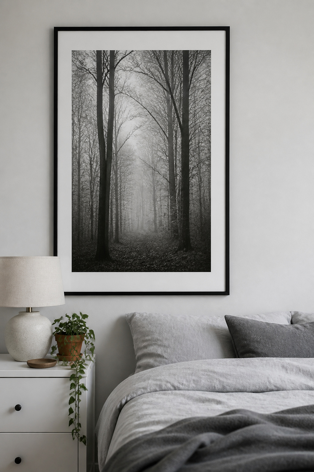
The practical advantage is obvious to anyone who’s redecorated a bedroom and had to rethink their art at the same time: monochrome photography works regardless of wall colour, bedding, or furniture changes. Interior designers consistently reach for it as the anchor piece in a bedroom for exactly this reason.
Subject choice requires more care in the bedroom than in shared spaces. Nature subjects — misty forests, bare winter trees, soft snow scenes, coastal landscapes with hazy horizons — carry biophilic calm even in monochrome and are the most restful option. Abstract architectural photography (light through a window, shadow patterns across a textured wall) suits minimal and contemporary rooms. Portraiture works best when the subject is personally meaningful; a generic portrait can create an unsettling sense of being observed in a sleep space.
Paper type separates a beautiful fine art print from one that just looks like a large photograph. Photo Rag Baryta — the modern equivalent of traditional silver gelatin prints — reproduces rich blacks beautifully with an elegant semi-sheen. Smooth Matte (100% cotton, fully archival) is flatter but preserves delicate mid-tones. Both outperform glossy photo paper, which creates reflections under bedroom lighting and makes the print look like a snapshot.
6. Earth-Toned Nature Prints That Match Grounding Bedroom Colour Palettes
The rise of earthy, warm colour palettes in bedrooms reflects something the nervous system genuinely responds to. Soft, muted tones in the ochre, terracotta, sage, and mushroom taupe family create warmth without stimulation. A bedroom art print in these tones reinforces the calming intent of the whole palette.
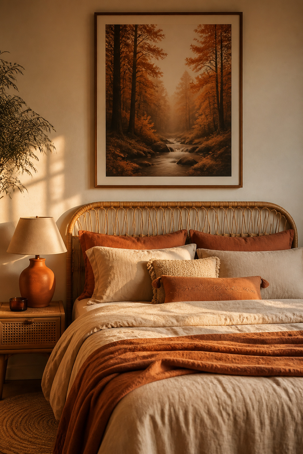
Art prints in these tones work best when connected to natural subjects rather than abstract colour fields. Desert landscape photography carries terracotta canyon walls and warm sand dunes authentically — these aren’t earth tones imposed on a subject, they’re the subject’s inherent colour. Autumn woodland photography spans ochre, umber, sienna, and sage in a single composition. Both give you the colour palette alongside biophilic content.
Pairing matters as much as the art choice. Linen bedding and terracotta prints share the same organic, warm quality — they amplify each other. Rattan furniture and jute rugs connect naturally to ochre-toned prints through shared warm undertones. Unpainted wood frames (oak or walnut) suit earth-tone art without creating the barrier that black frames produce.
One thing worth being specific about: the earth tones that work in a sleep environment are the dusty, muted, clay-like versions of these colours. A vivid terracotta bedroom art print looks energising. A burnt sienna or clay terracotta looks grounding. This distinction is often lost in online shopping — always read the seller’s descriptions carefully and, if possible, order a smaller test print before committing to large format.
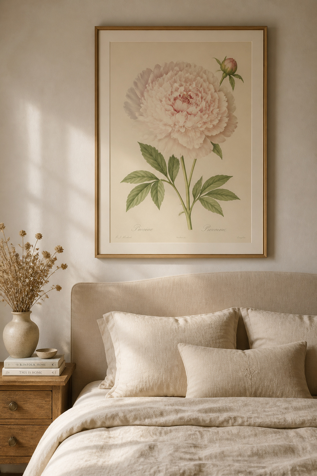
7. Vintage Botanical Illustrations for a Layered, Collected Bedroom Feel
There is a specific quality to antique botanical illustrations that modern prints rarely replicate. It’s partly the fine pen detail, partly the slightly warm paper tone of the original printing, partly the sense that what you’re looking at is both art and document. A Redouté peony from 1827 carries the weight of a specific place and time in a way that makes it feel permanently at home in a bedroom.
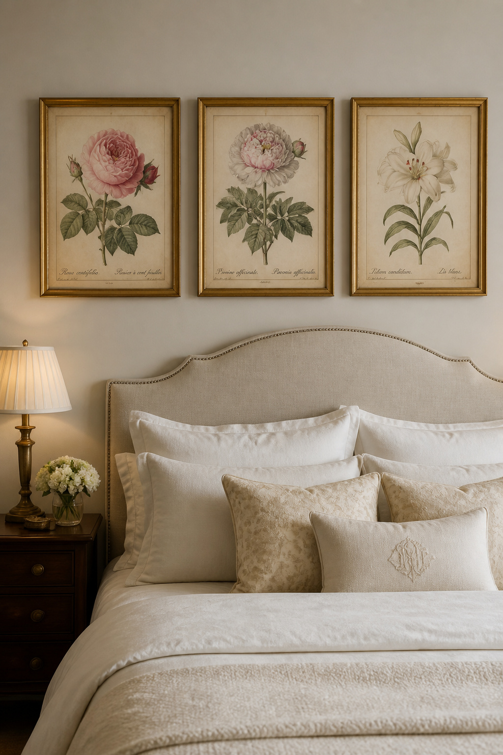
Pierre-Joseph Redouté (1759–1840) and Georg Ehret (1708–1770) are the two most important names in Western botanical illustration. Redouté’s rose and flower paintings are the most reproduced in interior design — his layered petal detail and gentle colour are immediately recognisable. Ehret’s work is more structural and scientific, with a clarity that reads as extraordinary precision. Both are public domain and available in high resolution through rawpixel.com, Pictureboxblue, and the Biodiversity Heritage Library.
Creating a curated feel requires resisting the urge to buy a matching set. Three illustrations that share a colour family but differ in subject — two roses and a peony — feel more collected than three identical prints from the same pack. Varying sizes slightly (8×10, 11×14, 8×10) compounds this effect, while matching frame finishes across all three create cohesion. Aged gold, warm brass, or natural oak all suit antique botanical content well. This approach to bedroom art also connects naturally to rustic bedroom decor ideas for warmth and character — the layered, collected quality runs through both.
At sizes below 8×10, the fine line detail in botanical illustrations is too compressed to read. For a hero piece, go to 11×14 or larger.
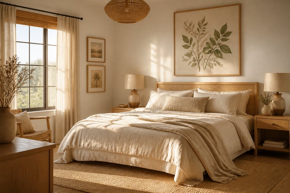
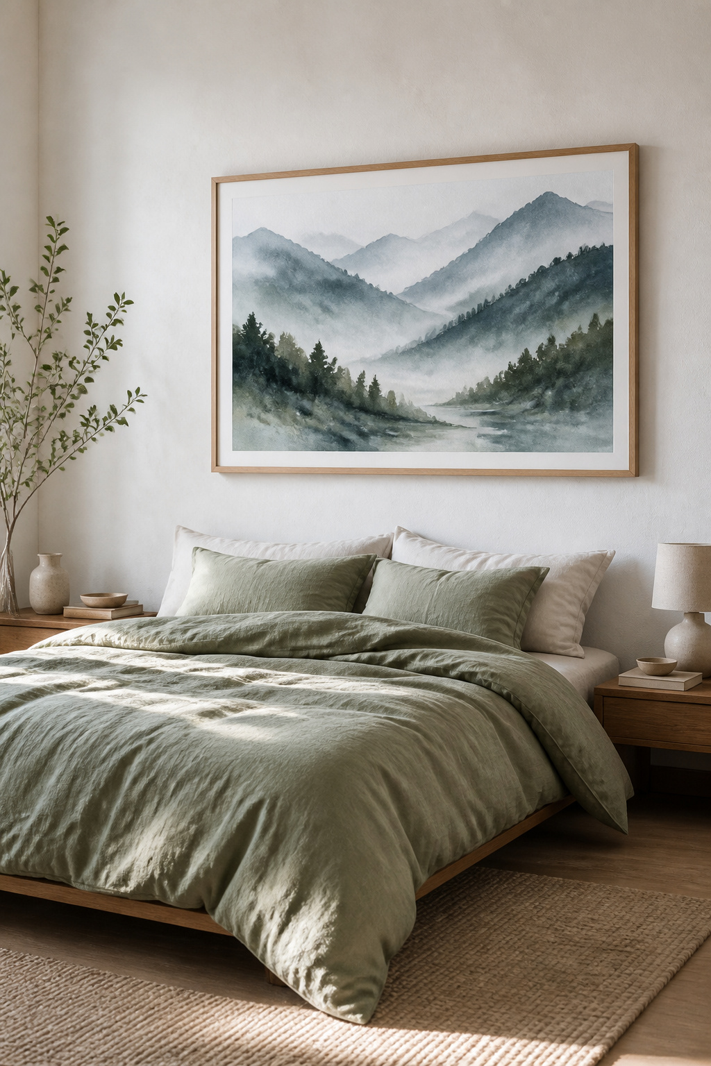
8. Oversized Bedroom Art Prints That Anchor the Room Without Overwhelming
A single large-format bedroom art print above the bed — the right subject, the right scale — does more for a bedroom’s atmosphere than most gallery walls. The 2/3 proportion rule is the design industry’s consistent standard: artwork width should cover 60–75% of the headboard beneath it.
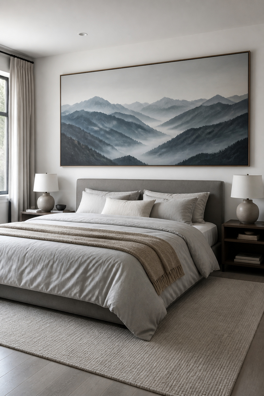
Getting the Scale Right
In practical terms: for a queen bed with a 60-inch headboard, you’re looking for art 40–45 inches wide. A 24×36 or 30×40 works. For a king bed at 76–80 inches, the target is 50–60 inches wide — either a 36×48 single print or two 20×30 panels side by side. Going wider than the bed itself creates a top-heavy imbalance that even a non-designer eye registers as wrong.
Subject and Hanging
Subject choice at large scale matters more than at smaller sizes. Watercolour landscapes and landscape photography work particularly well — a full mountain horizon or misty coastal scene gains genuine depth at 30×40 and creates something close to a window. Simple abstract prints with a clear compositional structure (a horizon line, a dominant colour field) anchor without demanding. Detailed, complex imagery gives the eye no place to rest and becomes visually exhausting at large scale.
Hanging correctly matters: the bottom edge of the frame should sit 6–8 inches above the top of the headboard. The common mistake is centering art at standard eye-level height, which disconnects an above-bed bedroom art print from the furniture it’s meant to relate to. For prints over 20 pounds, use two hanging points. For very heavy canvas prints above 40×60, find a stud or use proper anchor bolts.
9. Celestial Maps and Moon Phase Prints for a Mindful Bedroom Atmosphere
Moon phase prints have become so common in home décor that it’s worth asking whether the wellness context is real. It is. Research published in *Current Biology* confirms that human sleep synchronises with lunar cycles even in urban environments. Around the full moon, NREM sleep delta activity drops by 30%, time to fall asleep increases by five minutes, and total sleep duration shortens by 20 minutes on average.
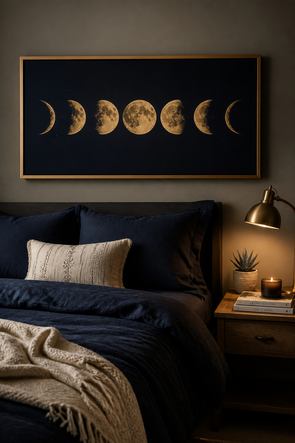
None of this means hanging a celestial bedroom art print will solve sleep problems. But it does mean that choosing this imagery is not purely decorative — it connects to biological rhythms in a way that most art subjects don’t.
The visual choices within celestial art are wider than they initially appear. Moon phase prints showing the eight phases are the most graphic and widely available. Custom star maps — showing the exact sky above a specific location on a specific night — are more personally significant; services like Mapiful and Positive Prints create these for $30–$120 on premium paper, and a print of the sky above the place you were born or the night you met your partner carries permanent meaning. Constellation charts are more detailed and suit analytical minds and masculine bedroom aesthetics particularly well.
For a wellness bedroom specifically, if you’re already exploring mindful boho bedroom ideas for a restorative space, celestial art is often already part of that vocabulary — the question is choosing quality over commodity. Moon phase prints on cheap glossy poster paper undercut the atmosphere entirely. Minimum 200gsm uncoated paper.
10. Soft Pastel Art for Bedrooms That Supports a Sleep-Ready Environment
Pastels occupy the most interesting territory in bedroom art print colour psychology. They retain the wavelength associations of their parent colours — blue calms, green reduces anxiety, lavender promotes relaxation — while removing the stimulation that comes with saturation.
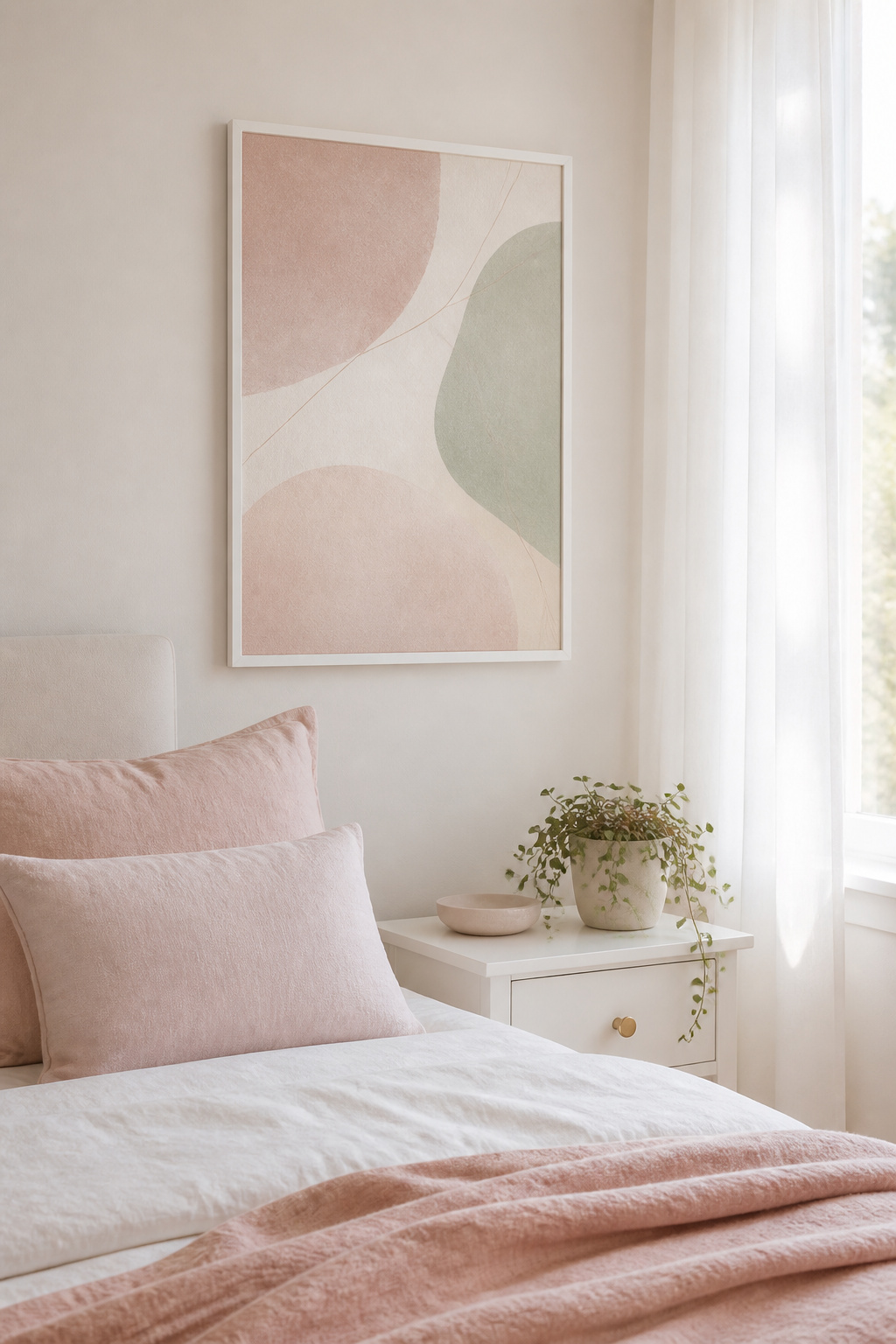
There’s an important clarification about how colour works in the bedroom: wall colour doesn’t emit light, so it doesn’t affect melatonin production the way your lighting does. What bedroom art colour does is affect psychological state through association and contrast response. Saturated, vivid colours increase alertness; muted, low-saturation colours reduce it. Pastels are the low-arousal version of colour.
The distinction between pastel abstract and pastel figurative art is worth thinking through. Pastel abstract prints (washes of colour, soft forms, no defined subject) are the most visually recessive option — they add colour without demanding attention. They suit minimal bedrooms where the priority is a quiet wall. Pastel botanical or figurative art adds more personality while remaining within sleep-compatible colour ranges; it suits warmer, more layered bedroom aesthetics.
Print quality matters more for a pastel bedroom art print than for high-contrast subjects. Cheap printing and the wrong paper make soft inks disappear. Look for giclée printing on warm-white or cream ground paper. A warm cream mat board around a pastel print prevents it from looking anaemic against a light wall. Always check whether the seller mentions print type — giclée is the minimum for pastel art — and order a smaller test print if uncertain.
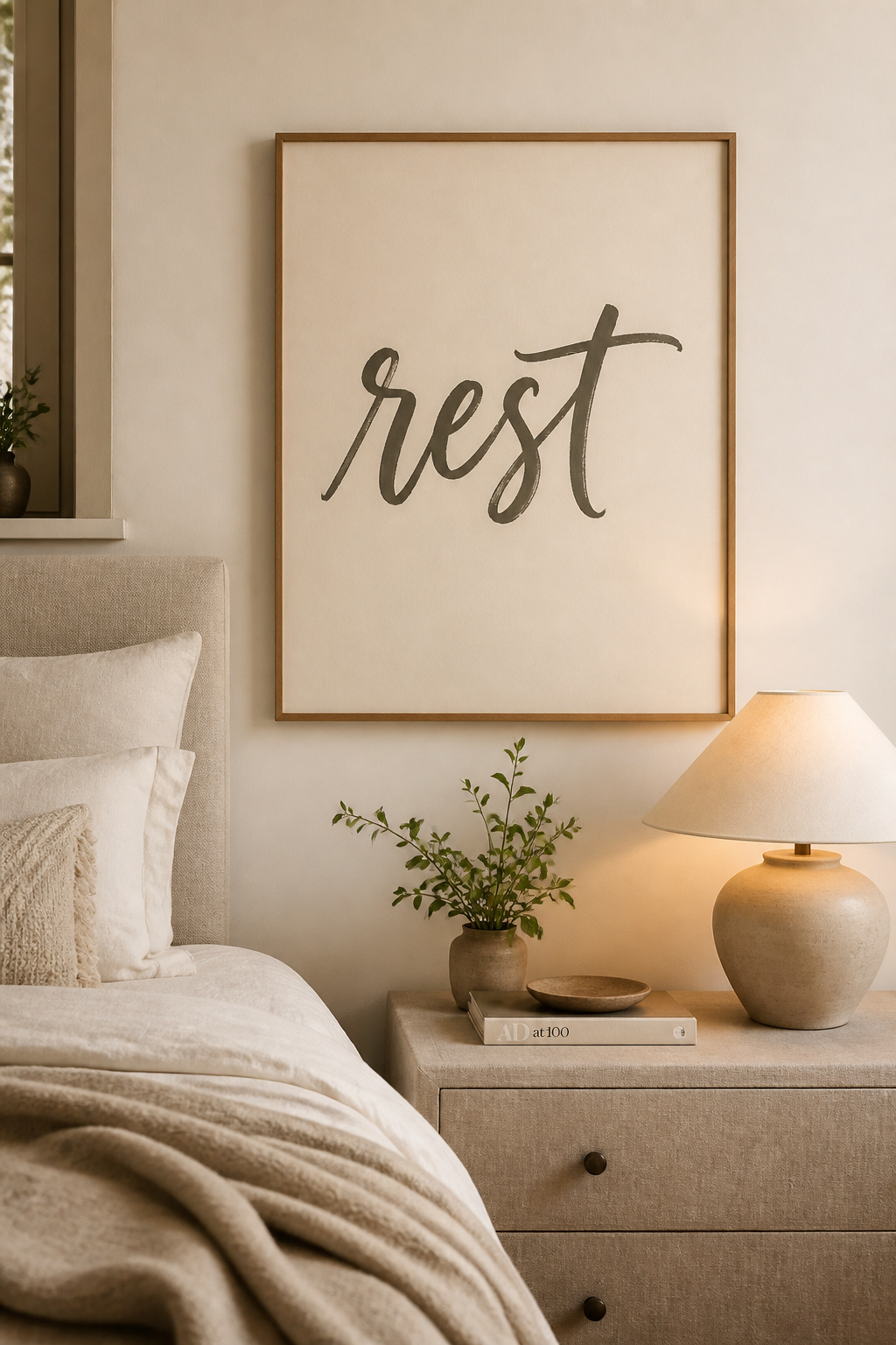
11. Affirmation and Text Art Prints for Bedroom Spaces That Feel Like Sanctuaries
The difference between affirmation bedroom art that actually works and art that becomes invisible within a week is the difference between words you chose because they’re trending and words you chose because they mean something to you.
Why Language Choice Matters
Environmental priming is real — exposure to words associated with a particular mental state activates related cognitive and emotional patterns. The bedroom is where this operates most intimately: seeing specific words in the last moments before sleep and the first moments after waking is a form of low-level, consistent intention-setting. For a wellness bedroom, bedroom interior design tips for deep sleep are often structural, but the text on the walls is part of the same conversation.
Choosing Words That Work
Sleep-focused language that validates rest — “you have done enough today”, “rest is productive”, “peace” — works differently than achievement-oriented language. Words like “grind”, “rise and shine”, “make it happen” are physiologically alerting and counterproductive in a sleep space, regardless of how well-designed the typography is. Hand-lettered or brush calligraphy feels warmer and more intimate than corporate sans-serif. A single meaningful word is more powerful in a bedroom than a full paragraph. The most enduring affirmation art for a personal space tends toward the poetic — a line from a poem, a word in another language, a phrase that’s genuinely yours.
12. Forest and Woodland Prints That Bring the Outside Into Your Bedroom
Shinrin-yoku — forest bathing, the Japanese practice of slow sensory immersion in woodland — has one of the most substantial wellness research bases of any nature-based practice. Developed in the 1980s, it’s backed by research showing reduced cortisol and adrenaline, boosted immune cell activity, decreased blood pressure, and improved heart rate variability, with effects persisting up to a week after a single session.
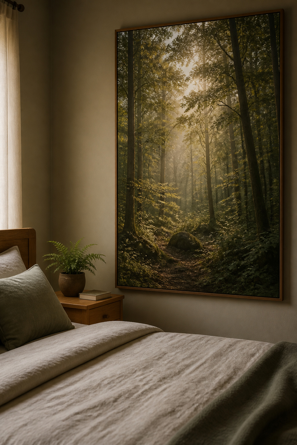
The relevant finding for bedroom art is what happens indoors. Research confirms that nature imagery produces similar neurological effects to actual forest exposure, though with reduced intensity. Viewing forest photographs activates similar pathways to actual forest immersion. For a bedroom that can’t have a view of actual trees, a well-chosen woodland bedroom art print is a genuine biophilic intervention.
The most important variable in forest prints is light quality. Soft, diffuse morning light through a canopy reads as restful. Misty forest photography obscures enough detail that the eye relaxes rather than explores. Hard midday shadows are visually demanding. Seasonal consideration: spring and summer greens feel renewing, autumn ochres and ambers feel grounding, bare winter branches suit a more meditative aesthetic. Avoid dense, dark imagery where the frame is entirely filled with shadow — this reads as claustrophobic.
Large format makes a meaningful difference — a 24×36 or 30×40 forest print creates a window-like immersive effect. Placement beside the bed rather than above it offers a view-from-the-pillow experience that compounds the effect.
13. Architectural and Map Prints for the Detail-Oriented Bedroom
Not everyone’s ideal bedroom art is soft and nature-based. For analytical minds — people who find satisfaction in precision, who love the intellectual pleasure of things that can be studied and discovered — architectural drawings and custom map prints offer a genuinely different kind of bedroom art experience.
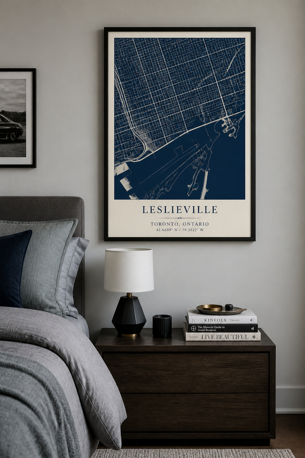
Blueprint-style prints (white lines on deep navy) sit at the intersection of technical and beautiful. They suit modern, industrial, or masculine bedroom aesthetics particularly well. For the right personality, the precision of an architectural drawing carries its own aesthetic authority — it’s a bedroom art print that rewards closer inspection, not just a glance.
City map prints have become significantly more personalised as custom services have developed. Mapiful, Positive Prints, and Craft & Oak allow you to specify any location, adjust colour scheme, and choose detail level. The personalisation is the key variable: a map of the city where you grew up, zoomed to neighbourhood level, is permanently meaningful. A generic world map is pleasant but impersonal.
The most effective map art in a bedroom is specific rather than broad. Choose the neighbourhood, not the country. Include the street that matters. A three-print set of meaningful locations — where you grew up, where you went to university, where you live now — creates a narrative. Placement beside the bed works well for map prints; they reward the close inspection available from a reading position.
14. Art Prints for Your Bedroom That Reflect Your Personal Story
Environmental psychology research is consistent on this point: personally meaningful objects in the home — photographs from significant trips, art by people you know, works that connect to specific memories — create stronger wellbeing outcomes than aesthetically chosen but personally neutral pieces.
The bedroom is where this matters most. It’s the most intimate space in the home — the one where you’re most genuinely yourself. And unlike living rooms and shared spaces, which need to accommodate other people’s comfort with your taste, a bedroom can handle full personal expression. Structural bedroom design decisions get a lot of attention, but the art layer is where the most personal choices live.
Personally meaningful bedroom art doesn’t require a bespoke commission. Your own travel photographs, printed at fine art quality through Artifact Uprising or Printique, become permanent bedroom art. A print of a poem or passage that has been genuinely significant — not trending text, but words you actually return to — carries its own authenticity. Art by an independent artist whose practice you’ve followed, bought directly from them on Etsy or at a local gallery, creates a genuine connection between you, the maker, and the work.
For commissioned custom work: Etsy illustrators offer custom house portraits and scene illustrations from around $50 to $500. Timelines run two to six weeks. The investment is different from buying a mass-market bedroom art print, and so is the result.
15. Limited-Edition and Original Art Prints Worth Investing In for the Bedroom
There is a meaningful distinction between a genuine limited-edition bedroom art print and a poster with “limited edition” in the product name. The actual definition: a specific total print run that the artist documents and commits never to exceed, with each print numbered and accompanied by a certificate of authenticity.
What makes a genuine limited edition worth the premium comes down to scarcity and documentation. Common edition sizes run from 25 (collector grade) to 250 (accessible limited edition). The combination of archival printing standards, documented edition number, and certificate of authenticity distinguishes a collectible print from a high-quality reproduction. As an artist’s reputation grows, early editions appreciate.
Print quality criteria: minimum 200gsm cotton rag (Hahnemühle Photo Rag or equivalent). Archival pigment inks rather than dye inks — rated for 100+ years of home display. The certificate of authenticity should state: artist’s name, title, year, print number (e.g., 12/50), edition size, paper and ink specifications, and artist signature. Without these details, the edition isn’t meaningfully limited.
For sourcing: Saatchi Art is the most curated platform for limited edition prints, with prices from $50 to $5,000+. Etsy offers more accessible price points — check rigorously for archival specs. Artsy handles the premium secondary market. Local galleries remain the best source for work you’ve seen in person, whose physical quality you’ve assessed directly.
16. Monochromatic Print Suites That Create Visual Harmony in the Bedroom
A print suite is not matching prints and it’s not mixed prints — it’s the more interesting middle ground. Two to five bedroom art prints sharing a single colour family, varying within it by tone, saturation, and shade. The result is visual unity with enough variation to hold genuine interest.
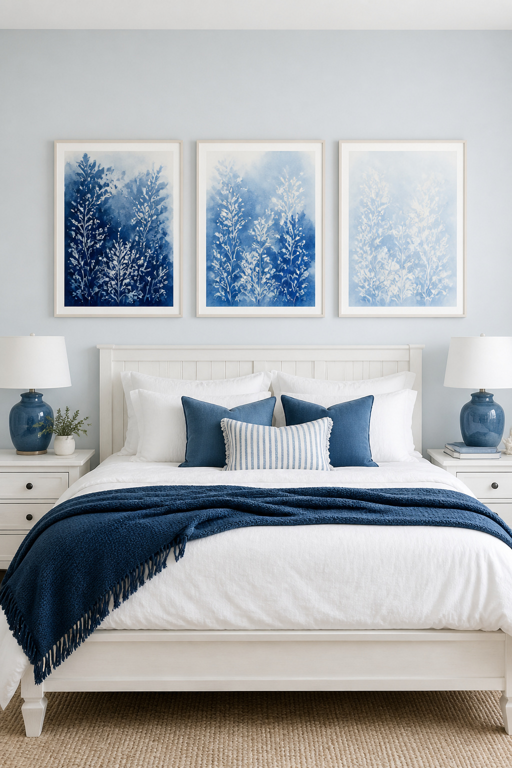
Choosing the Palette
Monochromatic art shifts the focus from colour contrast to other visual qualities: brushstroke, layering, tonal range, texture. This is exactly right for a bedroom — the visual engagement is present without the alertness-inducing quality of colour contrast. Blue suites — navy through cerulean to pale sky — have the most sleep research support and look stunning in natural light. Sage suites spanning deep forest green through to pale mint suit organic modern and Japandi bedrooms particularly well. Terracotta and warm-earth suites pair beautifully with natural materials. If your bedroom palette already leans blue, the luxe blue bedroom ideas for a restorative sanctuary on this site are worth reading alongside your bedroom art print choices — the palette in art should work with, not against, the palette in the room.
Arrangement
A horizontal row of three same-size bedroom art prints above the bed, 4–5 inches apart, is the cleanest presentation. For high ceilings, a vertical trio beside the bed. For hierarchy: a large central print flanked by two smaller ones — cohesion with structure. Frame all suite prints identically: same style, same finish, same mat colour. The specific failure to avoid: buying suite prints with no tonal variation — all the same shade of blue or all the same terracotta. You want the range from light to dark within the colour. That tonal progression is what makes a monochromatic suite genuinely beautiful rather than merely consistent.
Choosing the Right Bedroom Art Print for Your Space and Your Wellbeing
The through-line in everything above is this: the bedroom is not where you decorate most impressively. It’s where you design most intentionally. The bedroom art print you hang there will be the last thing you see at night and often the first thing in the morning — the hours when the nervous system is most receptive to environmental influence.
Practically: small bedrooms benefit from one large statement print or a simple diptych above the bed — gallery walls visually compress rooms that are already tight. North-facing or low-light rooms need lighter-ground prints that reflect available light rather than absorbing it. Existing warm palettes (creams, terracottas, natural wood) call for botanicals, watercolour landscapes, earth-tone prints, or vintage illustrations. Existing cool palettes work better with blue suites, black and white photography, and minimalist line art.
The most useful advice I give clients who are unsure: order a single bedroom art print and live with it for a week before buying anything else. Your eye needs time to tell you whether the choice is working. If a print makes you pause at the bedroom door with something that feels like recognition — that this is right — you’ve found it. Add more only if the wall genuinely asks for it.
Start with one. Choose it with intention. The rest can wait.