The history of kitchen tiles design is the history of how we have treated the most hardworked room in the house — with either the cheapest material available, or, in wiser periods, the most lasting. Walk into a Georgian farmhouse kitchen with its worn limestone flags, or an Edwardian terrace with its original penny round mosaic floor, and you understand immediately what it means to choose a material that outlasts the generation that installed it.
This is the distinction that matters. As someone who has spent years working on historic kitchen renovations, the single most revealing decision in any kitchen project is the tile choice — not because tiles are the most expensive element, but because they are the most permanent. Cabinetry can be repainted. Worktops can be replaced. A tiled floor or tiled wall that needs to come out represents days of damage limitation and significant cost.
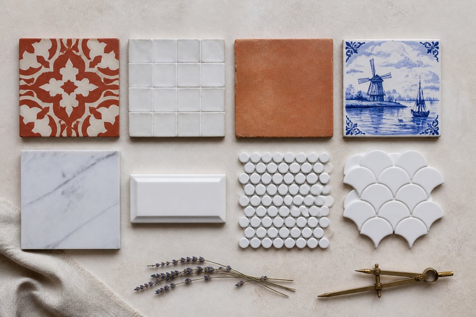
What follows is a guide to eighteen kitchen tile options that have earned their reputations, ranging from 10th-century Moroccan zellige to contemporary large-format porcelain that outperforms its historical predecessors by almost every measurable standard. Whether you are restoring an Edwardian terraced kitchen, renovating a modern open-plan space, or working somewhere between the two, these kitchen tiles design ideas are built to last.
1. Encaustic Cement Tiles: Bold Geometry for Kitchen Floors
When Herbert Minton re-invented the medieval encaustic process in the 1840s using hydraulic presses, he was solving an industrial problem — how to mass-produce geometric patterned tile floors that had previously taken skilled craftsmen months to lay by hand. What he could not have anticipated was that his solution would still be the defining choice for kitchen floors in Victorian restorations a hundred and eighty years later.
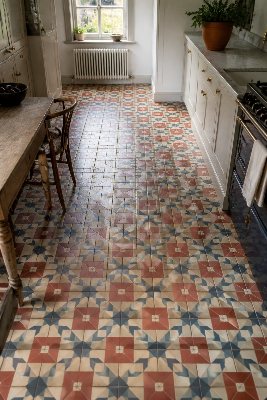
The process explains the durability. The design is pressed into wet clay with a metal mould, then filled with contrasting pigment slips before firing. The colour runs 3-5mm deep into the tile body — not painted on the surface. Worn encaustic tiles do not fade; they reveal a slightly different layer of the same design. Craven Dunnill Jackfield in Shropshire remains the only manufacturer of authentic hand-pressed encaustic ceramic tiles — and for anyone researching kitchen tiles design with a genuine Victorian brief, they are the first port of call, holding pattern archives from the original Victorian makers including Minton and Maw & Co.
For kitchen floors, a 15cm tile works in most spaces; 20cm suits larger open-plan kitchens. Limit patterned encaustic tiles to one plane — keep wall tiles, cabinetry, and worktops in solid colours to let the pattern breathe. Mix field tiles with plain border tiles in a coordinating colour to frame the design at skirting level.
Sealing and Long-Term Care
The one thing suppliers often omit: seal before grouting and again after. Use a penetrating impregnator rather than a surface film sealer — the film eventually peels. Annual resealing with a silane or siloxane-based product maintains the protection that has kept properly installed encaustic floors looking exceptional for 150 years. Moroccan cement encaustic, a separate tradition using Portland cement rather than fired clay, follows the same sealing logic: two-stage sealing is not optional.
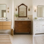
2. White Subway Tile Done Right: Proportions Matter in the Kitchen
George C. Heins and Christopher Grant LaFarge did not design the subway tile to be stylish. When they specified 3×6-inch white glazed rectangles for the IRT subway opening on 27 October 1904 — working with Grueby Faience of Boston and Rookwood Pottery of Cincinnati — the goal was purely functional: maximum light reflection in gas-lit tunnels. That a purely practical decision became one of the most lasting kitchen backsplash formats in history is a lesson in the staying power of honest design.
The 2:1 proportion, three inches high by six inches wide, mimicked existing brick coursing and was already familiar to builders. Period-correct subway tile has a bevelled edge that catches light and adds a subtle shadow line; flat-face versions common in budget ranges lose this dimensionality entirely, which is why the same pattern in different price categories reads so differently on the wall.
Grout, Layout, and Period Accuracy
Grout colour is the most impactful single variable. White grout creates a nearly seamless field; warm grey emphasises each tile as an individual unit; charcoal makes every tile a graphic element. Bright white grout on a floor-to-ceiling subway tile installation creates a clinical coldness that accessories rarely overcome. A dado height installation — tiles running 1.2-1.5m with painted plaster above — is more historically accurate than floor-to-ceiling coverage, and typically more interesting. Specifying a tile with slight glaze variation from makers like Mercury Mosaics or Fireclay introduces the life that uniform machine-made tiles lack.
For contemporary kitchen backsplash ideas that push the format further, the proportions and grout decisions above still do most of the work. Subway tile handled well is one of the most forgiving formats in the kitchen; handled thoughtlessly, it is the source of the most generic kitchen interiors of the last thirty years.
3. Terracotta Kitchen Tile: Provençal Warmth With Modern Durability
Few materials in the history of kitchen tiles carry the continuous biography of terracotta. The word means ‘cooked earth’, and the technique — forming clay, drying it, firing it — is genuinely unchanged from ancient Mediterranean building practice. French tomette tiles (hexagonal, 18-22cm across) have been produced in Provence and Burgundy without significant alteration since the 17th century. Spanish saltillo tiles from Saltillo, Coahuila in Mexico carry the Spanish colonial ceramic tradition forward with the most surface variation and warmest colour range of the three traditions. Italian cotto from Impruneta near Florence, fired from the same iron-rich clay since the Renaissance, commands the highest prices and the frost rating required for outdoor use.
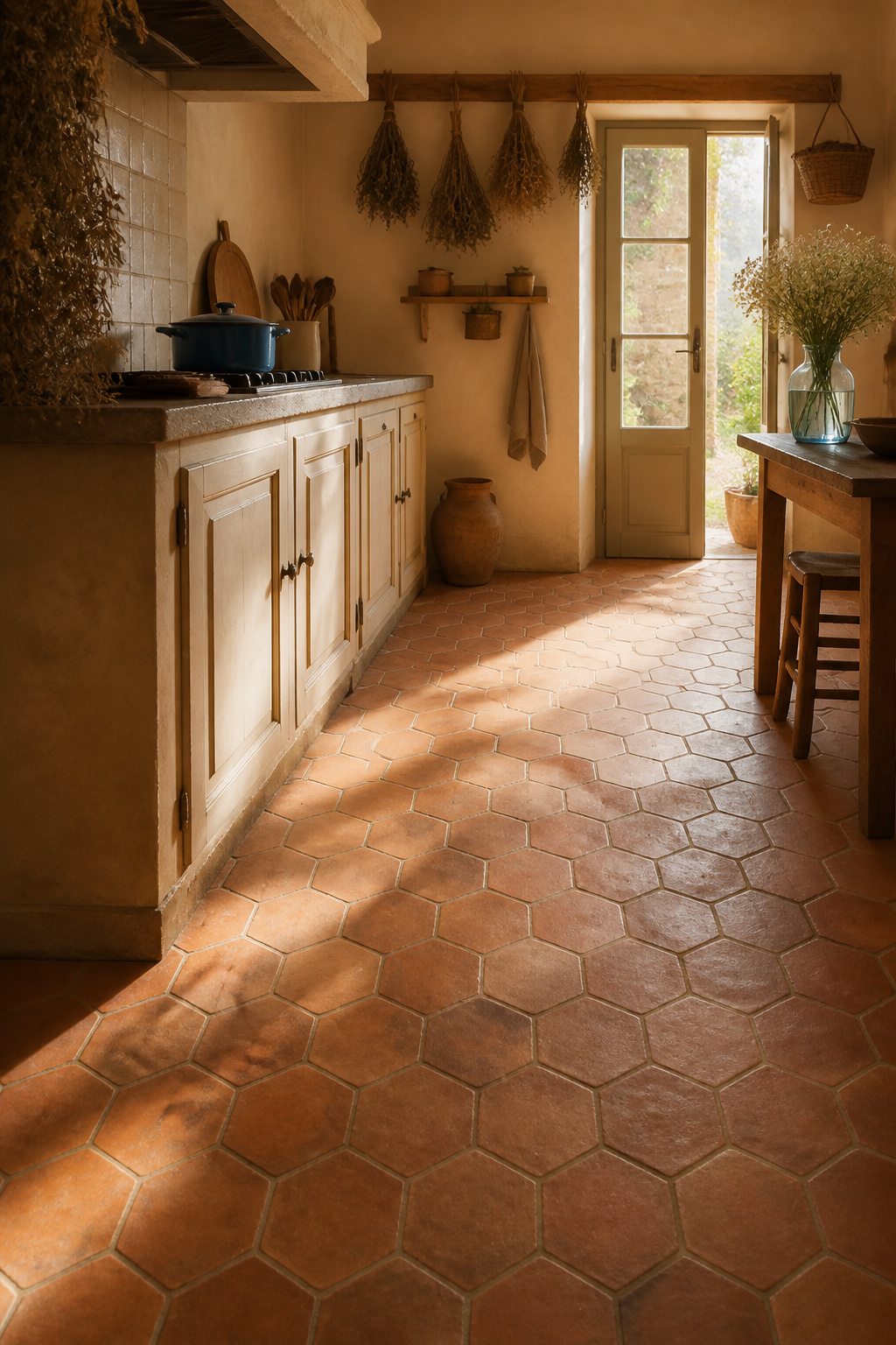
The material’s warmth comes from iron content in the clay body, not from any applied finish. This is why even heavily worn terracotta retains its characteristic colour. All three traditions produce tiles at 15-25mm thickness, significantly thicker than porcelain; this may require floor level adjustment at doorways — a consideration to design in from the outset.
Porosity is the central management question. Test an unsealed tile: if water absorbs within 15 minutes, begin with boiled linseed oil impregnation — not raw. Raw linseed oil stays sticky, attracts mould, and cannot be cleaned without stripping the floor. Boiled linseed oil applied warm at 2-5 coats, with excess wiped within 30-60 minutes, followed by a penetrating siloxane sealer, is the traditional approach. Modern silicone-based impregnators are equally effective if the traditional method seems daunting. Either way, the result is a floor that maintains the warmth and character of a centuries-old material while meeting the practical demands of a working kitchen.
4. Victorian Encaustic Pattern Tiles for a Backsplash Revival
The Victorian kitchen’s relationship with decorative tile is often misunderstood. It was not a universal enthusiast’s choice — it was the Aesthetic Movement of the 1870s and 1890s that pushed tile from the scullery floor into the kitchen wall. Manufacturers including Minton, Maw & Co., Godwin, and Malkin Edge developed wall tile ranges specifically for dados and splashbacks, responding to the movement’s argument that art belonged in every room of the house, not only the drawing room.
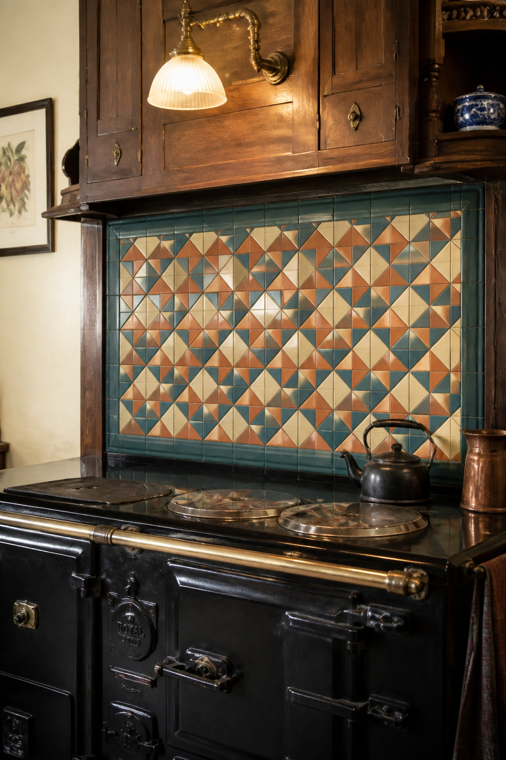
The standard format was 15x15cm (6 inches square), typically arranged in a repeating geometric pattern with a plain border tile. More ambitious installations used picture tiles — single decorative motifs — inserted into a plain field. The most practical application was the kitchen range surround: decorative encaustic tiles that also protected plaster from heat and steam. Victorian manufacturers produced specific ‘fireback’ ranges for exactly this purpose.
The critical choice today is between authentic hand-pressed reproductions and digitally printed imitations. Craven Dunnill Jackfield, which holds pattern archives from the original Victorian manufacturers, and Pugin Tiles (UK) supply from genuine Victorian pattern libraries. The distinction matters in practice: a digitally printed ‘encaustic-look’ tile has the design on the surface only — scratch through the glaze and the body is plain beneath. A genuine encaustic tile has pigment running 3-5mm into the body, producing a wearing quality that changes the relationship between the tile and time entirely.
For contemporary kitchens, this Victorian kitchen tiles design approach works best when the patterned tile is confined to a defined panel — behind the range, 60-90cm high — rather than covering every wall surface. Choose cabinet colours from the tile’s existing palette to contain the scheme.
5. Hand-Painted Delft Tiles: A 17th-Century Kitchen Tile Design Classic
The Delft tile’s journey to the European kitchen is one of the more improbable design stories in history. Portuguese and Spanish azulejo tiles carried the Moorish tin-glaze technique to northern Europe via trade routes in the late 16th century. Dutch potters in Delft, Rotterdam, and Haarlem took the technique and, inspired by Chinese Ming porcelain arriving in Amsterdam on VOC ships, reinvented it in cobalt blue on a white tin-glaze ground. At the height of production between roughly 1620 and 1750, Dutch factories used a technique called ‘pouncing’ — a pattern pricked with holes laid on the tile, dusted with charcoal to leave a visible outline, then painted over with cobalt and fired — to produce an estimated 800 million tiles. The numbers suggest something closer to an industrial revolution than a craft tradition.
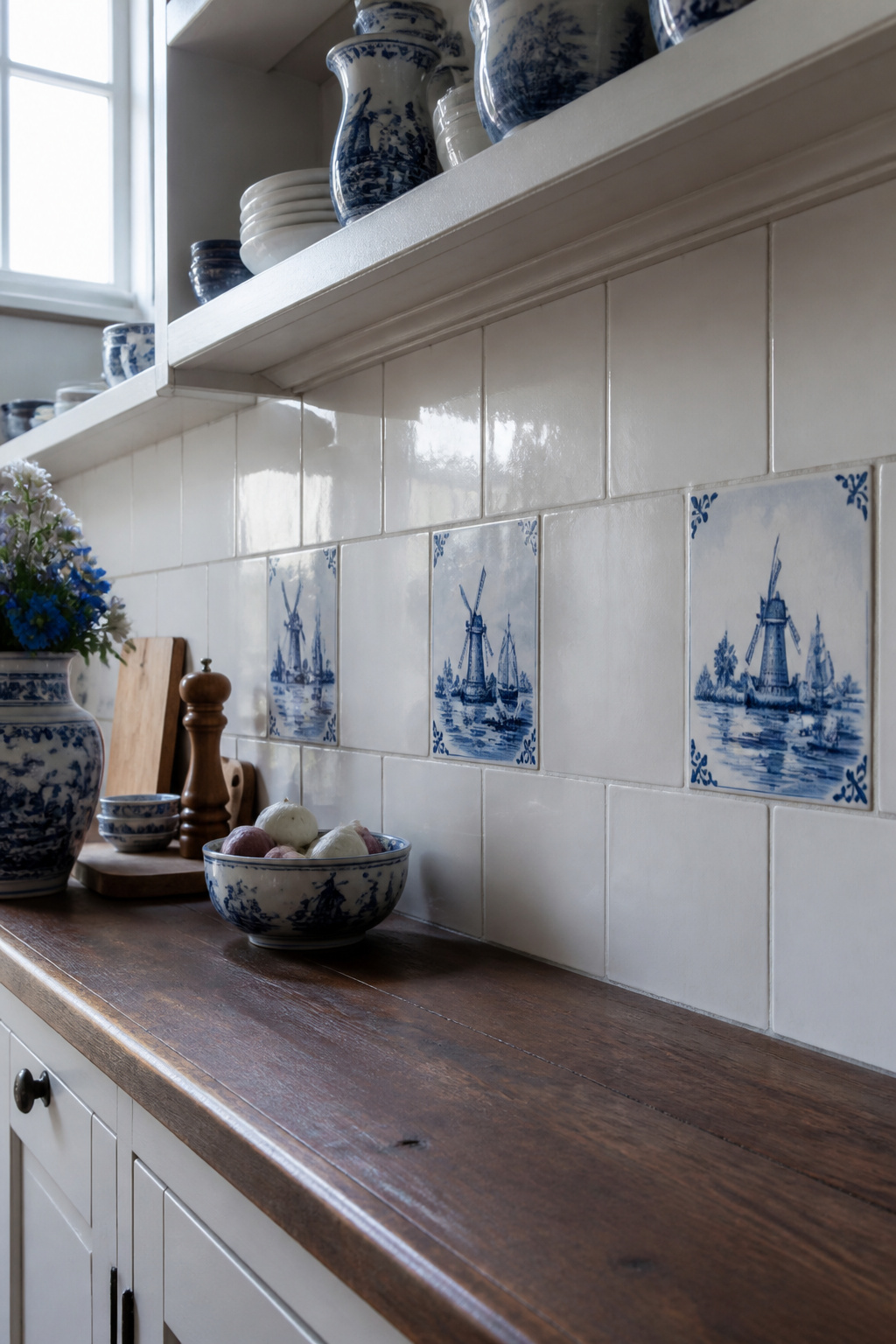
Period-correct Delft tile usage is unlike what modern reimaginings suggest. Picture tiles — pastoral scenes of windmills, sailboats, cattle, and biblical figures — were used as individual insertions in a plain white field at dado rail height, not as an all-over pattern. Individual tiles typically measure 13x13cm (5×5 inches). A border application — a single horizontal row of Delft tiles at the top of a splashback — is an elegant contemporary adaptation that references the period without replicating it literally.
Genuine hand-painted Delft costs between £40 and £120 per tile depending on complexity, from Dutch manufacturers including De Porceleyne Fles (Royal Delft, founded 1653). Transfer-printed replicas are immediately distinguishable by their machine-perfect uniformity. The originals show slight variation in brushwork, colour density, and a slight ‘crawling’ of the glaze at edges characteristic of tin-glaze firing. The investment in authentic tiles is the investment in the visual quality that cannot be replicated.
6. Natural Stone Kitchen Tiles: Limestone, Slate, and Sandstone
Of all kitchen tiles design options, natural stone is the only one that carries a genuine geological record. Pre-20th-century kitchens in farmhouses, manor houses, and urban townhouses used locally quarried stone — Welsh slate in Wales, York stone in the north of England, Purbeck limestone in Dorset — which gives those kitchens their specific regional character that no manufactured tile can simulate. The worn hollow in front of a range, the slightly polished path from door to worktop: these are the accumulated record of a house’s life.
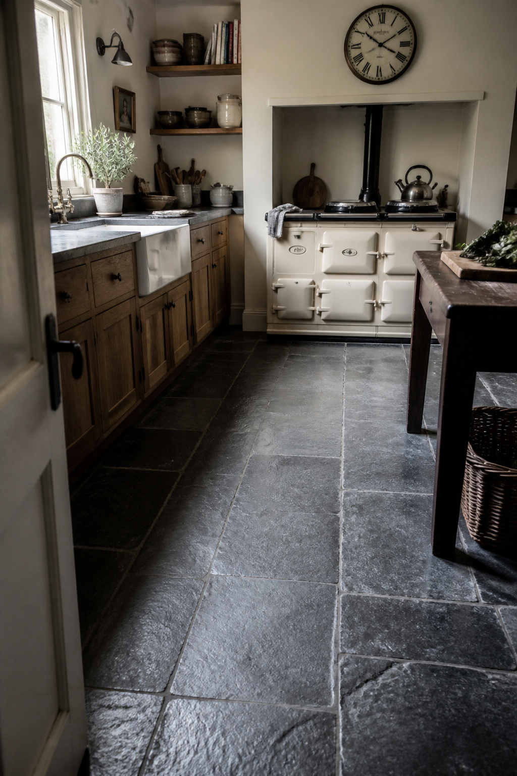
The three stone types most commonly specified in kitchen renovations offer genuinely different properties. Limestone (Mohs hardness 3-5) is warm and beautiful, and susceptible to acid etching — lemon juice, vinegar, and wine all attack the calcium carbonate surface, leaving dull marks. For a kitchen where acid contact is inevitable, this requires either strict discipline or accepting that the stone will develop a patina of honest use. Slate (Mohs hardness 5.5-6.5) has low natural porosity and is essentially maintenance-free once installed; Welsh slate from Penrhyn or Dinorwig quarries is the period-authentic choice for British kitchens and does not need sealing — applying sealer to slate can trap moisture and cause delamination. Sandstone (Mohs hardness 6-7) ranges from genuine quarried York stone to Indian buff sandstone, significantly cheaper but lacking the character of the original.
Stone floors in historic buildings are traditionally dry-laid on a sand bed or lime-mortar bed — never modern cement, which prevents the floor breathing and causes damp and frost damage over time. Understanding essential kitchen interior design principles helps frame why natural stone belongs in a category of its own: it is the only kitchen material that genuinely improves with honest wear rather than simply lasting it.
7. Zellige Moroccan Tiles: Handmade Character for the Kitchen Backsplash
No kitchen wall tile demands more of the person installing it, or rewards the effort more visibly, than zellige. The material originates in 10th-century Morocco as an adaptation of Byzantine and Roman mosaic traditions combined with Islamic geometric design principles, and the production method is essentially unchanged. Clay sourced from the hills surrounding Fez is sun-dried, glazed with mineral pigments, and fired in wood or gas kilns where uneven heat circulation creates tonal variation within a single colour. Each tile is then cut to shape by hand using the menkach — a medieval chisel-axe combination — by craftsmen who learn the geometry of Islamic tessellation over years of apprenticeship. The shapes are geometric: stars, octagons, crosses, lozenges.
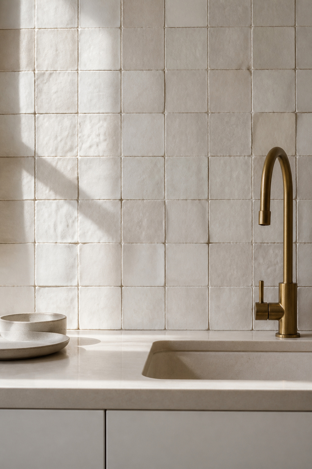
The variation that results — slightly irregular thickness (12-15mm with variation between tiles), a glazed face with micro-variations in colour and surface depth — is not a quality failure. It is the certification of the process. Machine-made ‘Moroccan style’ tiles are perfectly uniform in both dimensions and colour; genuine zellige from Fez is not. The Zellige de Fès quality label protects authentic production; importers My Moroccan Tile and Artzellige both supply certified product.
Zellige’s surface provides so much visual texture that surrounding materials must be restrained: plain-fronted cabinetry, no ornate hardware, worktops in a complementary tone. White zellige behind a range surround is perhaps the single most effective use of the material in a kitchen. For those considering the broader range of handmade backsplash options, modern kitchen backsplash ideas covers the alternatives that complement this kind of handmade character.
Do not use a generalist tiler for zellige installation. The irregular thickness and variable dimensions require a specialist; incorrect adhesive coverage produces hollow spots that crack under the thermal stress of normal kitchen use.
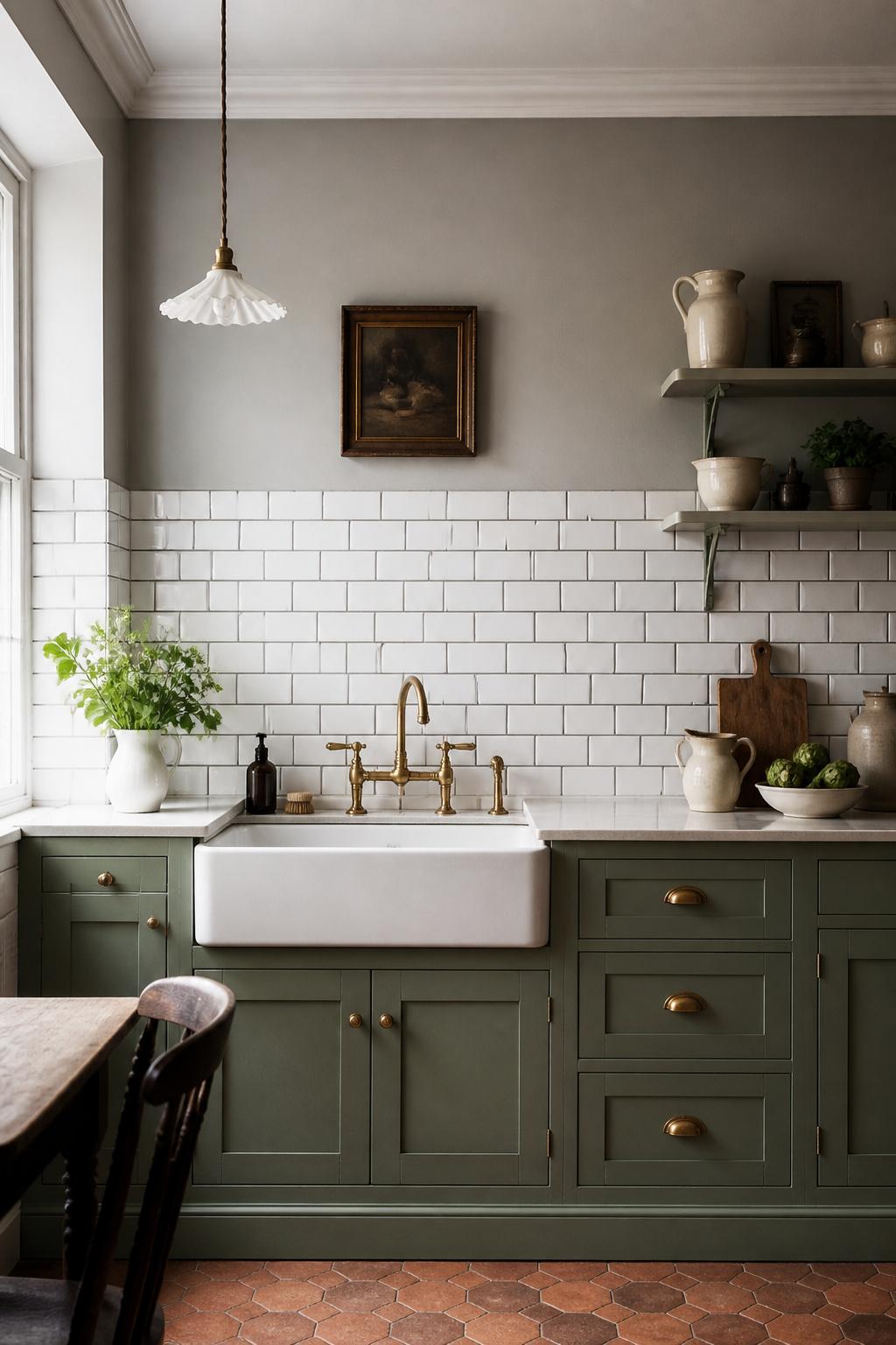
8. Brick Tile for Farmhouse, Industrial, and Rustic Kitchen Styles
Brick slips — tiles cut from genuine bricks to approximately 20-25mm thickness — occupy a useful middle ground between the abstraction of most tile formats and the materiality of actual construction. They bring the texture and colour variation of brickwork into the kitchen with a material sincerity that brick-effect porcelain cannot replicate, because they are actual brickwork, reconfigured into a tile format.
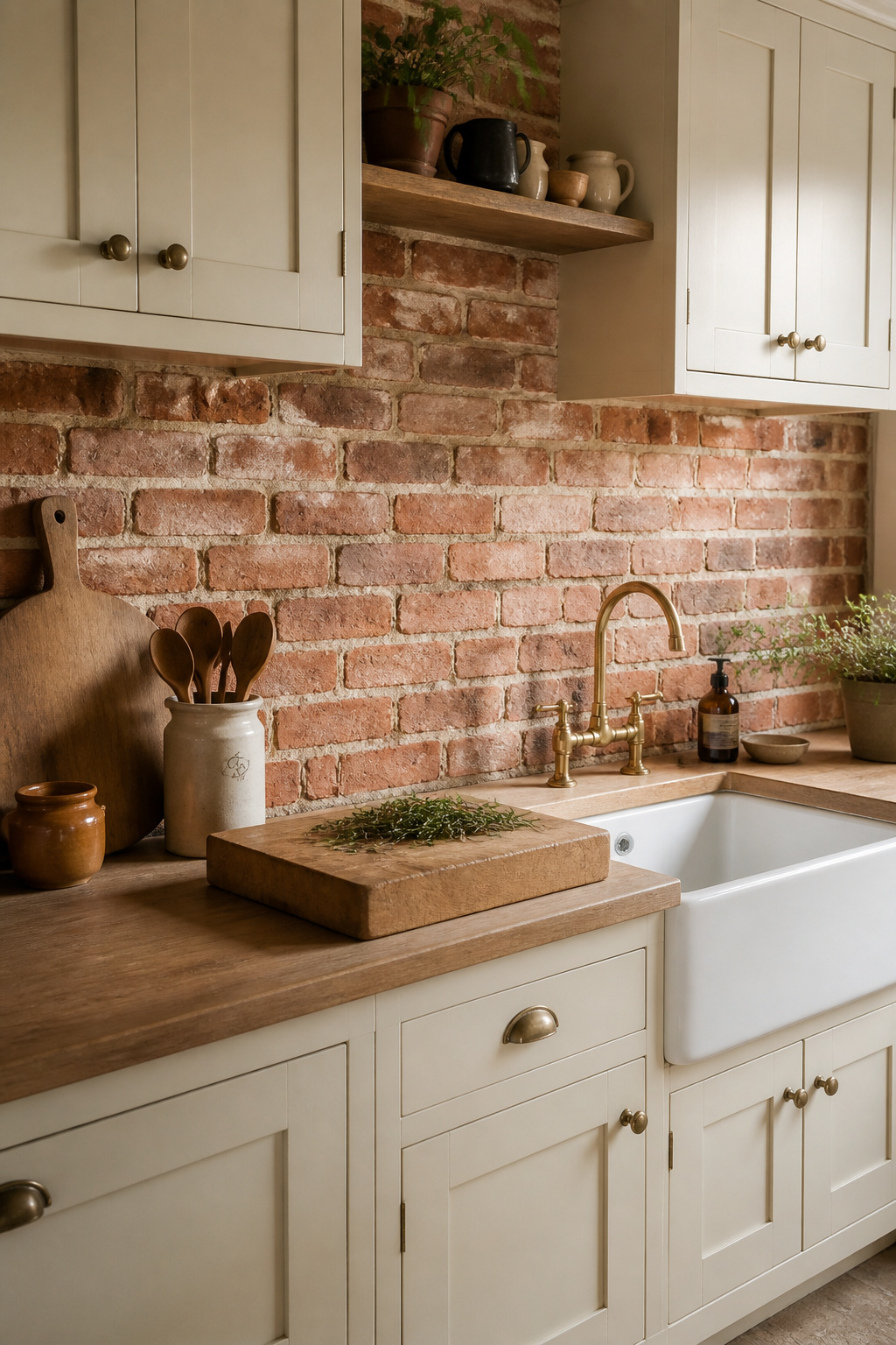
Reclaimed brick slips, cut from salvaged Victorian factories, Georgian terraces, or industrial warehouses, retain the naturally rounded arris (edge) and surface weathering that cannot be manufactured new. New brick slips, cut from freshly made bricks and sometimes tumbled to approximate reclaimed character, offer consistent sizing and colouration and present fewer installation challenges. In a genuine farmhouse or industrial conversion, reclaimed slips from the same region or period as the building are the period-appropriate choice. In a new-build farmhouse-style kitchen, new manufacture is entirely acceptable.
Standard 10mm mortar joints matching full brick construction are historically correct; lime-based pointing mortar gives the most authentic texture for a splashback application. Running bond — each course offset by half — is the appropriate pattern for farmhouse and industrial kitchens. The material vocabulary that brick slips should complement rather than compete with.
Sealing is essential for any brick kitchen tiles design: brick is porous and absorbs cooking grease without a silane/siloxane-based impregnator. Avoid acrylic or polyurethane film sealers — they trap moisture and eventually cause spalling. For a broader survey of kitchen tiles design in the farmhouse idiom, the team at Decorangle have assembled 24 ideas that span the full range of options in this style.
9. Marble Kitchen Tile: Choosing Between Honed and Polished Finishes
Marble is calcium carbonate. This is the essential fact that governs every decision in a kitchen that uses it, and the fact that most tile suppliers under-emphasise when presenting the material’s considerable attractions.
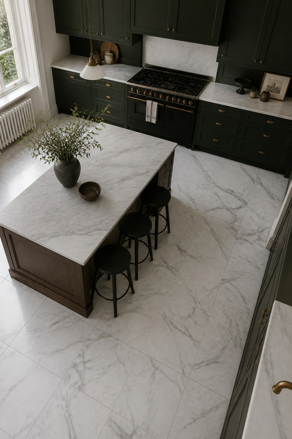
Georgian townhouse kitchens used Purbeck limestone and black-and-white marble flag floors — typically 60x60cm slabs, unpolished, dry-laid. Carrara marble, quarried in Tuscany since Roman times, became the prestige choice for Victorian kitchen worktops and floors; its white body with grey veining set the visual benchmark for kitchen marble that persists today. Statuary and Calacatta offer more dramatic veining at 3-5 times the cost of Carrara for the same tile format.
The finish decision is more consequential in a kitchen than anywhere else. Honed marble — matte surface, ground but not polished — is the right choice for the vast majority of kitchen floor installations. It hides etch marks (which appear as dull patches on a polished surface but are nearly invisible on honed) and provides better slip resistance when wet. Polished marble on a kitchen floor is high-maintenance: any acidic spill — lemon juice, wine, vinegar, tomato — etches the mirror surface immediately and visibly.
The critical point: sealer prevents staining, not etching. Sealer blocks liquid from penetrating the stone body but does nothing to protect the calcium carbonate surface from acid attack. Most suppliers gloss over this distinction, and it is the most common source of buyer disappointment with marble kitchen floors. For kitchen countertop design ideas that address how marble works alongside other worktop materials, the floor-to-worktop relationship is equally governed by this chemistry. Honed marble, resealed every 6-12 months with a penetrating impregnator, is a commitment to a material that rewards that commitment over decades.
10. Arts and Crafts Ceramic Tiles for the Craftsman-Style Kitchen
The tiles associated with the Arts and Crafts movement are, in a literal sense, an argument in ceramic form. William Morris founded the movement partly as a rejection of the mechanically perfect encaustic tiles being mass-produced by Minton — the very perfection that made Victorian manufacturing impressive was, for Morris, the evidence of its failure. The aesthetic of the hand, with its gentle imperfections, was the explicit alternative.
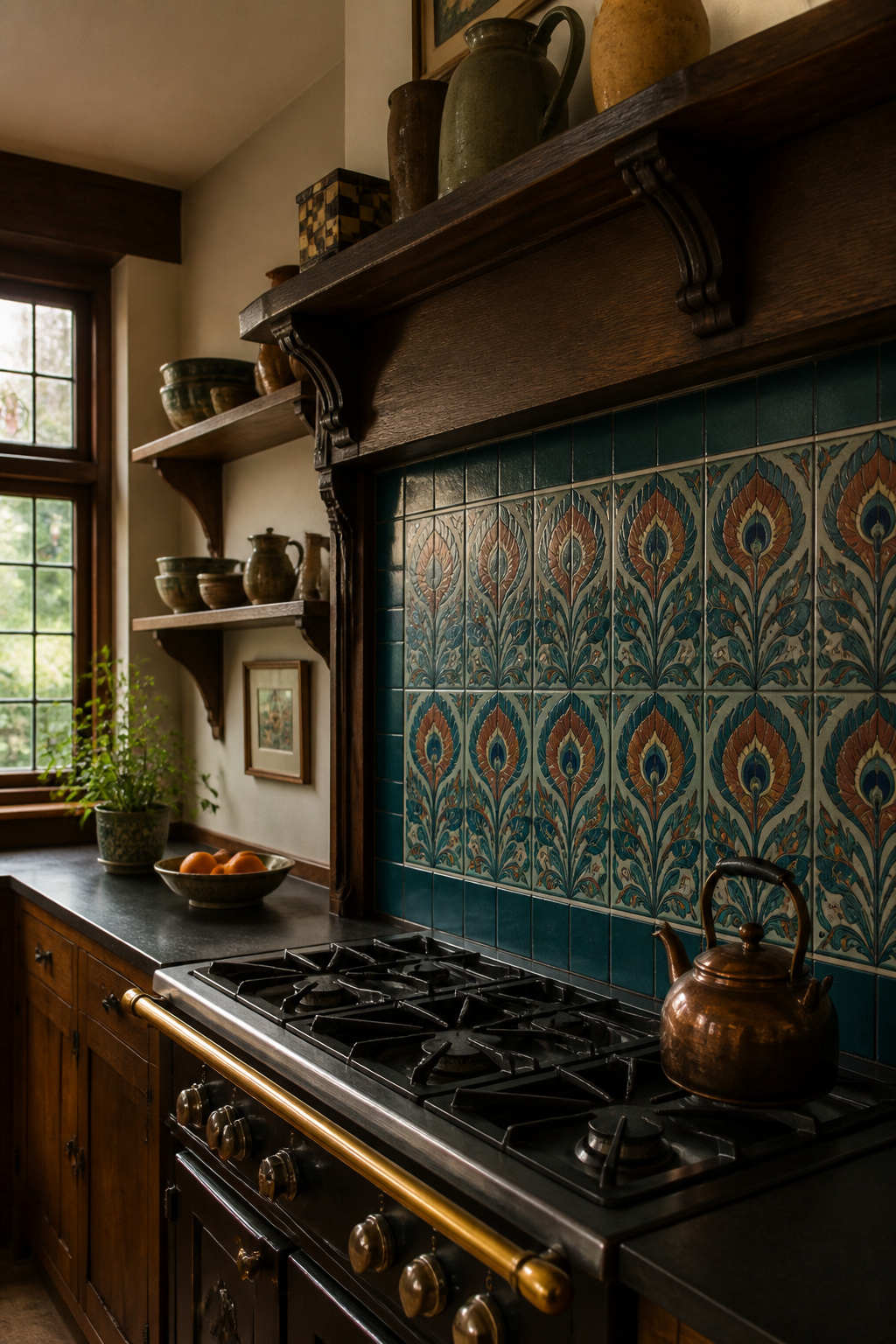
William De Morgan (1839-1917) is the movement’s defining tile maker. Working from studios in Chelsea, Merton Abbey, and eventually Sands End, Fulham (1888-1907), he specialised in lustre glazes derived from Persian and Moorish techniques — a palette of teal, cobalt, manganese, and deep rust orange that is immediately recognisable. His motifs — stylised foliage (hawthorn, lily, rose), peacocks, fish, deer, and medieval heraldic devices — are the visual vocabulary of the movement in ceramic form. Other significant manufacturers include Pilkington’s Tile and Pottery Company (Manchester) with its Royal Lancastrian range in matte olive, umber, and sage; Della Robbia Pottery (Birkenhead); and W. B. Simpson & Sons (London).
The defining technical marker of Arts and Crafts kitchen tiles design is the matte glaze — a deliberate rejection of the commercial sheen of industrial production. Most Arts and Crafts tiles are 15x15cm; De Morgan also produced 22x22cm tiles for dado panels and fireplace surrounds. The colour palette is the other clear marker: never primary colours, always complex mixed tones derived from mineral pigments.
Where to Source Arts and Crafts Tiles
Original De Morgan tiles appear at auction via Bonhams and Christie’s at £80-£400 per tile, £2,000-£20,000+ for framed panels. For kitchen renovations working with authentic principles on a realistic budget, Heath Ceramics (USA), Ruskin Pottery (West Midlands), and Fired Earth (UK) all produce matte-glaze tiles that honour the movement’s intentions without requiring auction-house prices.
11. Glazed Terracotta Wall Tiles in Earth Tones and Saffron
Spanish and Portuguese kitchens of the 16th through 19th centuries solved the kitchen wall problem decisively: tile the whole thing, in glazed terracotta, with colours taken from the land it came from. Talavera tile takes its name from Talavera de la Reina, where Moorish tin-glazing techniques fused with Spanish ceramic traditions in the 16th century. Spanish colonists transferred the technique to Puebla, Mexico in the early 17th century, where it developed its own vocabulary of deep saffron, burnt sienna, cobalt blue, leaf green, and warm ivory — all from mineral pigments on a cream-white ground. Portuguese azulejo tradition — the word derives from the Arabic azul — reached its domestic kitchen peak in elaborate blue-and-white pictorial panels covering entire kitchen walls in 18th-century manor houses and convents.
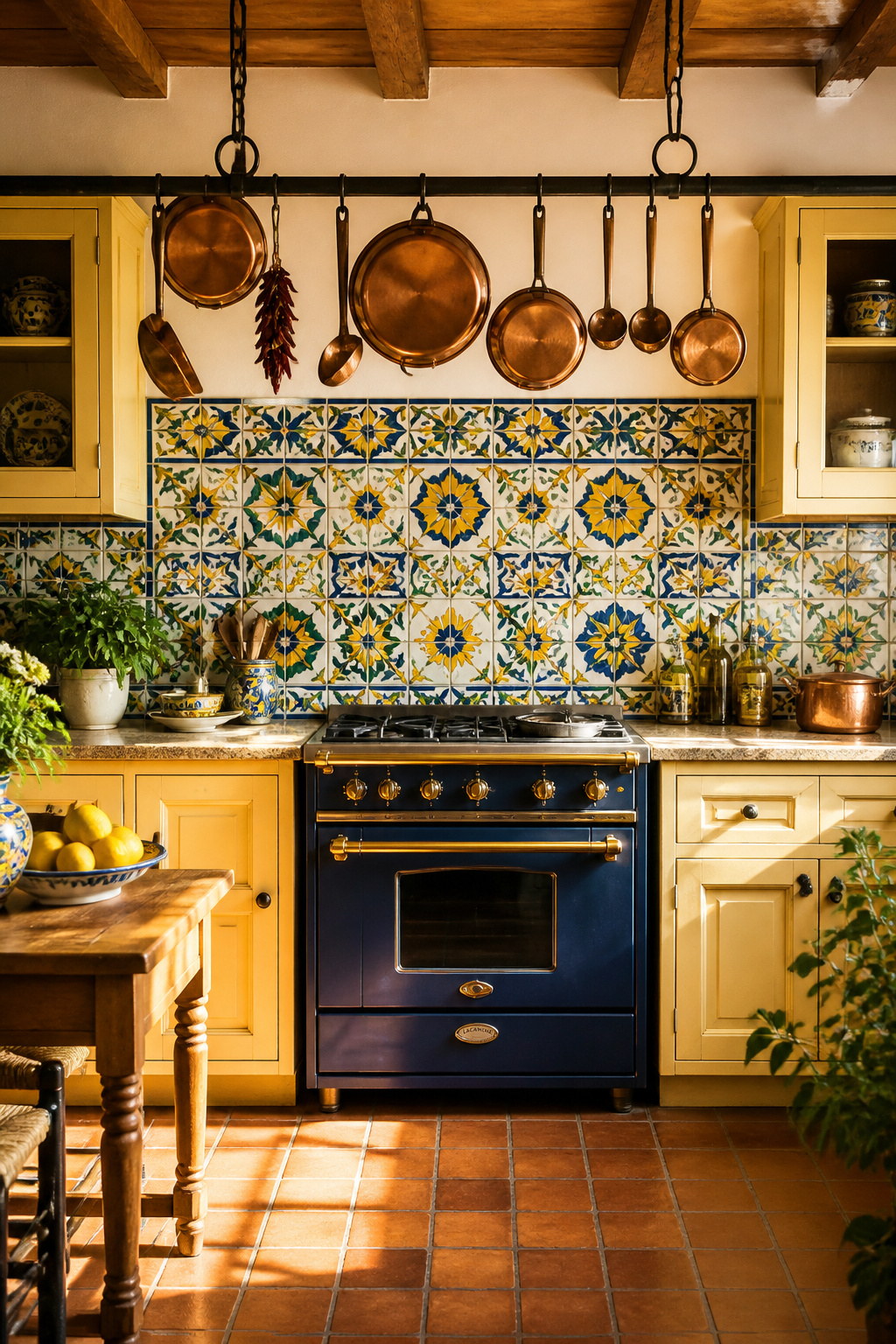
The chromatic range of this glazed terracotta kitchen tiles design tradition is warmer than almost any other tile family. Talavera’s combination of warm and cool tones on a cream-white ground gives it an exuberance entirely unlike the restrained coolness of a white subway tile. Glazed cotto tiles from Florence, Umbria, and Sicily tend toward amber, ochre, and sage — less elaborate but equally effective in a Mediterranean-influenced kitchen.
Colour Coordination and Pairings
Colour coordination is specific here. Glazed terracotta’s warm tones pair naturally with natural wood, unpainted stone, and aged brass. They clash with stainless steel, cool greys, and contemporary white cabinetry in ways that resist resolution. The traditional Spanish pairing — glazed wall tiles against unglazed saltillo floor tiles — works because the relationship between the glaze colour and the raw clay body is the underlying design principle: vary the surface (glossy wall against matte floor) while maintaining the tonal family. Use glazed terracotta in controlled applications — one splashback run, a single dado — against plain plaster or stone rather than on every surface.
12. Concrete-Look Porcelain: A Modern Kitchen Tiles Design That Lasts
The practical problem with real concrete kitchen floors has always been the same: porous, prone to cracking, requiring sealing, and visibly stained by cooking fat within the first year of use. Large-format concrete-effect porcelain, developed from the early 2000s alongside digital inkjet printing technology, solves every one of these problems while preserving the visual language that makes concrete floors compelling in contemporary kitchen design.
Fully vitrified porcelain tiles have water absorption below 0.5% — for comparison, natural stone tiles typically run 1-6% absorption. Digital inkjet printing, now producing resolution above 400 DPI, reproduces the tonal variations and surface irregularities of raw concrete at architectural scale in a way that earlier screen-printing processes could not. The result is a kitchen floor that performs better than the material it references, by almost every measurable standard.
Two technical details matter for large-format installations. Rectified tiles — mechanically ground after firing to tolerances within 0.5mm — allow grout joints as narrow as 2-3mm, creating the near-seamless look that makes large-format concrete-effect tile so effective. Calibrated tiles (sorted but not ground) have 1.5mm variation and need 3-5mm joints. For PEI abrasion rating: minimum PEI 3 for domestic kitchens, PEI 4 recommended for high-traffic open-plan kitchen/diners.
The risk with concrete-look porcelain is a clinical result. Pale grey tile with thin white grout joints, white cabinetry, and stainless steel reads as a commercial fit-out, not a domestic kitchen. The correction is warmth through contrast: natural wood open shelving, aged brass or bronze hardware, a raw linen blind, natural fibre rugs. For detailed guidance on maintaining this balance, the guidance on avoiding the clinical result covers precisely the interventions that prevent a contemporary kitchen from reading as institutional.
13. Penny Round Mosaic Tiles for Kitchen Floors and Splashbacks
The penny tile owes its name to a geometric coincidence: the 1-inch (25mm) diameter matched a penny coin, and the comparison stuck immediately. Penny round tiles became standard in the kitchens and bathrooms of Edwardian middle-class houses from around 1900, valued for their hygiene associations, their high grout-joint-to-tile-surface ratio (which provides excellent slip resistance), and their association with the hospitals, commercial kitchens, and public lavatories where cleanability was paramount.
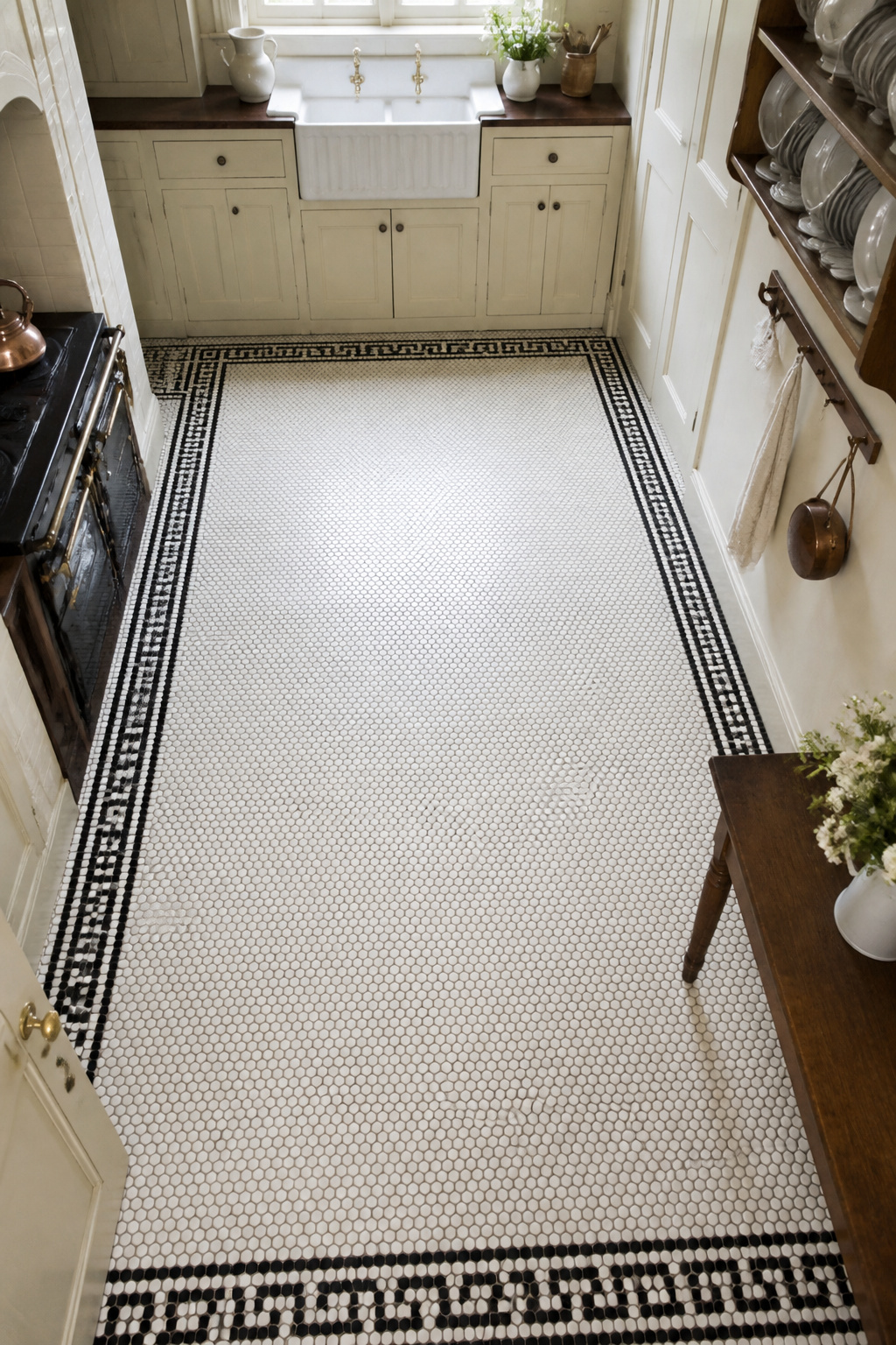
White porcelain was the overwhelming majority of Edwardian kitchen tiles design production. The colour, in the early 20th century, represented cleanliness and modern domestic science. Black-and-white combinations — a white field with a border or geometric pattern in black — came slightly later as a decorative elaboration of the pure white field. This remains the most authentically period application and still reads well in Edwardian and early 20th-century house kitchens.
The installation logistics are specific. Penny rounds are supplied on 300x300mm mesh-backed sheets — 120-200 tiles per sheet — which must be dry-laid before adhesive to check pattern continuity, particularly at sheet joints. The total grout joint length in a penny round floor is vastly greater than in a large-format floor: expect approximately 3 times the grout by weight for the same area. Epoxy grout is advisable in kitchens for stain resistance. The most common installation failure is grout that does not fully fill the joints between small tiles — inadequately filled joints trap bacteria and are almost impossible to clean in a kitchen environment.
Contemporary updates that preserve the period reference include pale sage green, dusty blue, or warm terracotta penny rounds in a white field. Avoid highly saturated primary colours — they read as playful rather than period and sit uneasily with the inherent sobriety of the Edwardian format.
14. Handmade Studio Ceramic Tiles: Embracing Intentional Variation
The small-batch studio ceramics sector has produced genuinely distinct kitchen tiles design options since approximately 2010, driven by consumer appetite for handmade goods and a reaction against the uniformity of digital-print porcelain. Heath Ceramics in San Francisco and Fireclay Tile in California — the latter B-Corp certified with a made-to-order service — are the best-known American producers. Fired Earth, Claybrook Studio Tiles, and Ruskin Pottery (West Midlands, continuing the Arts and Crafts tradition) serve the UK market.
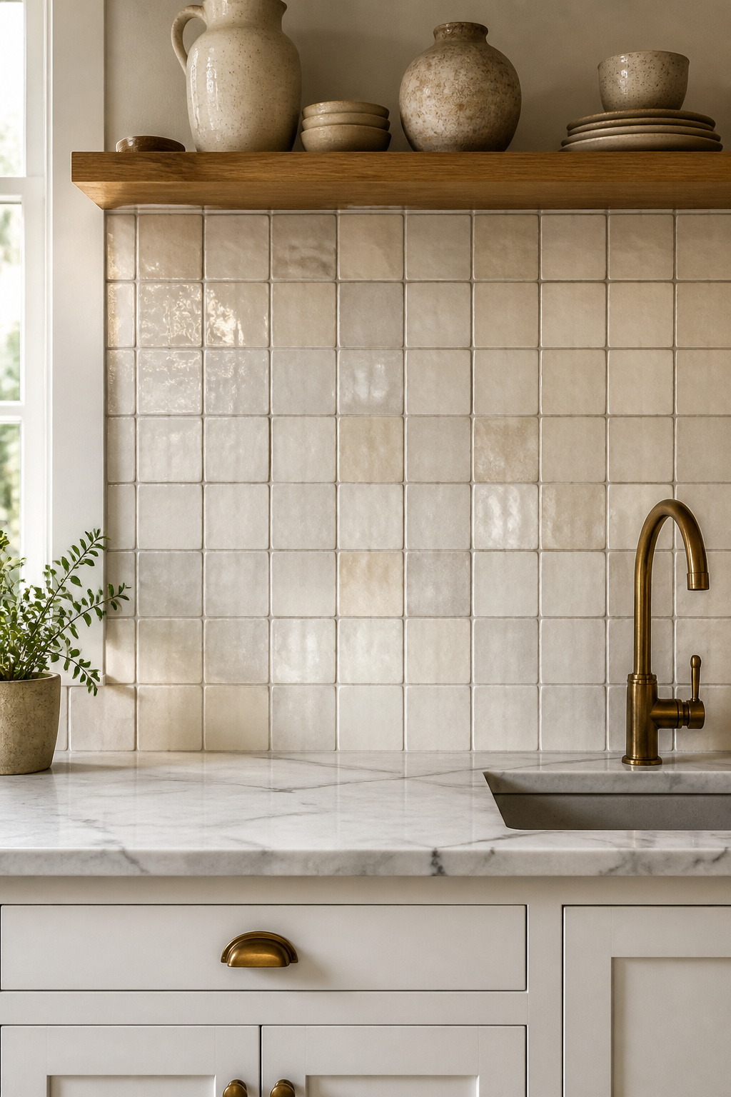
Heath Ceramics rates glaze variation from 1 (minimal) to 5 (very high tonal and hue shifts); Fireclay uses a V1-V4 scale. Both systems exist to help clients understand, before ordering, the degree of variation they will receive. The variation itself arises from kiln heat distribution, the iron and mineral content of individual clay batches, and the physical inconsistency of hand-applied glaze — forces of the making process, not manufacturing defects.
Ordering, Lead Times, and Installation
There are several logistical realities that separate a successful handmade tile installation from a difficult one. Order 10-15% more tile than the calculated area; matching a later batch is often impossible when the original glaze run is exhausted. Open all boxes before installation begins and draw from every box simultaneously — different batches may have slight tonal differences, and mixing from the start prevents colour banding. Allow grout joints of 5-8mm to accommodate the 2-3mm dimensional variation of handmade tiles; narrow joints produce uneven grout lines.
Tell the contractor what they are installing. Contractors unfamiliar with handmade tile interpret variation as a delivery problem and may reject tiles on site. The specification should explicitly note the expected variation range and direct the installer to the manufacturer’s guide before work begins. Lead times for small-batch handmade tile run 6-16 weeks; this must be factored into kitchen project programmes without exception.
15. Oversized Porcelain Slabs as a Kitchen Floor Tile Statement
The numbers tell the story of how large-format kitchen tiles design has evolved. In the early 1990s, the standard kitchen floor tile was 300x300mm. By 2010, 600x600mm was the residential norm. Today, 600x1200mm and 800x800mm formats are mainstream in kitchen/diner spaces. This is not a trend driven by aesthetics — it is a shift in what large-format manufacturing can now deliver at residential prices, driven by improvements in kiln technology and pressing equipment.
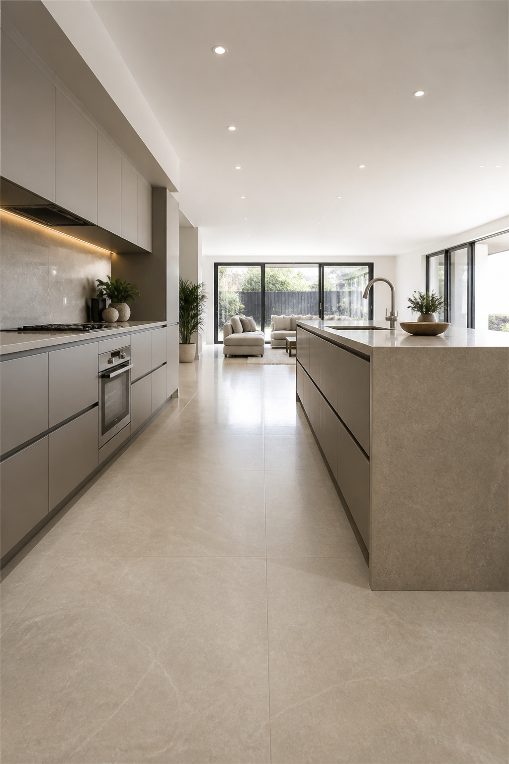
The visual logic is straightforward: the reduced number of grout joints in a large-format floor creates tranquillity. The eye reads the floor as a single plane rather than a grid, which is particularly effective in open-plan kitchen/living spaces where a coherent floor material unifies zones without architectural division. Sintered stone and thick-format vitrified porcelain (12-20mm) have also enabled the same material to run continuously from floor to worktop to wall — a visual ambition that was impossible before this manufacturing capability existed.
Substrate Preparation and Adhesive Specification
Substrate requirements are considerably more demanding than for smaller-format tile. BS 5385 (British Standard for Wall and Floor Tiling) requires substrate flatness no greater than 3mm deviation under a 2-metre straight edge for large-format installation. C2 S1 flexible cementitious adhesive is the minimum specification; for tiles over 600mm or underfloor-heated slabs, C2 S2 is recommended. Double-buttering — applying adhesive to both substrate and tile back — is mandatory for tiles over 600mm to ensure full contact and prevent the hollow spots that crack under point loads.
The architectural constraint is real and frequently underestimated: a 600x1200mm tile in a period Victorian kitchen with low ceilings and multiple doorways almost always fails. The tile scale overwhelms the architecture, and the cuts at every doorway destroy the clean-plane effect that is the entire point of the format. Large-format tiles need open-plan spaces with 2.7m+ ceiling heights and long, uninterrupted floor runs to work as intended.
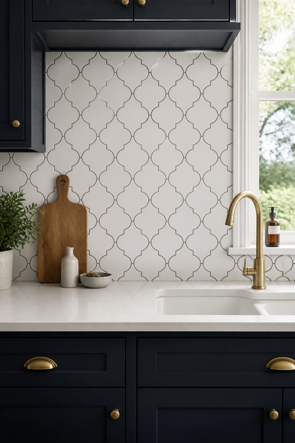
16. Arabesque and Ogee Tiles for a Moorish-Inspired Kitchen
Islamic architecture’s prohibition on figurative representation redirected centuries of creative energy into geometric abstraction of extraordinary mathematical complexity. Tilework using interlocking geometric shapes became the primary decorative language of mosques, medrasas, and palaces from Morocco to Uzbekistan — and when the Moorish occupation of Andalusia produced the Alhambra in Granada and the Alcázar in Seville, that geometry entered direct European view. Spanish craftsmen adapted it into domestic tilework; the arabesque shape became fashionable in northern European design during the 19th-century Orientalist period and has returned as a distinct kitchen tiles design option in the early 21st century as part of the handmade tile revival and the broader interest in global craft traditions.
Layout Planning and Installation
The arabesque tile — an interlocking pointed oval with four-sided geometry — requires more careful installation than square tiles. The geometry is self-completing (no filler tile required), but the cuts at perimeter edges need a wet saw and a detailed layout plan prepared before a single tile is set. Installation rates run 30-40% slower than a comparable square-tile backsplash; the four interlocking edges on each tile must lock with all adjacent tiles simultaneously, and a single misalignment in the first row propagates through every subsequent row. Draw the full pattern on the wall with level and chalk lines before opening a single box. Identify all perimeter cuts and cuts at appliance edges at the planning stage, not during installation.
Grout colour determines whether the pattern reads as a unified field or as a collection of individual shapes. Matching grout — same colour as the tile — makes the shape visible but subtle, appropriate for large backsplash applications where the pattern might otherwise dominate. Contrasting grout emphasises each tile as a graphic unit; use this in a contained application (a range hood surround, a single panel) rather than across an entire kitchen wall. Unsanded grout is essential for arabesque tiles with curved edges — sanded grout scratches the glazed face during application.
17. Two-Tone Chequered Floor Tile: The Kitchen Tiles Design That Never Ages
Two thousand years is a good run for any design. The black-and-white chequered floor has been in continuous use since Roman opus tessellatum appeared in villa excavations from the 1st century BC across Britain and France. Georgian Britain used large-format natural stone — typically Purbeck limestone for the white field, Belgian fossil limestone (Noir de Mazy) or Welsh slate for the black — in entrance halls and formal kitchen passages, at tile sizes ranging from 30x30cm to 60x60cm. Victorian encaustic manufacturers Minton and Maw extended the pattern to suburban and terraced housing in standard 15x15cm squares; by 1880 the chequered floor was the most widely used domestic tile design in Britain.
This kitchen tiles design persists because the pattern is the result of the simplest geometric decision — two colours, equal squares — and that simplicity gives it architectural authority without asserting a specific style. It belongs equally in Georgian kitchens, Victorian terraces, contemporary restaurant-style homes, and modern farmhouses, adapting to each context through material choice rather than pattern modification.
Choosing Material and Scale
Natural stone (limestone and slate, or marble) is the most authentic and expensive option, appropriate in period homes where budget allows. Porcelain and ceramic in a chequered format — available from Topps Tiles, Otto Tiles, and London Mosaic in reproductions of the Victorian 15x15cm format — is the reliable mid-range choice. For those working on a broader traditional kitchen style ideas project, the chequered floor is often the single most historically grounding element available.
Tile scale to room proportion: the tile diagonal should not exceed one-eighth of the room’s shortest dimension. A 2.4m-wide kitchen accommodates tiles up to 30x30cm; a 4.5m-wide open-plan kitchen suits 60x60cm. A plain border tile around the perimeter in one of the two field colours — the Georgian and Victorian detail — makes the floor read as a designed whole rather than a material decision that ran out at the skirting.
18. Fish Scale Tiles for a Vintage-Inspired Kitchen Revival
The fish scale tile arrived in Western domestic design via one of the more circuitous routes in decorative history. The scallop roof tile — kawara in Japanese — has been used in Chinese and Japanese temple and palace architecture since the Han Dynasty (206 BC-220 AD), where the overlapping pattern of convex half-rounds is the most efficient rain-shedding geometry for curved roof surfaces. The shape entered Western decorative arts via Japanese export goods arriving in Europe from the 1860s (Japonisme), was absorbed by French Art Nouveau designers including Hector Guimard and Victor Horta, and reached peak domestic popularity in the Art Deco 1920s.
Placement and Finish Options
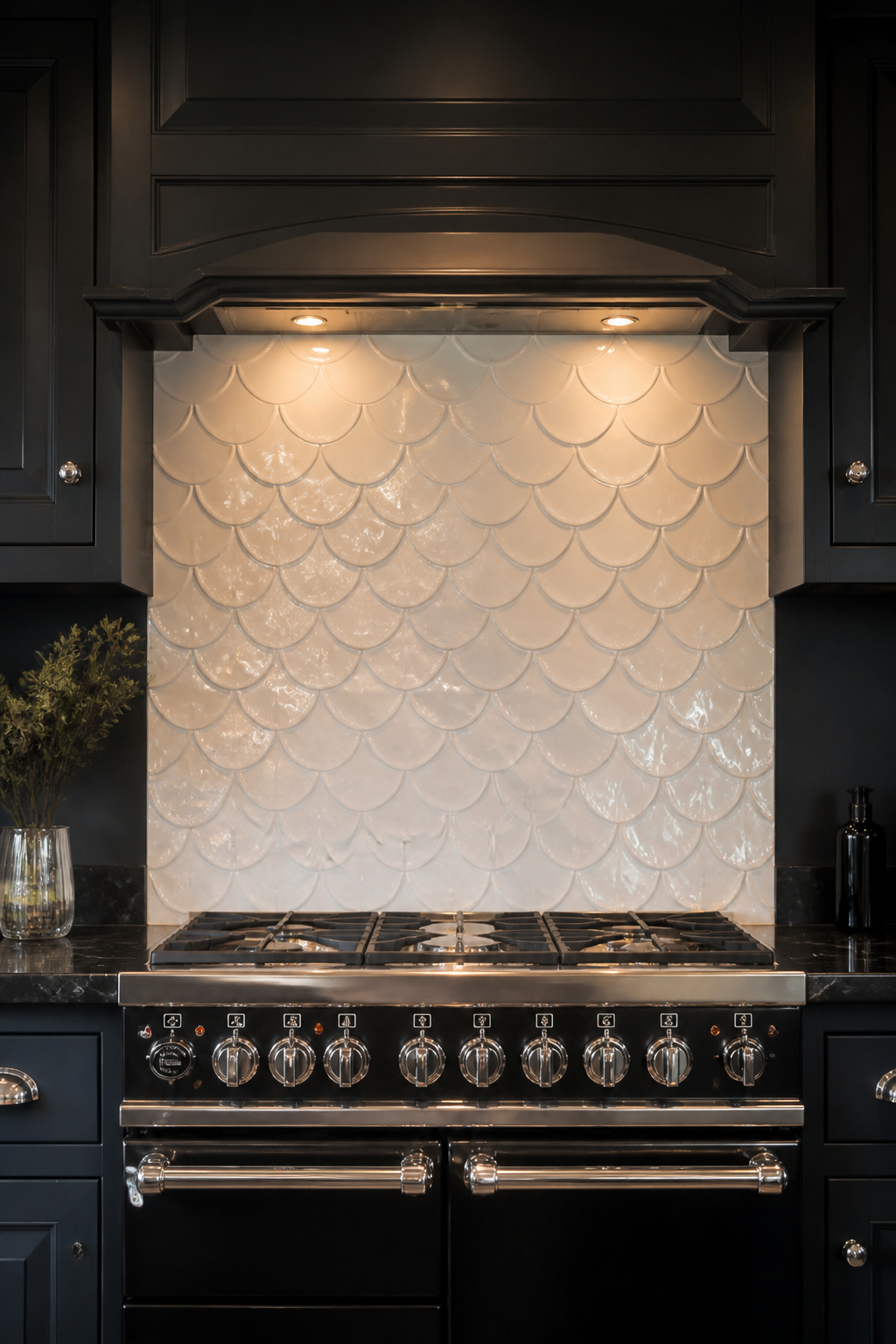
In a kitchen context, placement decisions determine the result. A full backsplash between worktop and upper cabinets (typically 60-80cm high) is a statement; the repeating curves are visually busy and work best with plain cabinetry and a simple worktop in a complementary tone. A contained panel behind the range — 90-120cm wide, matching the hob width — allows the tile to register without taking over the kitchen. Fish scale tiles on a range hood surround only is the most contained application: the tile frames the hood without competing with any other surface, and often reads as the most considered of the three approaches.
Porcelain fish scale tiles (water absorption below 0.5%) are recommended for kitchen backsplash use near the hob. Matte glazes suit a vintage or Art Nouveau reference; gloss glazes read as Art Deco and contemporary, and a gloss fish scale tile in front of a window has a particular light-catching quality worth considering. The 10cm scallop is the most versatile size; 5-7cm creates a fine-grained texture that reads well from a distance, while 12-15cm makes each individual tile legible.
Plan from the top down before installation begins. The overlapping geometry means the top edge must finish with a complete row of tile crowns, not a cut half-row. Calculate this before the first tile is set, not after half the wall is done.
Choosing Your Kitchen Tile Design: From Historical Research to Final Installation
The guide above spans more than two thousand years of kitchen tiles design, but the decision framework for any specific kitchen comes down to a much simpler set of questions.
Start with the architecture of the building before the kitchen tiles design trend cycle. Pre-1850 Georgian kitchens look most considered with natural stone, plain encaustic, Delft feature tiles, or black-and-white chequered stone — Georgian taste was restrained, and pattern overload in this context reads as historically illiterate. Victorian and Edwardian kitchens can absorb more pattern within architectural framing: encaustic geometric, penny round mosaic, subway tile (post-1904), Arts and Crafts ceramic. Post-1920s kitchens suit Art Deco fish scale, simple ceramic in pale tones, and early large-format geometric. Contemporary open-plan spaces have the widest latitude, though in a heritage setting, always consider what the building can absorb before what a material can achieve in isolation.
Ordering, Sampling, and Choosing an Installer
Then consider the ordering process. Always add 10-15% to the calculated floor or wall area for cuts, breakages, and future repairs. For handmade or natural stone tile, order 15-20% extra — matching a later batch is often impossible, and no successful tile floor was ever spoiled by having too much material left over. Order physical samples before committing; view them in the actual kitchen with cabinetry, worktops, and lighting in place. A tile that reads beautifully in a showroom can read entirely differently under kitchen downlighting.
Finally, choose the installer with the same care as the tile. Get three quotes, specify the same tile in each, and ask directly whether the installer has experience with that specific material. This question matters most for natural stone, handmade ceramic, zellige, and large-format porcelain — materials where inexperienced installation produces failures that are expensive to remedy. The tile you choose should still be standing in fifty years. That standard is the most useful filter for every decision on the list above.