Most people assume contemporary kitchen design means cold. Glossy white slabs, everything hidden behind seamless panels, not a human fingerprint in sight. After 14 years renovating homes across multiple architectural periods — Craftsman bungalows, mid-century ranches, newly built houses that want to feel like they have history — I can say that is the cheap version of contemporary. The real contemporary kitchen concepts are warmer, more specific, and more interesting than any traditional kitchen I’ve worked on. The difference is intention: every element chosen for what it does, not just what it matches.
These 15 contemporary kitchen concepts define what a genuinely well-designed kitchen looks and lives like in 2026. Some are about materials, some about systems, some about proportion. All of them age better than trend-chasing alternatives, and all of them come with trade-offs worth understanding before you commit. If you’re working through the contemporary kitchen design principles for a renovation, this list covers the elements that matter most.
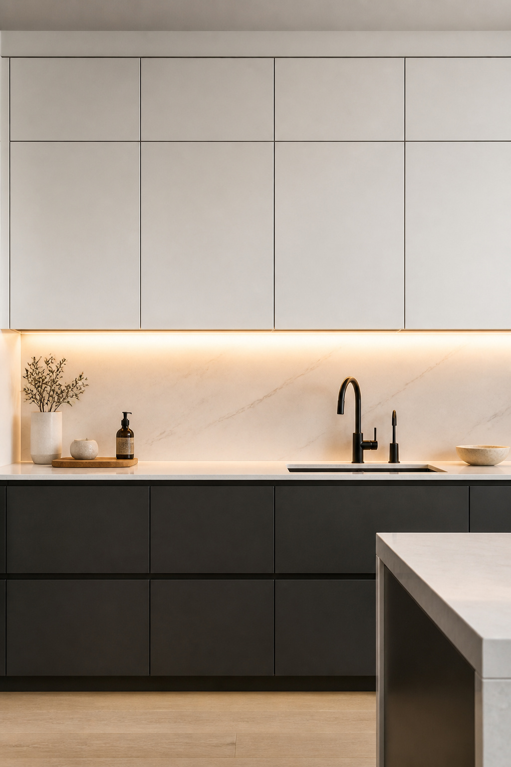
1. Contemporary Kitchen Concepts Start With Flush, Integrated Appliances
There is no single decision that does more to establish a contemporary kitchen than panel-ready integrated appliances. When the refrigerator, dishwasher, and sometimes the range carry the same door face as the surrounding cabinetry, the kitchen stops being a room full of machines and becomes a unified piece of architecture. It is one of the contemporary kitchen concepts where the investment is immediately legible to anyone who walks into the space.
The mechanics are straightforward. Panel-ready appliances accept a custom cabinet door panel — typically 3/4-inch thick — that mounts directly to the appliance door face. From across the room, the appliance is invisible. Fisher & Paykel’s DishDrawer is the most accessible entry point: their dishwashers accept standard panel thicknesses and don’t require special cabinetmaker ordering. Sub-Zero’s 500 and 700 Series refrigerators offer flush-inset installation, where the door sits recessed within the opening rather than proud of the cabinet face — the most technically demanding version, and the cleanest result. Gaggenau ovens sit flush with surrounding cabinetry by design. Miele’s entire appliance suite is engineered for seamless integration, with flush-door dishwashers and precision steam ovens at the top of the range.
What most renovators miss: integration must be planned before the cabinetry is designed, not after. Panel-ready refrigerators have specific rough-in depths — flush-inset models need an opening 3-4 inches deeper than a standard 24-inch cabinet run. Ventilation gaps are mandatory above and beside integrated units. And dishwasher rough-in heights shift when a panel is added to the door face. Get the appliance specifications before the cabinetmaker draws a single cabinet elevation. It’s the number-one sequencing mistake I see in kitchen renovations that start from the cabinetry rather than the systems.
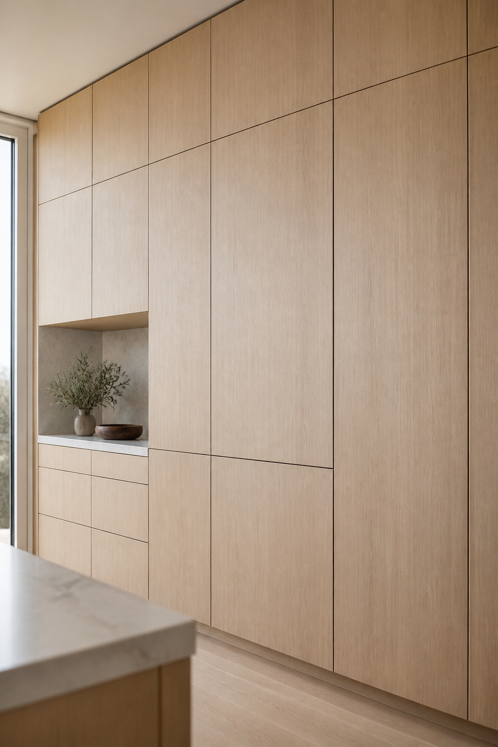
2. Flat-Front Cabinetry With Visible Wood Grain Panels
Flat-front slab cabinetry has been the contemporary standard for fifteen years, but the version that reads most sophisticatedly today is not a lacquer finish — it’s natural wood grain combined with clean geometry. The combination works because it resolves the tension that pure minimalism cannot: contemporary in form, warm in material.
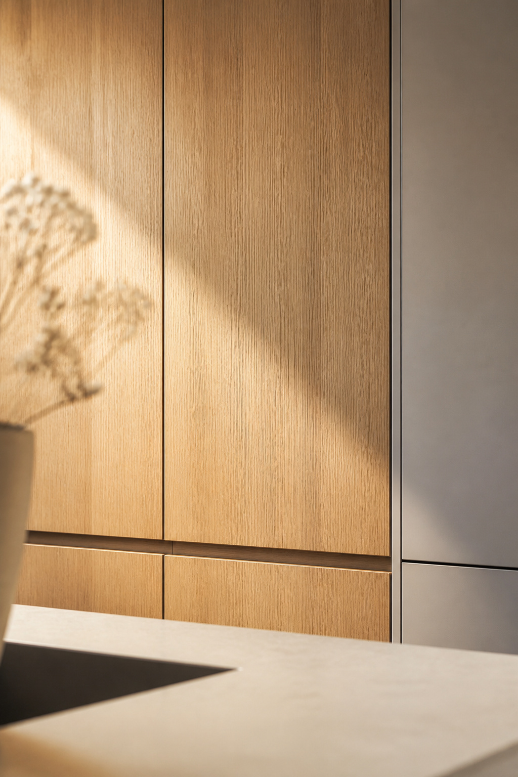
The grain orientation is everything. Rift-sawn white oak — cut radially to produce straight, consistent grain with minimal figure — reads as architectural when used vertically on full-height cabinetry. The same wood with pronounced cathedral grain reads as rustic. The NKBA identifies rift-sawn white oak as the most-specified wood in contemporary residential cabinetry; walnut is preferred where depth and moodiness are the goal.
Finish matters as much as species. A clear matte urethane or hardwax oil (Rubio Monocoat is widely used in the trade) keeps the grain visible without adding reflectance. High-gloss lacquer on wood grain is one of the more reliable ways to make real wood look like printed laminate. UV-cured catalyzed finishes offer the best durability for kitchen environments; two-part polyurethane is the middle option; hardwax oil is the most natural-looking but requires re-oiling every 12-18 months in daily-use areas.
One practical note: in flat-front wood grain cabinetry, the substrate matters. Solid wood panels at cabinet-door scale will move with humidity, creating gaps at joints and swelling around hinge points over time. HDF veneered with a real wood face is the professional standard — the veneer carries the visual language, the HDF provides the dimensional stability.
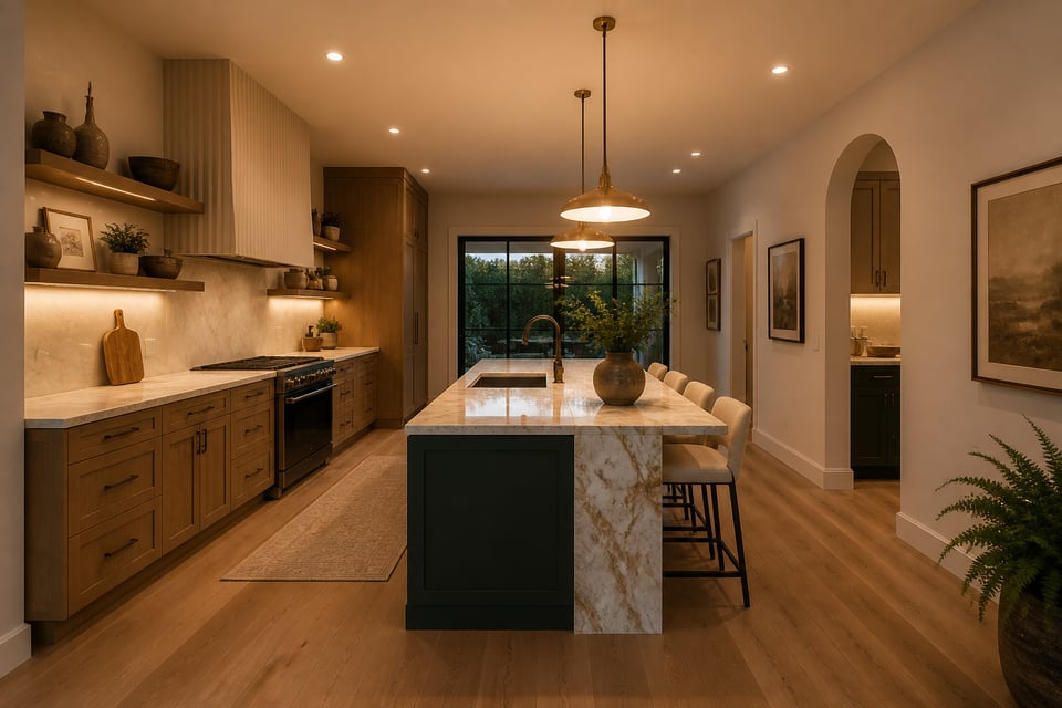
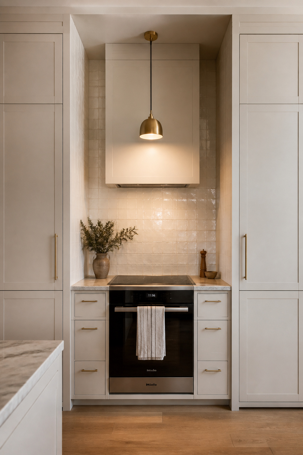
3. Statement Range Hoods Framed Like Architectural Columns
In 2026, the range hood is the most visually prominent design decision in a contemporary kitchen. That’s a reversal from a decade ago, when hoods were specified to blend in. Now they are the element designers lead with — the architectural anchor that establishes the kitchen’s character from across the room. Among contemporary kitchen concepts, this is the one most visible to guests before they’ve taken their coat off.
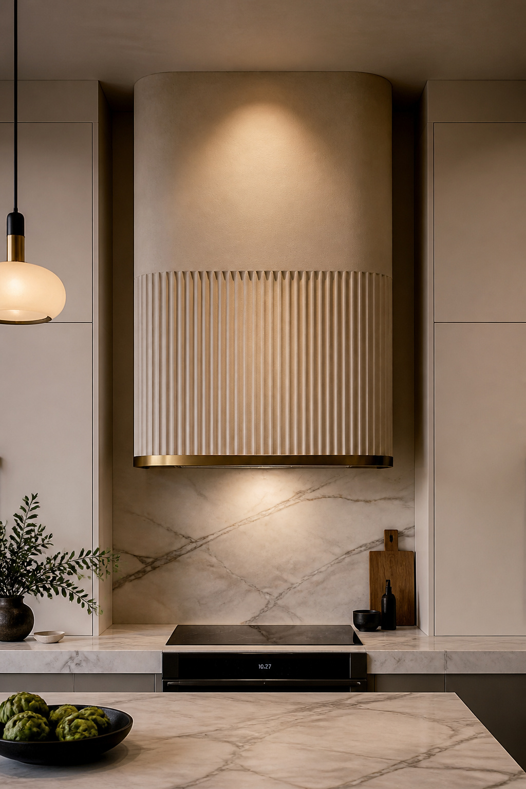
Material choices have expanded. Plaster hoods can be finished to match the kitchen wall exactly, making the hood feel built-in rather than applied. Copper develops a natural patina over 2-3 years that makes every installation unique. Brass speaks in a softer register — refined, warm, slower to change than copper. The mixed-material approach — plaster body with a brass trim band, or timber surround with a stainless exhaust liner — is currently the most sophisticated specification, layering organic warmth with precision metalwork. Vertical fluting is the dominant 2025-2026 detail: grooved surfaces that catch light differently across the day and read as genuinely architectural.
On proportions: the hood should be at minimum the same width as the cooking surface below, and most experienced designers specify 6 inches wider (3 inches on each side) to maximize grease capture. Height above the cooktop: 20-30 inches above gas, 24-30 inches above induction. For custom fabrication, budget $3,000-$12,000+. ZLINE offers an accessible version — a 7-layer hand-rubbed copper finish over 304 stainless steel — at $800-$2,200 with a lifetime motor warranty. For most renovations, a factory-made base hood with custom cladding applied by the kitchen installer achieves a bespoke result at 40-60% of full custom fabrication cost.
4. Handleless Cabinetry—A Defining Contemporary Kitchen Idea
Handleless cabinetry is one of the most consistently cited contemporary kitchen concepts, but the term covers three very different mechanisms that are not interchangeable. Understanding the difference before you specify will save you frustration — and a service call.
The J-pull profile is a continuous recessed groove routed along the top or side edge of the cabinet door — typically 18-22mm deep and 35-45mm high — that allows fingers to grip and pull without a separate hardware element. It has no mechanical component, so nothing wears out. It requires a minimum door thickness of 18mm to machine cleanly, and a groove in a contrasting color or lined with aluminium extrusion makes cleaning grease residue easier. The J-pull is the most durable and maintenance-free of the three options.
The Push-to-Open Option
The Blum TIP-ON is a spring-loaded catch mounted in the cabinet carcass. A firm inward push of approximately 5-8mm disengages the latch and a spring pushes the door open 10-15mm, allowing grip. Combined with Blum BLUMOTION soft-close hinges, the door returns with hydraulic damping. Blum rates TIP-ON at 80,000 cycles — at 10 openings per day, that’s 22 years of daily use. The limitation: it can be inadvertently triggered by leaning against base cabinets, which is a genuine annoyance in busy kitchens. Blum SERVO-DRIVE takes the motorized version — a gentle touch triggers the servo mechanism, useful when carrying groceries or large platters. A full kitchen installation (12-15 doors) costs approximately $2,500-$4,000 in hardware alone.
The professional approach: J-pull or TIP-ON for upper cabinets and doors; minimal bar pulls or knurled finger pulls on base drawers where heavier loads require a more positive grip. Most designers use a hybrid — handleless everywhere it looks good, discreet hardware where the ergonomics demand it.
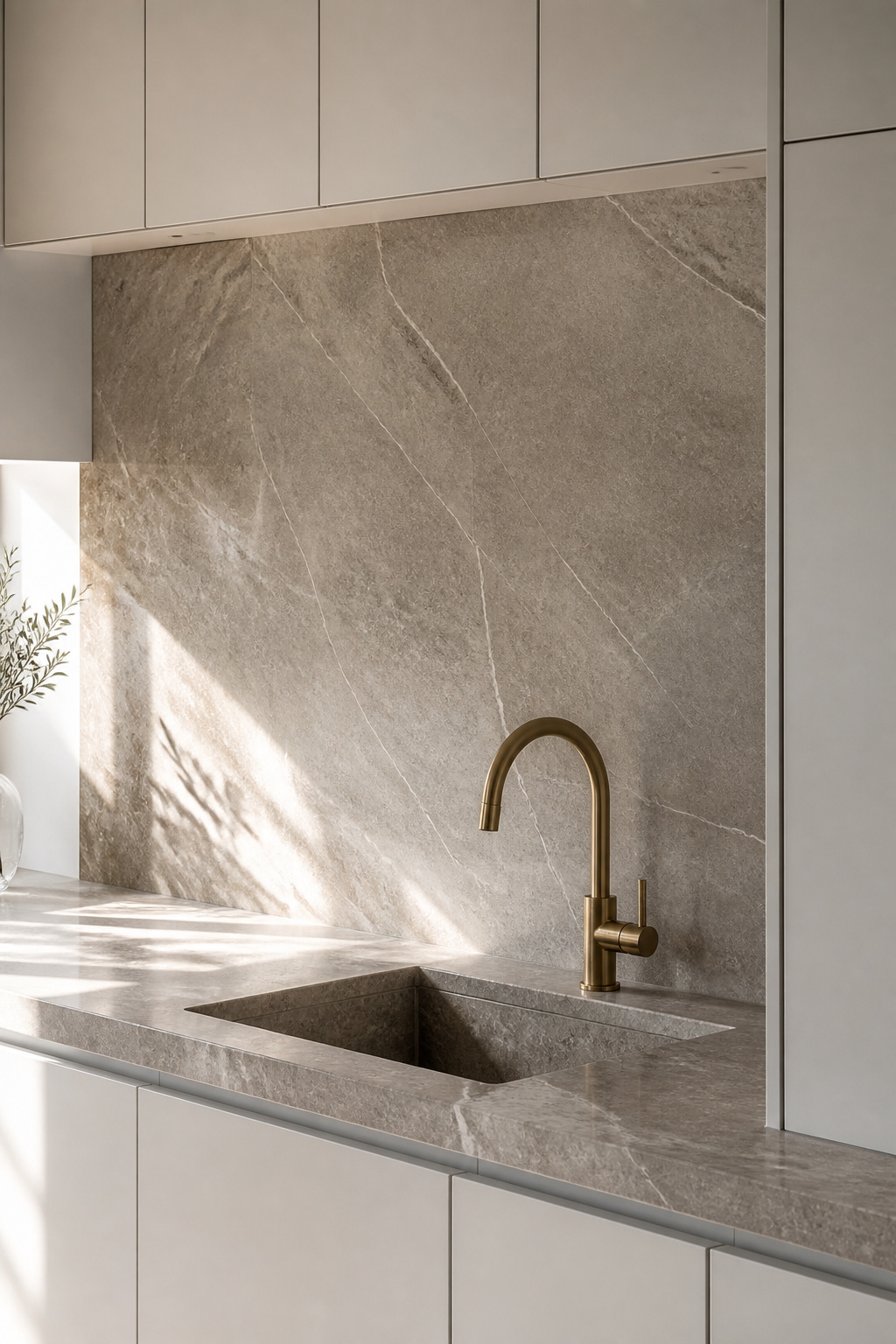
5. Waterfall Countertop Edges That Treat Stone Like Sculpture
A waterfall edge turns a kitchen island from a functional object into a sculptural one. Both the horizontal countertop and a vertical side panel are cut at 45 degrees and mitered together so the stone flows continuously from the counter face down to the floor. Done correctly, the island reads as a solid block of material — a piece of furniture rather than a cabinet with a top. This is one of the contemporary kitchen concepts where the visual return on material investment is immediate and dramatic.
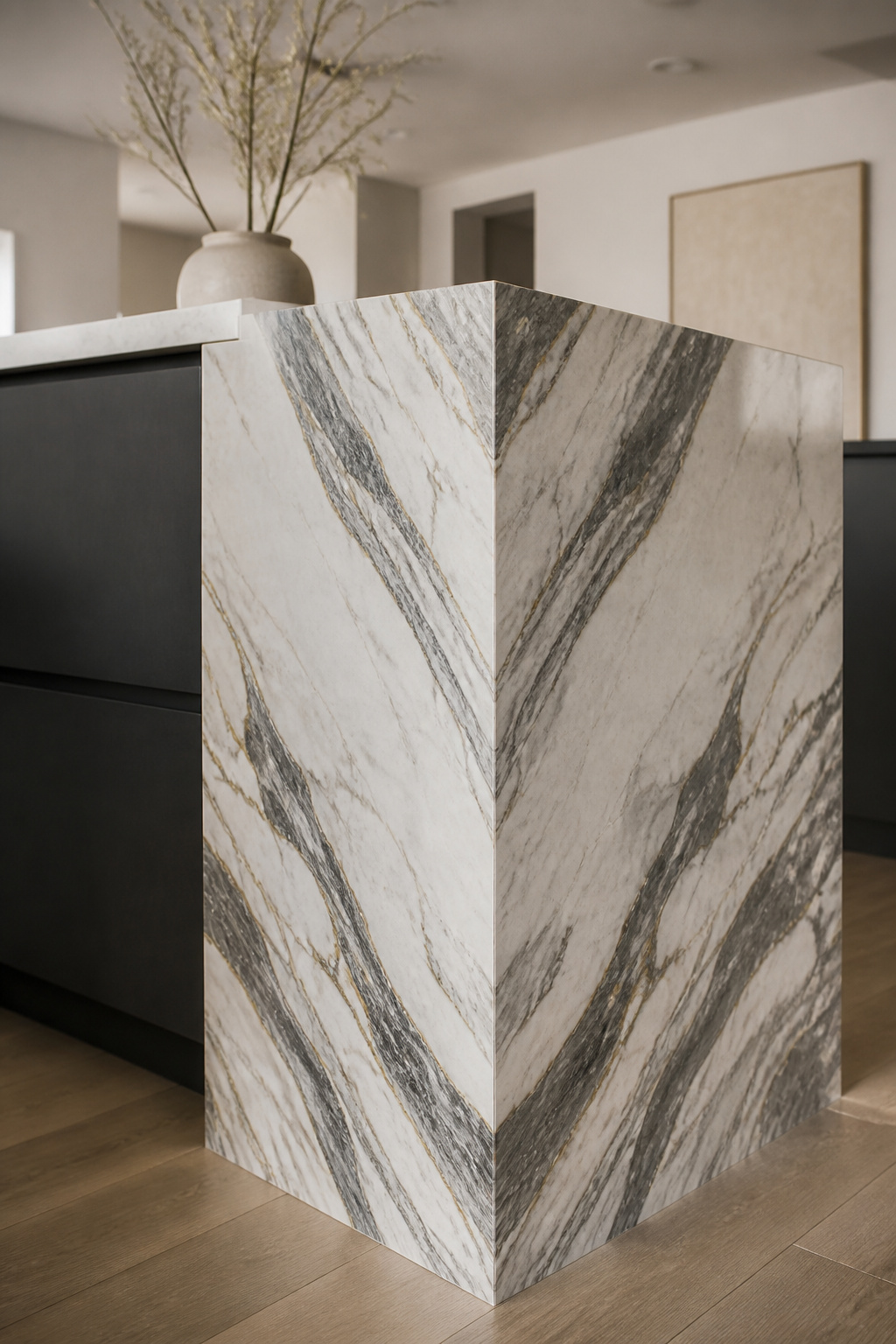
The miter geometry is where most waterfall edges succeed or fail. A precise 45-degree cut on both faces, CNC-routed by an experienced fabricator, produces a joint where the surfaces meet without visible gap. For stones with pronounced veining — marble, quartzite — book-matching adds another layer: consecutive slabs from the same block are cut and polished on opposite faces to create a mirrored grain pattern across the seam. The result is a vein that flows from horizontal to vertical as if the stone is a single piece. For kitchen countertop ideas and material options, it’s among the most striking effects available in residential design.
The Cost Case for a Single-Side Waterfall
A standard island top uses approximately 15 sq ft of stone; waterfall edges on both sides increases that to 25-30 sq ft, requiring two additional slabs from the same bundle. Total cost premium: $3,000-$10,000+ in 2025 pricing, with marble at the higher end and sintered stone at 20-30% less. A practical middle path: waterfall on the dining side only. This cuts material cost by 40-50% while maintaining the sculptural effect at the most-viewed angle. For budget-conscious renovations, an engineered quartz with a simple one-side waterfall can be achieved for $1,200-$2,500 above standard countertop cost. 3cm (1.2 inch) slab thickness is the minimum — at 2cm, the edge looks fragile rather than sculptural.
6. Paired Metal Finishes Used With Strategic Restraint
For most of the 20th century, the default rule was simple: pick one metal finish and match it throughout the kitchen. Every pull, every faucet, every cabinet hinge in the same brushed nickel or polished chrome. The rule made sense as a safeguard against accidental chaos, but it produced kitchens that read as specification sheets rather than designed spaces. Contemporary kitchen concepts have moved past it.
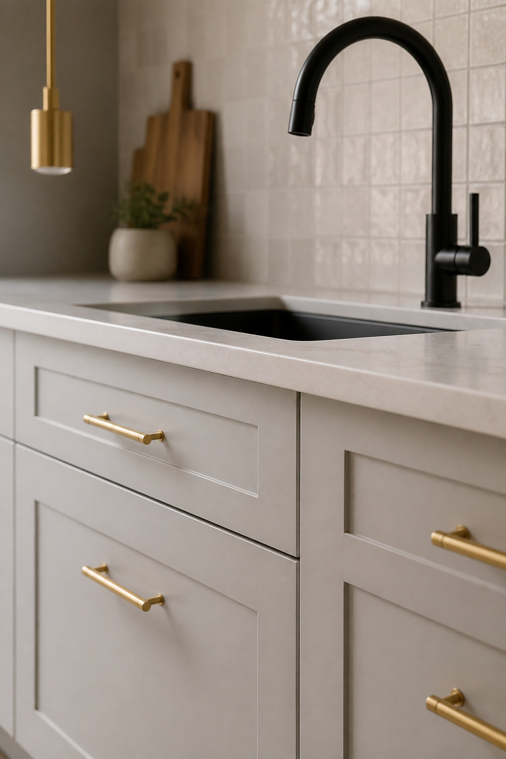
Contemporary designers now work with an intentional mixing principle. Two complementary metal finishes — one dominant (60-70% of the metal present), one accent (30-40%) — create visual rhythm and depth that a single finish cannot. The key word is complementary: a pairing of opposites by temperature, sheen, or both.
Brushed brass and matte black is the most proven pairing in contemporary residential kitchens of the last four years. The warmth of brass and the grounding quality of matte black produce contrast that is rich without being loud. Specify brass for cabinet hardware and pendant cables; matte black for the faucet and pot filler. Satin nickel and unlacquered brass is a softer pairing with longer decorative history — the unlacquered brass develops a natural patina over 6-12 months that deepens the contrast gradually. For kitchens with natural stone and warm wood, polished nickel and bronze reads as collected and considered.
The pairing rules that hold: always balance a warm metal (brass, bronze, copper) with a cool or neutral one (stainless, nickel, matte black). Never mix the same finish in different sheen levels — brushed brass hardware with polished brass faucet reads as mismatched purchases, not intentional design. And the maximum two metals rule stands: a third finish, if used at all, appears in minimal quantity only.
7. Induction Cooktops Recessed Flush for a Seamless Contemporary Kitchen Look
The range hood defined the cooking zone visually for generations. Eliminating it — through flush-mounted induction combined with integrated downdraft ventilation — produces the most architecturally clean contemporary kitchen look possible. The entire cooking surface disappears into the countertop; the overhead hood disappears entirely. As contemporary kitchen concepts go, this one requires the most advance planning and produces the most dramatic result.
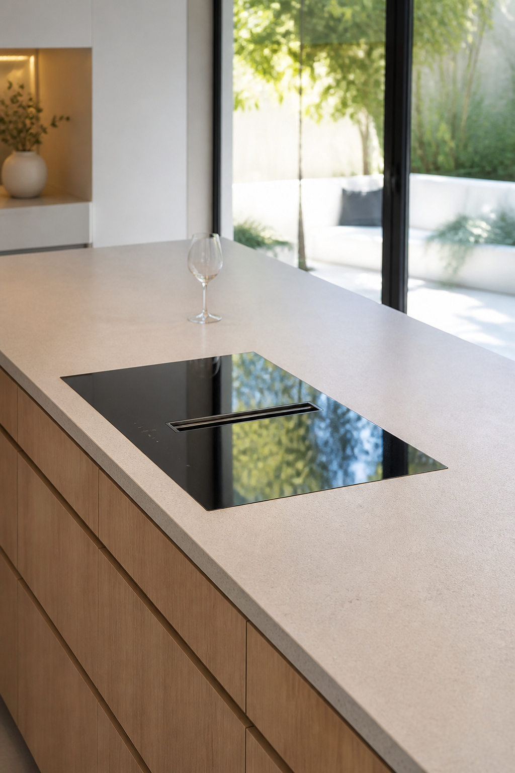
BORA is the market leader in this integration. The BORA Pure and BORA Basic X models feature a central extraction slot in the cooktop surface that draws cooking vapors downward at 400-600 CFM, either recirculating through a filter or venting externally. The cooktop glass installs flush with the countertop surface; the extraction slot is barely visible when not in use. Available in 31 and 36-inch widths. Miele’s KM 7745 FL is the principal alternative — a 36-inch flush-mount induction with six cooking zones and three PowerFlex areas, designed to pair with Miele’s CSDA 3010 downdraft unit.
The technical requirements are significant. Flush installation demands the countertop fabricator cut the opening to the exact chassis dimensions, with the finished countertop coplanar with the cooktop glass to within 1-2mm. A dedicated 240V/50A circuit is required, roughed in before countertop installation. The downdraft duct path requires a minimum 3.5-inch round duct run from below the cooktop to an external wall or roof vent — plan this at the rough-in stage, not after cabinetry is installed.
The trade-off worth knowing: 500-600 CFM downdraft handles everyday residential cooking well. For high-heat work — wok cooking, deep frying, sustained searing — a downdraft can struggle with smoke and grease volume. Kitchens used heavily for high-heat cooking may find a retractable overhead extractor more practical, even if it compromises the fully-integrated aesthetic.
8. Open Shelving Balanced Against Deep, Closed-Door Storage
The all-open-shelving kitchen was a design movement that peaked on social media and then collided with daily reality. Mismatched storage containers, appliances used twice a month, and the discipline of perfect curation every day — the aesthetic demands exceed what most households can sustain. The contemporary resolution is to use open shelving purposefully: as a visual break in a closed cabinet run, displaying a curated selection of objects that earn their place.
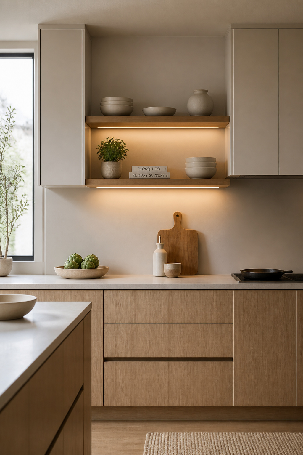
The working ratio used by most kitchen designers: 70-80% closed storage, 20-30% open. In a typical kitchen with 15 linear feet of upper cabinet space, that means 3-4 feet of open shelving — enough to create visual depth and personality without requiring museum-level maintenance of every visible surface.
What Earns Open Shelf Placement
Display-worthy items: matched sets of everyday dishware (white ceramic, clear glass), cookbooks arranged by height, a wooden cutting board, a single herb pot, and cast iron or carbon steel pans — which are design objects in a Japandi or contemporary context. Behind doors: everything with a manufacturer label, mismatched food storage containers, cleaning products, and anything used less than twice a week.
Shelf dimensions that work: 10-12 inches deep (accommodates dinner plates without overhang), 16-18 inches between shelves, brackets as slender as the structural load permits. Materials: rift-sawn white oak on floating steel brackets is the most current specification. A grouping of three items in a triangular arrangement — one tall, one medium, one small — is the most reliable display pattern, and repeating it across a shelf run creates rhythm without looking formulaic.
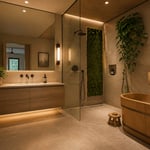
9. Under-Cabinet Lighting Engineered as a Structural Element
In renovation specifications from ten years ago, under-cabinet lighting was a line item at the end of the electrical plan — puck lights added after cabinetry was installed, running on a cord tucked behind the cabinet back. In a well-designed contemporary kitchen, it’s planned at the architectural stage, concealed within cabinet profiles, and connected to a dimmer system that makes it a functioning layer of the kitchen’s lighting design. These are the contemporary kitchen concepts where the planning sequence matters most: decisions made at rough-in stage have effects that last the life of the kitchen.
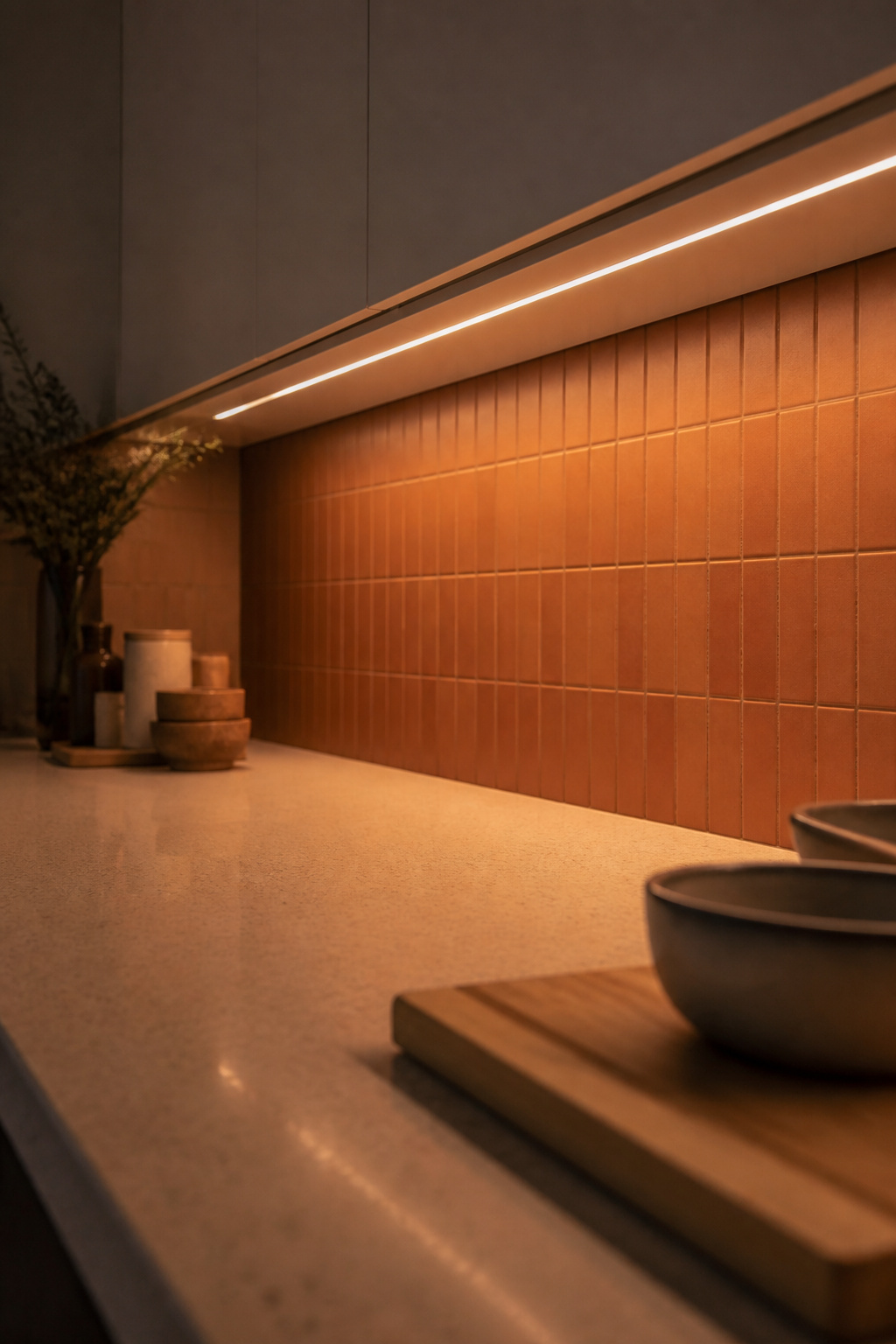
The fixture type determines the quality of the result. LED tape at a minimum 60 LEDs/meter with 10W/meter gives smooth, even output; below this density, individual LED hotspots are visible at normal viewing angles. The strip must run inside a channel extrusion with a diffuser lens — without the diffuser, the dotted line of LEDs is visible when the light is on, and the result reads as hardware-store lighting regardless of everything else in the kitchen. Integrated LED cabinet systems (Häfele Loox, Eglo) are the premium specification — wiring concealed within cabinet profiles, matching connectors, purpose-built drivers. The light appears to emerge from the cabinet face itself.
Color Temperature and the Dimmer Circuit
Color temperature selection has a measurable effect on the daily experience. 3000K (soft white) is the versatile standard for contemporary kitchens — warm enough to flatter food and wood grain without the yellow cast that 2700K can produce on cool stone countertops. CRI 90+ is the professional minimum: below this threshold, vegetables look dull and the stone countertop will not match the showroom sample. Run the under-cabinet lighting on its own circuit during rough-in. A separate circuit costs nothing at that stage and gives you the ability to dim the task layer independently from overhead ambient — the single most-cited quality-of-life improvement by homeowners who’ve renovated twice.
10. Japandi-Influenced Tones—A Contemporary Kitchen Design Direction
Japandi — the fusion of Japanese wabi-sabi philosophy and Scandinavian hygge — is one of the most durable contemporary kitchen design directions in residential interiors. It’s not primarily a color palette, though it has one. It’s a material philosophy: natural over synthetic, matte over glossy, functional over decorative. A Japandi kitchen is calibrated to remove everything that doesn’t earn its place.
The Japanese principle of ma — deliberate negative space — is the hardest to execute and the most important. A Japandi kitchen has some empty countertop. Not because storage has been eliminated, but because the display discipline has been applied: only objects that are both useful and beautiful occupy visible space. Cast iron pans on open shelves, a wooden cutting board, a single ceramic herb pot. Everything else is behind a door.
The palette: warm whites (Farrow & Ball White Tie, Benjamin Moore Chantilly Lace in warmer variants) for upper cabinets; natural wood — white oak for a lighter register, walnut for depth — on the island or a feature run; charcoal or matte black as a punctuation finish on fixtures and hardware. Muted greens (Farrow & Ball Mizzle, Pigeon) function as the Japandi accent color, used sparingly on a single run of base cabinets or the island. Avoid cool grey: it reads as Scandinavian minimalism, not Japandi. The contemporary kitchen backsplash ideas that complement natural materials — honed limestone, handmade ceramic, large-format matte tile — belong to the same material register.
For kitchens where a full renovation isn’t the plan: a hardware swap to blackened steel or knurled brass ($200-600), replacing glossy fronts with matte laminate panels ($3,000-8,000 for a cabinet reface), and editing the open shelf display to unglazed ceramics and wooden objects will shift the kitchen’s material language immediately.
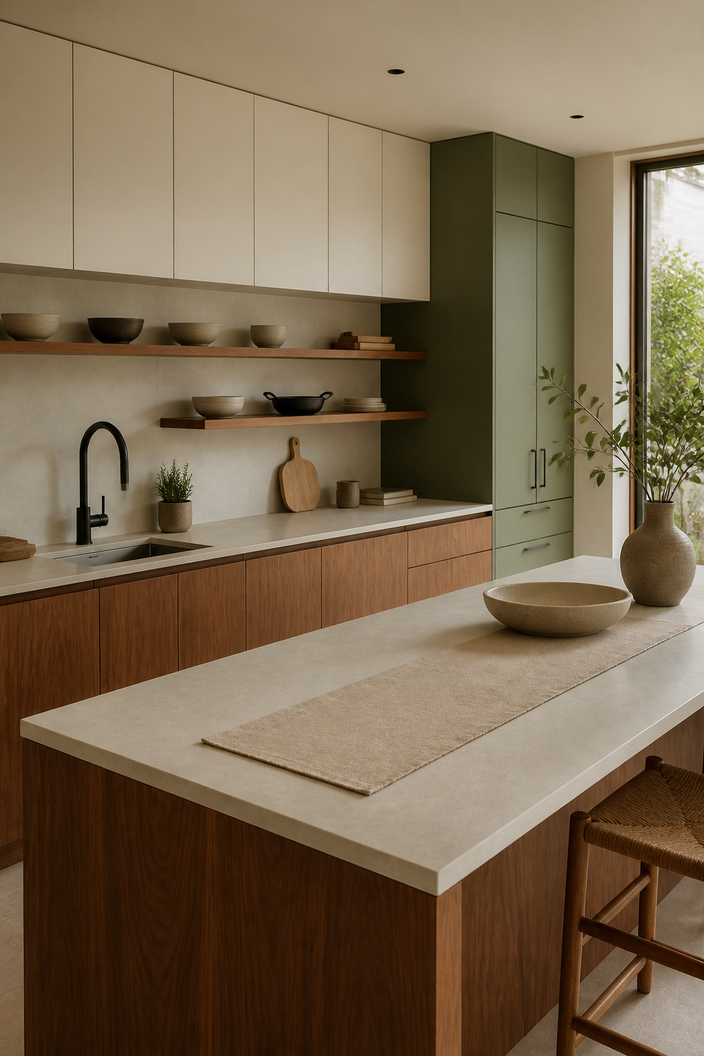
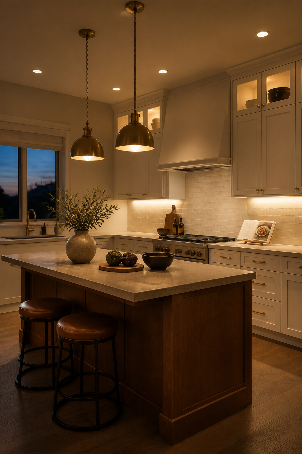
11. Contrasting Island Colors That Ground the Perimeter Palette
A colored island in a neutral kitchen is one of the contemporary kitchen ideas that never dates — not because it’s trend-proof, but because when done correctly it solves a genuine spatial problem. An all-neutral kitchen, especially an all-white one, has visual flatness. The island as anchor — in navy, forest green, charcoal, or natural wood — introduces the depth and weight that the space needs without altering its clean-lined character.
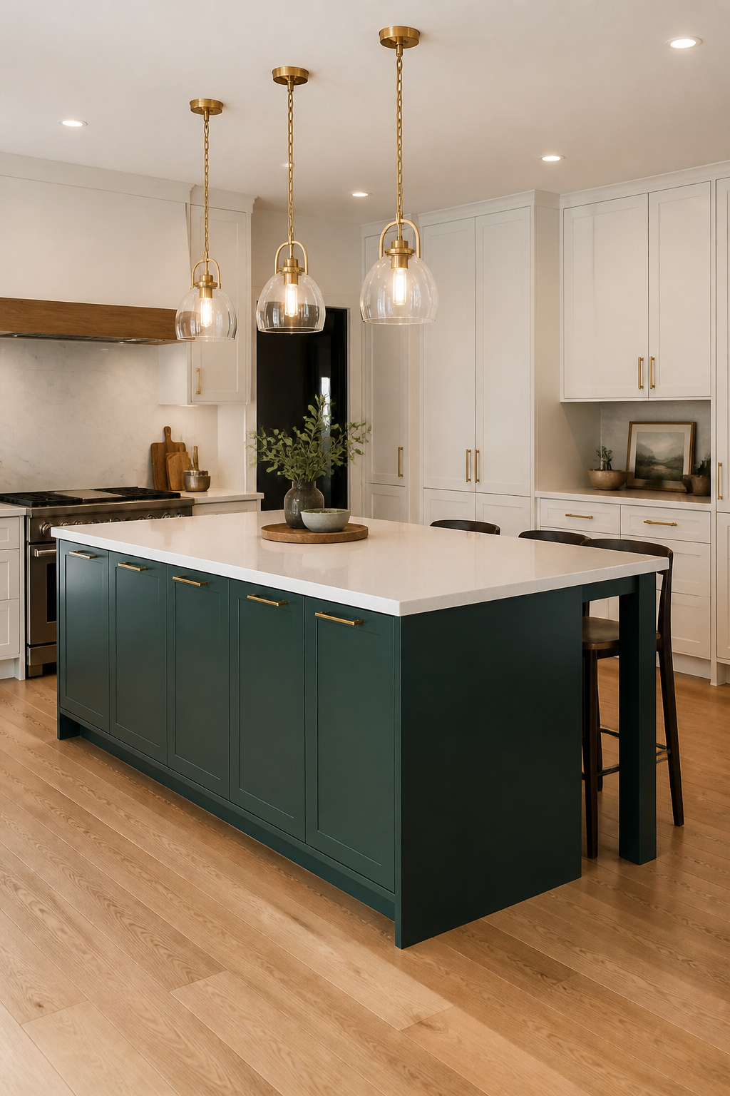
The psychology works because the island is typically the largest single volume in the kitchen. Applied with a contrasting color, it defines itself as a furniture piece within the room rather than a continuation of the perimeter cabinetry. This creates the same visual hierarchy as an accent wall: one clearly differentiated element that grounds the rest of the composition.
Combinations With Proven Longevity
Navy blue island against white perimeter is the most proven of all the pairings — established in design publications from 2015 and still prominent in 2026 specifications. It has the durability of a navy suit. Forest green against warm cream or off-white is the rising 2024-2026 combination: deep emerald and hunter green against warm white read as both contemporary and nature-connected. Charcoal or graphite against white or pale grey is the most versatile and resale-safe — dark grey sits neutrally against almost any countertop or backsplash choice.
The most important proportioning rule: the island must be large enough to carry the color. Minimum dimensions for a contrasting-color treatment to work spatially: 48 inches long by 30 inches wide. Smaller than this and it reads as a painted piece of furniture rather than an anchoring element. The 60-40 ratio — perimeter in the dominant (lighter) color, island in the contrasting — is the practical standard.
12. Large-Format Stone Slabs Running Seamlessly From Counter to Wall
Running the same stone from the countertop surface up the backsplash wall — ideally as a single uninterrupted slab — is among the most architecturally resolved specifications in a contemporary kitchen. The effect is straightforward: where a standard tiled backsplash creates a horizontal seam at countertop height, the continuous slab eliminates that break entirely. The eye reads a single surface from counter face to upper cabinet bottom, which expands the apparent size of the wall and improves the material language. For stunning kitchen backsplash and countertop combinations, this approach sets the highest standard available.
For backsplash applications at this scale, sintered stone materials offer the best combination of format and performance. Dekton (by Cosentino) is the benchmark — available in slabs up to 126 x 63 inches, in thicknesses from 4mm to 30mm. The 4mm ‘Slim’ format is developed for vertical cladding: lighter weight, more practical on existing walls. Neolith offers a 3mm format and slabs up to 126 x 60 inches, with several series that produce book-matched veining patterns. Porcelain slab alternatives from Florim and Atlas Concorde run 20-40% less expensive than Dekton or Neolith with negligible performance difference in a backsplash application.
Installation Prerequisites
The substrate must be flat, plumb, and structurally sound. Any high spot or hollow in the wall telegraphs through a thin panel as a visible undulation — the most common installation failure in this category. Drywall alone is insufficient; cement board provides the necessary stability. Large-format slab installation is a specialist trade: the scale and weight require vacuum-cup handling equipment and at least two experienced installers. Where a seam is unavoidable, place it at a natural break — a window reveal, a vertical return — so it reads as architectural rather than as a constraint.
13. A Concealed Range Alcove—One of the Bolder Contemporary Kitchen Concepts
Of all the contemporary kitchen concepts on this list, the range alcove is the one that most directly references architectural history — and the one that most completely resolves the question of how to give a cooking zone a clear sense of place. It’s the kitchen element most likely to look as if it was always there.
The alcove traces back to the inglenook fireplace of English vernacular architecture and the potager — the tiled cooking hearth of French provincial farmhouses. Both are recesses that frame the heat source and organize the cooking zone as the room’s purposeful center. Contemporary designers have reclaimed this form: two full-height columns flank the central cooking zone, the recess defines the space without walls, and the cooking area gains depth and hierarchy that flat perimeter cabinetry cannot produce. For expert kitchen remodeling ideas for historic and contemporary homes, the alcove is the concept I return to most often — it integrates modern systems within an architectural form that references history rather than ignoring it.
Construction and Dimension Requirements
Minimum alcove width for a 36-inch range is 42 inches (range plus 3 inches on each side). For a 48-inch range, minimum 54 inches. Standard cabinetry depth (24 inches) is sufficient when the alcove is formed by flanking full-height cabinets rather than a true wall recess. A true recessed alcove requires building into the wall structure — straightforward in new construction, feasible in renovation where a non-structural wall exists.
The ventilation hood recesses within the alcove ceiling and conceals behind a full-height panel — the extraction slot is the only visible evidence. Lighting within the alcove (a recessed task light above the hood line, or LED strip on the inside faces of the flanking columns) provides cooking-zone illumination independent of the ceiling ambient system. The practical limitation: alcove side walls extend to the countertop, limiting counter space adjacent to the range. For kitchens under 200 square feet, this trade-off may be too costly in work surface.
14. Touch-Latch Mechanisms Where Hardware Would Usually Live
The clean face of a handleless kitchen is made possible by a touch-latch system — a spring-loaded or electromagnetic mechanism that allows the cabinet to open with an inward push rather than a handle pull. It’s a category with meaningful differences in how each system performs over time and under heavy use. Getting this choice right is one of the more detail-oriented contemporary kitchen concepts, but it matters every time you open a cabinet.
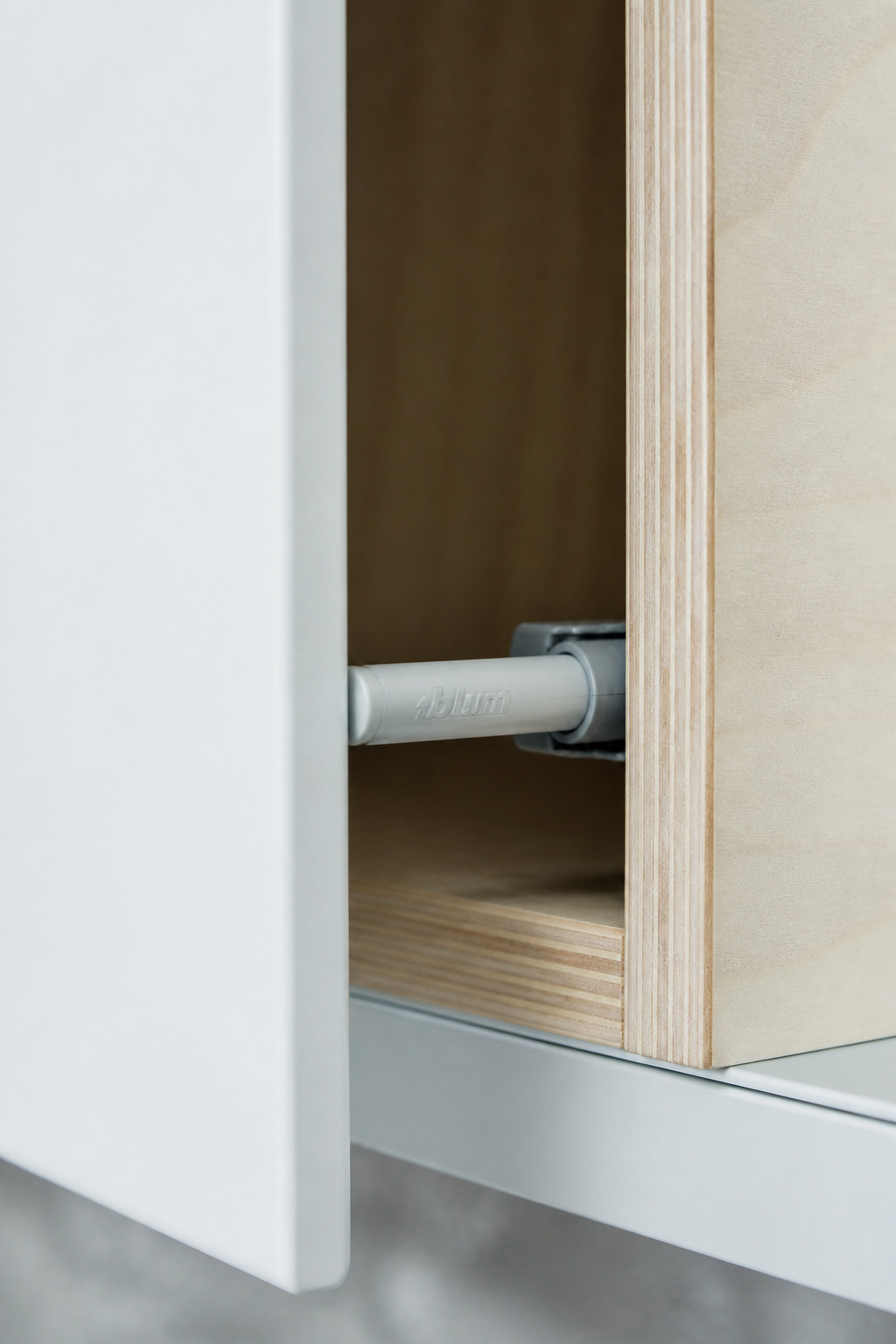
Blum TIP-ON is the most widely specified mechanical touch-latch in the professional market. A spring catch in the cabinet carcass latches the door closed; a firm inward push of 5-8mm releases the catch and the spring pushes the door open 10-15mm. Combined with Blum BLUMOTION soft-close hinges, the door returns with hydraulic damping. Rated at 80,000 cycles — 22 years at 10 openings per day. Hettich SenSys takes the electromagnetic approach: the door closes against magnetic attraction, and an electronic sensor detects the push to trigger an actuator. More reliable in moisture-heavy environments, slightly more complex to troubleshoot when the sensor fails.
Reliability and the Hybrid Approach
Budget touch-latch catches from hardware stores carry no published cycle rating. Professional kitchen installers report failure rates of 15-25% within three years for budget systems on heavily used cabinets. The Blum catch costs approximately $15-25 more per cabinet than a budget alternative — it clips into a standardized mounting bracket, so replacement is a 10-minute task with no hinge adjustment required.
The hybrid approach that most designers actually use: TIP-ON for upper cabinet doors and lighter-duty storage, J-pull or a minimal bar pull for base drawers with heavy loads. A pantry pull-out fully stocked with canned goods and dry goods can weigh 40-60 pounds — TIP-ON spring tension is calibrated for doors, not that kind of loaded drawer resistance. Island drawers are typically better served by a discreet horizontal bar pull, even in a handleless kitchen overall.
15. Task Lighting Zones Mapped to the Kitchen Work Triangle
Kitchen lighting done well is invisible in the sense that it makes every task easier without drawing attention to itself. Done poorly, it produces a kitchen that is simultaneously over-lit from above and under-lit at the counter surface — harsh shadows in the prep areas, flat ambient light that makes everything look the same distance away. The difference between the two is zone-specific planning rather than a single overhead circuit.
The traditional kitchen work triangle (refrigerator, sink, range) remains a useful layout principle, but contemporary kitchen lighting design works better organized around work zones: prep counter (highest task illuminance, 300-500 lux), cooking zone (warm-toned task light at the surface, 600-900 lux), cleanup zone (functional brightness at 150-300 lux), and storage zone (interior cabinet lighting). The NKBA specifies 30 foot-candles for general kitchen lighting and 75 foot-candles for dedicated task surfaces — the ceiling ambient layer alone, even at full output, doesn’t come close to task requirements.
The three lighting layers: ambient (recessed LED downlights, spaced approximately 4 feet apart for 8-foot ceilings, dimmer-controlled), task (under-cabinet LED strip at the prep counter, pendant lights over the island at 30-36 inches above the surface), and accent (LED strip inside glass-fronted cabinets, directional spots aimed at a stone backsplash, LED strip beneath floating shelves). Accent lighting is the layer most often omitted in standard specifications and most noticed in its absence.
For kitchen lighting over island principles for well-designed spaces: two pendants for a 48-inch island, three for 72 inches, on a circuit separate from task pendants so island dining can dim while prep zones stay at full output. This is the practical reason to run island pendant and task lighting on separate circuits — a single evening decision that affects how the kitchen feels every night for the next twenty years.
Bringing Contemporary Kitchen Concepts Into Your Renovation Plan
Fourteen years of kitchen renovations across a range of budget levels has taught me one consistent lesson: the kitchens that hold their quality over time are the ones where decisions were made in the right sequence. Appliance integration planned before cabinetry. Lighting circuits roughed in before the floor goes down. Stone slab substrate verified flat before the fabricator measures. The contemporary kitchen concepts that disappoint are almost always the ones where execution was retrofitted onto a plan that didn’t account for them.
Not every concept on this list belongs in every kitchen. The range alcove is a bold commitment of space and budget. Flush BORA induction requires specific duct routing that some existing kitchen layouts cannot accommodate. Full integrated appliances at the Gaggenau or Sub-Zero level require a budget that starts at $80,000 and climbs from there.
But several of these contemporary kitchen concepts are accessible at every budget level. Under-cabinet lighting on its own circuit costs very little at rough-in and transforms the kitchen’s daily experience. A handleless J-pull profile is a cabinetmaker’s standard cut, not a premium specification. Mixed metal hardware — replacing chrome pulls with brass ones — is a $300 afternoon. The Japandi material direction is as much about restraint and shelf editing as it is about expensive new surfaces.
Start with the element your kitchen most needs. Often it’s the hood — the first thing the eye finds. Or the countertop — the most-touched surface in the room. Address the highest-visibility element first and plan the rest around it. A well-conceived kitchen with these contemporary kitchen concepts doesn’t require doing everything at once. It requires doing each thing correctly when the opportunity arises.